


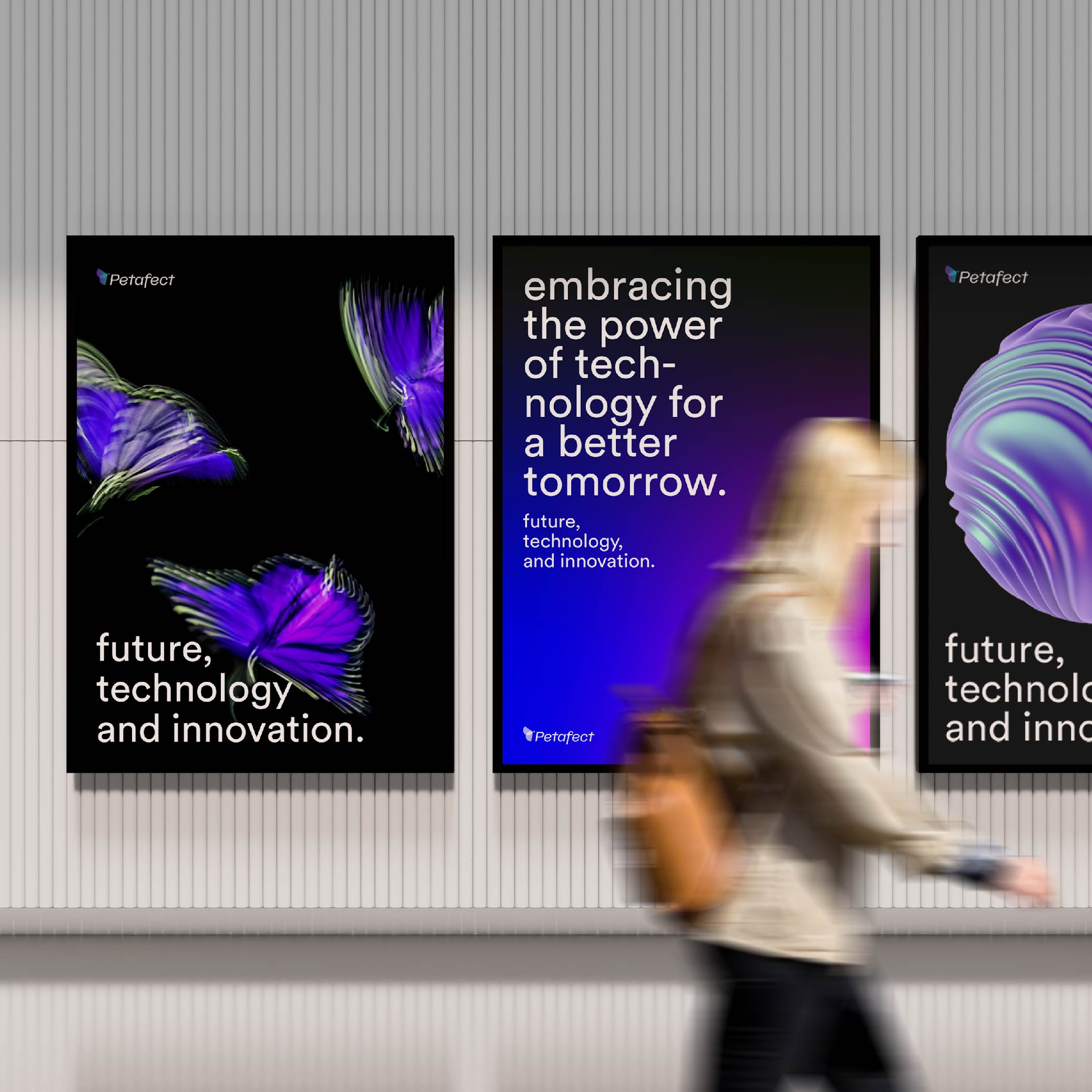
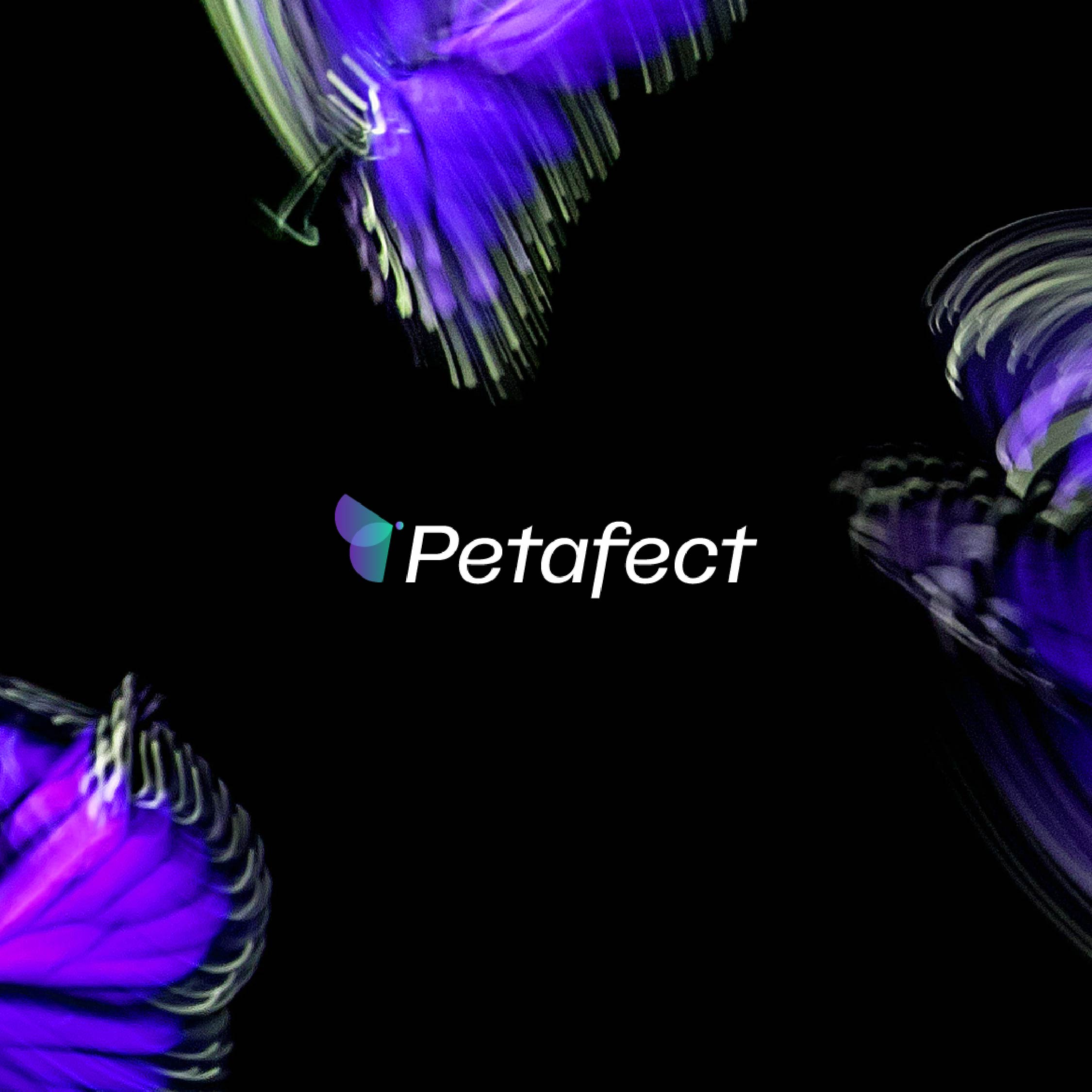
At the core of Petafect’s identity lies the Butterfly Effect – a concept that perfectly encapsulates their mission and vision for the future. The Butterfly Effect is a phenomenon from the field of chaos theory that highlights how even the tiniest of changes can have an enormous impact on the world we live in. This concept is deeply ingrained in Petafect’s DNA and is reflected in everything they do.
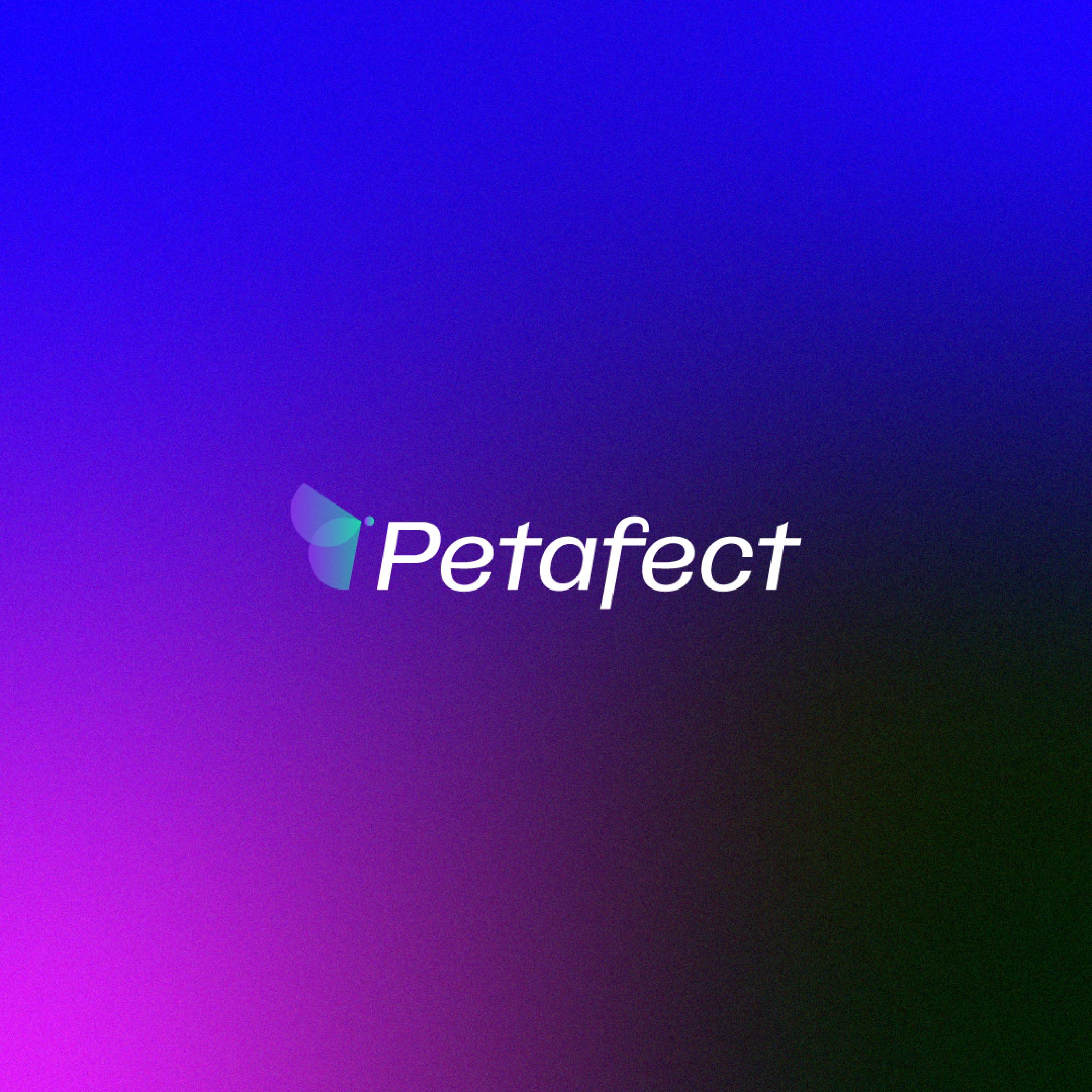
One of the most striking examples of this philosophy can be seen in Petafect’s logo icon. Taking inspiration from the golden ratio rule, the company’s logo is a perfect representation of the commitment to precision and balance that is so crucial to their work. The logo has a transparency which shows the motion of the butterfly effect, signifying the transformative nature of Petafect’s work and their unwavering focus on creating a future of innovation and advancing human knowledge.
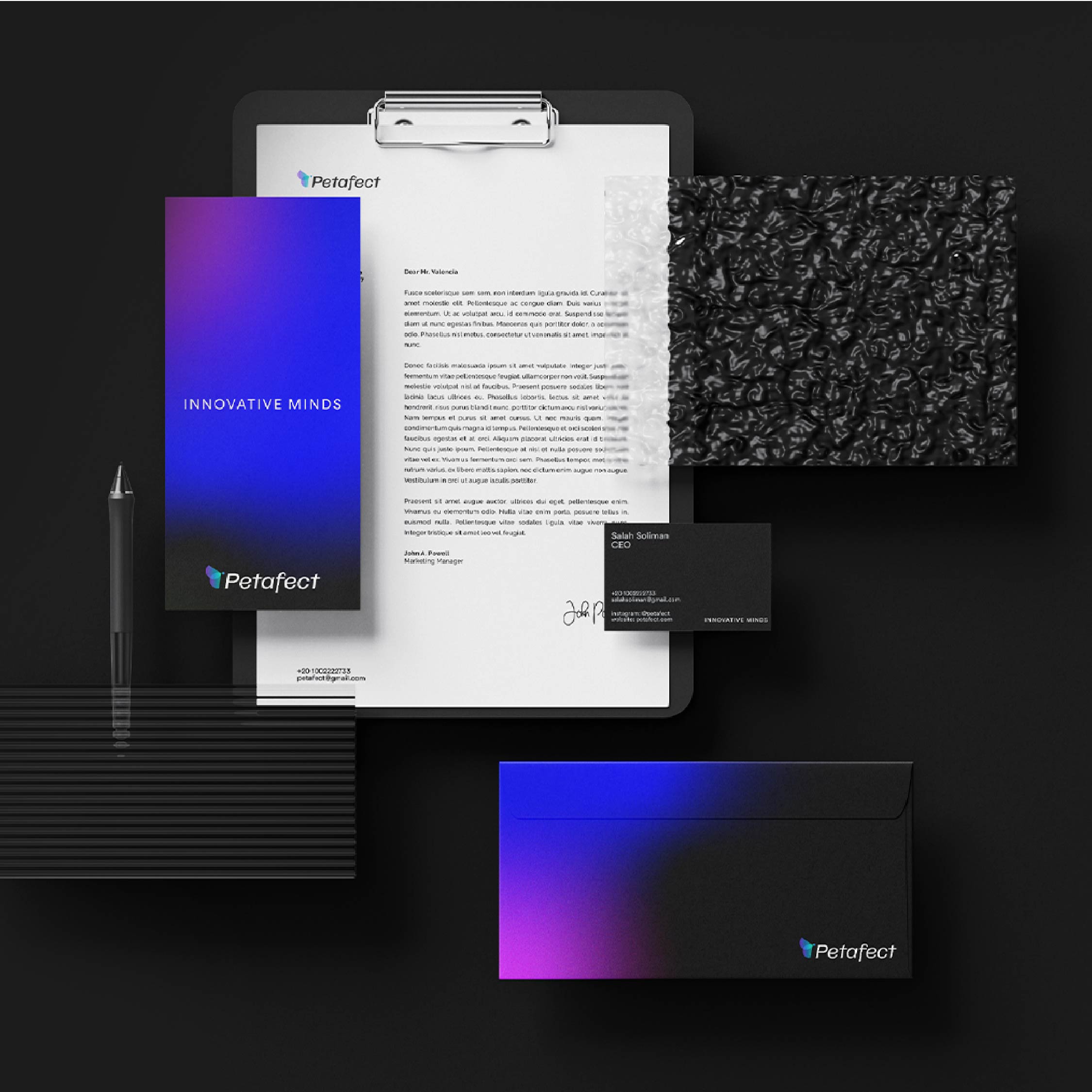
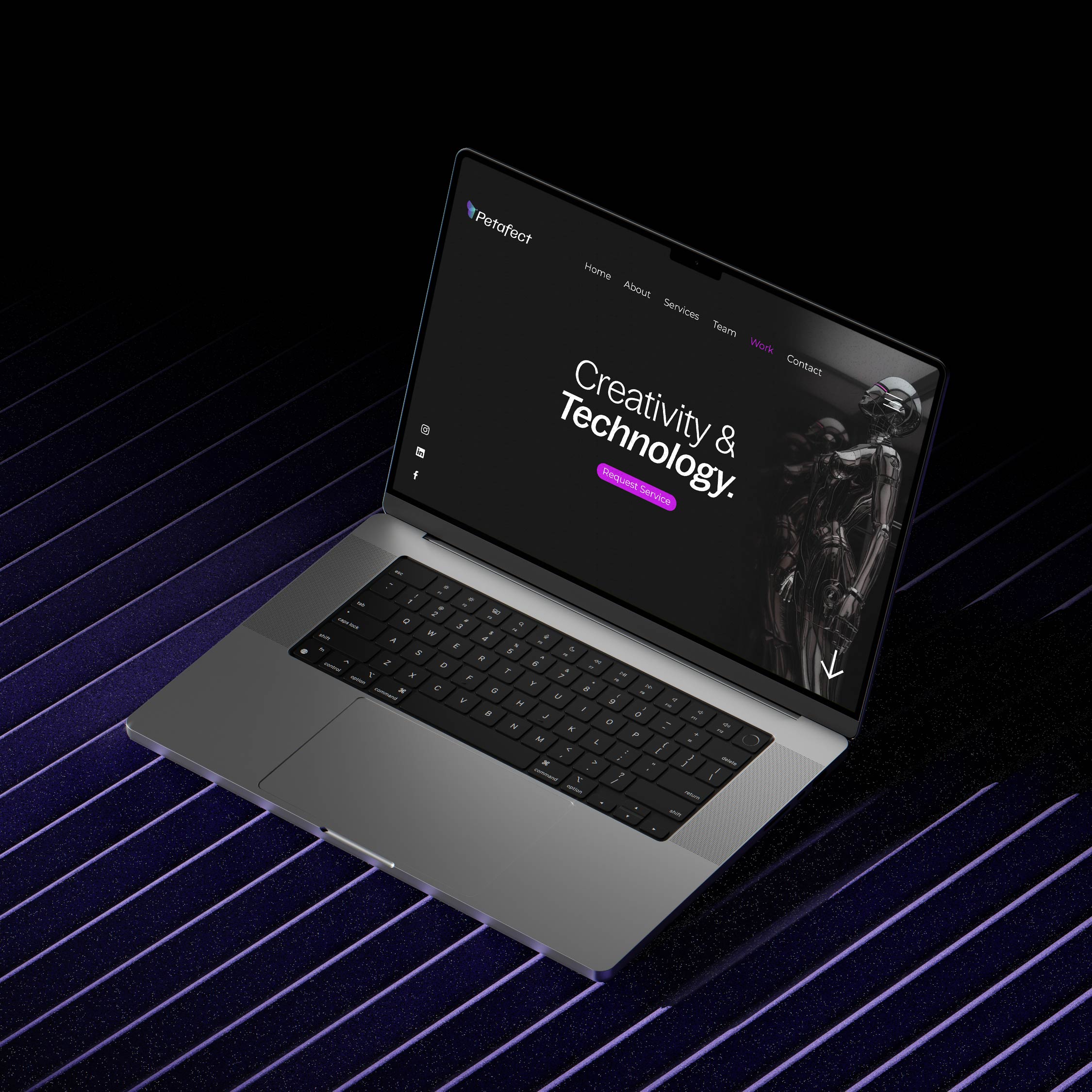
Petafect takes the same meticulous approach to their chosen typeface. The company has opted for a modern, simple, and easily readable typeface that perfectly encapsulates their brand identity. By using lowercase letters, Petafect creates a friendly and approachable feel without compromising on the professional and straightforward appearance that is so crucial to the tech industry.
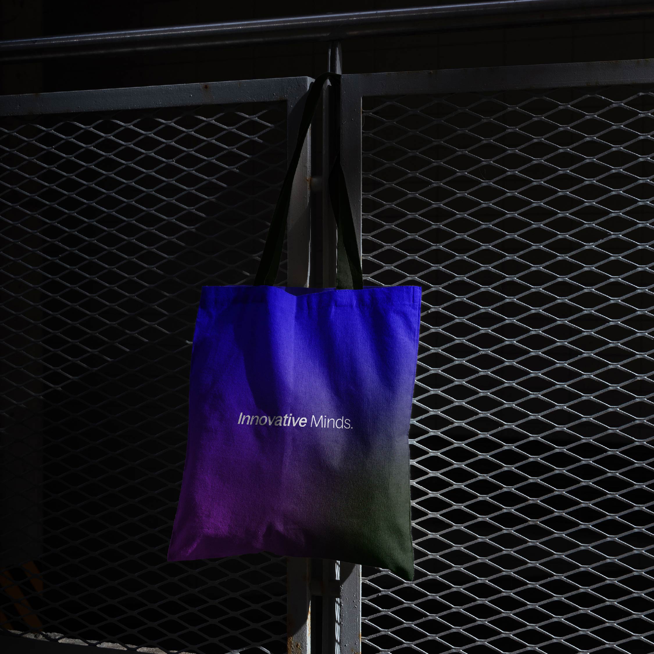
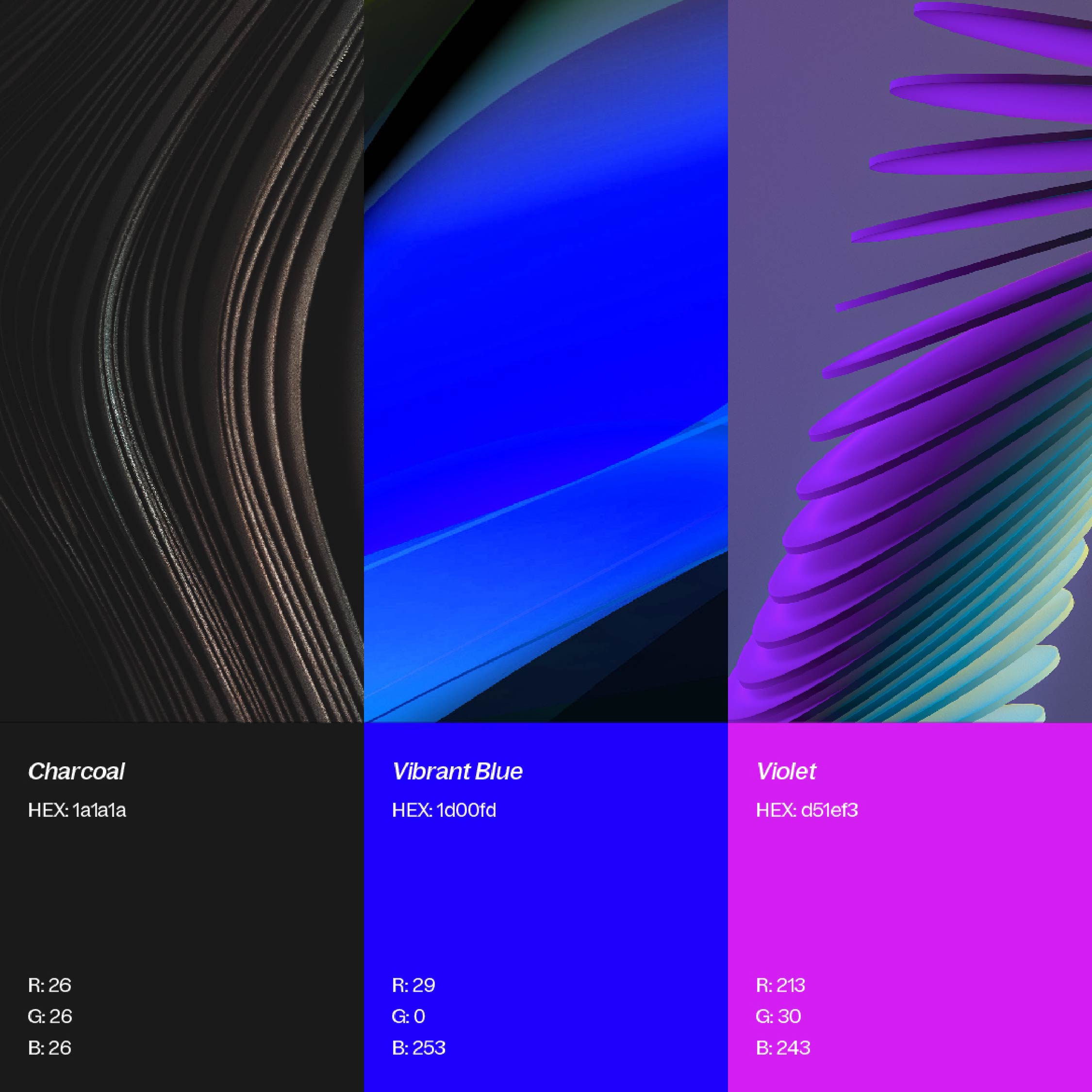
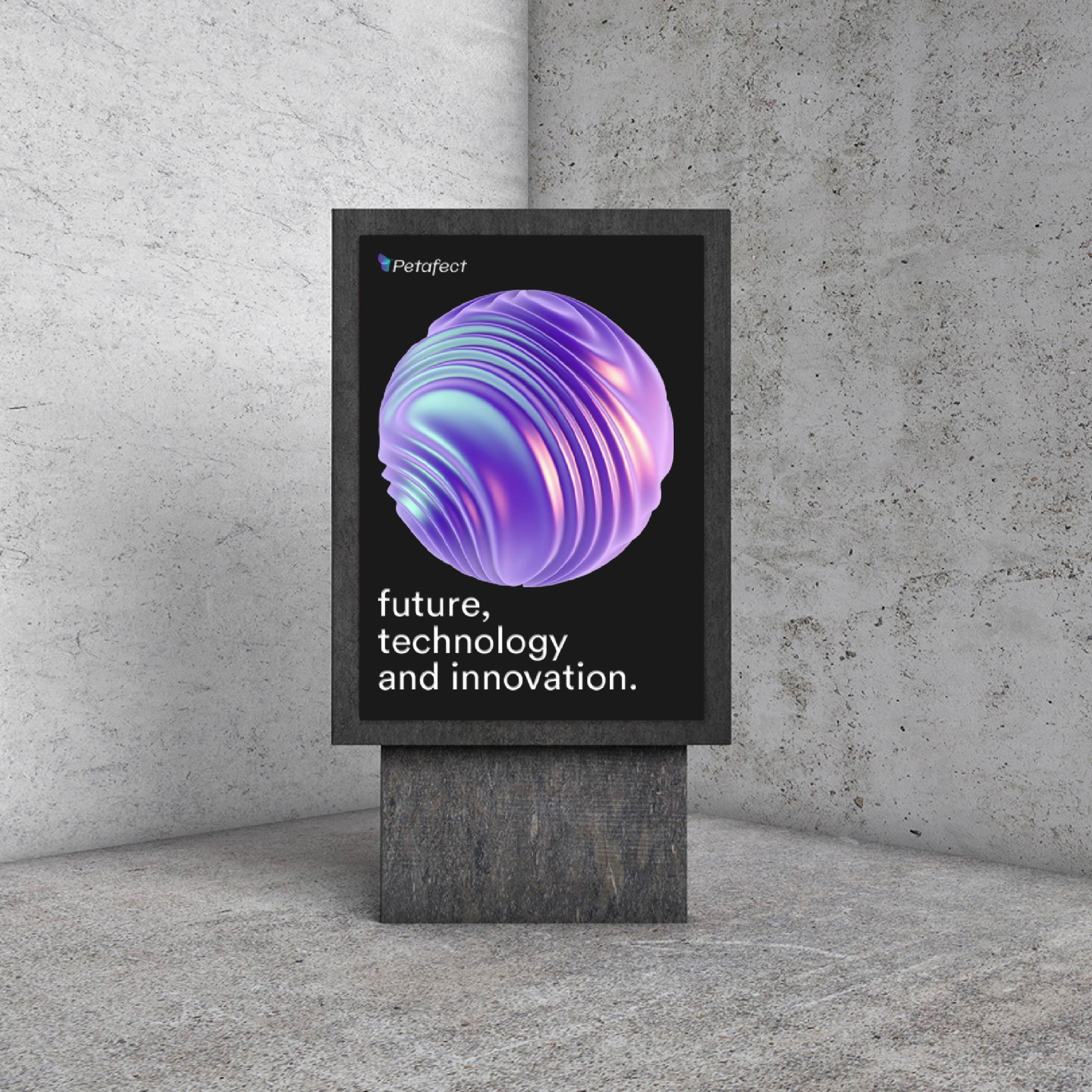
In terms of their color palette, Petafect took inspiration once again from the Butterfly Effect itself. Their color scheme begins with a vibrant blue, a classic color representing modernity, security, and stability. This is followed by a darker shade of black, representing discoveries, innovations, and human knowledge. Finally, the color scheme concludes with a touch of purple, a hue that symbolizes creativity and imagination. Together, these colors make up a distinctive palette that is both striking and memorable.
The chosen typeface is modern, simple, and easily readable typeface for the brand. The lowercase letters give it a friendly and approachable feel, while maintaining a professional and straightforward appearance.
The Color palette is inspired by the butterfly effect, that starts with blue and ends with purple. Blue is the color of innovation, security and stability, Black refers to discoveries, innovations and human knowledge and Purple is the color of creativity and imagination.
CREDIT
- Agency/Creative: nahla gohar
- Article Title: Embracing the Butterfly Effect: Petafect’s Brand Identity Through Precision and Innovation
- Organisation/Entity: Freelance
- Project Type: Identity
- Project Status: Published
- Agency/Creative Country: Egypt
- Agency/Creative City: cairo
- Market Region: Africa
- Project Deliverables: Art Direction, Brand Design, Brand Identity, Branding, Graphic Design
- Industry: Technology
- Keywords: technical minimal futuristic modern gradient
-
Credits:
Senior Graphic Designer: Nahla Gohar


