Briefing
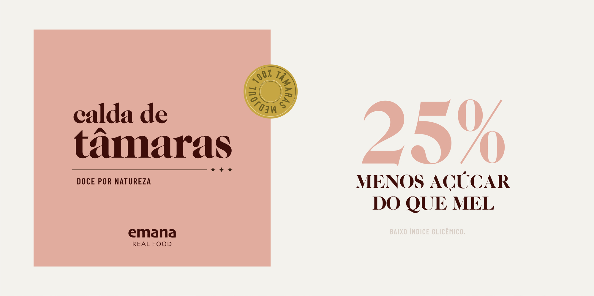
Emana is a new Brazilian food company with focus on superfoods – healthy, natural and tasty food products. Their first product is date syrup, a nutritious replacement to sugars made solely from pressed dates. Dates and their by-products aren’t common in Brazil and the syrup competes with more familiar sweeteners, such as honey and coconut sugar.
The design studio FatFaceStudio was commissioned to create an identity and packaging that felt premium, healthy and natural.
Research
Research for this project was in two different fronts, competitors and culture.
FatFaceStudio visited supermarkets and healthy food shops to gather information about competitors, to see what kind of other products the date syrup would be surrounded with once it hit the shelves, and also what other products consumers could be interested in when shopping for healthy foods.
In addition, the studio interviewed a chef and Instagram influencer, as well as the client and an experienced trader about the kind of audience that would be likely to look for alternative sweeteners such as date syrup. The objective was to identify possible early adopters and their lifestyle, brands they love, places they go, etc.
Concept
The team decided to target the identity and label to a health- and environment-conscious audience that can pay a premium for alternatives to sugar and would most likely be the early adopters.
After researching the available sweeteners, superfoods and the local culture around eating healthy, FatFaceStudio came up with four pillars to guide the creative process:
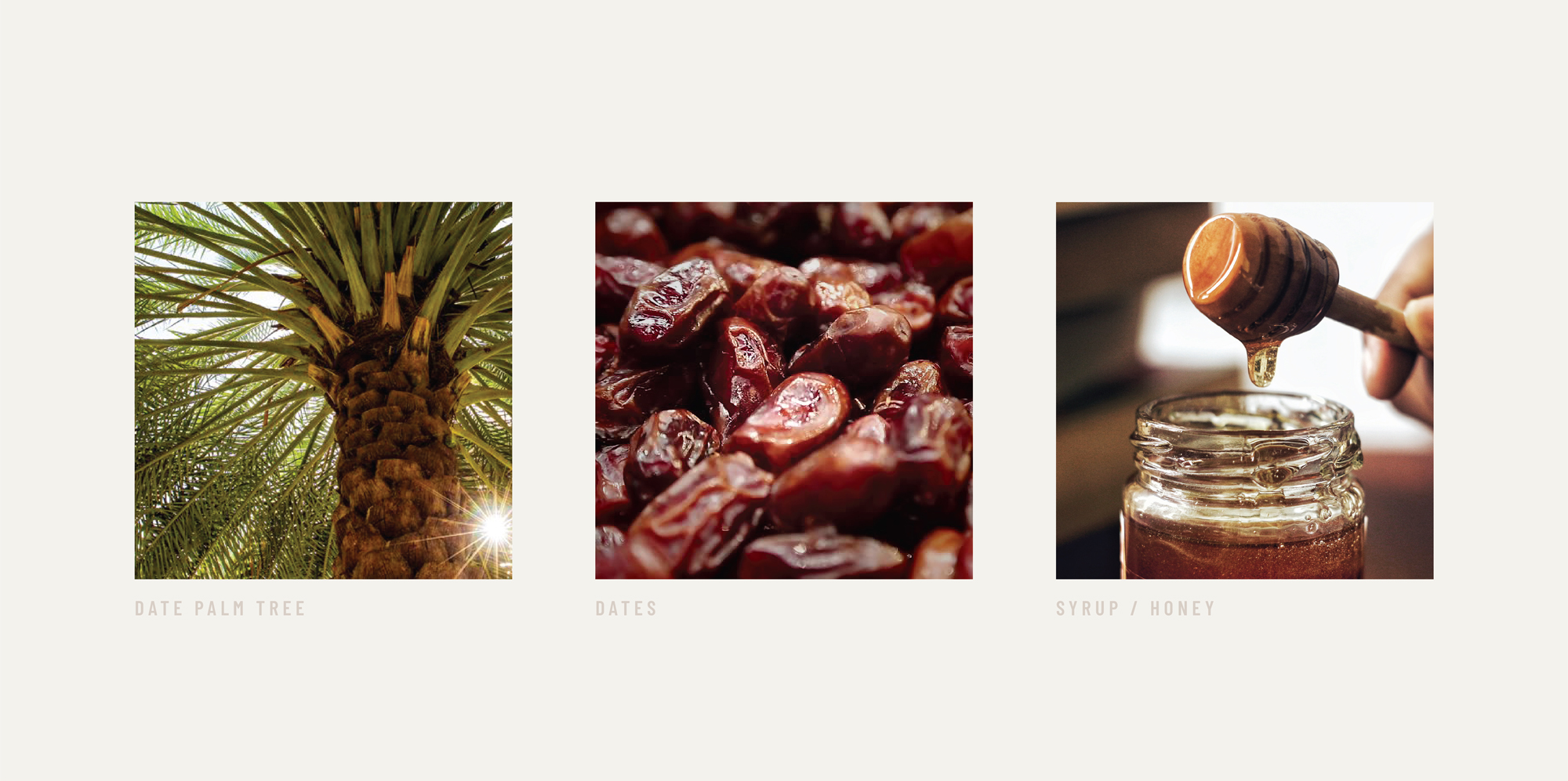
Exotic – Brazilians aren’t yet used to dates, a fruit that comes from the Middle East and it is sold in specialised shops and open markets, sometimes nicknamed ‘natural chocolate’.
Neutral – even though it’s exotic, the flavour you get from using dates as a sweetener is mostly neutral, although some say it can feel a bit like chocolate.
Benign – the syrup is healthier than many other sweeteners and made only from dates.
Premium – customers should know they’re purchasing a superior quality product. Emana sources some of the best dates available.
Visual identity
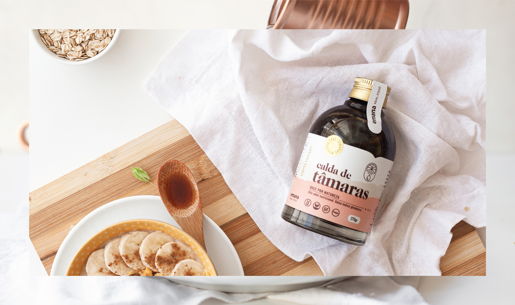
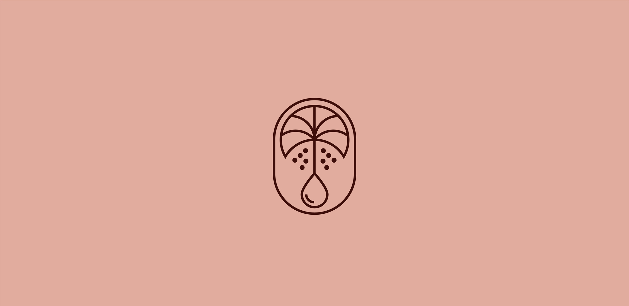
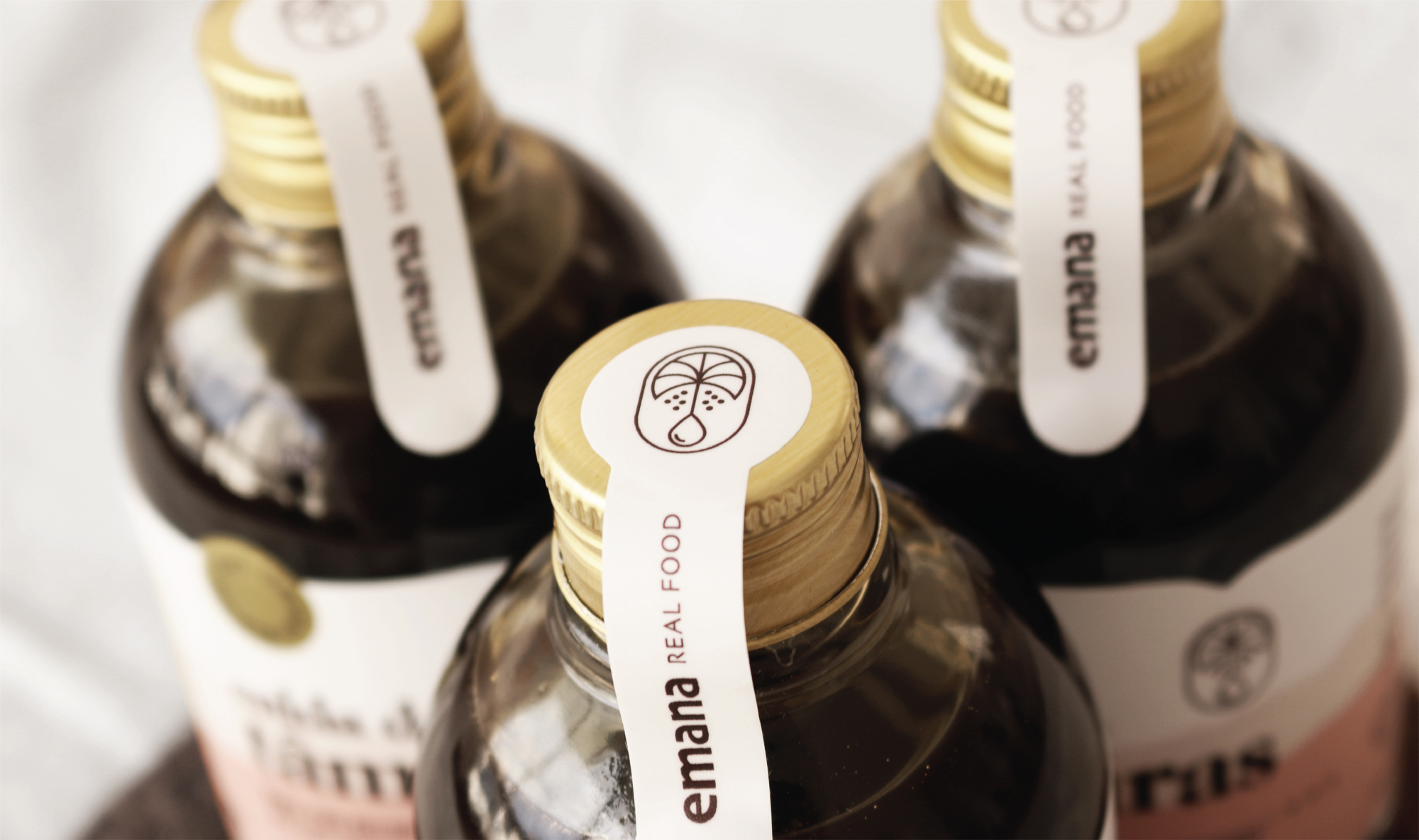
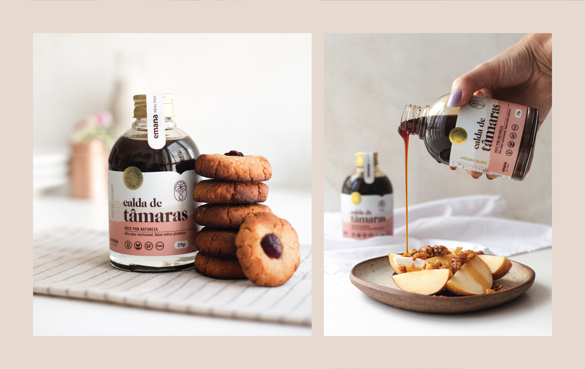
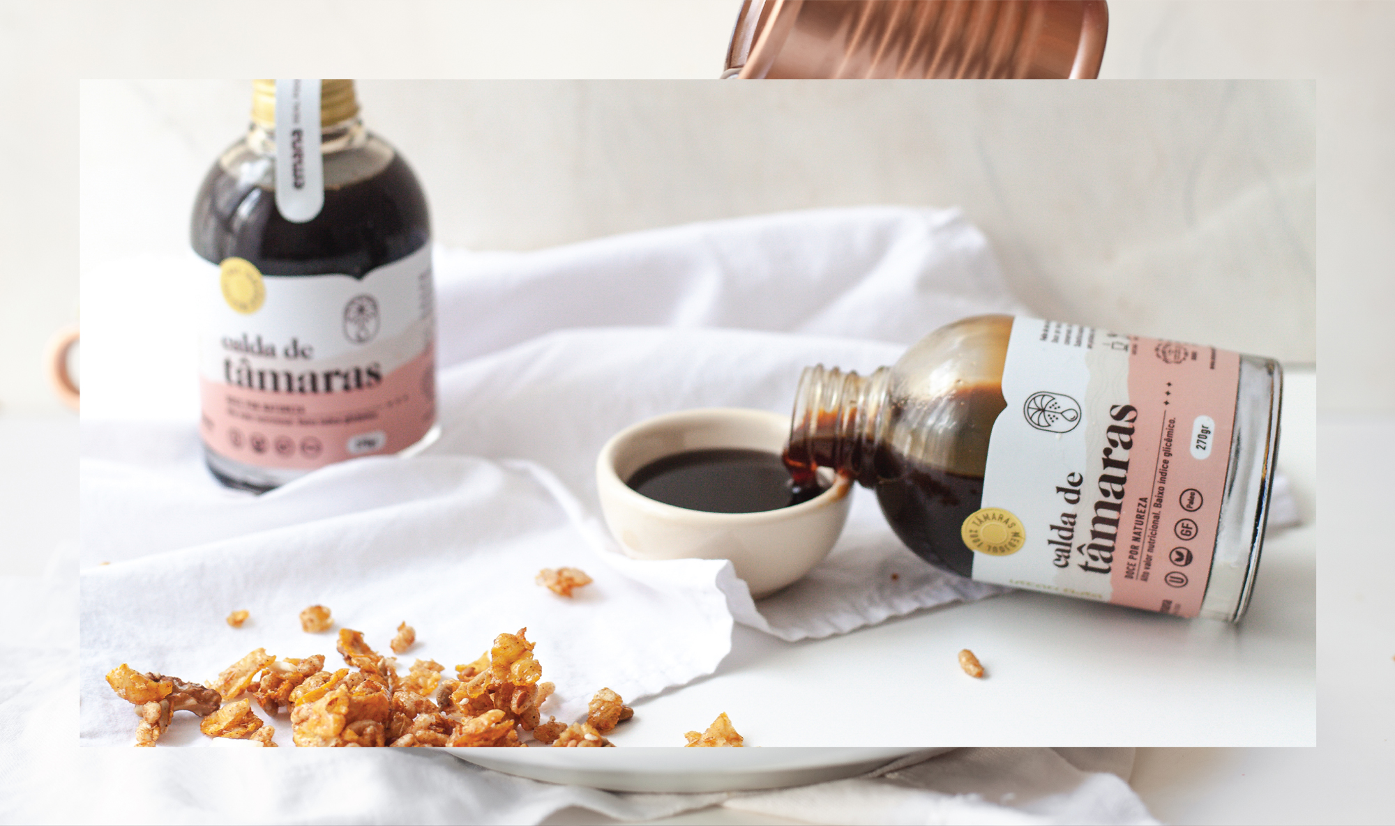
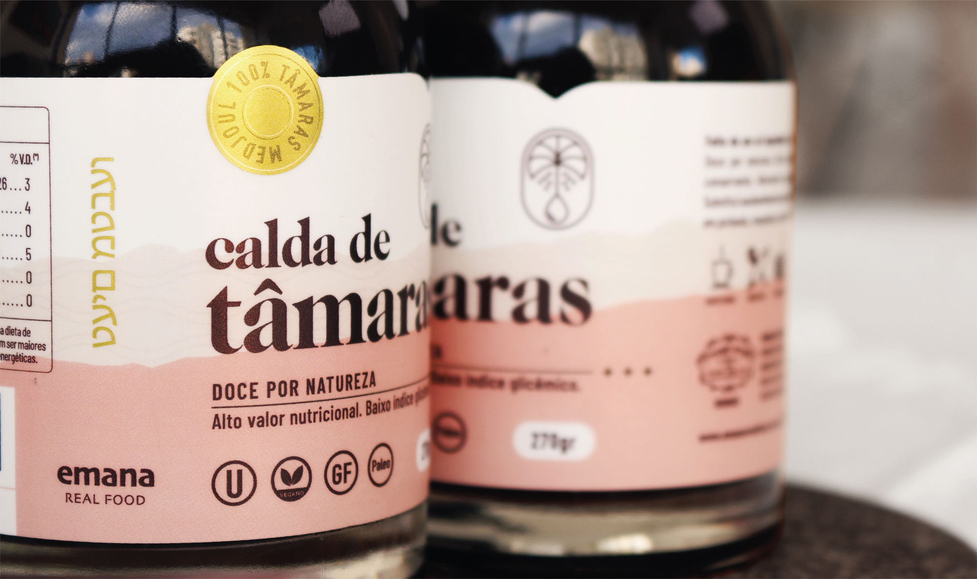
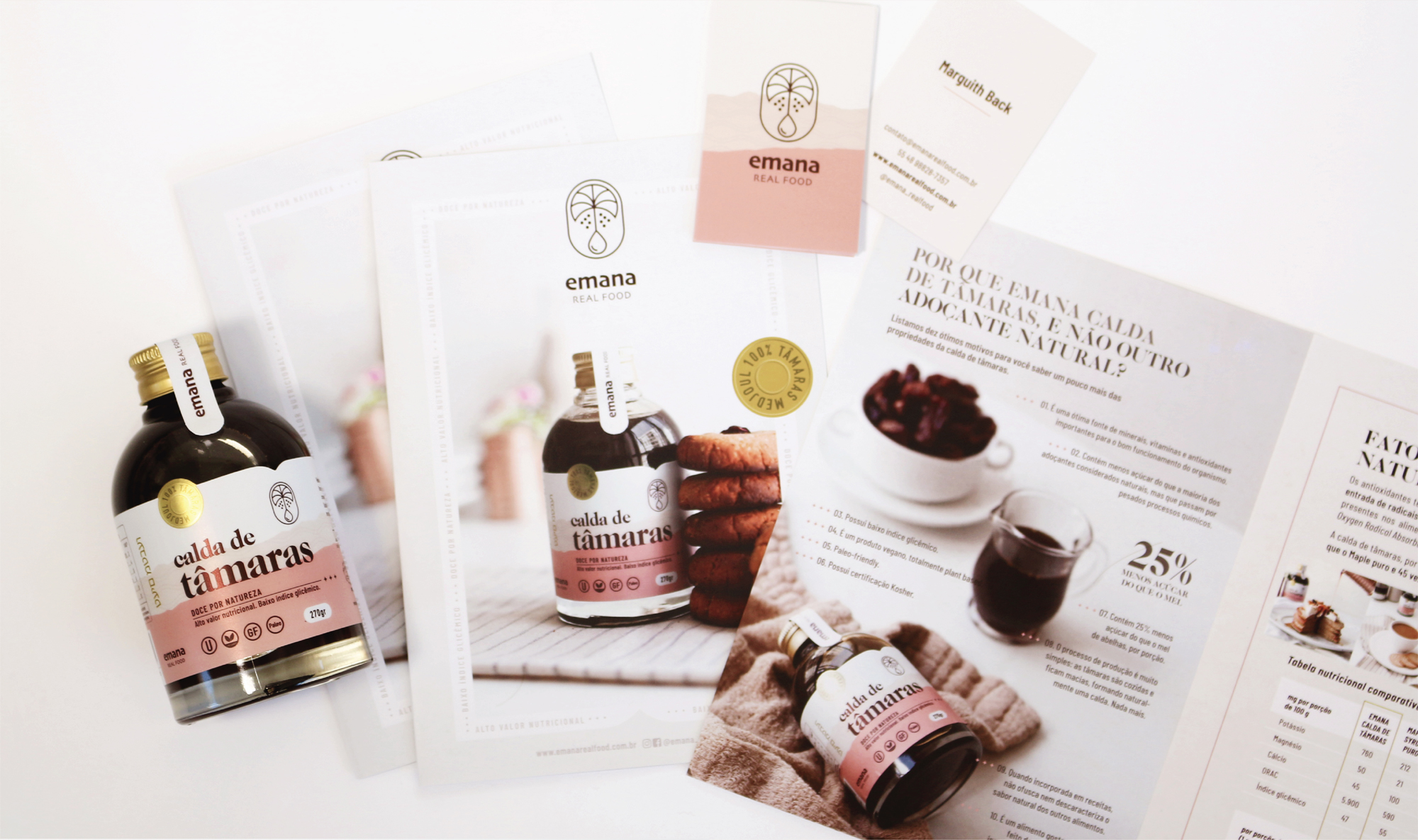
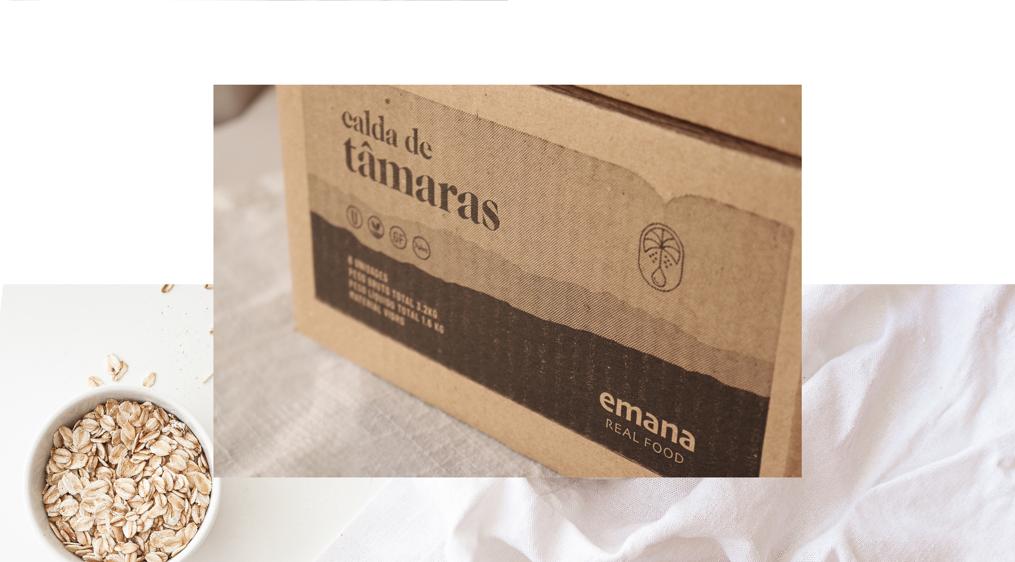
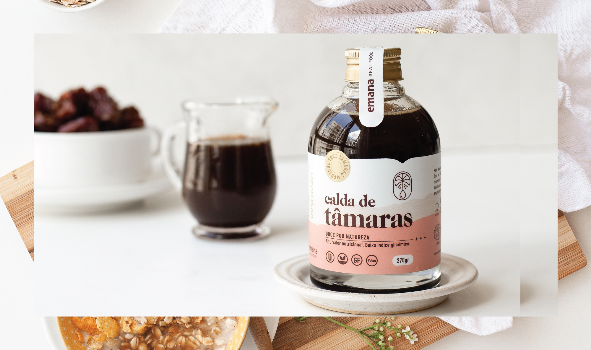
The glass bottle was chosen for its charming and friendly form and due to it being fully recyclable. The colour palette and forms were selected to convey similar attributes, but also a sense of neutral, slightly chocolate-like flavour.
The main typeface is a bold serif, which gives the label elegance and presence. These attributes also dictated the metallic paper stock choice with matte finish.
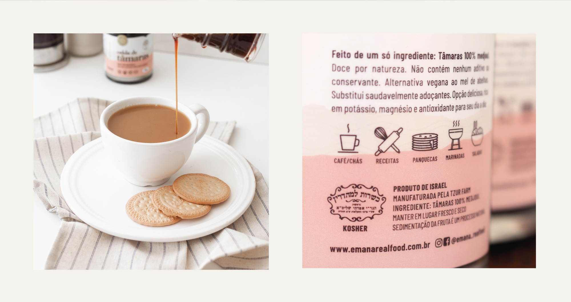
Finally, this being a pioneering product in the Brazilian market, the team decided the packaging should include information about the benefits using date syrup.

CREDIT
- Agency/Creative: FatFaceStudio
- Article Title: Emana Date Syrup Branding and Packaging
- Organisation/Entity: Agency, Published Commercial Design
- Project Type: Packaging
- Agency/Creative Country: Brazil
- Market Region: South America
- Project Deliverables: Brand Identity, Graphic Design, Packaging Design, Photography, Product Architecture, Research
- Format: Bottle
- Substrate: Glass


