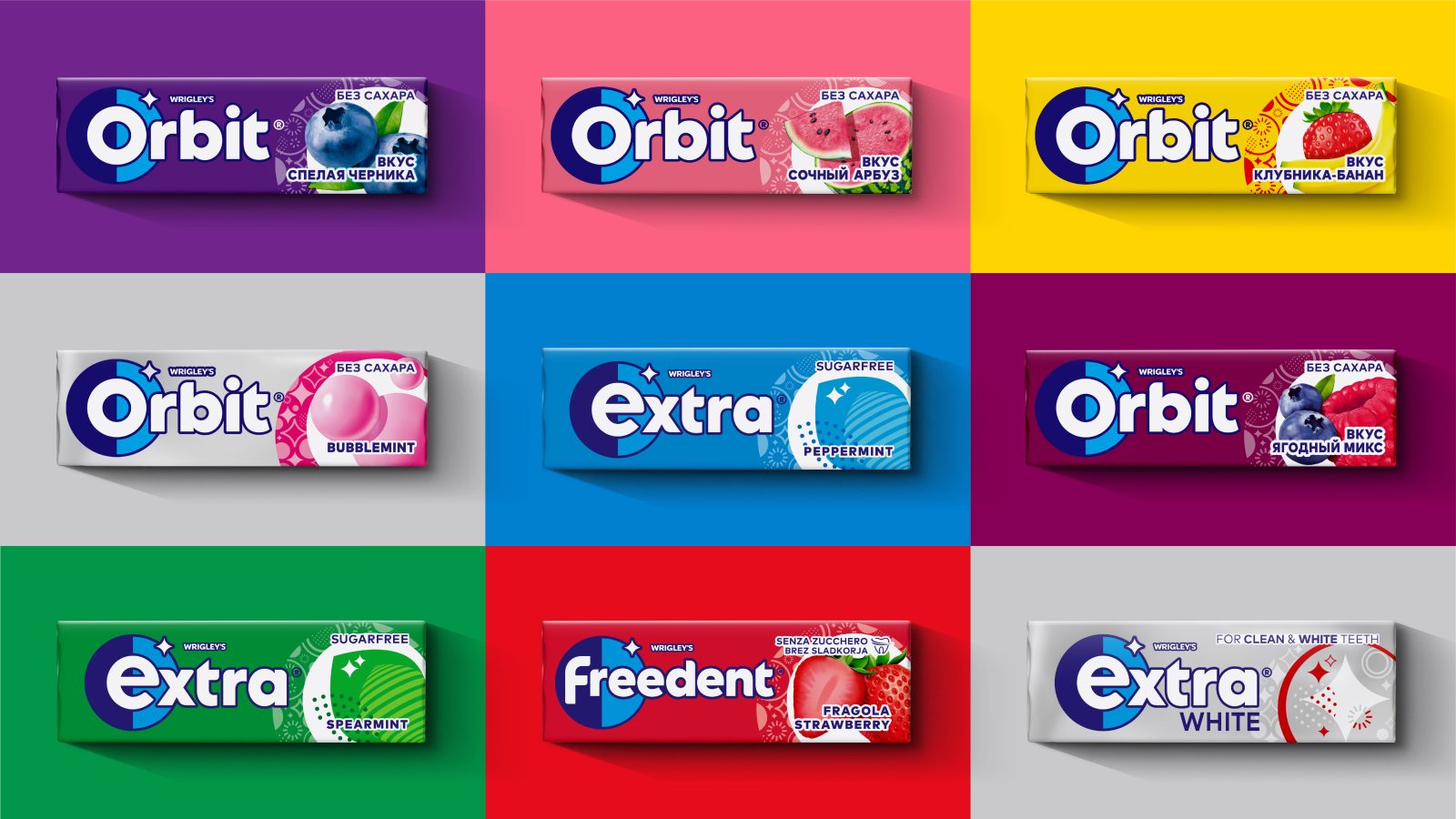
Historically, gum has been linked to confidence, but, until now it’s never been baked into the wider brand experience. When Mars Wrigley approached us to rebrand Extra and help them appeal to younger consumers, we saw an opportunity to create a brand that embodied confidence for a digital-first generation. Wrigley’s Extra chewing gum wanted the rebrand to move away from dental hygiene cues and instead focus on its variety of flavours.
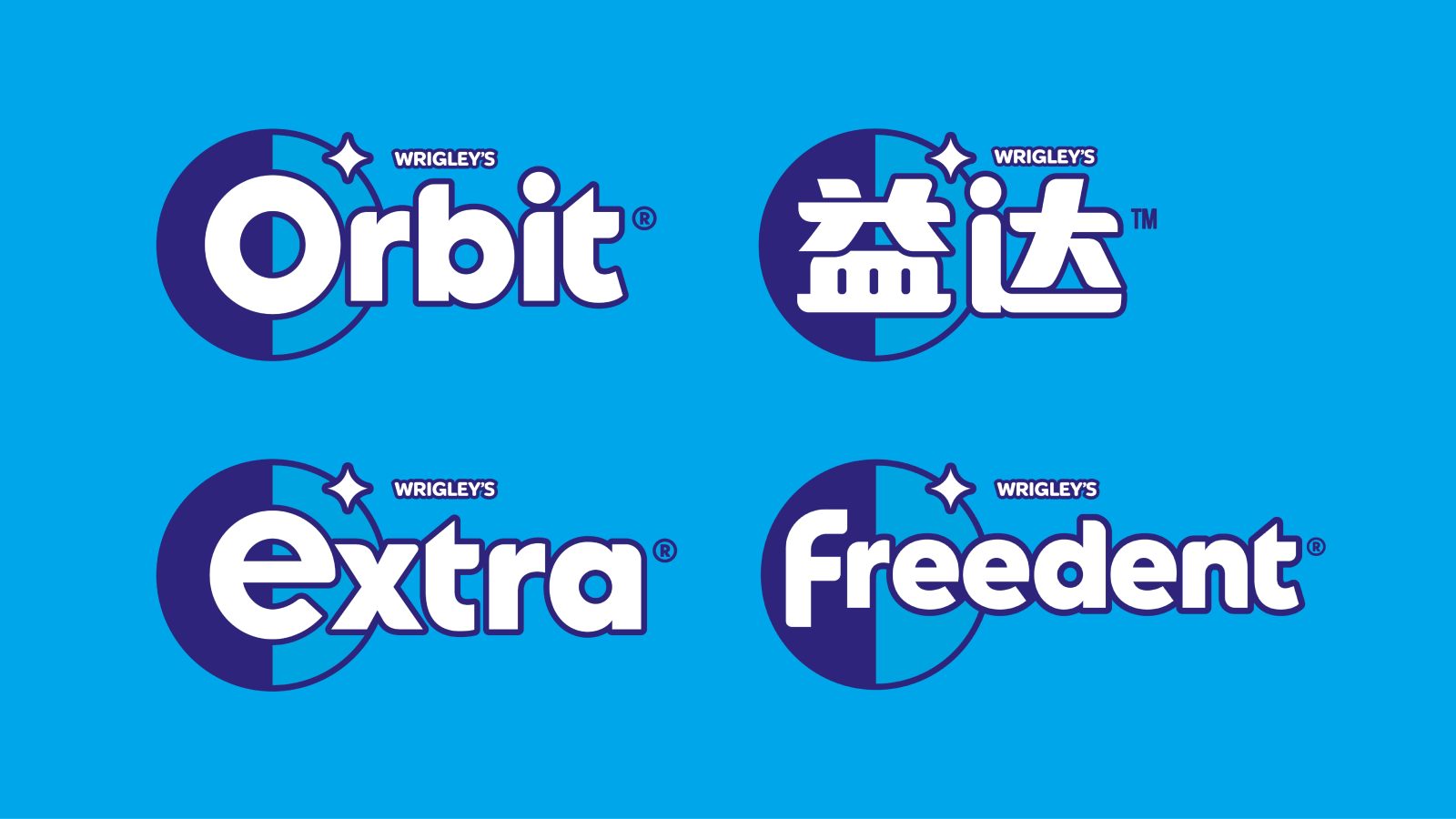
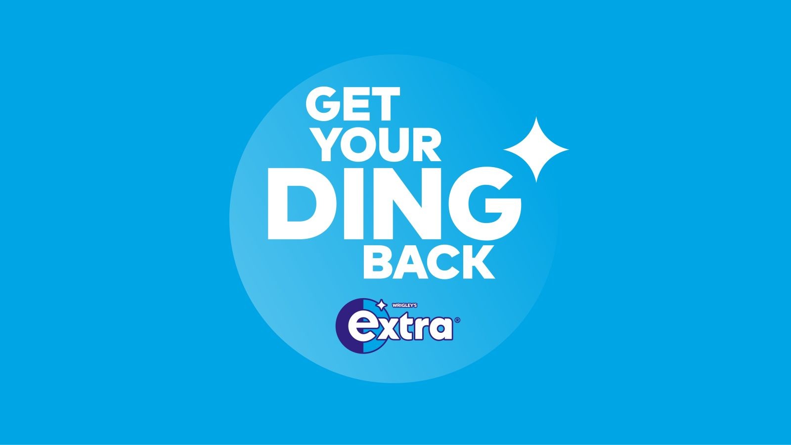
We wanted to transform Extra into an iconic lifestyle brand and place it at the heart of everyday living for a Gen Z audience, encouraging confidence in the moments that matter. We worked with Mars Wrigley to commission research about this group of consumers, which revealed a series of key moments around ‘styling up’ and ‘single life/dating’ – providing the perfect platform for the rebrand. To access this, Extra needed a new universal brand flag – the ‘ding’. The overall ambition for the rebrand was Extra’s ‘ding’ symbol. The old one featured a static, graphically out-of-place ‘ding’, representing a missed opportunity. The star-like symbol has been refined with softer curves and a new look, and featured within a circular frame. This lock-up can be used in isolation, but also on multiple touchpoints. This newly created ding icon, set beside a rounded shield shape, would inform and inspire the shape language of the entire brand identity. The icon is also used alone as a global, shorthand icon for all territories and is the first unification of the brand at a global level.
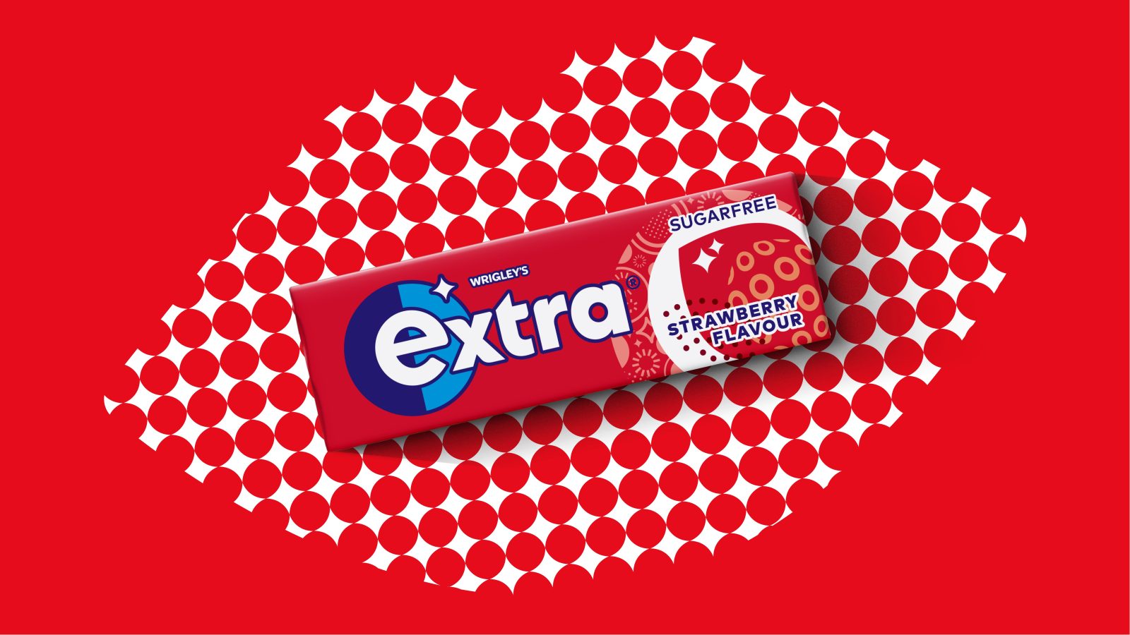
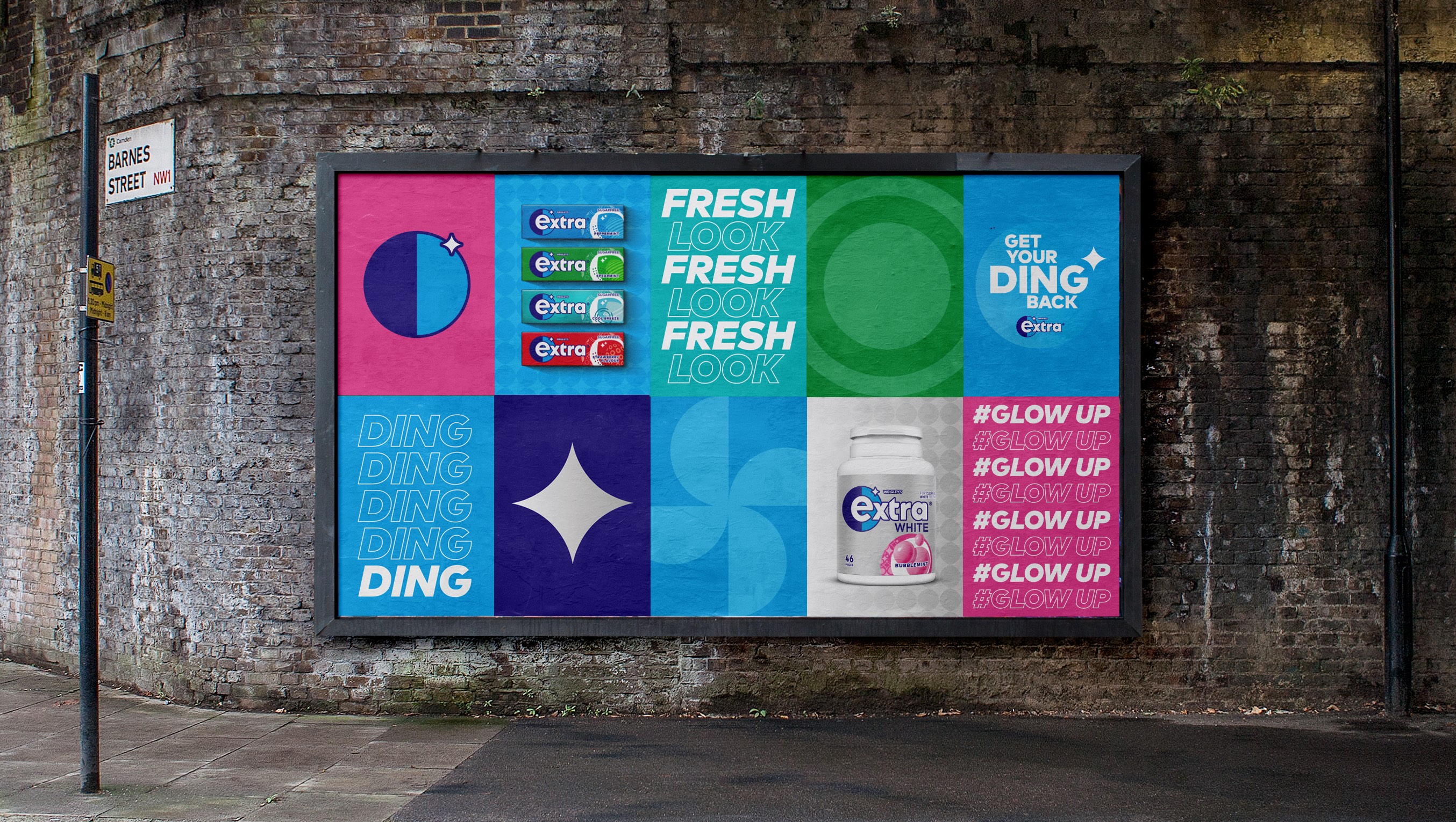
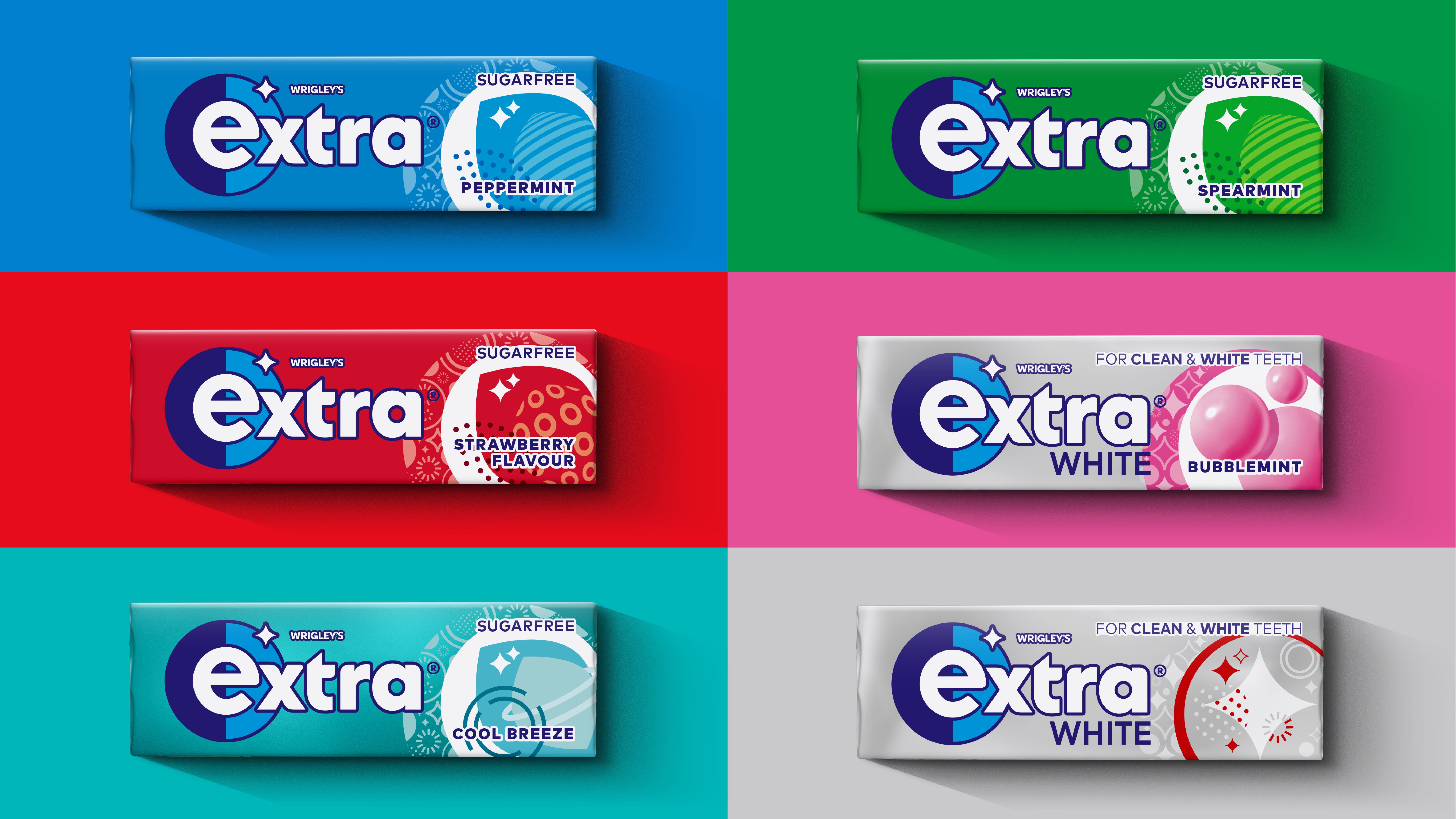
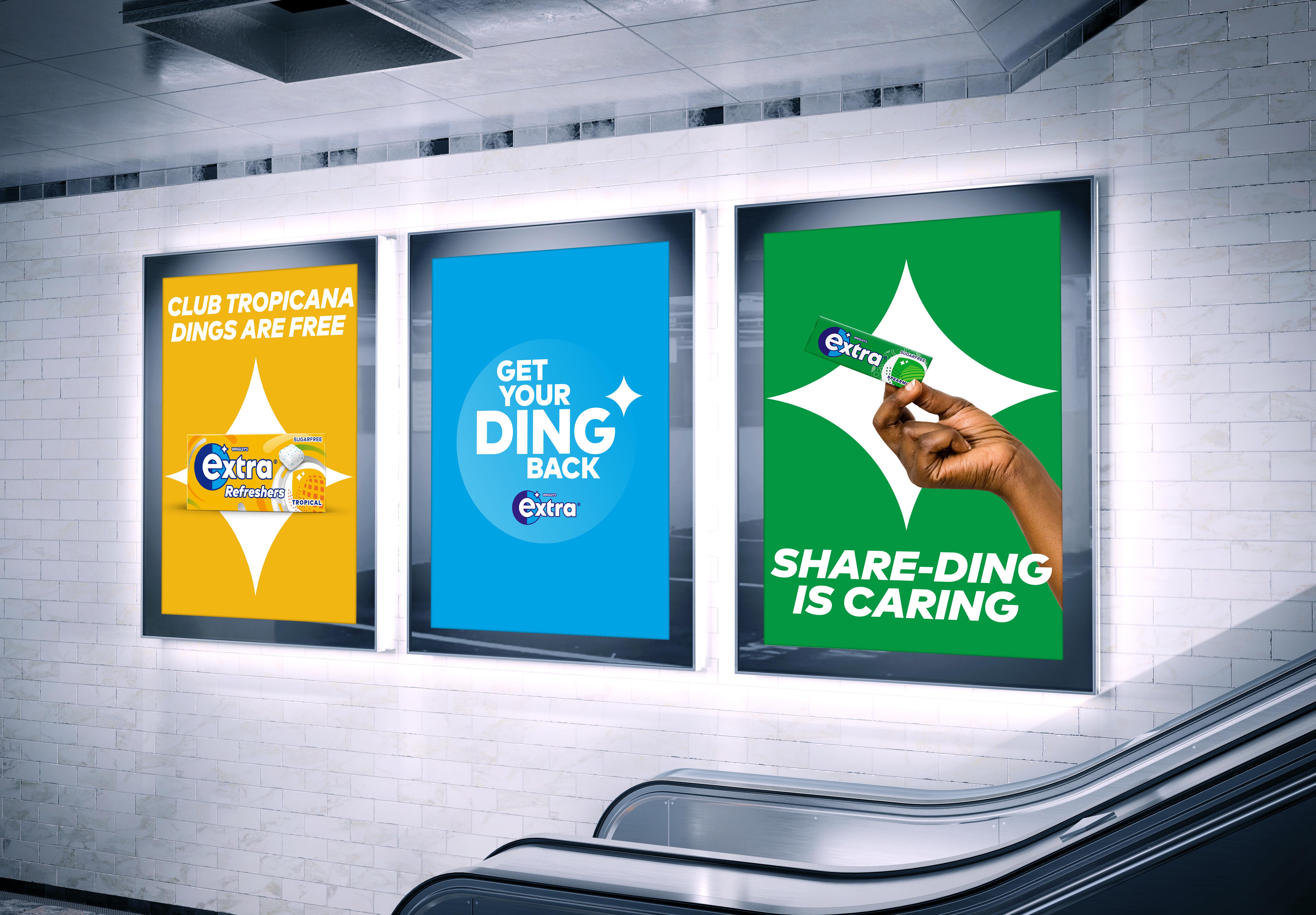
The circular imagery can also be seen in the updated typography as well as the flavour framing device. The aim here is to focus on flavour and moments of confidence. This is also the first time, in the UK, that Extra will feature this spotlight technique – an attempt to create greater clarity for consumers. The ding system also takes centre stage on the rebrand’s digital and social campaign. We designed a series of visual assets – involving animated work – which have been inspired by pop art and feature playful taglines.
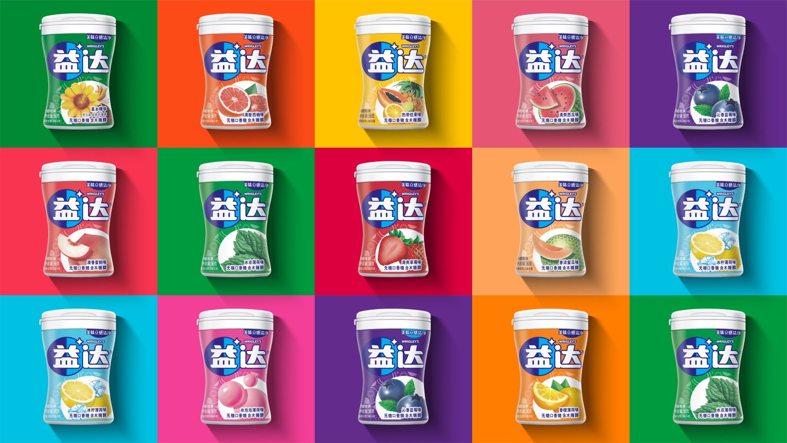
The new brand flag and system is baked into every visual element of the packaging. Extra now has a brand system that can flex across all touchpoints, giving it new life beyond packaging to allow the brand to appeal to a digital-first mindset.
Extra has evolved into a confident, forward-thinking brand that captures a younger and contemporary feel – while staying true to its brand heritage. The global rebrand began its rollout in December 2021 in China and has continued in the UK followed by a world-wide rollout. Extra’s new brand system can be evolved to allow for new product innovations and partnerships, as seen in the brand’s recent cross-promotional campaign via a partnership with Gen-Z focused online fashion retailer, I Saw It First. Designed to meet market needs and drive future innovation, Extra’s new distinctive visual identity is its first unified expression of the master brand at a global level – a move that is nothing short of “extra”.




CREDIT
- Agency/Creative: Elmwood
- Article Title: Elmwood Redesigns Extra Chewing Gum
- Organisation/Entity: Agency
- Project Type: Identity, Packaging
- Project Status: Published
- Agency/Creative Country: United Kingdom
- Agency/Creative City: London
- Market Region: Global
- Keywords: WBDS Agency Design Awards 2022/23
-
Credits:
Global Executive Creative Director: Andrew Lawrence
Creative Director: Craig Barnes
Design Director: Mark Laws
Designer: Jack Bannerman
Designer : Mike Preston
Designer: Emily Morris
Designer : Sam Povey
Designer : Rob Dyer
Designer : David Walsh
Animation: Doug Brown
Typography: Rob Clarke
Chief Provocation Officer: Greg Taylor
Account Director: Beth Stanford
Account Manager: Hanni Etherington


