


The Week is an icon of the newsstand. Part of a group of respected magazines that cover weekly political commentary, The Week is unique, delivering a balanced point of view. They do this by pulling together news from a multitude of respected sources every week, allowing the reader to be fully informed and able to come to their own conclusions without political sway or bias. The Week has a loyal readership, but they were keen to recruit new readers through digital and print comms. Our challenge was to create a visual identity system that reflected the publication’s balanced editorial style to deliver recruitment campaigns and connect with new readers.
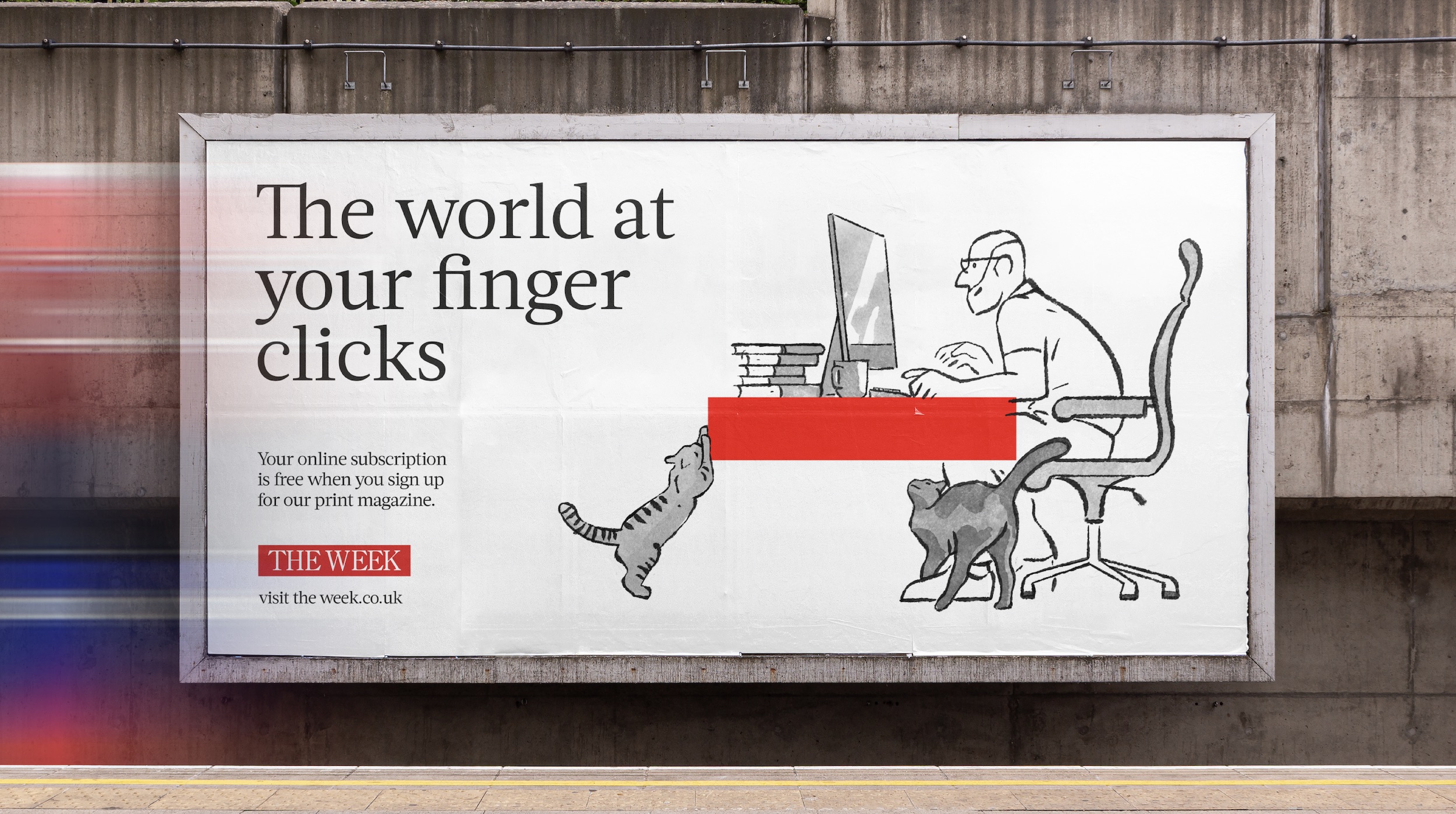
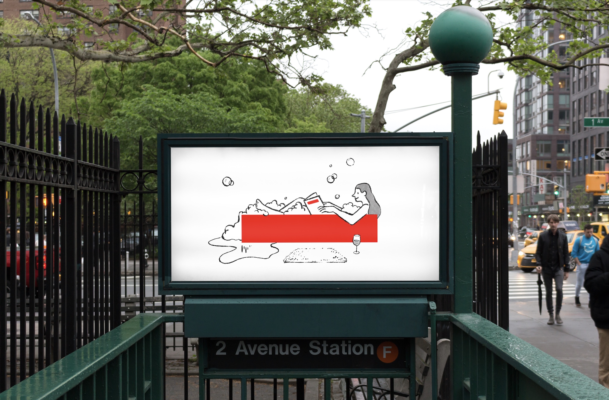
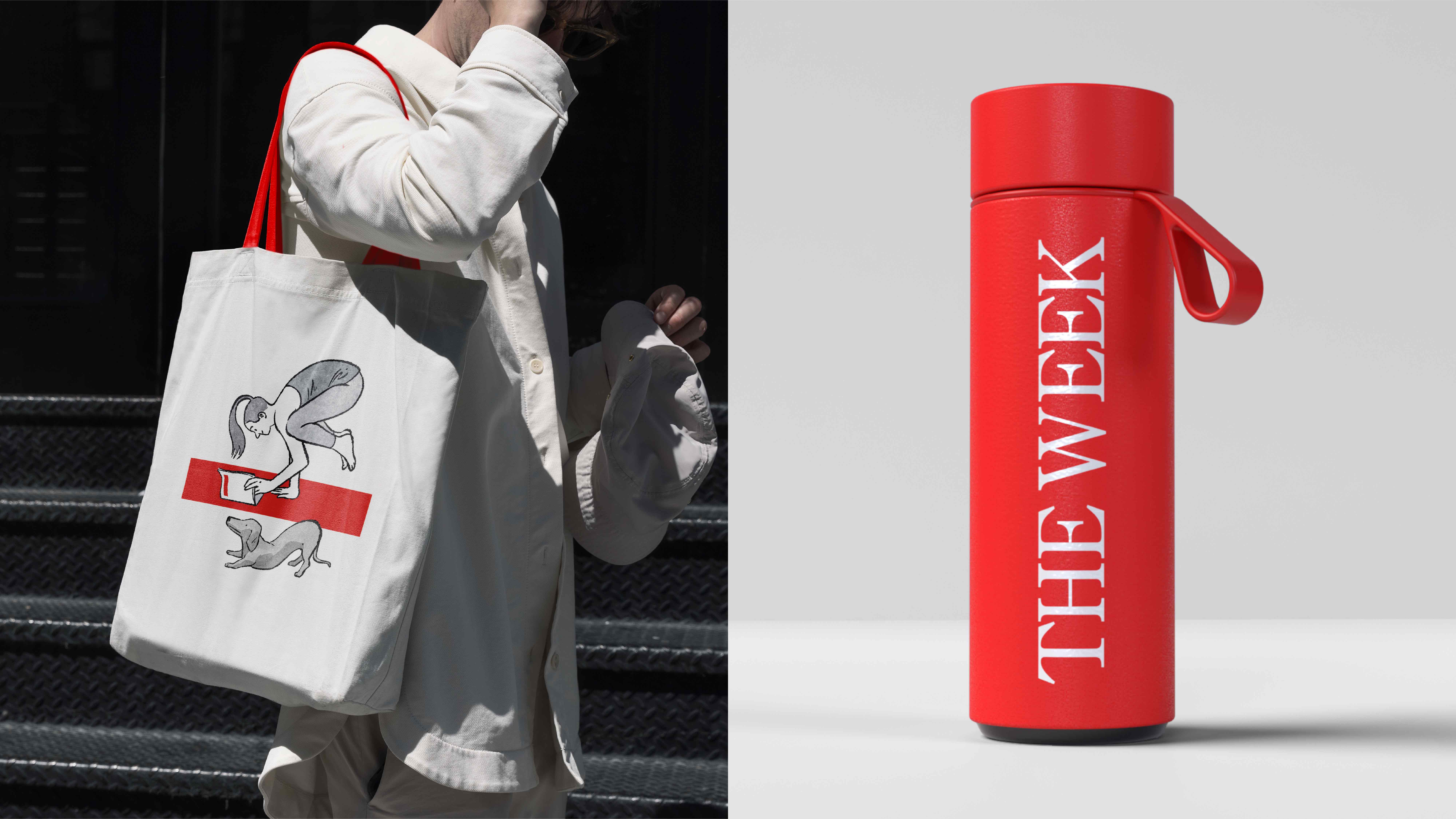
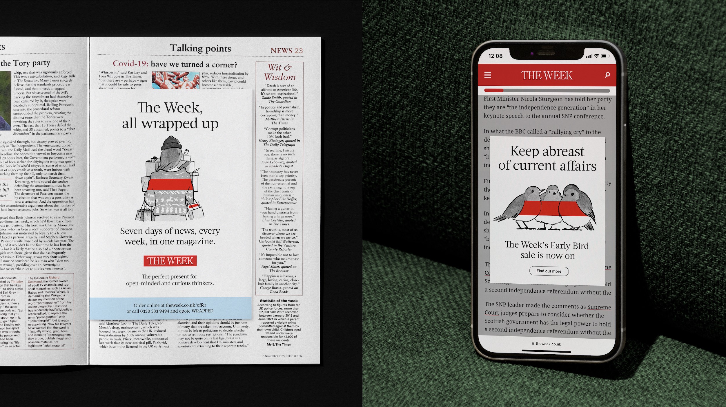
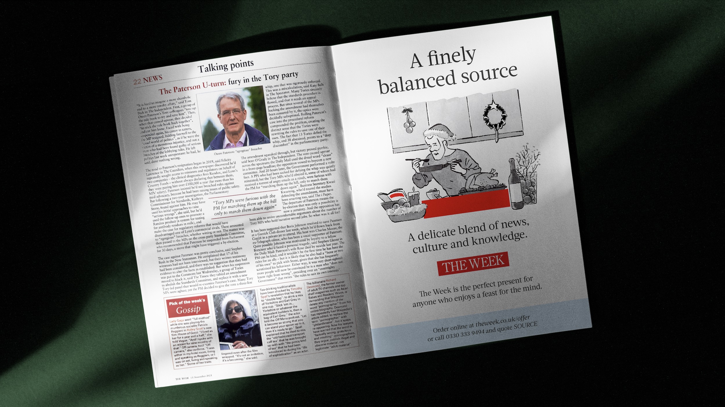
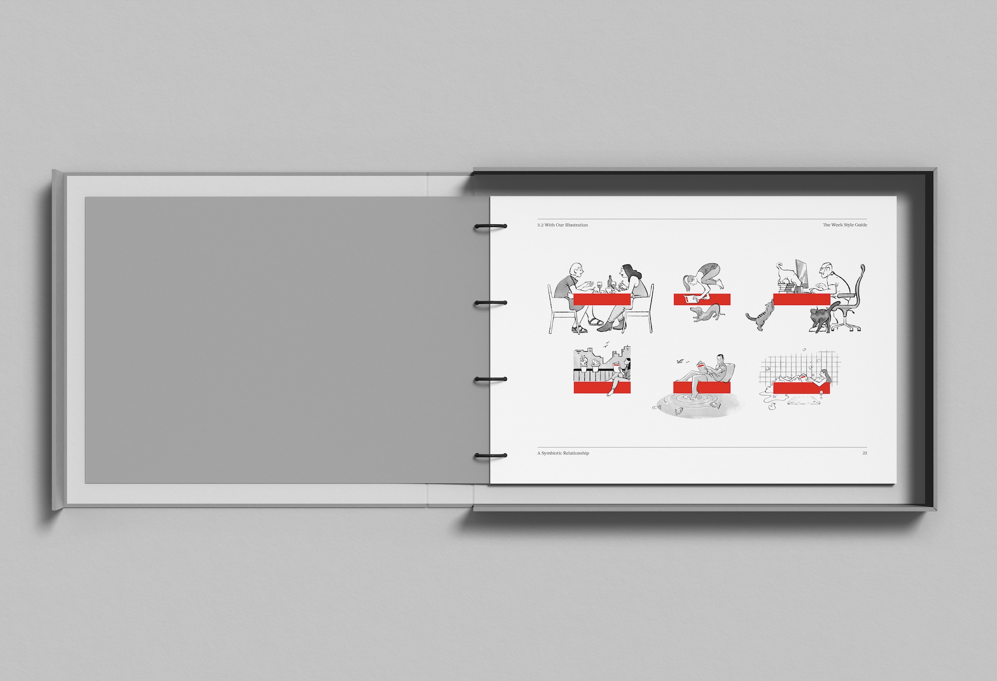
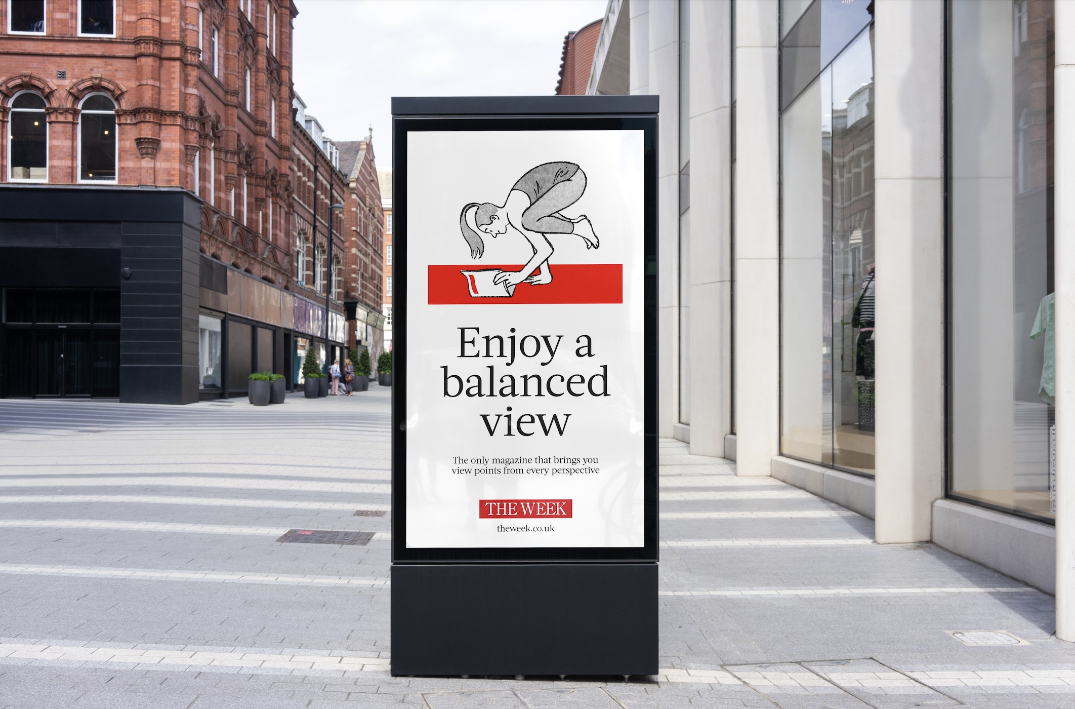
Whilst The Week is known for its colourful and illustrated covers depicting political satire, there was very little left to play within the brand toolkit. We thought on the challenge and quickly identified that the solution was hiding in plain sight – the iconic red masthead.
The powerful, iconic shorthand was destined to become the stage for witty, idea-led copy and the whimsical illustrations of artist supremo, Luis Mendo. Mendo’s delightful, pen and ink illustrations really do act as a foil to the more colourful cover illustrations of The Week, allowing both to co-exist in the same brand world with ease. We got to work, flexing our imagination and looking for new ways that the bar could form the centre point of a myriad of different stories. This optimised brand shorthand quickly became the gift that kept on giving with new scenarios and copy solutions to delight and entice new readers – from summer subscription giveaways to early bird deals and Christmas gift subscriptions. Our new easy-to-use visual identity system has the ability to flex to cover all stories from all angles, translating The Week’s measured news voice and bringing it to life in a multitude of fresh and distinctive ways.
CREDIT
- Agency/Creative: Elmwood
- Article Title: Elmwood Creates Visual Identity for The Week
- Organisation/Entity: Agency
- Project Type: Digital
- Project Status: Published
- Agency/Creative Country: United Kingdom
- Agency/Creative City: London
- Market Region: Europe, North America
- Project Deliverables: Brand Experience, Brand Guidelines, Illustration
- Industry: Mass Media
- Keywords: brand toolkit, brand experience, illustration, key assets, iconic, visual identity system, balanced editorial style
-
Credits:
Global Executive Creative Director: Andrew Lawrence
Middleweight Designer: Mike Preston
Senior Designer: Matt Churchill
Account Manager: Nicole Segal
Head of Client Partnerships: Sheila Buchet
Head of Animation: Oli Minchin


