


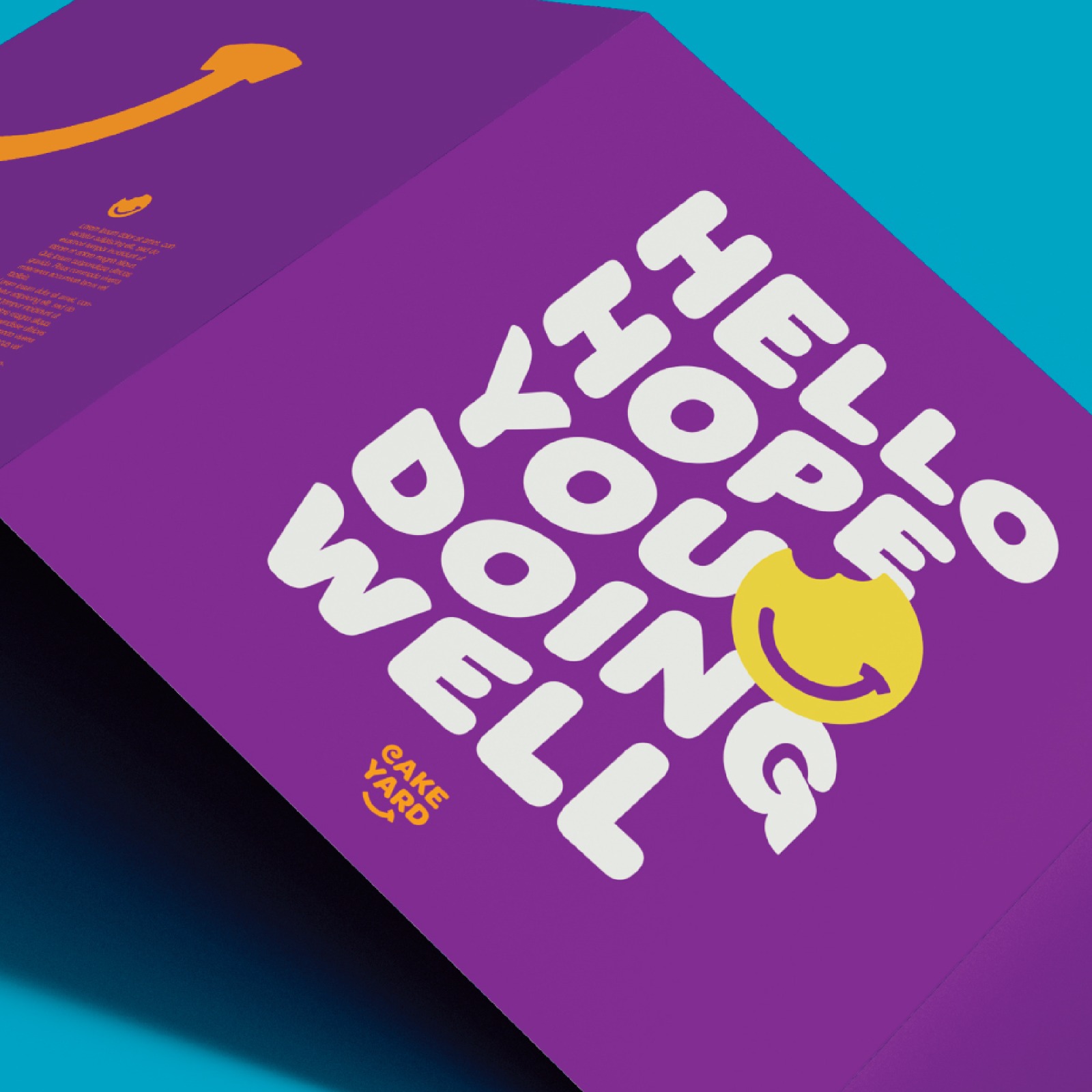
At Cakeyard, our journey with this extraordinary brand transformation was an exciting odyssey that transcended the mere facade of a cinnamon roll shop. We meticulously crafted an identity that is an epitome of positivity and happiness. Our brand’s core essence is to evoke the same feeling that a bite of a freshly baked cinnamon roll brings, creating a harmonious fusion of vibrant colors, whimsical illustrations, and a touch of nostalgia that wraps around each roll.
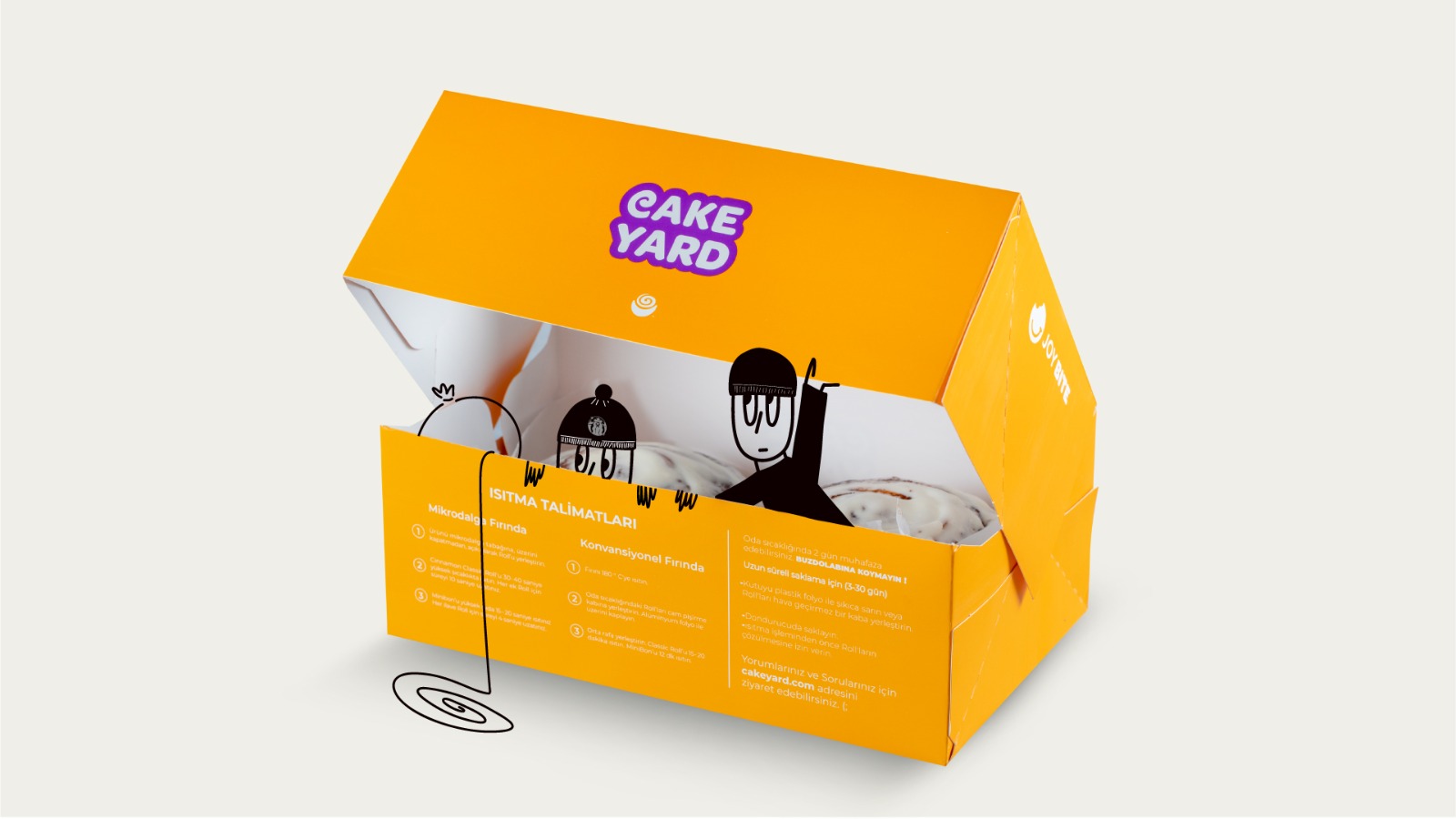
Our project was more than a redesign; it was a mission to deliver joy. Every element of Cakeyard was designed with this in mind. The vibrant colors exude an energy that’s infectious, much like the cheerful mood one feels when biting into a warm cinnamon roll. Whimsical illustrations, featuring funny characters peeking out of the cinnamon roll boxes, were introduced to tell stories without words, offering a sense of happiness and warmth.
Through this visual transformation, we managed to encapsulate the heartwarming spirit of Cakeyard. It’s not just a bakery; it’s a sanctuary where positivity and optimism thrive. The message we aimed to convey was simple: Cakeyard brings happiness. It’s an exceptional experience that goes beyond the ordinary.
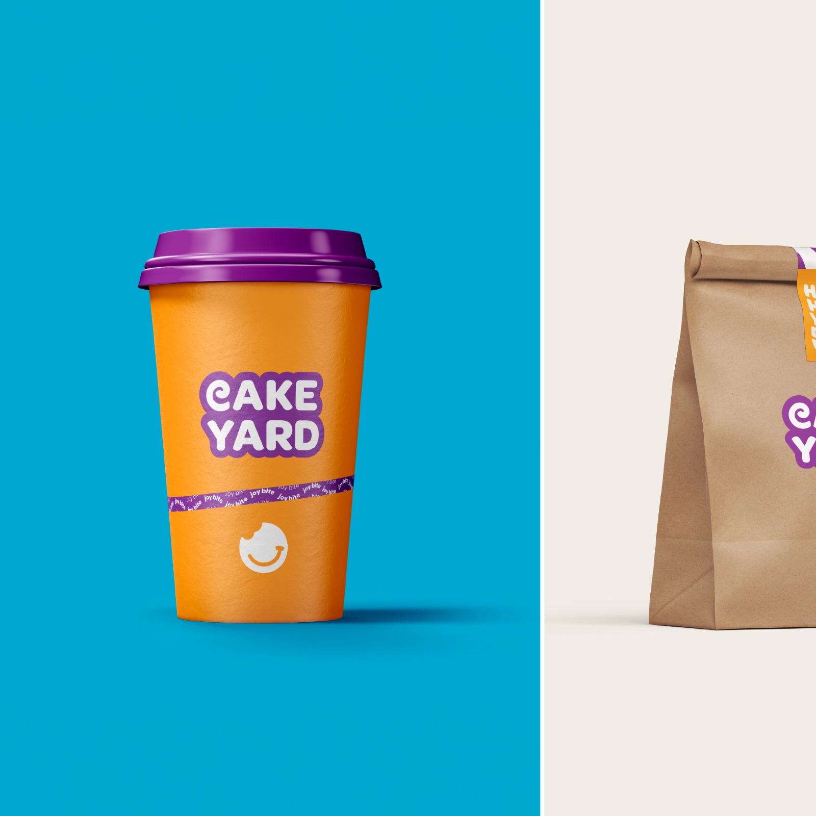
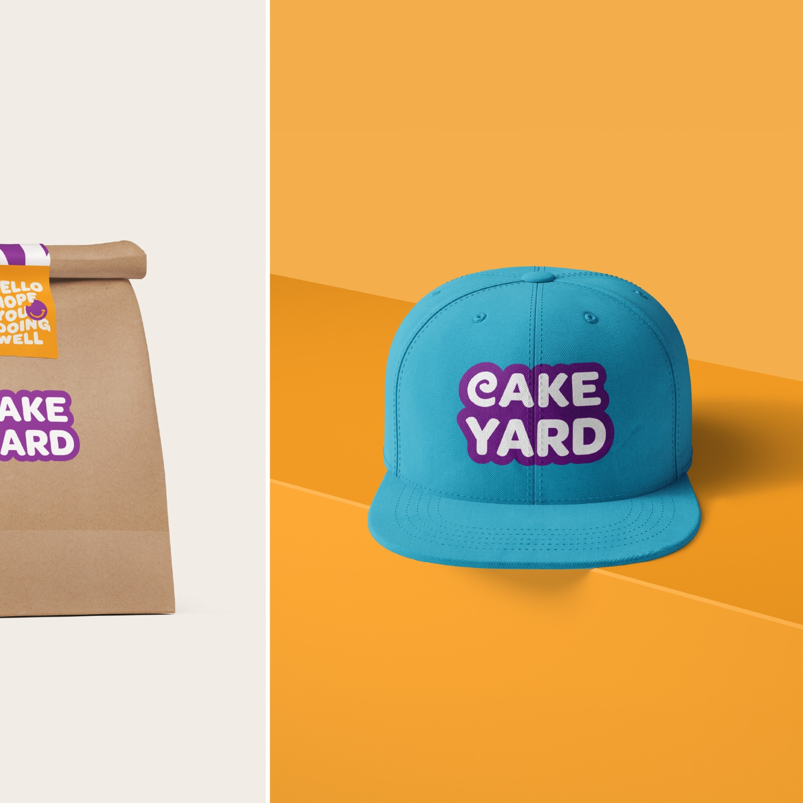
The brand’s typography was a key player in this narrative. We chose ‘Omes’ font, available in bold and light variations, to strike a balance between the comforting essence of baked treats and the exuberance of joy. The bold variation embodied the tactile sensation of freshly baked goodness, while the light variation added a touch of playfulness and carefree joy.
The Logo & Word Mark served as the heart of our identity. The ‘C’ in the wordmark drew inspiration from the captivating radial effect of a cinnamon roll viewed from the top, adding a touch of familiarity to our brand. The choice of a bold, bubbly font mirrored the texture of freshly baked cinnamon rolls, invoking a sense of indulgence. Arranging the wordmark ‘cake yard’ on two lines symbolized the heart of an oven, where the magic unfolds.
Our illustrations were the delightful cherry on top. Funny characters peeking out of cinnamon roll boxes, scenes of summer and winter fun, all of these narratives seamlessly integrated with the overall visual identity of Cakeyard, creating a colorful world where every bite felt just right.
Cakeyard is more than just pastries; it’s an invitation to indulge in happiness. Join us in this delightful journey, where each bite is a gateway to pure bliss. Together, let’s spread positivity and optimism.

CREDIT
- Agency/Creative: 7x agency
- Article Title: Elevating Happiness: Cakeyard’s Whimsical Brand Transformation for a Sweet Journey
- Organisation/Entity: Agency
- Project Type: Identity
- Project Status: Published
- Agency/Creative Country: Turkey
- Agency/Creative City: Istanbul
- Market Region: Middle East
- Project Deliverables: Architecture Concept, Art Direction, Brand Identity, Branding, Creative Direction, Packaging Design
- Industry: Food/Beverage
- Keywords: Cinamonrolls
-
Credits:
Creative direction: Loay katib
Design: Raouia Ajoulien
Interior design: Baher jad
Motion design: Roma kanjaa
Content creation: Firdaous Baitour


