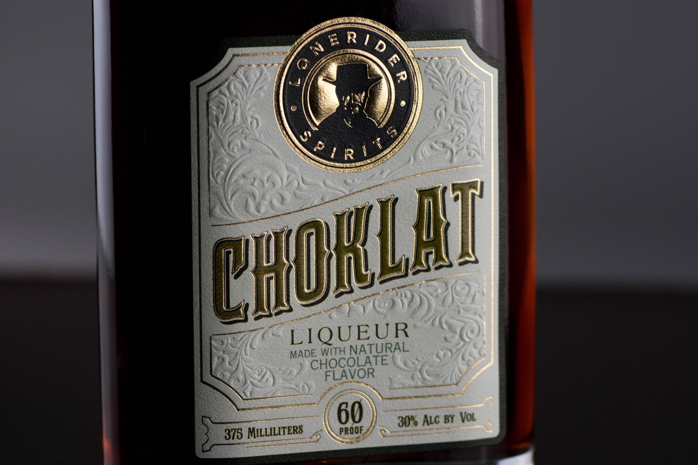
We were approached by Lonerider Spirits to create a design for a product that didn’t quite fit within their normal product line and therefore would break out of their standard design aesthetic. They knew that liqueur is a niche market and chocolate liqueur could be even more niche.
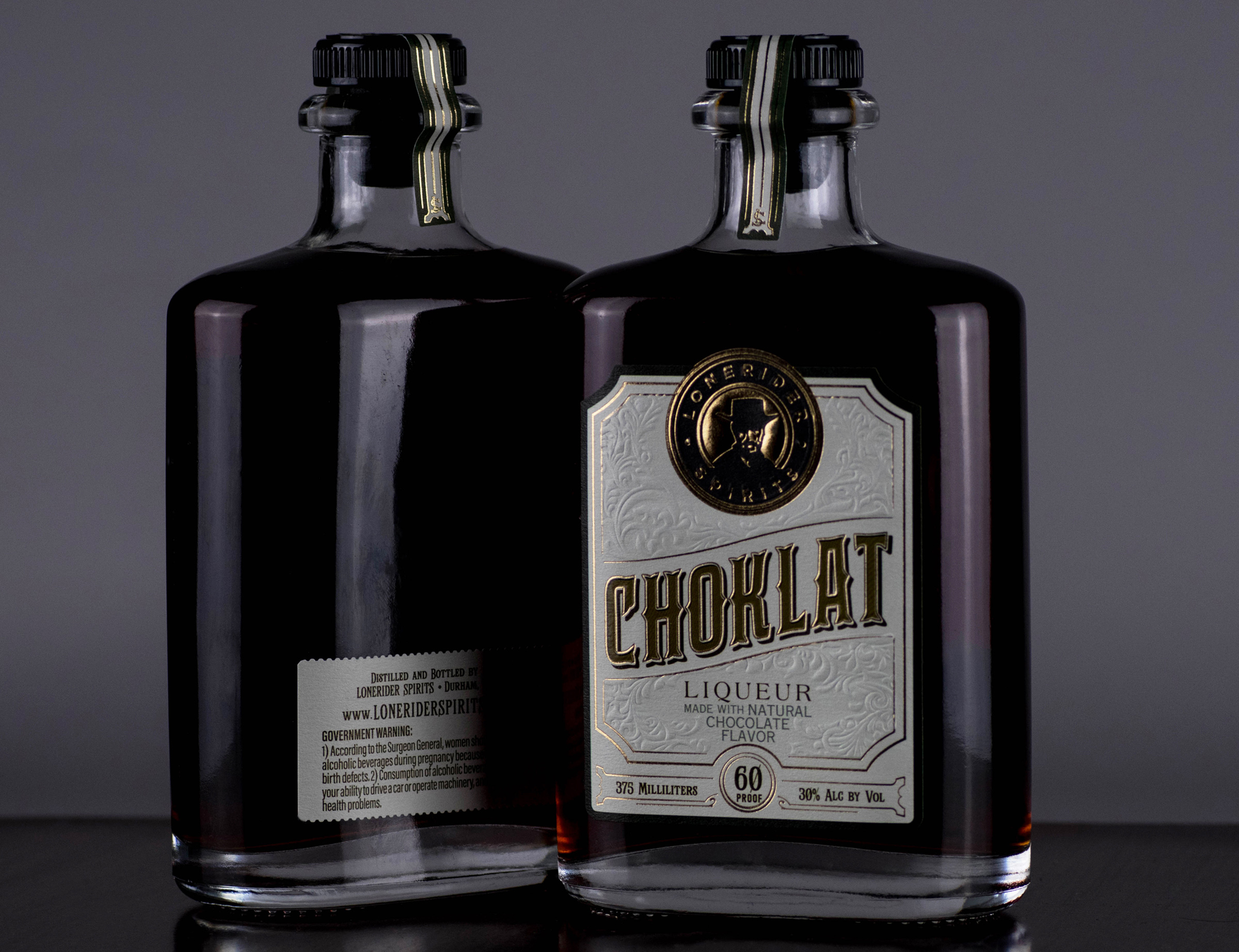
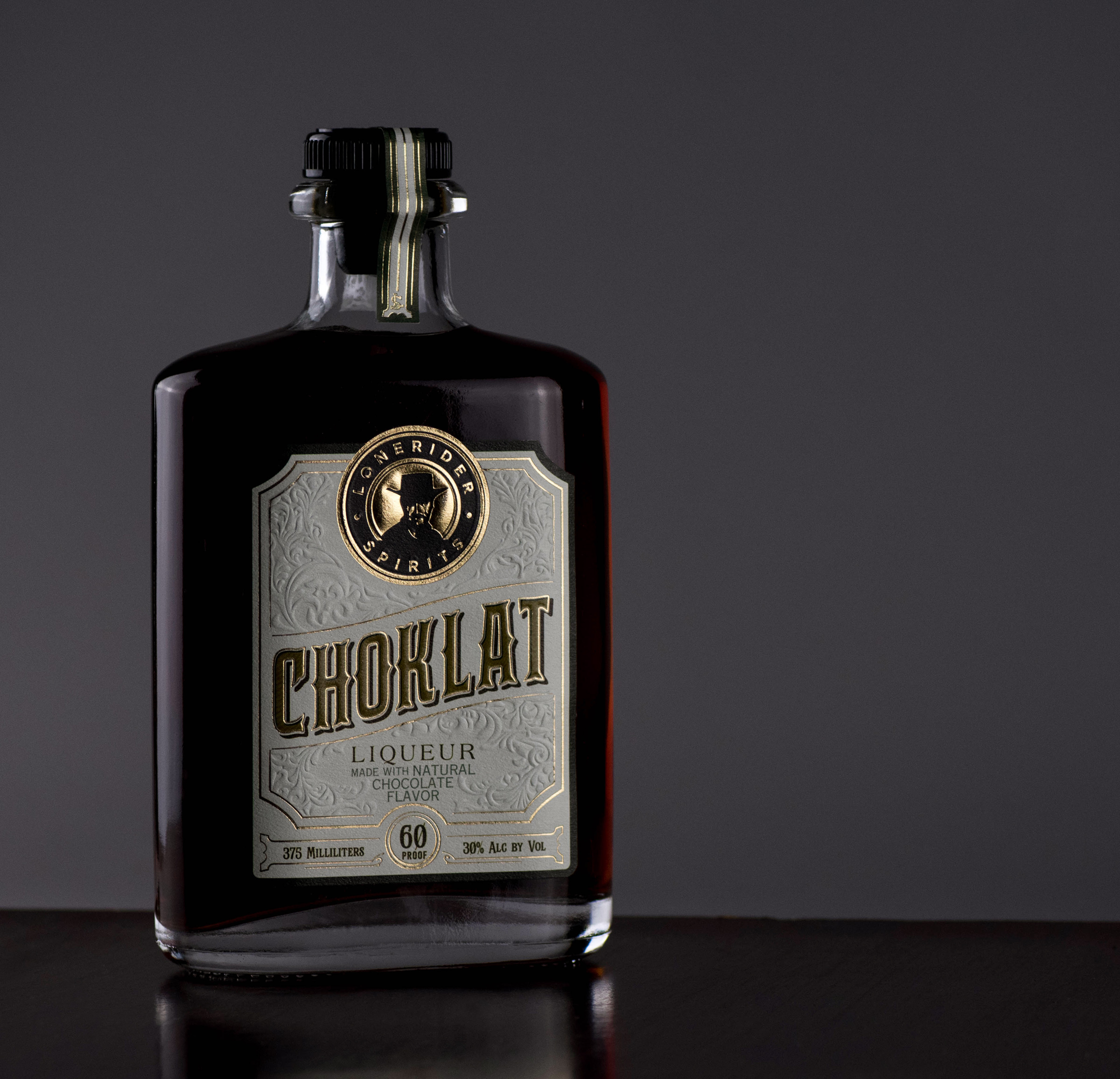
We wanted to create a design that was accessible and spoke to the quality of the spirit inside. We imagined this product would be a big hit at holiday and work parties so we settled on a flask style to easily slip into a pocket or bag. The Prohibition era label design works very well with the bottle shape and points to a time where people really cared about quality and their image.
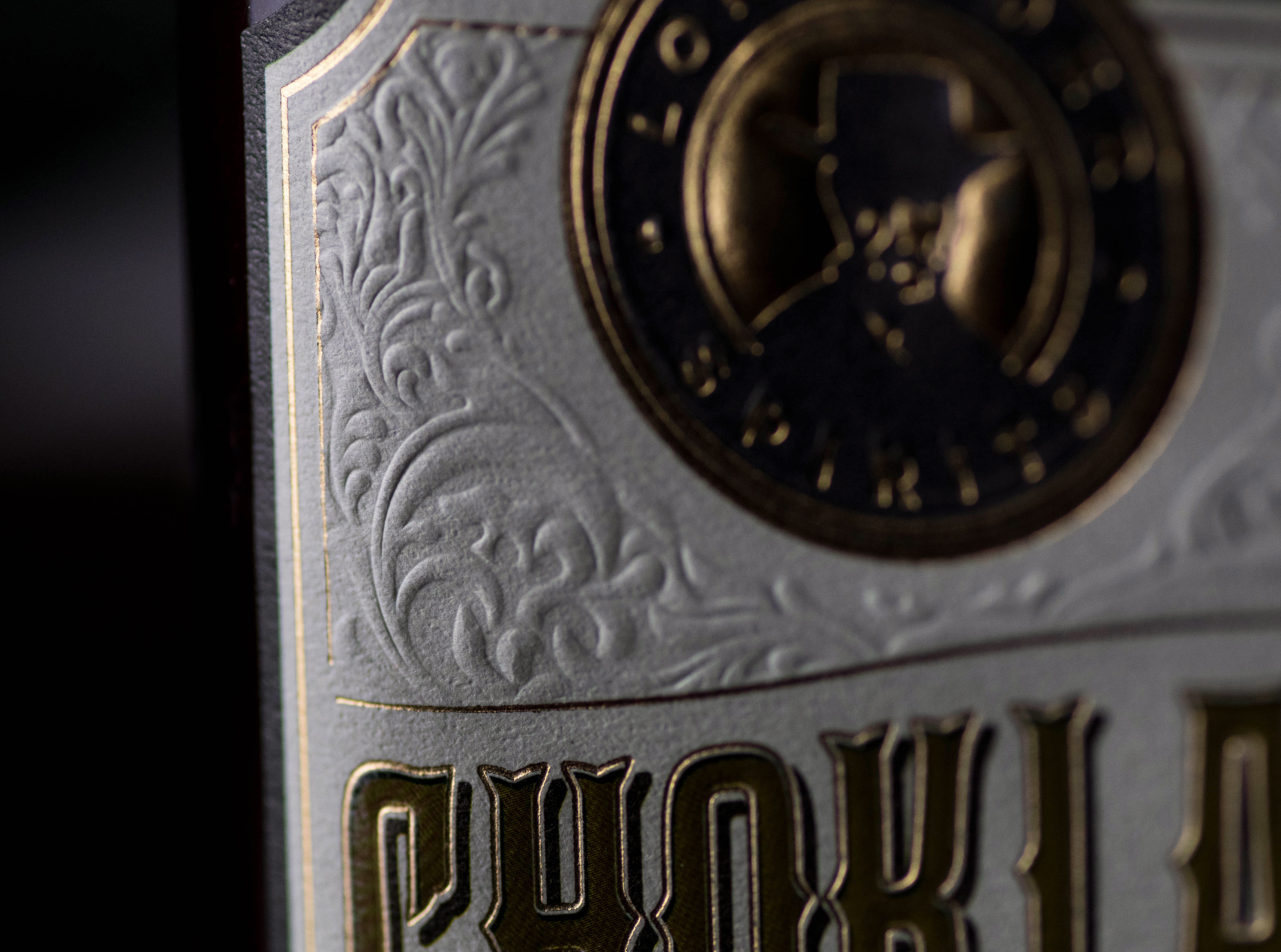
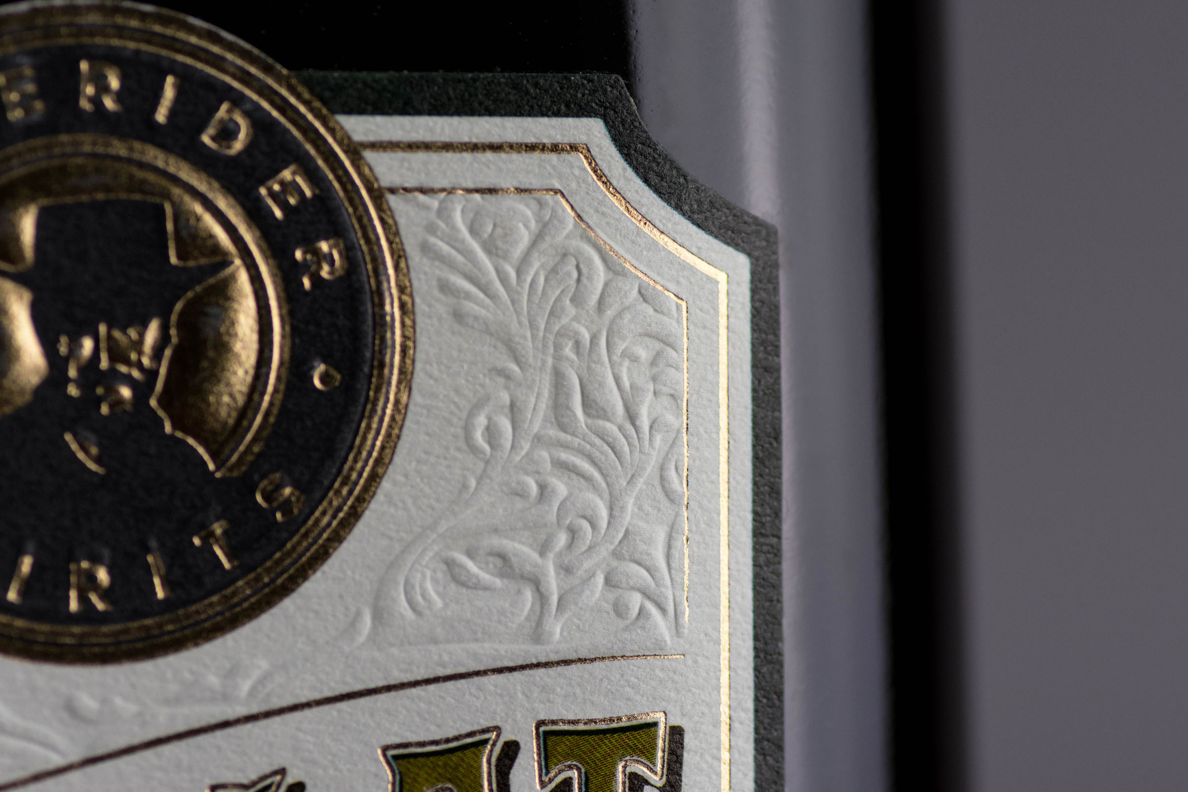
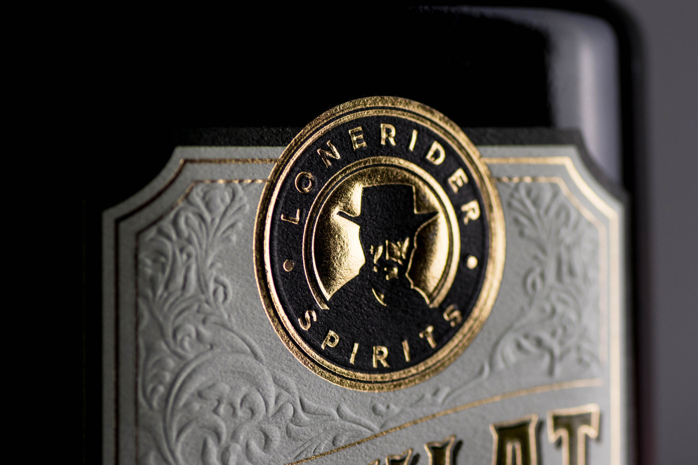
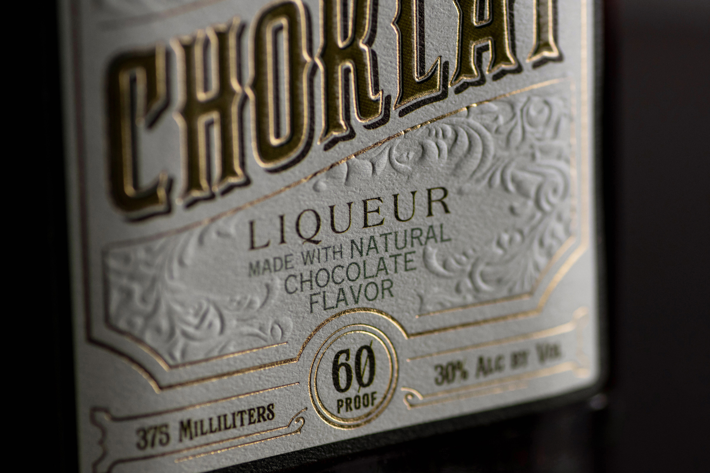
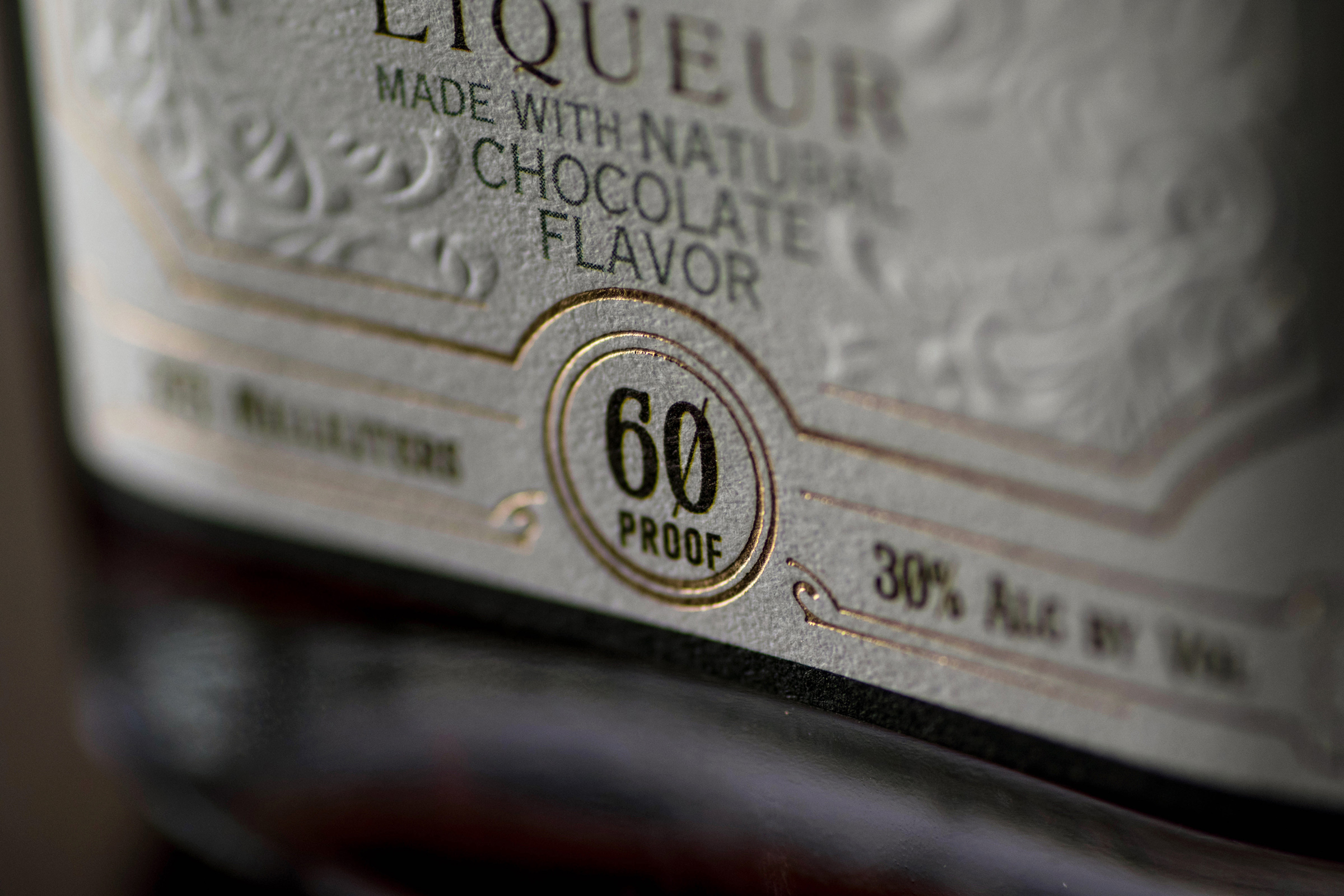
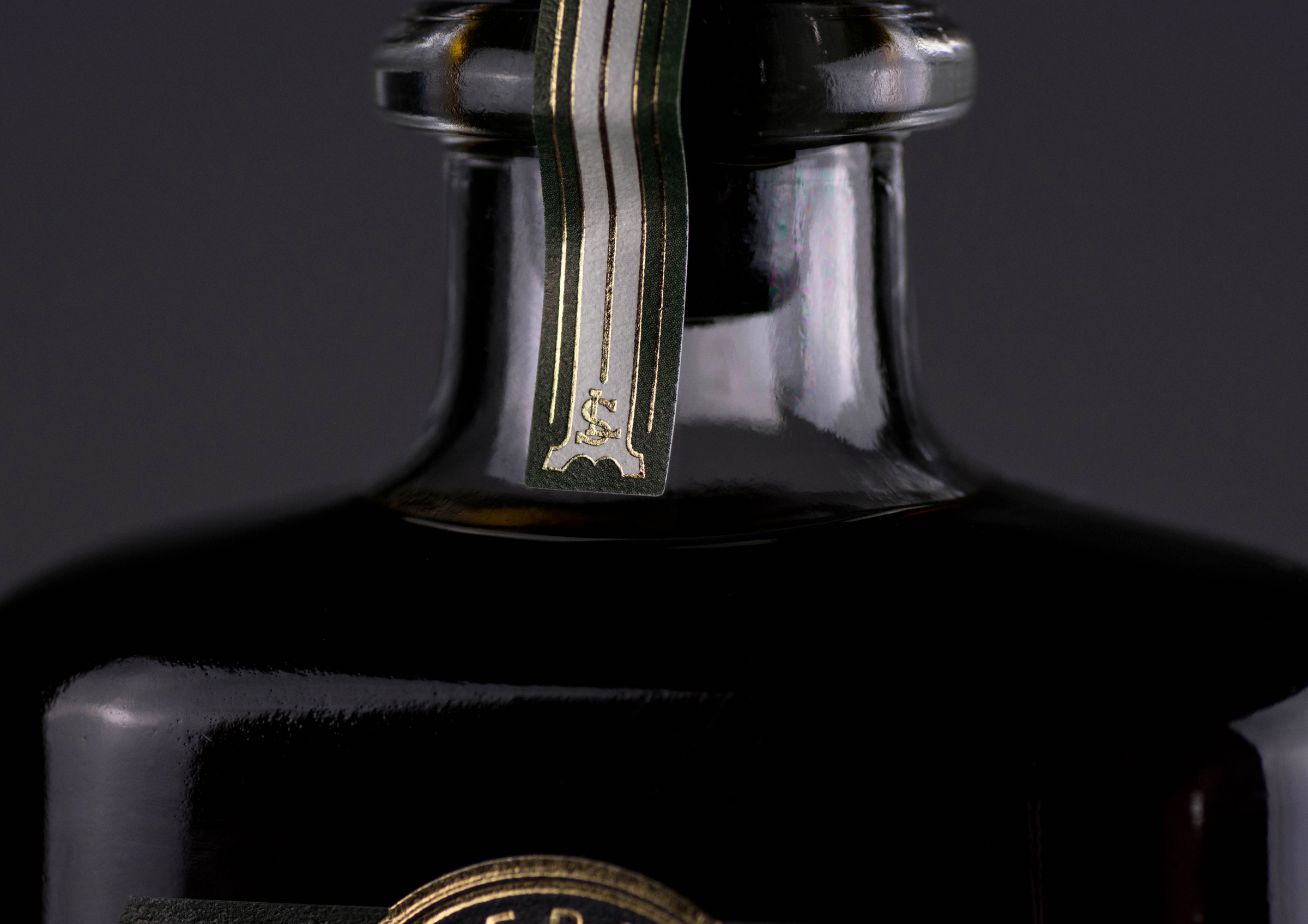
The result is an elegant and detailed design full of custom scroll work, layered and dimensional lettering, blind embossing and lots of gold foil. Not only does this look beautiful on any shelf, it also has an incredible tactile experience.
CREDIT
- Agency/Creative: Fresh Bread Design
- Article Title: Elegant Prohibition Era look for the Modern Day LIqueur
- Organisation/Entity: Agency, Published Commercial Design
- Project Type: Packaging
- Agency/Creative Country: United States
- Market Region: North America
- Project Deliverables: Brand Strategy, Branding, Graphic Design, Packaging Design, Photography, Research
- Format: Bottle
- Substrate: Pulp Paper


