


Electric boat-racing series and sports entertainment brand E1 powers up with new branding from Mother Design at Venice Boat Show unveiling
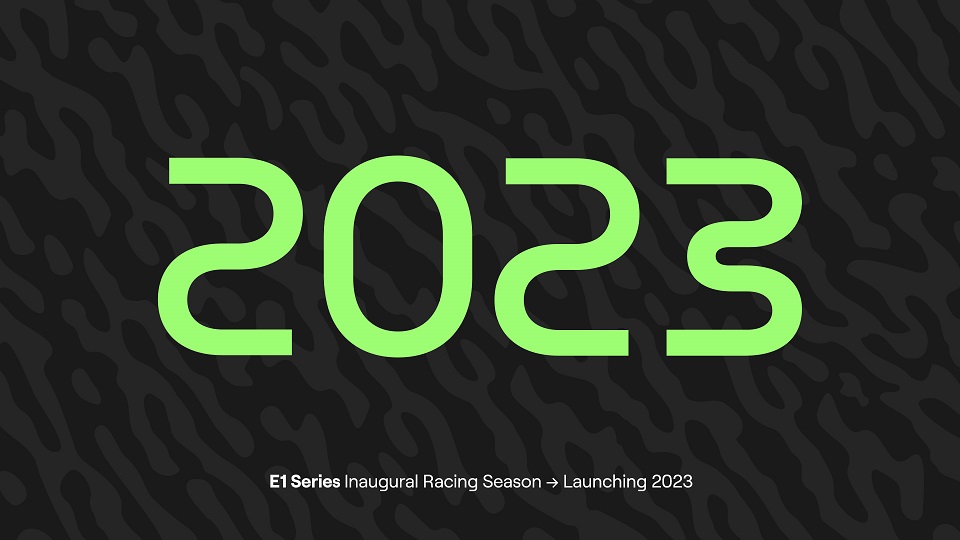
Sports entertainment brand E1, the world’s first all-electric raceboat championship, revealed a new brand identity at the Venice Boat Show ahead of 2023’s inaugural racing season.
Designed by branding studio Mother Design, the new visual identity underpins a repositioning of the brand. Appealing to an inclusive mass audience, the renewed identity channels the excitement and energy of E1, positioning it as a global spectator sport. The new branding was unveiled alongside E1’s RaceBird electric vessel, which has been seen on the water in public for the first time in Venice.
Founded on three core principles – sustainability, technology and entertainment – the idea for E1 was conceived by Rodi Basso, alum of Formula One’s Ferrari and Red Bull Racing teams, and NASA, together with the Founder of Formula E and Extreme E Alejandro Agag during the first wave of pandemic lockdowns in 2020.
Passionate about healing coastal waters around the world, they were adamant that the spectacle of racing should be sustainable, and that the marine transportation industry needed to catch up with the automotive world in adopting electric power. With a background in motorsport innovation, Basso and Agag created a new, eco-conscious fixture on the sports calendar.
Designed to amplify the eco-credentials as well as the thrill of the sport itself, Mother Design created a vibrant identity system that transcends tired cues of sustainability and doubles down on the entertainment value and potential for mass appeal of the brand.
Saving the seas with spectacle
Rodi Basso, Co-Founder & CEO of E1, said: “Being born and raised in Naples, I’ve always had a very strong connection with the water. You could say that I learnt to swim before I could walk! When I conceived the idea of E1, I wanted to create something new, something exciting and something with a purpose beyond just racing. What we’re building with the E1 World Championship is a new sport that can positively influence the wider marine industry and change the paradigm of what future watercraft look like and how we travel. Working together with Mother Design, we’ve stayed true to our mission objectives and values, and that’s reflected in the new brand.”
The Venice Boat Show provides a poignant platform on which to unveil the new identity of this environmentally-conscious series for the very first time: its Venice location highlights the acute need to address the health of coastal waters, as the city itself faces the risks of rising water levels due to global warming.
As part of its commitment to sustainability, E1 will offer to install marine electric charging points for ongoing use beyond the event, a practice they will employ following race weekends around the world. In addition, the E1 team is using Smartmark technology for anchorless buoys that do not damage the seabed, as well as incorporating hydrofoil technology on boats to lessen the disturbance on marine life.
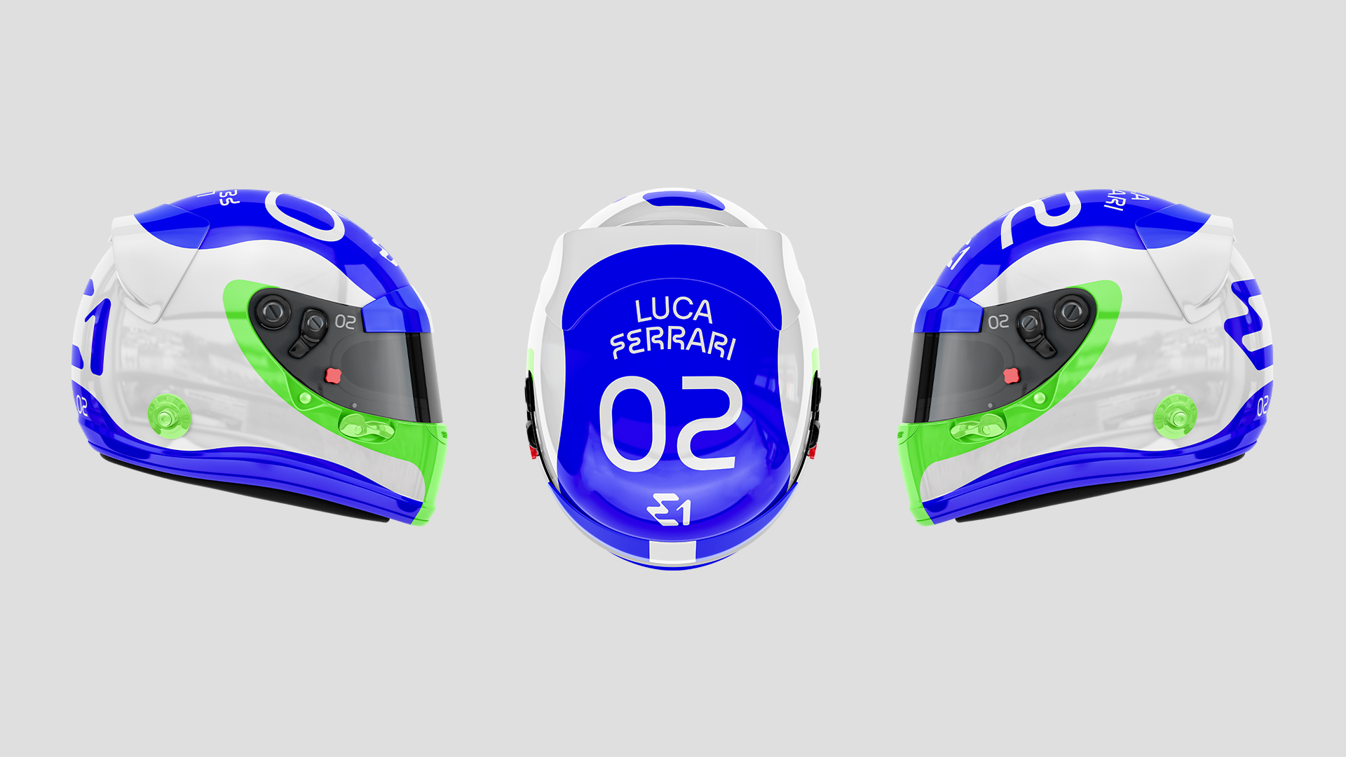
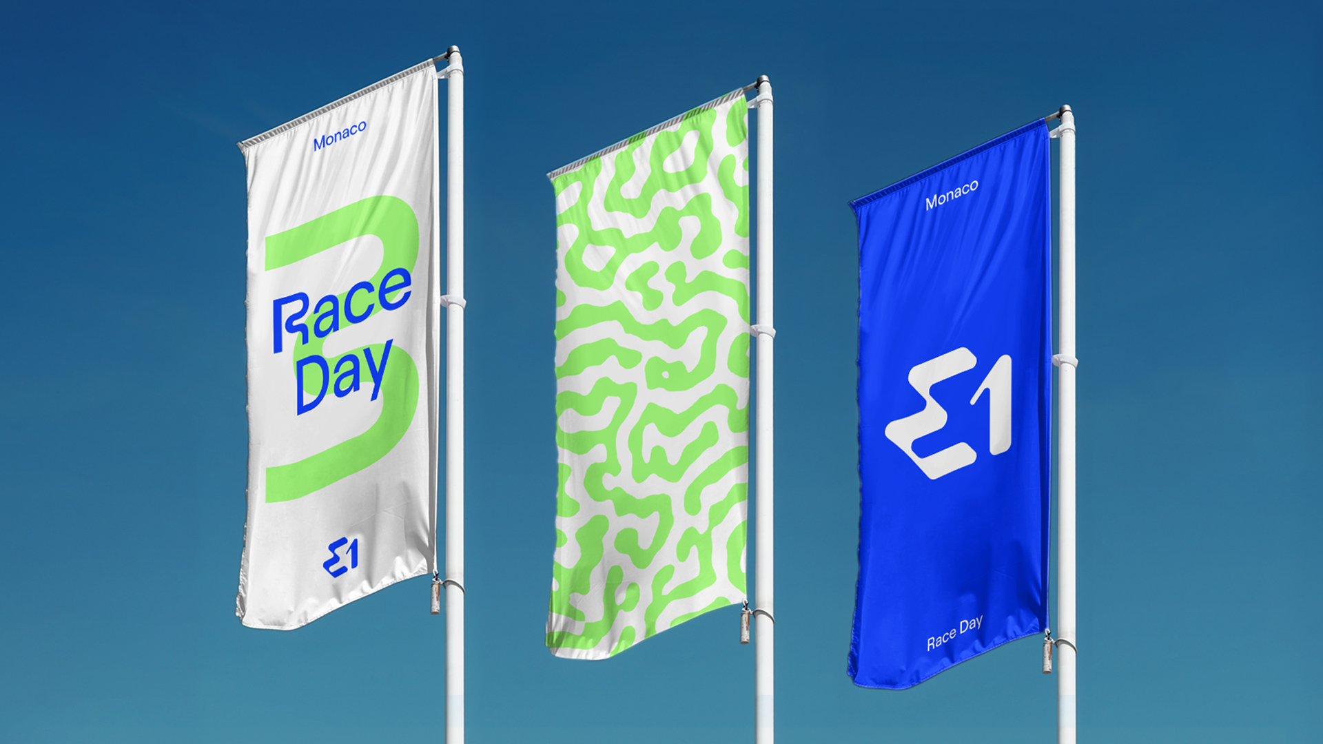
All of these facets carry the results of Mother Design’s work, from the RaceBird boat and the E1 World Championship itself, to the uniforms, banners and media badges.
Harry Edmonds, Creative Director at Mother Design London says: “E1 is first and foremost an entertainment brand, but one with ambitions to do great things for the planet and leave a legacy of change – the shift away from petrol powered engines on our waterways. It is also a company driven by technological innovation, with the new championship the first of its kind. By emphasising the entertainment value of E1 in order to reach as wide an audience as possible, we in turn raise more awareness of the sustainability ambitions that are inherent to the brand.”
Futuristic, fluid, electrifying
Key design elements of E1’s identity evoke clean water, aquatic energy and fluidity associated with the new sporting championship, as well as marine environments.
Allowing the brand to stand out from its Formula E and Extreme E sister brands while remaining complementary to the family, the rebrand highlights the electrifying nature of the series, felt by both the audience and competitors alike. A suite of patterns inspired by marine flora and fauna join a bold colour palette, with Electric Blue, Aquatic Green and Coral Pink taking their cues from tropical seas. The Aquatic Green and Coral Pink accent colours also serve a functional purpose – they are easy to distinguish when in the water, allowing the crowds to follow the action more easily from the shoreline.
Mother Design also worked with Displaay Type Foundry to create a bespoke typeface for E1 to be instantly recognisable as part of the brand. Based on Roobert, the new typeface includes 27 specially crafted characters that are designed to evoke fluidity, reference the movement of the RaceBird boat and provide a nod to the sport’s race courses, with its hair pin and large sweeping turns.
The new logo has been designed to communicate energy and fluidity – from both the atmosphere of the crowds and events, as well as the nature of the sport itself. It also cues elements of the RaceBird design like the distinctive hydrofoil, the iconography of electricity and the flow of water.
Edmonds continues: “One of our core missions at Mother Design is to make our children proud, so E1’s aim to help protect the world’s oceans, lakes and rivers really spoke to us as an agency. To see this work come to life as a tangible project has been very exciting and it’s great to think that wider audiences will be able to connect with the sport and its values soon.”
CREDIT
- Agency/Creative: Mother Design
- Article Title: Electric Boat-Racing Series E1 Unveils Electrifying New Identity by Mother Design
- Organisation/Entity: Agency
- Project Type: Identity
- Project Status: Published
- Agency/Creative Country: United Kingdom
- Agency/Creative City: London
- Market Region: Global
- Project Deliverables: Brand Redesign, Logo Design, Typography
- Industry: Entertainment
- Keywords: E1, Mother Design, redesign, electric, boat, racing, logo, typography, identity, rebrand
-
Credits:
Creative Director: Harry Edmonds
Image credit: Lloyd Images


