El Rancho is a hamburger delivery service located in the city of Lençóis Paulista, in the interior of São Paulo, which has traditional, gourmet and varied snacks on its menu.
To understand the concept created for El Rancho, it is necessary to go back in time. Inspired by the story of Route 66, the most famous interstate highway in the United States, the idea behind El Rancho is to bring back the feeling of adventure and adventure specifically from the American Wild West that makes up part of the Route. More than that, behind this theme, the hamburger’s main objective is to offer hamburgers and portions of the highest quality and taste of homemade food, from a real ranch.
Still on Route 66, it became famous, in part, for being an easily accessible route linking the country’s traditionally conservative northwestern region with the more liberal state of California in the 1950s and 1960s – a period known for libertarian movements such as the Woodstock festival. As a result, it was branded as a global icon of the American spirit, and cuts across the states of Illinois, Missouri, Kansas, Oklahoma, Texas, New Mexico and California.
And El Rancho is also named after a hotel on the famous highway in Gallup, New Mexico, which has housed dozens of Hollywood celebrities like John Wayne and Humphrey Bogart.
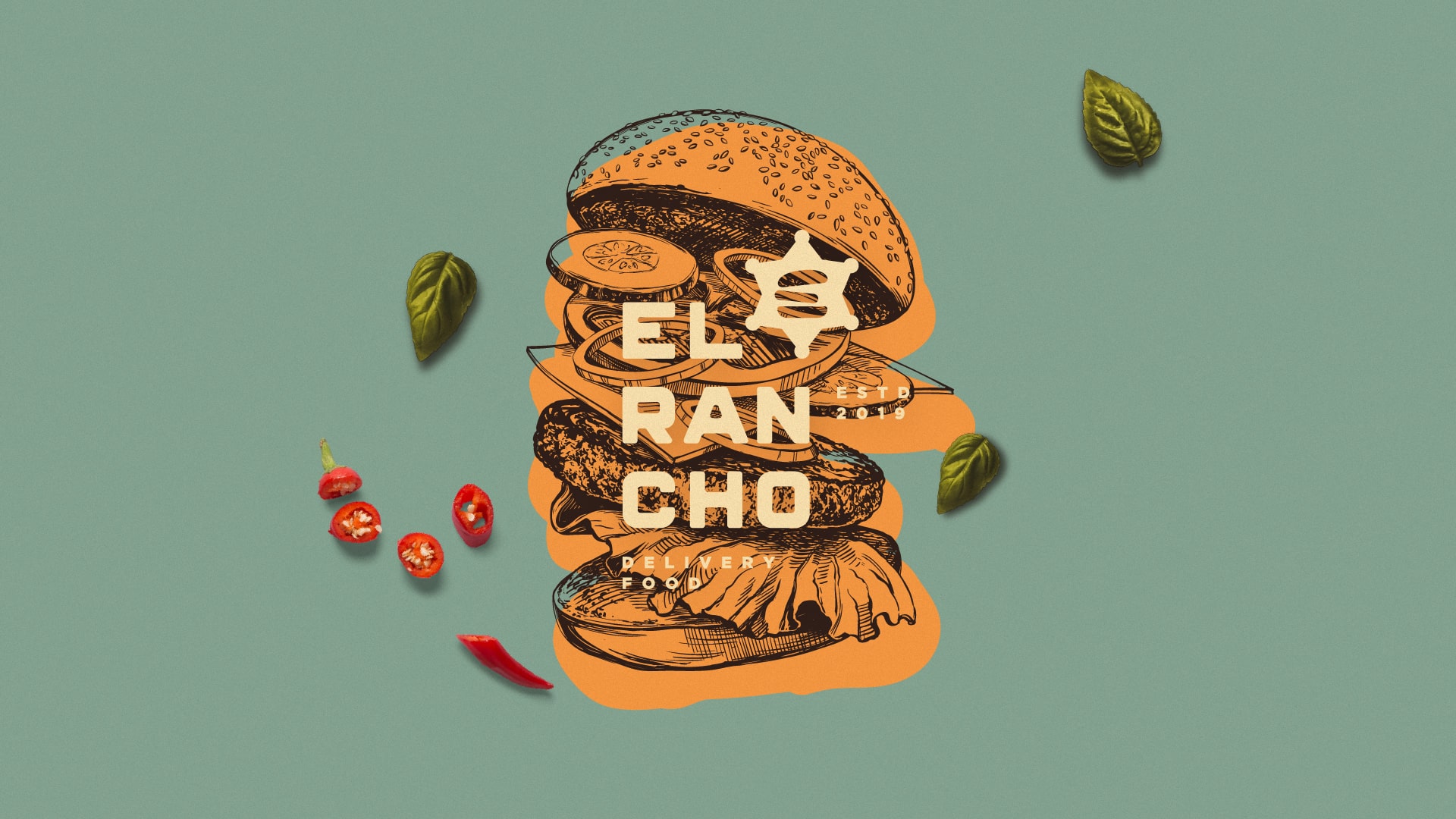
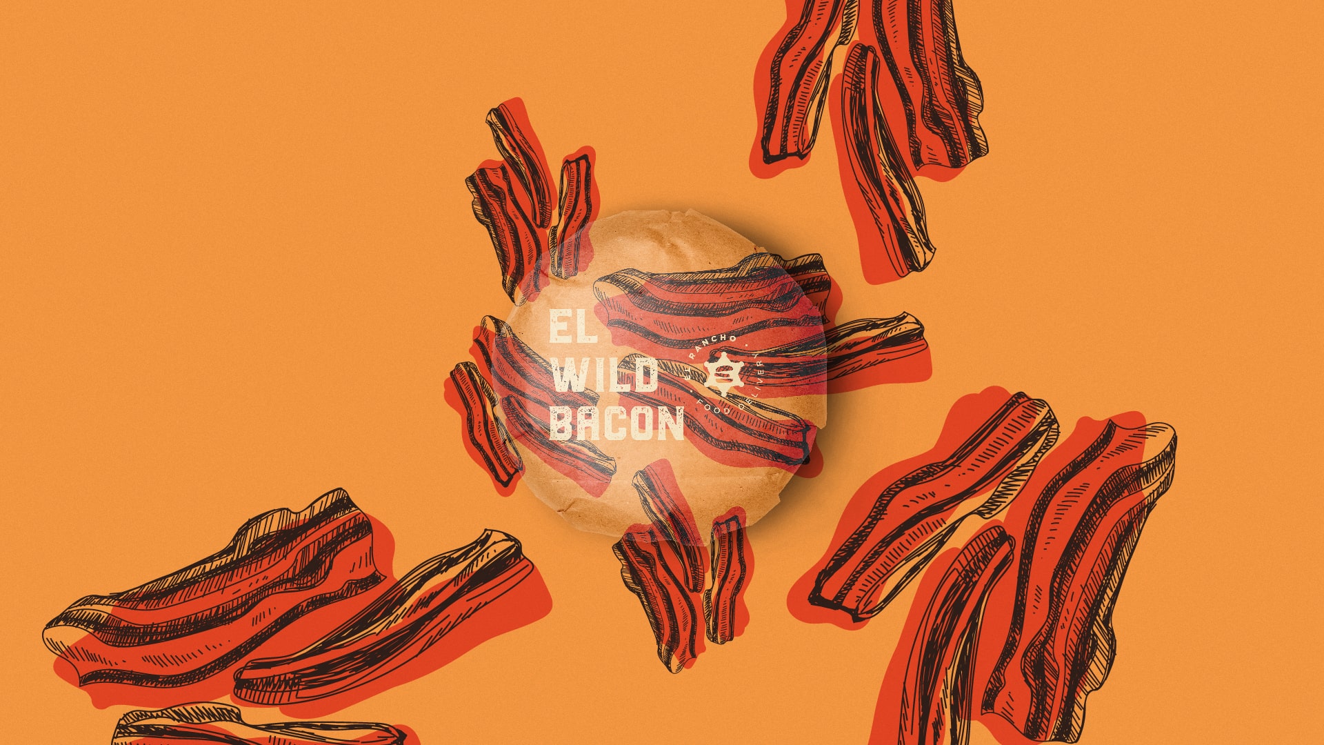
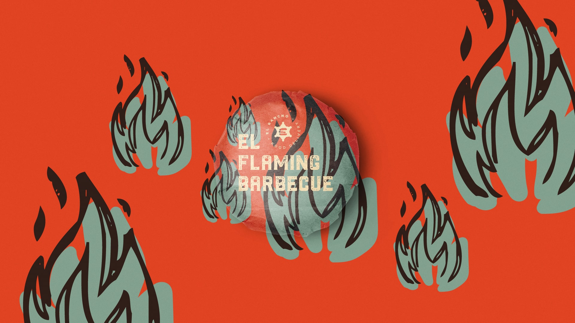
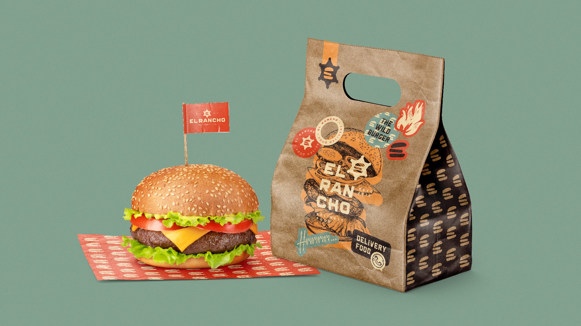
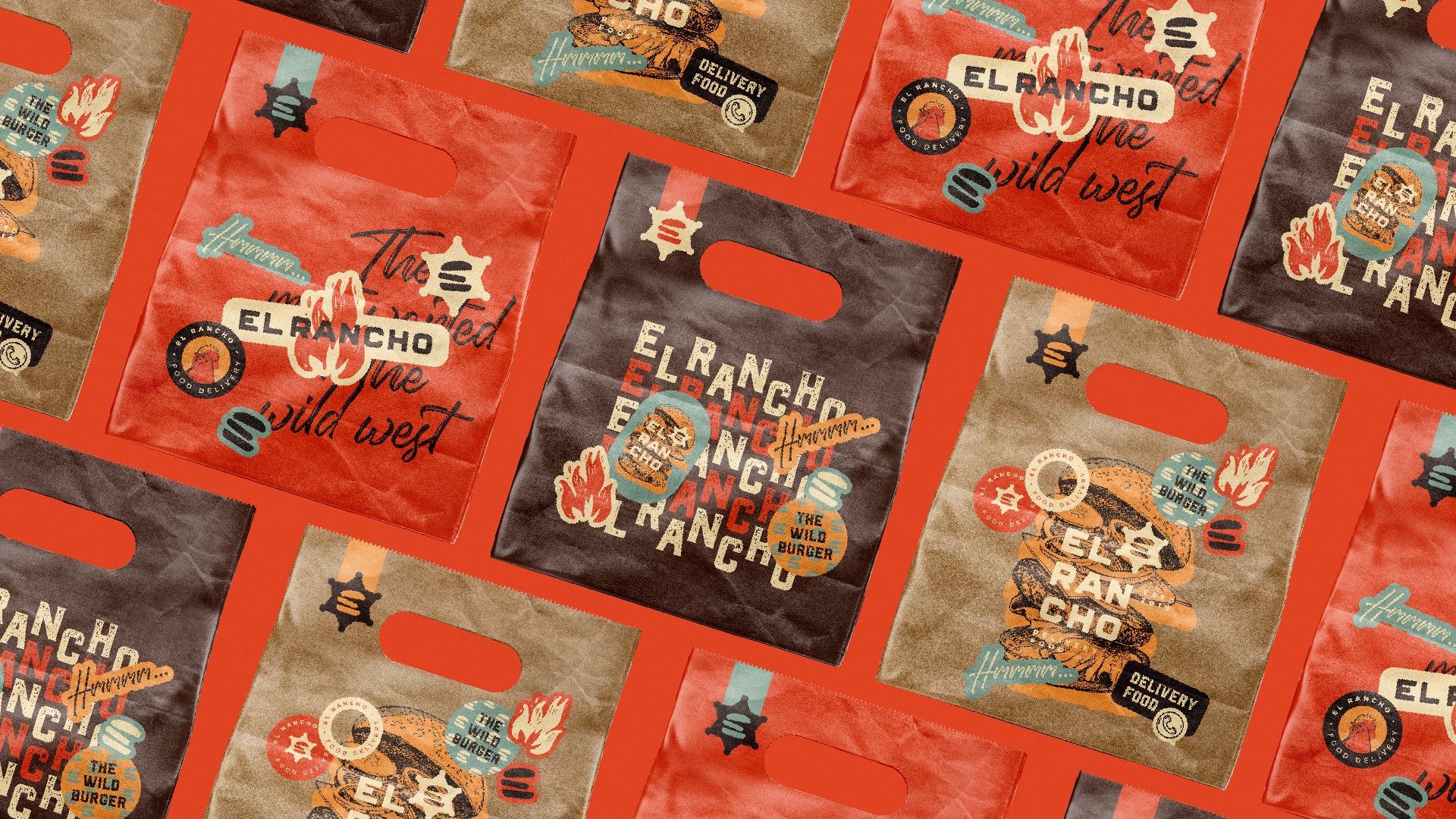
For the logo, it was chosen to use rectangular shapes, which form a hamburger, in addition to representing an “e” from El Rancho. This symbol, in the main version of the logo, is inside a sheriff’s badge, which reinforces the “old west” theme present throughout the visual identity of the hamburger shop.
Fun, the logo is also extremely versatile as it has several different ways of application. This makes it possible to give some freedom in relation to how the logo behaves in different types of media.
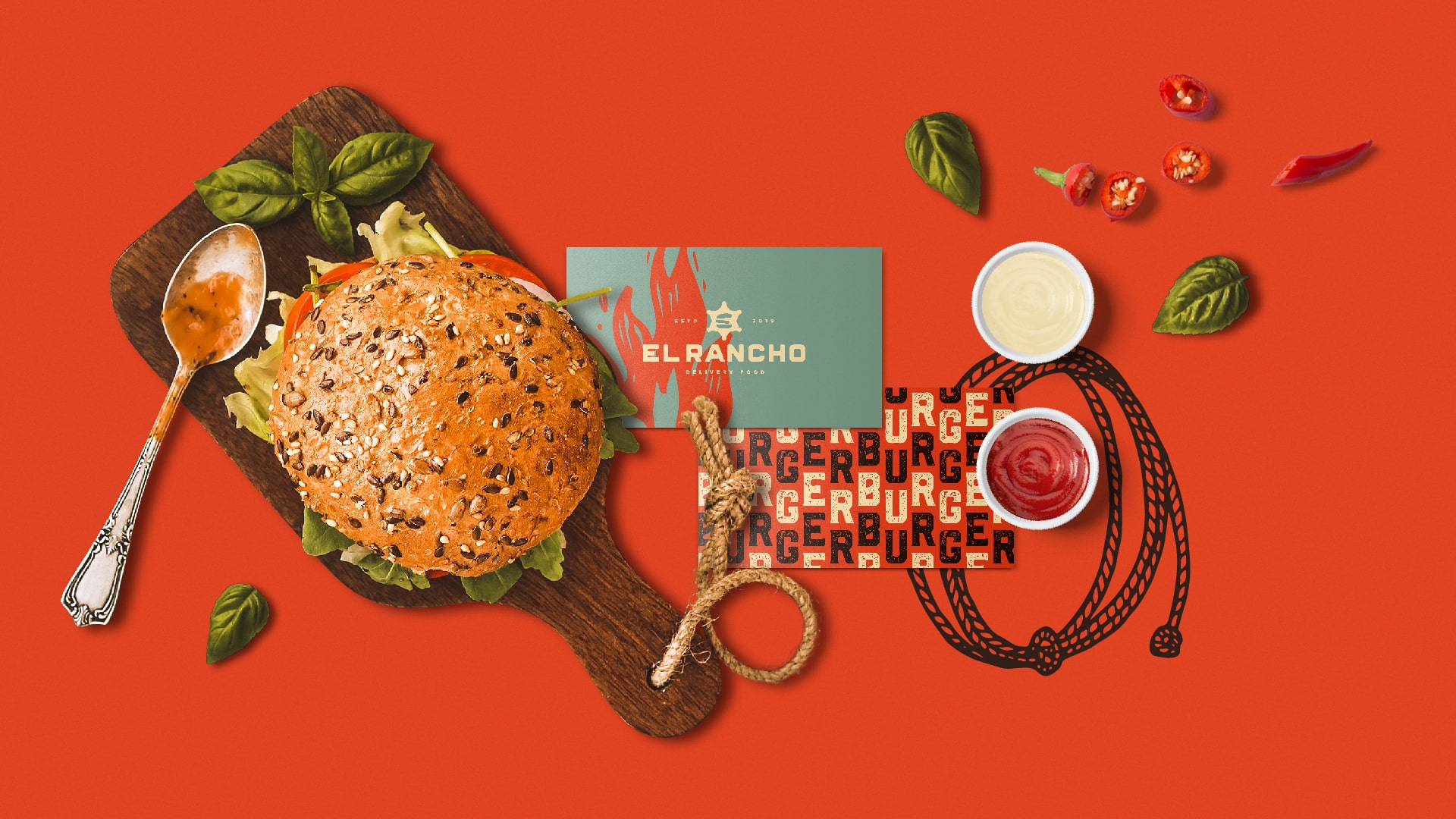
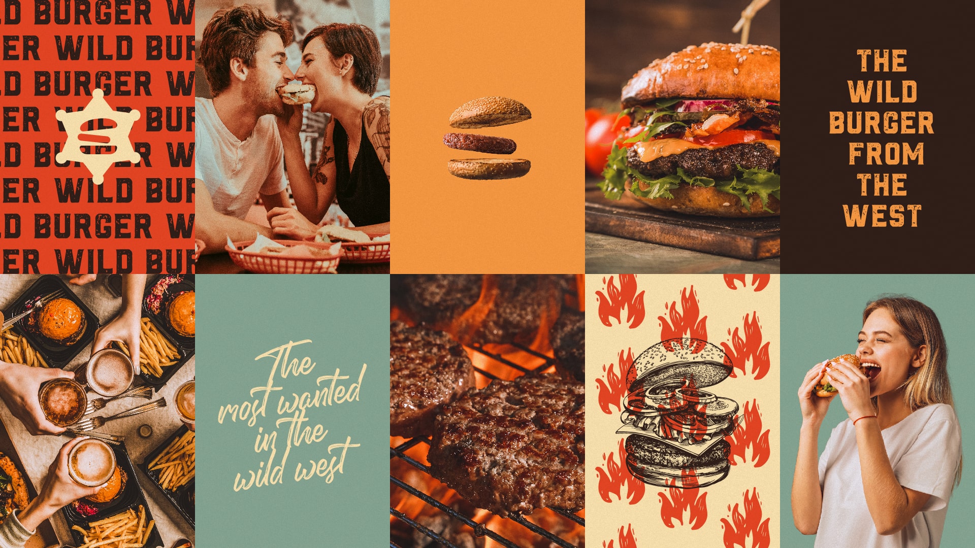
Colours: The choice of colours and tones was based on the meaning and emotions aroused by each one of them: Brown: brings association with “old west or “wild west”; Red: awakens hungeEl Rancho Brand and Visual Identity by Matheus Ferreirar, desire to eat; Yellow: exudes warmth, joy, happiness and optimism; Light blue: together with the colors mentioned above, it brings the memory of the 50s and 60s, which also served as inspiration for the creation of the entire visual identity. It also conveys confidence; Shades of beige and kraft: they are classic and associated with lightness, calm.

CREDIT
- Agency/Creative: Matheus Ferreira
- Article Title: El Rancho Brand and Visual Identity by Matheus Ferreira
- Organisation/Entity: Freelance
- Project Type: Identity
- Project Status: Published
- Agency/Creative Country: Brazil
- Agency/Creative City: Lençóis Paulista
- Market Region: South America
- Project Deliverables: Art Direction, Brand Creation, Brand Design, Brand Identity, Branding, Graphic Design
- Industry: Food/Beverage
- Keywords: Visual ID, Branding, Burger, Food, Packaging
-
Credits:
Art Director: Matheus Ferreira


