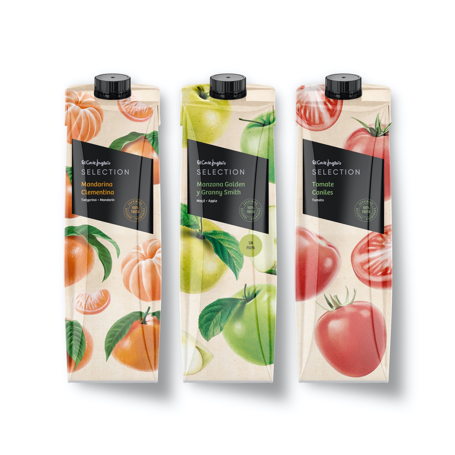
The sashes used by monarchs inspires the brand asset of Selection, the new premium brand of El Corte Inglés.
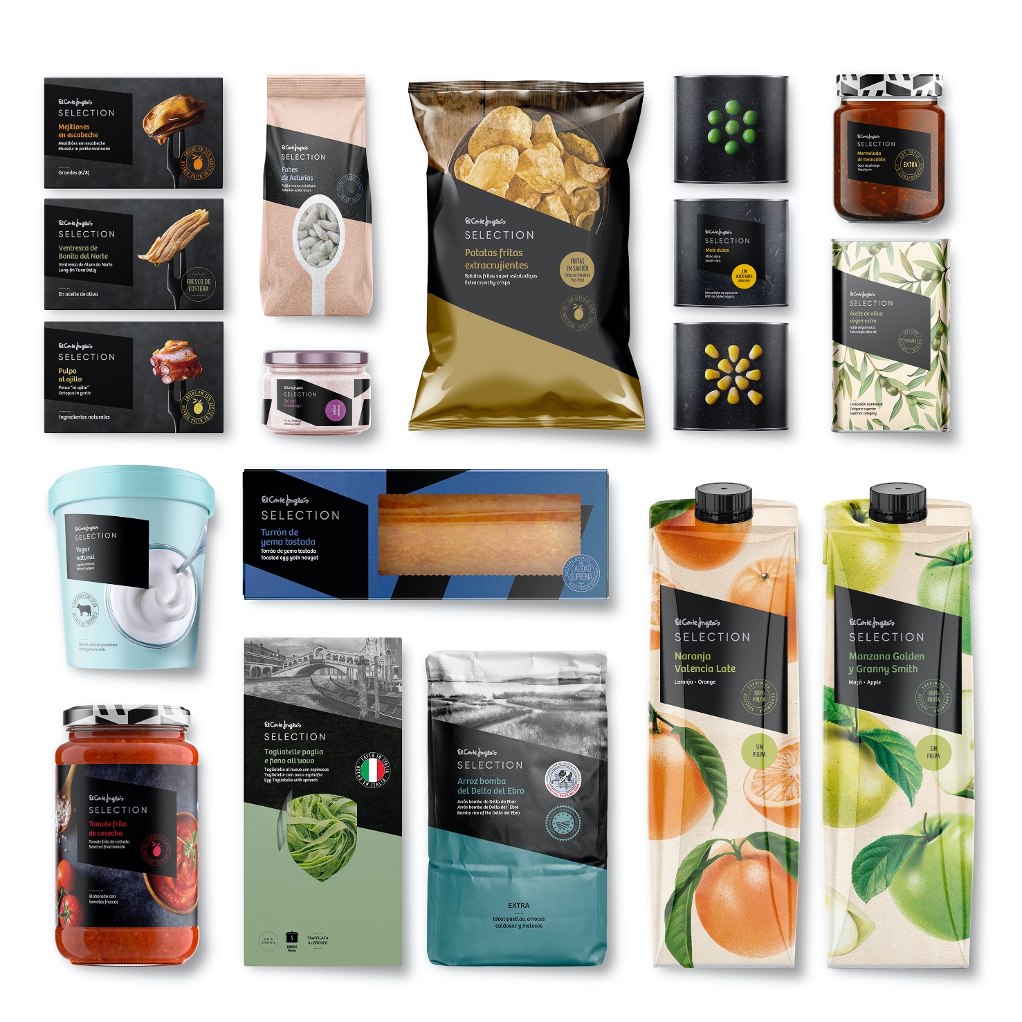
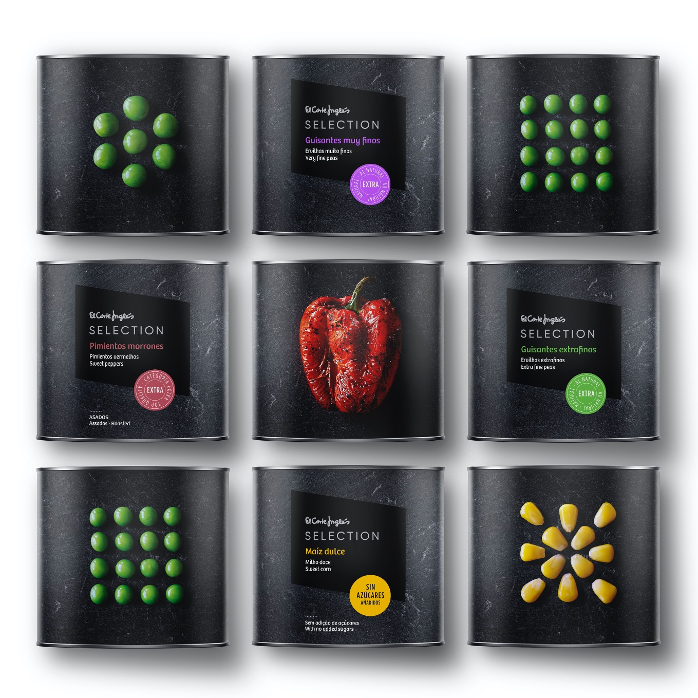
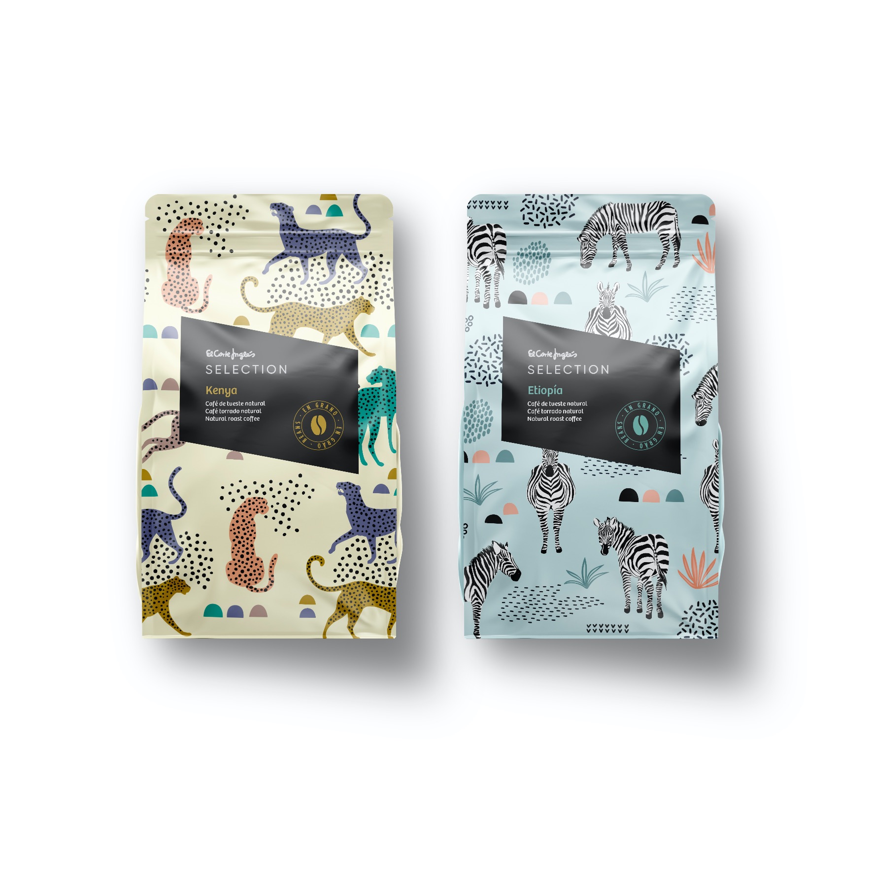
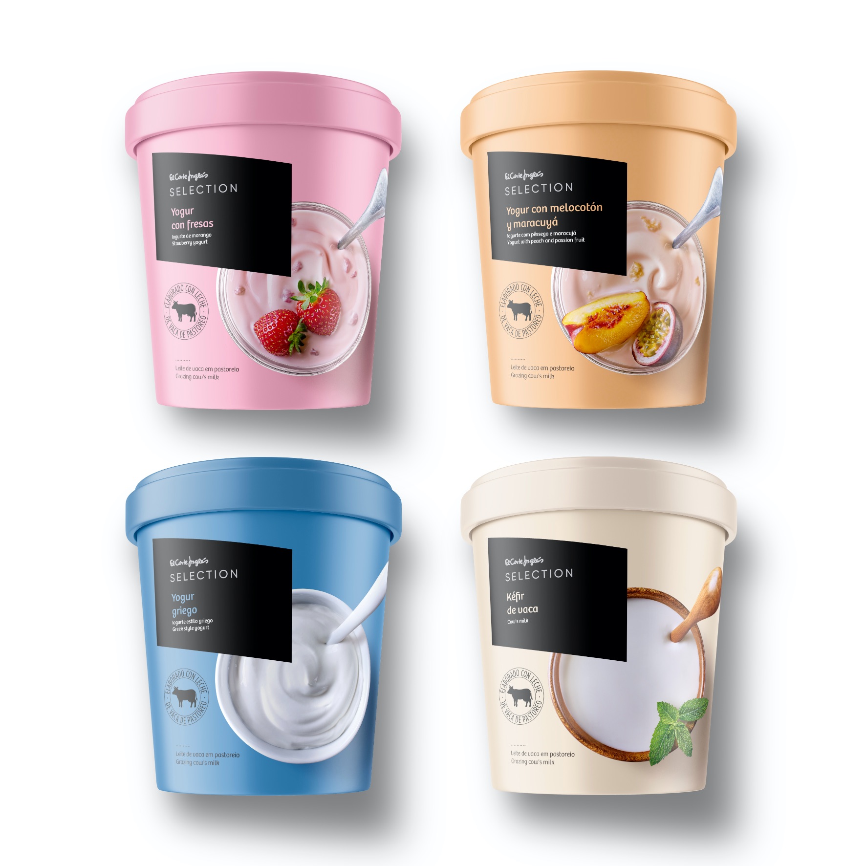
One of the most important challenges was to build a solid brand capable of combining gourmet products and traditional products or products with denomination of origin under the same packaging architecture.
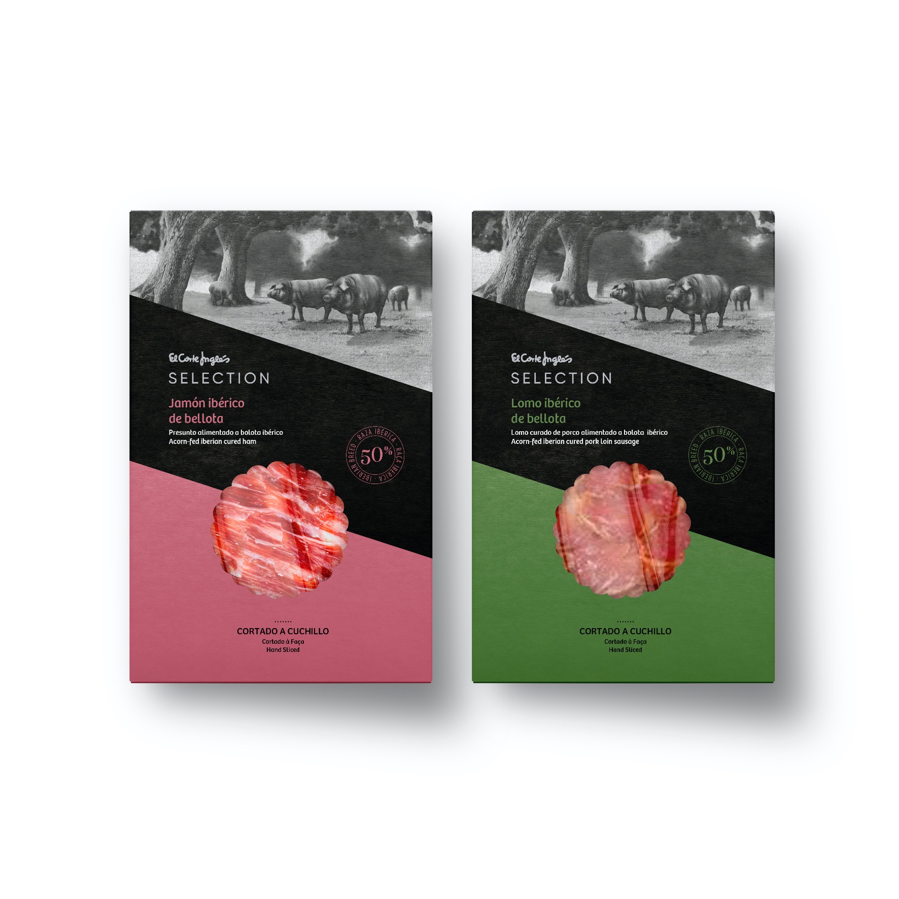
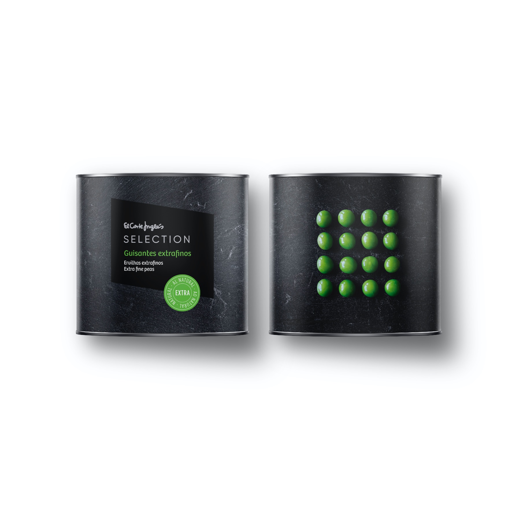
The proposal articulates the design through a transversal band that divides the pack into three parts and serves to organizes the information and creativity. Based on this architecture and the master brand, each family of products has a design that link with each other, but at the time time respond to the specific needs of each product category.
The main tools we use to communicate are: illustration (craftsmanship), photography (appetising) and graphic design (gourmet). In addition, the special finishes: metallic inks and brand stamping, give a premium look to the packaging line.
The result is a versatile and recognizable design that allows the product family to grow to around 1,000 references in the future.
CREDIT
- Agency/Creative: Supperstudio
- Article Title: El Corte Inglés Selection by Supperstudio
- Organisation/Entity: Agency
- Project Type: Packaging
- Project Status: Published
- Agency/Creative Country: Spain
- Agency/Creative City: Madrid
- Market Region: Global
- Project Deliverables: Packaging Design
- Format: Bag, Box, Can, Jar
- Substrate: Glass, Metal, Plastic, Pulp Carton
- Industry: Food/Beverage
- Keywords: WBDS Agency Design Awards 2021/22
-
Credits:
Design Agency: Supperstudio


