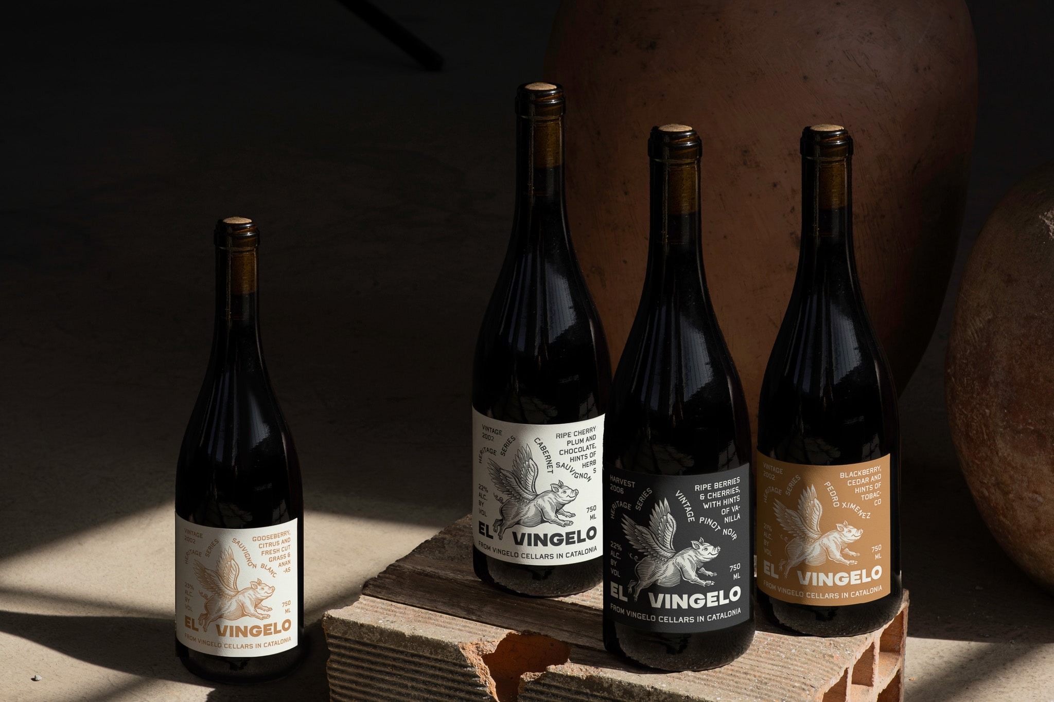
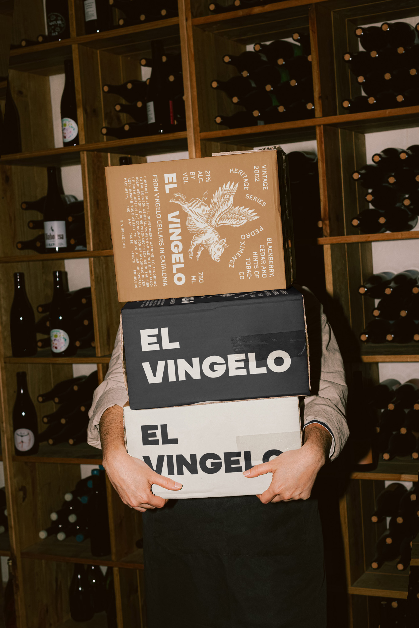
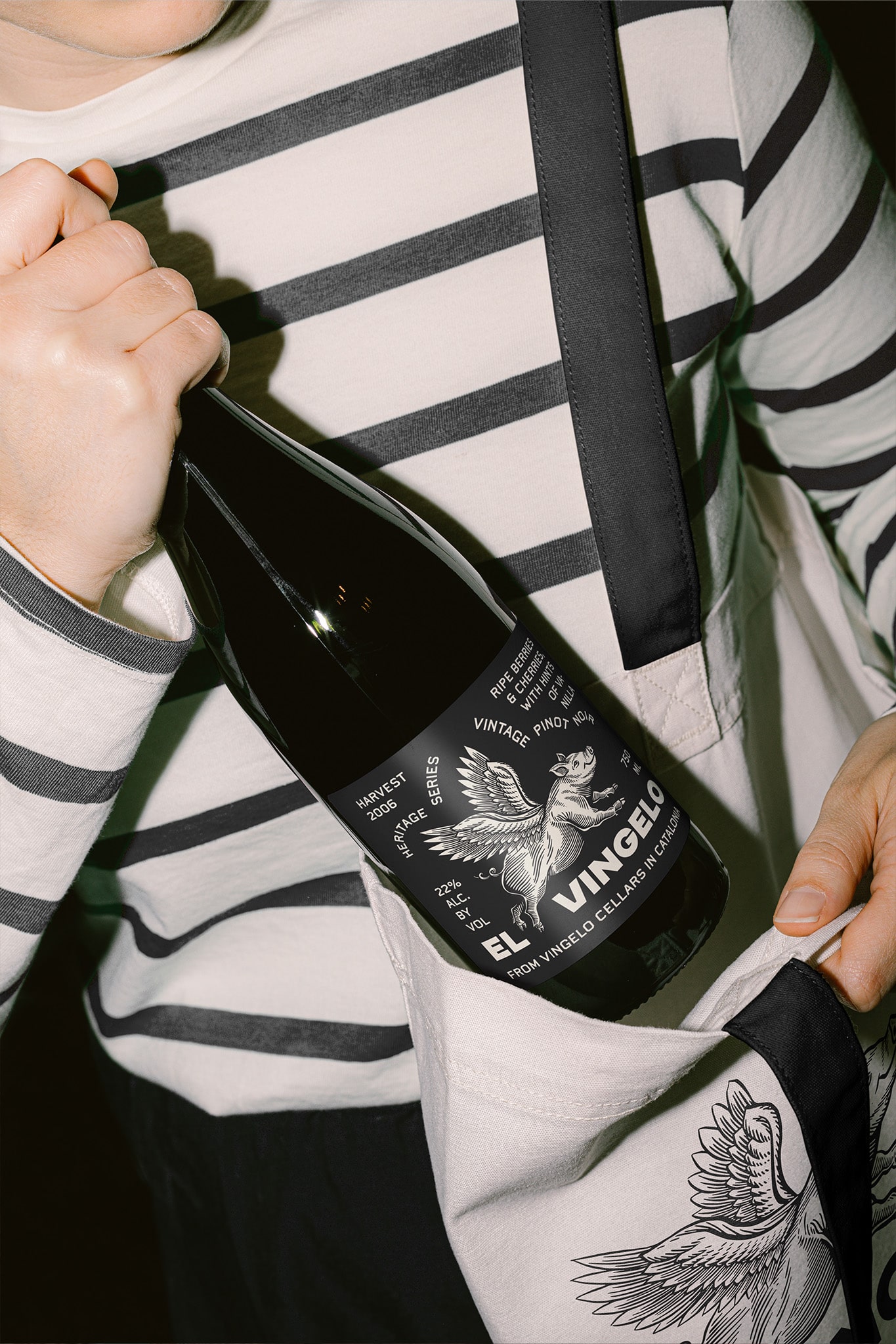
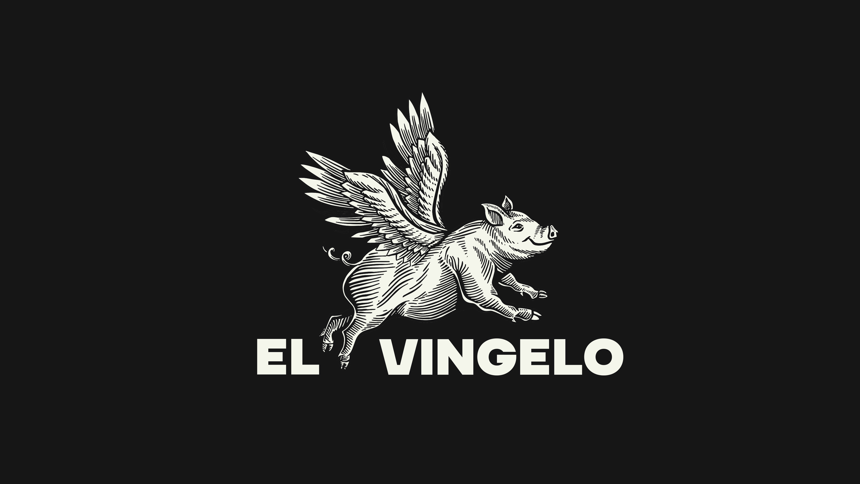
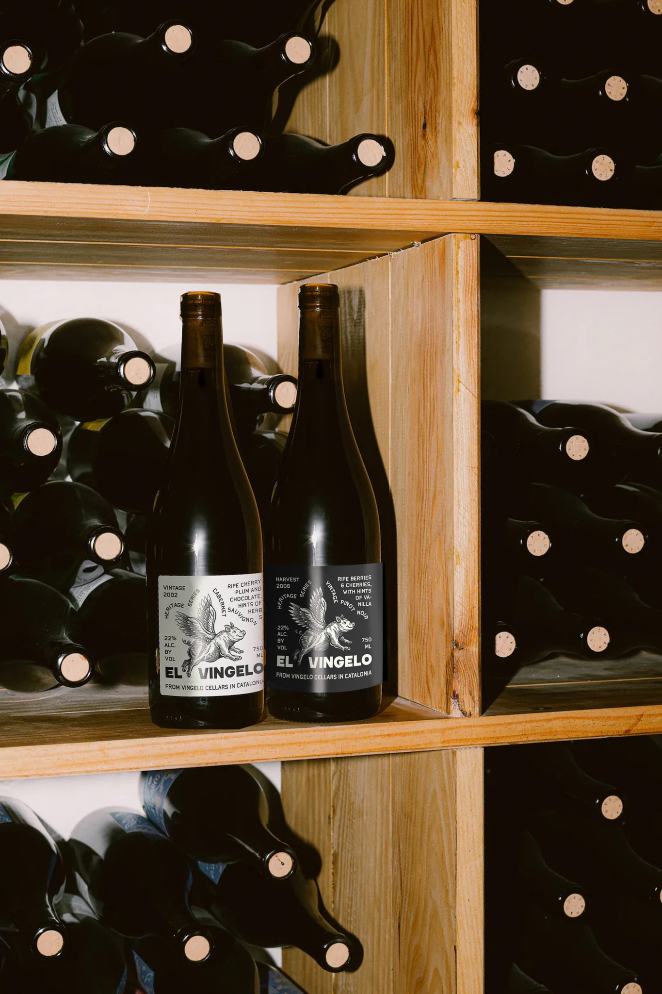
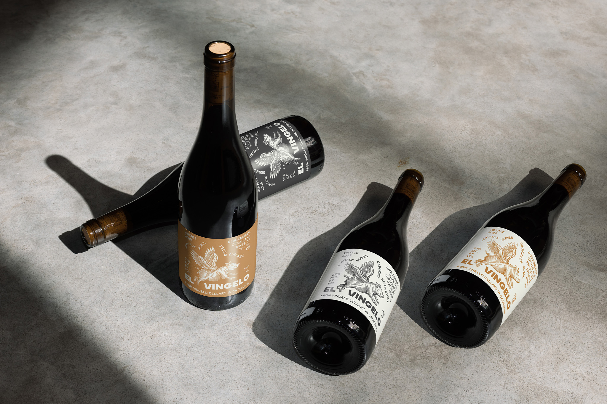
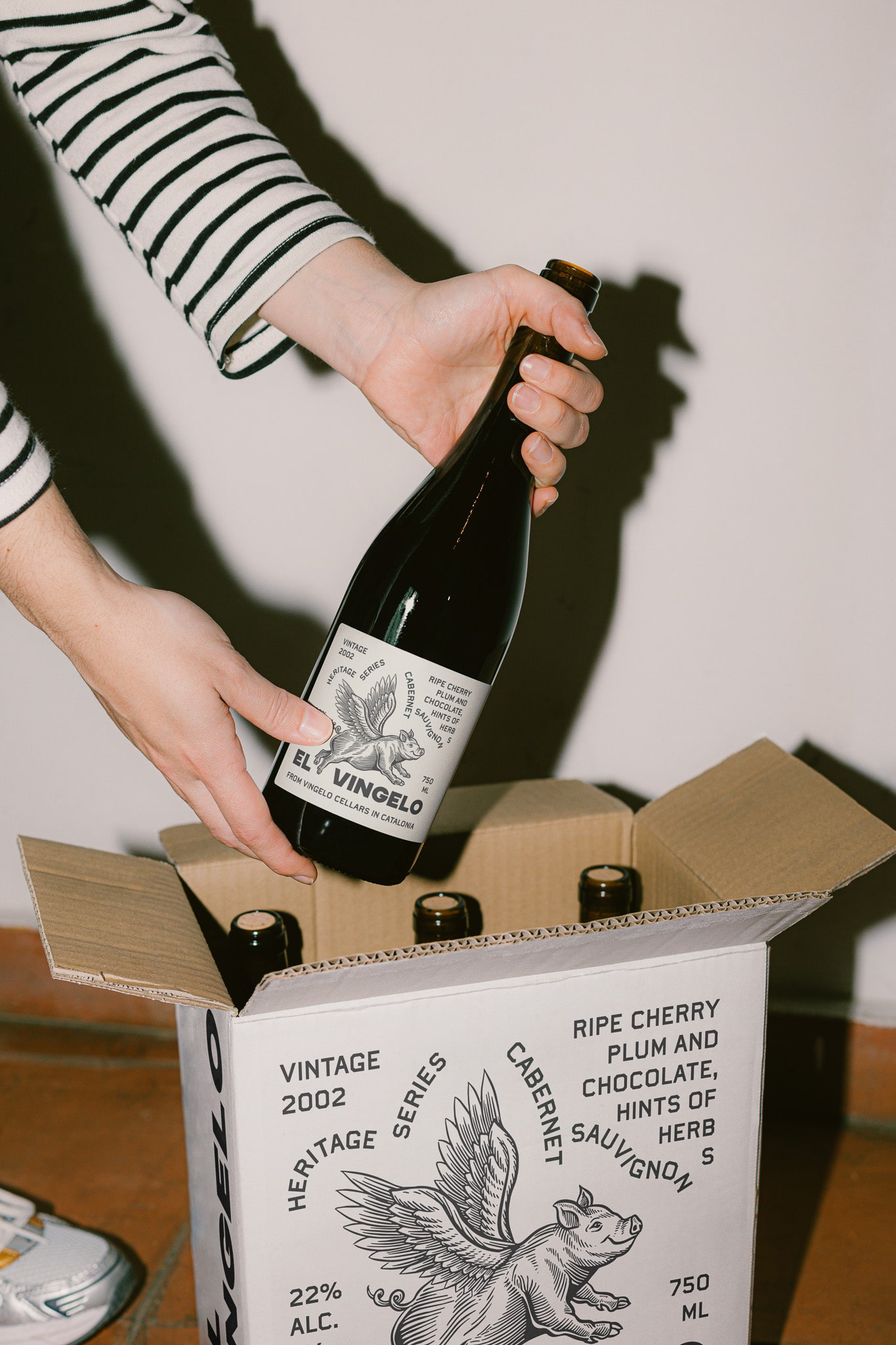
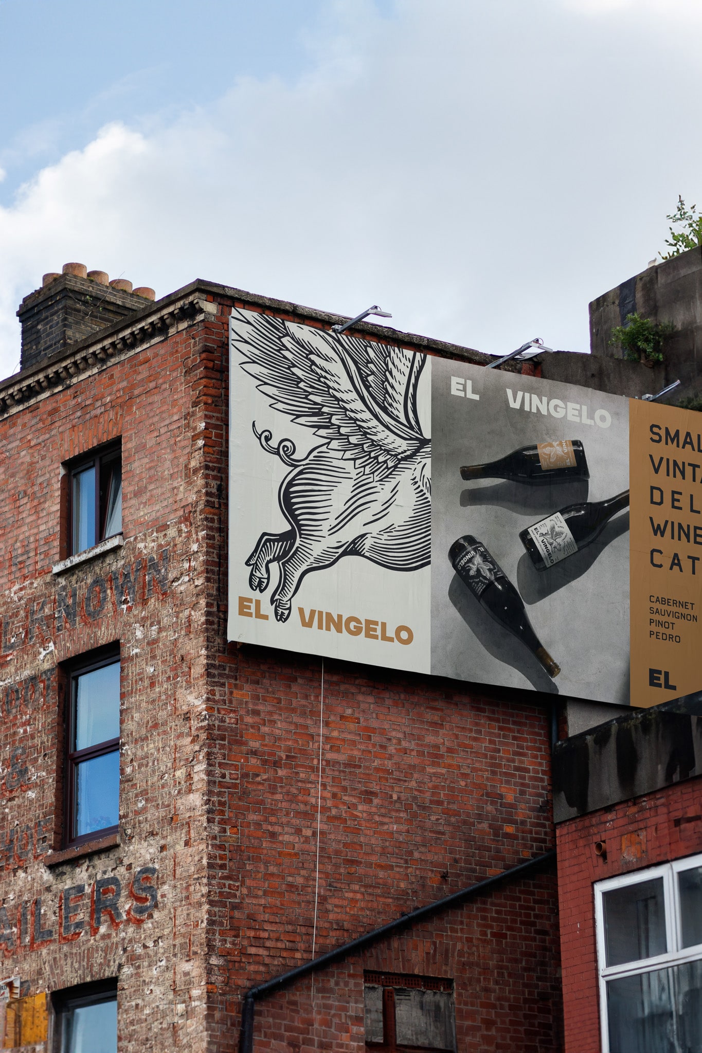
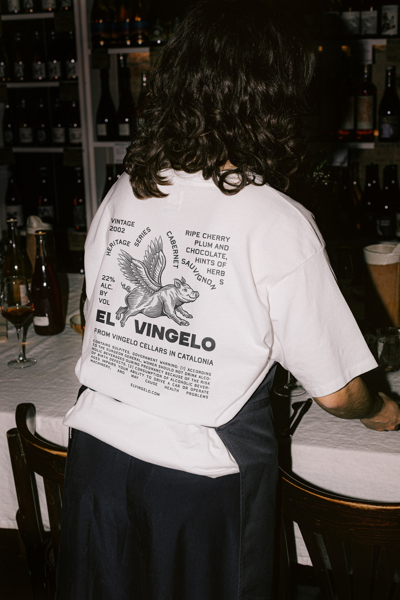
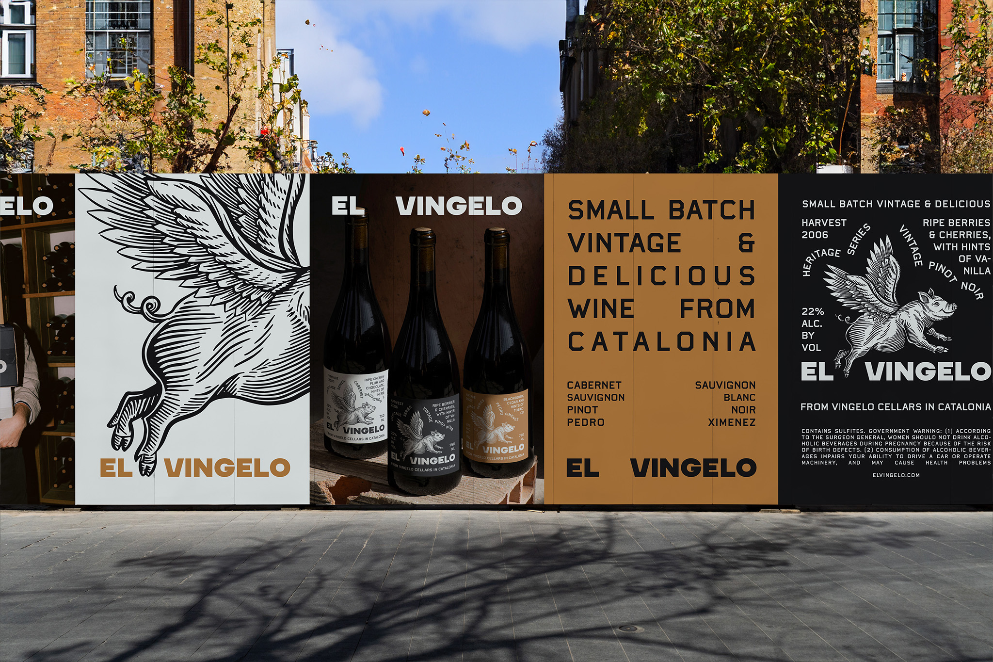
Inspired by the charm of vintage wine packaging and the whimsical appeal of cartoon illustrations, Ceren crafted a unique label for El Vingelo Winery that stands out on the shelves. The design features earthy terra-cotta tones paired with bold typography to create a striking contrast. At the heart of the label is a playful illustration of a flying pig, which all the wine information such as grape origin and tasting notes are wrapped around. This design choice not only captures attention but also adds a youthful and energetic vibe, making it appealing to a broad audience. The goal was to create a wine label that is both distinctive and memorable, ensuring it attracts potential clients and stands out in a competitive market.
The concept behind the flying pig is rooted in the idea of making the improbable possible, aligning with the innovative spirit of the wine brand. The earthy tones evoke a sense of tradition and quality, while the bold typography ensures clarity and readability, essential for conveying the wine’s details effectively. By combining these elements, the label not only stands out visually but also tells a story that resonates with consumers.
The goal was to design a wine label that not only attracts potential clients but also brings a smile to their faces, embodying both uniqueness and approachability. Aimed to create a balance between vintage elegance and modern playfulness, making the wine accessible and inviting to both seasoned connoisseurs and casual drinkers alike. The design process involved careful consideration of color harmony, typography selection, and illustration style to ensure that all elements worked cohesively.
Through this design, Ceren blend nostalgia with a modern twist, reflecting her passion for creating engaging and dynamic visual experiences. She wanted the label to evoke curiosity and joy, prompting potential buyers to pick up the bottle and explore its story.
CREDIT
- Agency/Creative: Ceren Burcu Turkan
- Article Title: El Vingelo Winery’s Distinctive Label with Bold Typography and Playful Illustrations by Ceren Burcu Turkan
- Organisation/Entity: Freelance
- Project Type: Packaging
- Project Status: Non Published
- Agency/Creative Country: Netherlands
- Agency/Creative City: amsterdam
- Market Region: Europe
- Project Deliverables: Brand Creation, Packaging Design
- Format: Bottle
- Industry: Food/Beverage
- Keywords: WBDS Agency Design Awards 2024/25 , wine packaging, winery, wine branding, wine label design
-
Credits:
Creative Director & Designer: Ceren Burcu Turkan


