


Rebranding of Tantra Studio “Rutantra”
Rutantra is a space for deep self-exploration and building conscious relationships through tantra practices. Based in Moscow, it combines regular in-studio classes with offsite trainings and retreats. The project is aimed at adults aged 25–45 with above-average income, who are interested in personal growth, psychology, spiritual and body-based practices. These are educated, open-minded, curious individuals seeking harmony in relationships and ready to invest in their emotional and sexual wellbeing.
Before the rebranding, Rutantra lacked a unified visual and communication style. The brand was limited to a logo, and both the website and social media lacked consistency. The overall aesthetic reinforced common stereotypes around tantra—excessive mysticism, esotericism, and an inaccessible tone. The main channel for attracting clients was word-of-mouth.
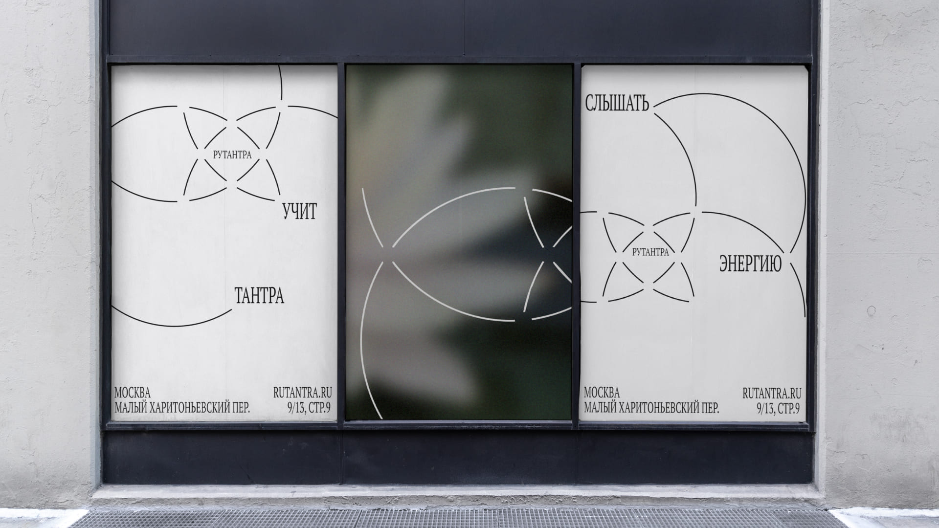
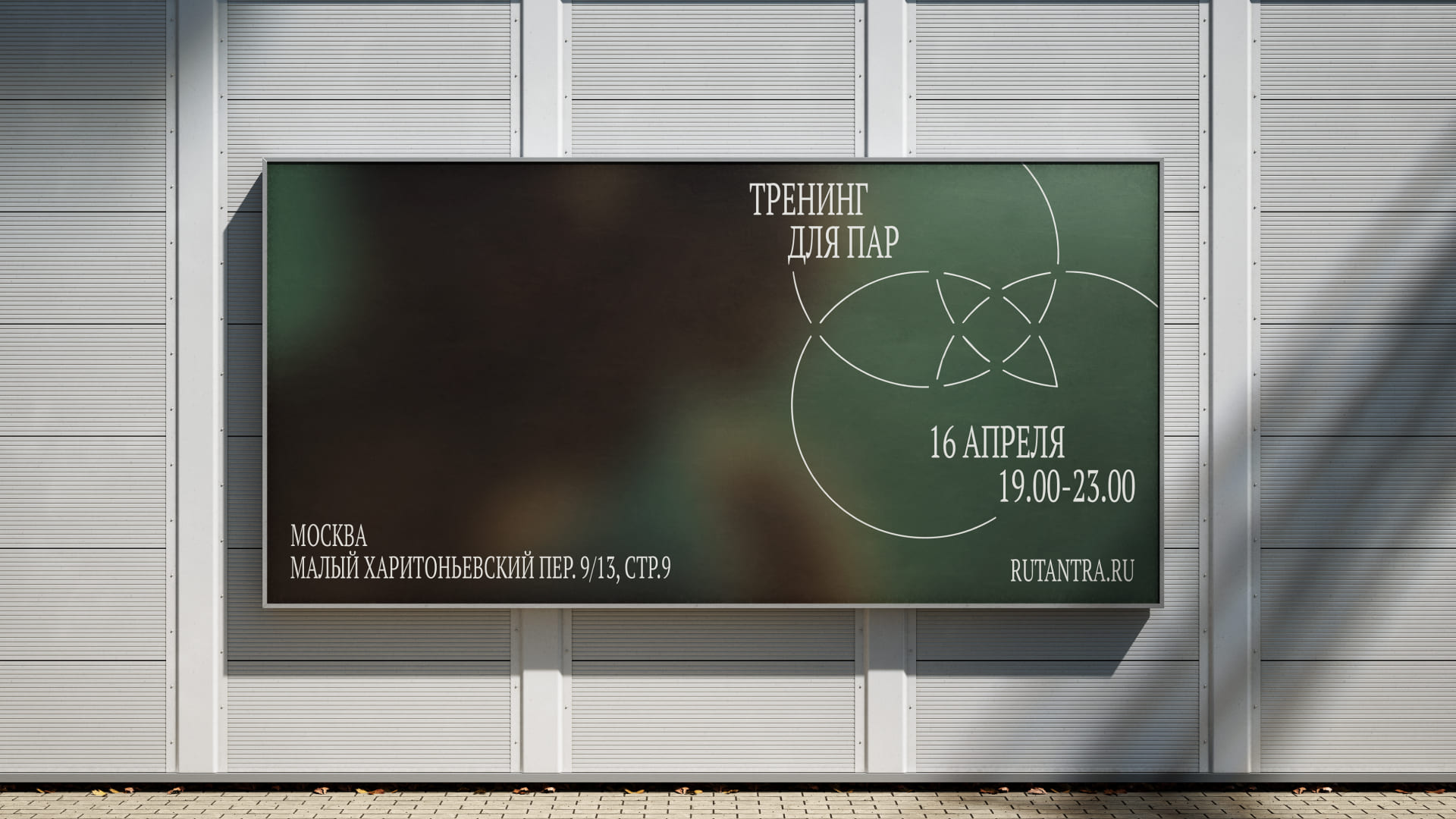
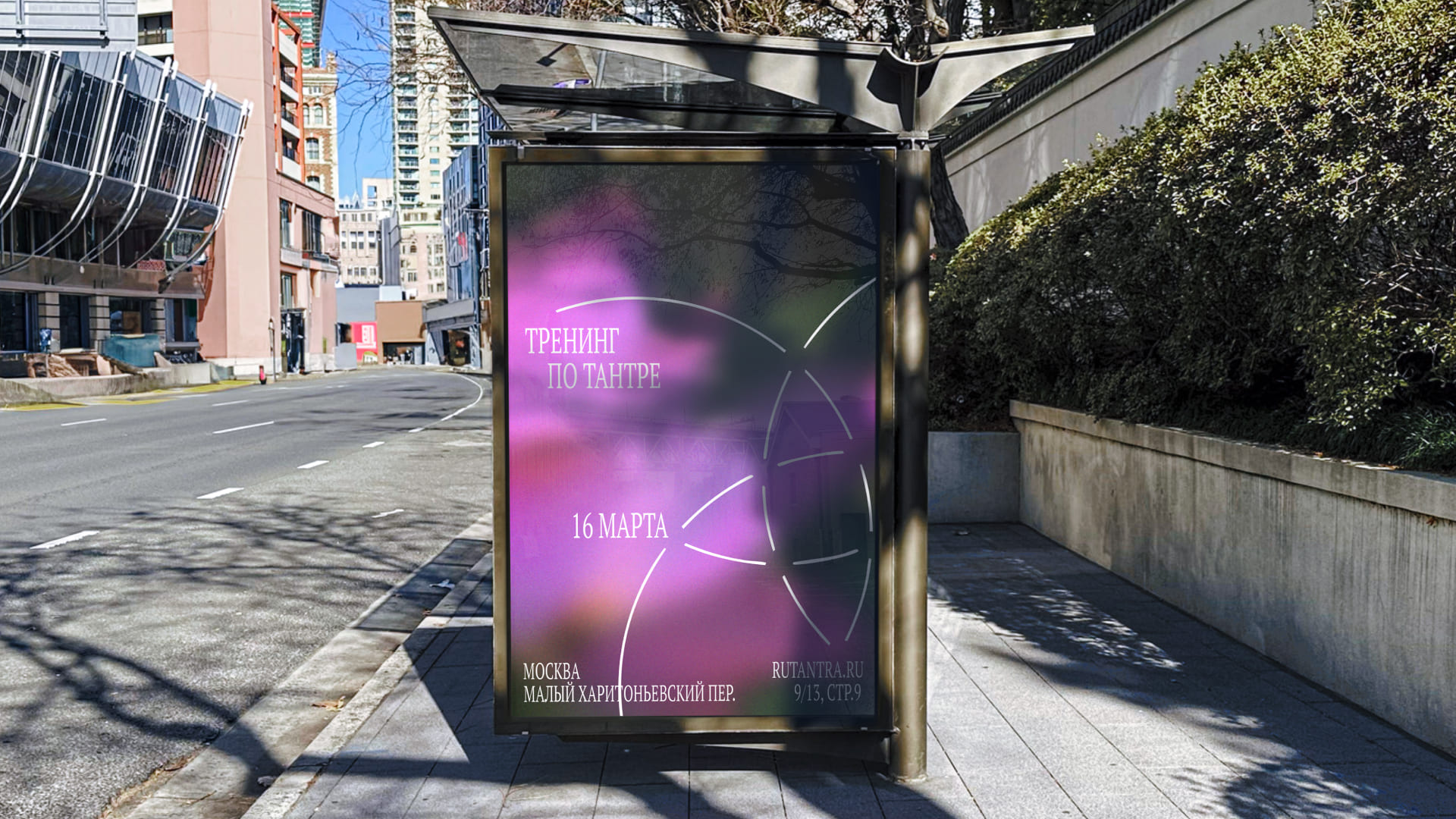
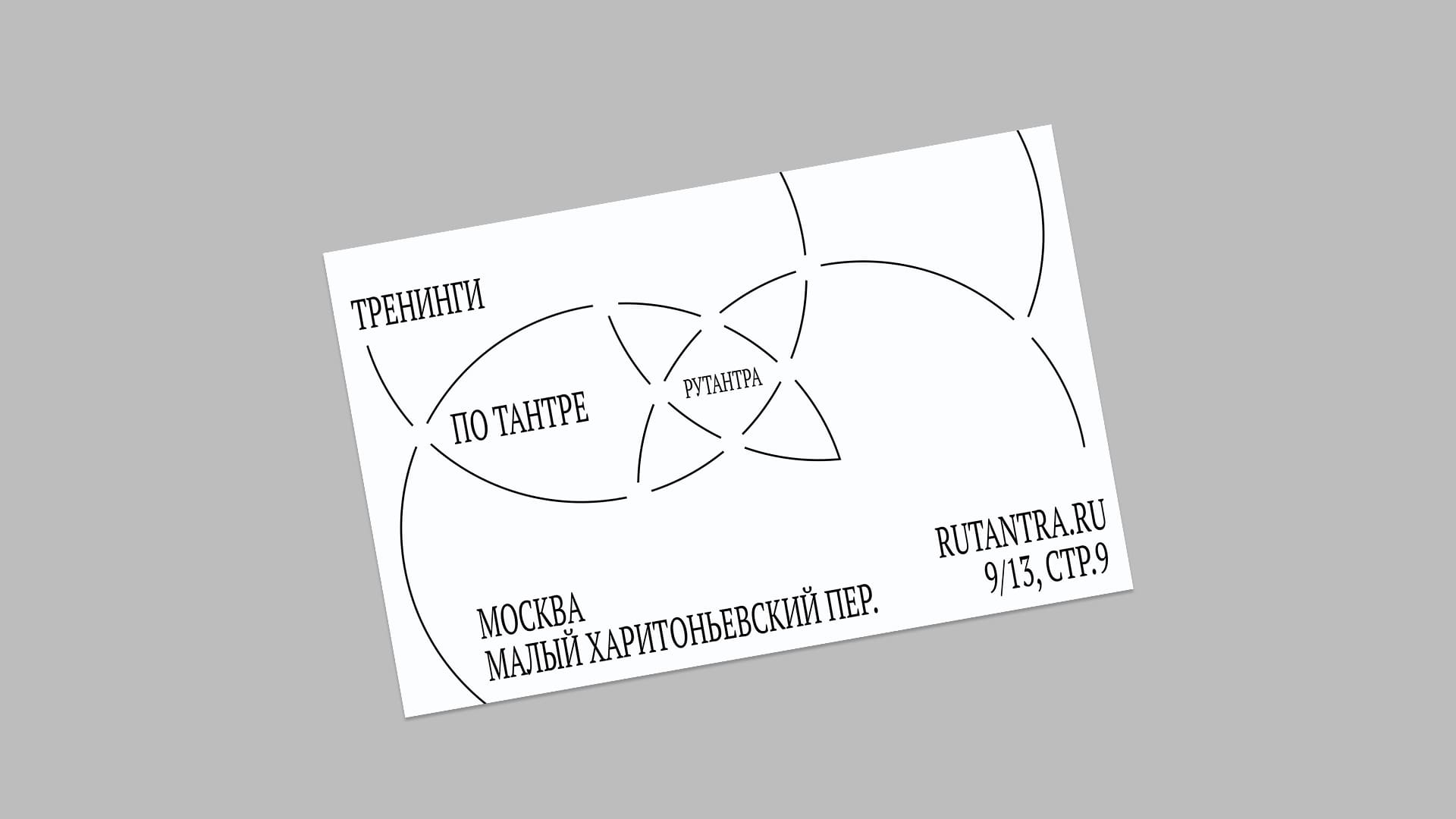
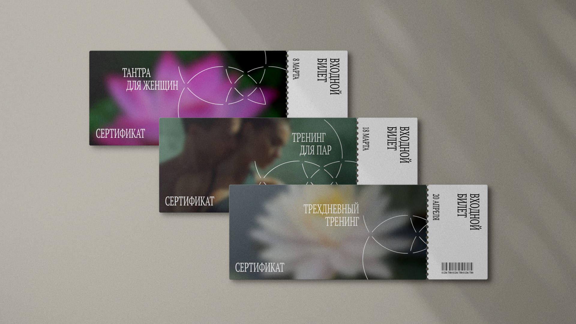
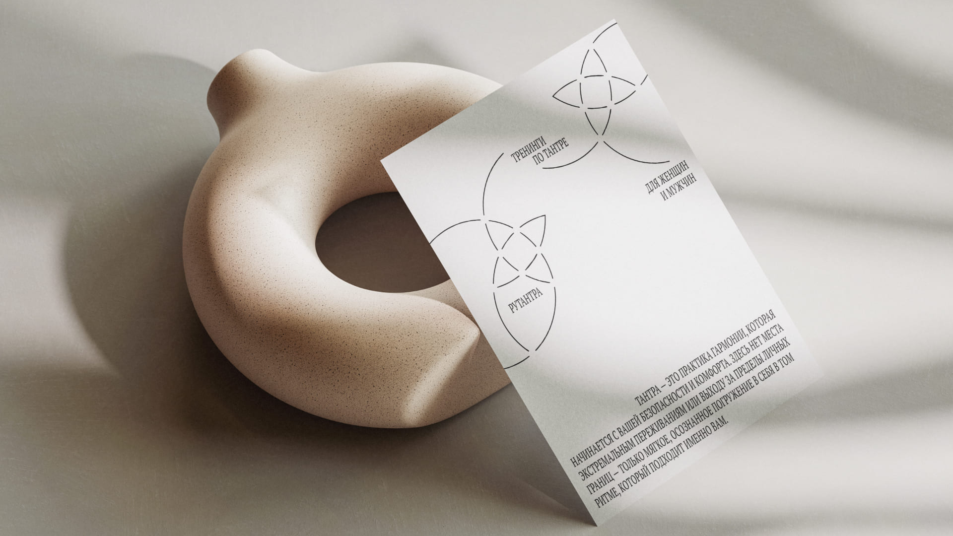
The goal of the rebranding was to create a modern, clean, and emotionally resonant identity that feels approachable and trustworthy. The new visual language is built around minimalism, deep tones, and clean lines, creating a sense of intimacy and safety. The mystical and esoteric elements were stripped away in favor of clear, practical, and proven tools for self-awareness: conscious breathing, mindful movement, and embodied presence.
Rutantra is now positioned as a safe space in the center of Moscow where people can explore tantra without fear, pressure, or pretense. It’s “magic made accessible” — tantra for real people: couples, working professionals, those simply curious. No sensationalism, just gentle entry points into deeper self-understanding.
The brand now speaks a modern, human, and emotionally intelligent language. It’s visually and verbally aligned with the values of its audience — clean, warm, and free from clichés. The overall feeling from the design can be described in hashtags: #clean #intimate #clear #emotional #modern. Rutantra becomes a grounding point for those looking to feel more, connect more deeply, and simply be themselves.


CREDIT
- Agency/Creative: Ekaterina Kravchenko
- Article Title: Ekaterina Kravchenko Redefines Tantra with a Grounded and Emotional Identity for Rutantra
- Organisation/Entity: Student
- Project Type: Identity
- Project Status: Published
- Agency/Creative Country: Russia
- Agency/Creative City: HSE design
- Market Region: Global
- Project Deliverables: Brand Design
- Industry: Health Care
- Keywords: brand identity, brand design, tantra studio
-
Credits:
Art director: Ekaterina Kravchenko


