


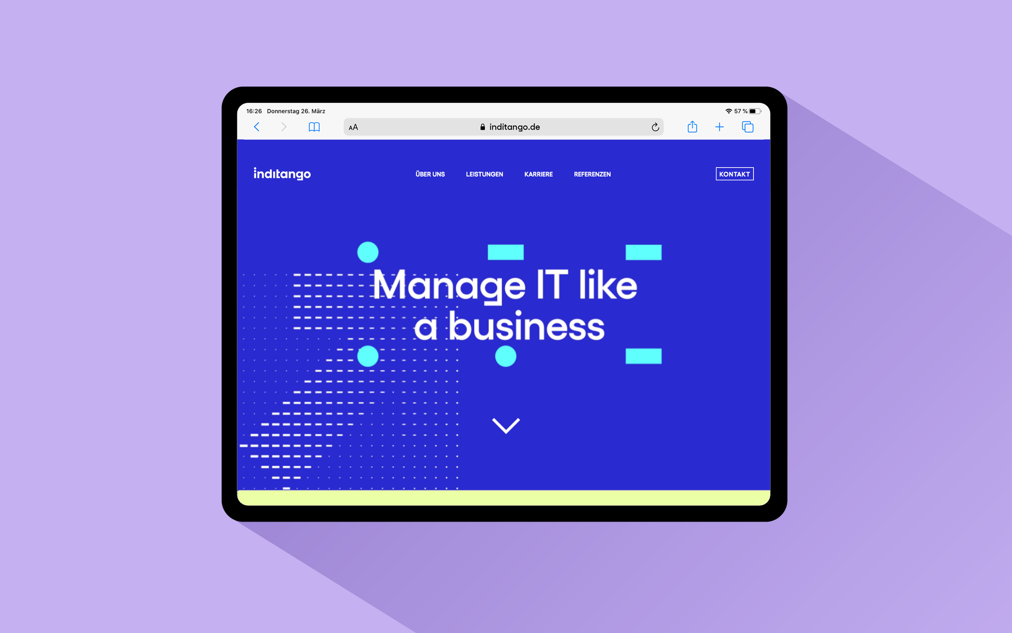
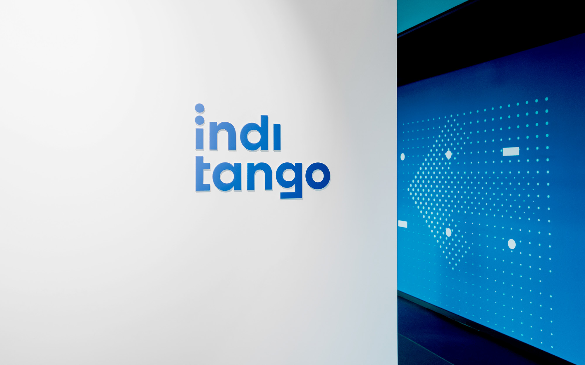
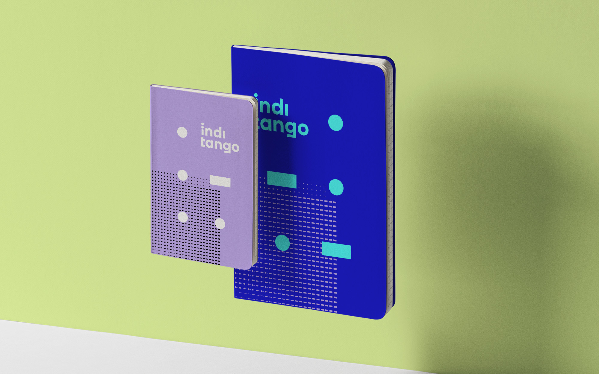
Inditango Brand Identity Relaunch for one of Europe’s leading IT management consultancies. Inditango enables organisations to manage IT like a business and is one of Europe’s leading management consultancies for increasing the added value of IT. Inditango asked EIGA to help them express the uniqueness of their authentic yet progressive approach through brand strategy, visual identity, and digital communication.
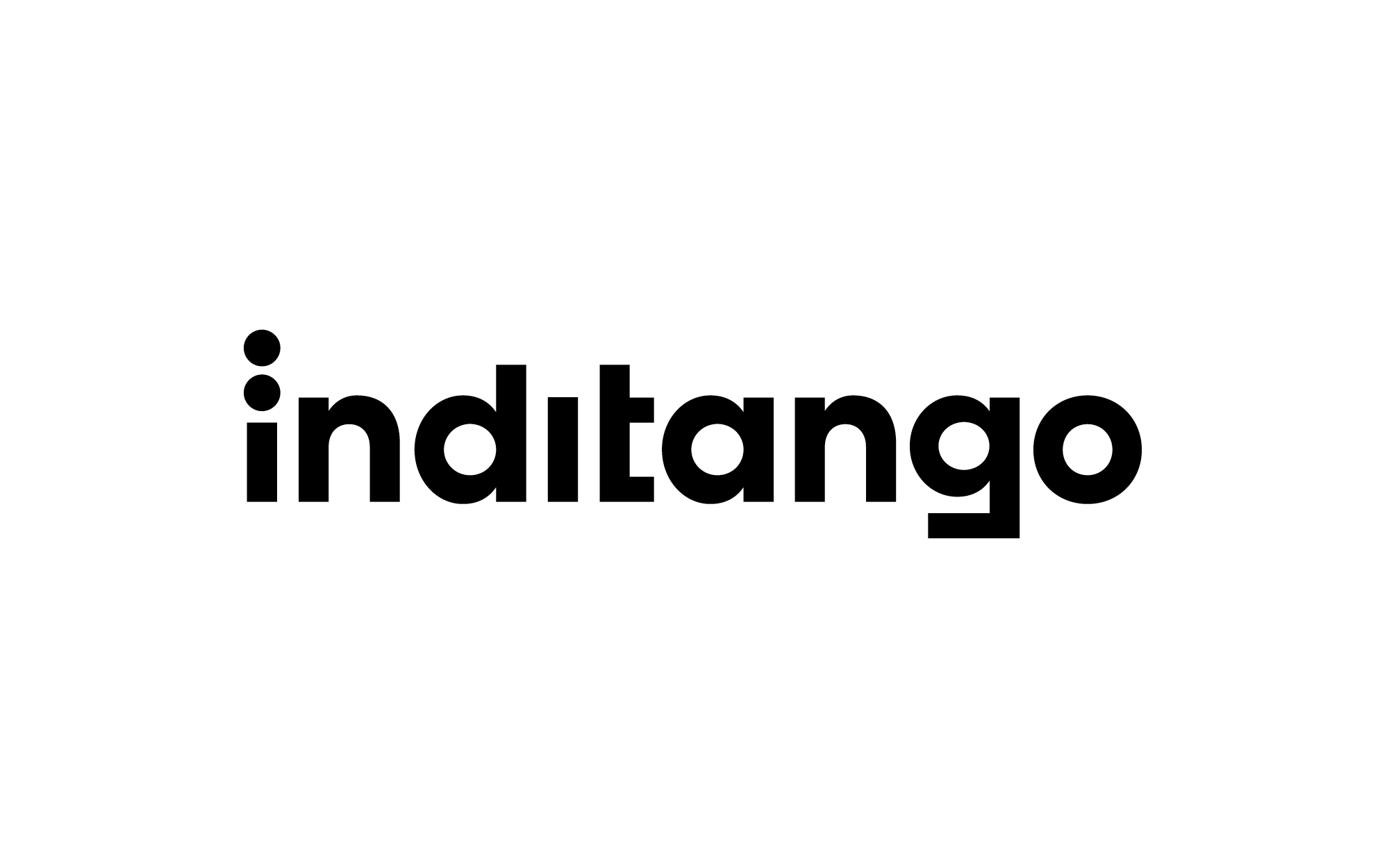
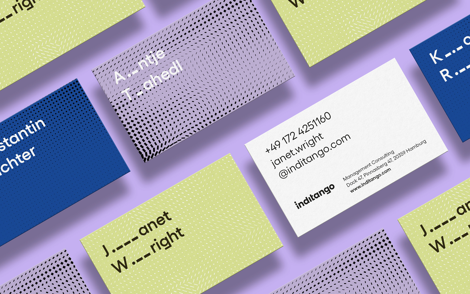
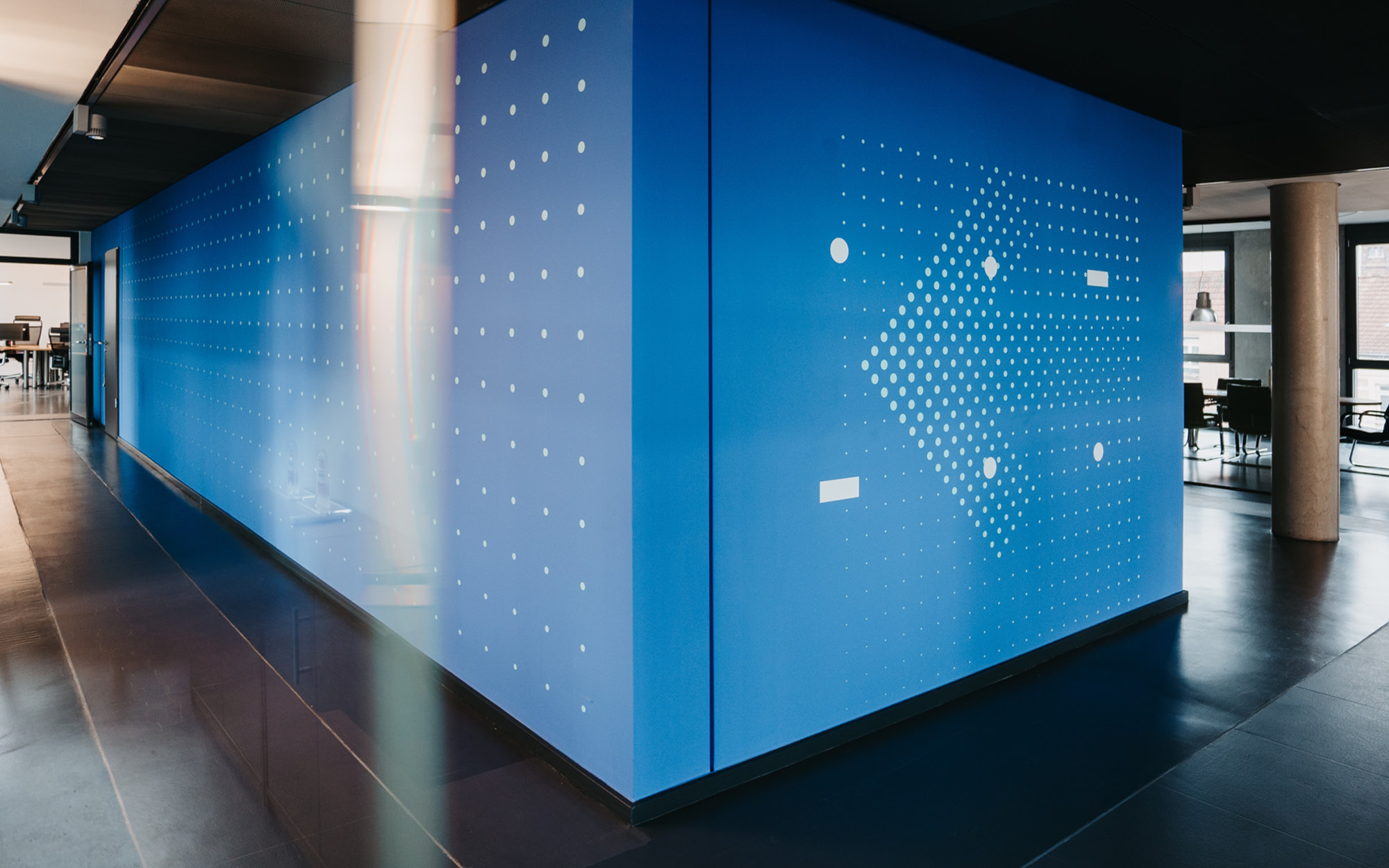
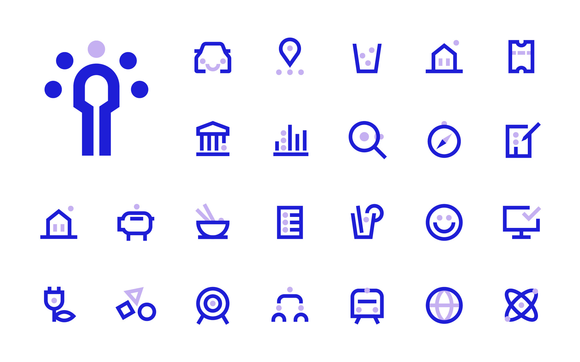
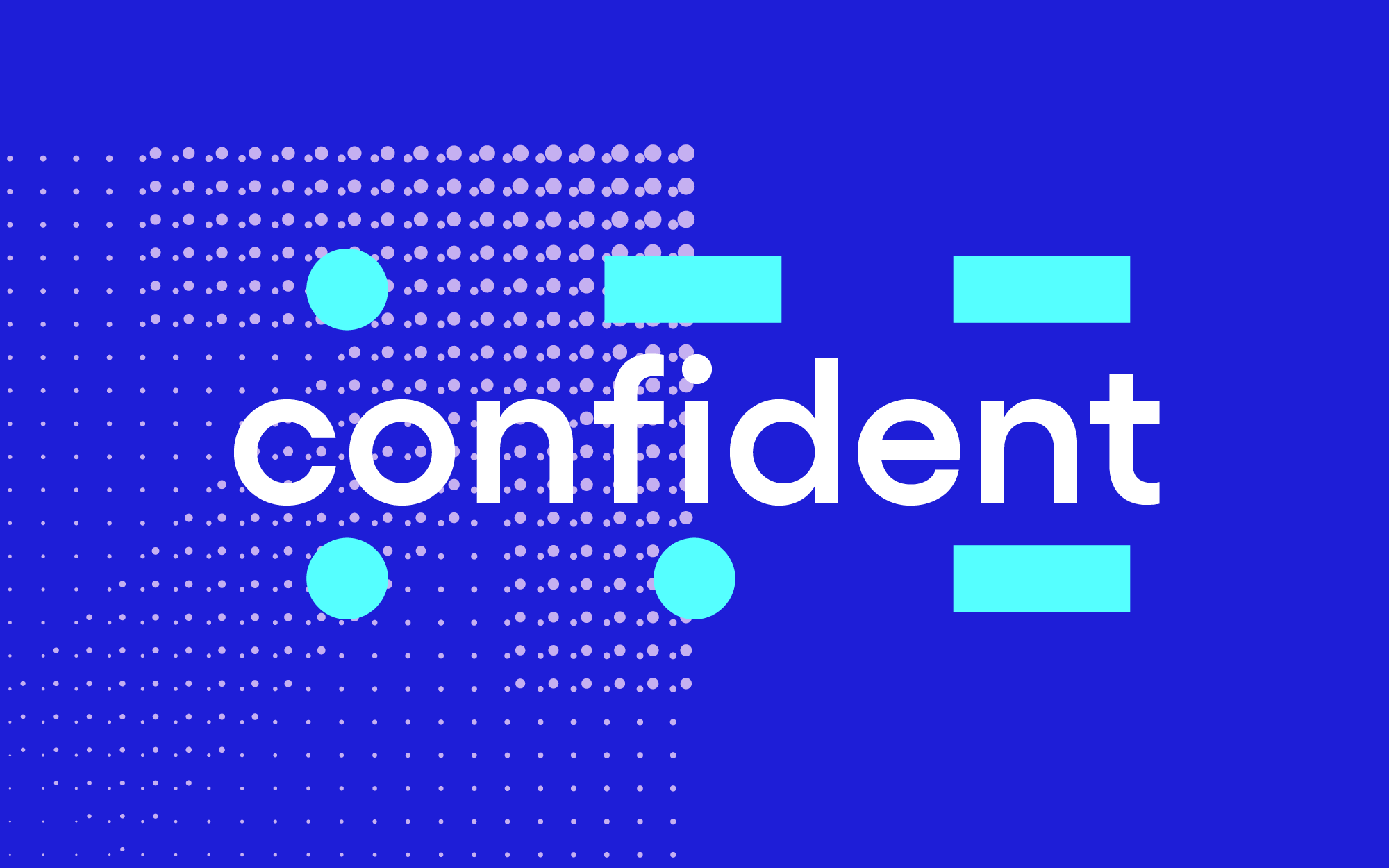
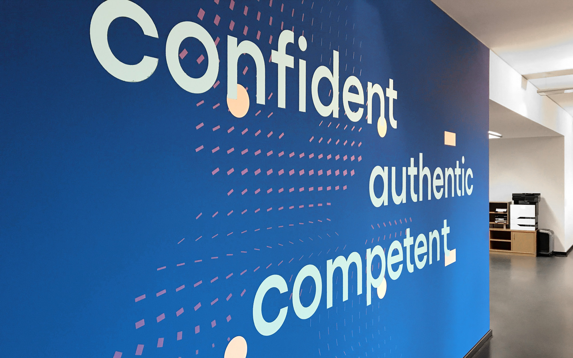
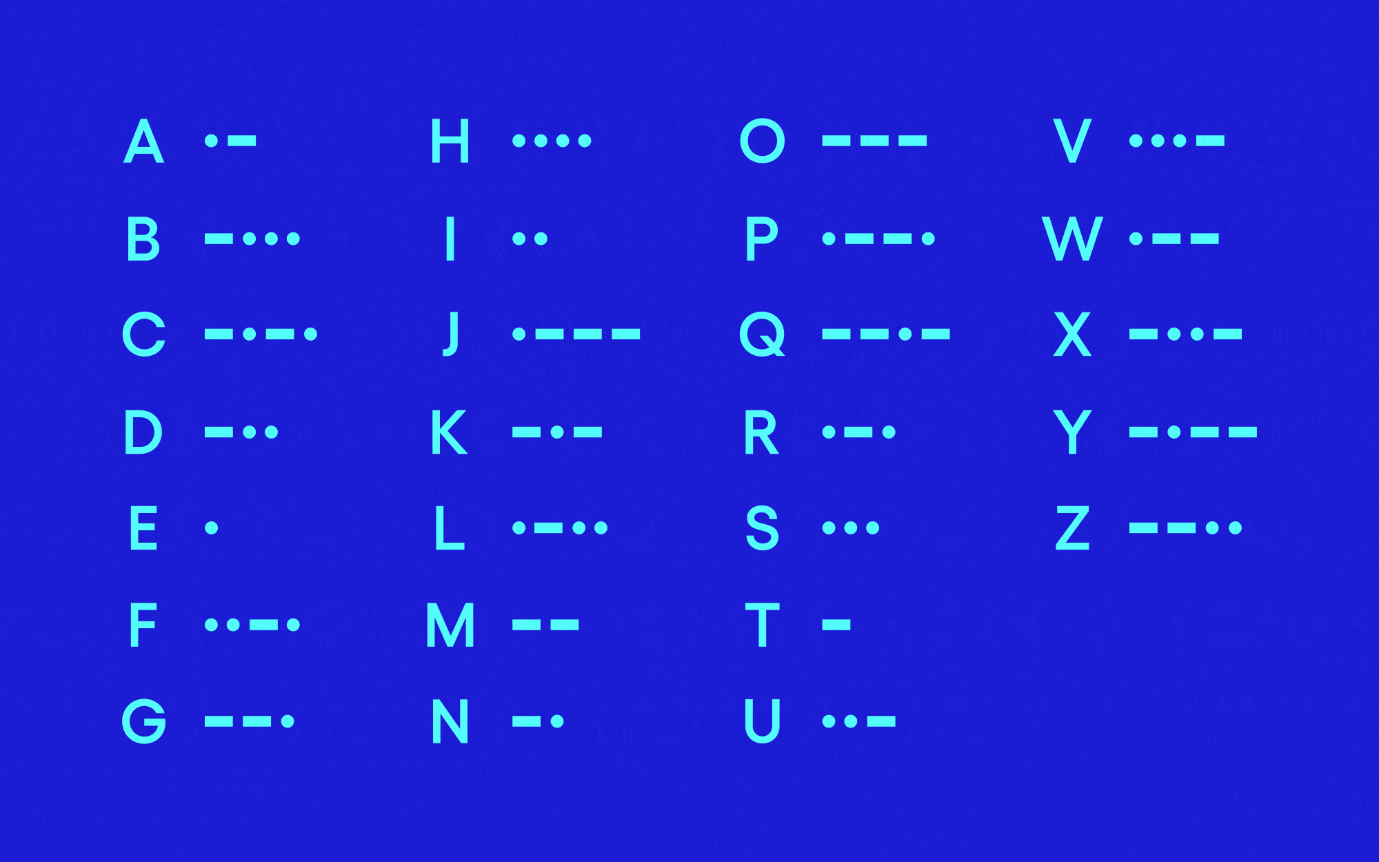
Dot, dot, dash. inditango’s unique brand name is derived from the NATO phonetic alphabet in which the abbreviation for IT would be rendered as “India” and “Tango”. It’s as simple as that! It also seemed logical to use the visual system of Morse code to complete the design—two dots for ‘i’ and a single dash for ‘t’. All visual elements—logo, layout grid, illustrations, and icons are constructed from these basic elements.


CREDIT
- Agency/Creative: EIGA Design
- Article Title: Eiga Creates Brand Identity for IT Management Consultancy Inditango
- Organisation/Entity: Agency, Published Commercial Design
- Project Type: Identity
- Agency/Creative Country: Germany
- Market Region: Europe
- Project Deliverables: Brand Guidelines, Brand Identity, Brand Strategy, Branding, Graphic Design, Identity System, Illustration, Rebranding, Research
- Industry: Technology
- Keywords: Brand Identity, Relaunch, Redesign


