The Brief
EFM rebranded their range of mobile phone accessory and device gear in 2015, and in 2021 re-engaged Dessein to assess both the design and structural components of the packaging to keep the EFM brand on-trend with modern lifestyles, and to continue their position as an innovative market leader.
The objectives of the brief were to revolutionize the current packaging from both a style and functionality perspective with an innovative solution which cuts through the crowd, offered an excellent customer unboxing experience, maintained the premium qualities of the brand, utilized minimal components and materials, and presented the EFM brand as a market leader of sustainable packaging.
The packaging itself has a number of important structural requirements, many dictated from the retail customers themselves:
It must secure the product within the packaging
Allow the product to be seen and touched (phone cases)
Offer some form of theft protection
Fit within planogram sizing
Remove the need for an internal PLA bag for protection
The new structure should also be damage proof when in transit or while being handled
Keep the packaging weight as light as possible
The materials used adhere to APCO guidelines which values the reduction of the harmful impact of packaging in the environment and encourages the recycling of as much of the packaging as possible.
The budget considerations requested that the costs should be within the targets outlined.
The design considerations included:
Simplified messaging
The visual representation of the product to be highlighted in context with its purpose
A reduction in multiple elements, (warranty information etc)
Retaining the EFM brand equity which has ensured it’s success.
Retaining the striking fluorescent orange used extensively across the range.
The size and visibility of the packaging and how it displayed with the planogram requirements.
Design with Sensory Ignition
Since the inception of EFM, the brand has continually evolved to deliver quality products and experiences which meet the needs of the modern consumer’s lifestyle with affordable, high quality mobile phone accessories. This new chapter of the EFM brand celebrates its Australian provenance and introduces sensory perception with multi-sensory packaging.
EFM products ignite the senses.
Its Australian design ensures it delivers the best user experience engaged through touch, sight, sound and the latest EFM innovation – scent. The edition of scent expands the sensory experience effectively satisfying 4 of the 5 main senses.
Each of the 4 of the 5 senses are aligned to an EFM category referencing a sensory experience and EFM’s role as an Australian brand made for Australian lifestyles through the tag line. (While we are not able to incorporate a physical taste into the packaging, we acknowledge the buyer as having good taste for recognising EFM as a quality brand).
EFM ignites the senses with:
TOUCH – Case Armour. EFM The Australian touch
Strong, stylish smooth and textural protection you can feel.
VISION – Screen Armour. EFM The visionary Australian
Seeing is believing with crystal clear clarity your eyes can trust.
SOUND – Audio. EFM the sound of Australia
Listen to that harmony, big bass and beat. Strike a chord and hear it all.
TASTE – Empower. The energy of Australia
Recharge and energise with quality design and performance.
SCENT – Promise. The choice of Australia
Breathe in and relax. We guarantee surety with each sniff.**
EFM is sensory driven, and as such the EFM logo is paired with the words: Sensory Ignition, acknowledging the brands understanding of how our senses are ignited through user experiences with EFM products.
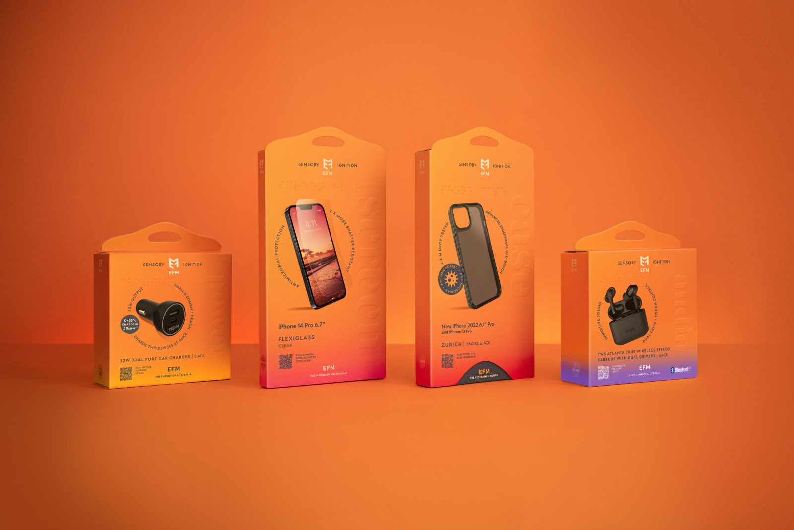
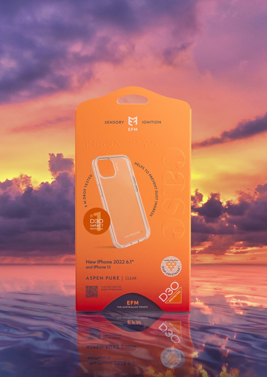
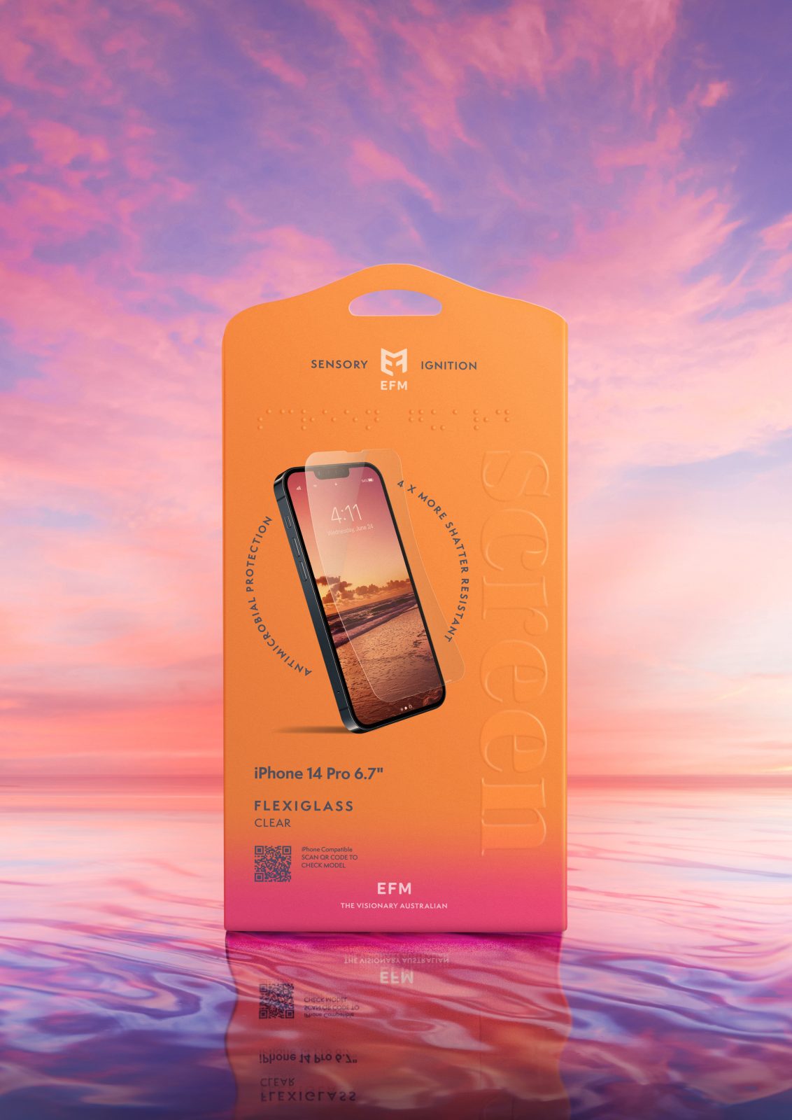
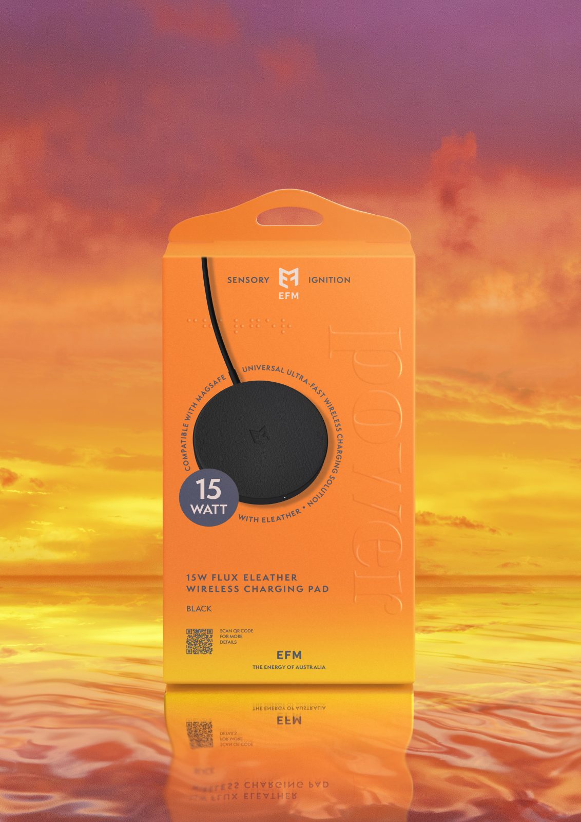
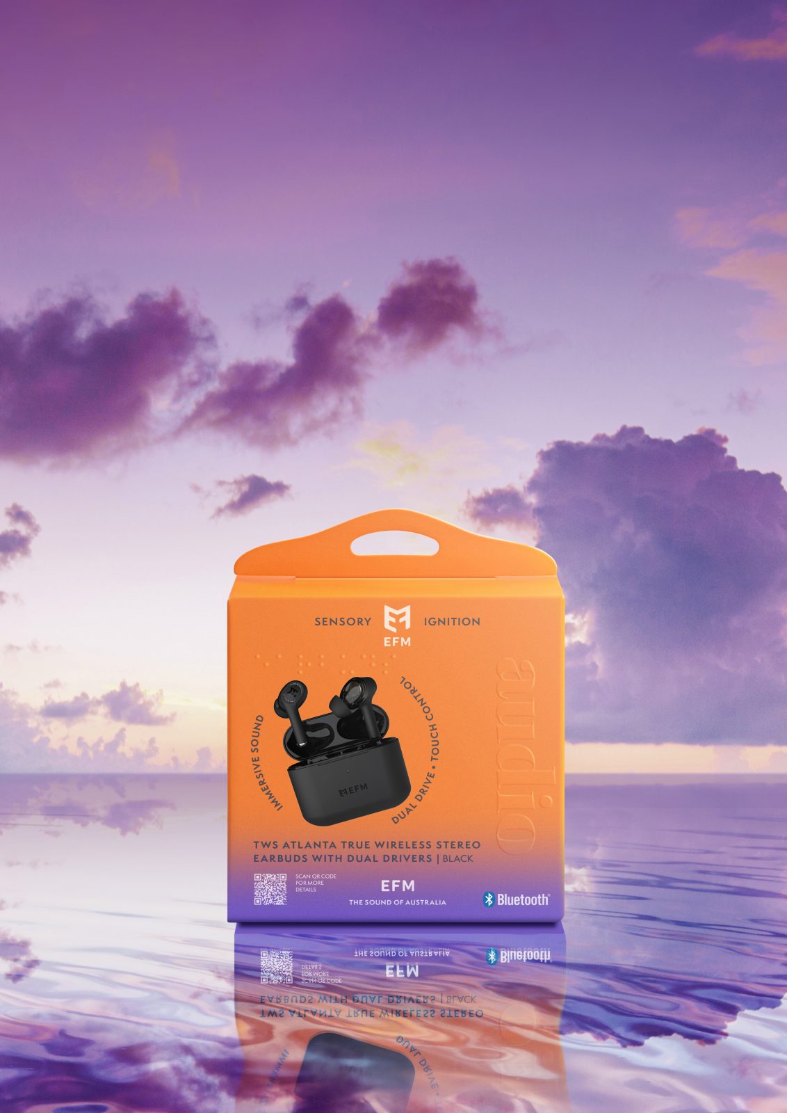
Visually, the packaging ignites our senses through the bold use of vivid colour. Inspired by this Australian company, we played homage to their identify and brought the distinguishable colours of Australian sunsets to the fore. Bright hues of yellow, pink, red and purple were used to identify each product category, heightening the sensory experience with combinations of vivid beach scape colour pairings.
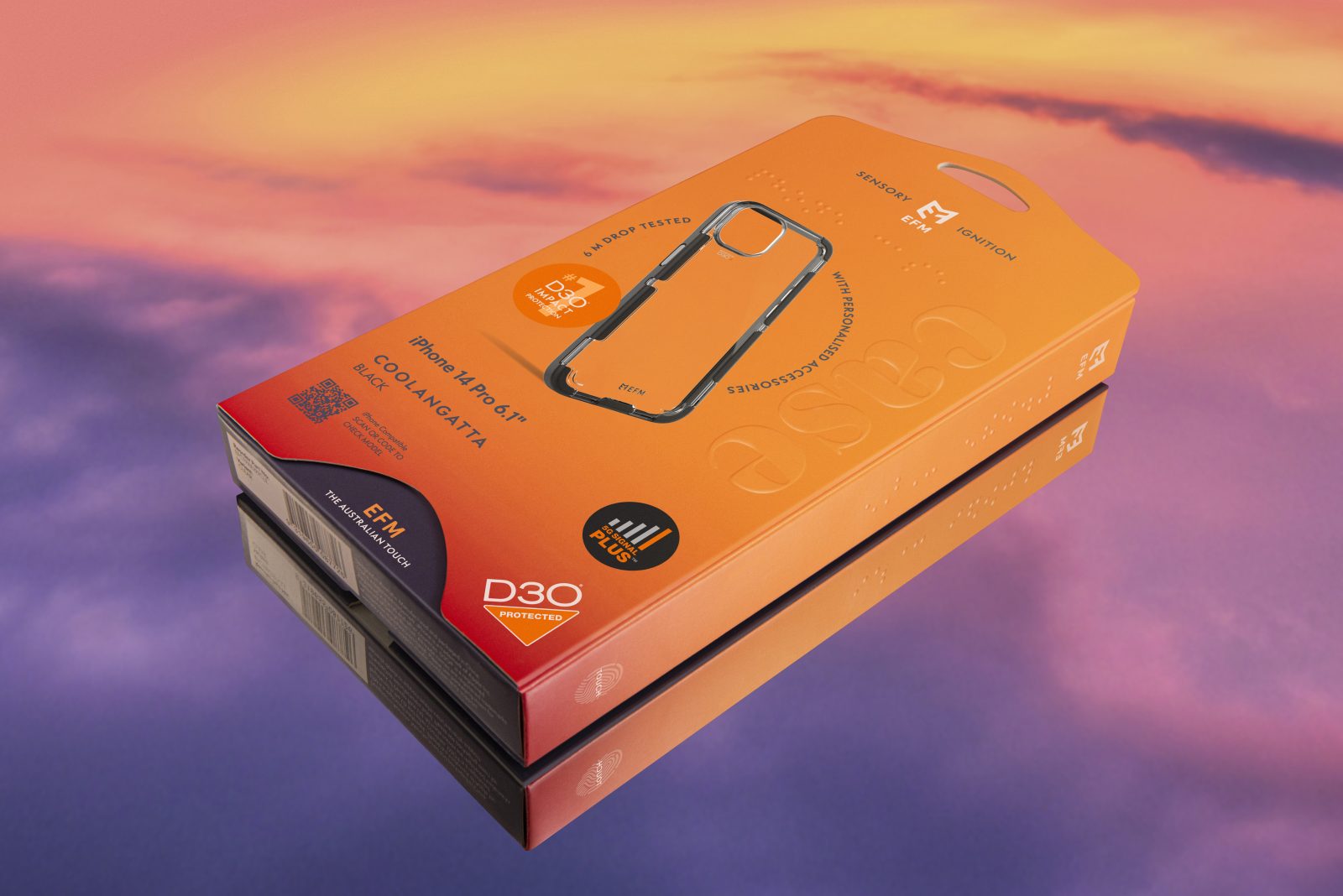
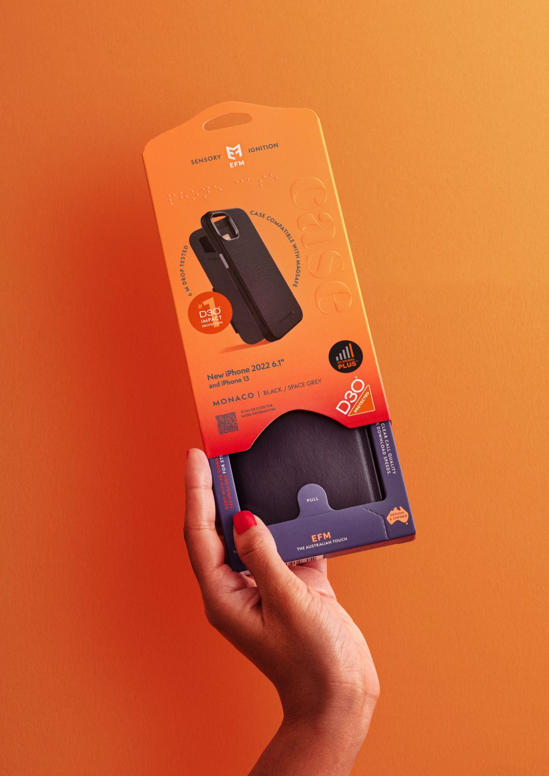
Enhancing the visual experience with the embossing introduces the tactile experience. The word representing each product category – Screen, Case, Power and Audio, are embossed into the front of the packaging. These words are also embossed in Braille on both the front and side panels of the packaging to ensure it is inclusive and accessible for people with a vision impairment. The embossing is also a sustainable way to subtlety enhance the premium aspect of brand. Including the embossing to the new packaging solution also prevented the boxes from scuffing and removed the necessity to pack each individual box into PLA bags to protect them during shipping.
The design embraces simplicity. Hero product imagery is surrounded by their unique selling points presented in simple language, with the product name, model and colour information supported by a dynamic QR code linked to the specifications of each.
The back of pack highlights the product features and the internal trays used in the case packaging has the ‘you have great taste’ and EFM ignites your senses with touch, vision, sound, scent and taste story and EFM Cares message.
Structural integrity
Reducing the carbon footprint of the EFM packaging begins with the structure of the packaging itself. Removing 3 individual components of the previous case packaging, we effectively reduced the amount of material used by eliminating the plastic hang tab and internal films by replacing them with a unique 2 part tamper-proof box.
Where the items are light-weight, the hang tab is incorporated into the front face of the packaging, allowing more room to showcase the product and its features. Heavier weighted products use a variation of the packaging whereby they use a separate hang tab, positioned central to the packaging to balance and distribute the weight evenly when hung on the shelf.
The EFM Case packaging is made from two parts: a female outer and male (inner tray). The female outer packaging is the same size and is used across all of the case packaging and is designed to fit two different inner tray sizes for both large and smaller model cases.
The manufacturer places the phone case into the internal tray and slides it into the outer packaging, locking the internal tray inside it in doing so. Customers are encouraged to pull the internal tray down to view and touch the phone case. The tray stops at the predetermined position to reveal the product and additional features printed on the tray. It is impossible to remove the case from the tray (without destroying the box), without first pulling the designated pre-cut area to remove it from the packaging, thus making it almost theft proof.
The multi-sensory experience comes into play as the friction of the internal moving parts releases a subtle but noticeable scent. Reminiscent of the Australian coast, the scent is a fresh, clean ozonic burst with hints of zesty citrus and eucalyptus notes.
Where it is not essential that the product be viewed, the packaging eliminates the internal tray and uses the same outer box features as the case packaging. The range of EFM packaging fits into 2 main sizes, whereby the smallest size stacks to the same vertical height of the larger box, enabling effective planogram blocking. The new hang tab solution is also efficient to pack for shipping. Butting each box head to head reduced the packing of ‘air’.
Manufactured with Sustainability in mind
Using recyclable, bio-degradable and sustainable materials, we removed all previous plastics and provided a unique packaging solution to showcase their products.
The production of the packaging aims to mirror the APCO values of reducing the harmful impact of packaging on the environment. As such the packaging is printed with soy inks on responsibly sourced FSC® paper and encourages the recycling of as much of the packaging as possible.
Through creative and innovative design, the latest iPhone 14 product packaging has on average a reduction of 12% in materials when compared to the previous iteration. Using less material, makes the product lighter to ship, reduces material waste and is better for the environment.
Removing all plastics from the packaging by integrating the hang tab into the soft card means all parts of the EFM packaging are recyclable.
Outcomes and customer response
Our latest EFM packaging project was no simple task, however Dessein were forthcoming and approached each challenge in their stride and delivered solutions that are truly innovative, on-brand and a stand-out in market.
“EFM’s latest packaging breathes life into phone accessories shop shelves, with a standout presence versus the competition. The packaging combines minimal use of materials, all of which are 100% recyclable, with optimal use of D3O protection information, ensuring consumers know they’re getting the best for their money.” said D3O, EFM’s exclusive technology partner that engineers the number 1 impact protection material in the world.”

CREDIT
- Agency/Creative: Dessein
- Article Title: EFM Sensory Ignition Structural Packaging Design
- Organisation/Entity: Agency
- Project Type: Packaging
- Project Status: Published
- Agency/Creative Country: Australia
- Agency/Creative City: Perth
- Market Region: Australia
- Project Deliverables: Packaging Design
- Industry: Technology
- Keywords: WBDS Agency Design Awards 2022/23
-
Credits:
Director/Designer: Tracy Kenworthy
Director/Designer: Geoff Bickford


