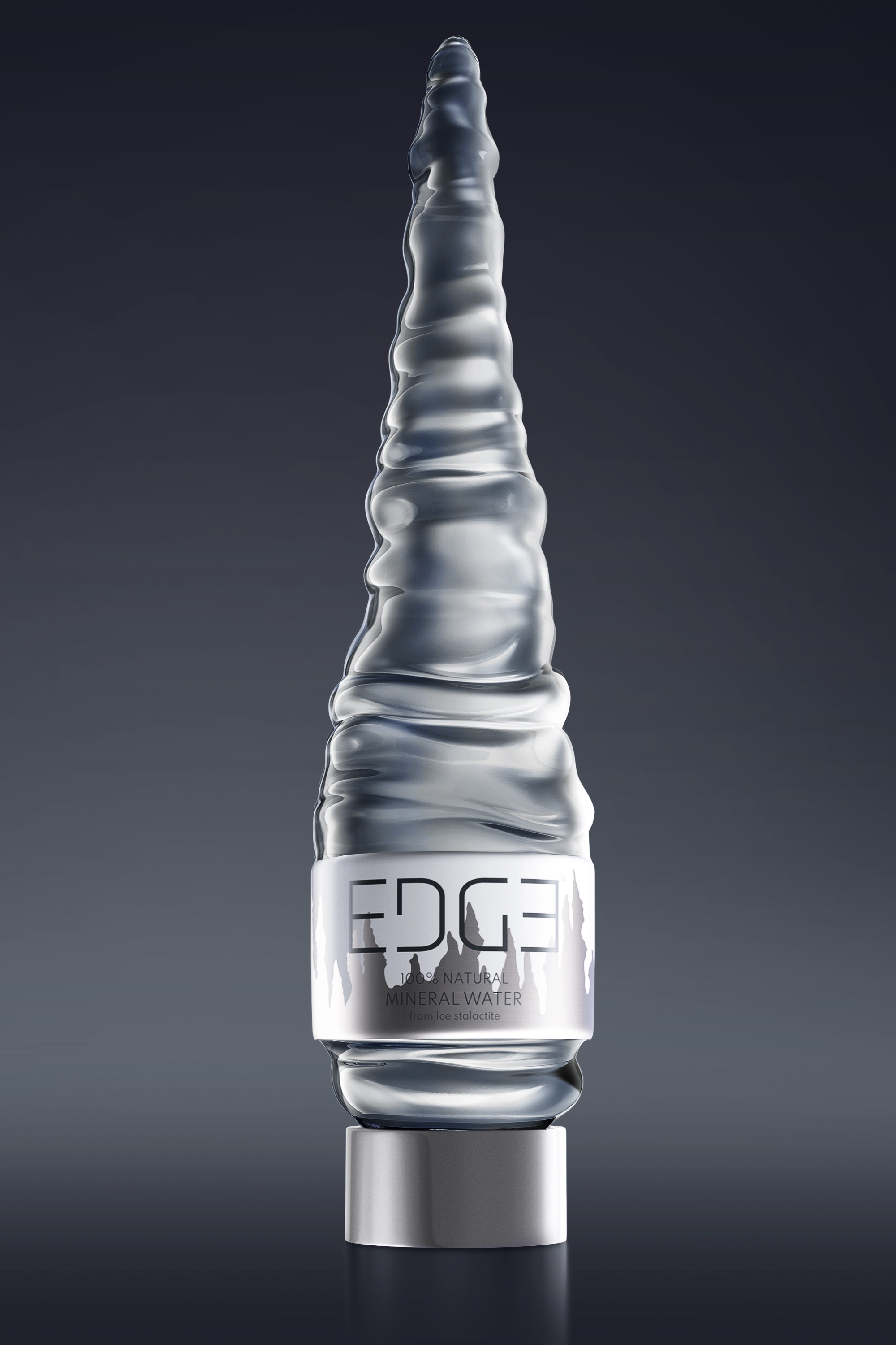
For Edge Mineral Water, the best-selling mineral water brand by Narwhal World Service Company Limited, all of their water has always been sourced from the hilly Khao Hua Khon province of Ratchaburi, Thailand where the purest mineral water is an abundant natural resource. Where for hundreds of years, water runs through the complex cave systems made up of several different layers of rock and mineral deposits and creating a high-nutrient mineral water.
Based on the beautiful stalactite and stalagmite formations found within the caves of the hilly countryside where the purest water can be found dripping from their very tips, the Thailand-based Prompt Design agency have taken this inspiration to heart and designed a beautiful bottle and packaging design for Edge Mineral Water that encapsulates the natural beauty of Thailand’s cave systems as well as showcasing the purity of their mineral water in a way that no other mineral water brand has done before!
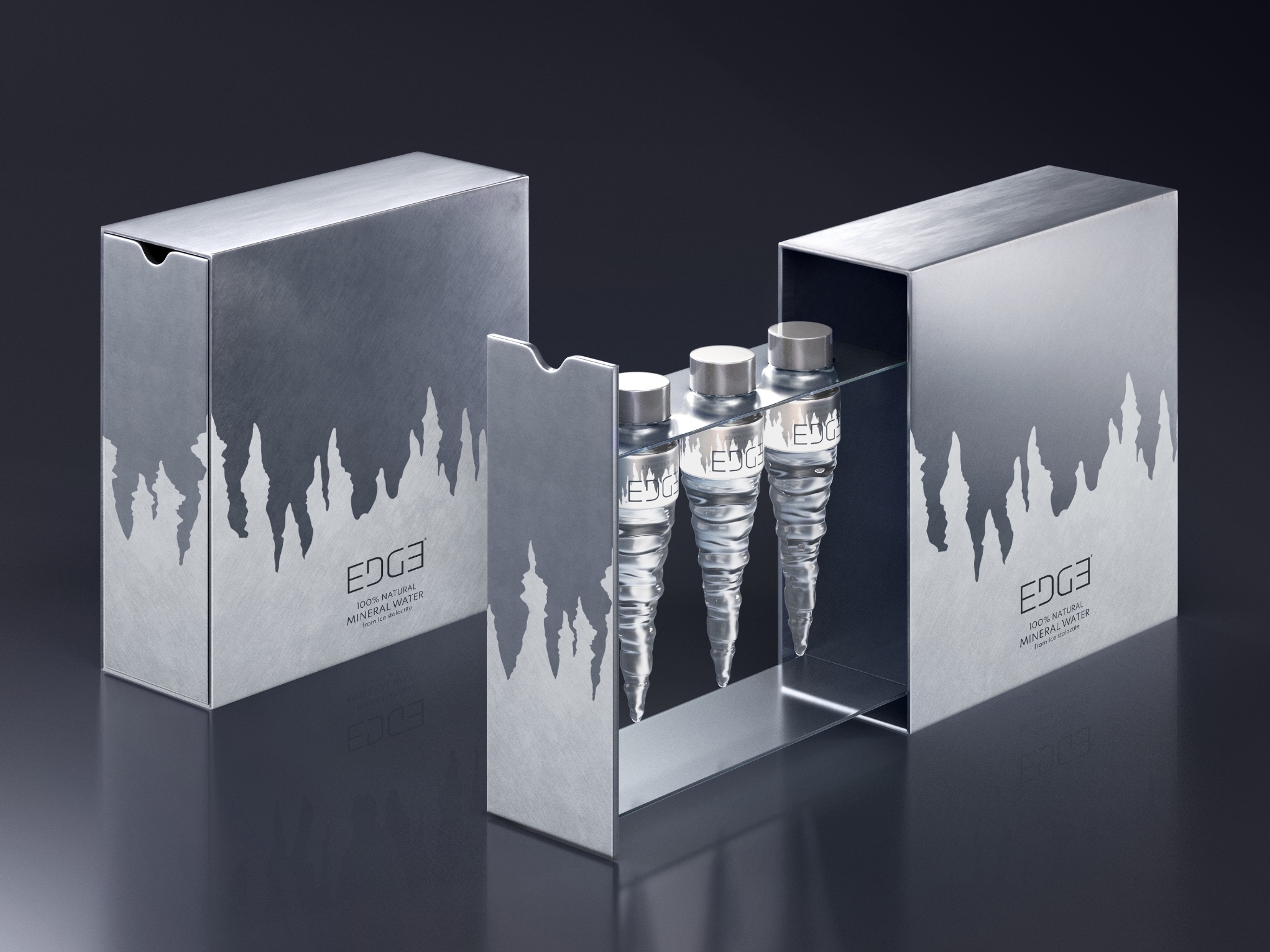
Beginning with the box, the first layer of the one-of-a-kind Edge Mineral Water is a two-tone grey box that depicts the brand-new mirrored logo that can be read and recognized instantly in any orientation. The minimalistic color scheme chosen as part of the box art is also reversible, as it depicts the stalactite and stalagmite formations found within the caves of Thailand.
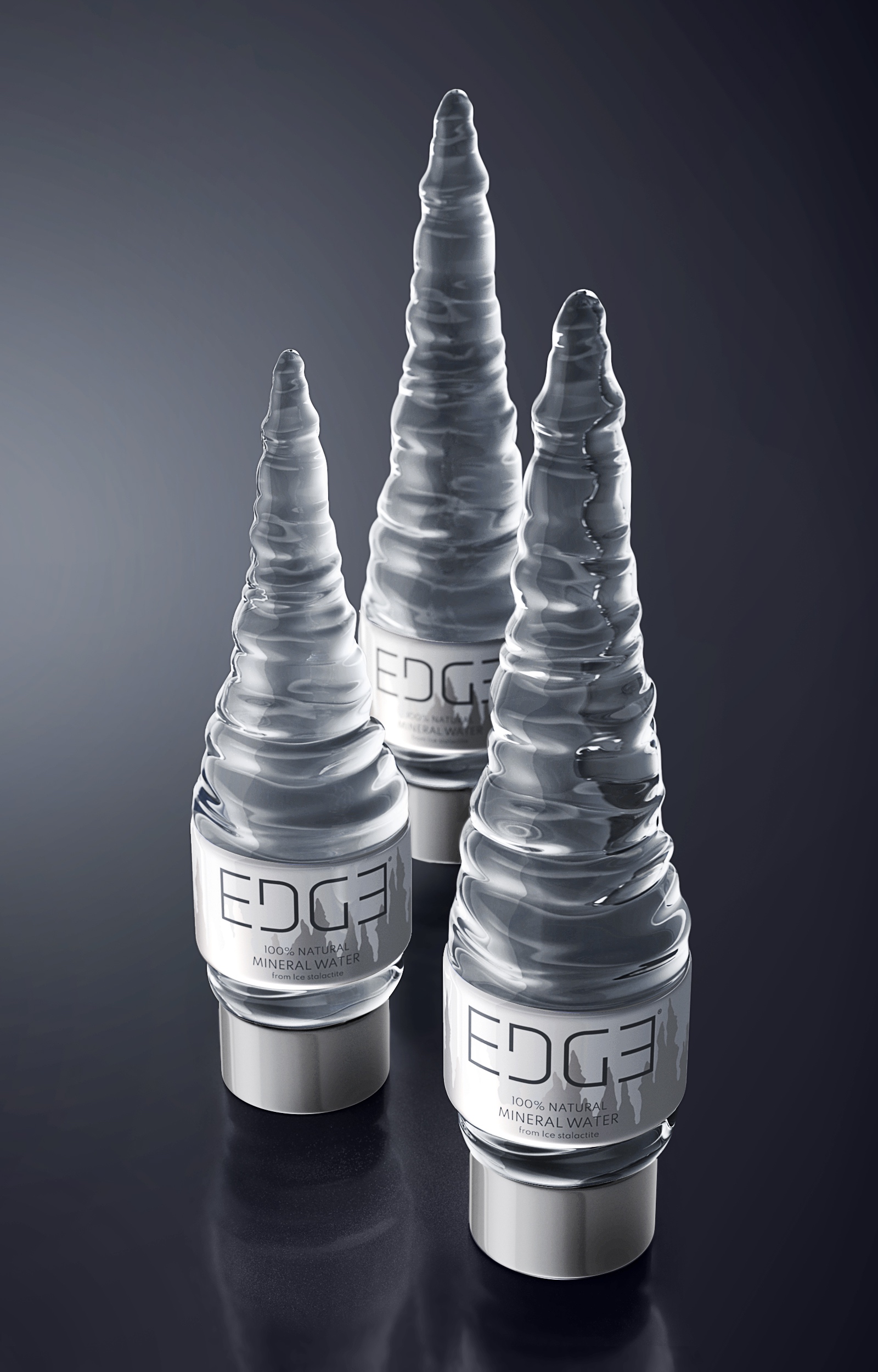
The magic starts to unveil itself once you slide the box open, revealing three bottles of crystal-clear mineral water suspended from an acrylic holder. The bottles take on an unusual but beautiful shape of the very same iconography of the stalactite and stalagmites. Complete with the same design theme as the exterior box and capped off with a unique silver bottle cap for a more premium look and feel.
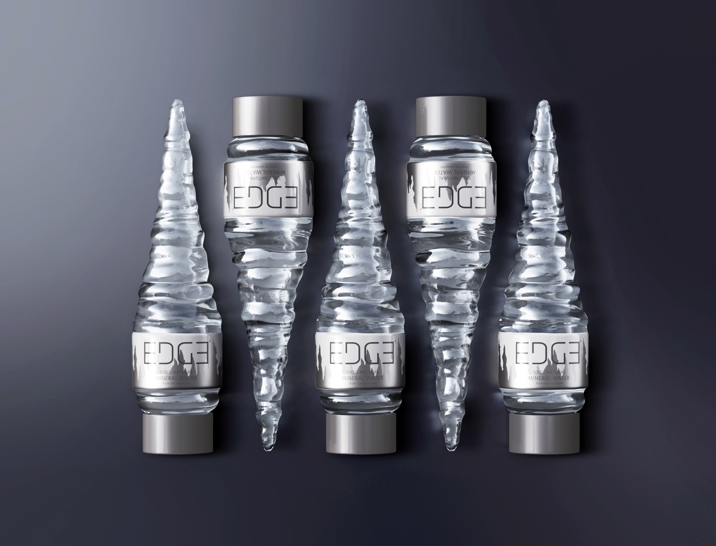
Similarly, upon closer examination, the bottles also a slightly different shape from each other and mimicking the randomness in rock formation that can be seen within the caves of Thailand. Just like the exterior box, when laid flat on the bottle cap upside down, the logo can still be read clearly as well as the two-tone cave formation graphic design.
Water is an incredibly vital resource and an important one for everyone to keep in check to regulate their bodily functions, but we mustn’t forget about the natural processes they go through.


CREDIT
- Agency/Creative: Prompt Design
- Article Title: Edge Mineral Water Packaging Design
- Organisation/Entity: Agency
- Project Type: Packaging
- Project Status: Published
- Agency/Creative Country: Thailand
- Agency/Creative City: Bangkok
- Market Region: Asia
- Project Deliverables: Packaging Design
- Format: Bottle
- Industry: Food/Beverage
- Keywords: WBDS Agency Design Awards 2023/24
- Keywords: Packaging Design: Product Creation
-
Credits:
Design Agency: Prompt Design


