


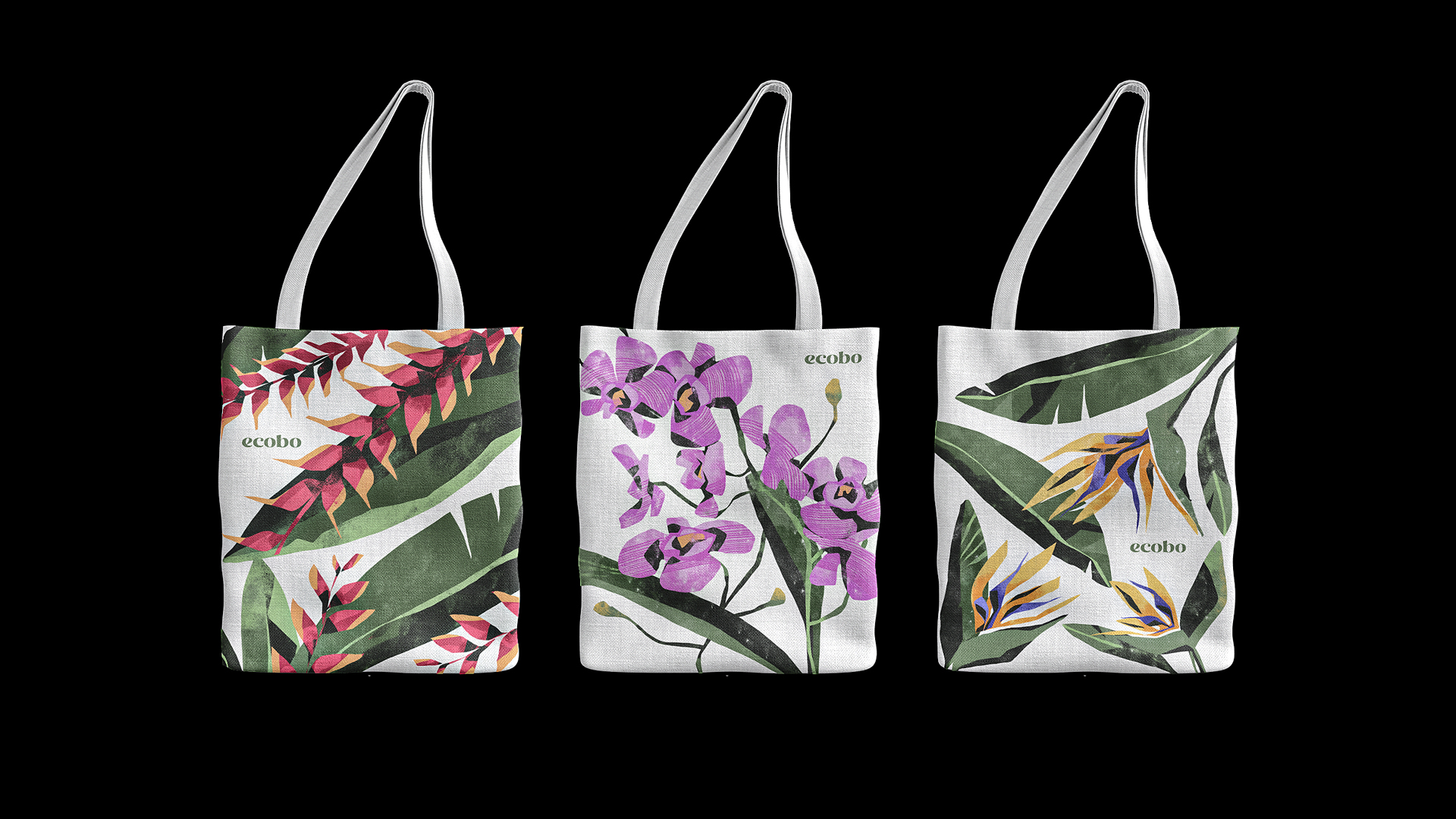
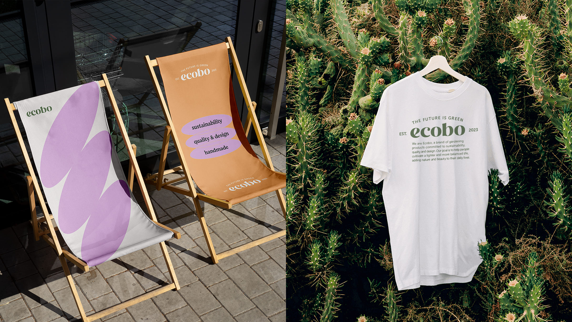
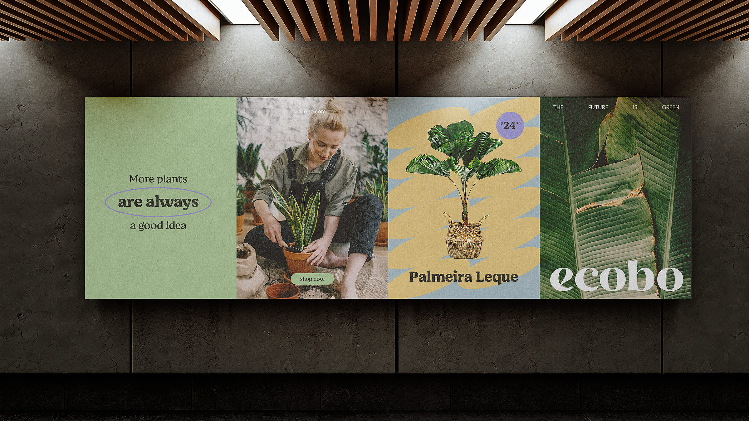
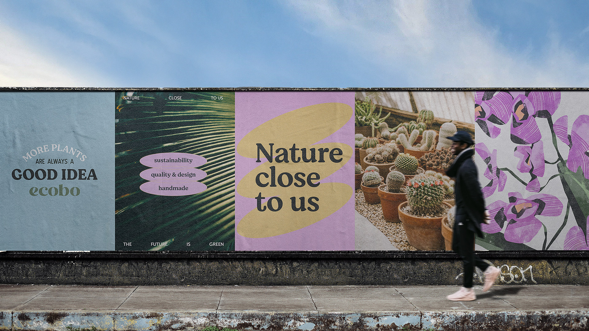
Ecobo is an American brand of gardening products that prioritizes sustainability, quality, and design. Their goal is to enhance people’s lives by bringing nature and beauty into their daily routines. Ecobo imports unique plant pot designs from Brazil, which inspired us to create tropical illustrations for the visual identity. These illustrations, along with a vibrant color scheme, aim to capture the essence of Brazil and showcase the brand’s commitment to eco-friendly gardening solutions.
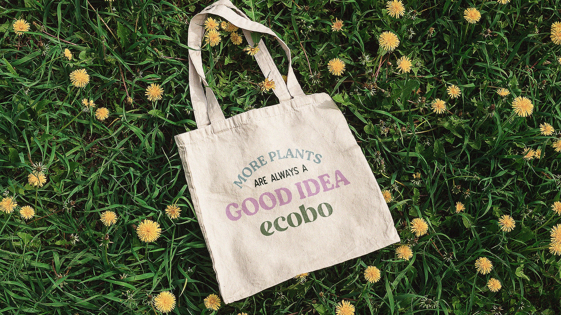
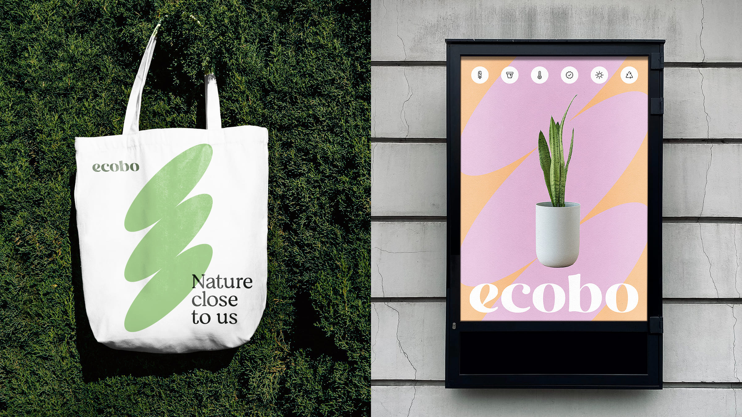
To convey an organic and natural appeal, we incorporated illustrations of leaves and flowers in Ecobo’s visual identity. By selecting tropical plants, we sought to highlight the brand’s Brazilian essence and the country’s rich flora. Through these visual elements, we established a strong connection between Ecobo and the beauty of nature, reinforcing its commitment to sustainability and providing eco-friendly gardening options.
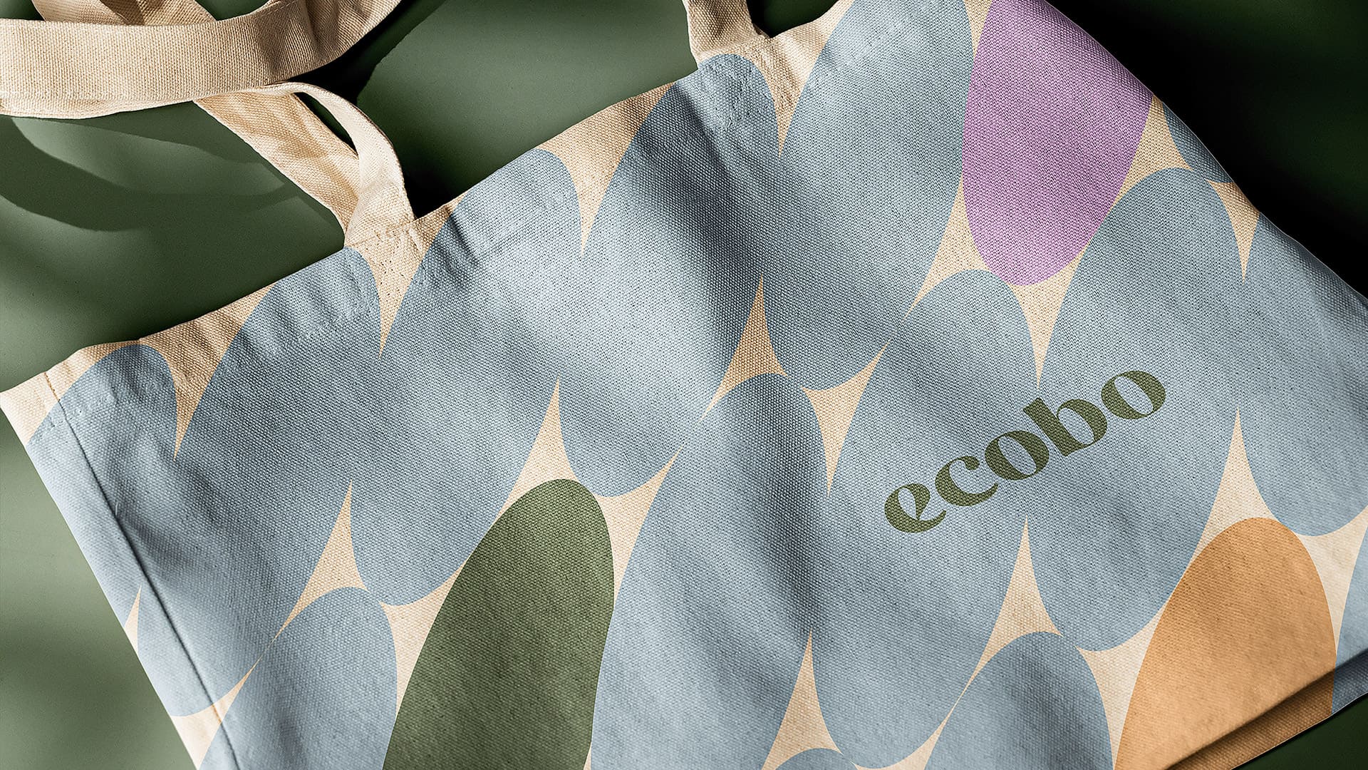
The visual assets created for Ecobo’s identity were inspired by the shape of a seed, featuring organic and rounded forms that reflect our deep connection to the environment. By incorporating these elements into the design, Ecobo communicates its dedication to eco-friendly practices and its mission to foster a greener future.
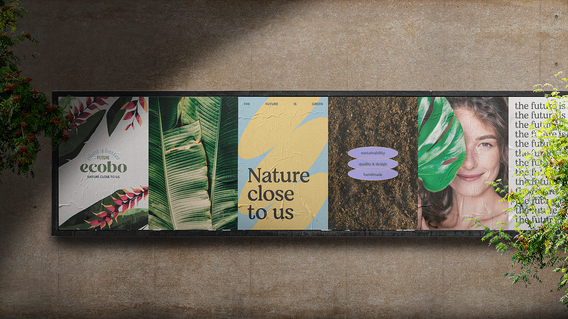
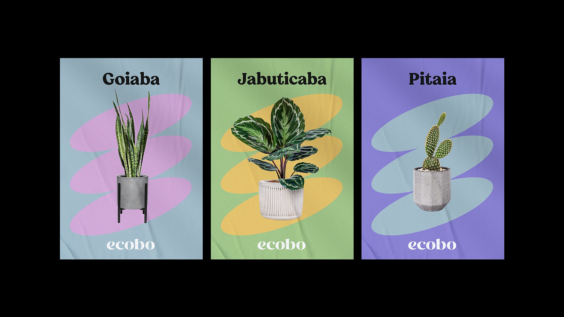
In developing the color palette for Ecobo’s visual identity, we aimed to capture the joy and visual richness of Brazil. However, considering the American market where the company’s garden products will be sold, we made slight adjustments to the colors, creating a more muted version. This decision allows us to maintain the essence of Brazil while ensuring familiarity and appeal to American consumers. The balanced color palette aims to create a visually captivating brand that resonates with both the Brazilian and American markets.
Overall, Ecobo’s visual identity is characterized by vibrant tropical illustrations, rounded organic forms inspired by seeds, and a carefully crafted color palette that combines the joy of Brazil with the preferences of the American market. This cohesive design approach adds a touch of natural elegance to Ecobo’s branding, embodying the brand’s commitment to sustainability and its mission to bring nature and beauty into people’s lives.
CREDIT
- Agency/Creative: Mirela Melo
- Article Title: Ecobo Gardening Products Visual Identity
- Organisation/Entity: In-House
- Project Type: Identity
- Project Status: Published
- Agency/Creative Country: Brazil
- Agency/Creative City: Mirela Melo / Cuiabá
- Market Region: North America
- Project Deliverables: Animation, Art Direction, Brand Creation, Brand Design, Brand Guidelines, Brand Identity, Copywriting, Design, Graphic Design, Identity System, Illustration, Logo Design
- Industry: Retail
- Keywords: #design #graphicdesigner illustration #sustainability #designer #logodesign #brazil #brand #art #visualidentity #brazilian #organic #nature #botanical #colorful #rounded
-
Credits:
Graphic Designer: Mirela Melo
Illustrator: Thiago Limón
Motion Designer: Jorge Amorim
Copywriter: Ásbel Torres


