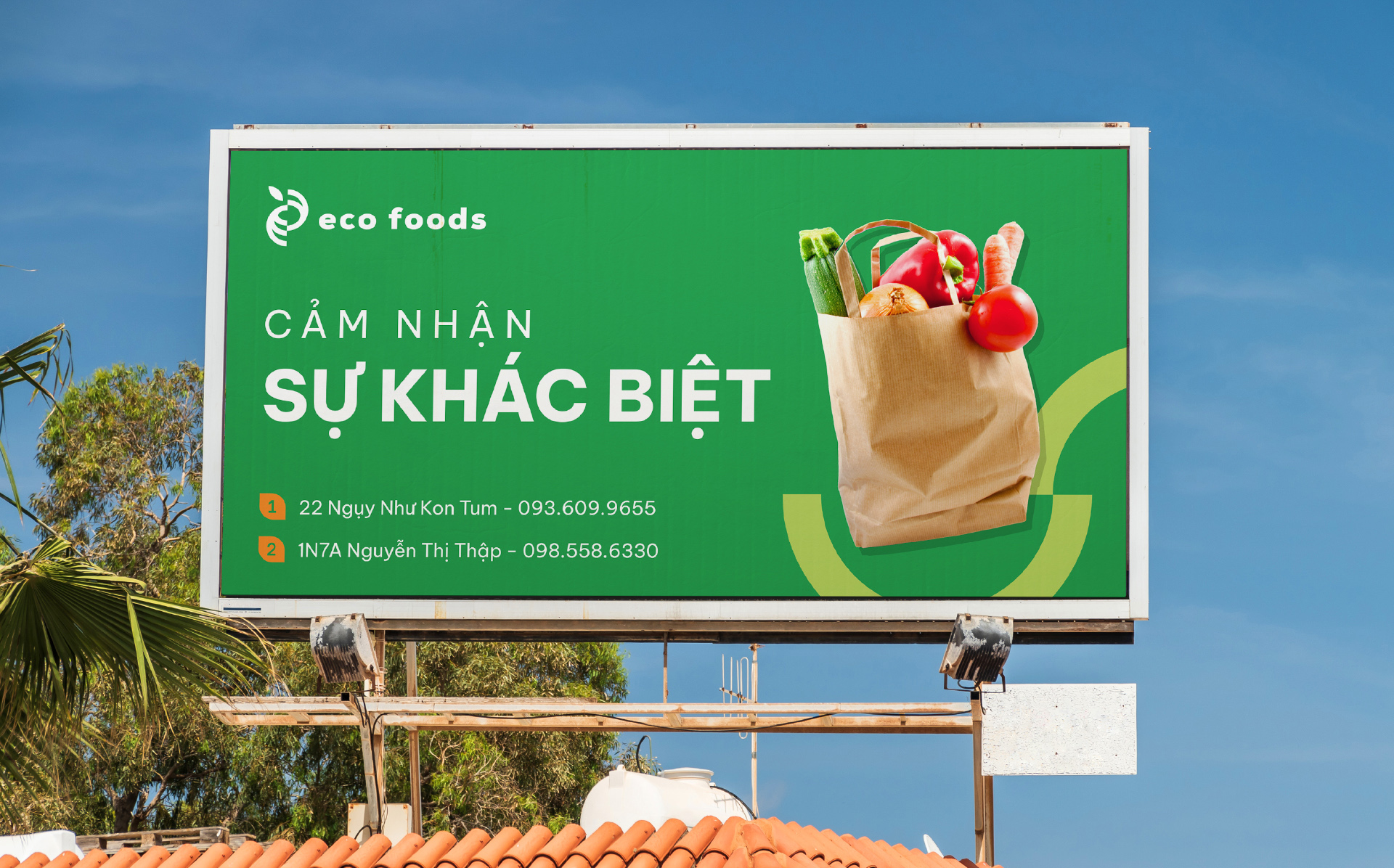
Eco Foods has grown as a top retail brand since 2014 that provides high-quality agricultural products based on carefully researched criteria, with an affirmation of “feel the difference”. Their customers are people with conditions, fastidious, strict or sick, and need food support.
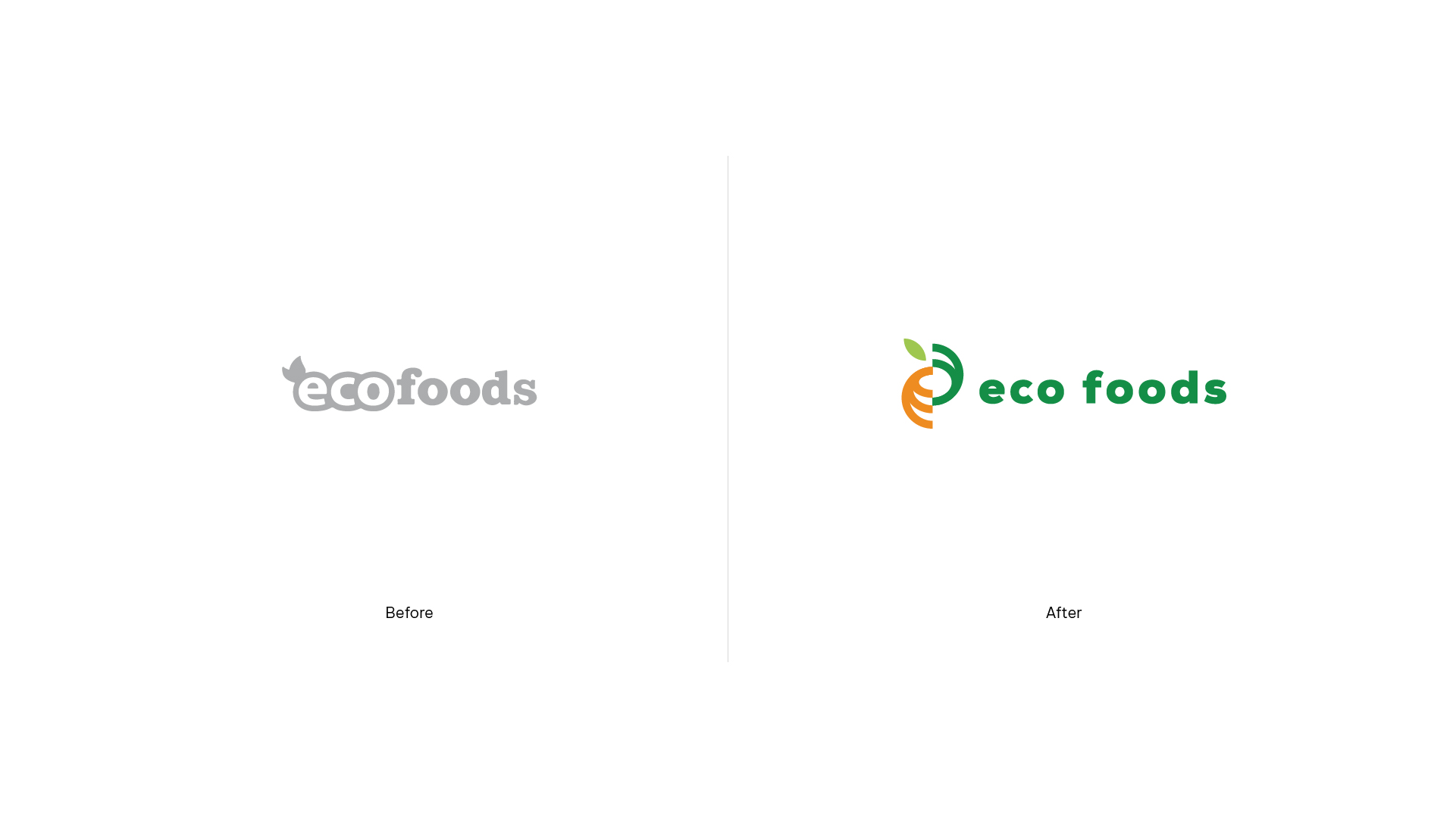
After seven years in the market, Eco Foods approached us to redefine and improve its brand equity. Their previous images don’t have a clear visual system and lack a good user experience, especially since there are very few eco-connections to the name itself. Our challenge was to bring a new identity refreshment that matches their cores and products.
“Feel the difference” is the brand proposition since the beginning. After proposing several ideas, we’ve decided to build a simple, yet flexible brand identity upon this foundation.
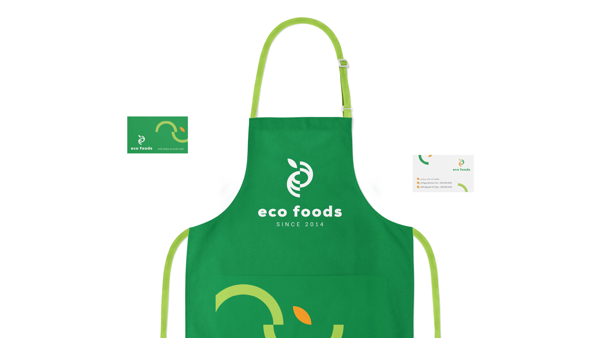
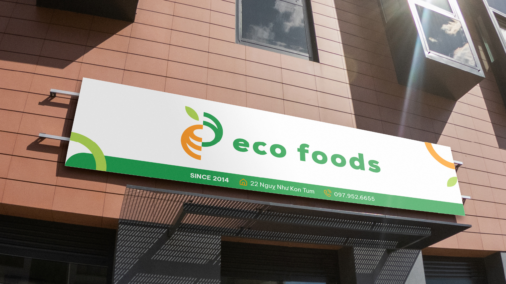
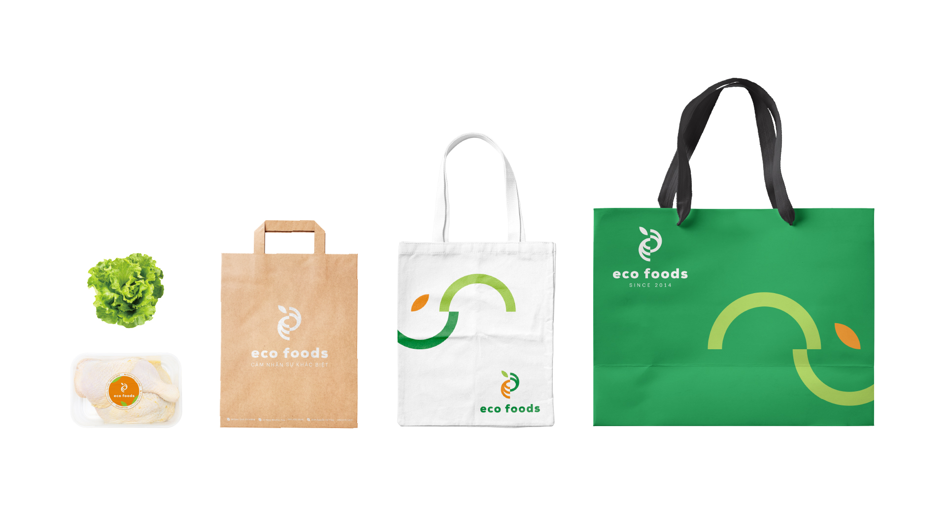
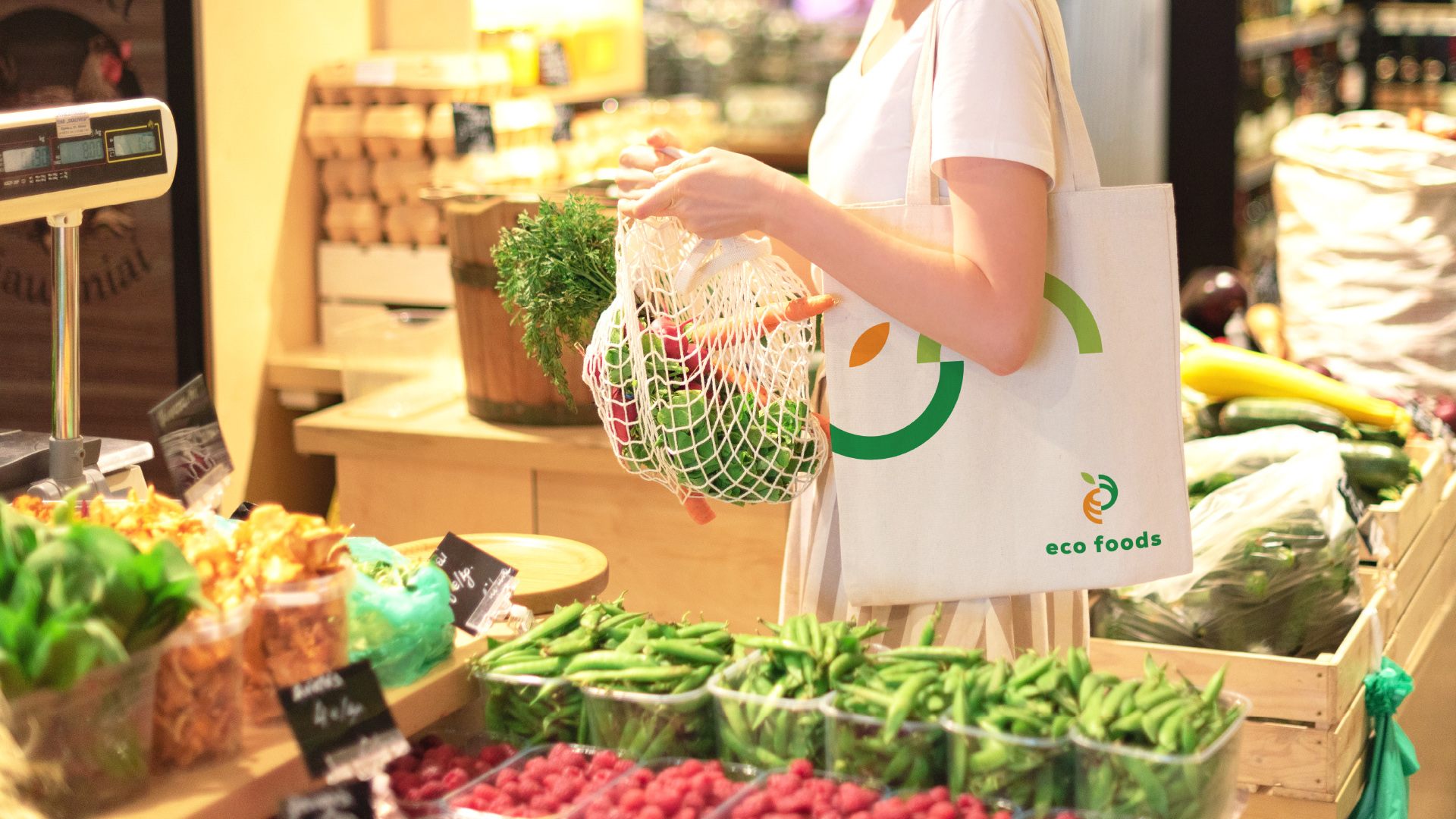
The logomark was designed from the initials E and F from the brand name. By slicing them in half with an addition of a leaf, we want to tell the brand’s “inner” process of researching and providing fresh, high-quality products. The strokes of the letters are knit together, inspired by the shopping basket and eco-friendly material.
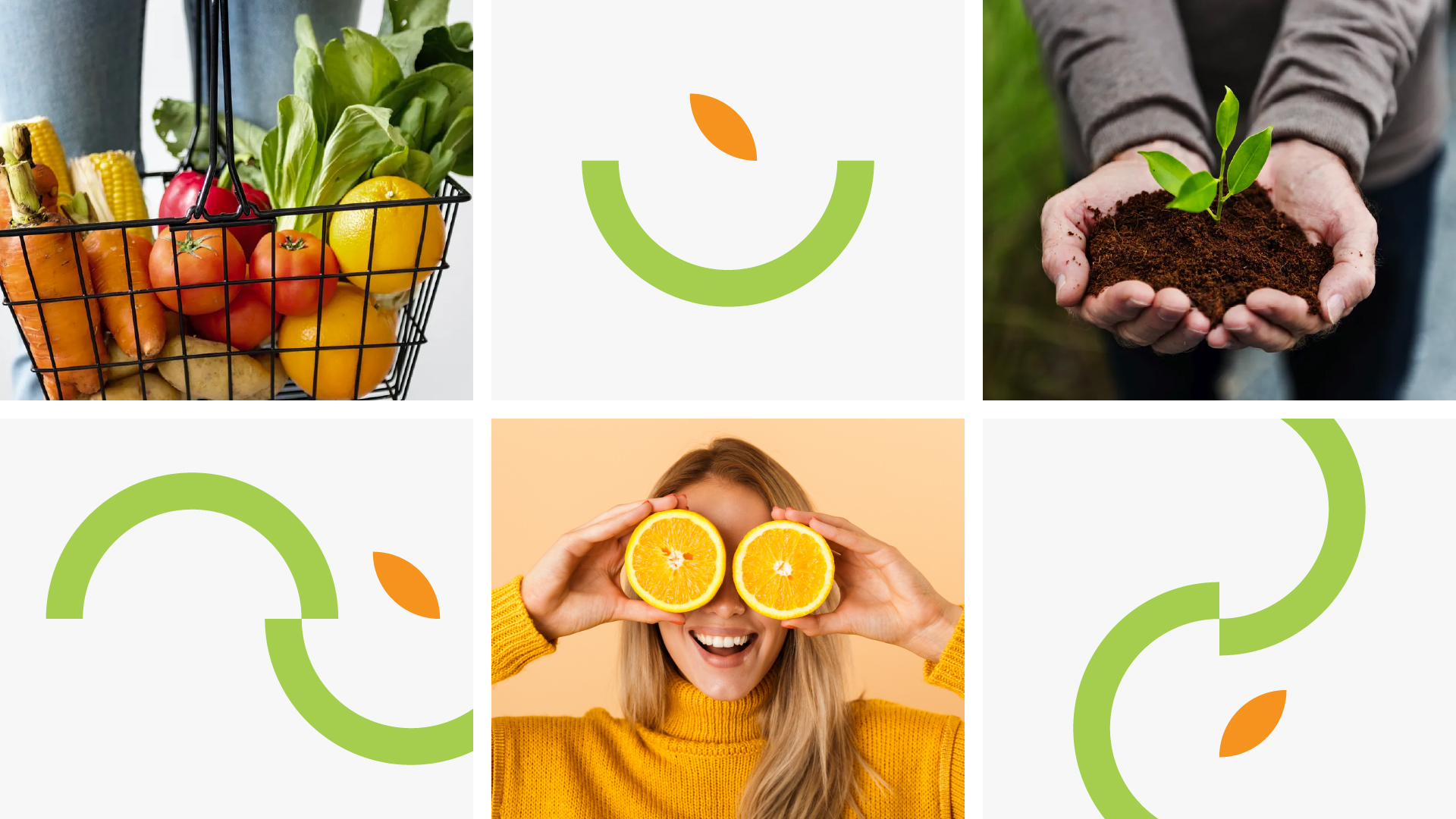
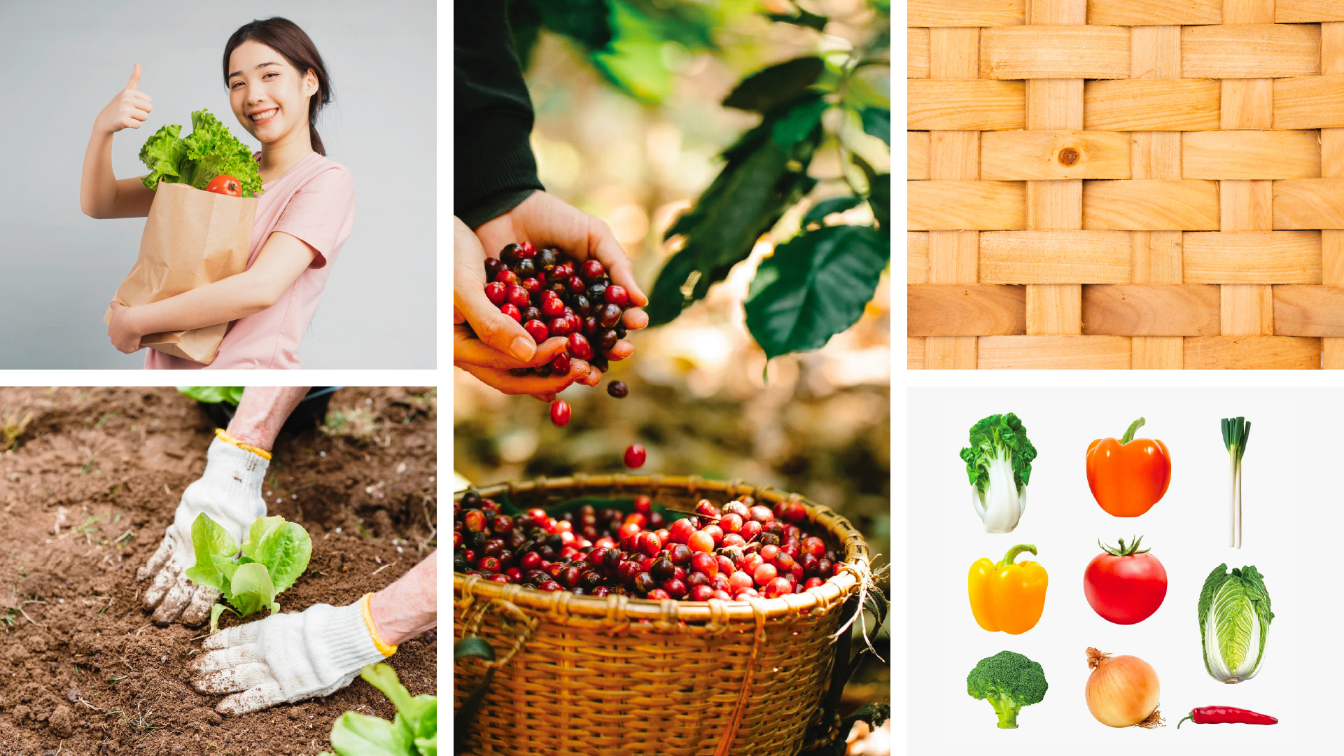
We developed the key visual based on the mark’s strokes and connection. It was built as a storyteller, with hidden meaning that Eco Foods provides. This identity can be a basket, a growth sprout, or an element that supports and brings joy to customers. We combine high-contrast images inside the “basket”, to showcase the quality of the products for the customers to directly “feel the difference”.
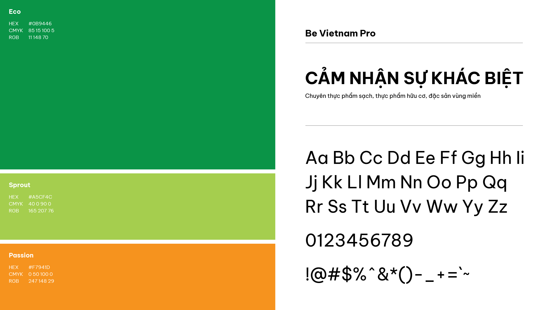
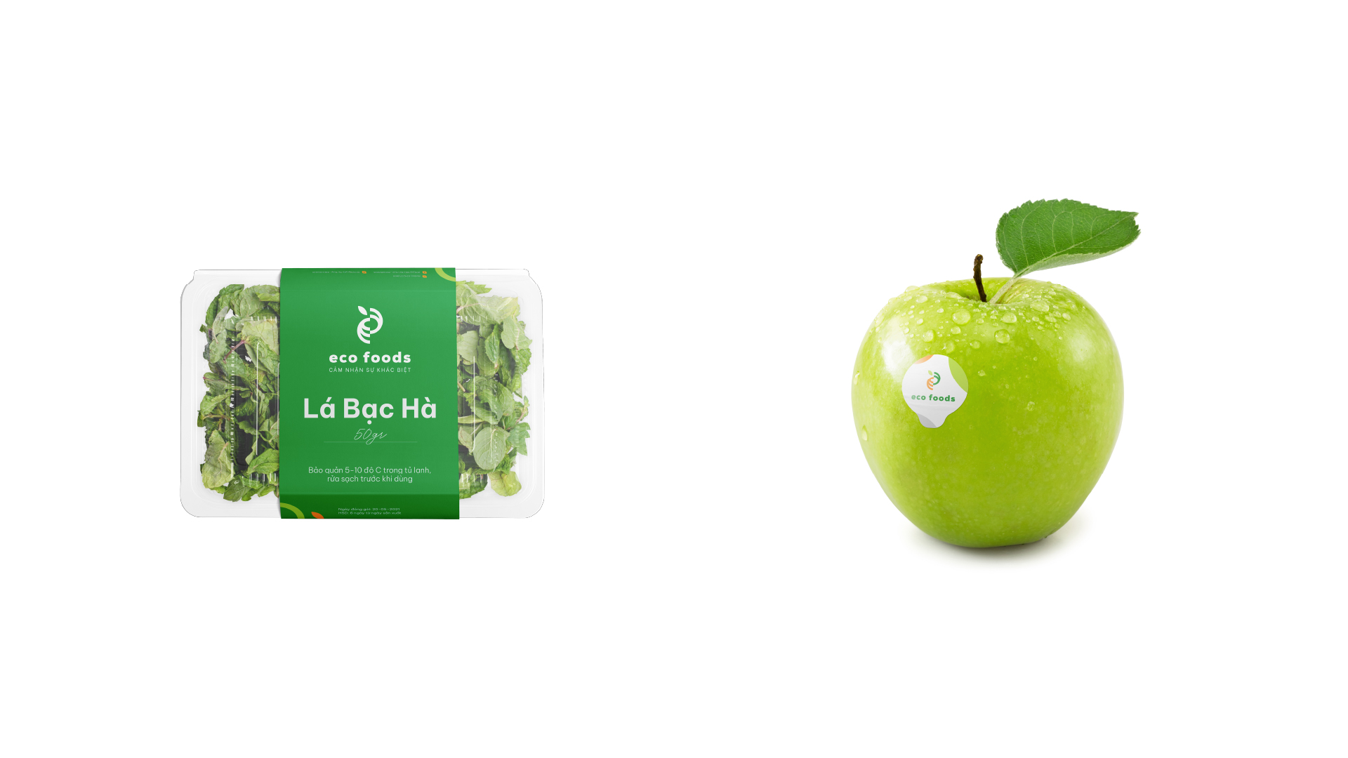
We improved the previous color’s shades to make a new eco-friendly green. The orange color was embellished to play as a supporting mood as we want to bring more happiness and smiles to the user experience. Typography needs to be clean and clear, to transfer the content and information directly. Be Vietnam Pro was chosen as the brand’s typeface because of the modern feelings and readability of Vietnamese languages, with flexible applications between print and digital.
With a new flexible identity, Eco Foods has revived younger and is ready to embark on a new journey.
CREDIT
- Agency/Creative: Duong Tran
- Article Title: Eco Foods Rebranding
- Organisation/Entity: Freelance
- Project Type: Identity
- Project Status: Published
- Agency/Creative Country: Vietnam
- Agency/Creative City: Hanoi
- Market Region: Asia
- Project Deliverables: Brand Identity, Graphic Design, Logo Design
- Industry: Retail
- Keywords: Grocery store; Eco Foods; Retail
-
Credits:
Art Director: Mai Phuong Ngan


