ECE is an educational project specializing in IELTS preparation training. Developed from a traditional teaching model called “Mrs. Nuong Class,” ECE was officially established when it was widely known to meet the needs and quality of students in need of training.
Challenges
With the scale of ECE’s replication, Tree Creative must create a comprehensive, professional identity while expressing the brand’s message “Always towards people.”
Solutions
By changing the brand’s primary colors, Tree Creative has built a completely different identity for ECE, starting with its most prominent feature.
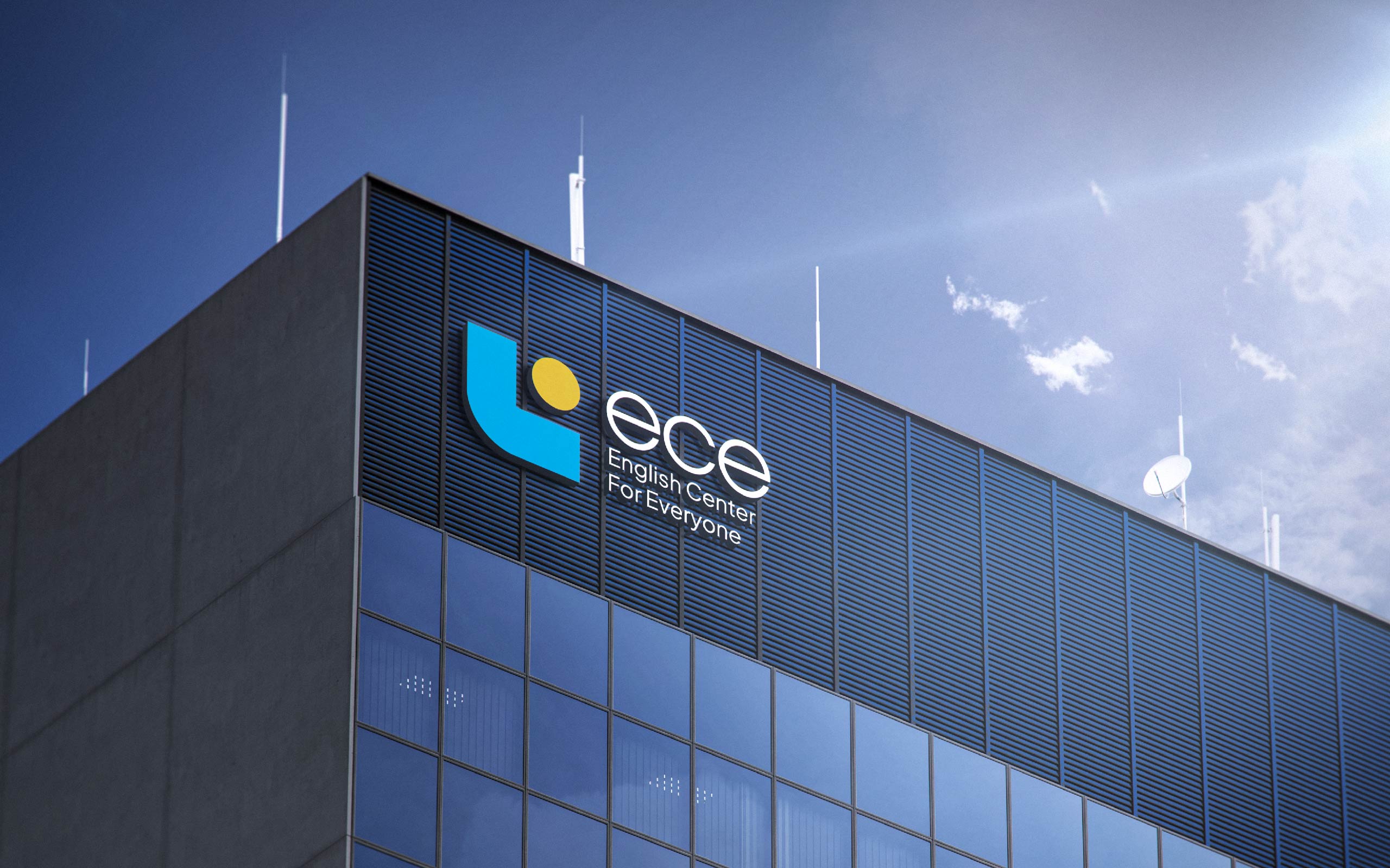
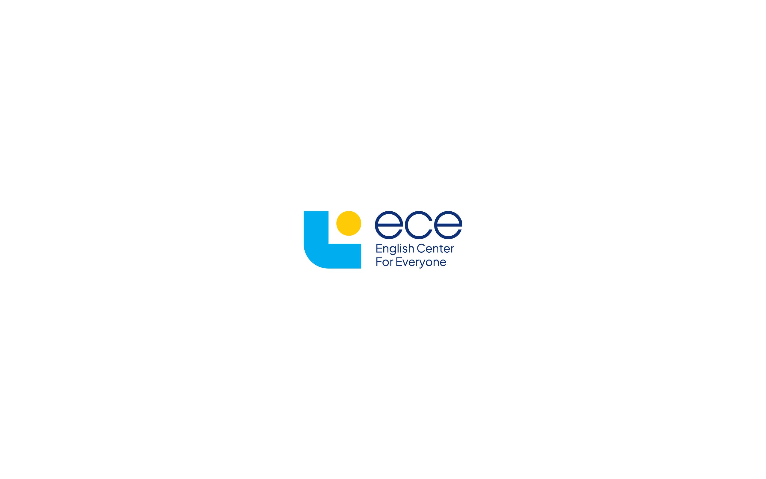
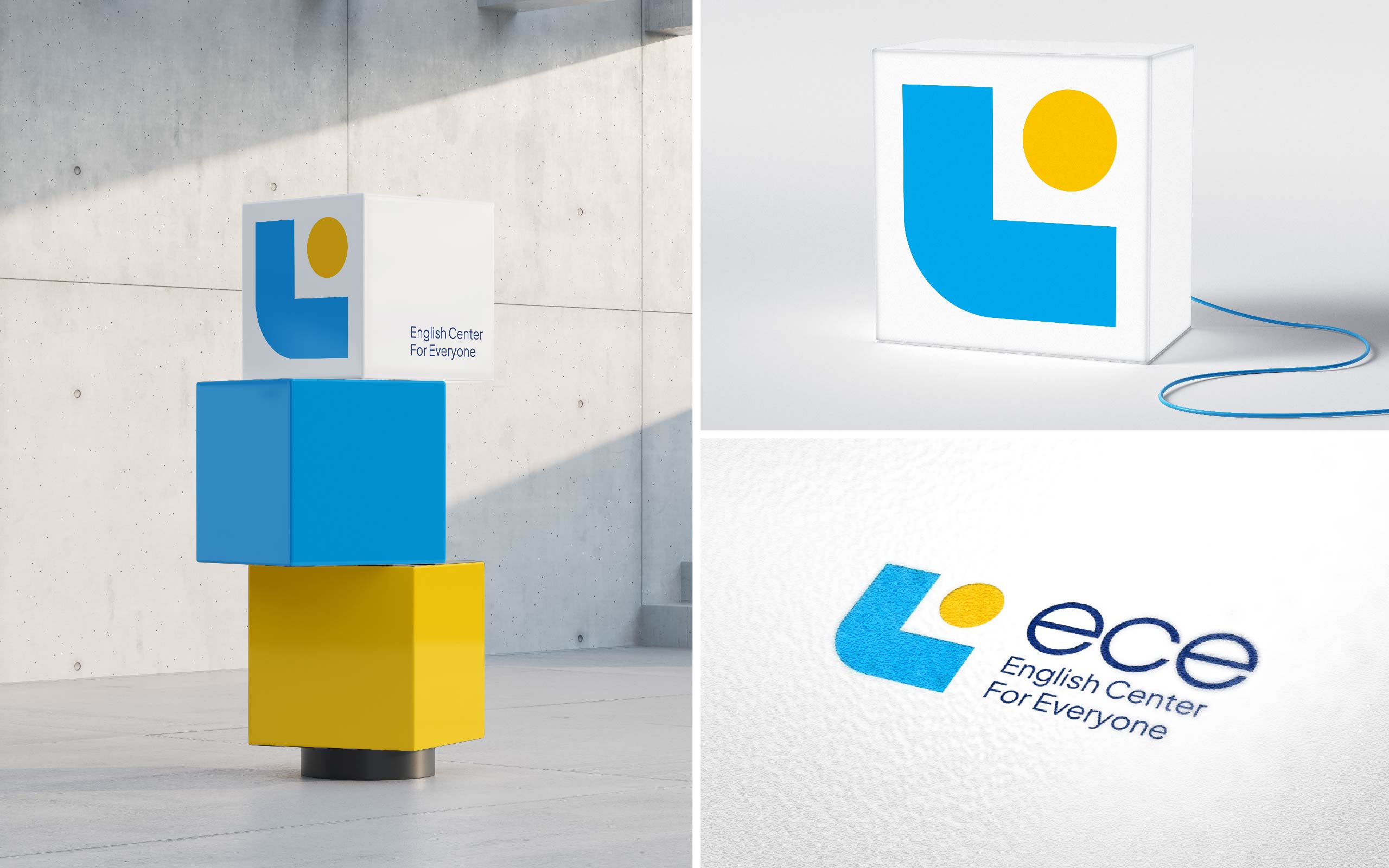
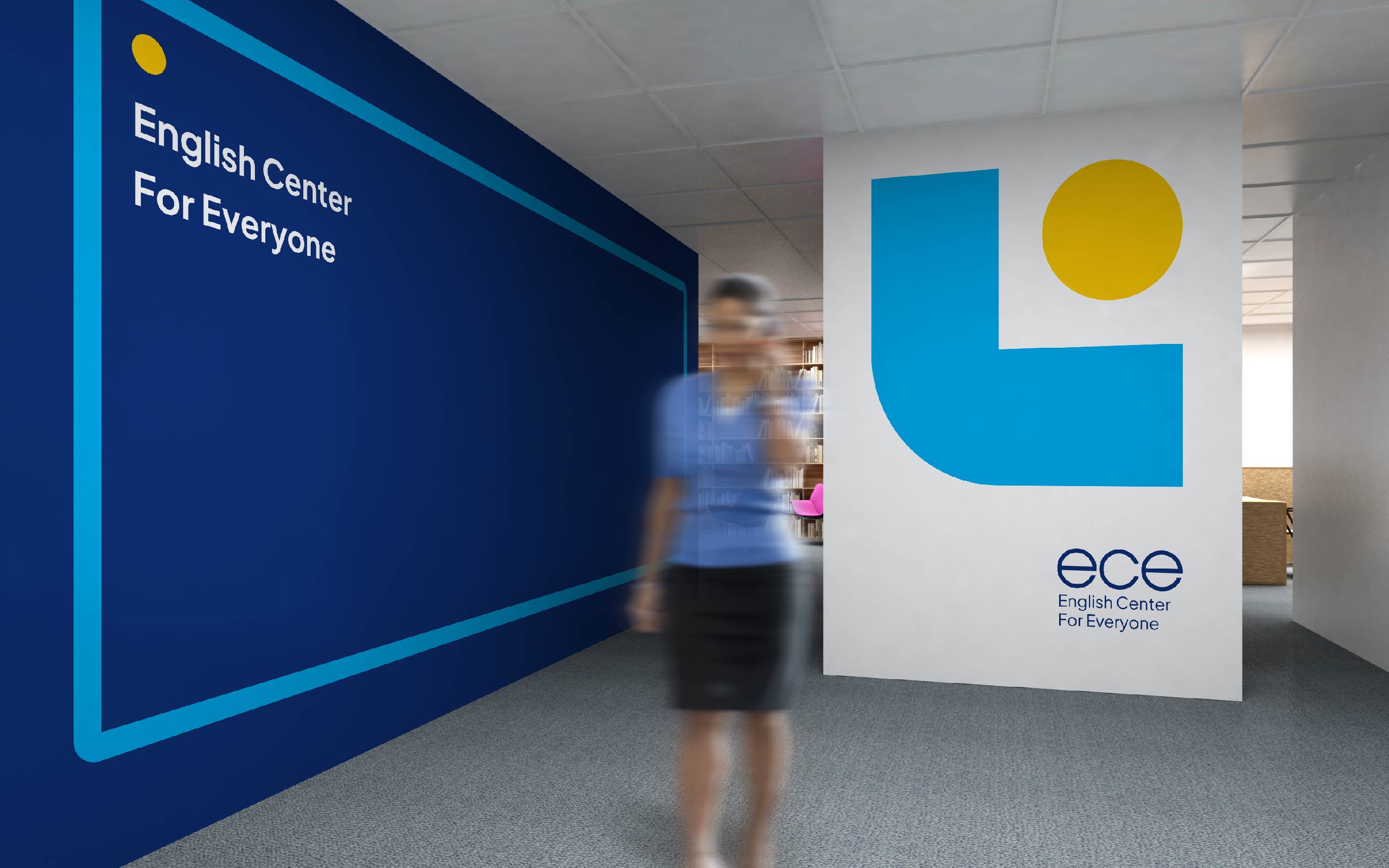
The image of “People” is made from a combination of circles and squares to represent the brand’s message. “Always towards people,” especially on the journey of conquering a language, ECE will always accompany its customers.
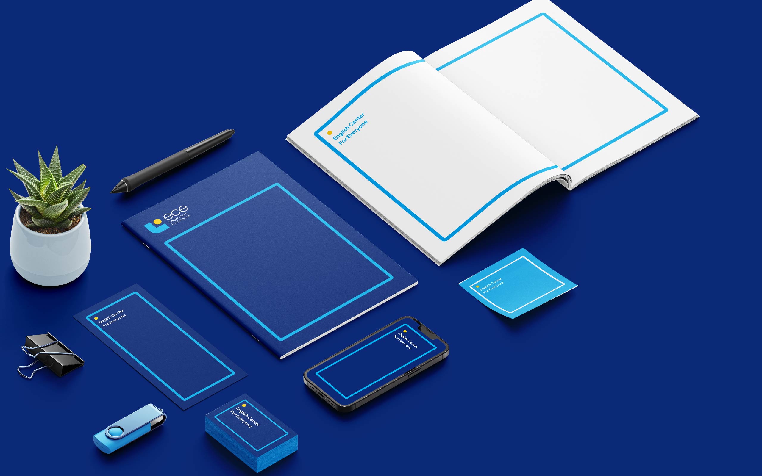
Powerful visuals are developed from the “honor frame,” creating a distinctive identity for the brand. At ECE, teachers always honor the unique abilities of each student.
Tree Creative took inspiration from the image of the ocean and sky, choosing a combination of light blue, dark blue, and yellow tones that are perfect to represent knowledge, greatness, and success, creating a sense of peace of mind for the viewer.
The logotype is designed to be soft and rounded while strongly contrasting with the icon to increase brand recognition.
Results
ECE has developed a professional identity that fits with the ongoing brand expansion while also meeting the approval of previous students.




CREDIT
- Agency/Creative: Tree Creative Agency
- Article Title: ECE Brand Identity By Tree Creative
- Organisation/Entity: Agency
- Project Type: Identity
- Project Status: Published
- Agency/Creative Country: Vietnam
- Agency/Creative City: Hanoi
- Market Region: Asia
- Project Deliverables: 2D Design, Brand Design, Brand Identity, Logo Design
- Industry: Education
- Keywords: Education, English Center, Class
-
Credits:
Agency: Tree Creative


