


WeWantMore – Rebranding Adriaen Brouwer
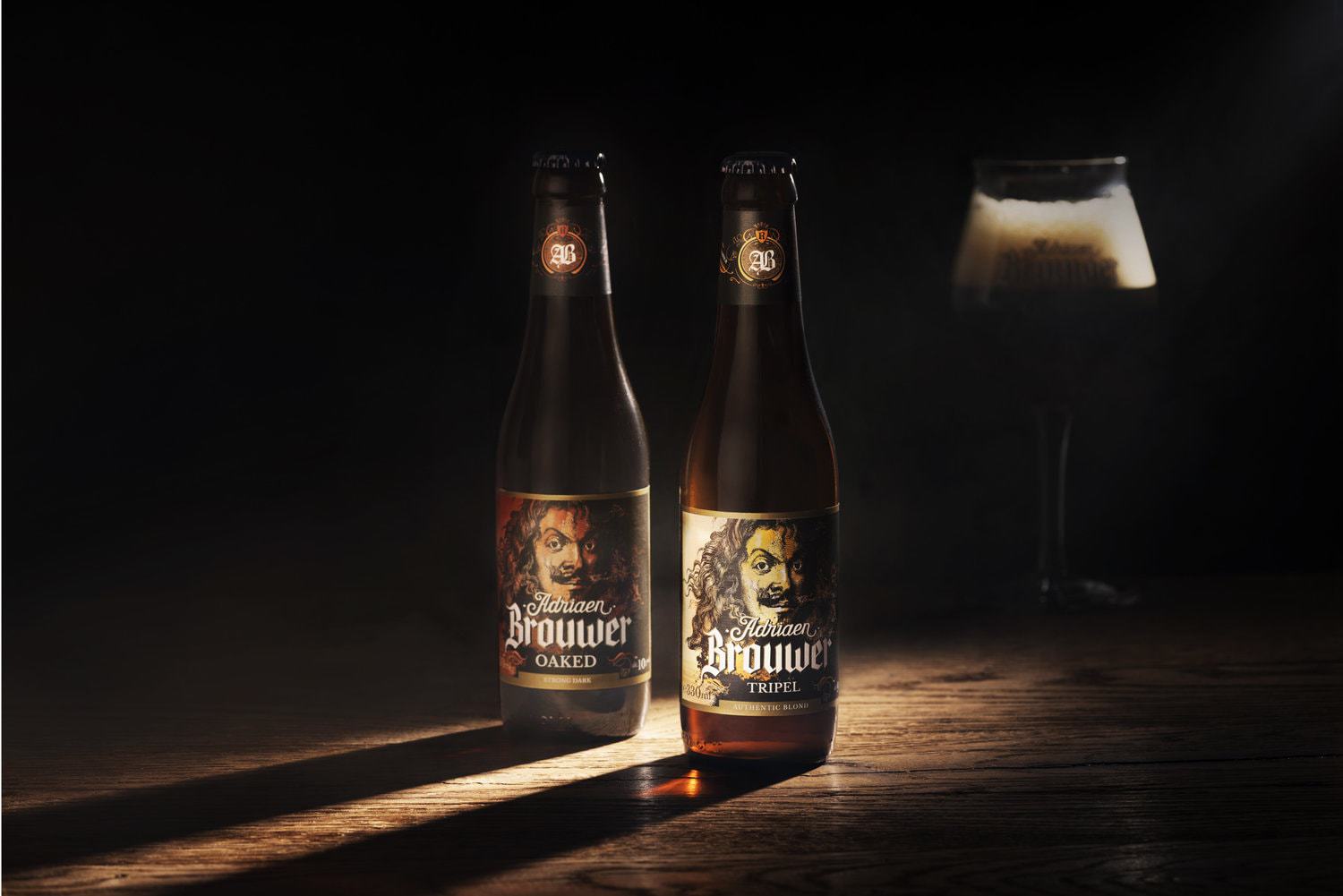
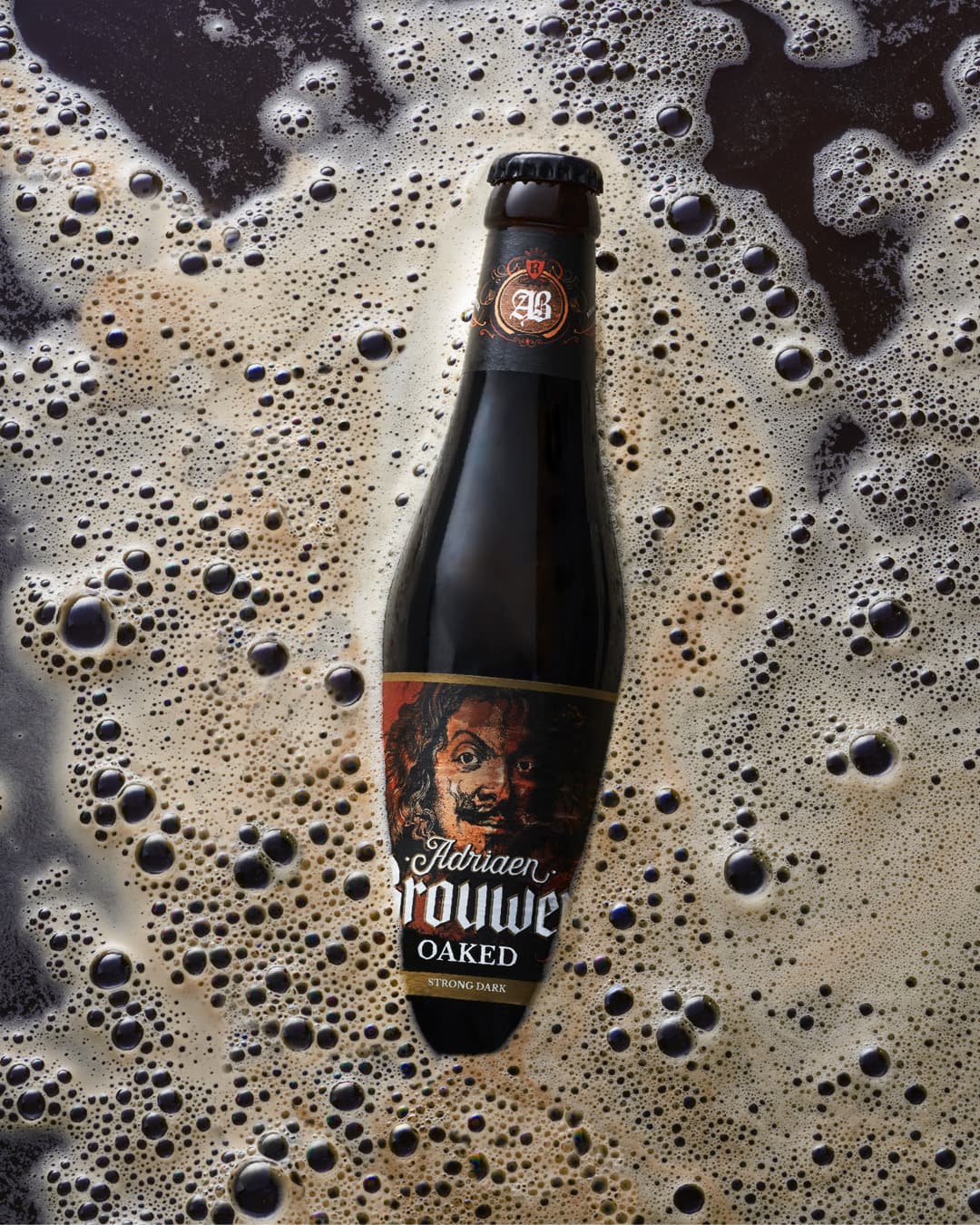
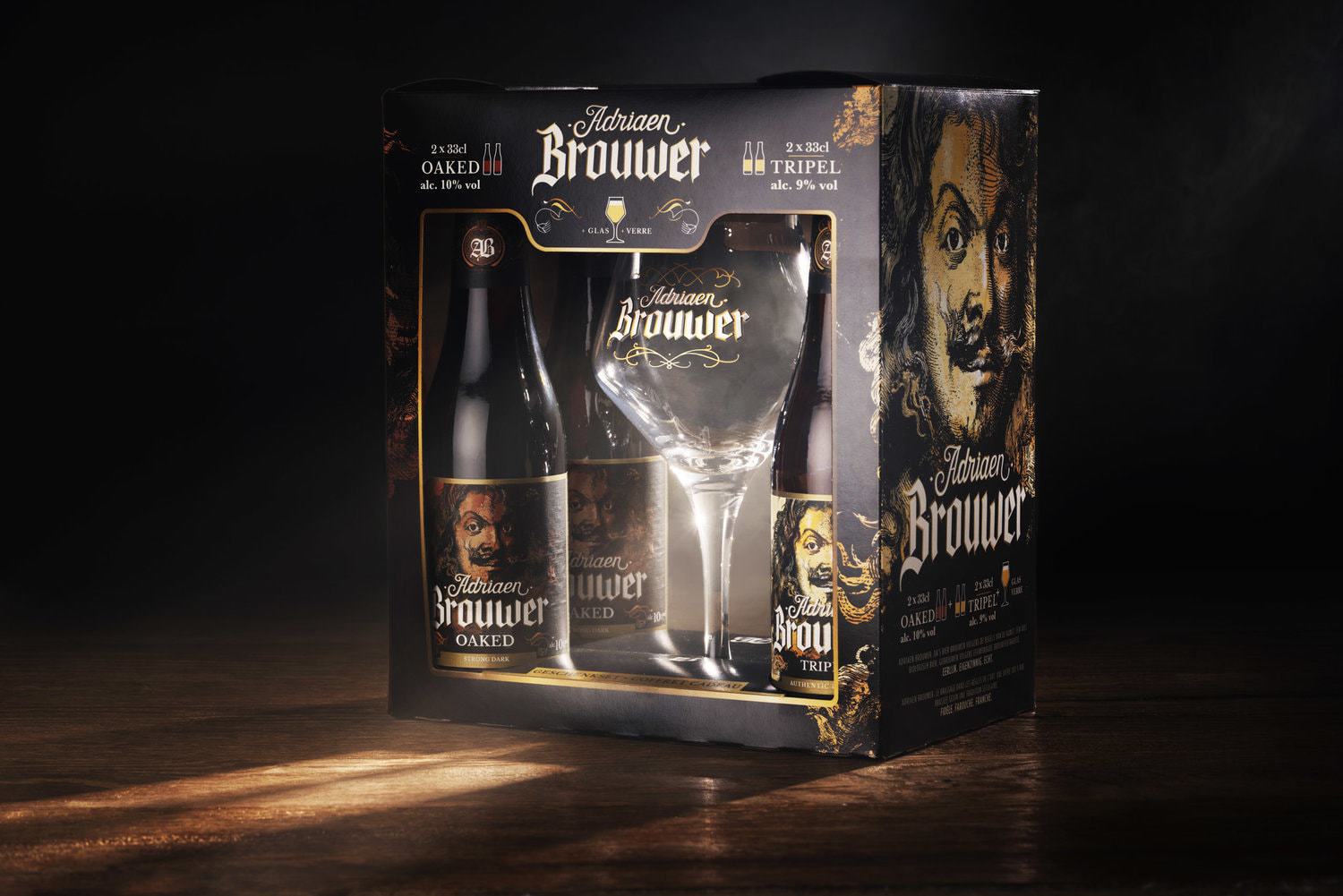
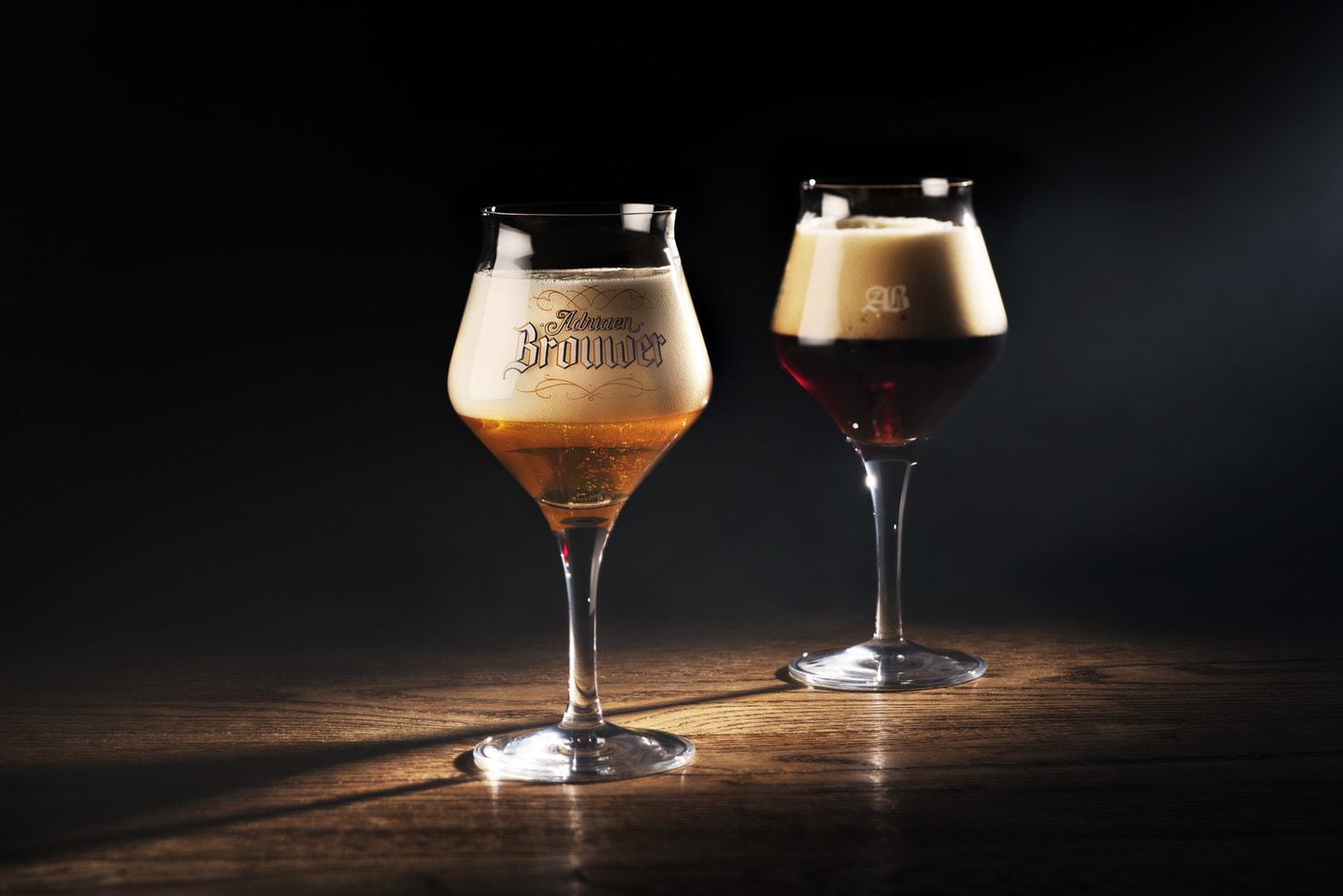
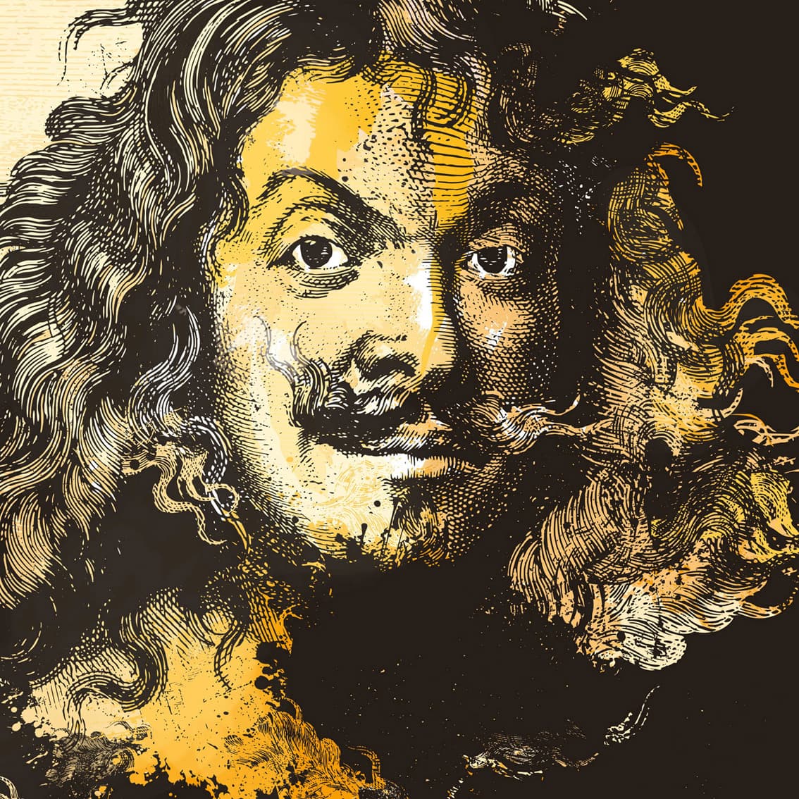
The rebranding of Adriaen Brouwer, an organic Belgian beer, was all about redefining what set the beer apart. The answer lied within the initial inspiration for the beer: Adriaen Brouwer himself. The Flemish painter’s work stood out during the Baroque Era because of his ability to capture raw emotions in trivial, but in-the-moment scenes in bars and pubs where people were smoking, fighting, drinking, … Capturing the ferocity and expressiveness that characterizes Brouwer’s work & personality, served as the main inspiration for the rebranding of the product. To reinforce the entire story even more, the final design also contains elements dating back to the middle ages like blackletters and heraldic decorative elements. An undeniable reference to the historic roots of the Flemish painter.
CREDIT
- Agency/Creative: WeWantMore
- Article Title: Ebranding and Packaging Design for Belgian Beer Adriaen Brouwer
- Organisation/Entity: Agency, Published Commercial Design
- Project Type: Packaging
- Agency/Creative Country: Belgium
- Market Region: Europe
- Format: Bottle, Box
- Substrate: Glass, Pulp Carton


