Making Sense Studio – APES & HUMANS
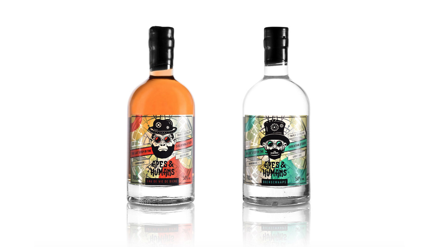
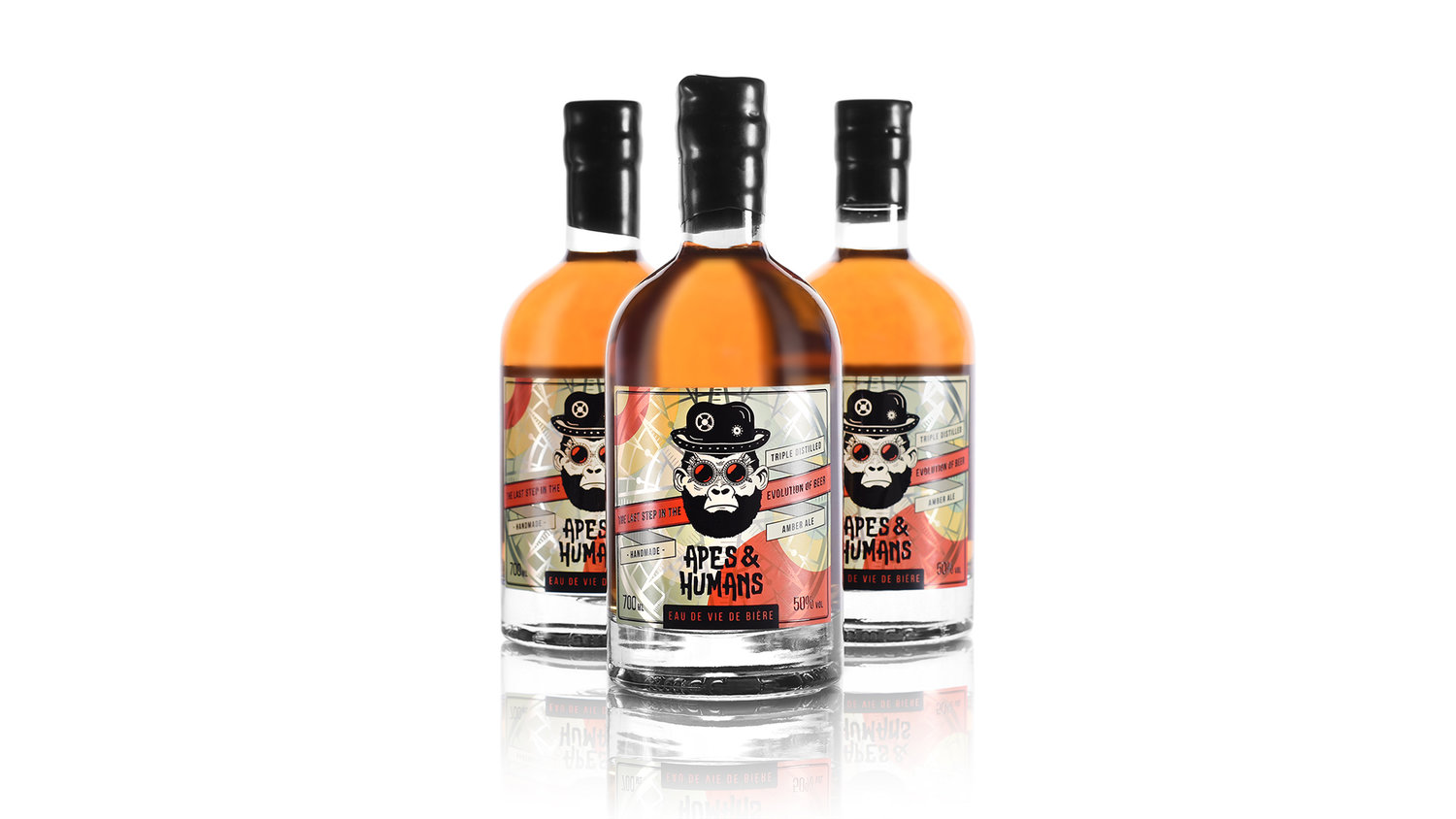
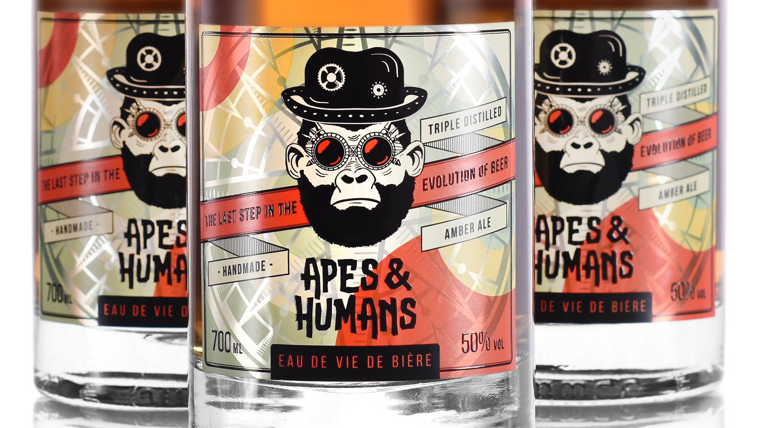
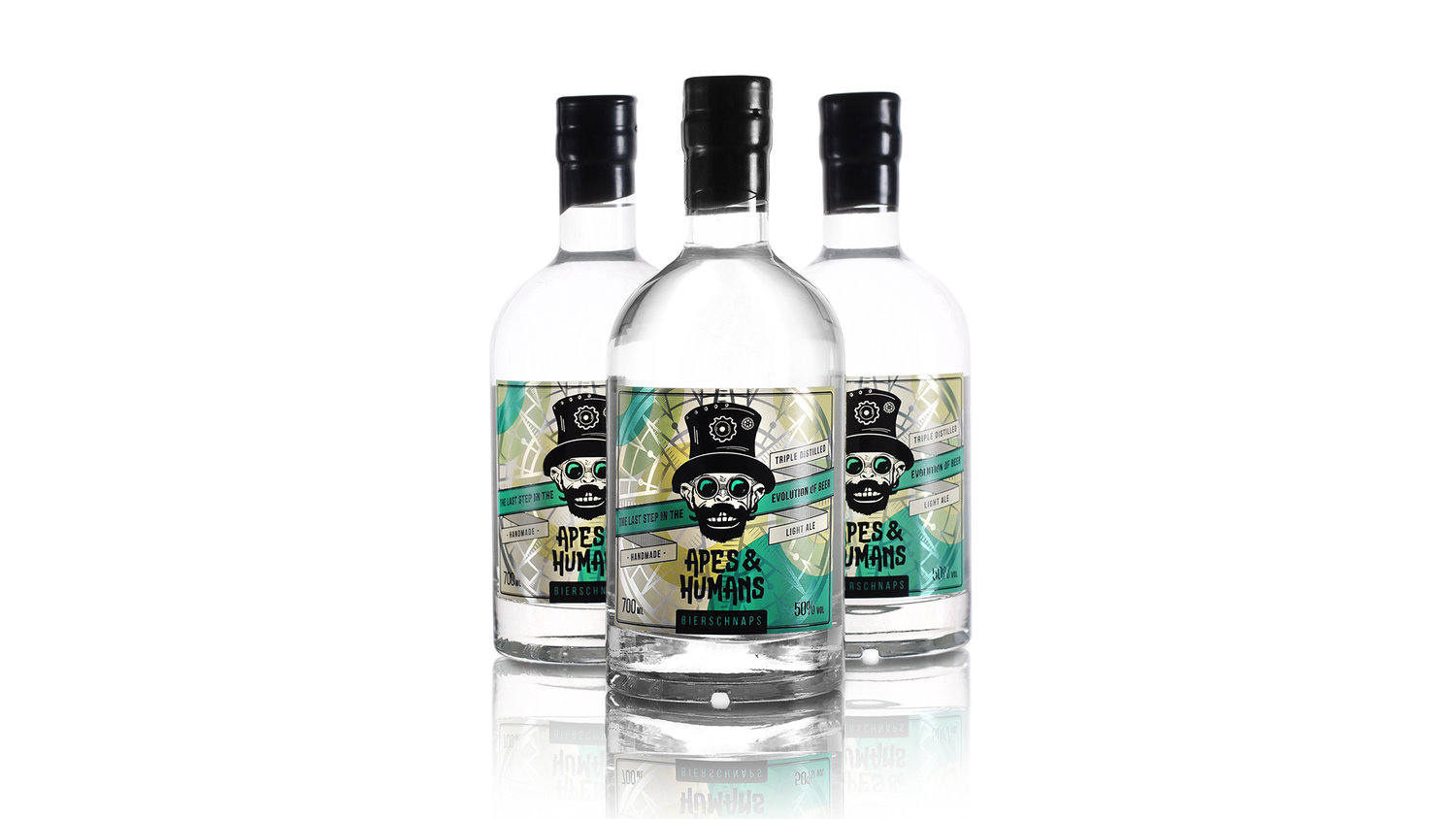
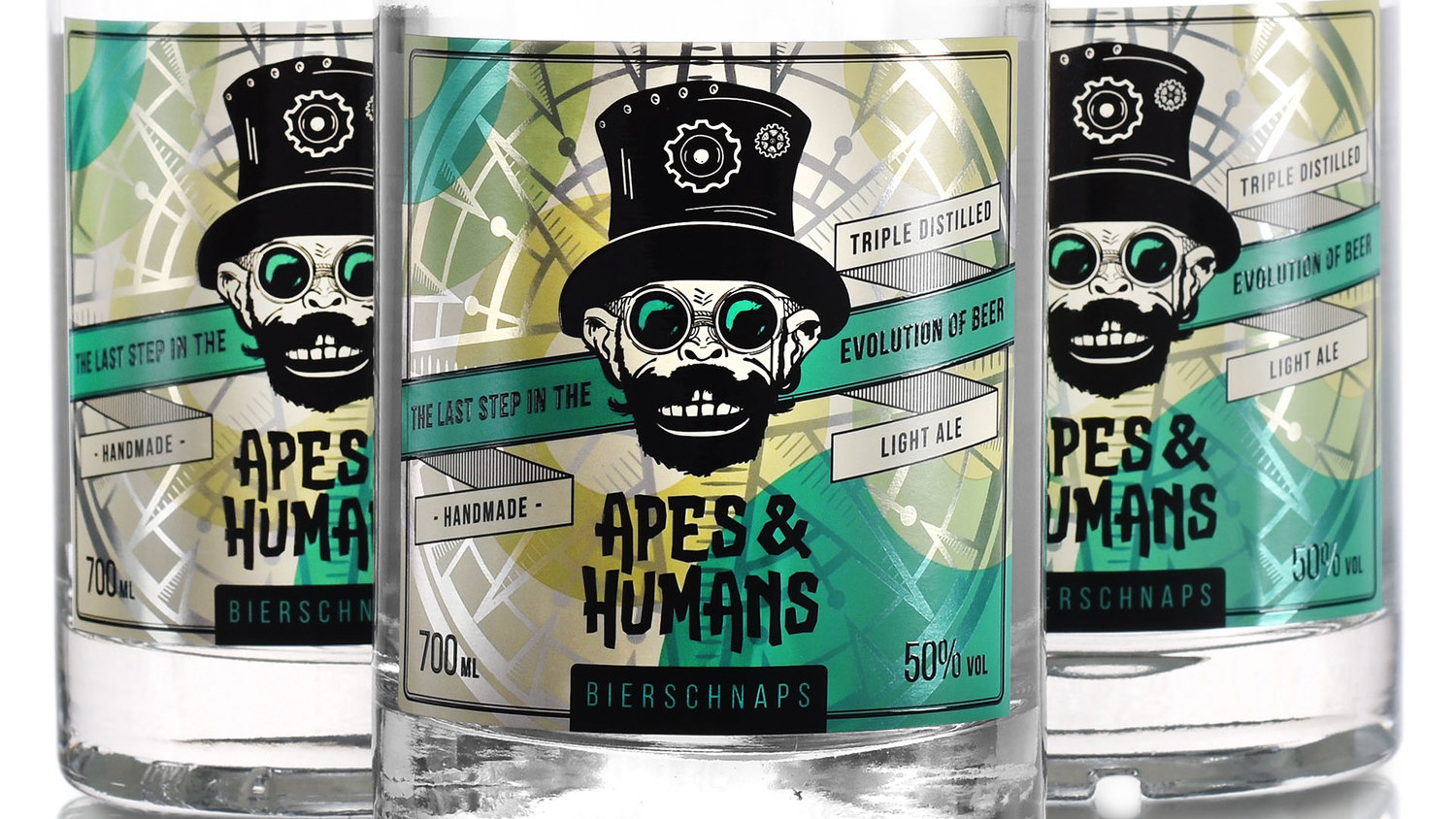
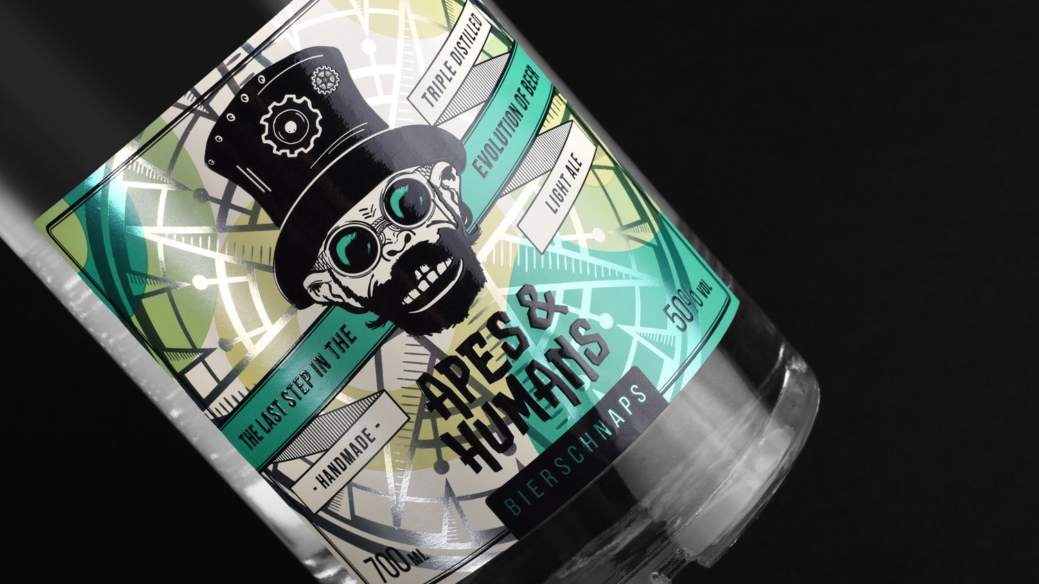
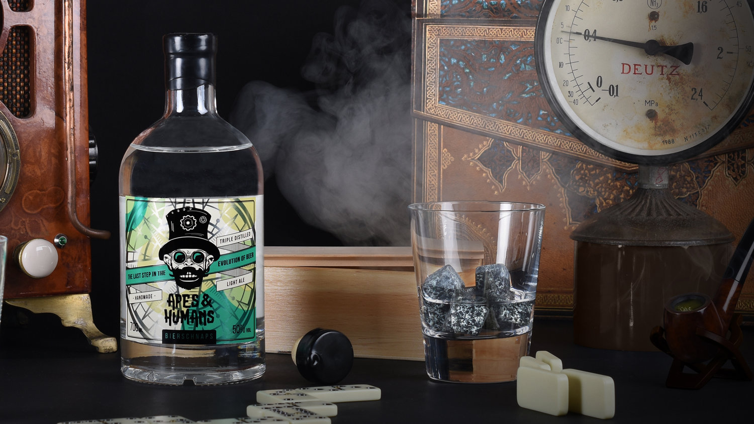
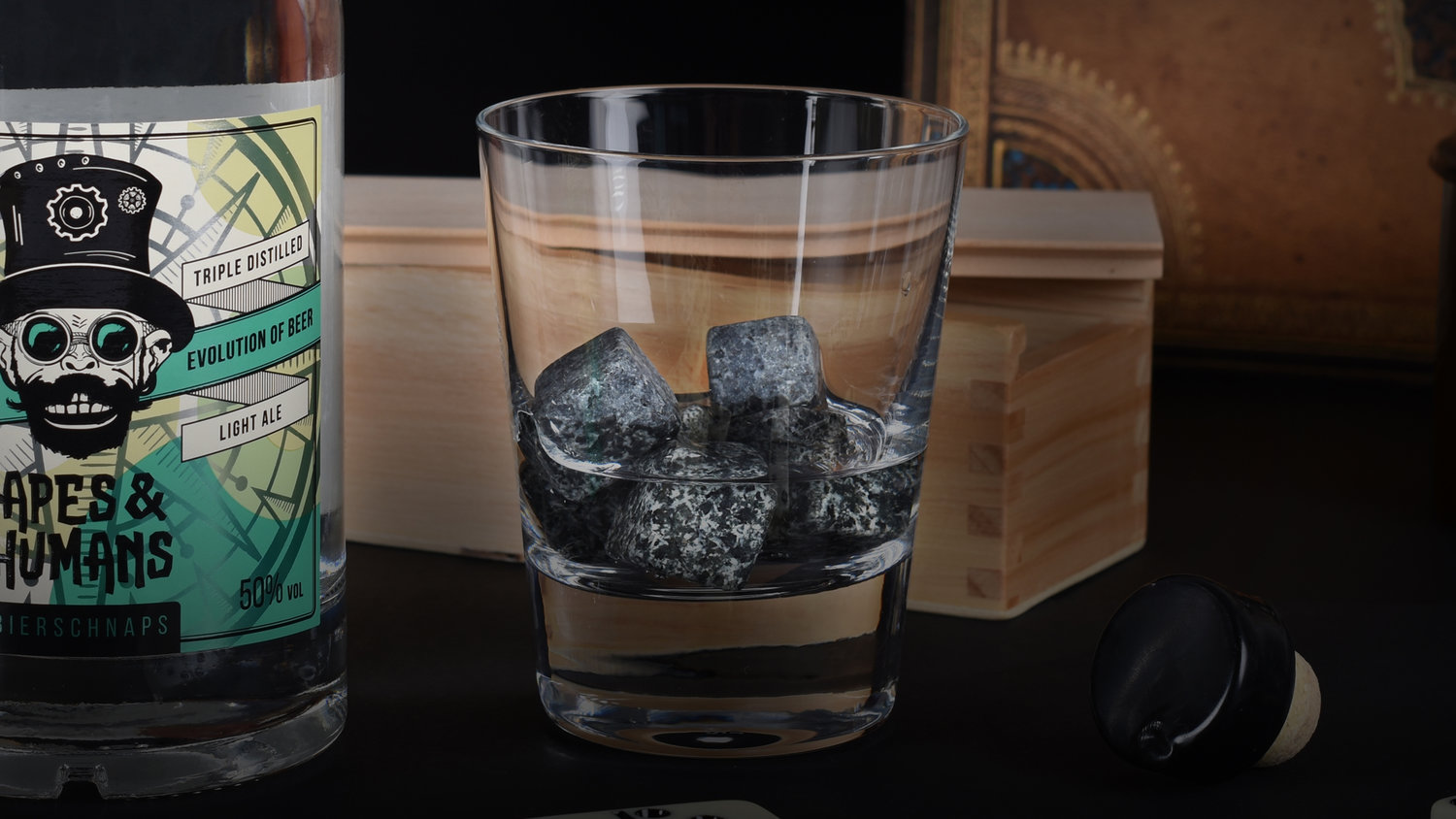
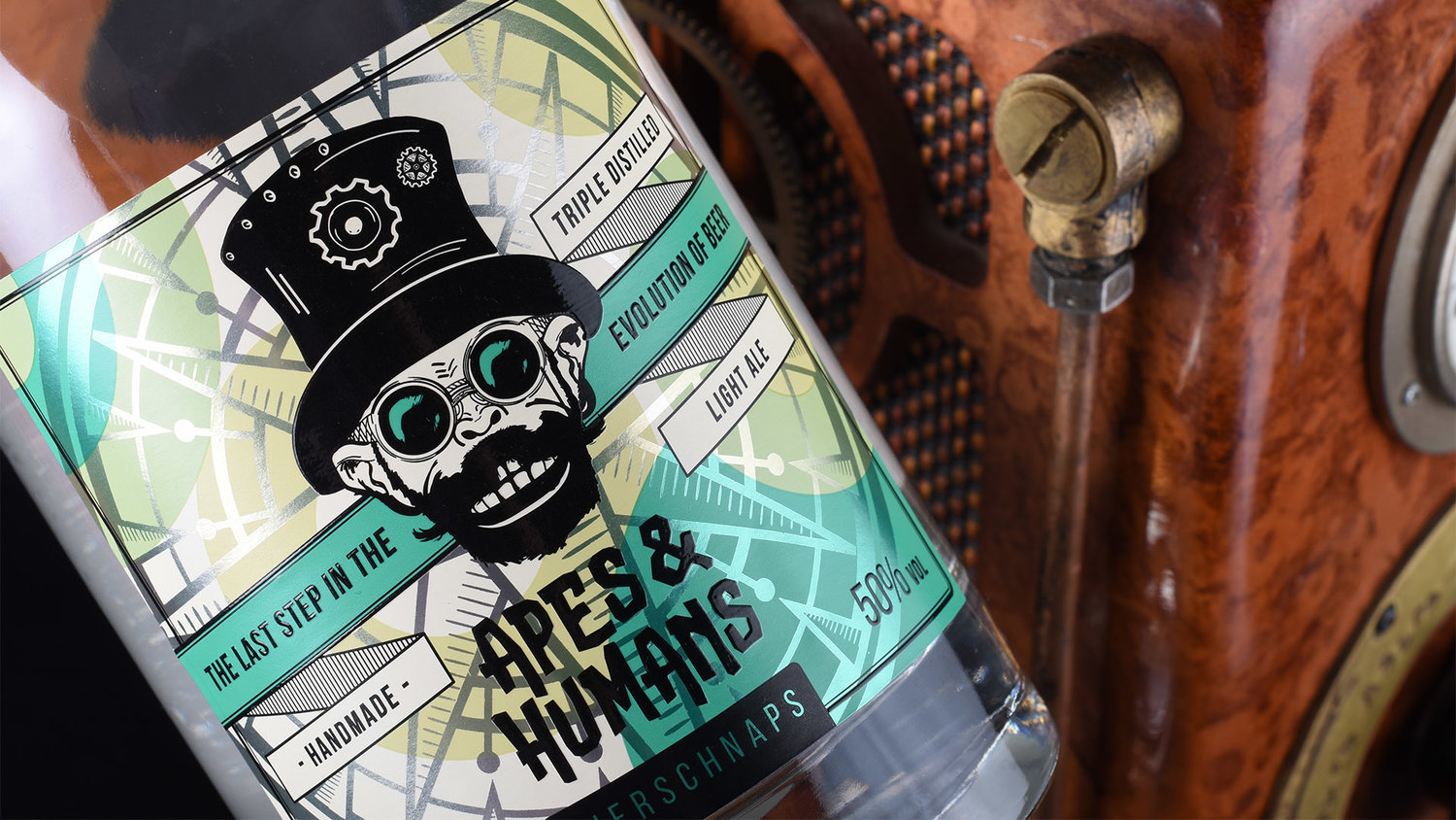
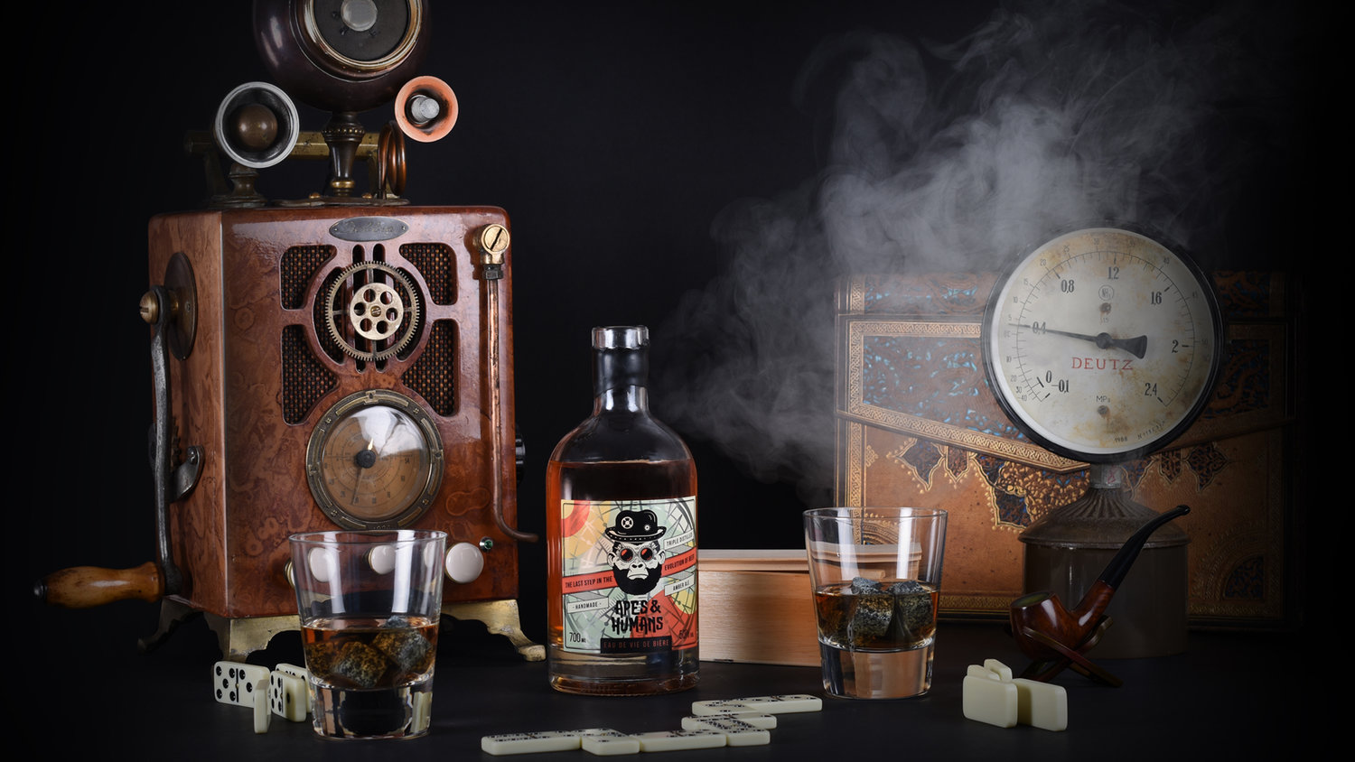
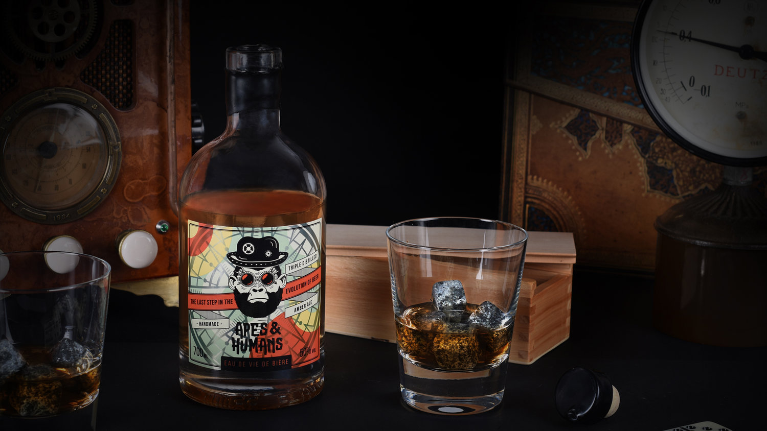
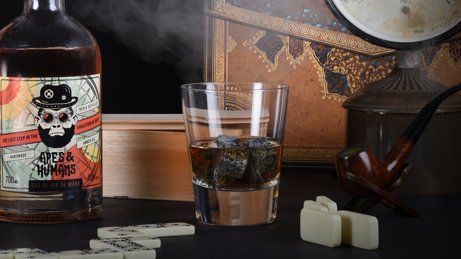
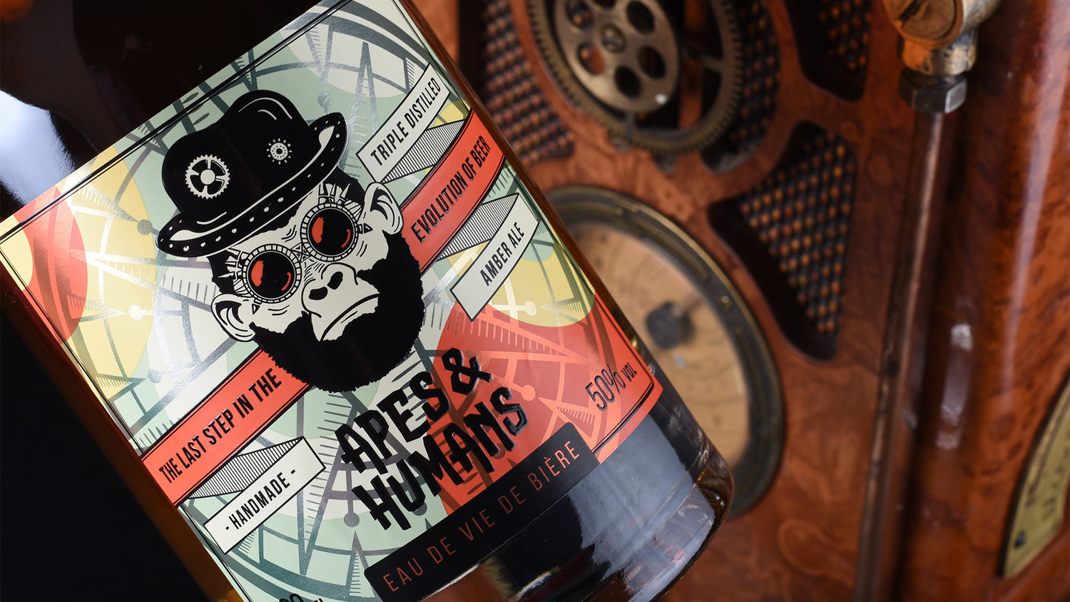
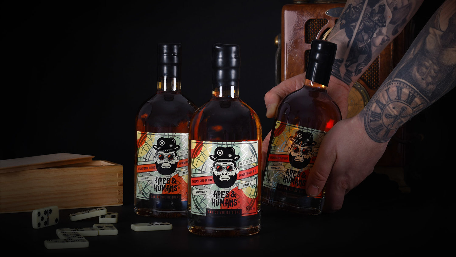
Bierschnaps & Eau de Vie de Bière are the unique products and doesn’t belong to any other main spirit category. The drinks were born from a long and persistent journey towards the evolution of beer when the distillate of beer was purified. It’s a combination of old traditions, craftsmanship and of course the modern science. Eau de Vie de Bière is really appreciated by gourmets. It’s made from a single malt. Beer masters with years of experimenting experience knows how to prepare the young beer properly. The beer is distilled twice, so the drink is obtained very delicate, has yeast and bread aromas what makes it stand out from other similar drinks. Once the process is finished a fully prepared drinks are further maturing in oak barrels. Bierschnaps is made from a double distilled young beer. Distillation goes on until it contains suitable alcohol concentration. Later on the product is kept in a “first-time” barrels, so it does not get any additional taste or aroma from previously preserved drinks. The drink has a strong malt taste. Once the process is done the presented product to consumer is pure, without any additional impurities. During the filtration, the drink is clarified and is emphasised by all natural shades of taste. For such a unique product we needed an exceptional solution. From the very beginning we wanted to convey the concept of evolution. We’ve decided to merge the human evolution together with the evolution of beer. Our inspiration came from Apes theory, steampunk vibes, science, technology and a bit of magic. That’s how the new Apes & Humans brand was born. Firstly, we’ve decided to create the unique characters for each taste. It’s really tricky to distinguish whether the character is it an ape or a human, smart scientist or party lover, self confident or shy. The lines between all of this are erased! It actually represents how different each taste is. By taking this project we didn’t want to go for an easy solution. We wanted it to be different, bright and loud. We’ve combined steampunk elements together with a modern twist of colours, typography and other graphic elements. It presents how modern technologies can really transform the old standards and most importantly – match perfectly! For the packaging we went for a vintage look by choosing pure white clear glass bottle. This really allows to present how clear and rich drinks are. Bottle contains cork closure covered with real wax. Each label design was printed in five colour Pantone flexography. To highlight the label additional technologies such as gloss black 3D silkscreen print and metallic prints were chosen. Lastly, we just want to say how magnificent the product itself is. It’s called a real soul of beer. It’s the last step between beer and high volume spirit. We call it “the last step in the evolution of beer”.


CREDIT
- Agency/Creative: Making Sense Studio
- Article Title: Eau De Vie De Bière Packaging Design
- Organisation/Entity: Agency, Published Commercial Design
- Project Type: Packaging
- Agency/Creative Country: Lithuania
- Market Region: Europe
- Format: Bottle
- Substrate: Glass


