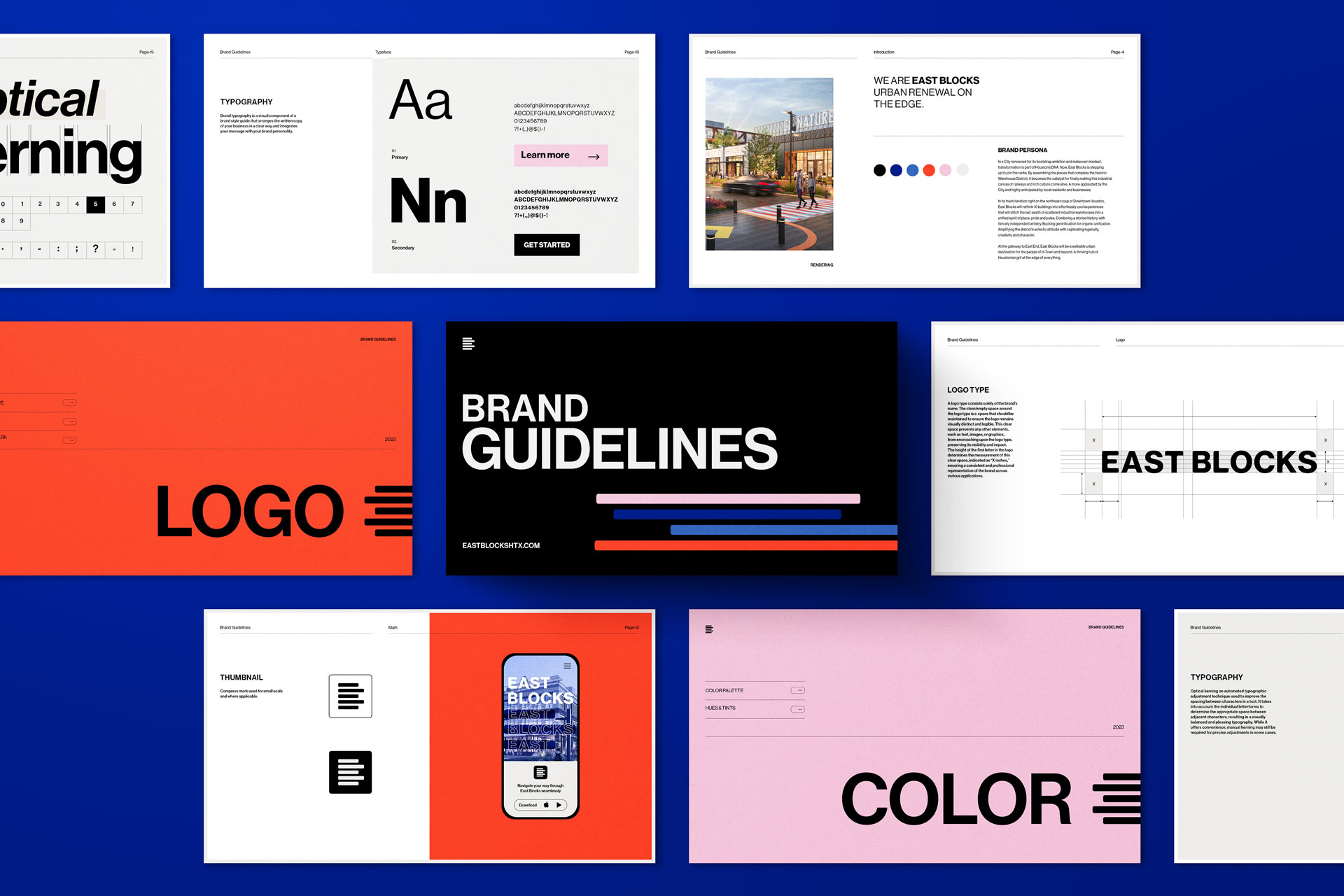
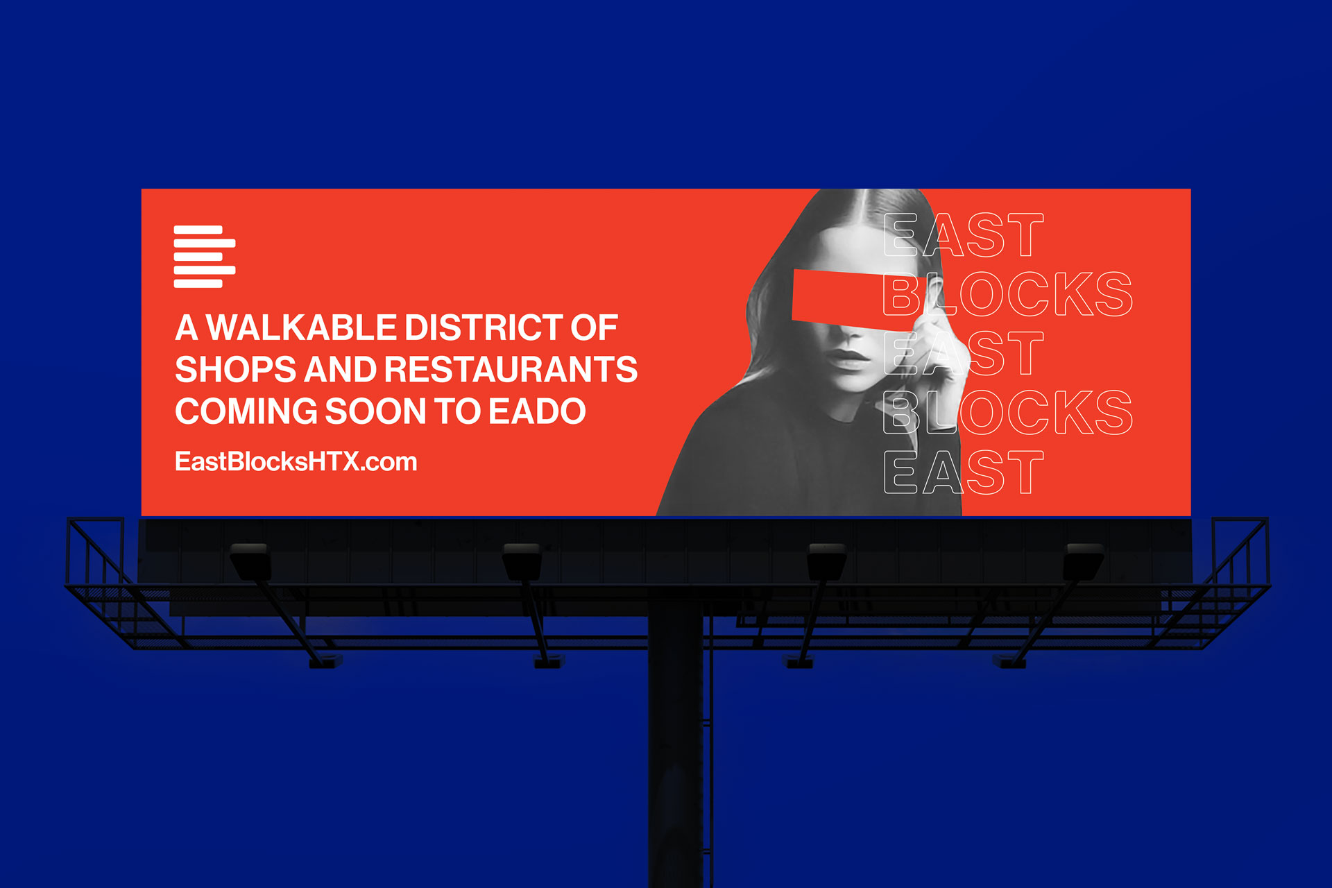
Form Creative is thrilled to unveil the meticulously crafted visual identity and branding for East Blocks, a groundbreaking 10-block mixed-use district that stands as a beacon of urban renewal in EaDo, Houston. At the heart of our creative endeavor was the ambition to encapsulate the vibrant dynamism and transformative ethos that define this ambitious development. Our approach was to create a brand identity that not only resonates with the architectural innovation and community spirit of East Blocks but also sets a new benchmark in urban development branding.
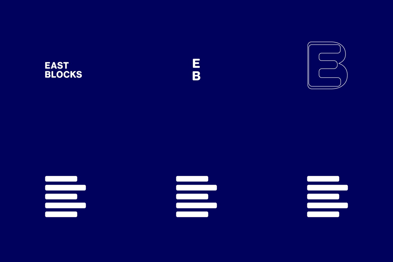
The logo, a centerpiece of our design strategy, ingeniously integrates the letters ‘E’ and ‘B’ through an arrangement of stacked blocks. This configuration is not merely aesthetic but is imbued with deep symbolism, reflecting the project’s name and its core values of innovation, versatility, and connectivity. The design’s modular nature allows for a fluid transformation, making the logo a dynamic element capable of highlighting text or imagery, thereby offering a versatile tool for various branding applications.
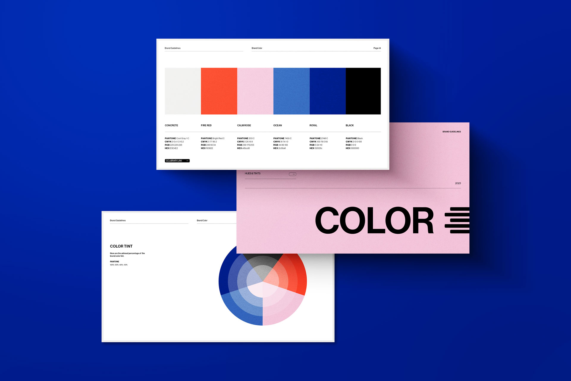
Our selection of a curated color palette was a deliberate choice to infuse the brand identity with depth, energy, and a touch of whimsy. Regal blue, chosen for its connotations of stability and sophistication, lays the foundation for a trustworthy and dignified brand image. Fire red is introduced to inject a potent vibrancy, symbolizing the energetic pulse and forward momentum of the East Blocks community. Soft pink adds a layer of playfulness and approachability, softening the overall aesthetic and inviting engagement. Black accents are employed to provide contrast and depth, grounding the identity and enhancing its visual appeal.
The design blocks, characterized by their bold linear forms that intersect and overlap, serve as a metaphor for the multifaceted nature of East Blocks. They represent the architectural diversity, the interplay of spaces, and the interconnectedness of the community, offering a visual narrative that speaks to the essence of urban transformation. These elements come together to create a visual language that is both coherent and adaptable, capable of evolving alongside the development itself.
In crafting the visual identity for East Blocks, Form Creative has not just created a brand but has woven a visual story that captures the essence of this dynamic urban development. Our work reflects a deep understanding of the project’s vision and a commitment to excellence in design that resonates with the energy, ambition, and spirit of East Blocks. As this development continues to evolve, the identity we have created will stand as a lasting testament to the transformative power of thoughtful design and branding in shaping the perception and success of urban projects.


CREDIT
- Agency/Creative: Form Creative
- Article Title: East Blocks Branding
- Organisation/Entity: Agency
- Project Type: Identity
- Project Status: Published
- Agency/Creative Country: United States
- Agency/Creative City: San Diego
- Market Region: North America
- Project Deliverables: Advertising, Brand Design, Brand Guidelines, Brand Identity, Logo Design
- Industry: Real Estate
- Keywords: Branding, Mixed-Use Development Branding
-
Credits:
Founder + Creative Director: Sarah Scharaf


