


Earthling Studio pumps up Surreal’s brand for its next bold move in cereal.
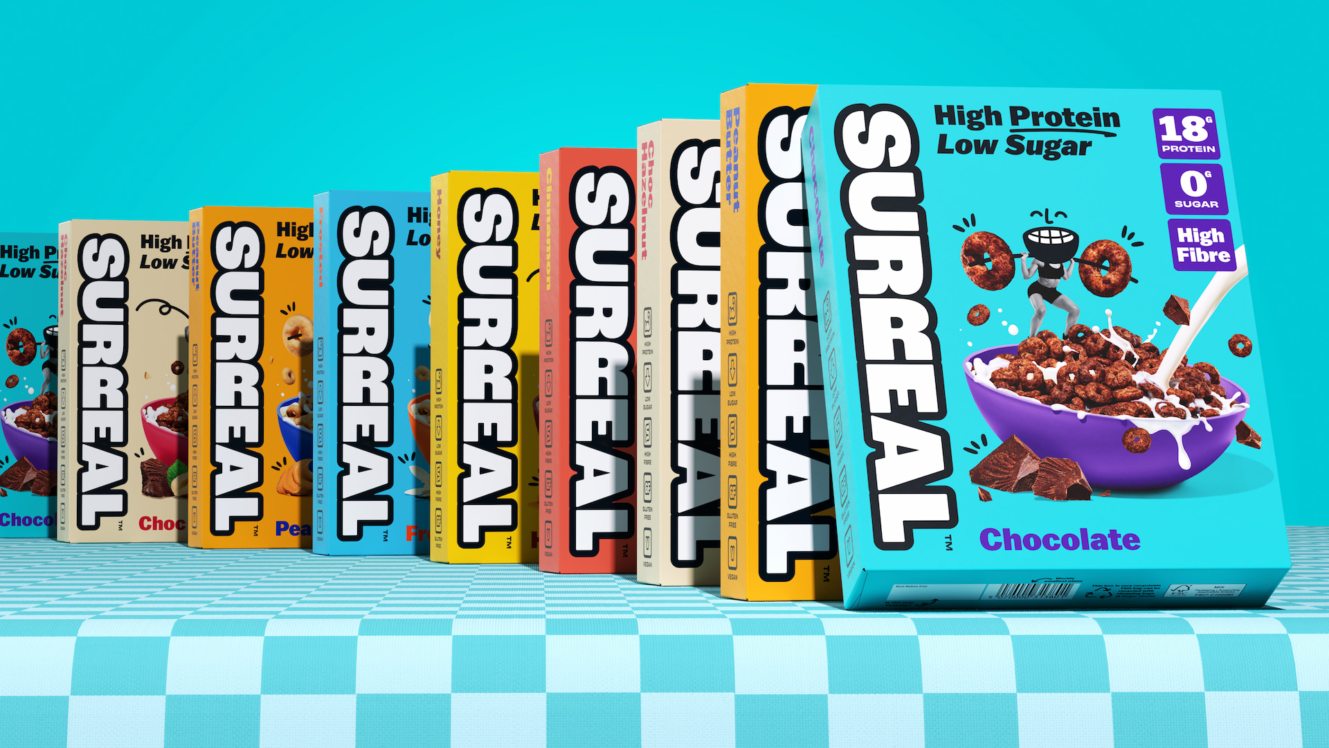
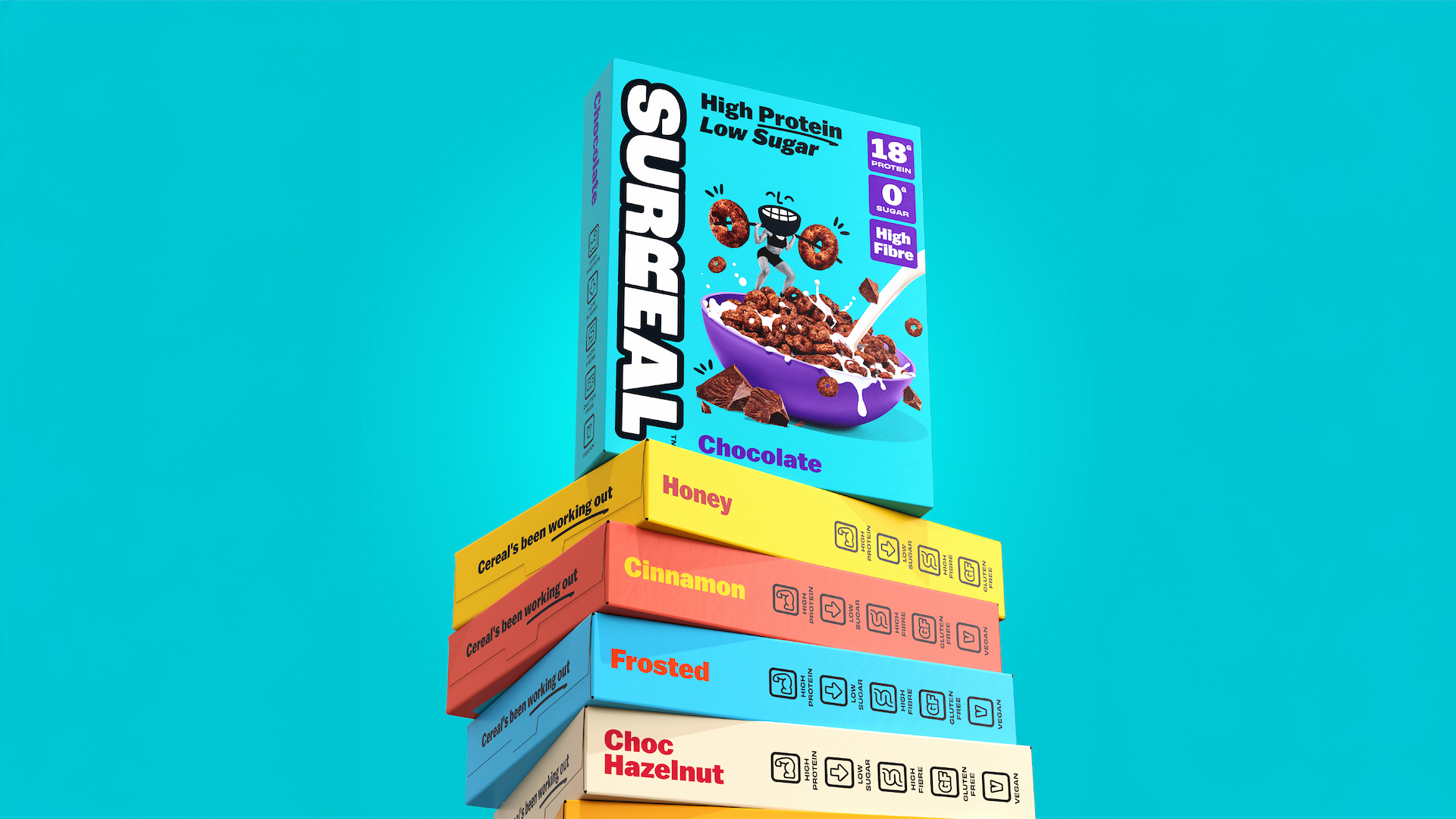
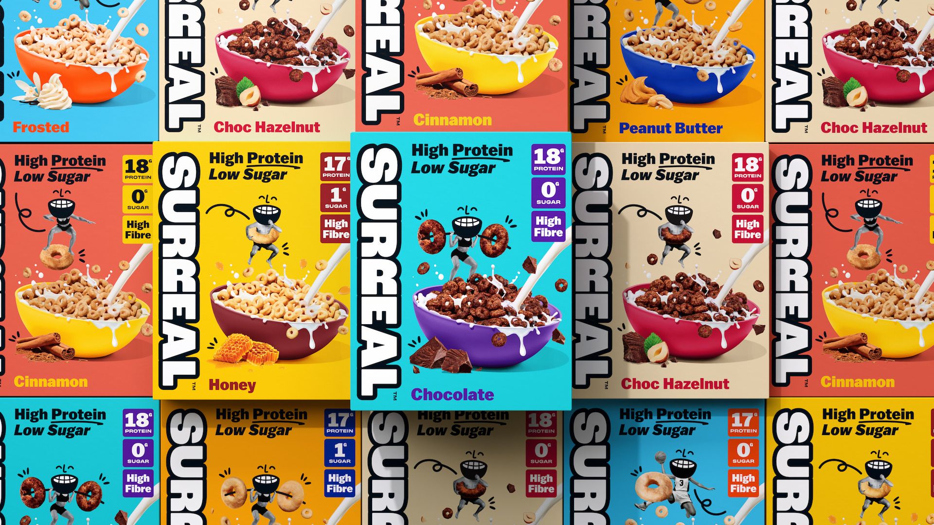
High-protein, low-sugar cereal brand Surreal has hit the brand gym. Teaming up with Earthling Studio, Surreal has undergone a full identity and packaging transformation as it flexes its muscles beyond DTC and builds a significant presence in mainstream grocery retail.
With the protein category booming across food and drink — yet many products still weighed down by hidden sugars and confusing labelling — Surreal saw an opportunity to lead with clarity, flavour, and attitude. After rapid growth online, the brand set its sights on supermarket shelves, where strong navigation, nutritional transparency, and appetite appeal are crucial.
Earthling Studio was briefed to:
• Modernise Surreal’s brand identity for grocery scale
• Amplify its bold, irreverent personality from social into packaging
• Clearly communicate high protein, low sugar, and taste benefits
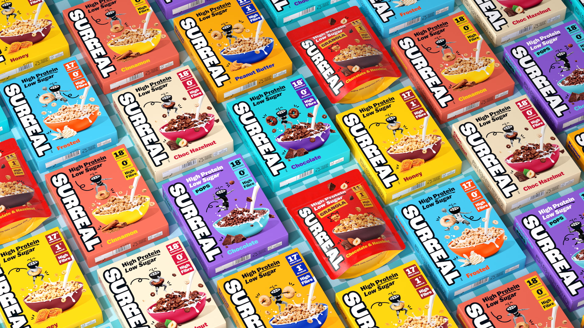
• Build a flexible system to support future innovation, including new formats such as Granola and Pops.
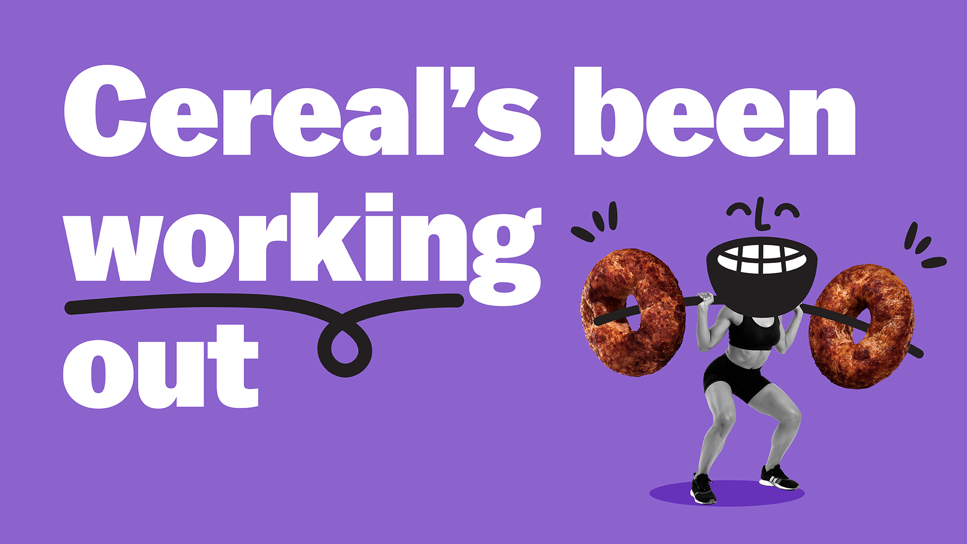
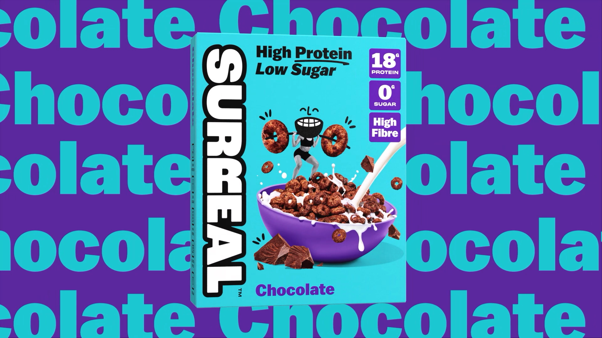
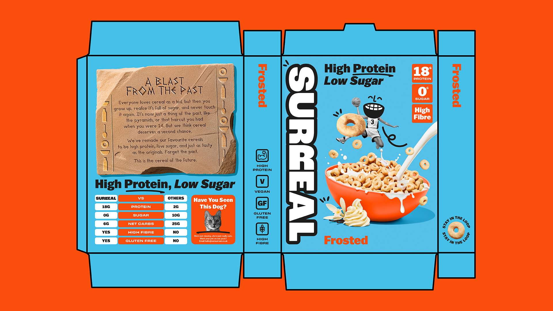
Working in close collaboration with the Surreal team, the creative platform “Surreal’s Been Working Out” became the foundation for the refresh — dialling up the brands colour palette and typography, strengthening product storytelling, and introducing bold on-pack claims paired with tasty, energetic product photography, shot with Frankie Turner.
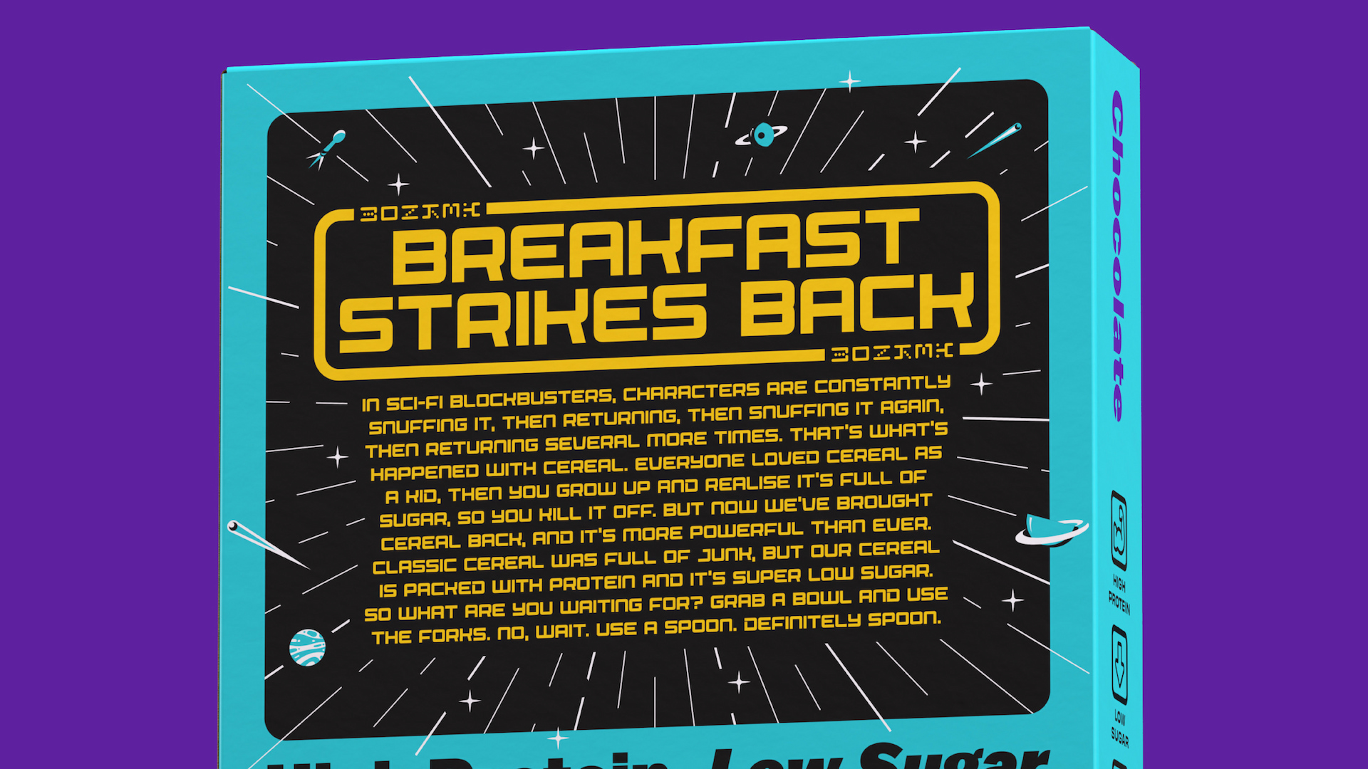
Every box features a bespoke back of pack design and story, aiming to re-invent cereal with a Surreal twist, they cover topics such as pop art, science fiction and retro computer games.
The result is a brand that delivers category leading standout while staying true to the playful personality that continues to build its cult following online.
Earthling Creative Partner, Stephen McDavid
“We approached the redesign with the idea that ‘Surreal’s Been Working Out’. Every element got a few extra reps to build strength and recognition. The challenge was toning up without losing the brand’s irreverent, low-fi energy. Surreal’s always been serious about protein but nothing else, so we made sure that spirit stayed front and centre in this evolution, setting them up to flex some real muscle in the cereal aisle”
SURREAL Co-Founder, Kit Gammel
“Surreal was built to make healthier breakfasts fun, not complicated. As we move from our direct-to-consumer roots into grocery, we wanted a brand identity that stays true to our personality while making our benefits crystal clear on shelf. Earthling Studio understood that balance perfectly — bold, confident and designed to scale”


CREDIT
- Agency/Creative: Earthling Studio
- Article Title: Earthling Studio Pumps Up Surreal’s Brand for Its Next Bold Move in Cereal
- Organisation/Entity: Agency
- Project Type: Packaging
- Project Status: Published
- Agency/Creative Country: United Kingdom
- Agency/Creative City: London
- Market Region: Europe
- Project Deliverables: Animation, Art Direction, Brand Architecture, Brand Design, Brand Identity, Branding, CGI, Food Photography, Illustration, Packaging Design, Typography
- Format: Box
- Industry: Food/Beverage
- Keywords: SURREAL, Brand Identity, Brand Redesign, Typography, Animation, 3D, CGI, Packaging
-
Credits:
Creative Partner: Stephen McDavid
Managing Partner: Tom Bruce
Senior Designer: Tom Mitchell
Designer: Zita Nagy
Food Photographer: Frankie Turner


