Earthling Studio builds a new entrant into the sleep supplement category – Cuddle Sleep Health – with the brief covering brand positioning, visual and verbal identity.
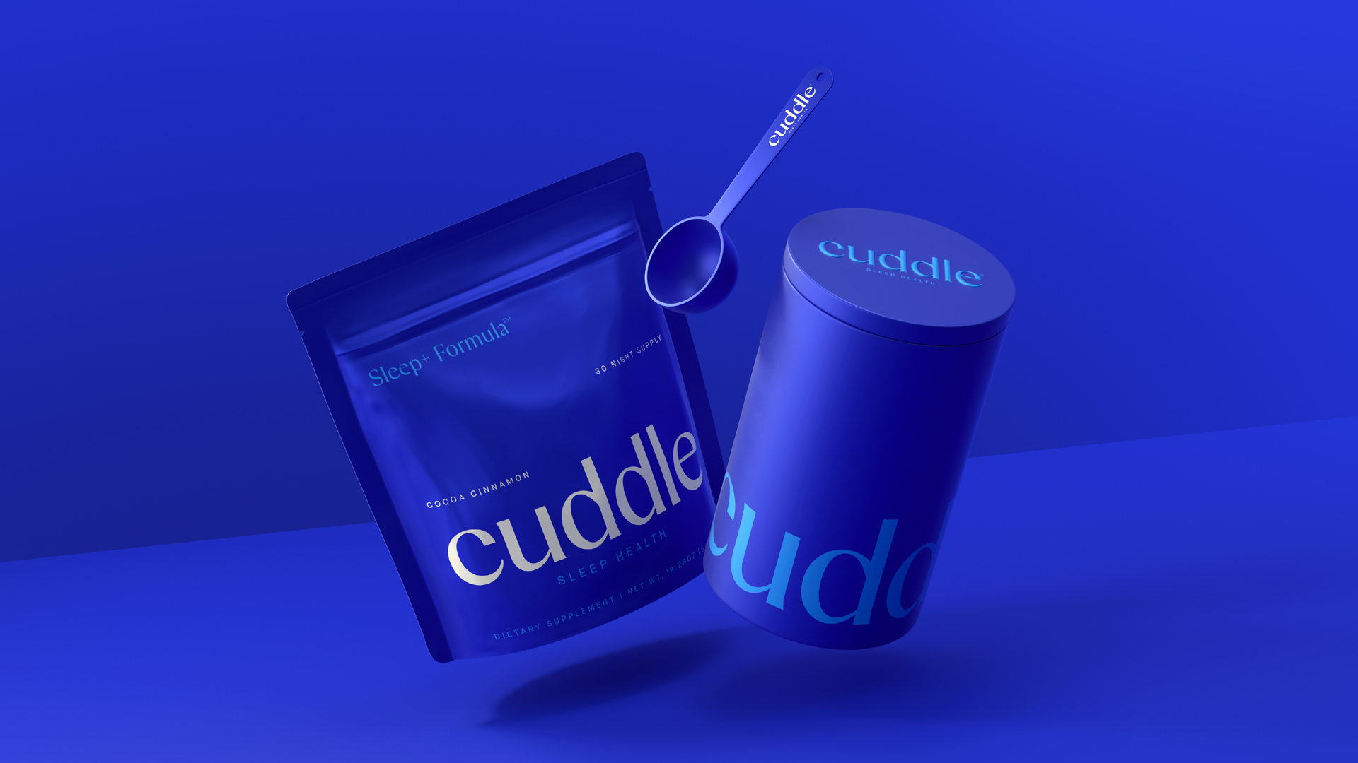
Sleep is natures panacea, more powerful than any drug in its ability to restore and rejuvenate the human brain and body. In fact, sleep is emerging as a potent factor in achieving better health. Founders, Hugh Thomas and Poppy Jamie set out on a mission to change the landscape of sleep health supplements after becoming frustrated with the lack of effective, natural sleep solutions on the market. Partnering with Dr. Russell Foster, a globally renowned sleep scientist from Oxford University and expert in circadian cycles, the team spent two years developing a science-led industry first formula made up of 11 natural ingredients, delivered as a cinnamon and coca beverage. The Sleep+ Formula is the first product from Cuddle, The Sleep Health Company.
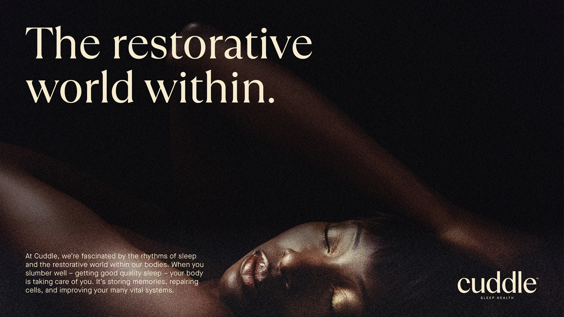
With the formula in place the team turned to Earthling Studio to disrupt the already crowded sleep supplement space with an identity that married the credibility and scientific rigour of the formula with an elevated lifestyle aesthetic that would fit seamlessly into consumers nightly wind down routines. Health is after all, the new wealth.
“The brief was to build a highly credible, trusted brand that can help the consumer navigate the sleep supplement category. We wanted to enter with the de facto mindset of a leader” says Stephen McDavid, Creative Partner at Earthling.
The team collectively defined Cuddle’s mission to prioritize sleep health for all by placing science at the centre, ensuring everyone experiences the benefits of remarkable sleep.
“Early research opened our minds to the misunderstood power of sleep, debunking the belief that we simply shut down at night, when the opposite is true. In fact, when we drift off, our brains spring into action, pulsing with electrical signals that wash over the brain with a soothing, hypnotic flow”, says Stephen.
This insight, coupled with the ambition to create a new standard in sleep, unlocked a distinctive brand identity, built around the idea of “Drifting into Remarkable Sleep”.
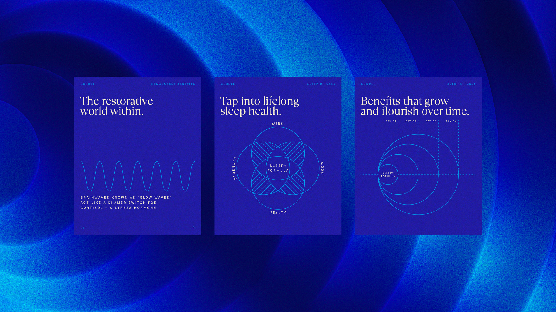
Four unique rhythmic patterns were created and animated in collaboration with Damon Xart, to dramatize the remarkable activity and hypnotic natural rhythms that pulse through our bodies and minds when we sleep. The four patterns leverage the brands distinctive use of colour and link to the key benefits of the product which helps you to relax, restore, replenish and rebalance, night after night.
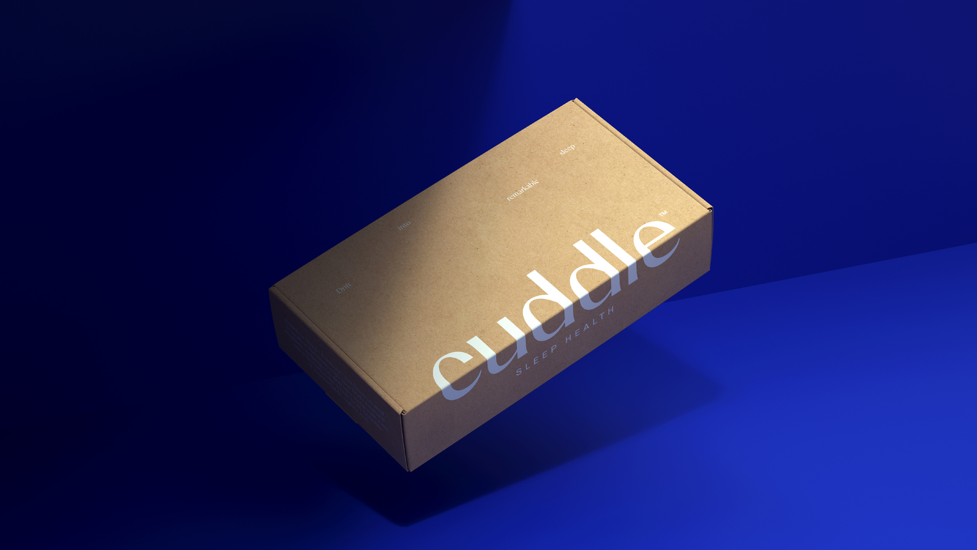
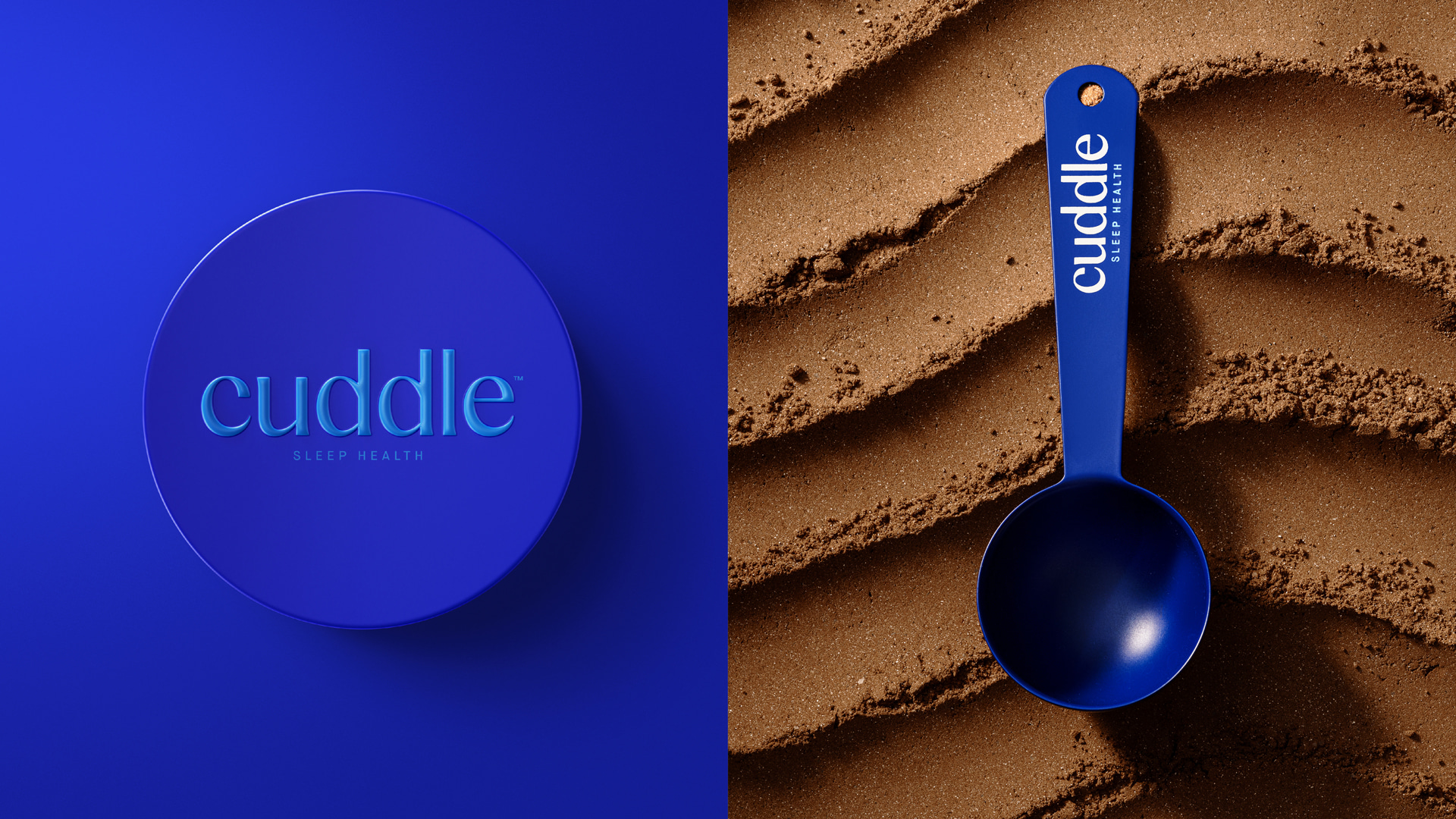
Stephen continues, “from the get-go we knew a confident use of colour was going to be key to establishing Cuddle as a new benchmark in the emerging sleep supplement category and we were conscious not to follow some of the clichés that have become associated with this new sector. As a result, we landed on a serene yet bold blue. This is used consistently throughout the brand to deliver an ownable balance of calm and authority. We also developed a secondary palate of blue hues that can be dialled up and down depending on the context. A vivid blue to aid performance, a cool blue to deliver more scientific content and deep blue to provide some overall contrast”.
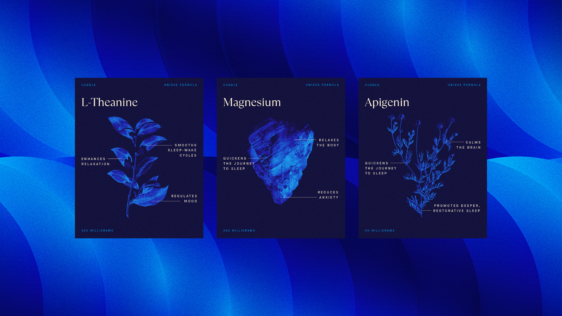
The product formula itself brings together 11 science-backed natural ingredients which have been added to the identity as reimagined botanical illustrations, delivering a consistent aesthetic for each remarkable active component. Lastly, an elegant custom wordmark, inspired by sleep cycles, was crafted with typographer Rob Clarke and a family of accompanying fonts were selected, to deliver a delicate mix of lifestyle and science.
Cuddle Sleep Health Founder, Hugh Thomas “At Cuddle Sleep Health, our vision is to create a global leader in sleep health supplements. By combining science- backed formulations with an elevated brand experience, we aim to set a new standard in the industry and ensure everyone has access to effective, natural solutions for better sleep. Our Sleep+ Formula is just the beginning.”
Earthling is a creatively led studio, building super-powered brandsTM that people need, and the world can’t ignore. On a mission to partner with courageous brands to unlock their super-power and go beyond the ordinary.


CREDIT
- Agency/Creative: Earthling Studio
- Article Title: Earthling Studio Create Brand Positioning, Visual and Verbal Identity for Cuddle Sleep Health
- Organisation/Entity: Agency
- Project Type: Identity
- Project Status: Published
- Agency/Creative Country: United Kingdom
- Agency/Creative City: London
- Market Region: North America
- Project Deliverables: 3D Design, 3D Motion, Advertising, Advertising Photography, Animation, Art Direction, Brand Design, Brand Identity, Brand Mark, Brand Strategy, Brand Tone of Voice, Brand World, Branding, CGI, Design, Logo Design, Packaging Design, Tone of Voice, Type Design, Typography, Web Design
- Industry: Food/Beverage
- Keywords: Cuddle, Sleep, Health, Drift, Into, Remarkable, Sleep, Supplement, Beverage, Cocoa, Cinnamon
-
Credits:
Creative Partner: Stephen McDavid
Managing Partner: Tom Bruce
Senior Designer: Tom Mitchell
Designer: Zita Nagy
Digital Artist: Damonxart
Typographer: Rob Clarke


