


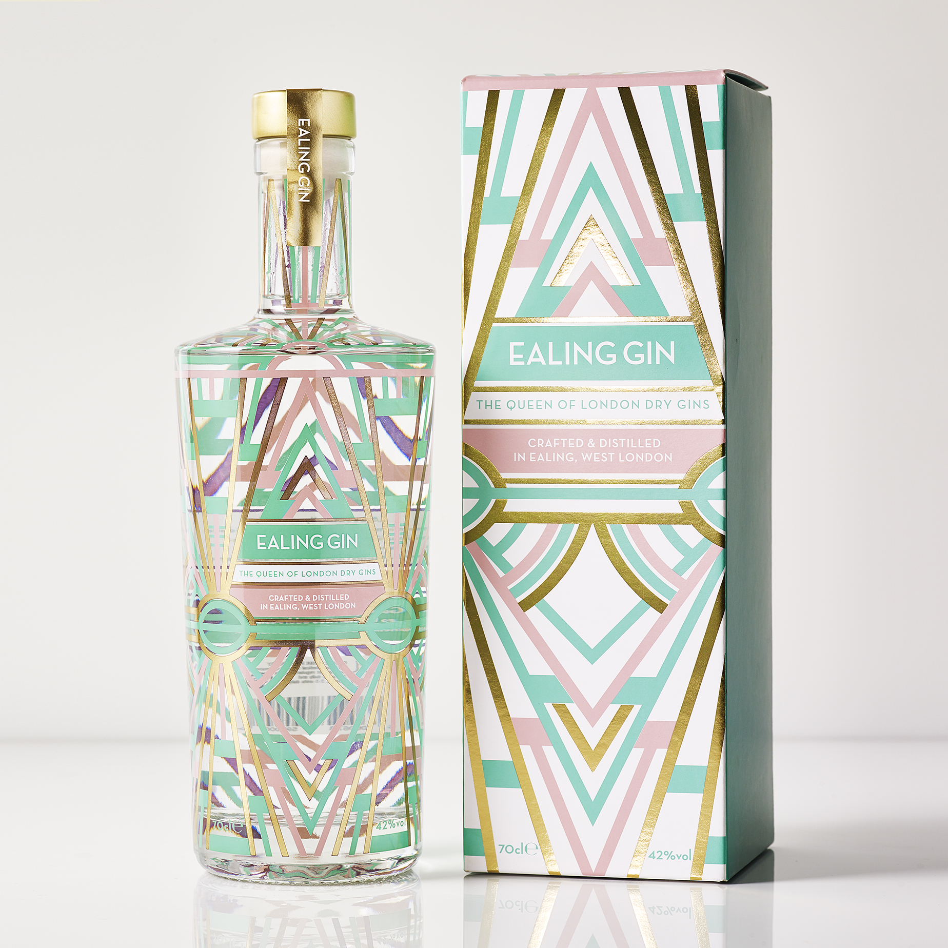
The Duncan Family, the makers of Ealing Gin have lived in the West London borough for four generations. It’s a place full of diversity, rich heritage and a wonderful community spirit and was nick-named ‘Queen of the Suburbs’ over a century ago.
Ealing is most famous for it’s studios, pretty parks, lively social scene and beautiful art deco buildings. This is where the client was keen to take inspiration from in the making of the design.
We decided an overt ‘art deco’ design would feel a bit obvious and passé, and therefore created a bespoke pattern with a nod to the hoover building and a colour palette that felt fresh and inviting. As a celebration of not only Ealing, but also London, We included a subtle reference to the iconic London underground within the pattern.
The bottle needed to feel special and a considered purchase, also one that could be bought as a gift and be proudly put on show. Elevating the design with the classy shape (also a nod to the art deco era) and with a hint of gold, created a more premium look and feel.
CREDIT
- Agency/Creative: AAH STUDIO
- Article Title: Ealing Gin Packaging
- Organisation/Entity: Freelance, Published Commercial Design
- Project Type: Packaging
- Agency/Creative Country: United Kingdom
- Market Region: Europe
- Project Deliverables: Brand Identity, Packaging Design, Research
- Format: Bottle, Box
- Substrate: Glass Bottle, Pulp Board


