


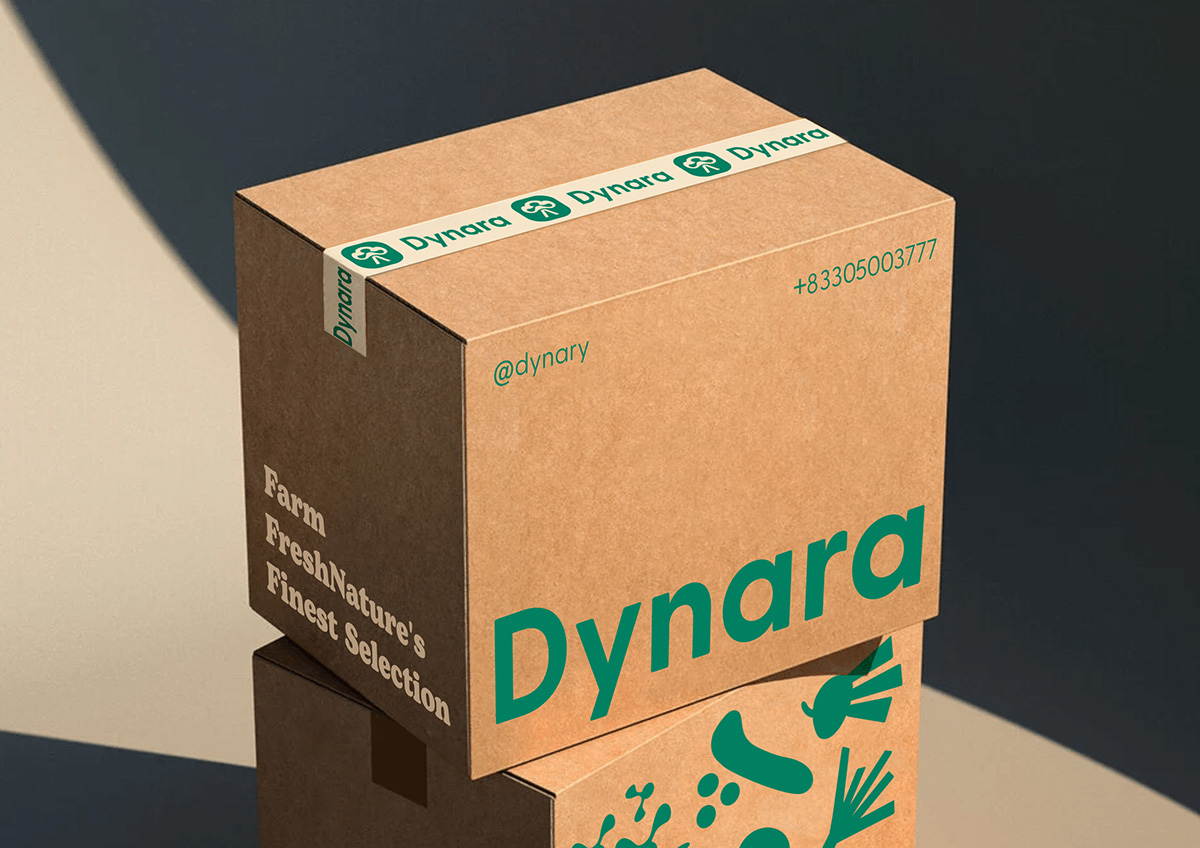
Dynara – Fresh Vegetables and Seeds
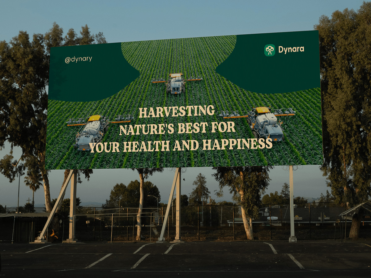
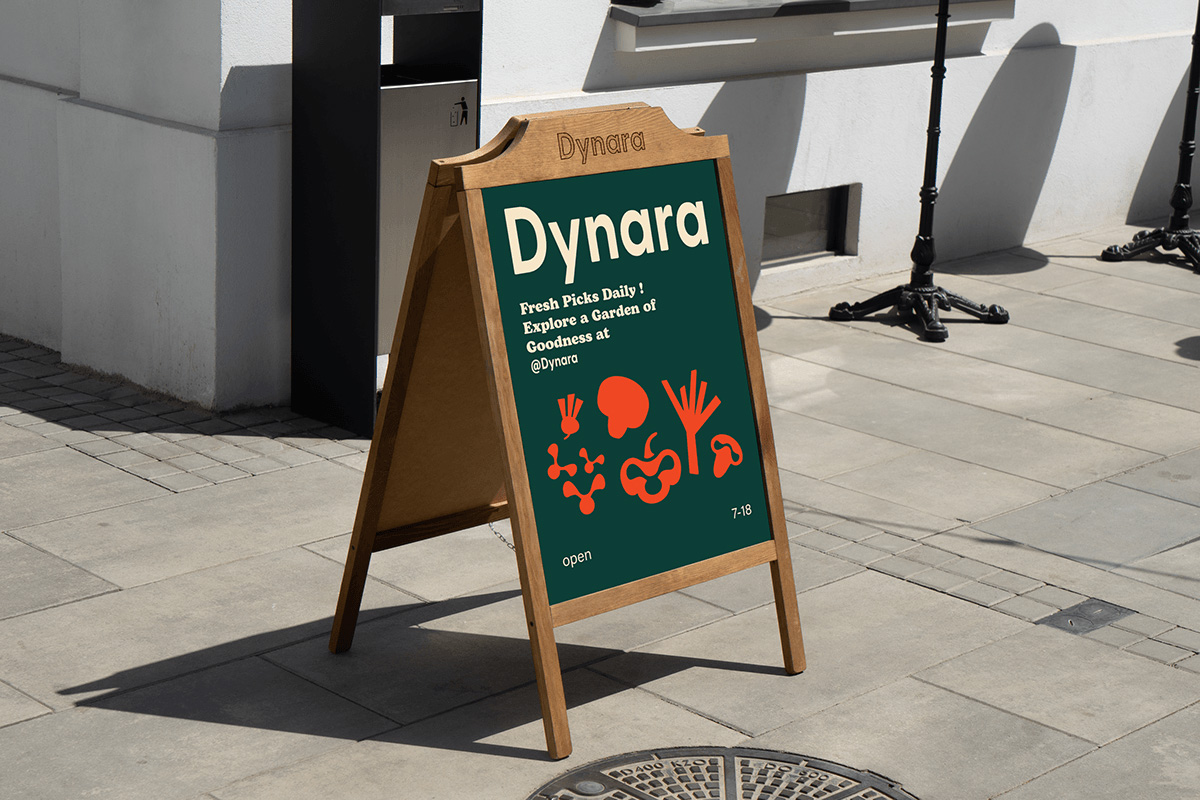
Dynara is your trusted partner in providing fresh vegetables and seeds, bringing the highest standards of quality and safety to every meal. With a commitment to sustainability and natural goodness, we aim to bridge the gap between farm and fork, providing products that reflect the essence of nature’s bounty. Not only is the brand providing high-quality vegetables and seeds, but also a symbol of the connection between nature and creativity in design. To clearly convey the brand philosophy, we aim for a minimalist packaging design that still highlights the natural beauty of the product.
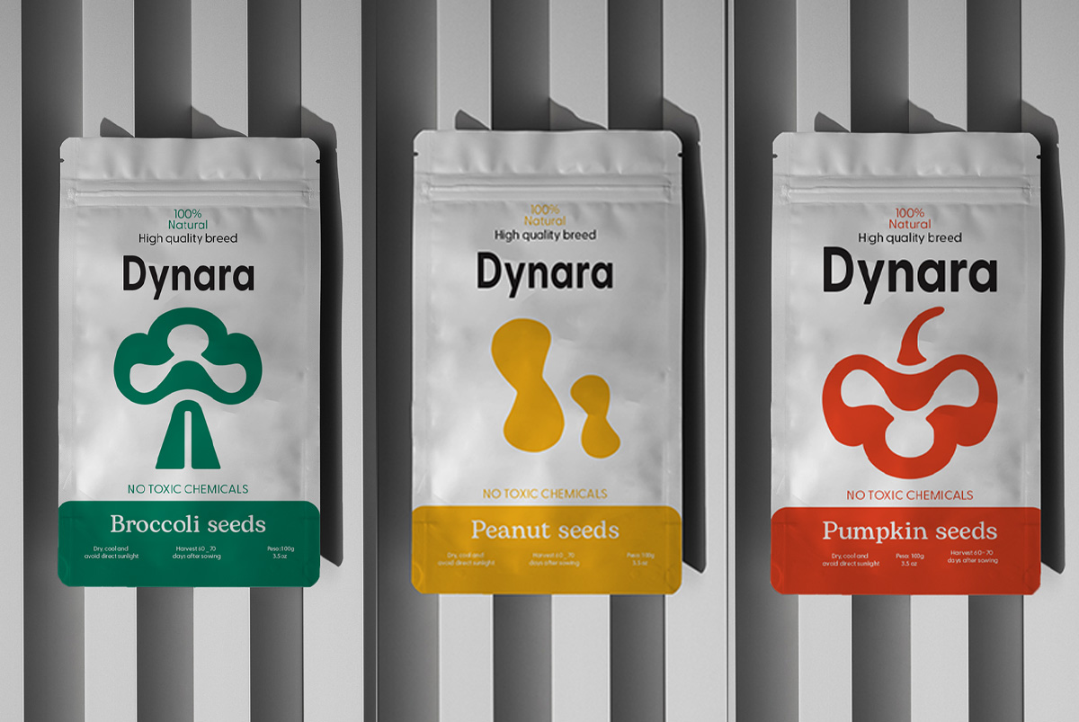
Inspired by the colors of vegetables
The core idea of Dynara’s packaging design is to exploit the natural color palette of vegetables and seeds. Each distinctive color tone is chosen to represent not only the product inside but also the meaning of freshness, nutrition and connection with nature:
– Bright orange of pumpkin: Represents warmth, energy and full of nutrients.
– Green of kale: Evokes a feeling of freshness, coolness and safety.
– Yellow of bell pepper: Conveys brightness, vitality and joy.
– Red of tomato: Symbolizes health and natural passion.
This color combination is not only aesthetic but also creates uniformity in brand identity, helping customers easily recognize Dynara immediately.
Minimalism in design
Minimalism is the central element in Dynara’s design concept. We believe that simplicity not only helps the product stand out easily but also conveys a message of sophistication, neatness and modernity. Packaging design focuses on:
– Clean fonts: Choose a sans-serif font, minimalist but sophisticated, helping to convey information clearly and easily read.
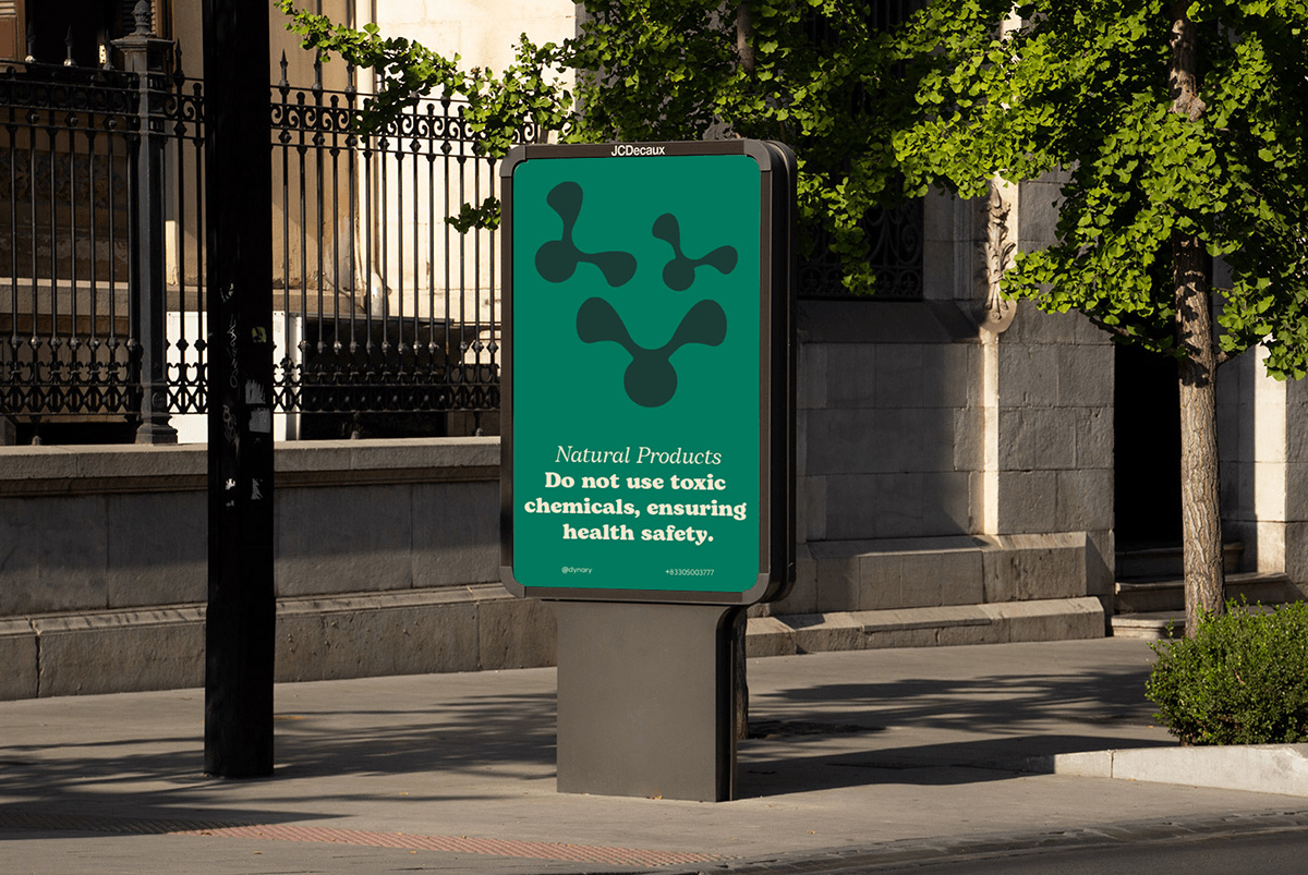
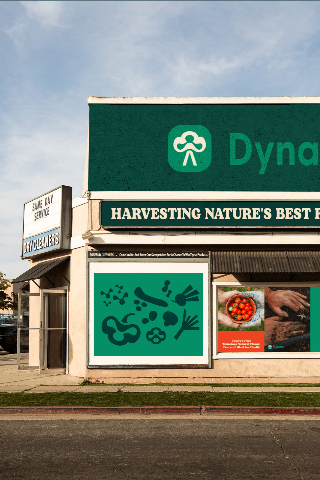
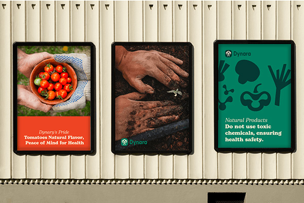
– Neat layout: Instead of using too many cumbersome details, each package only focuses on the main image – illustration of vegetables or seeds – highlighted on a characteristic color background.
– Open space: White space is used to create visual balance, helping customers feel light and comfortable when looking at the product.
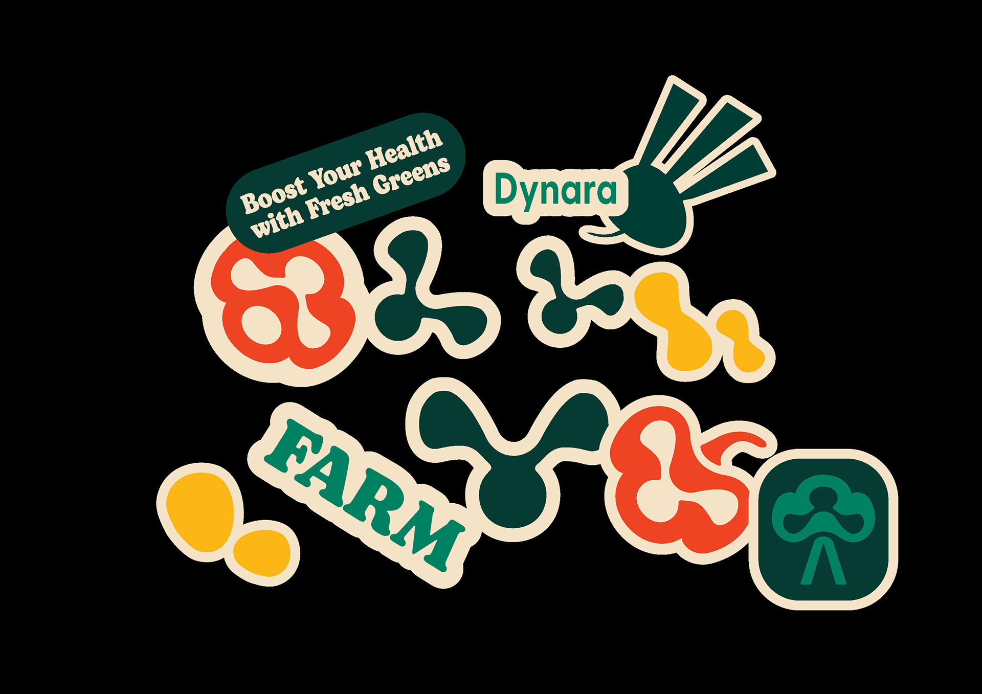
Delicate and creative illustrations
Each vegetable or seed is illustrated in a simple and sophisticated style, simulating a realistic image but still having an artistic touch. The gentle lines and natural color palette create a harmony between visual and emotional elements, making the packaging not only a commercial product but also a work of art.
Eco-friendly materials
In addition to design, Dynara is committed to using eco-friendly packaging materials, such as recycled kraft paper or biodegradable plastic. This not only contributes to protecting the planet but also fits in with the natural, safe and sustainable message that Dynara wants to convey.
CREDIT
- Agency/Creative: Dương Công Lực
- Article Title: Dynara Redefining Seed Packaging with the Harmony of Nature and Minimalist Elegance
- Organisation/Entity: Freelance
- Project Type: Packaging
- Project Status: Published
- Agency/Creative Country: Vietnam
- Agency/Creative City: Can Tho
- Market Region: Asia, Europe
- Project Deliverables: Brand Design, Brand Identity, Packaging Design
- Format: Bag, Box, Wrap
- Industry: Agriculture
- Keywords: vegetables, Seeds


