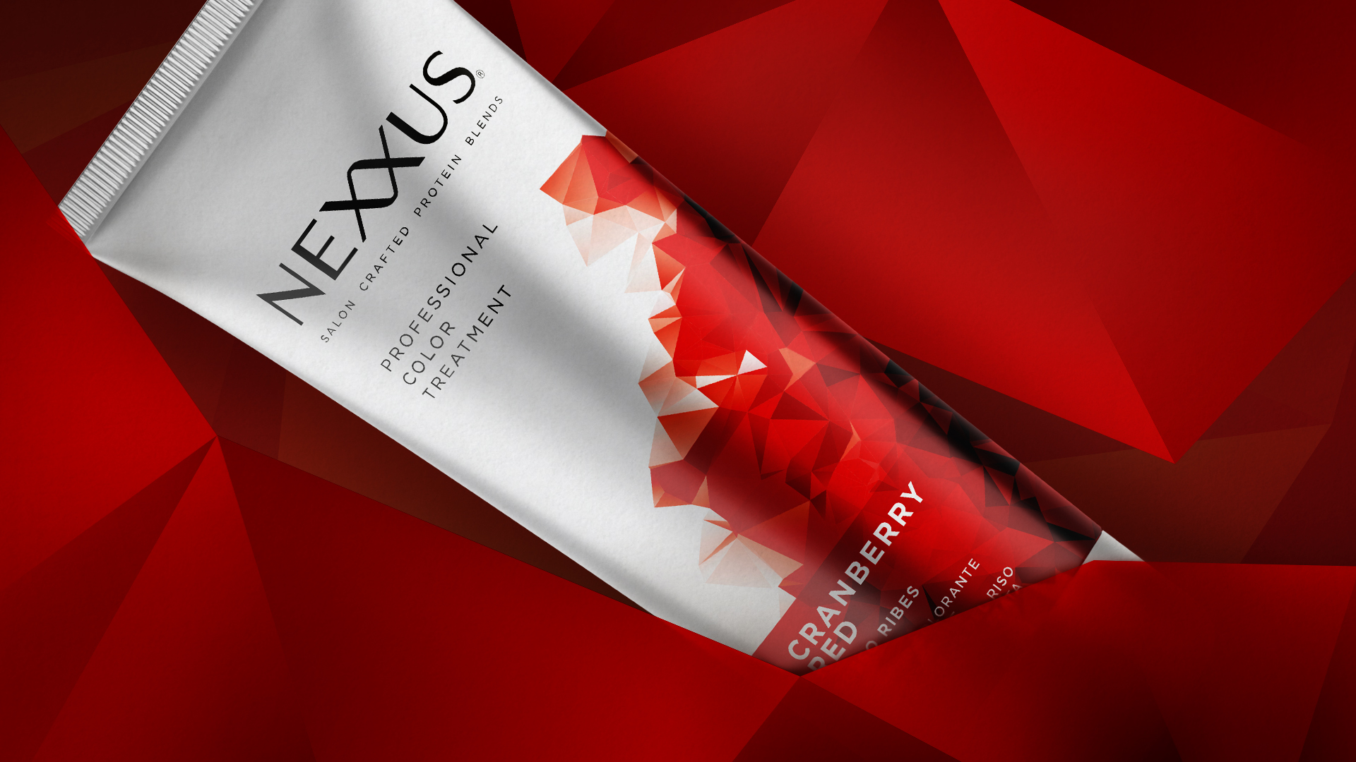
Personal Care is a sector in which innovation never stops and expectations, also in terms of visual identity, are always very high. In fact, ever more brands are commissioning chromatic and style research that asks those involved in packaging and graphic design to match the pace, thereby communicating immediately the mix of care, beauty and performance that characterizes the most avant-garde products.
Such is the case of Nexxus, a brand founded in 1979 by American Jheri Redding – scientist, cosmetologist and inventor of modern conditioner – who discovered that hair becomes healthier and stronger when treated with protein. Winner of countless awards, Nexxus, focusing strongly on technological innovation, is now part of the Unilever Group.
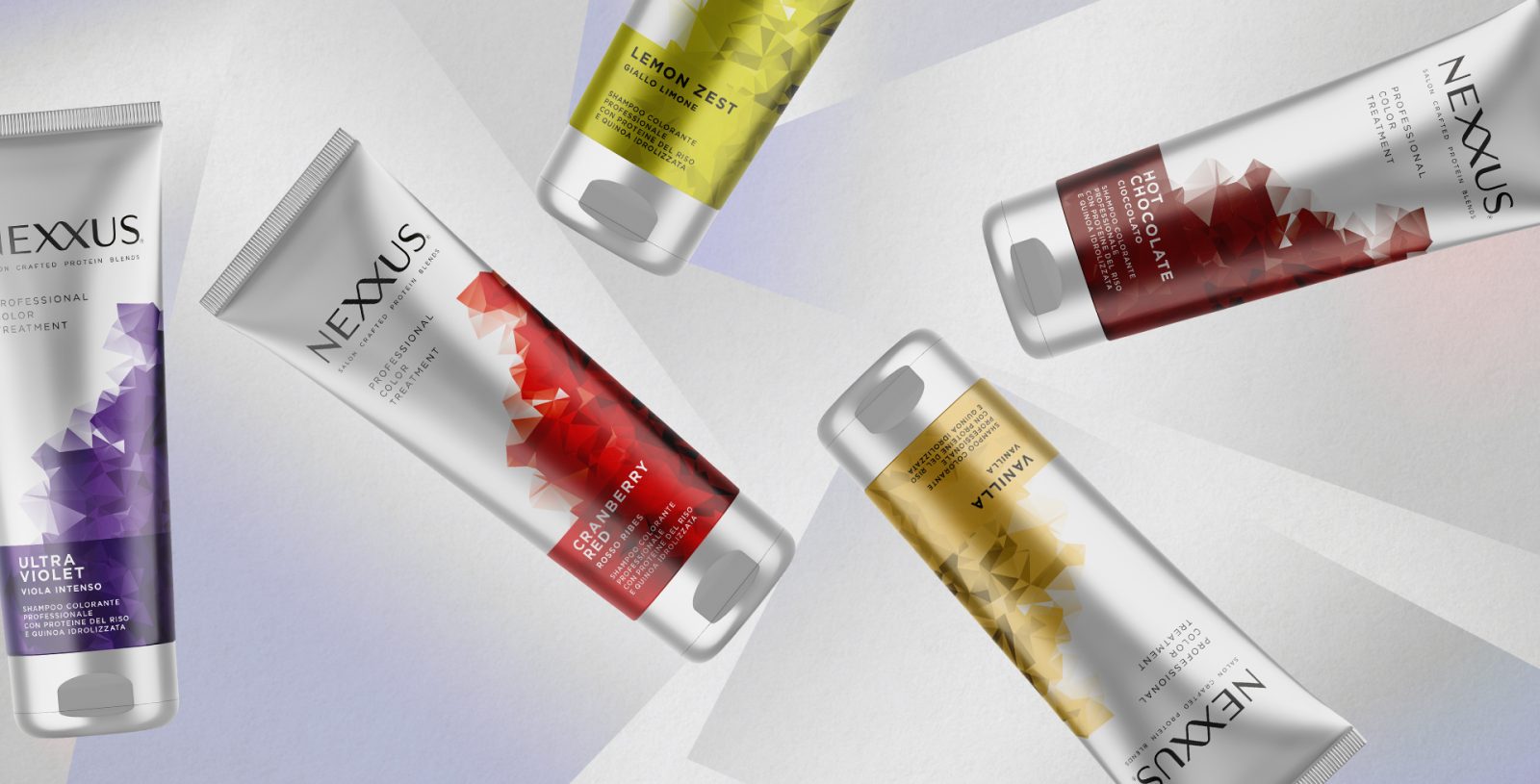
In 2021, Nexxus arrived in Italy. For the launch of the Nexxus Professional Color Treatment line of premium coloring shampoos in 2022, aimed at the professional channel, the agency was asked to develop graphic-communicative packaging. Consistency with the brand’s other lines, language communicating performance, differentiating immediately shades of coloring: these were some of the brief’s main points.
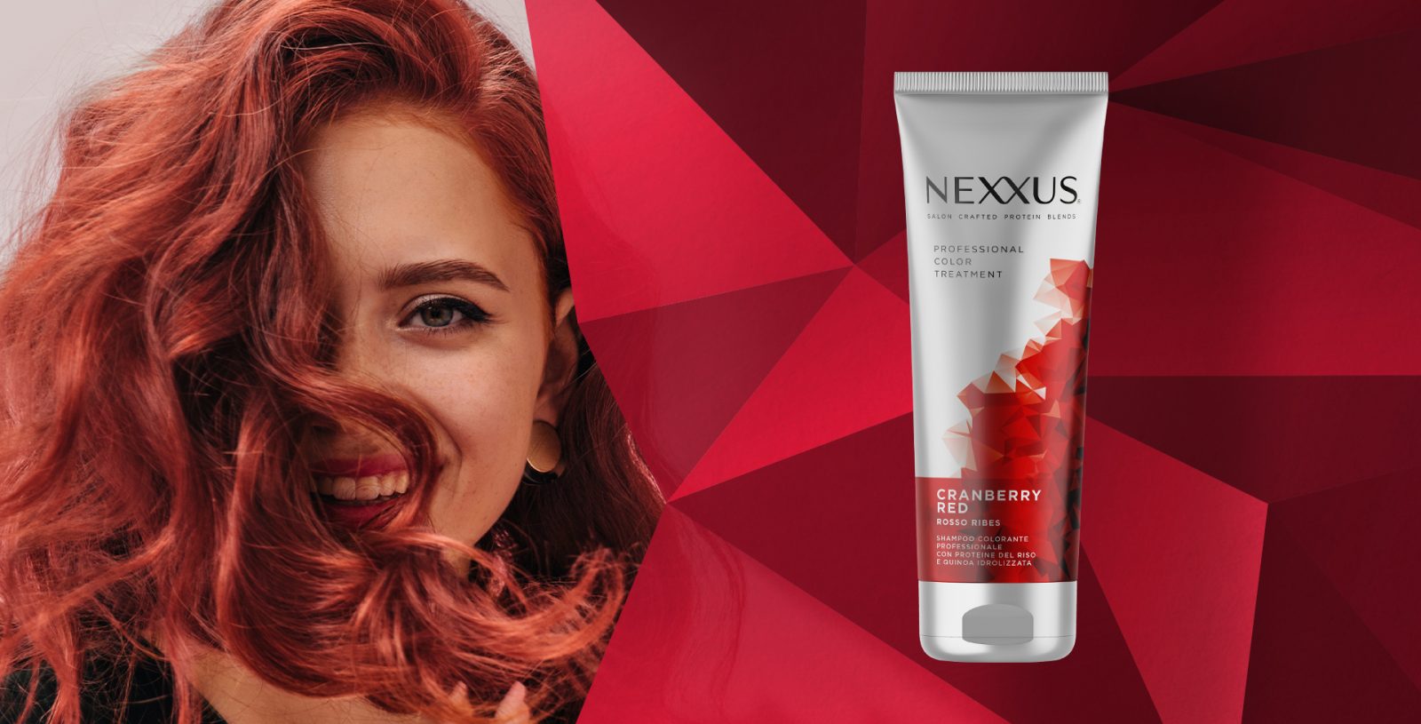
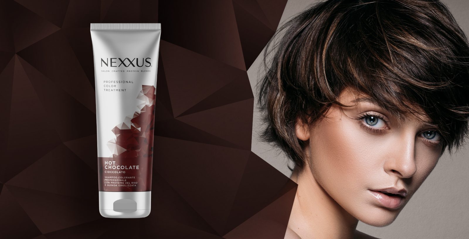
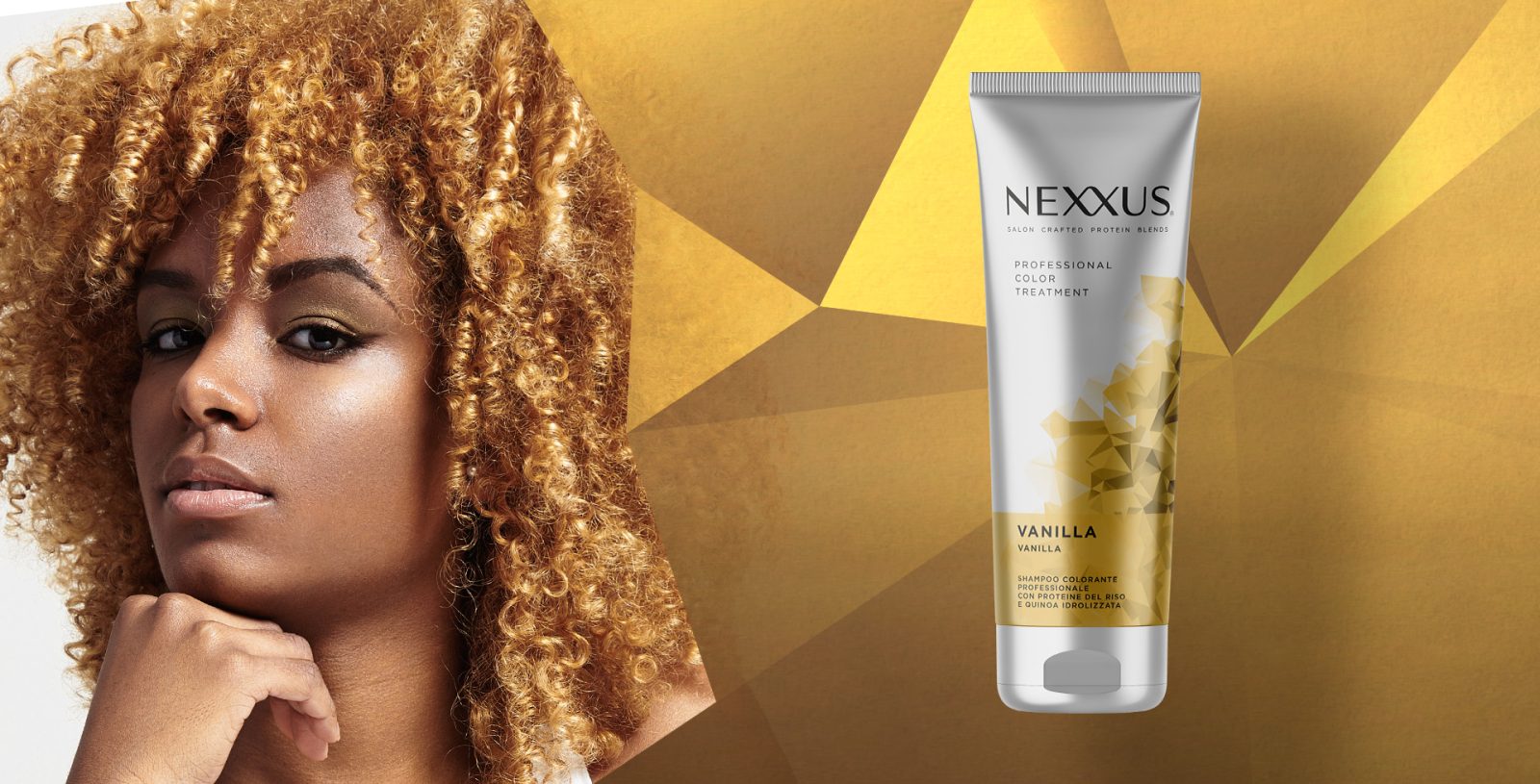
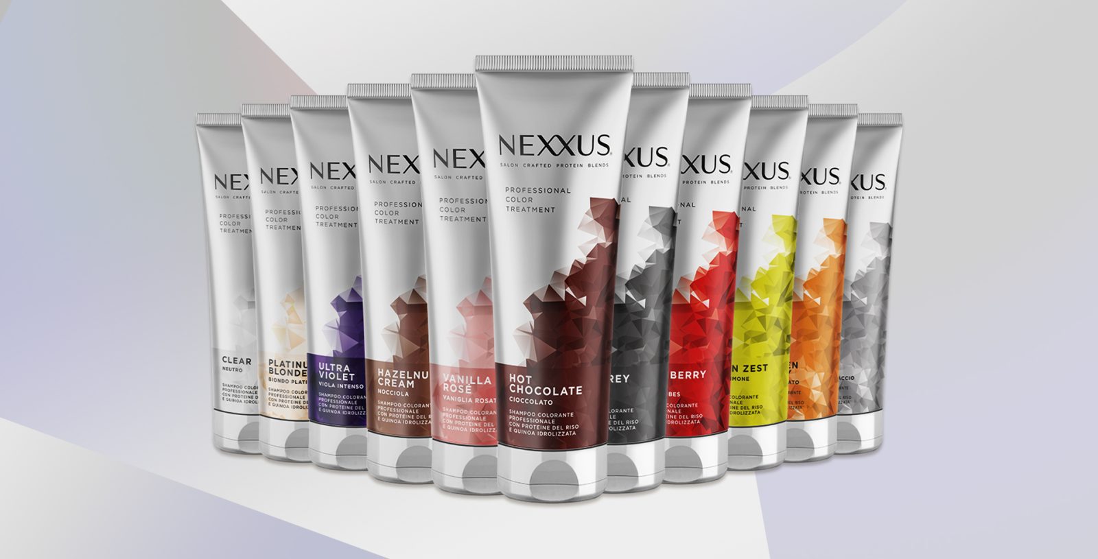
This was an important launch, which required an integrated approach to packaging design where every aspect is important. Thanks to its meticulous work, the agency responded with a clear, modern and minimalist design. The silver pack forms the background for graphics that dynamically explore geometry and bold tones to communicate high-level technology and effectiveness.
The architecture of the system has been developed to emphasize the brand and allow the key information to be communicated easily identifiable. A colorful band at the base of the pack, in chromatic harmony with the vector illustration, highlights the name of each one of the 11 variants and narrates the product in the local language.
The result is a strong identity consistent with the product’s highly-evolved concept, conveying the exclusive brand positioning at first glance.
CREDIT
- Agency/Creative: Reverse Innovation
- Article Title: Dynamic Geometry, Modern Elegance and Minimalism. A “Tech” Style Design for the Nexxus Professional Color Treatment Pack
- Organisation/Entity: Agency
- Project Type: Packaging
- Project Status: Published
- Agency/Creative Country: Italy
- Agency/Creative City: Milano
- Market Region: Global
- Project Deliverables: Packaging Design
- Format: Tube
- Substrate: Plastic
- Industry: Health Care
- Keywords: WBDS Agency Design Awards 2023/24
- Keywords: Packaging Design , Product Creation
-
Credits:
Creative Director: Alice Tacconi
Graphic Designer: Davide Cavagnoli
Account: Matteo Rivolta


