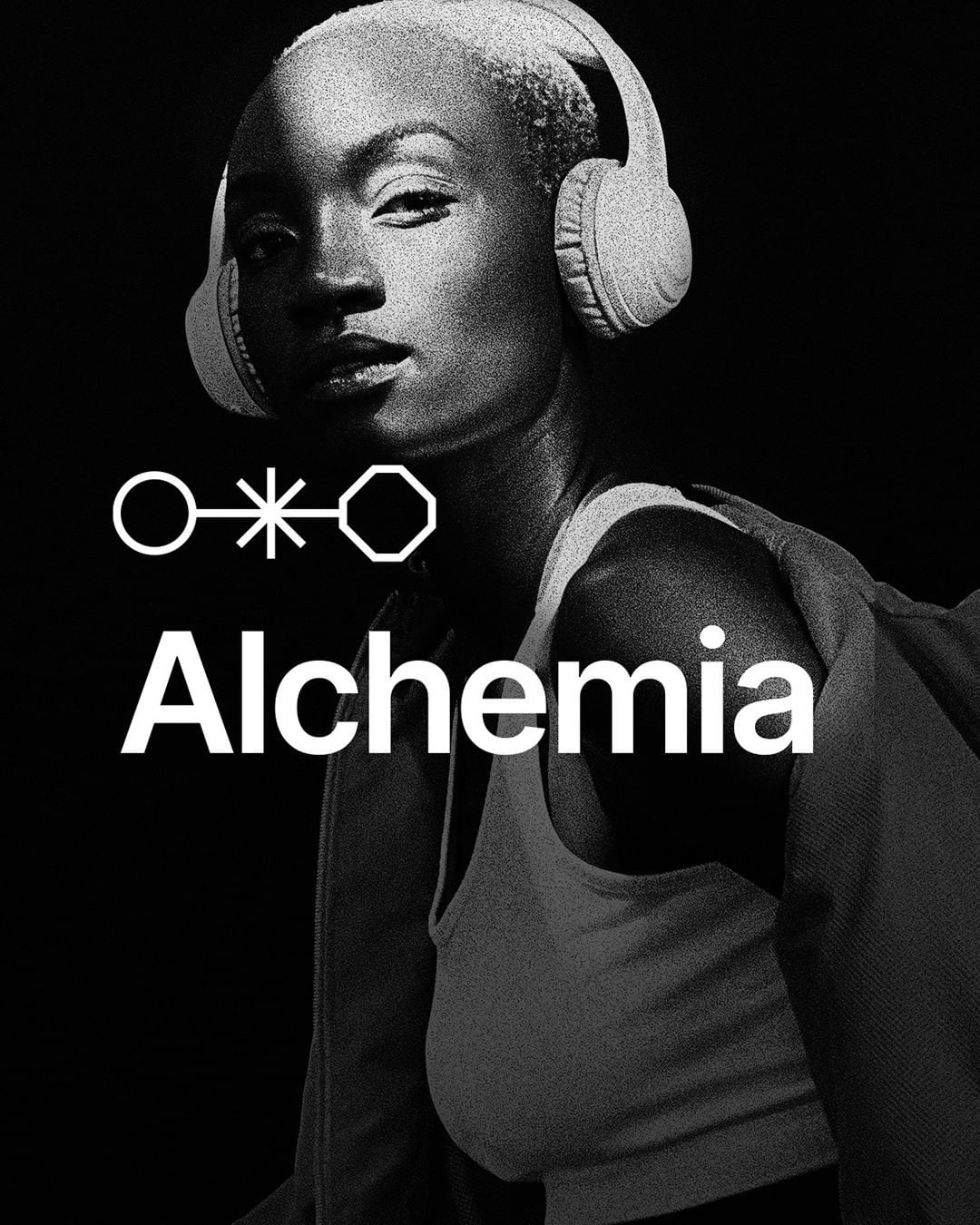
The project: Alchemia is a design collective passionate about creations and concerned with making it possible to unlock the full potential of projects, equipping the designer with tools and sealed assets to achieve this goal.
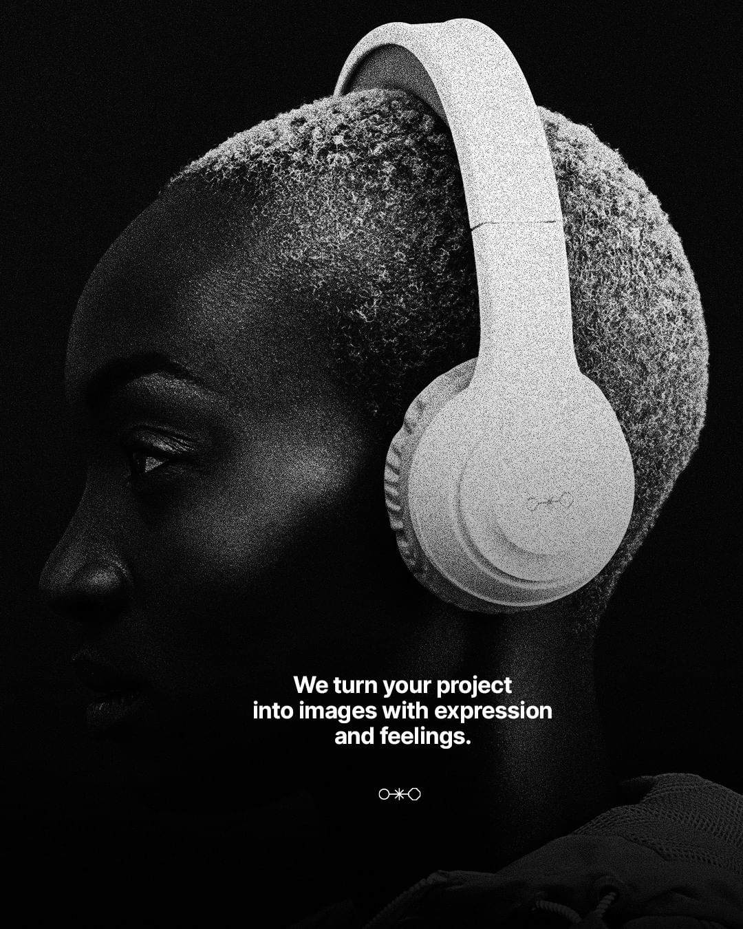
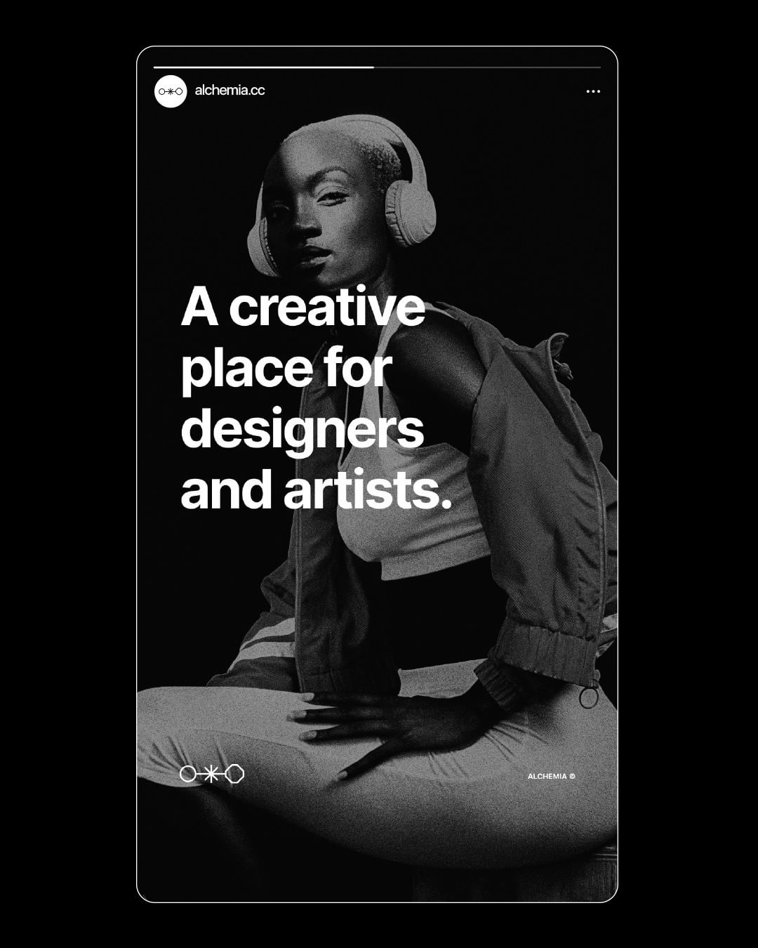
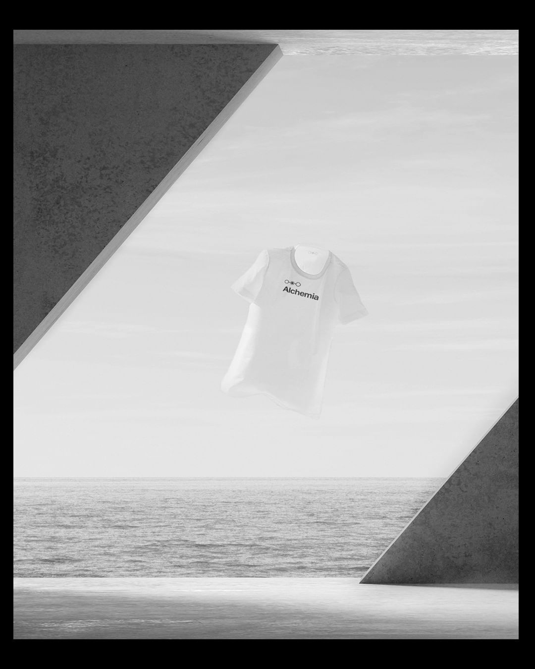
In this project, we are responsible for translating the brand concept into Visual Identity. One of the significant challenges was the creation of distinctive identity, with the presence of visual elements such as the symbol and the shape gradient, as the brand must focus on the product presented (in this one, the mockups) and not steal the user’s attention with an identity respectively.
Understanding the motivation of Alchemia: In the research stage, we actively participated in collecting all the perspectives of the creator of the collective, Santiago, and materialising this in a cohesive communication. The primary motivator was to channel the passion for design into something that could provide differentiated curation for other designers within the field.
Based on this perception, we built an exciting report based on our research methodology, investigating different ways of communicating these values as a brand. We found in the Alchemist archetype issues very close to what Santiago (Owner of Alchemia ) felt he should share with the brand. We also had good directions from the selected references, inspired by local references and the metaphor of alchemy itself to materialise all these concepts, associations, and feelings.
The challenge behind the visual identity: From these perceptions collected in the research stage, we started the challenge of concretising these perceptions in visual identity with an exciting question about the brand: we should neutrally present all this personality because it could not “steal” the highlight of the materials, mockups, templates, and other artifacts to be presented by Alchemia.
It was from there that the choice for neutral gradients and communication without accent colours was defined and consolidated a path for the construction of an exciting symbol – the ellipse means the beginning, the natural state of things, and can also be a metaphor for designers’ projects before being leveraged.
The asterisk shows the transformation (or transmutation if we’re talking about alchemy itself), which is when the natural state of things changes: think of it as a peak of creativity or the entry of a tool or tool methodology presented by Alchemia itself in a project. – the hexagon shows the new shape – the ellipse was transformed into something different and enhanced to a possibility that was not viable before, changing from its journey.
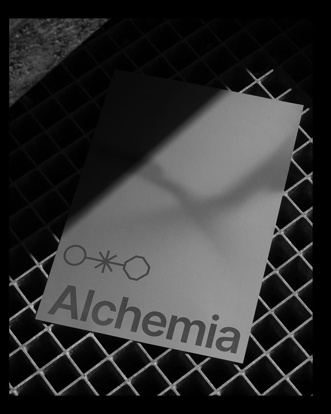
Minimalism as a function in materials: Finally, when we unfold the essential visual identity that we build in materials, we highlight how minimalism can be used outside of fads or hype. In this case, it completes the explicit purpose of staying neutral and not stealing the performance from products. The visual signature composed of these different shapes (gradients, grid patterning, etc.) seeks to achieve a cohesion that can be perceived without necessarily depending on the display of the complete logo in an “ideal” situation.
It is always an extra responsibility to work with a client who is also a designer on our side. However, we also find ourselves as an audience of Alchemia itself, and this identification certainly directly impacted our project conception.

CREDIT
- Agency/Creative: Duck Design Studio
- Article Title: Duck Design Studio Create Visual Identity Alchemia
- Organisation/Entity: Agency
- Project Type: Identity
- Project Status: Published
- Agency/Creative Country: Brazil
- Agency/Creative City: Gramado
- Market Region: Global
- Project Deliverables: Brand Guidelines, Brand Identity
- Industry: Public Utility
- Keywords: Alchemia
-
Credits:
Creative Director: Vinicius Germano Muller
Designer: Eduardo Matos
Researcher and Designer: Gabriel Sauer


