The project is a design for a children’s drum school.
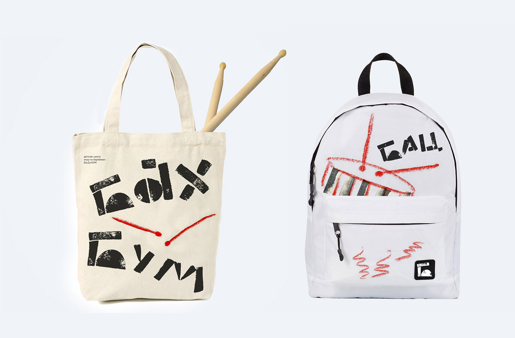
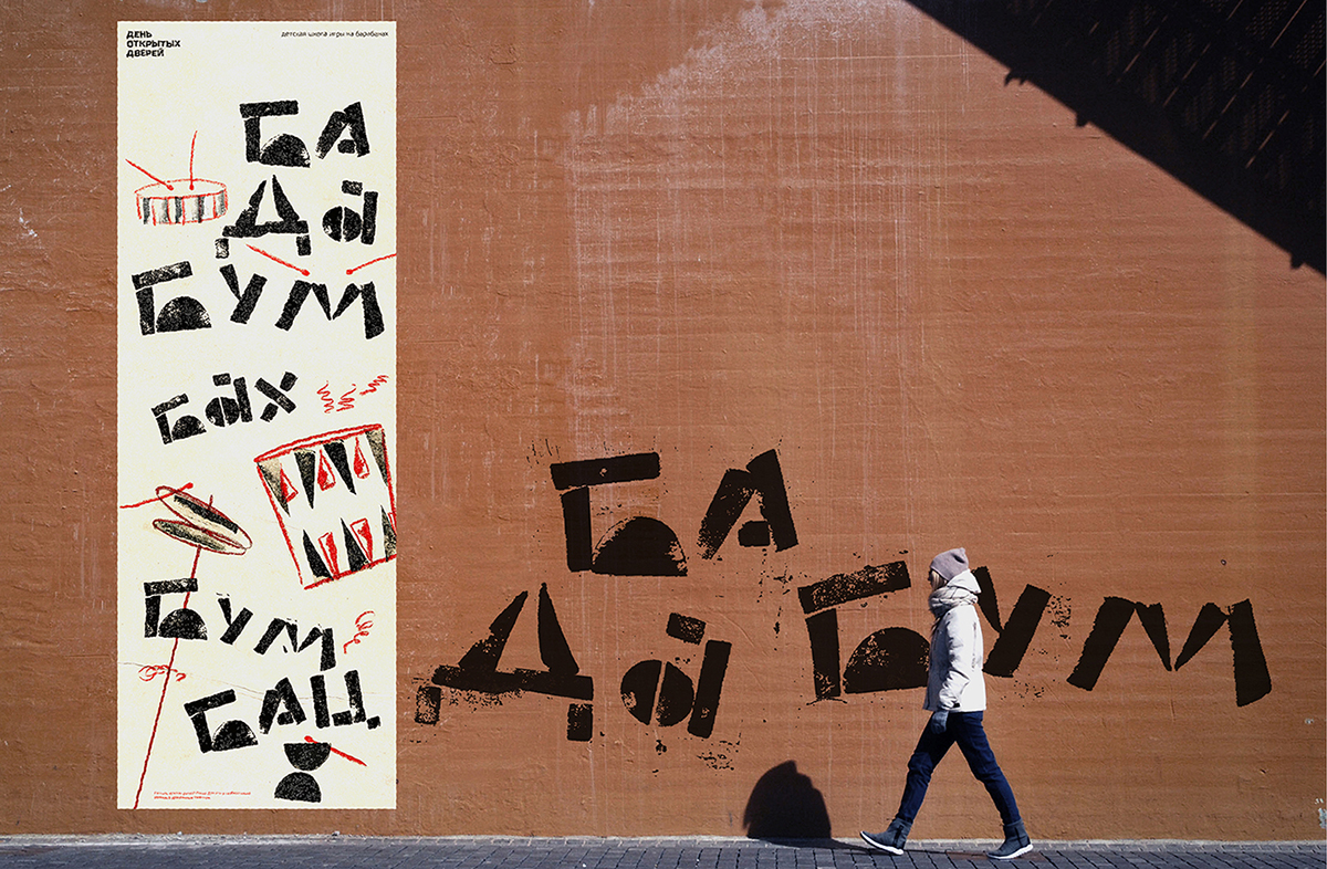
Moving massive typography and illustrations create a kid-friendly atmosphere.
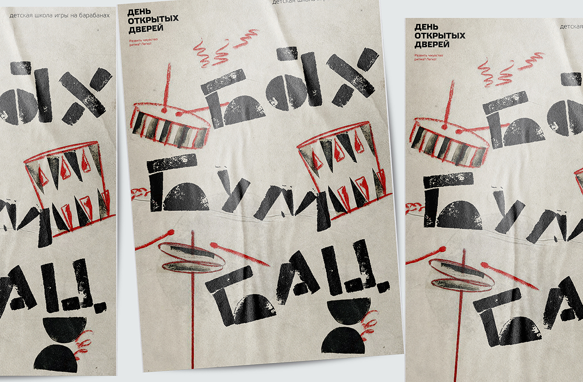
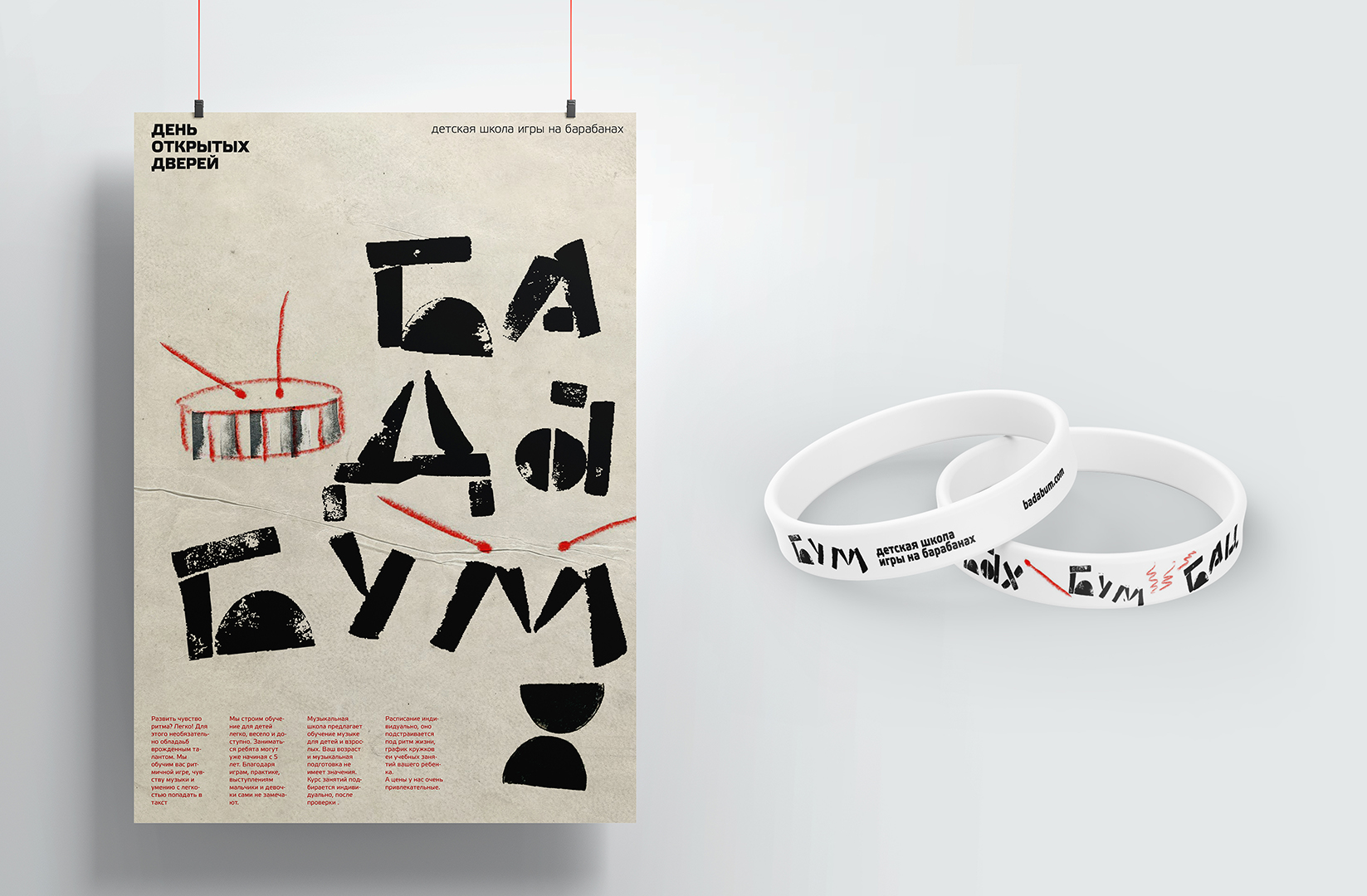
To create the style, “potato typography” was used – the name and additional visual elements were made using the cut-out potato module. It gives a sense of movement, dynamics. The font was printed from the modules on paper, and watercolor illustrations were made to complement the font composition.
Due to simple forms, the atmosphere of musical instruments is conveyed. It is as if you are entering the hall: noisy, merrily, there are claps, resounding beats on the drums. In the drum illustration, “tactility” appears.
The potato typeface creates unique letters on every print while remaining lightweight despite its dense typography. Printing makes the project live and moving. Easily transformable for any media such as advertising and souvenirs and accessories for children. The design turns out to be modern and not overloaded, and the main thing is very different from other children’s music schools. What makes it stand out in the market.
The music school uses in its methodology not only classical lessons but also attracts children with appropriate age-related lessons. We turn the learning process into a game constructor. Therefore, the corporate identity is a playground on which we can build various solutions with the help of modules.
The expressive name ba-da-boom is based on onomatopoeia when playing percussion instruments and, if necessary, we can continue this series for other areas of the music school such as choir, solfejo, or wind instrument playing. The main thing is to create a short sonorous naming that is easy for children to remember.
All of these design features allow you to continue working on your corporate identity, as new templates are easily created thanks to the modular font.
The project was created by Elizaveta Starodynova at the HSE School of Design, 2021. Tutor Pavel Borisovsky.


CREDIT
- Agency/Creative: Elizaveta Starodynova
- Article Title: Drum School for Children Branding and Promotion by Elizaveta Starodynova
- Organisation/Entity: Student
- Project Type: Graphic
- Project Status: Non Published
- Agency/Creative Country: Russia
- Agency/Creative City: Moscow
- Market Region: Europe, Global
- Project Deliverables: Brand Identity, Design, Graphic Design
- Industry: Education
- Keywords: WBDS Student Design Awards 2021/22
-
Credits:
Tutor: Pavel Borisovsky.


