Liberate your shopping from bad returns
Droppa is a multi-return platform setting a new standard in e-commerce logistics. That means less emission, less cost, and less hassle for the world of fashion brands and consumers.
From frustration to a best-in-class experience
Droppa grew out of the frustration of managing returns as an e-commerce merchant. Frustration rooted in everything from customer registrations to customer service contacts and warehouse management. They knew they could make returns better.
Returns that make sense
We all need things delivered, and we all need to send things back sometimes. But why ship multiple parcels when you can ship one? Droppa allows consumers to send all their returns with the courier of their choice. No more nonsense returns.
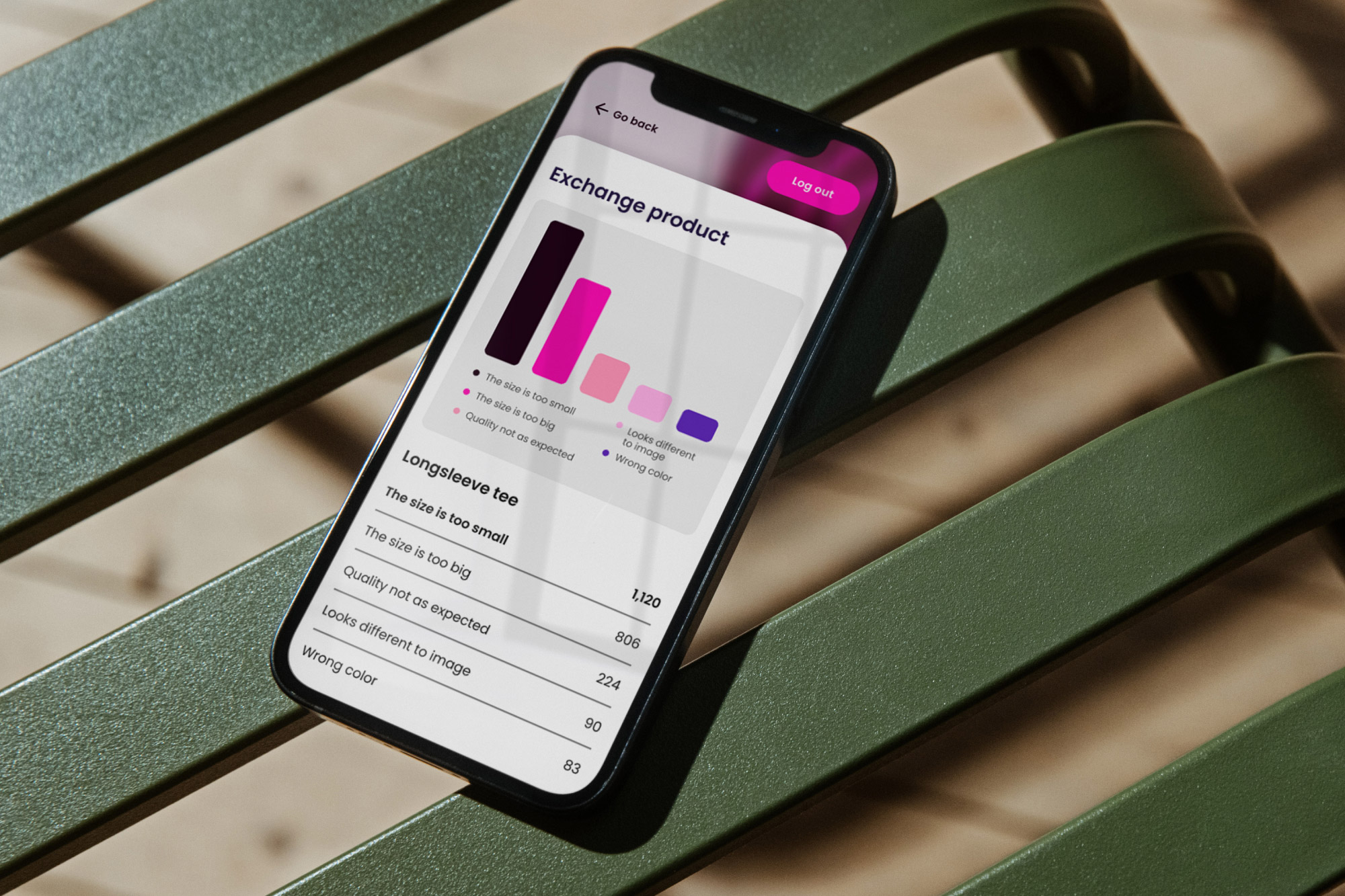
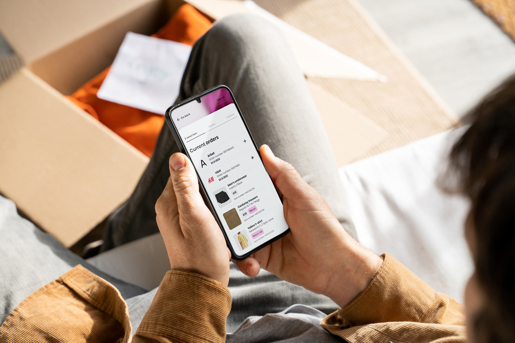
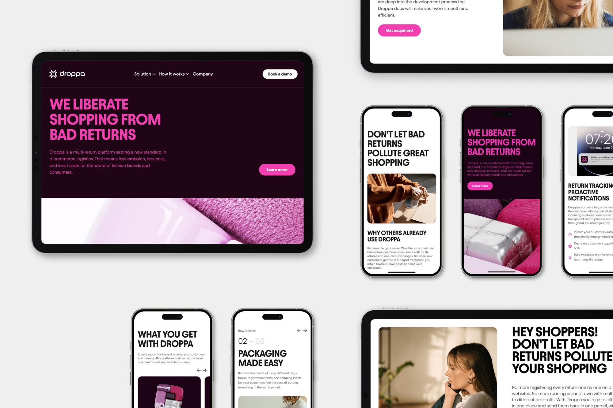
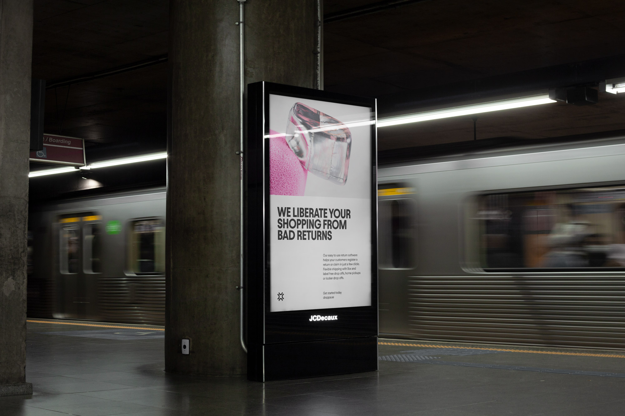
We supported Droppa with creating the brand strategy, messaging, visual identity, website, and assets, as well as mobile app design.
Laying the foundation
Droppa’s brand values – Commercial boost, Multi-returns standard, and Footprint reduction – were developed through market research and internal strategy sessions.
”Commercial boost” positions Droppa as a company that delivers measurable results. ”Multi-returns standard” shows Droppa’s commitment to shaping the future of shipping by actually aggregating multiple returns into one sign-in, one registration, one parcel, and one shipping provider. Lastly, ”Footprint reduction” speaks for itself, the improvements Droppa is bringing to the logistics industry will have a huge sustainability impact.
The Droppa fusion
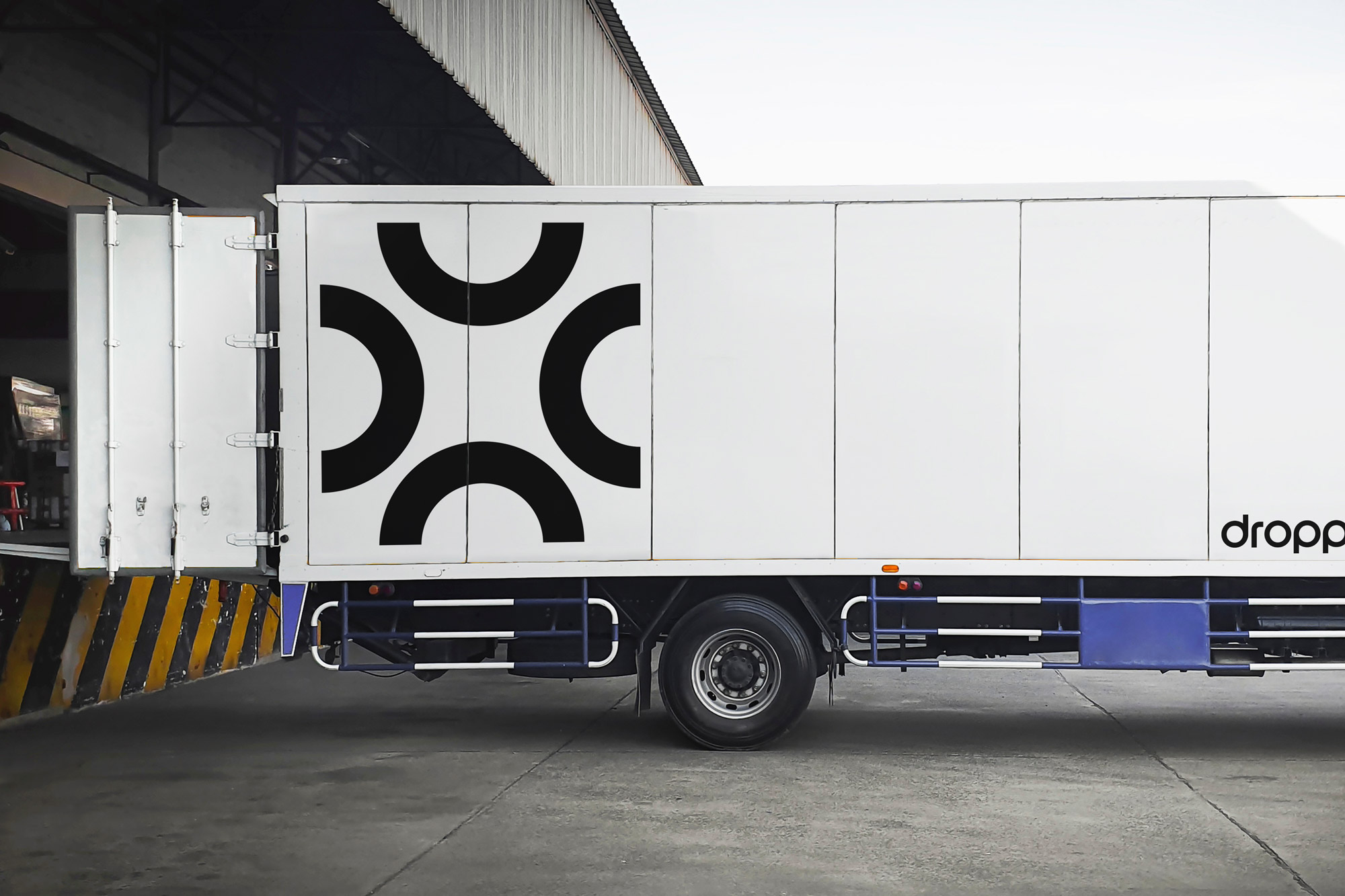
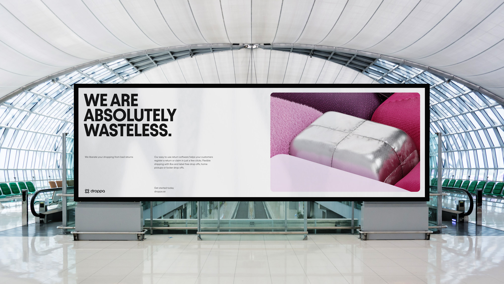
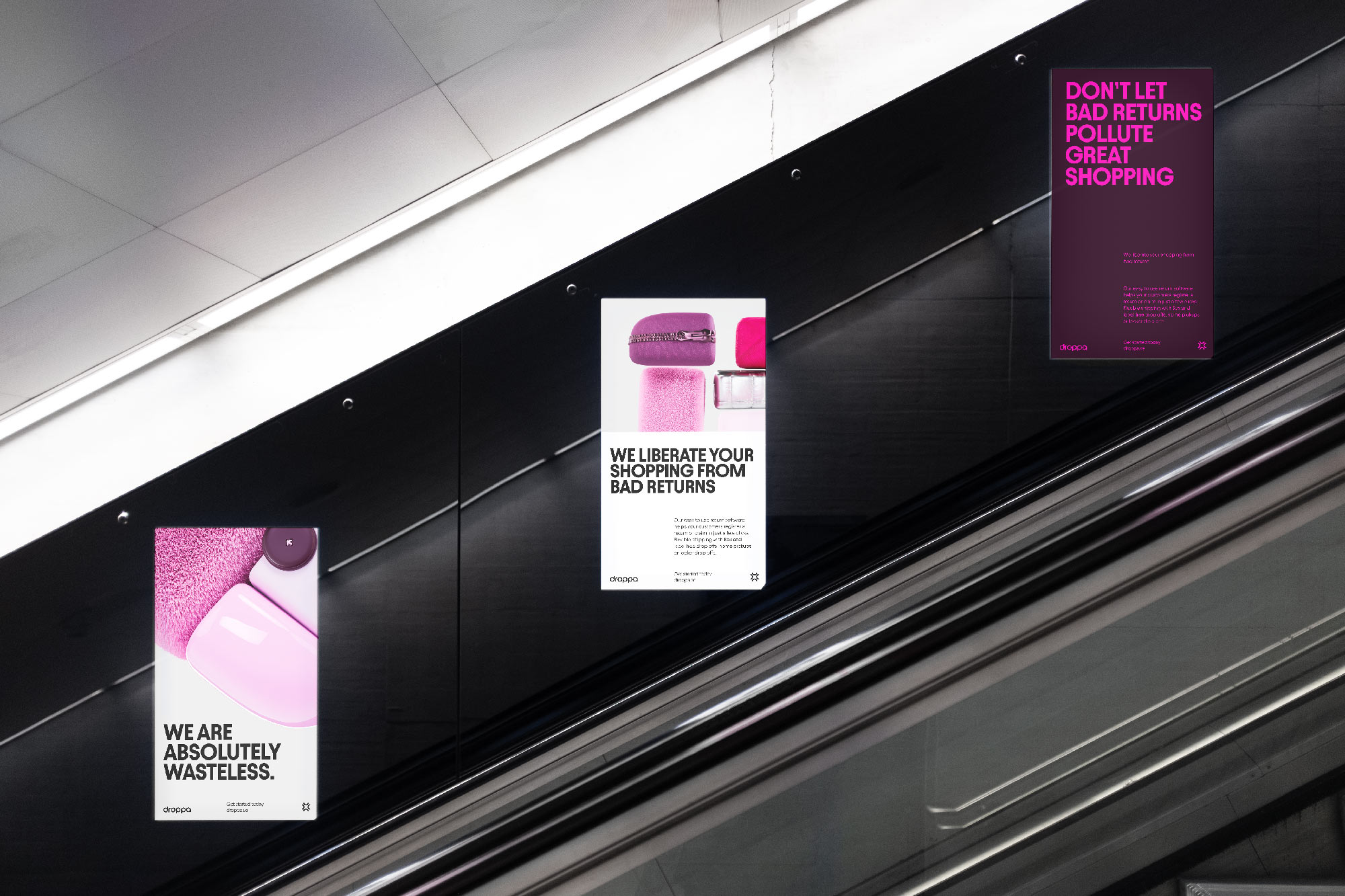
Droppa’s visual identity stands out with its vibrant color palette and unique typography. By embracing bold design elements, Droppa sets itself apart from the more conventional players in the logistics industry and effectively communicates its close tie to the apparel industry.
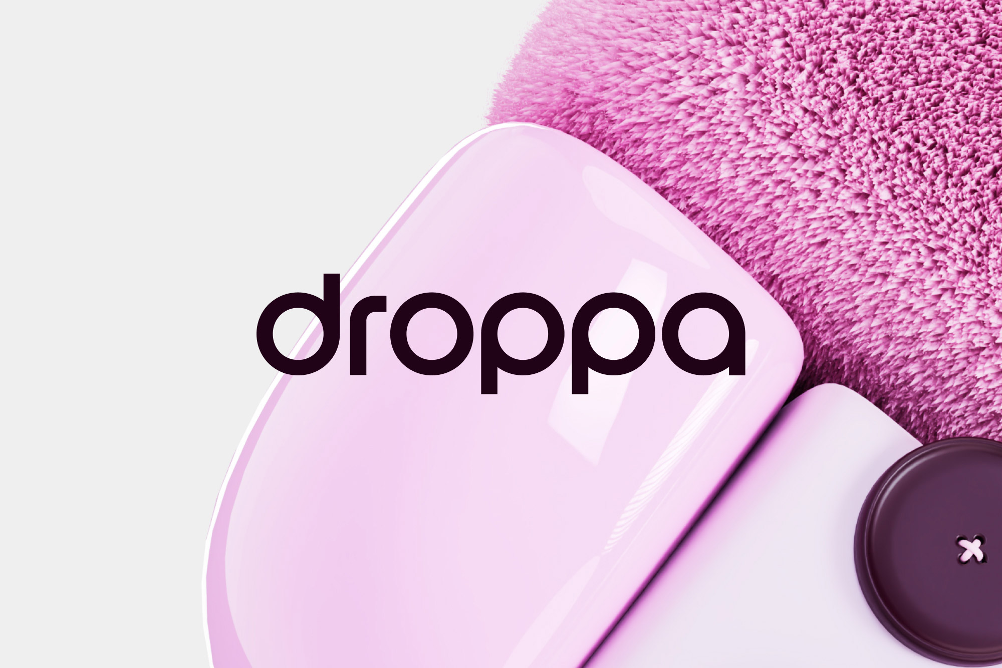
The concept behind Droppa’s visual identity is the fusion of multiple objects into a single entity. The logo incorporates the same idea, as pieces of the circles from the wordmark are integrated into a box to form the symbol.
By incorporating textures inspired by various textiles into our 3D graphics, we are also building on the relevance to the apparel industry.
The website holds a clean and subtle techy look while still reflecting the fashion industry using a warm tone to our images with a sense of locality to communicate the Footprint reduction trait.
By using Webflow, the design-to-launch process for Droppa’s new brand is smooth and efficient, allowing the team to iterate quickly and focus on the design and content of the site.

CREDIT
- Agency/Creative: Most Studios
- Article Title: Droppa’s Visual Identity and Web Design: A New Standard for Hassle-Free E-commerce Returns
- Organisation/Entity: Agency
- Project Type: Identity
- Project Status: Published
- Agency/Creative Country: Sweden
- Agency/Creative City: Stockholm
- Market Region: Europe
- Project Deliverables: 3D Design, 3D Motion, App Design, Brand Design, Brand Identity, Brand Strategy, Branding, Motion Graphics, Photography, Web Design
- Industry: Technology
- Keywords: brand design, brand identity, 3Ddesign, branding, web design, droppa, delivery, app, product,
-
Credits:
Graphic Designer: Johannes Persson
3D and Motion Designer: Benjamin Karlström
Project Manager: Viveca Larsson
Strategist: Johan Sahlström
Creative Director: Oskar Pettersson


