Earlier this year, the popular file-hosting company Dropbox acquired a number of new products. Expanding their offerings beyond their existing cloud-based storage services. They kindly invited us to help position these new products within Dropbox’s current brand architecture.
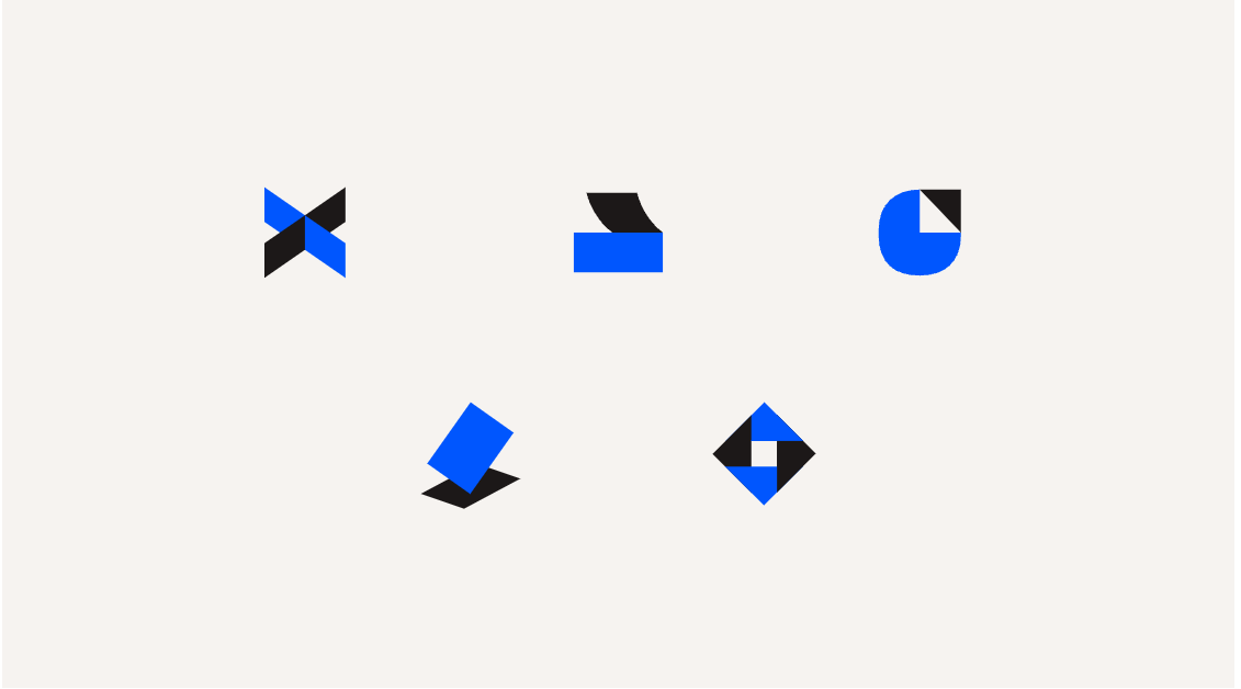
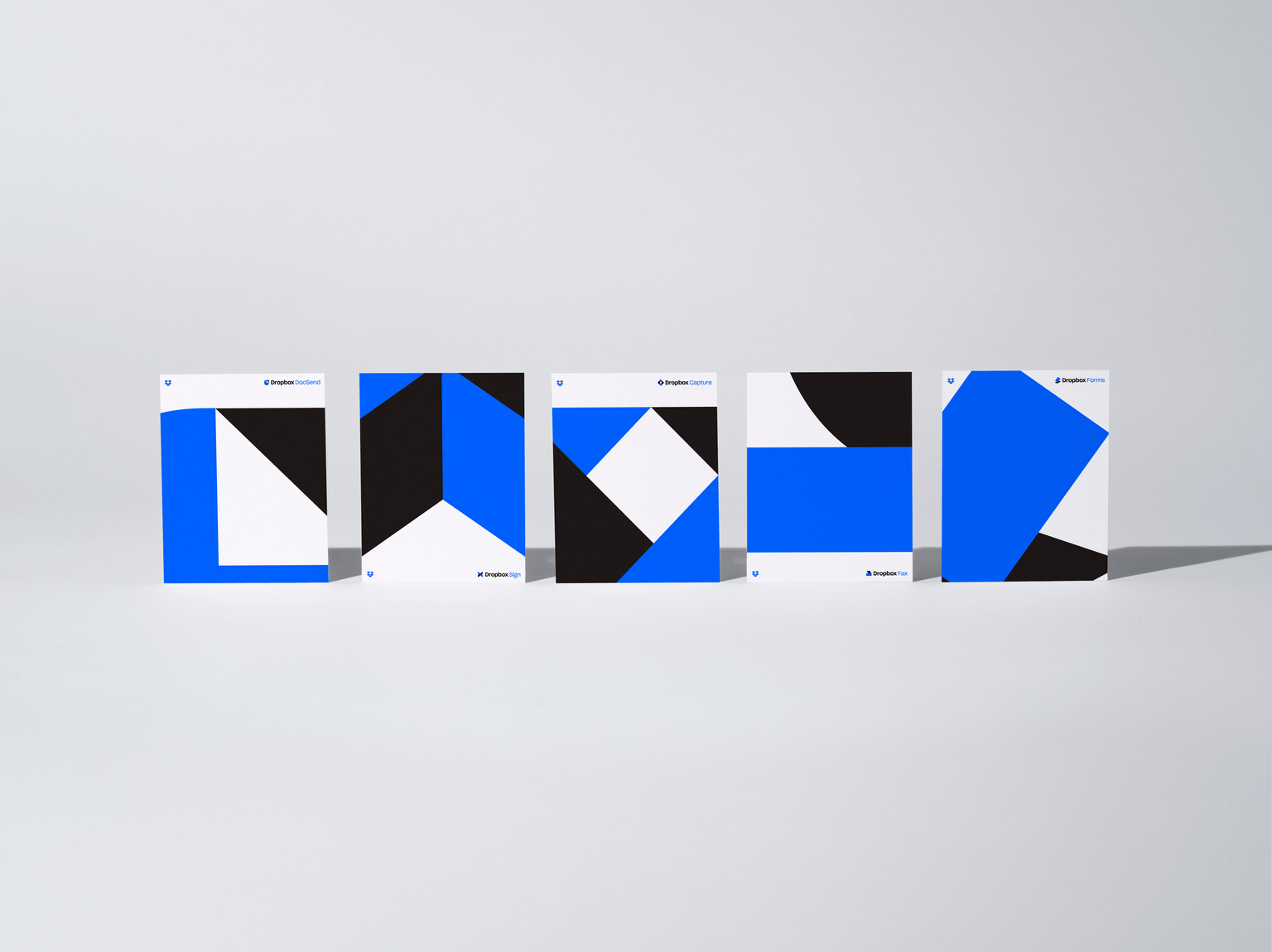
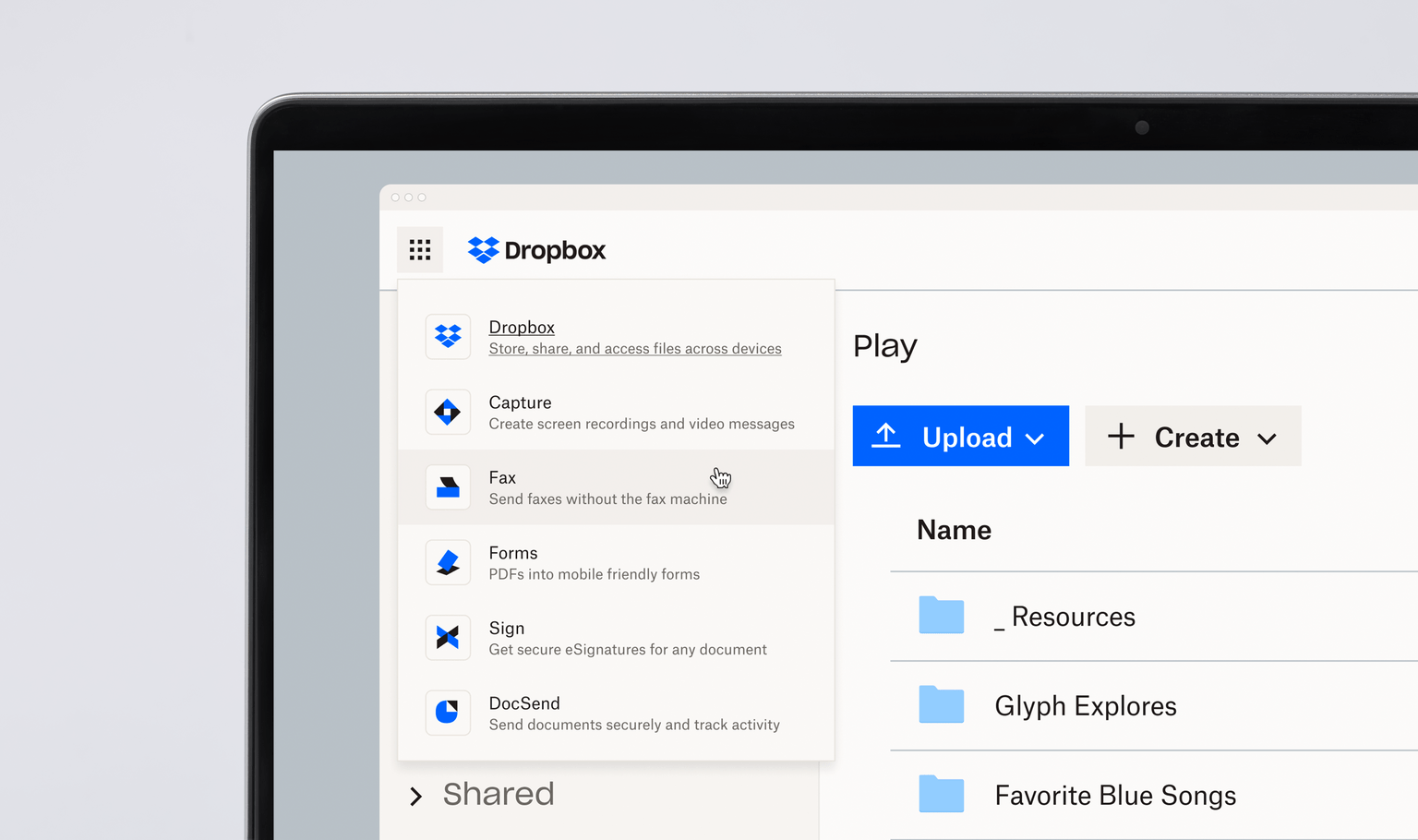
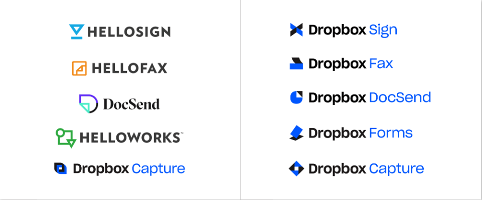
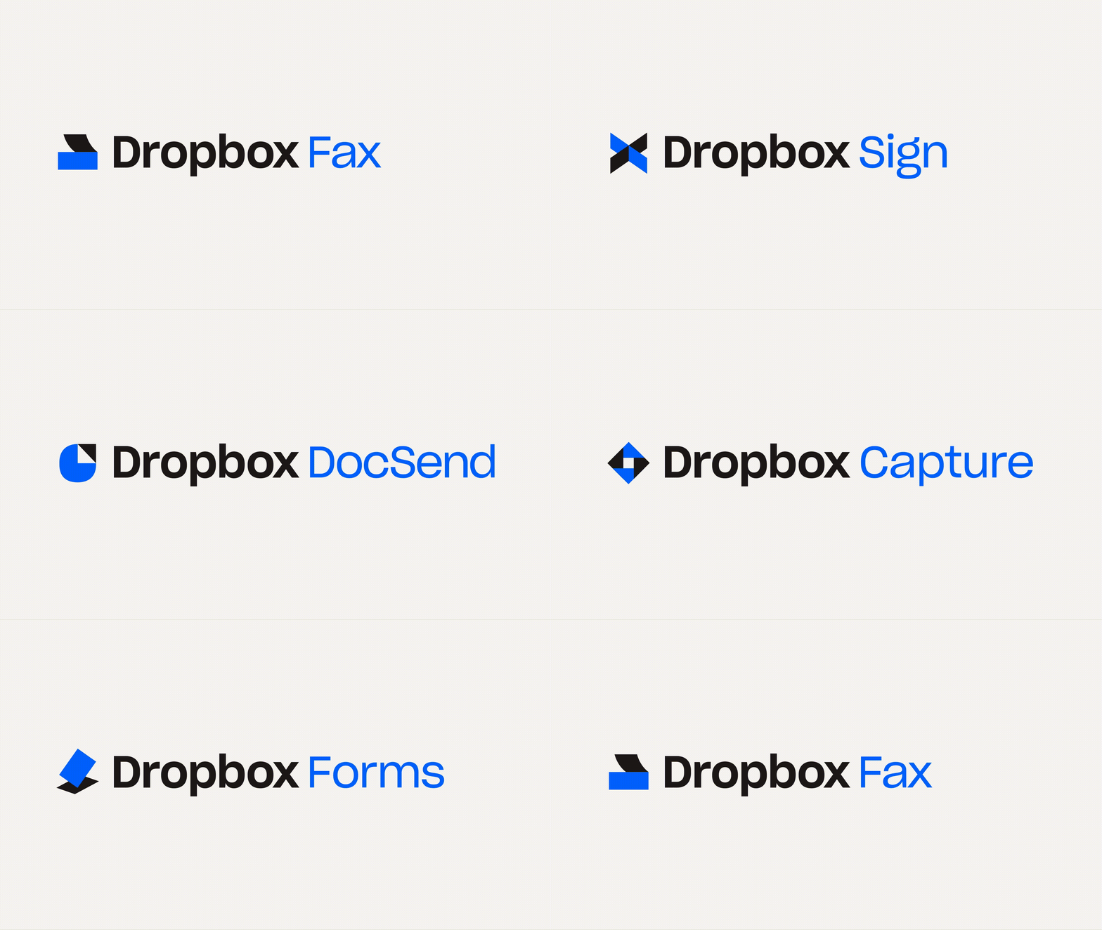
We collaborated closely with the Dropbox team to create an eyecatching new library of glyphs to visually bring each of their new products to life. They are as follows: Dropbox Capture, Dropbox Sign, Dropbox Forms, Dropbox Fax, and Dropbox DocSend.
We wanted each symbol to not just represent but embody the product features as clearly as possible. Allowing them to stand alone and be recognized and understood when seen apart from their product name. As we developed the look of each glyph, we explored options that were extremely literal as well as quite abstract. Thousands of iterations later, we all seemed to agree that leaning into simplicity was the best path forward.
While holding ourselves to the most rigorous standards, we were able to generate a new series of icons that are as equally iconic as the original Dropbox logo. While some break occasionally break the symmetry of the original, each leverages the overarching geometric style made famous by the parental Dropbox icon as well as its signature core brand colors of blue and graphite.
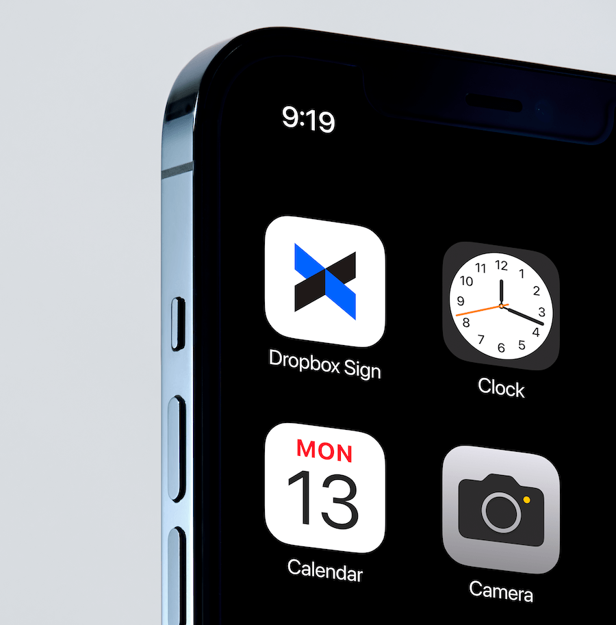
It’s easy to see the craft and innovation that went into the creation of each glyph. The glyph for Dropbox Capture, a video messaging tool, takes its inspiration from a camera’s aperture. Dropbox Sign, a tool that lets users send and request documents for signing, incorporates the iconic X used to mark the spot for signatures. Dropbox Forms converts PDFs into signature-ready, mobile-friendly forms. Its corresponding glyph takes shape as a document hovering over a mobile phone screen. The Dropbox Fax glyph naturally takes on the appearance of a fax machine. Lastly, Dropbox DocSend leans into the tool’s analytic capabilities for sending business-critical documents. It artfully comes to life as a dog-eared pie-chart with an arrow reveal indicating the send function.
And what is a Dropbox case study without the customary mic drop at the end? Gotta drop the mic if your name is Dropbox.


CREDIT
- Agency/Creative: Play Studio , Dropbox
- Article Title: Dropbox Glyphs Brand Redesign
- Organisation/Entity: Agency
- Project Type: Identity
- Project Status: Published
- Agency/Creative Country: United States of America
- Agency/Creative City: San Francisco
- Industry: Technology
- Keywords: WBDS Agency Design Awards 2022/23
-
Credits:
Executive Creative Director: Casey Martin
Designer: Chandler Reed
Designer: Daniela Paz
Designer: Dylan Wells
Sr. Designer: Ellis Latham-Brown
Designer Director: Kyle L. Beck
Animator: Lauren Konig
Sr. Producer: Lindsay McMenamin
Sr. Designer: Rosie Manning
Sr. Designer: Simon Blanckensee
Photographer: Mari Juliano
Strategist: Alexandra Brown
Brand Studio Producer: Beauty Nazzaro
Brand Studio Director: Liz Gilmore
Producer: Ryan Wilson
Sr. Brand Designer: Sydney Goldstein


