


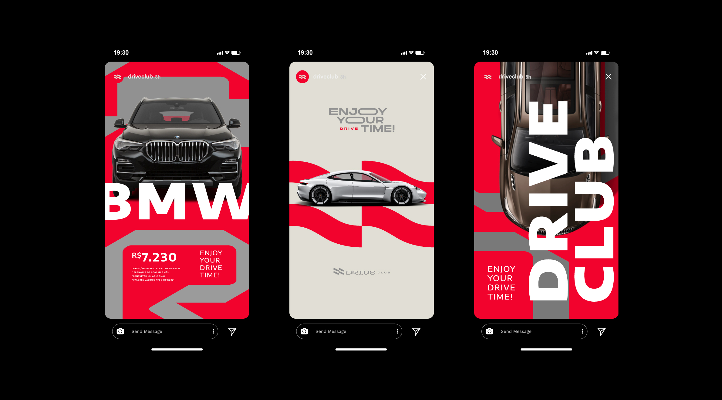
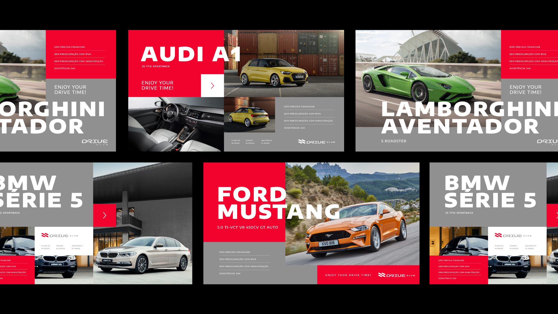
Drive Club / Identity: It is not secret that people seek to fulfil their dreams. They make our lives brighter and happier. share purchase service values each of these moments in our life and seeks to provide a unique experience in buying a car sport through quotas. Enjoy the time you drive.
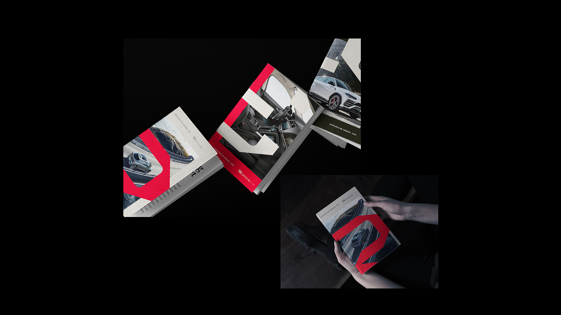
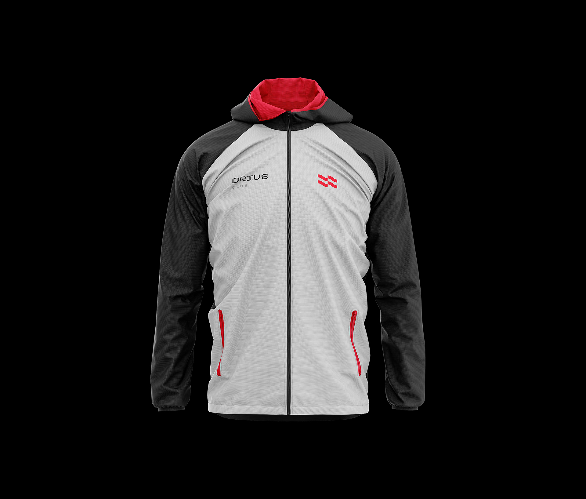
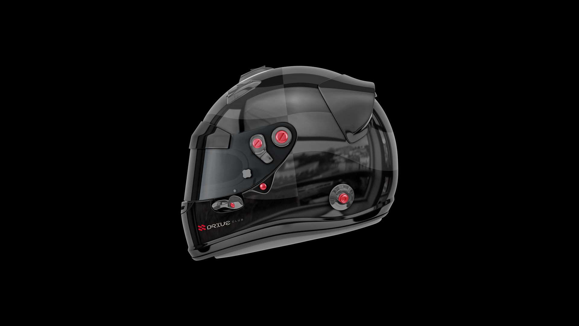
Providing a saving of money, but above all, the realisation of a dream. The mission of this project was to develop a new visual identity for the Drive Club® brand, creating a closer, more solid and accessible visual system through simple, functional elements and vibrant colors. The new brand will need to be flexible and extended to all products that Drive Club® offers to consumers.
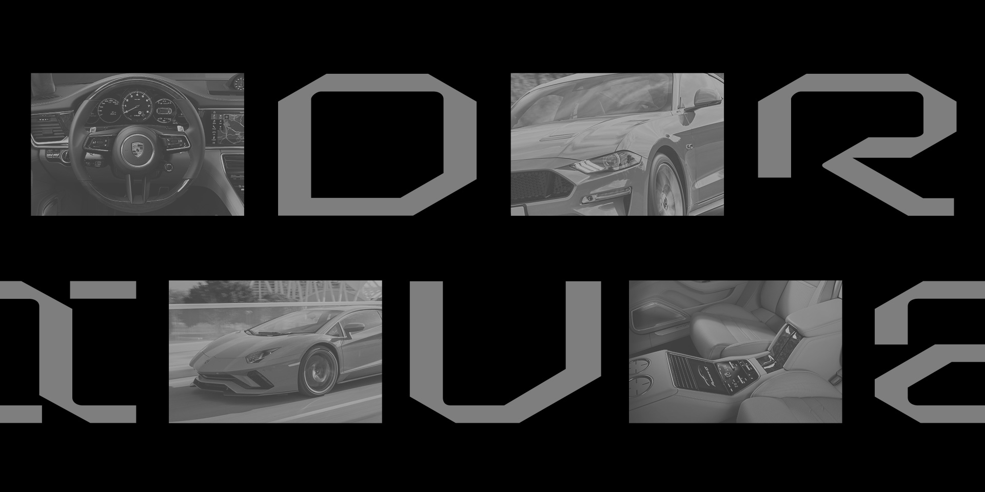
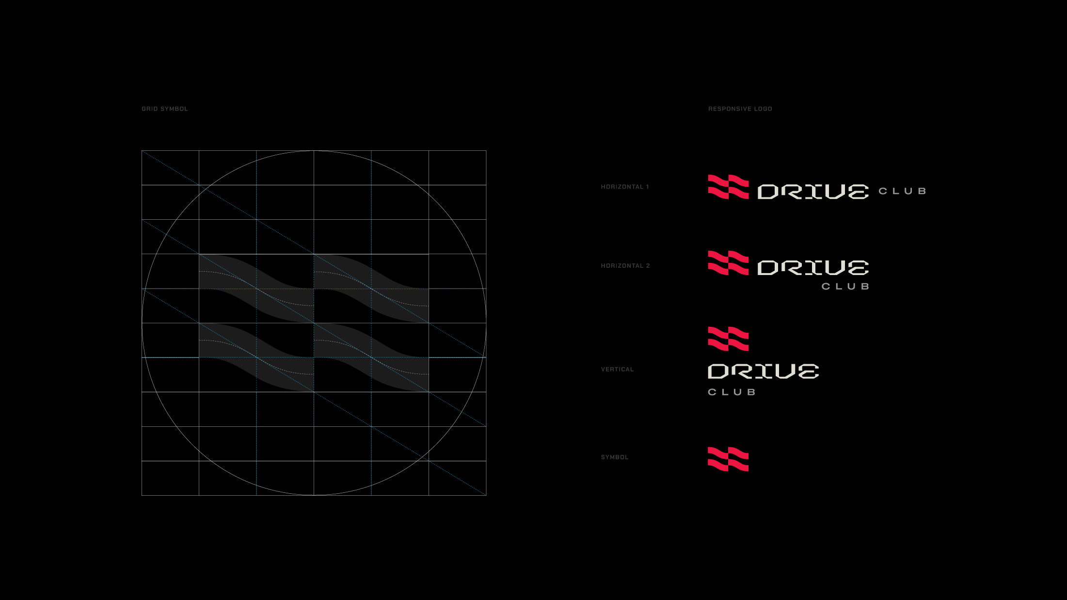
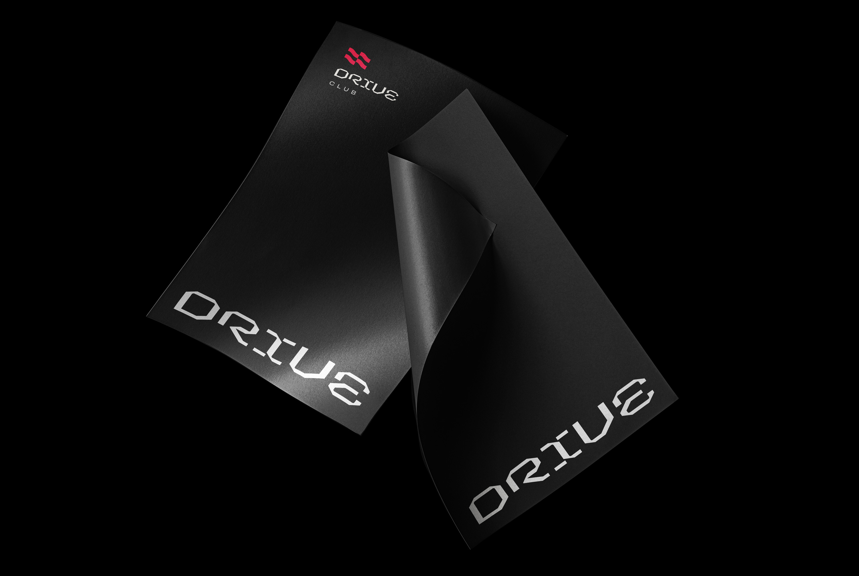
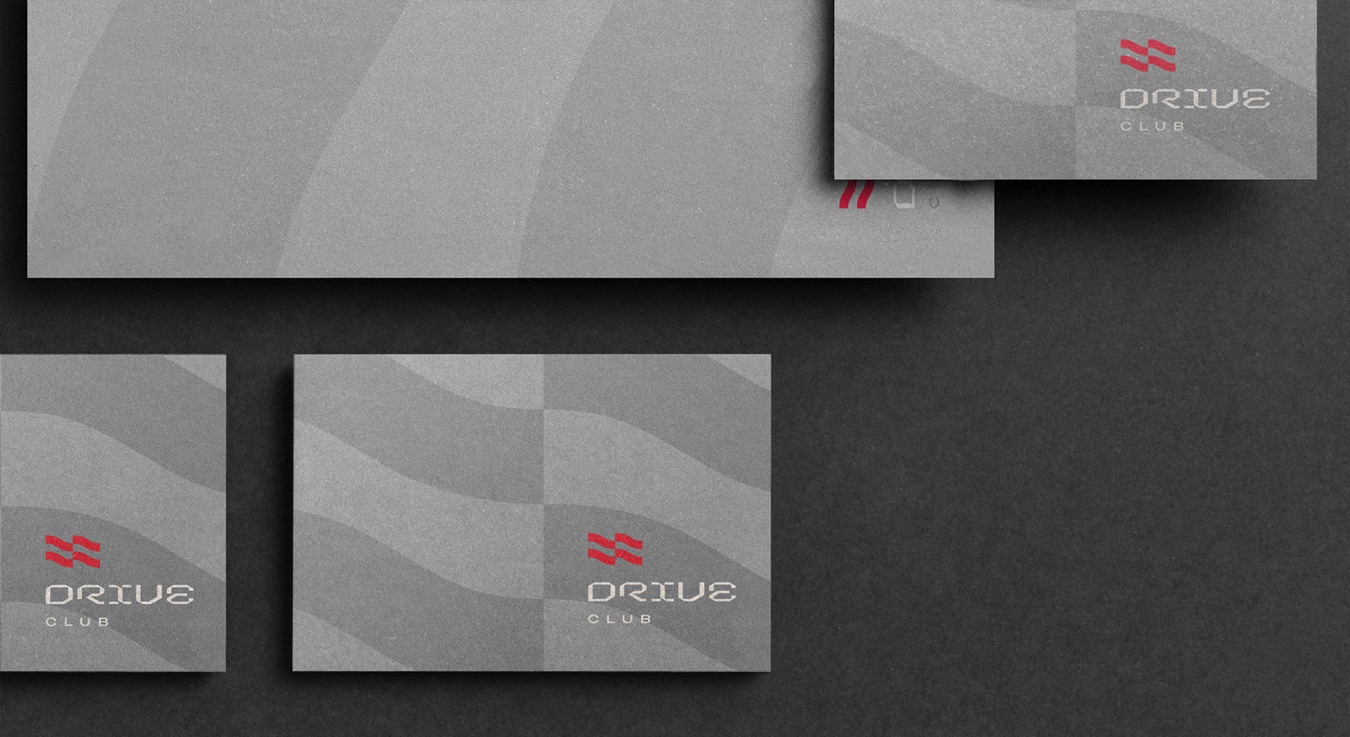
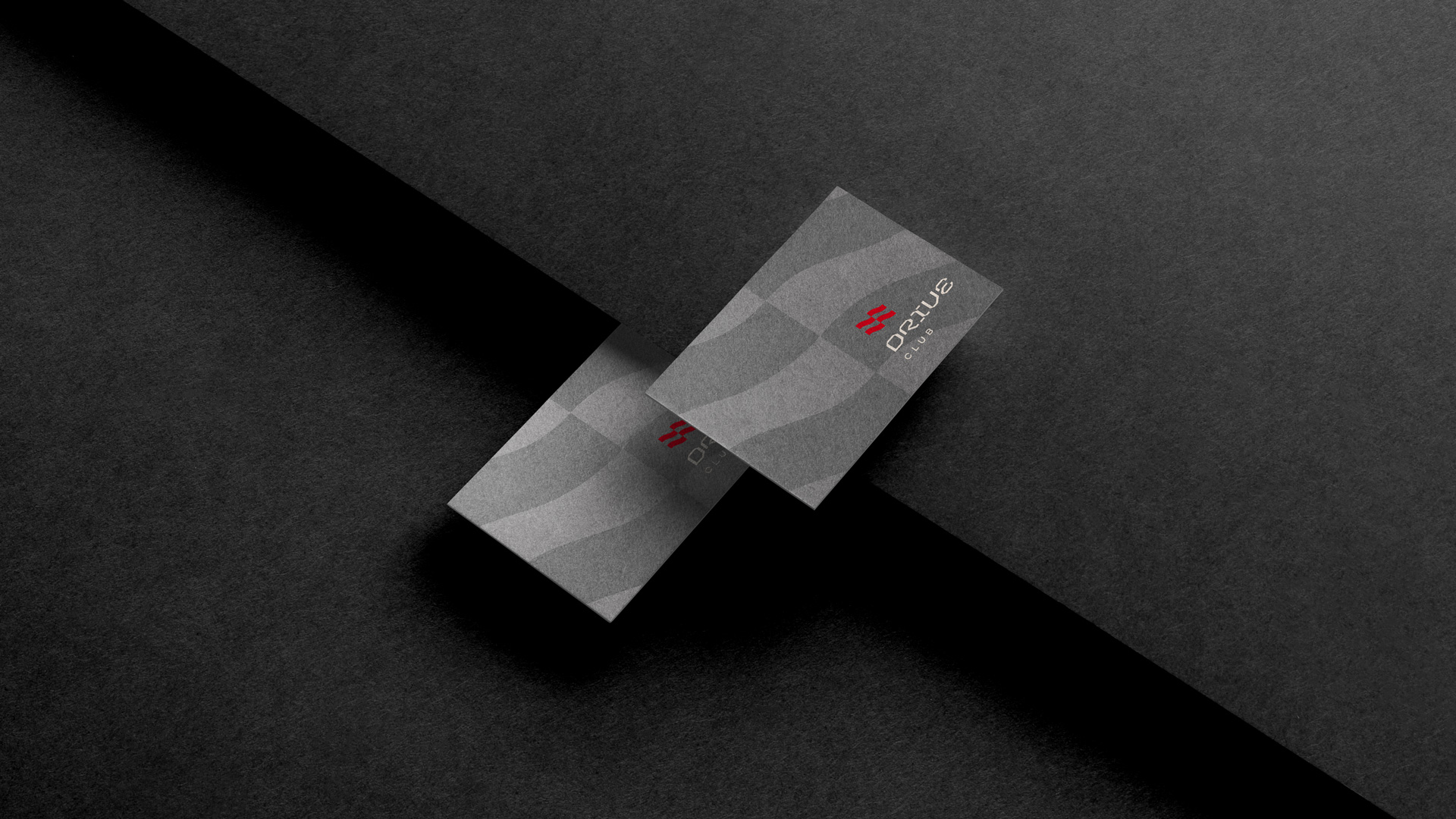
The logo explores the race tracks and the start / finish flag: But in a modern and experimental way. Each letter is a rigid geometric design with optical corrections purposely reduced to a minimum. They evoke the freedom and sportiness of the race tracks, while conveying a feeling of modern technology, and their symbol immediately connects the visual identity with the brand’s services.
Modular grid 15-13 for brand identity assurance: All tools are controlled by the modular grid. This makes a relationship between shapes and images common in all tools, and has been defined to maximize their effect. In addition, everyone wants to be able to produce that relationship easily. A grid changes according to the various media. Together with this modular system, we seek to explore the design of typography in your media as a graphic support, making it even more versatile and unique, with modern and suitable characteristics for the brand’s audience.
Our primary colours: Are called Brave Red, Hut Steel and Plane White. They were carefully selected to balance the bold, bold and imaginative side (Brave Red), with our confident and solid side (Hut Steel).
The color divisions defined here are intended to capture the emotional intent of colors and maintain their relationship between digital and print applications.
CREDIT
- Agency/Creative: Estúdio Kuumba
- Article Title: Drive Club Brand Corporate Identity Designed by Estúdio Kuumba
- Organisation/Entity: Freelance
- Project Type: Graphic
- Project Status: Published
- Agency/Creative Country: Brazil
- Agency/Creative City: Minas Gerais
- Market Region: South America
- Project Deliverables: Animation, Art Direction, Brand Design, Branding, Logo Design, Type Design
- Industry: Transport
- Keywords: Brand; Branding; Car; Identity; Sportcar
-
Credits:
Director Art: David Silva


