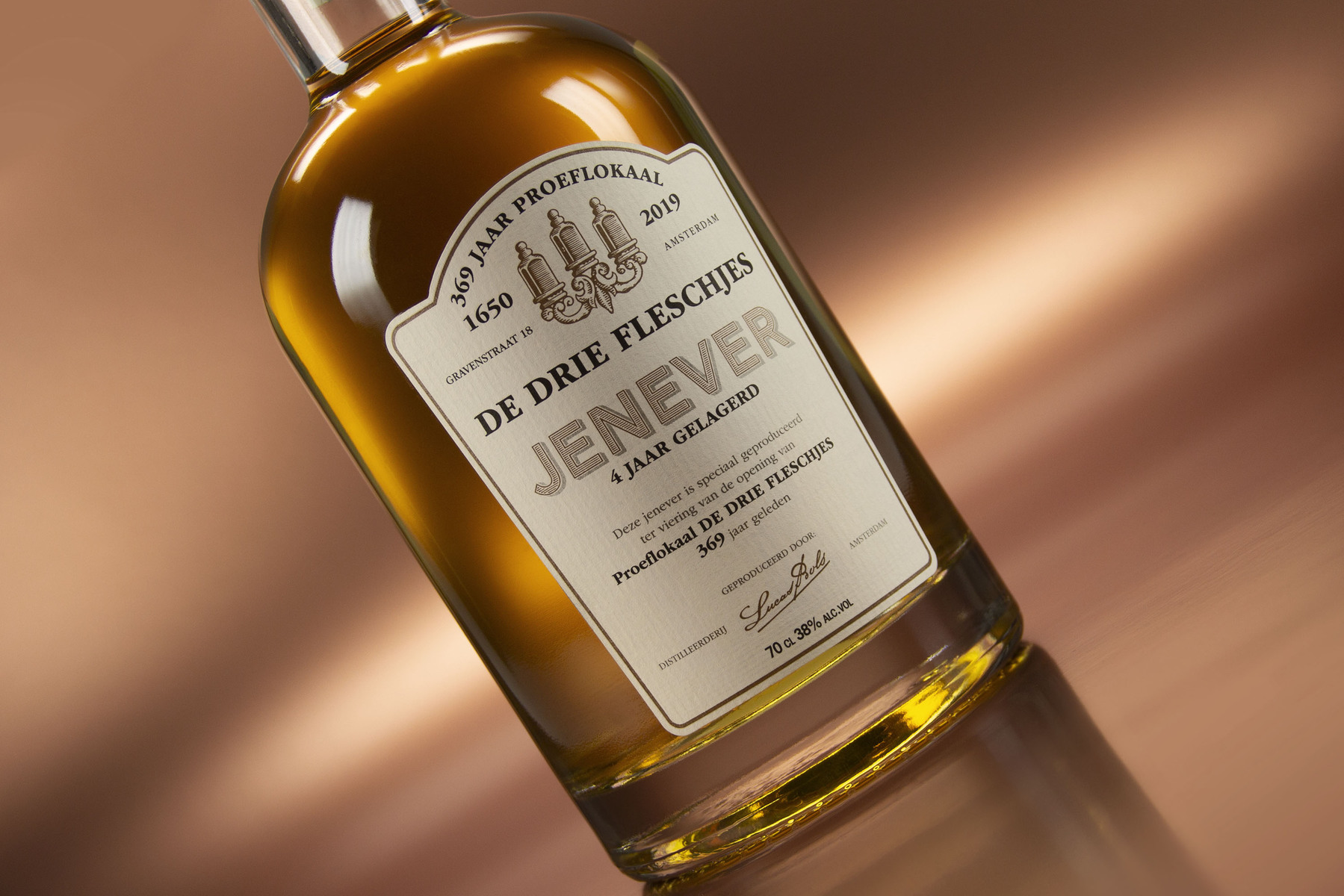
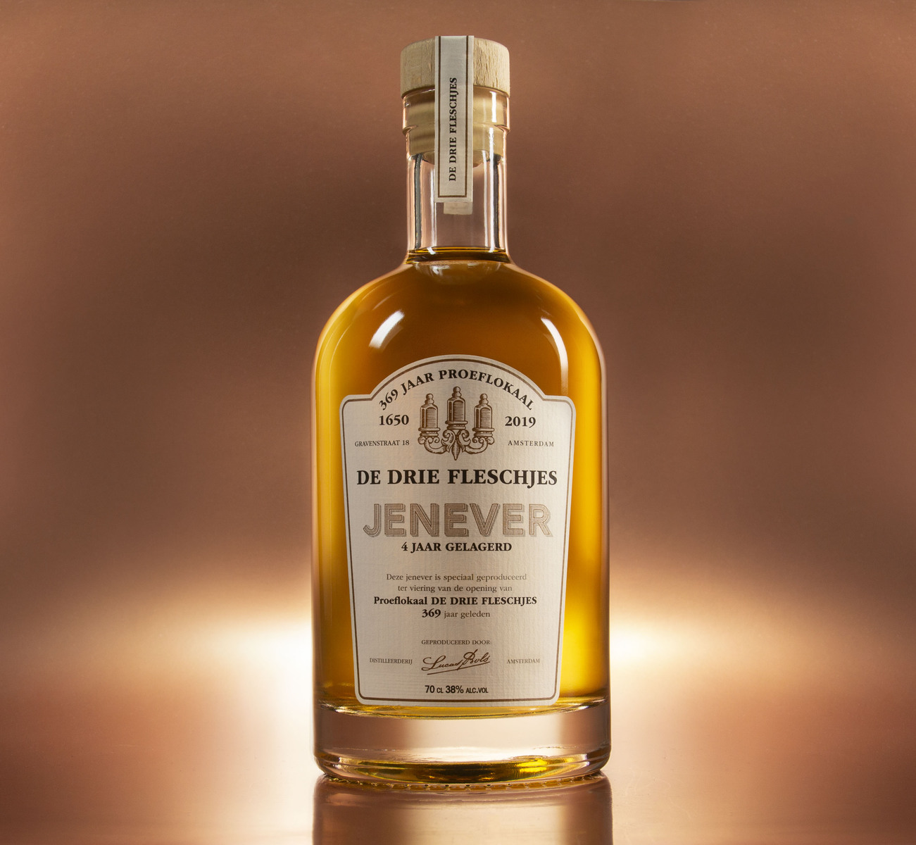
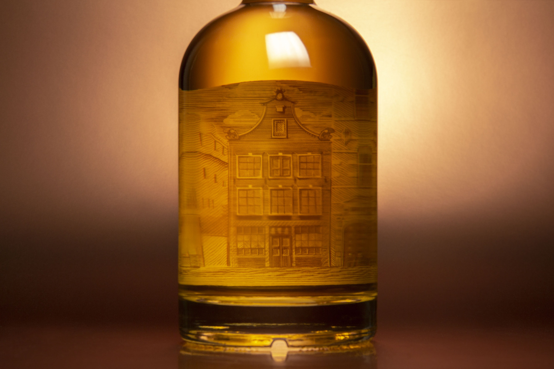
For the oldest tasting room (bar) in Amsterdam, Holland, we got the honor to design the packaging for their first ever own Genever celebrating their 369th anniversary!! Yeah that’s right, more than 3 centuries. The building is still standing strong in Amsterdam and is a real iconic building, sonwe illustrated it by hand on the inside of the label. Connecting the genever to the iconic building in Amsterdam. This was the most important thing for us. laying the connection between te past, the building and the spirit. Next to that we created a very carfty/historical looking front label design that fits the complete story. Cheers to de drie fleschjes (translation – the three bottles).


CREDIT
- Agency/Creative: Van Heertum Design VHD
- Article Title: Drie Fleschjes Genever Design (three bottles design)
- Organisation/Entity: Agency, Published Commercial Design
- Project Type: Packaging
- Agency/Creative Country: Netherlands
- Market Region: Europe
- Project Deliverables: Brand Architecture, Brand Creation, Brand Identity, Brand Strategy, Branding, Graphic Design, Illustration, Packaging Design, Photography, Product Architecture, Tone of Voice
- Format: Bottle
- Substrate: Glass Bottle
FEEDBACK
Relevance: Solution/idea in relation to brand, product or service
Implementation: Attention, detailing and finishing of final solution
Presentation: Text, visualisation and quality of the presentation


