


Bolter Studio – Dressd
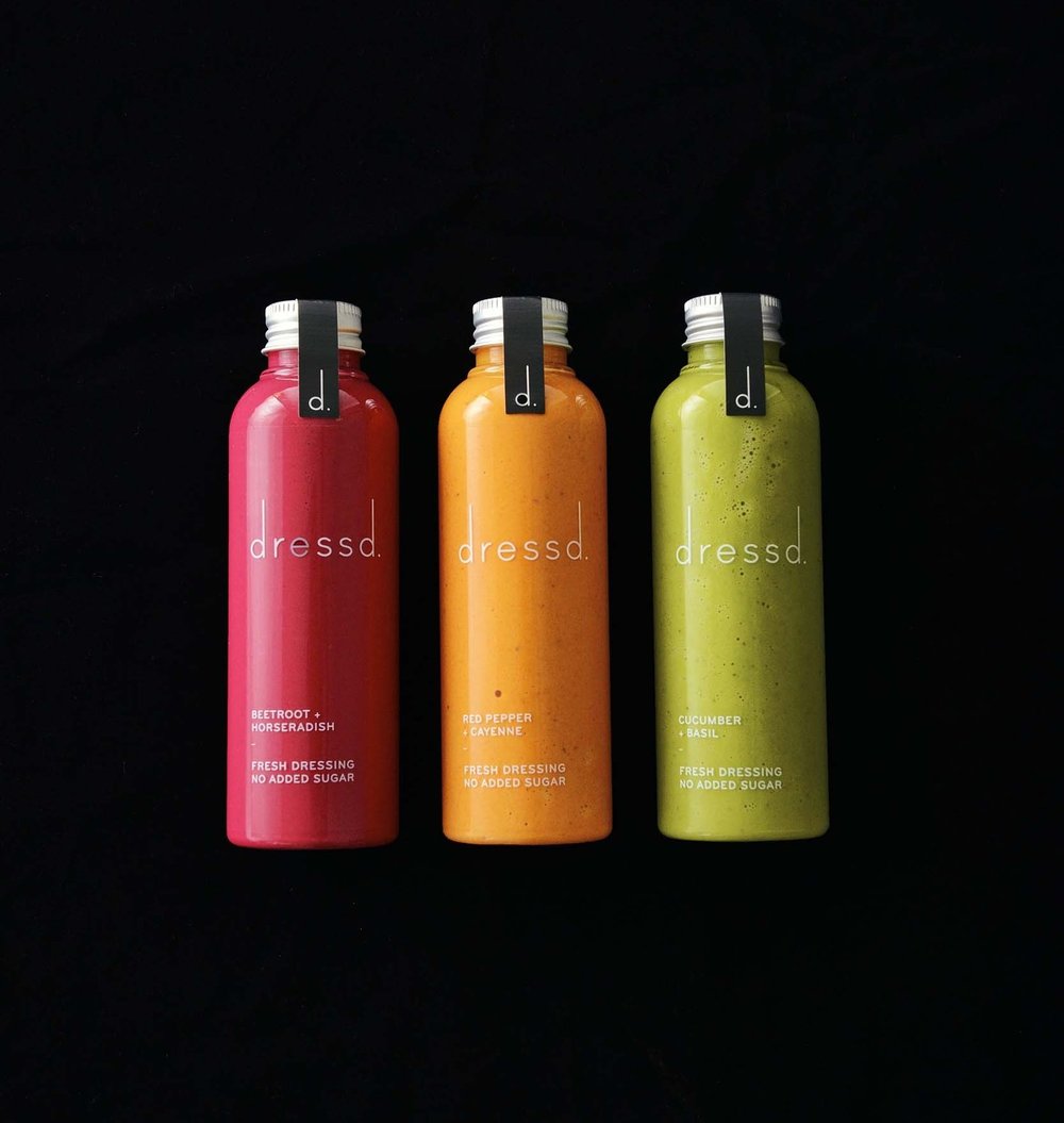
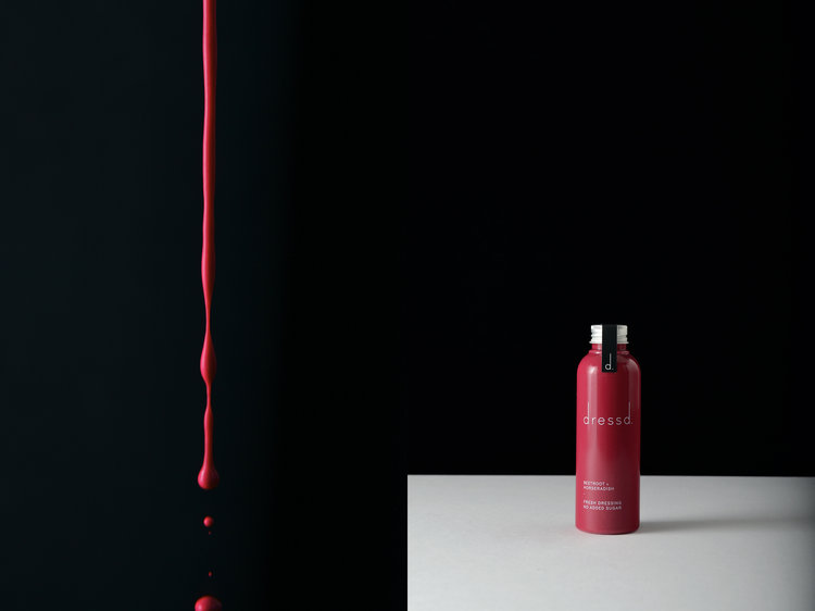
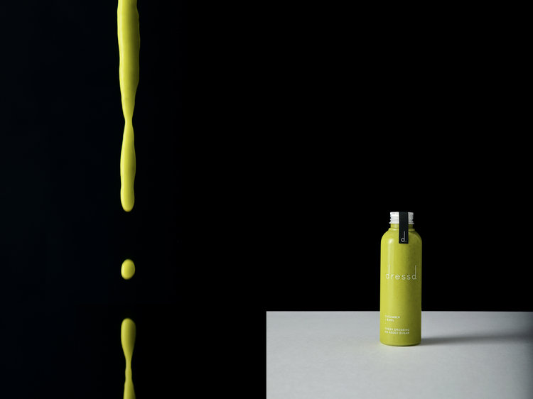
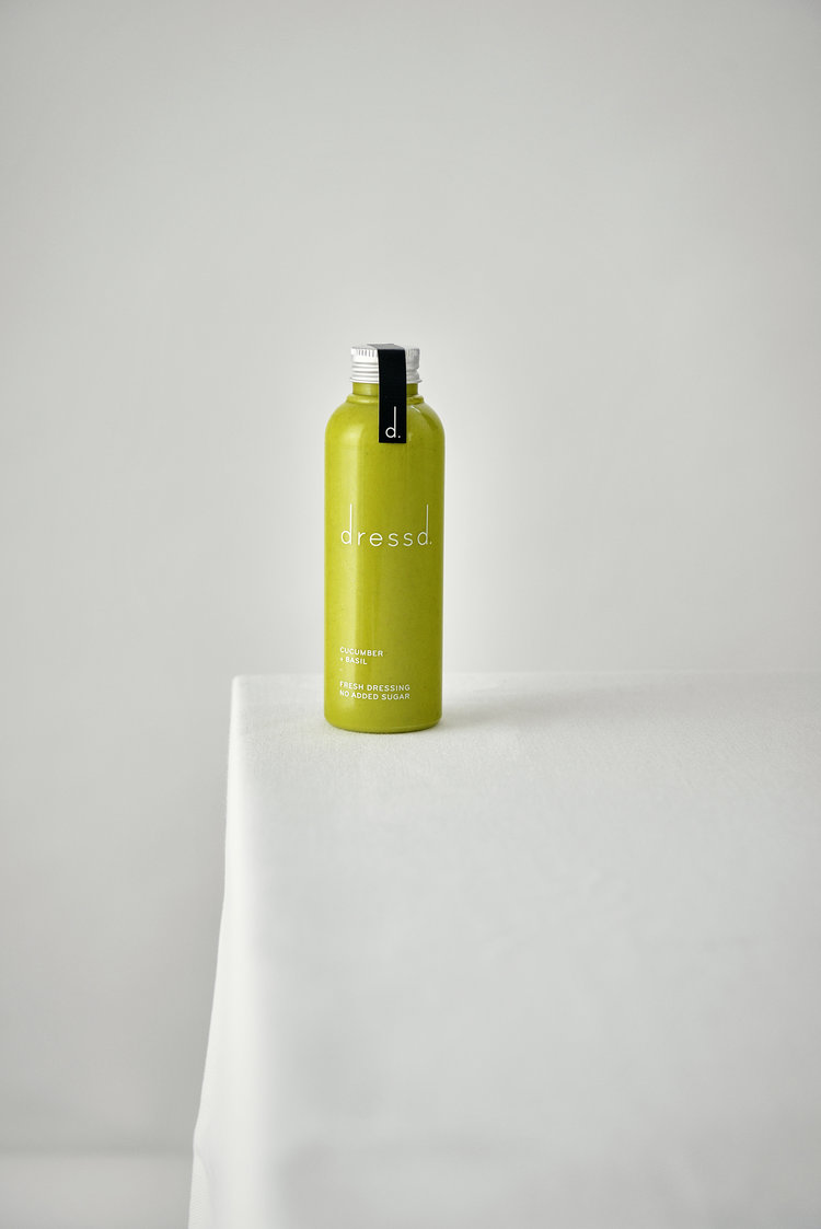
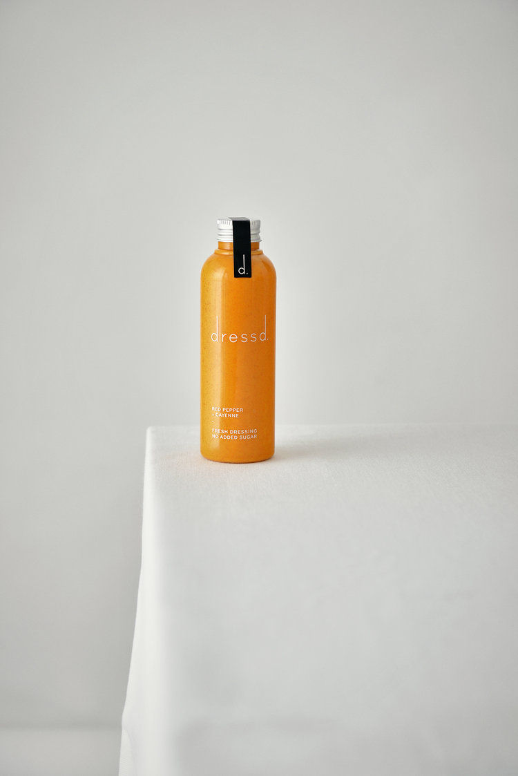
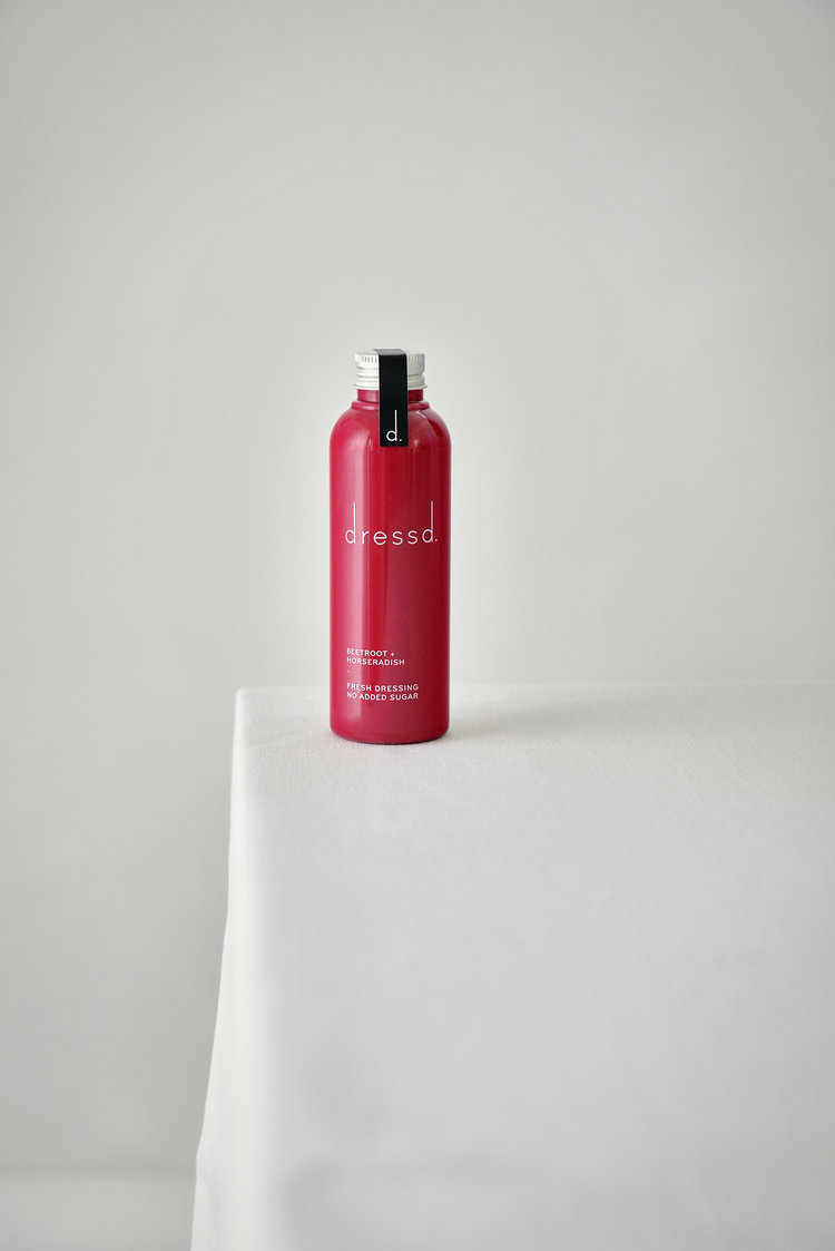
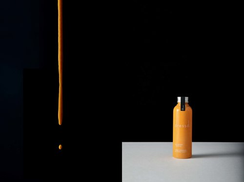
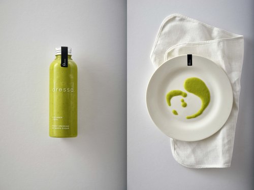
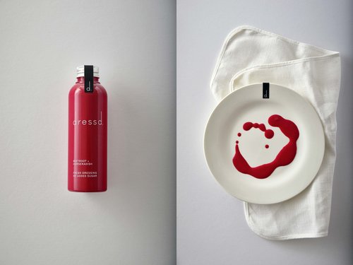
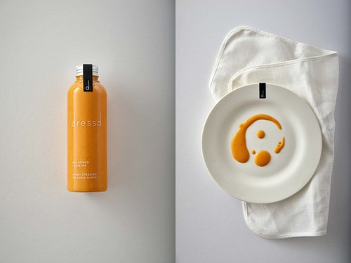
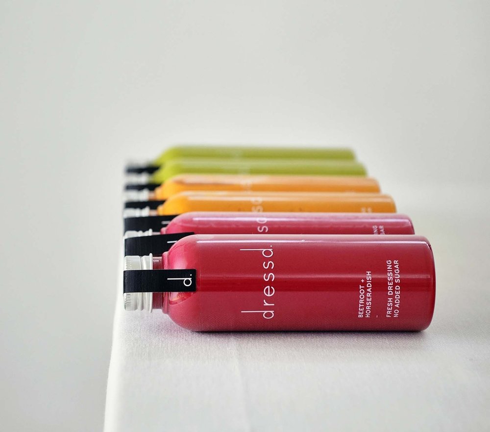
We used a monochrome colour palette to enhance the zinginess of the natural colours and ingredients and chose a completely see-through bottle to enhance the focus on the liquid. We also wanted to give it a clean, modern look and feel, to highlight the integrity and complete healthiness of the product. To do so, we chose a beautifully simple typographic logo, and used a lot of white space.
CREDIT
- Agency/Creative: Bolter Studio
- Article Title: Dressd Brand Identity
- Organisation/Entity: Agency Commercial, Published
- Project Type: Packaging
- Agency/Creative Country: United Kingdom
- Market Region: Europe
- Format: Bottle
- Substrate: Plastic
FEEDBACK
Relevance: Solution/idea in relation to brand, product or service
Implementation: Attention, detailing and finishing of final solution
Presentation: Text, visualisation and quality of the presentation


