


Background
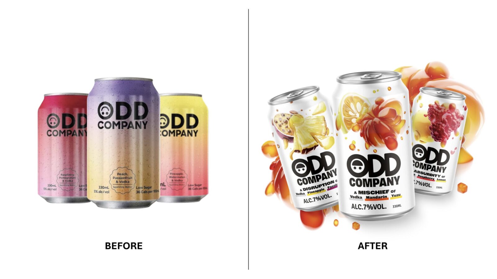
Odd Company a ready-to-drink (RTD) brand from Heineken had launched in New Zealand but was failing to connect with Gen Z consumers. Its gradient can and quirky logo nodded to “odd”, yet the minimal look tended to blend into a sea of sameness, with limited impact and taste appeal, and an identity that didn’t really extend beyond pack. As the category grew, it had started to get lost on shelf, crowded out by new competitors.
Meanwhile, the RTD category was fizzing with new growth across APAC. With markets like Singapore and New Zealand ripe for disruption, the time was right for a reboot.
Brief
This wasn’t just a standard brand refresh. The stakes were high. Odd Company had failed to find traction and was being given a second – and final – chance to prove itself. Heineken HQ saw the brand as a potential flagship for its ‘beyond beer’ innovation pillar – so all eyes were on us.
We were tasked with rebuilding Odd Company from the ground up – keeping only the name – to reintroduce it across APAC, starting in Singapore and New Zealand, with the potential to go further.
That meant finding a compelling insight, shaping a distinctive strategy, and carrying the idea through into product, design and storytelling. Working in close collaboration with the Heineken APAC innovation team, local markets and flavour houses, we moved fast and stayed flexible – feeding brand into product and vice versa, making sure we always stuck to our core strategy.
Strategy
The project kicked off in true Odd Company style with an unexpected blend of people in the room. Global and regional leads, local markets, product developers and us at Dragon Rouge, all there to workshop the Odd Company positioning.
The insight we landed on was simple, but powerful: sometimes the strangest combinations – of flavours, ideas, or people – lead to the most memorable results. We all know it’s our quirks, not our similarities, that give the friend group its flavour.
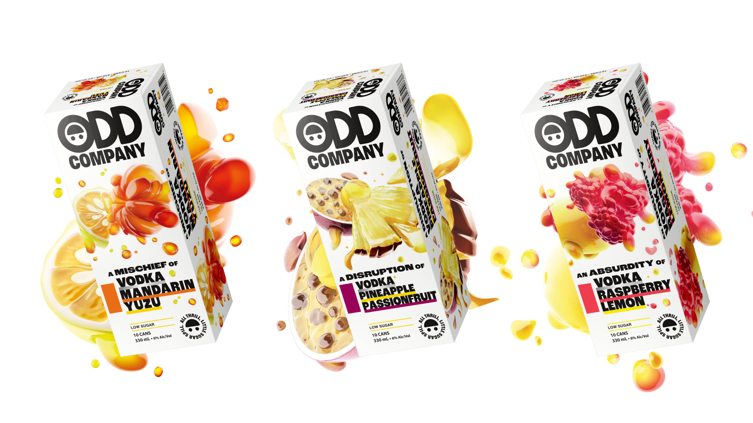
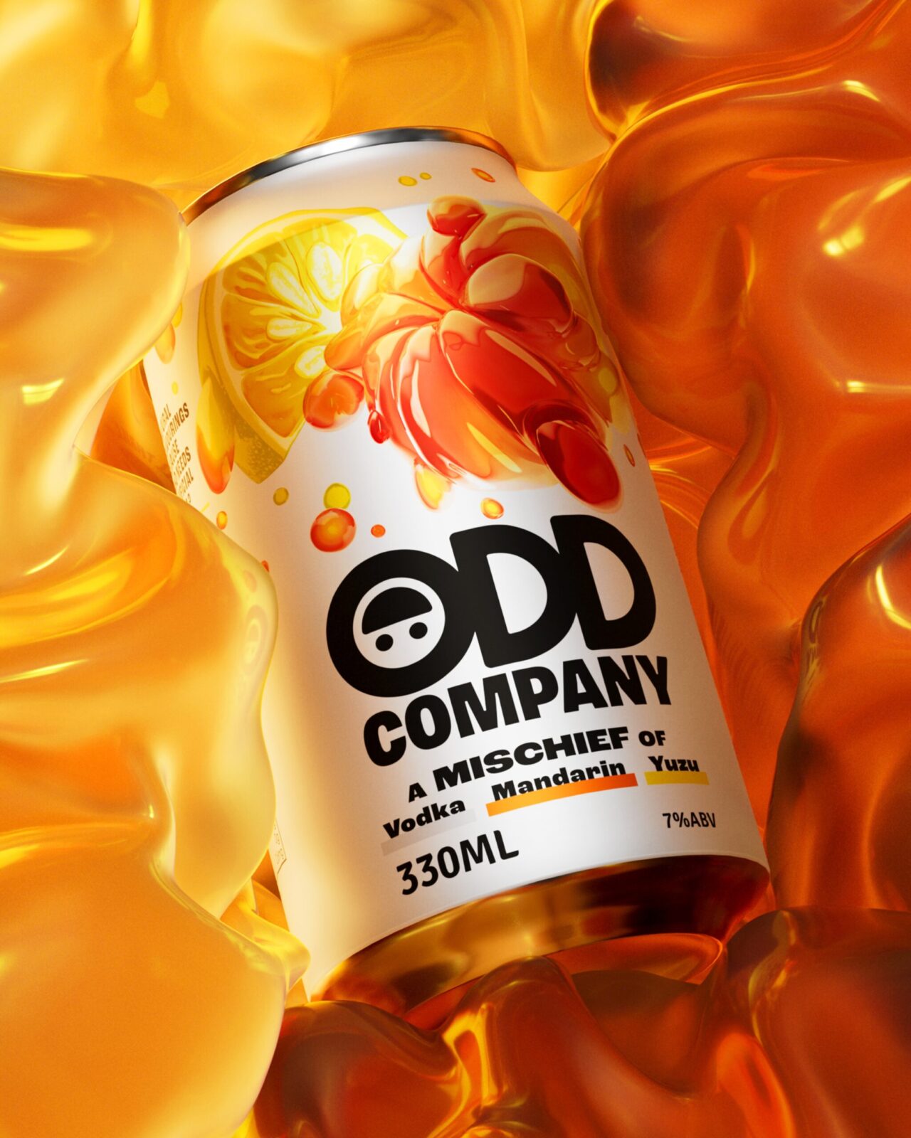
That thought became the brand’s unifying mantra – an invitation to own your oddities and blend them into something better, together. We captured this in the brand essence: The Odd Ones In. A playful twist on the idea of being the “odd one out”. This became the creative springboard that shaped everything to come, from the product flavours to pack design and the brand world beyond.
For the product itself we suggested focusing on the number three – not just an odd number, but our magic number. Each variant blends three ingredients (one sweet, one sharp, one spirit) that are great alone, but even better combined. Like a friend group, in a can. This marked a subtle shift for the category, which usually sticks to a spirit and a single flavour or mixer.
Design-wise, our ambition was clear: to disrupt the norm. To create a brand bursting with flavour, character and oddity, that would shake the RTD shelf up and unleash a new chapter of growth for the brand.
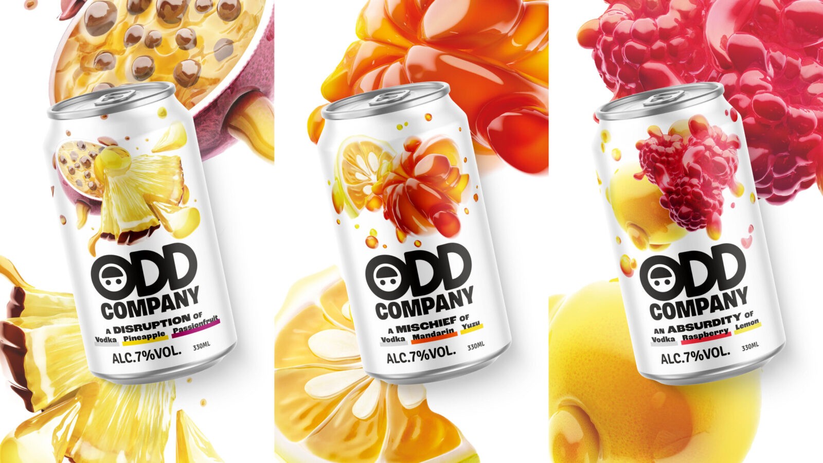
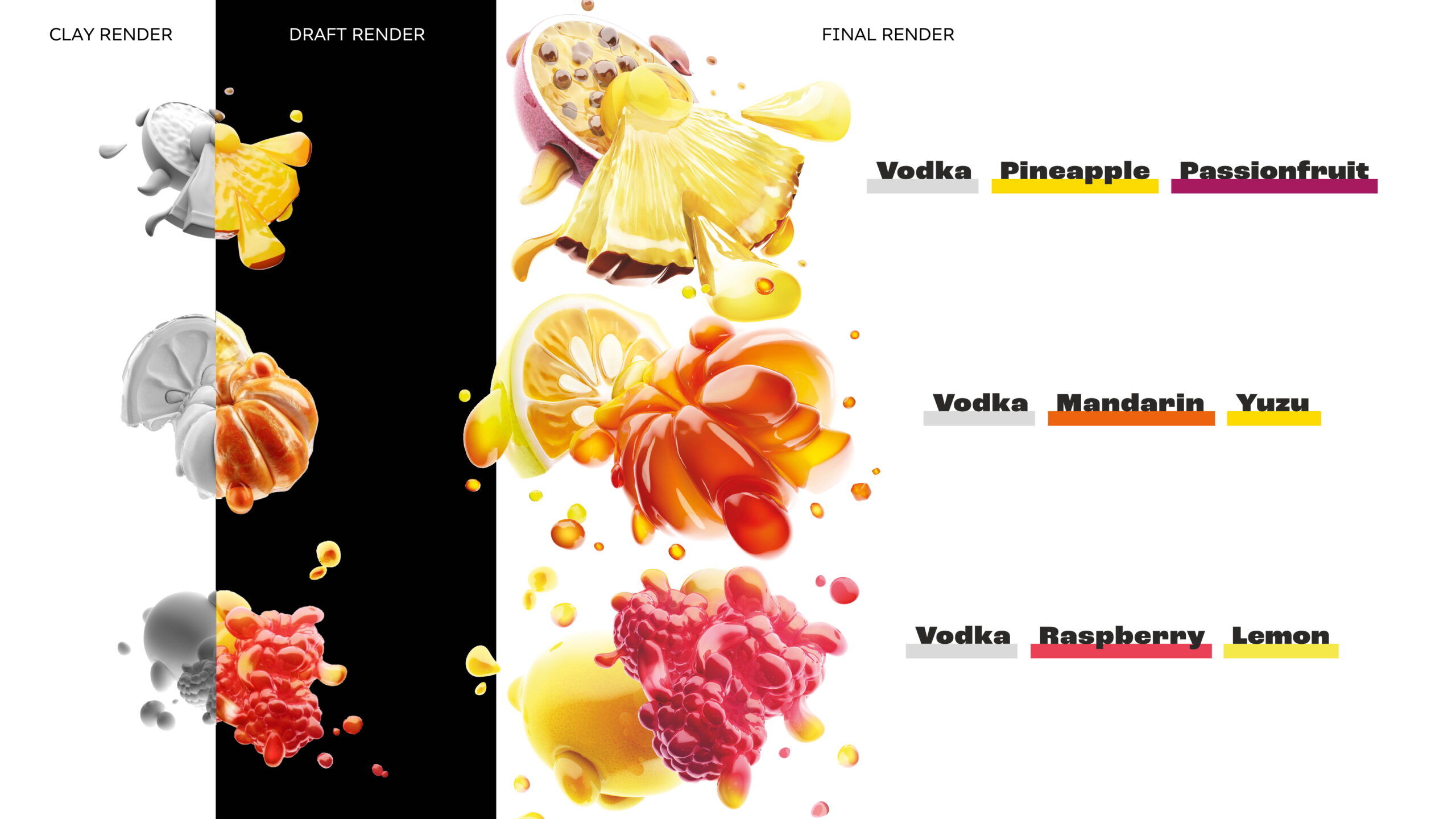
For our core design idea, we came up with the Oddganisms – surreal illustrations that merge the ingredients into one juicy new organism. Hyper-real yet a bit alien, these creations were designed to spark curiosity, dial up taste appeal, and bring a bit of bubbly, out-there character to a category that tends to be more minimal.
Design Process
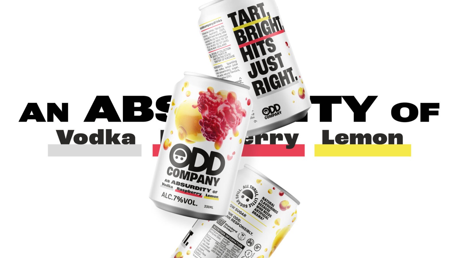
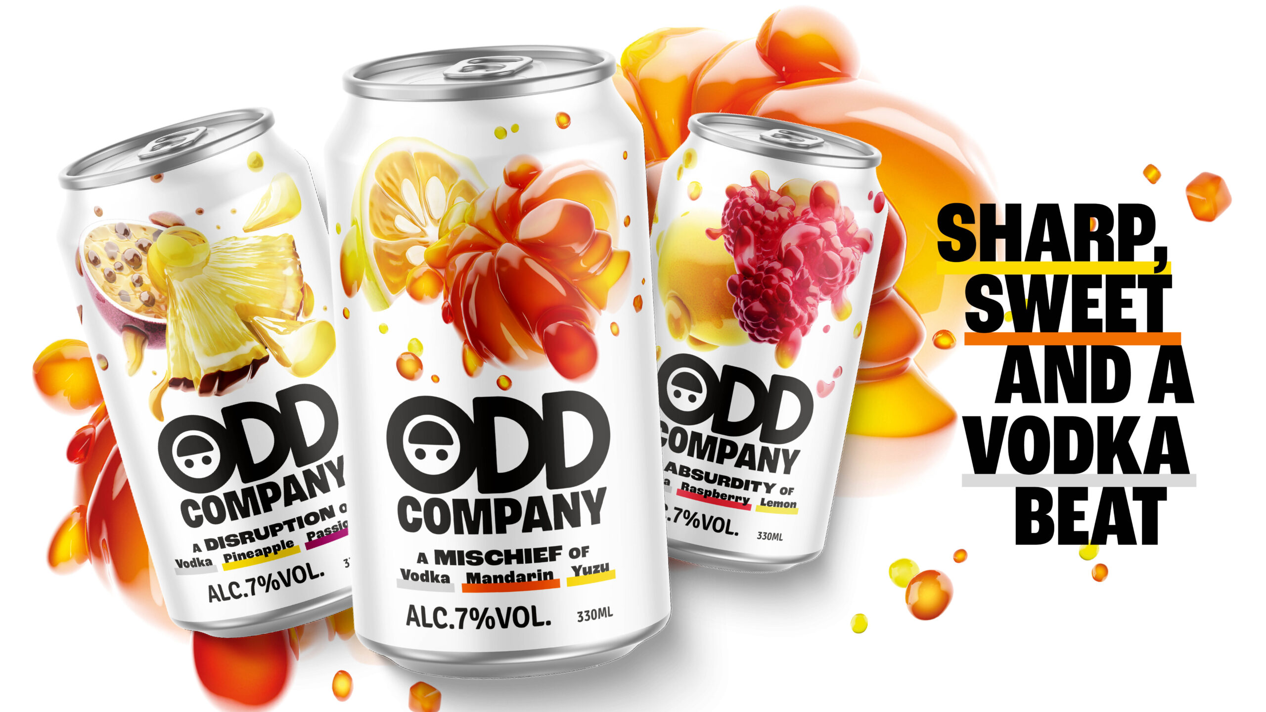
From the outset, we aligned on the core elements of the visual identity system. The Oddganism illustrations would be the hero, supported by a bold black-and-white type-driven system to help them stand out. A flavour-led secondary palette added playful pops of colour to underline key bits of information.
The logo was subtly but impactfully updated: spacing tightened, weight increased, and the signature upside-down smiley given a bit more attitude – switching from a polite, close-lipped smile to a cheekier, irreverent grin.
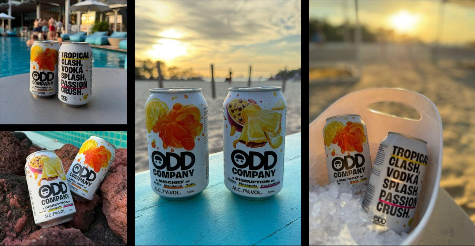
With the system locked, we turned to packaging. We tested multiple iterations with consumers to fine-tune everything from oddness levels to appetite appeal. The Oddganisms became the star of the front-of-pack, covering half the can for maximum impact and intrigue. The rest of the layout was designed for strong hierarchy and clarity of navigation.
On the back of pack, we used every inch to reinforce brand character, with variant copy as expressive as it is informative. We applied the same thinking to the secondary packaging too, especially key in New Zealand where multipack cartons dominate – presenting a valuable brand-building opportunity.
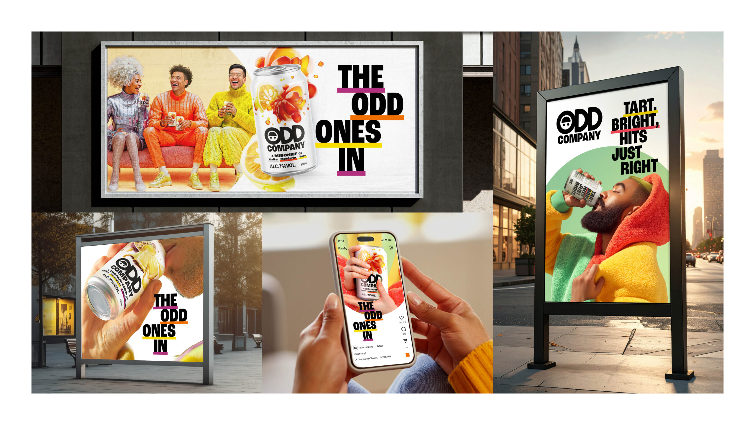
We also built out a suite of launch-ready key visual templates, both product-led and talent-led, to ensure strong, consistent storytelling across channels. And we created guidance for talent photography to match: each person styled to reflect a flavour or ingredient, with quirky accessories, playful props and colour cues that hinted at our variants.
The process, like all innovation projects, was at times chaotic and had the occasional curveball as the product evolved in real time. But with a strong core idea, an agile, adaptive approach and a great cast of characters, we managed to blend it all into one cohesive and characterful whole.
Results
The brand relaunched, oddly enough, just before Halloween 2025.
The Singapore launch event took place at Haw Par Villa: a quirky, kitsch theme park whose cult Halloween event felt quite on-brand for Odd and got us in front of the right audience. 75% of visitors to the pop-up were aged 18–36 – Gen Z and younger millennials, the core target. Feedback was strong: 78% were satisfied or very satisfied with the Mandarin Yuzu flavour, and 77% said the same for Pineapple Passionfruit. Most importantly, over 70% said they were likely or very likely to buy Odd Company.
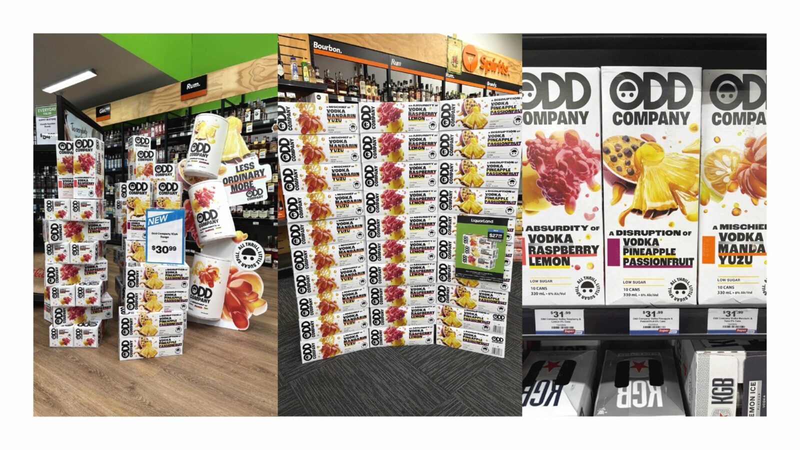
In New Zealand, early ROS is performing ahead of expectations with both retailers and consumers excited to see Odd Company back with a strong new look and feel
It’s still early days, but signals are strong. Not just from consumers, but from within Heineken, where other markets are now expressing interest in launching the brand. Watch this space – Odd might just be going global.
CREDIT
- Agency/Creative: Dragon Rouge Singapore
- Article Title: Dragon Rouge Singapore Rebuilds Odd Company Into a Standout RTD Brand for Gen Z
- Organisation/Entity: Agency
- Project Status: Published
- Agency/Creative Country: Singapore
- Agency/Creative City: Singapore
- Market Region: New Zealand & Singapore
- Project Deliverables: 2D Design, 3D Modelling, Art, Art Direction, Brand Creation, Brand Design, Brand Experience, Brand Guidelines, Brand Identity, Brand Mark, Brand Redesign, Brand Rejuvenation, Brand Strategy, Brand Tone of Voice, Brand World, Branding, CGI, Copywriting, Creative Direction, Design, Digital Art, Graphic Design, Identity System, Illustration, Logo Design, Packaging Design, Packaging Guidelines, Rebranding, Retouching, Tone of Voice, Visualisation
- Industry: Food/Beverage
- Keywords: WBDS Agency Design Awards 2025/26 RTD Rebrand Packaging Strategy Positioning Illustration
-
Credits:
Creative Director: Gökçe Şahbaz
Creative Director: Estevam Abe
Strategy Director: Cecylia Grendowicz
Design Director: Roger Donadell
Designer: Felipe Amorim
Designer: Yu An Lum
Account Manager: Flavia Zacarias
Senior Account Manager: Claudia Ong
Illustrator: Cem Ozkurt
Artworker: Silas Yamakami


