


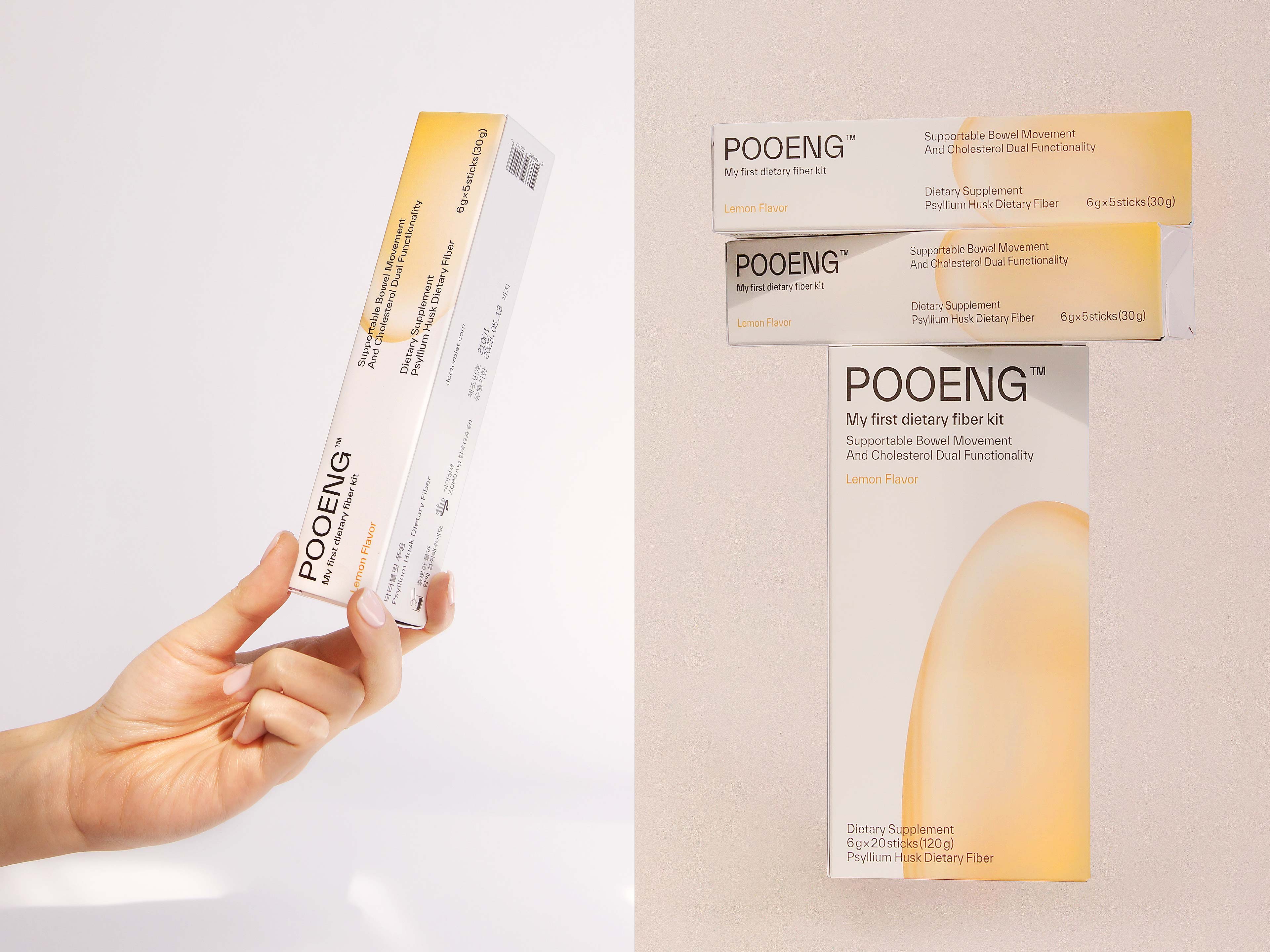
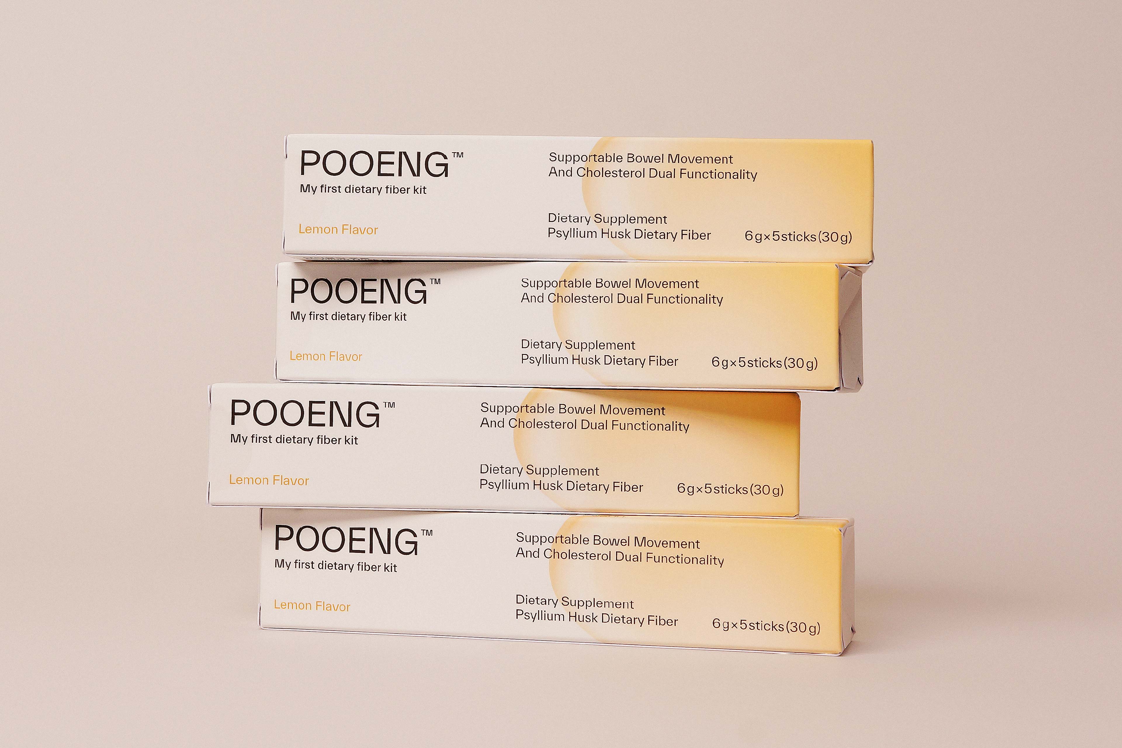
Overview: dr.blet is a women’s health functional food brand that takes care of discomfort in daily life. To renew the existing brand and build a new brand identity, we developed a logotype, colour, and key visual system.
1. Visual images that can be used flexibly have been developed to highlight the professionalism of healthy functional foods and to deliver experimental images.
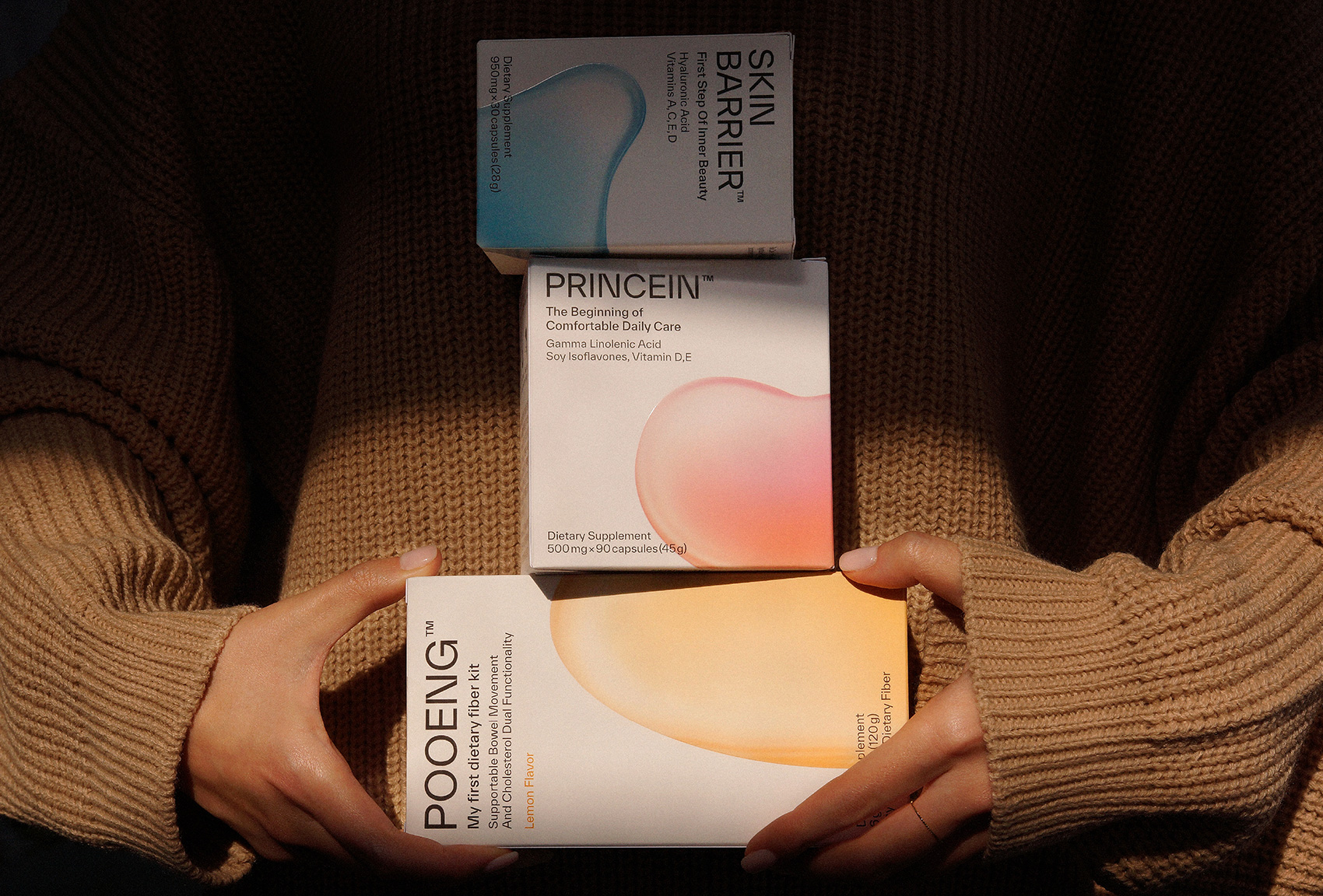
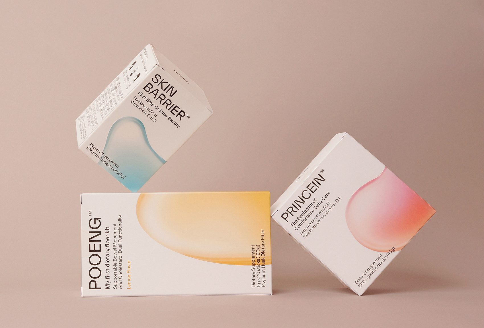
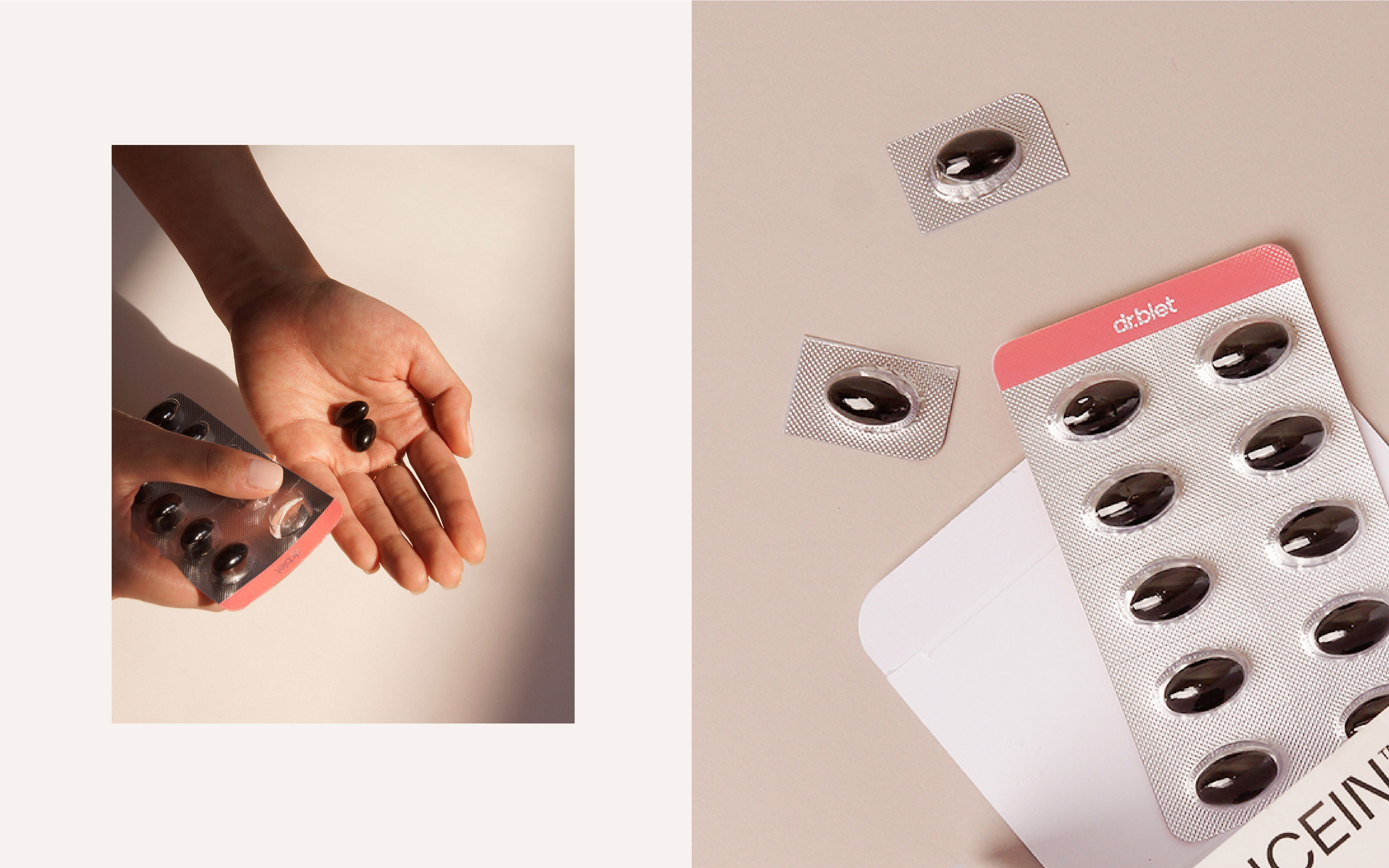
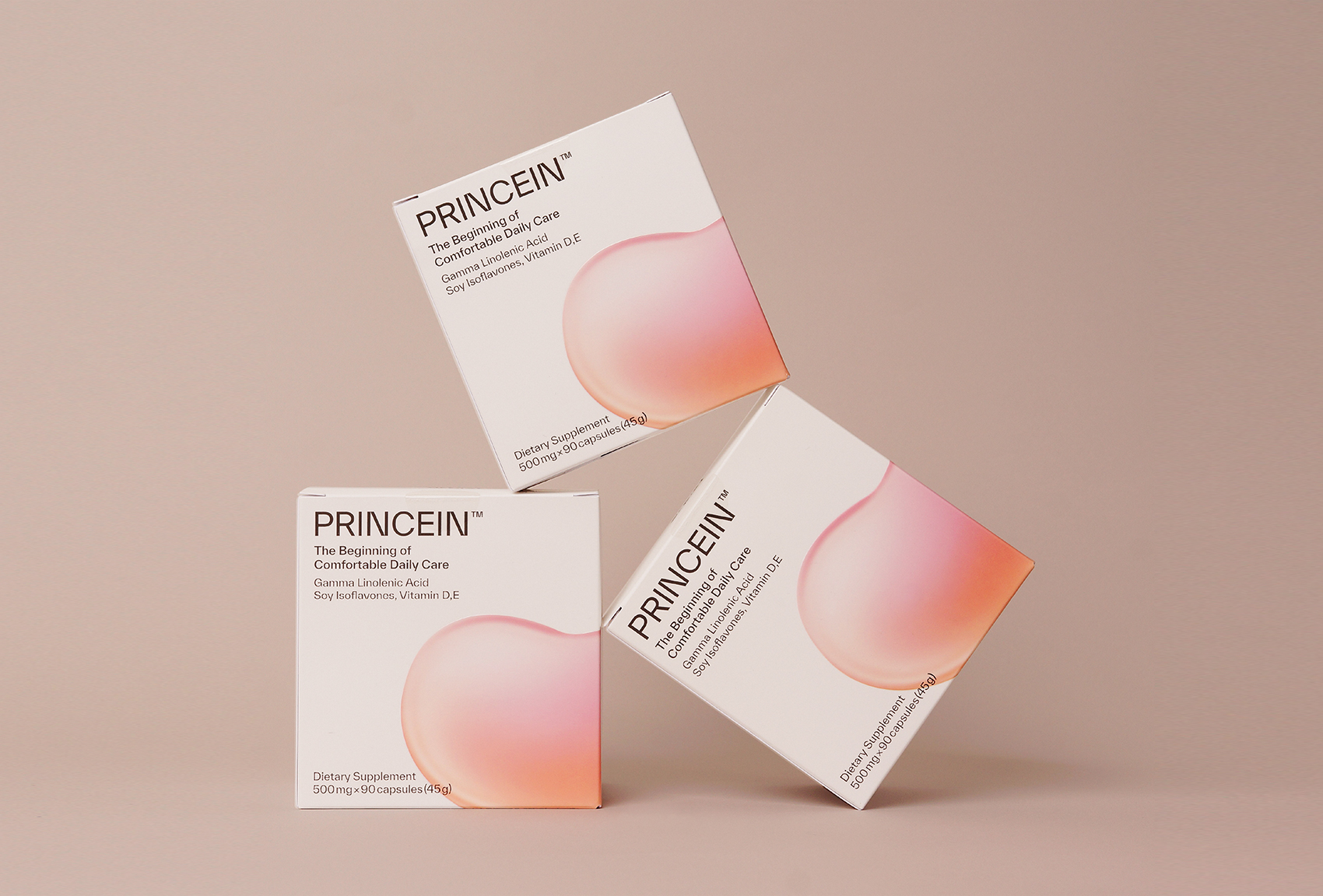
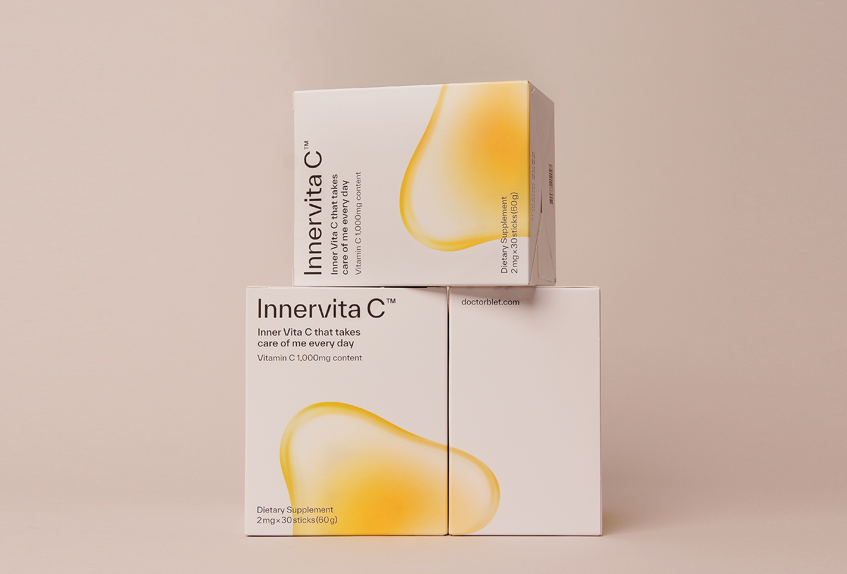
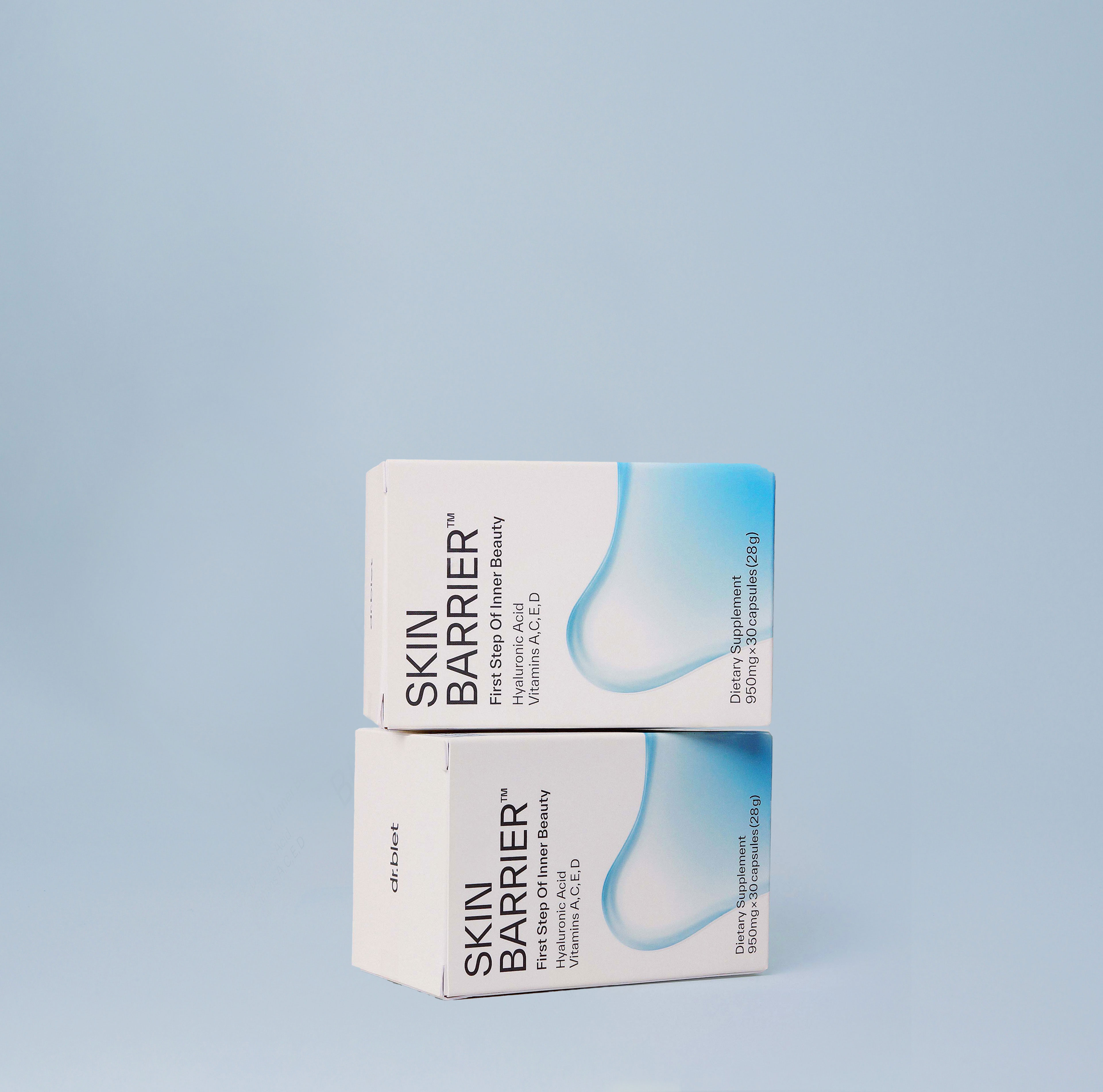
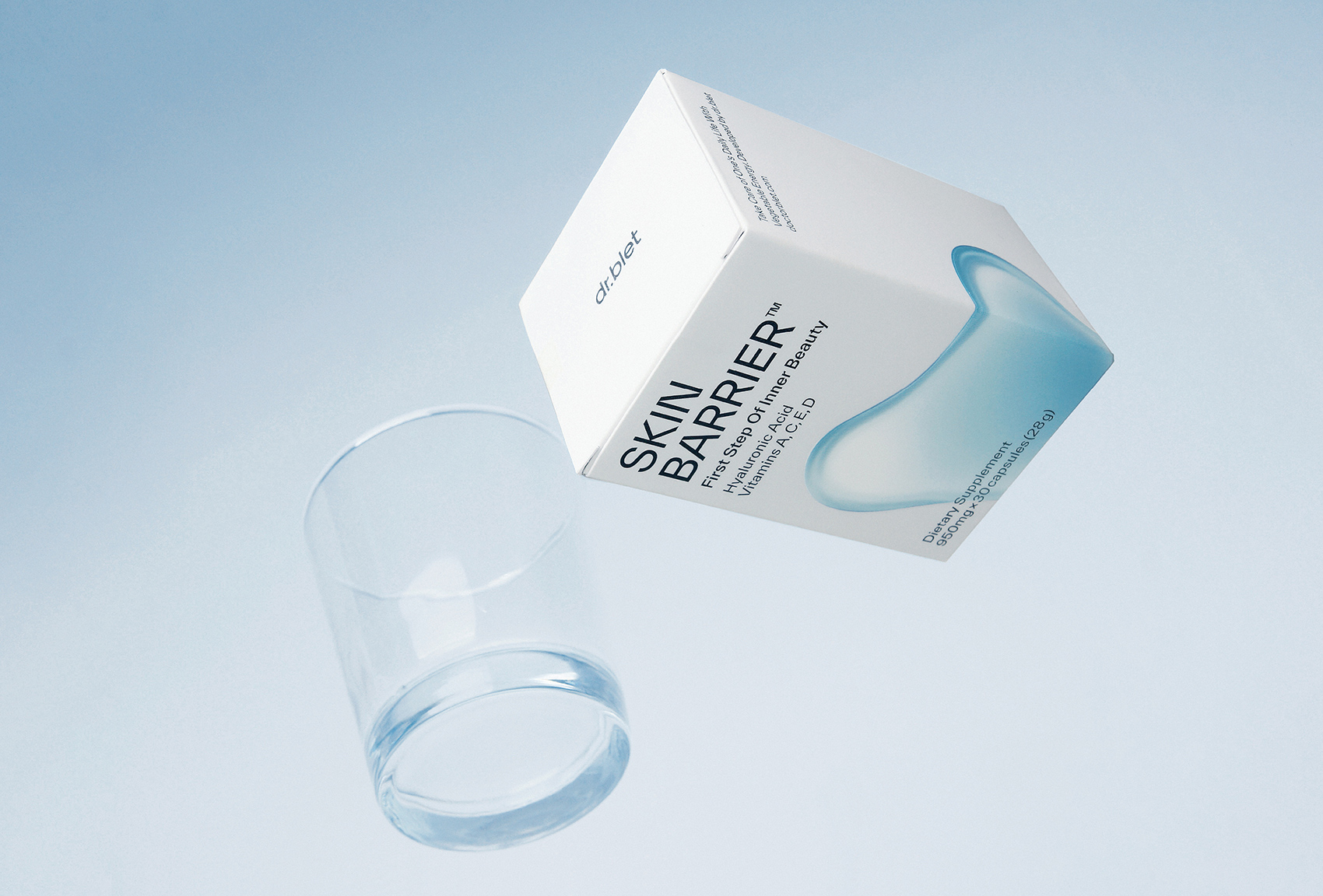
2. Inspired by various types of formulations (tablets, capsules, pills, granules, powders, etc.), we have developed various types of Form Key Visual.
3. The brand mood that dr.blet aims to convey is that it is an experimental and researched product focusing on the single functionality of the product.
Challenge: We focused on improving consumer awareness of existing healthy functional foods that give an old-fashioned impression due to the characteristics of the product. To improve this, we aimed to deliver an experimental image of the direction dr.blet wants to move forward and a visual image to highlight the professionalism of healthy functional food
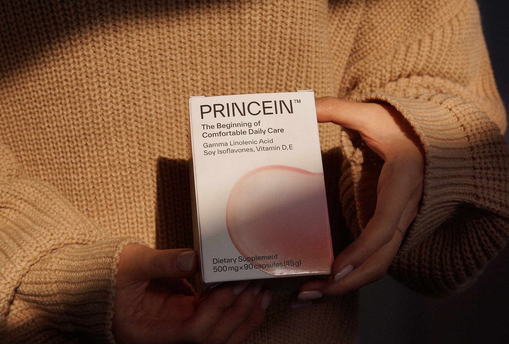
Solution: In order to intuitively express the single functionality of each product, such as Princein, Pooeng, Skin Barrier, and Inner Vita C, we have created a Key Visual System and a Layout System that is easy to expand products. The Key Visual System “Form”, developed with the motive of the single functionality of the product, was developed for universal use in a flexible form and applied to the packaging system to deliver a consistent brand identity.
CREDIT
- Agency/Creative: Kwangmyung Lim
- Article Title: dr.blet Brand Design Women’s Health Functional
- Organisation/Entity: Freelance
- Project Type: Identity
- Project Status: Published
- Agency/Creative Country: South Korea
- Agency/Creative City: Seoul
- Market Region: Asia
- Project Deliverables: Brand Design, Packaging Design, Photography
- Industry: Pharmaceutical
- Keywords: women's health functional, package design, brand design, doctorblet, dr.blet
-
Credits:
brand, package, photography: Design : Kwangmyung Lim, Hyeonmo Kim, Euisung Hwang Photograpgy: Euisung Hwang


