


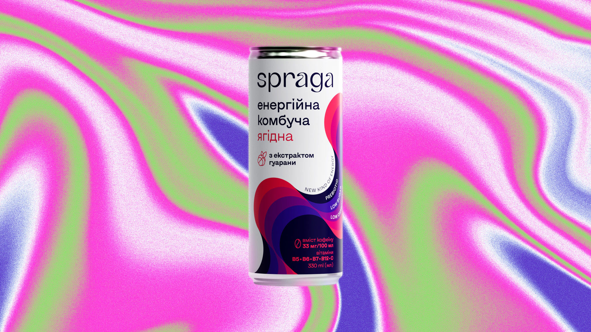
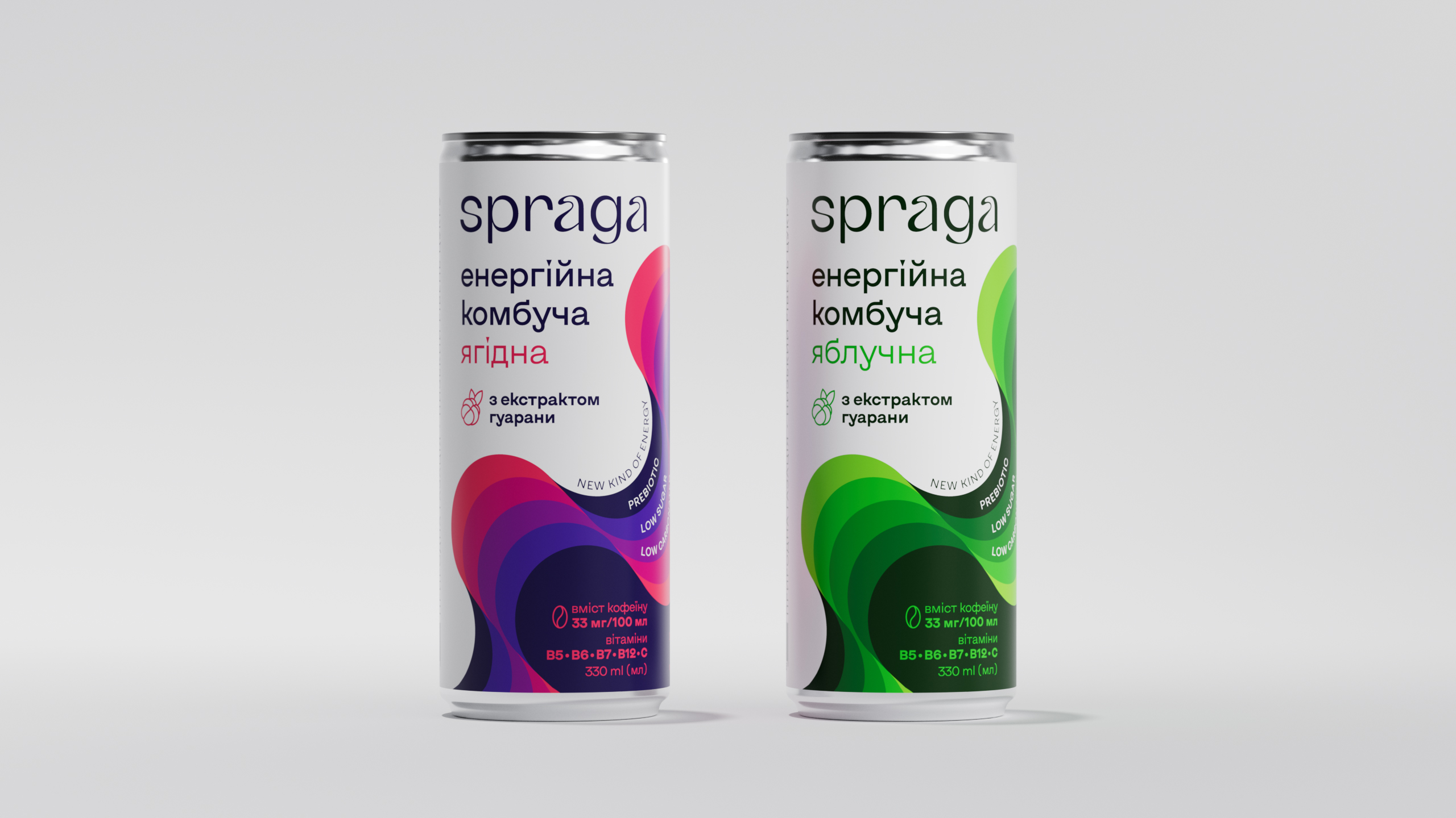
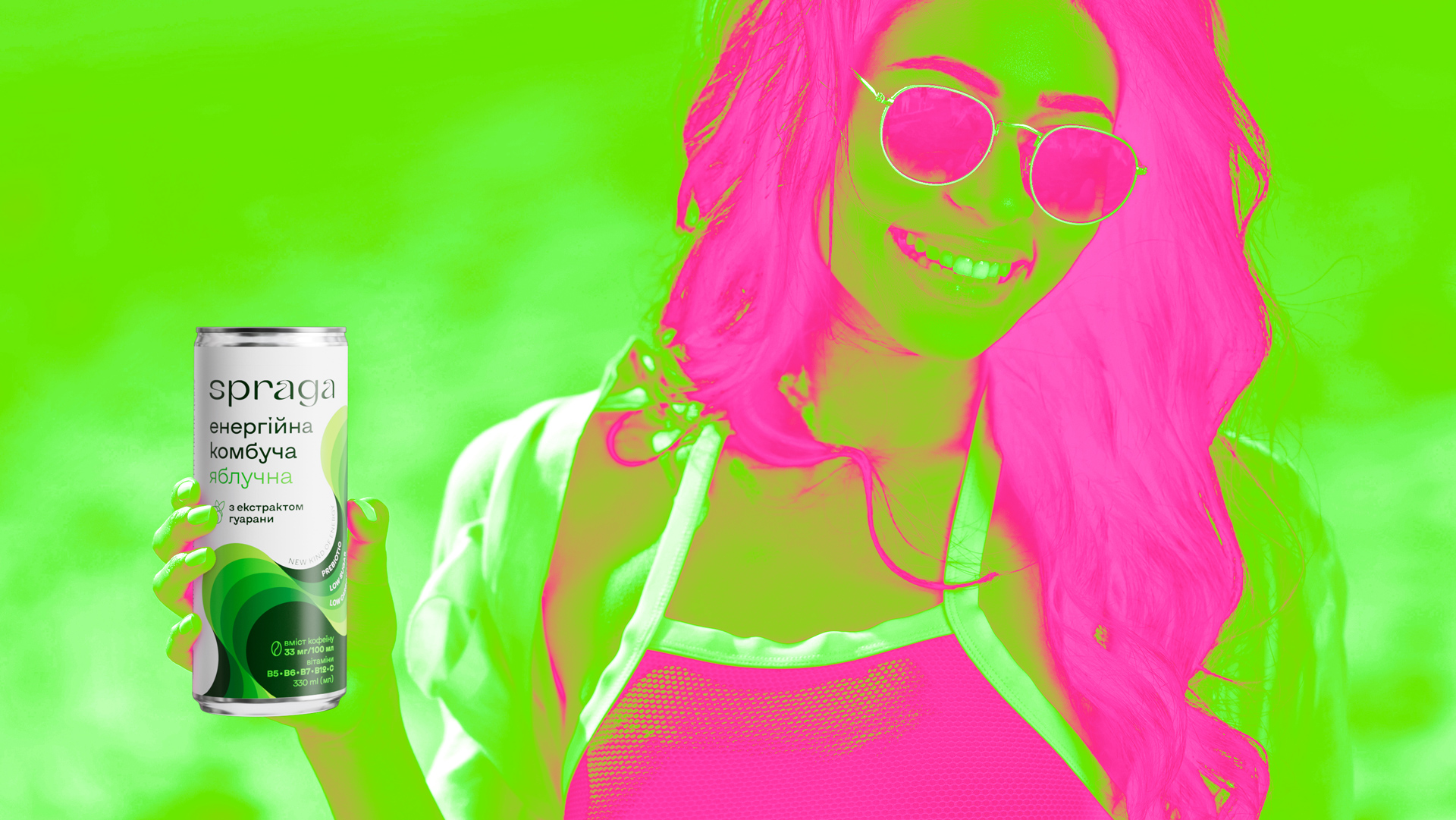
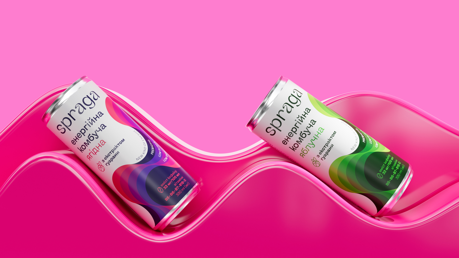
Kombucha Market Leader
Spraga has entered a new category of energy drinks with an innovative product — a range of energising kombuchas with classic and mixed fruit and berry flavours. The healthy energy drink, with the refreshing taste of familiar kombucha, natural juices, vitamins, tonic extracts, and light carbonation, was a surprisingly appropriate step in the brand’s development in the Ukrainian market.
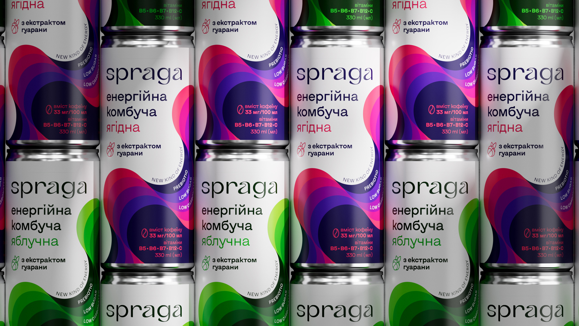
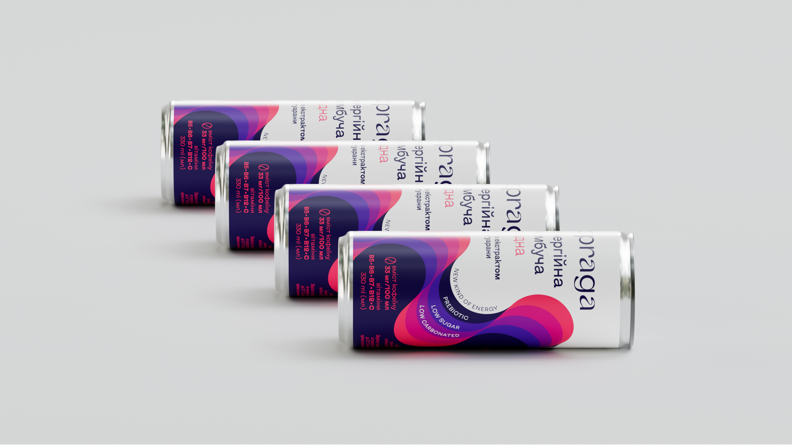
Energy Waves
Born from the distinctive plastic of Spraga’s identity, they create a rhythm of infinity, no matter how you display the product: whether you spin the can in a circle or create pyramids of drinks for unforgettable parties with friends. Note that it is quite difficult to compete on the shelves of modern energy drinks: you have to be the brightest among the bright. And in our case, you also need to keep the markers of healthiness and naturalness. That’s why we mixed and balanced the usual purity and white background of the brand with its bright, explosive spirit.
Easy to Improve
But it’s hard to spoil an already great product. So we relied on a vibe of purely positive energy in the design. It looks like the chakra circles of your favourite kombucha. We hope that they will attract everyone who appreciates the real thing and is thirsty for sincere emotions.
Kombucha Market Leader
Spraga has entered a new category of energy drinks with an innovative product — a range of energising kombuchas with classic and mixed fruit and berry flavours. The healthy energy drink, with the refreshing taste of familiar kombucha, natural juices, vitamins, tonic extracts, and light carbonation, was a surprisingly appropriate step in the brand’s development in the Ukrainian market.
Energy Waves
Born from the distinctive plastic of Spraga’s identity, they create a rhythm of infinity, no matter how you display the product: whether you spin the can in a circle or create pyramids of drinks for unforgettable parties with friends. Note that it is quite difficult to compete on the shelves of modern energy drinks: you have to be the brightest among the bright. And in our case, you also need to keep the markers of healthiness and naturalness. That’s why we mixed and balanced the usual purity and white background of the brand with its bright, explosive spirit.
Easy to Improve
But it’s hard to spoil an already great product. So we relied on a vibe of purely positive energy in the design. It looks like the chakra circles of your favourite kombucha. We hope that they will attract everyone who appreciates the real thing and is thirsty for sincere emotions.
CREDIT
- Agency/Creative: Dozen
- Article Title: Dozen Creates Packaging Design for Spraga Kombucha Market Leader
- Organisation/Entity: Agency
- Project Type: Packaging
- Project Status: Published
- Agency/Creative Country: Ukraine
- Agency/Creative City: Kyiv
- Market Region: Europe
- Project Deliverables: Brand Design, Illustration, Packaging Design
- Format: Can
- Industry: Food/Beverage
- Keywords: beverage, can, design, packaging
-
Credits:
Designer: Roman Melnyk


