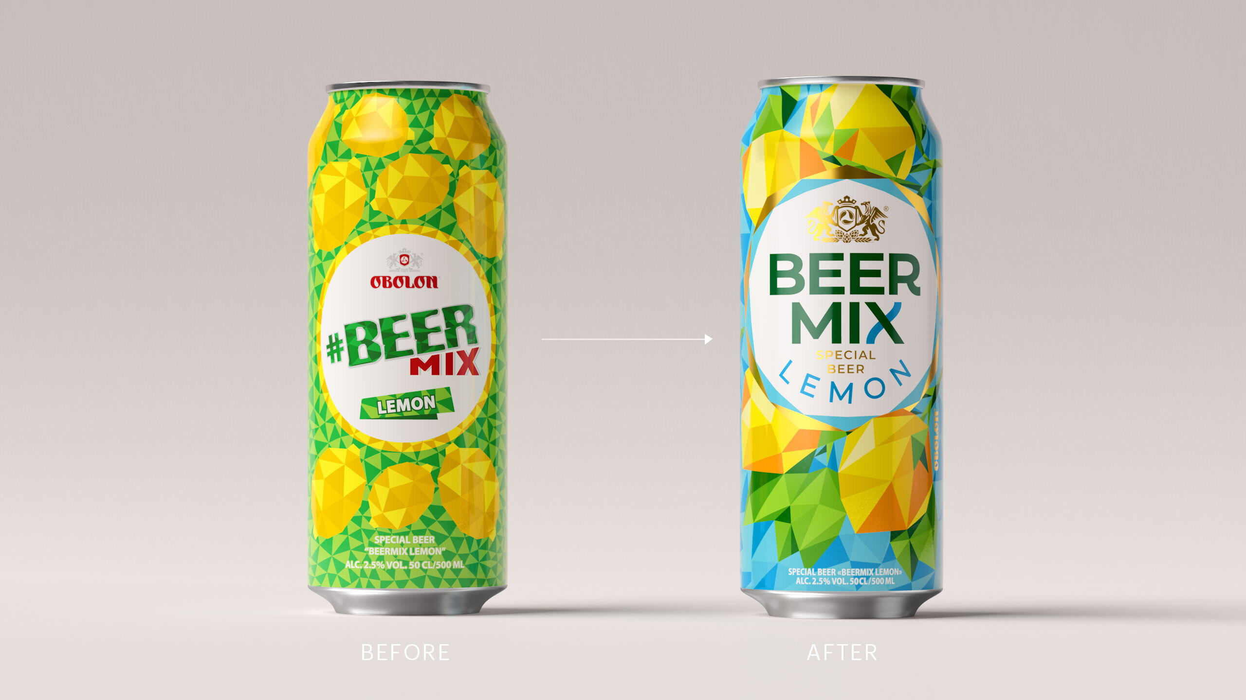
Landmark Event: This year, the people born in the early days of Obolon’s Beermix brand are reaching the age of majority, officially becoming the beverage’s target audience. Infamously, young adults’ sentiments, trends, as well as stylistic and taste preference change at the speed of light, just as the young adult cohort grows with each passing year. Therefore, the 18-year-old brand needed rejuvenation despite its rather young age by human reckoning.
Feminisation Course: While negotiating with the client, we decided to head for feminisation. After all, it is female consumers that are in the center of our attention. Girls will always be girls. They want to party, chat, occasionally show off their trinkets, and certainly spoil themselves with all things tasty that are not beer. So, we tried to understand how to please them without breaking the brand’s traditions.
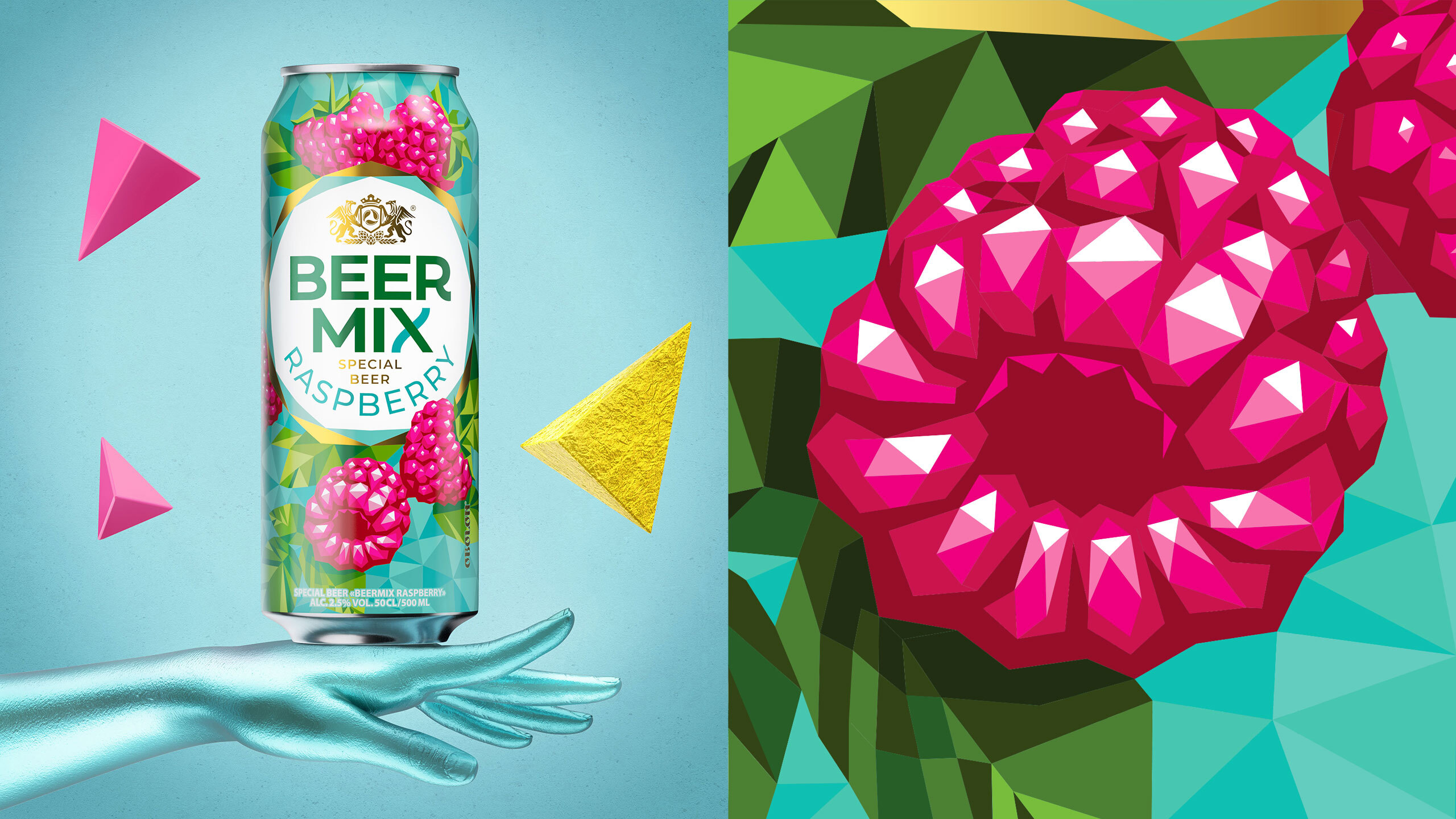
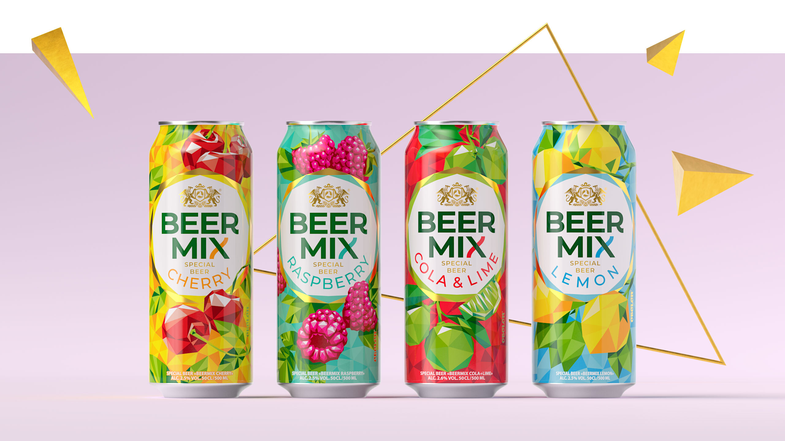
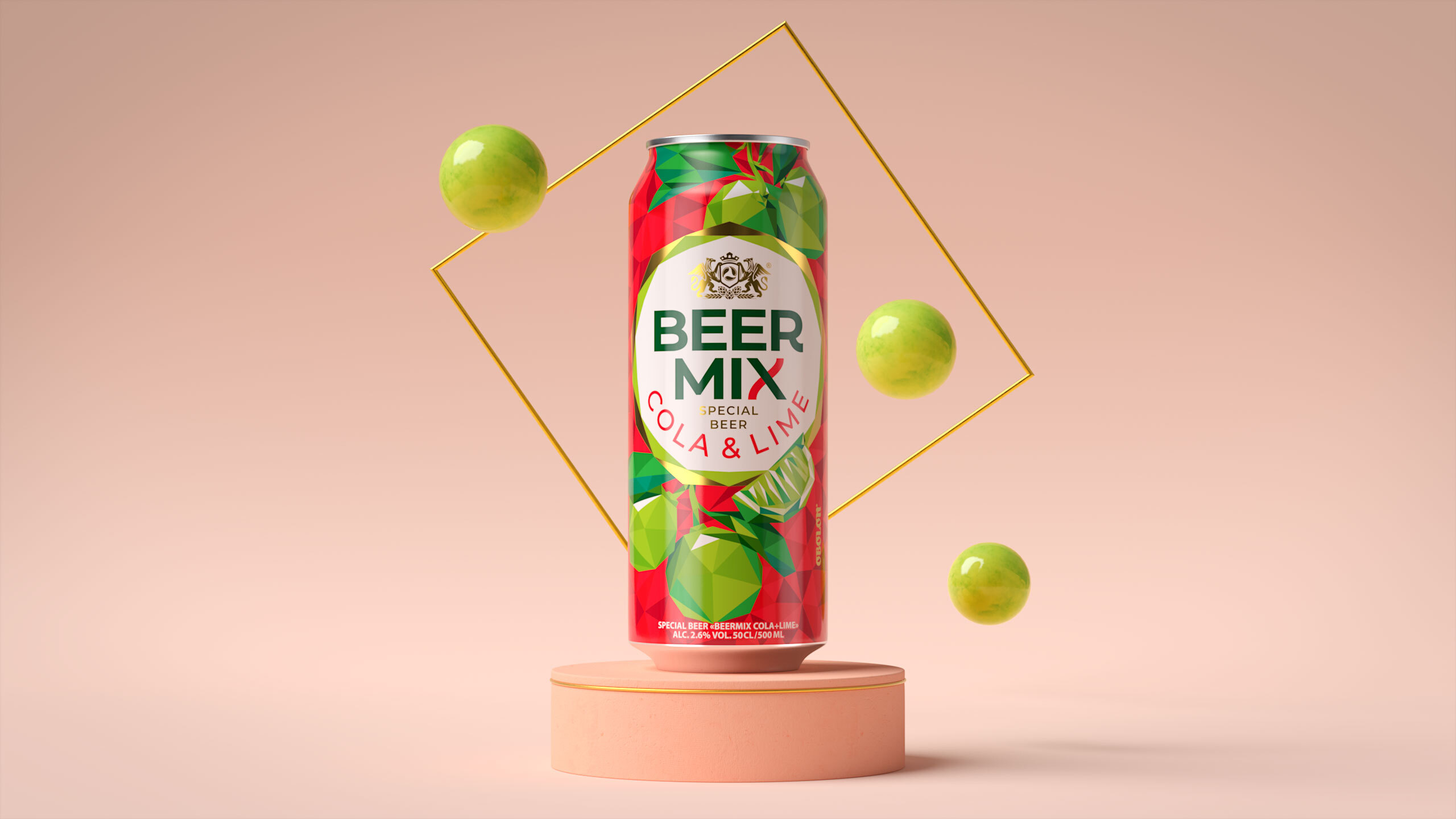
Take it and mix it: In our metamodern times, all kinds of things get mixed: beer and fruit, past and present, form and content. We realised that polygonal design as a must-have in the client’s brief is a somewhat outdated trend. Still, we wanted to get the most out of it and use its potential to the fullest. The pattern for every flavor was constructed like an exquisite mosaic, turning the initial simplicity into a neatly realistic look. Working on the logo, we added faceting around the brand zone and elegant styling for the X as a finishing touch to highlight the focus on mixing and femininity.
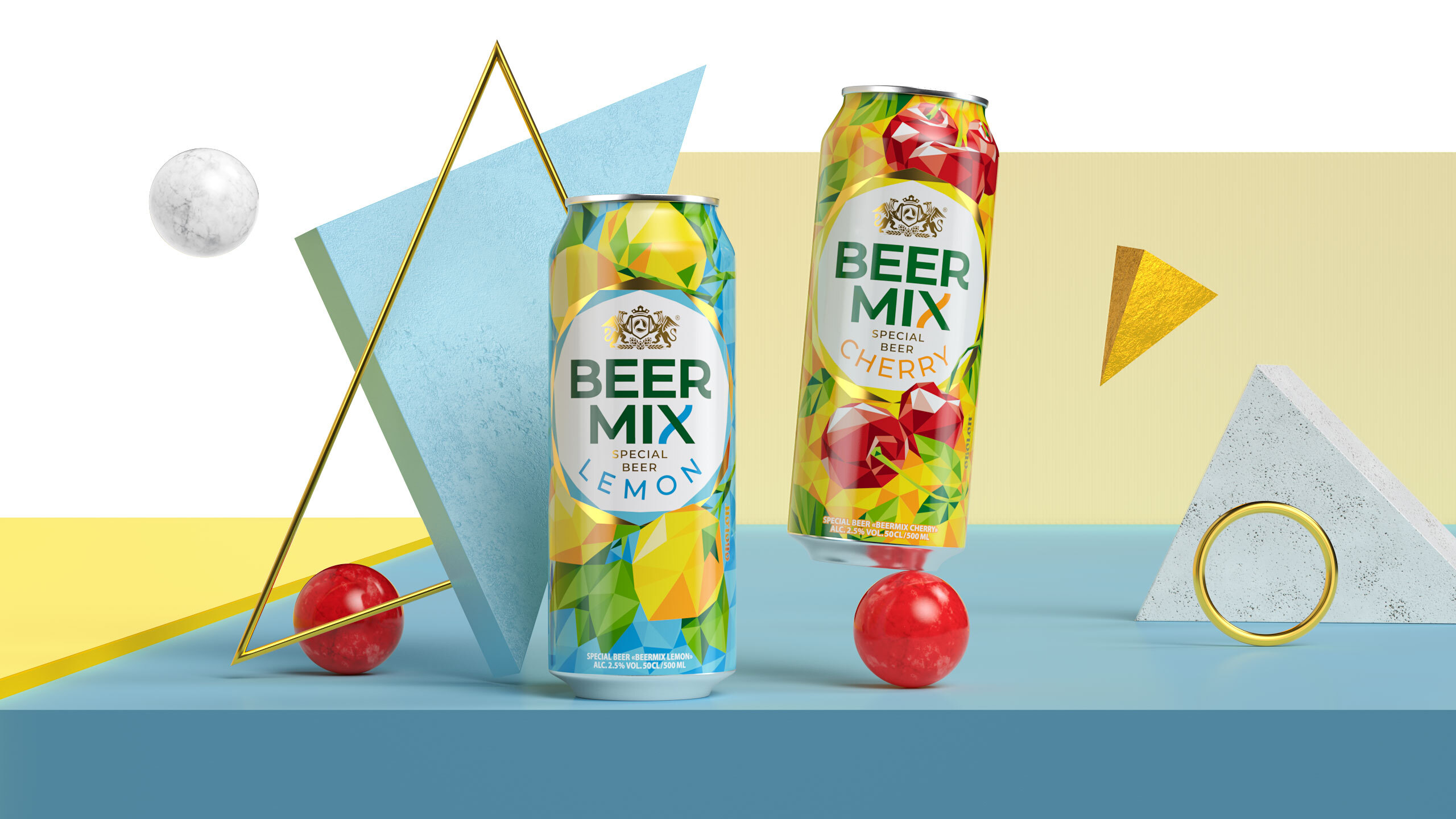
All beauty and no sacrifice: We had to go the extra mile to ensure the packaging looks gorgeous. It became a challenge to mix 50 shades of all kinds of stuff while dealing with some technological nuances of packaging production, e.g., 8-color can printing. Therefore, we understood that for the concept to pan out, we needed to keep our hand on the printing processes’ pulse. We got ourselves together, channeling our inner LVL 80 prepress ninjas, and kept returning to the printing house until the client got what they wanted. Seeing how great it looks on the shelf now makes us hopeful that Beermix’s renaissance is just around the corner.


CREDIT
- Agency/Creative: Dozen Agency
- Article Title: Dozen Agency Relaunch of Brand and Packaging for the Obolon’s Beermix Brand
- Organisation/Entity: Agency, Published Commercial Design
- Project Type: Packaging
- Agency/Creative Country: Ukraine
- Market Region: Europe
- Project Deliverables: Brand Architecture, Brand Rejuvenation, Graphic Design, Illustration, Packaging Design, Research, Tone of Voice
- Format: Can
- Substrate: Metal


