


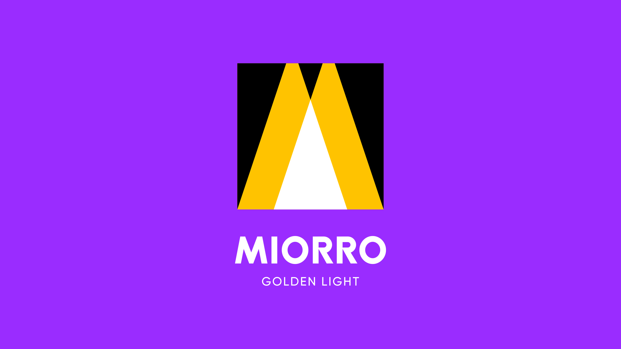
Let there be light that’s what the client company decided and turned to us with the task of launching a new business and developing a modern brand of lighting with a range from light bulbs to various luminaires. We aimed to create an entirely cozy atmosphere around the non-craft brand. To convey the magic that lighting brings with the promise of beauty and comfort using the name and visual identity. Eternal values that are literally worth their weight in gold today. Among the proposed naming concepts, the client team chose an Italian-inspired one: Miorro — which represents a combination of the words “my gold”, but with a more confident sound thanks to the double “r”.
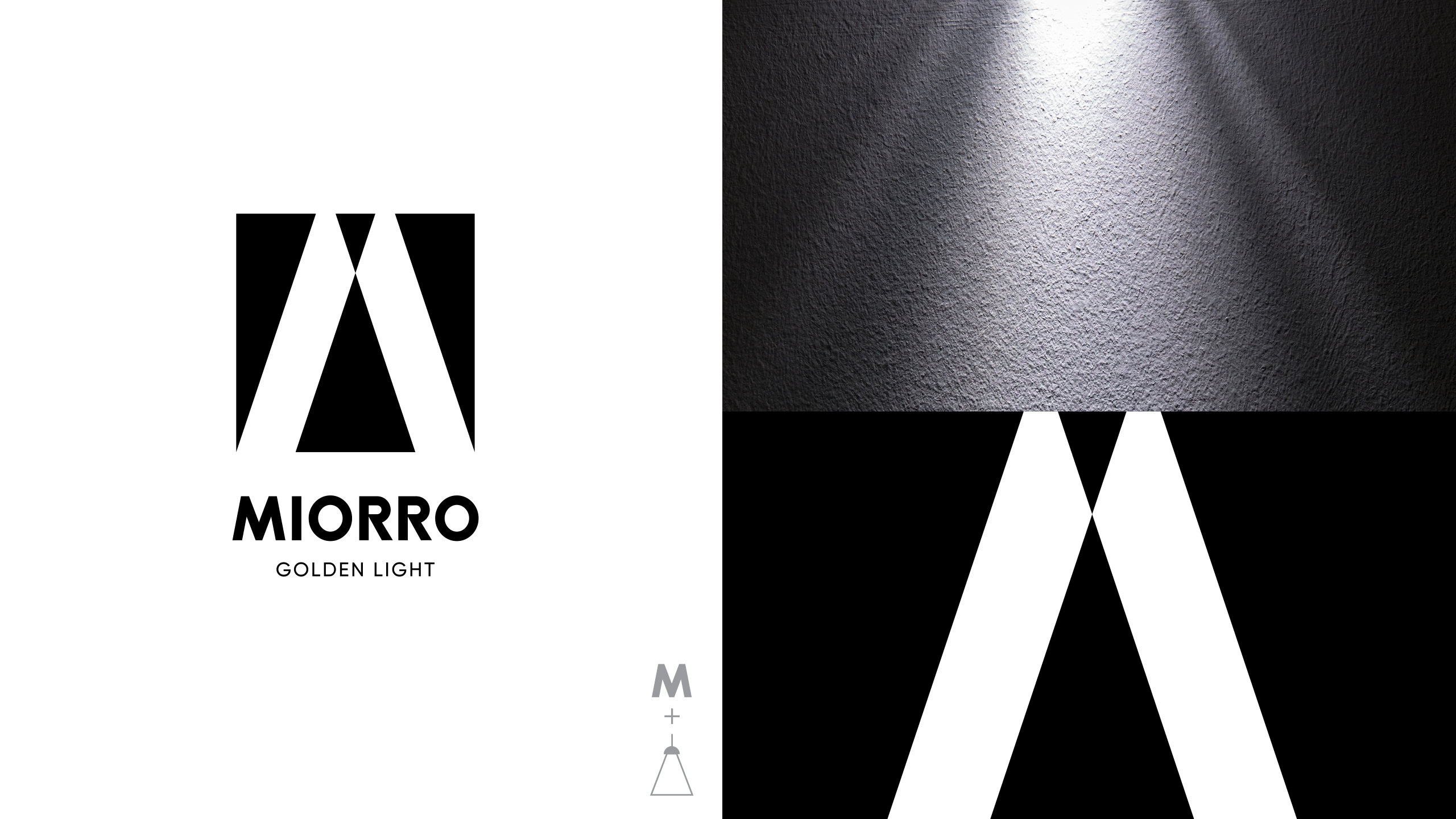
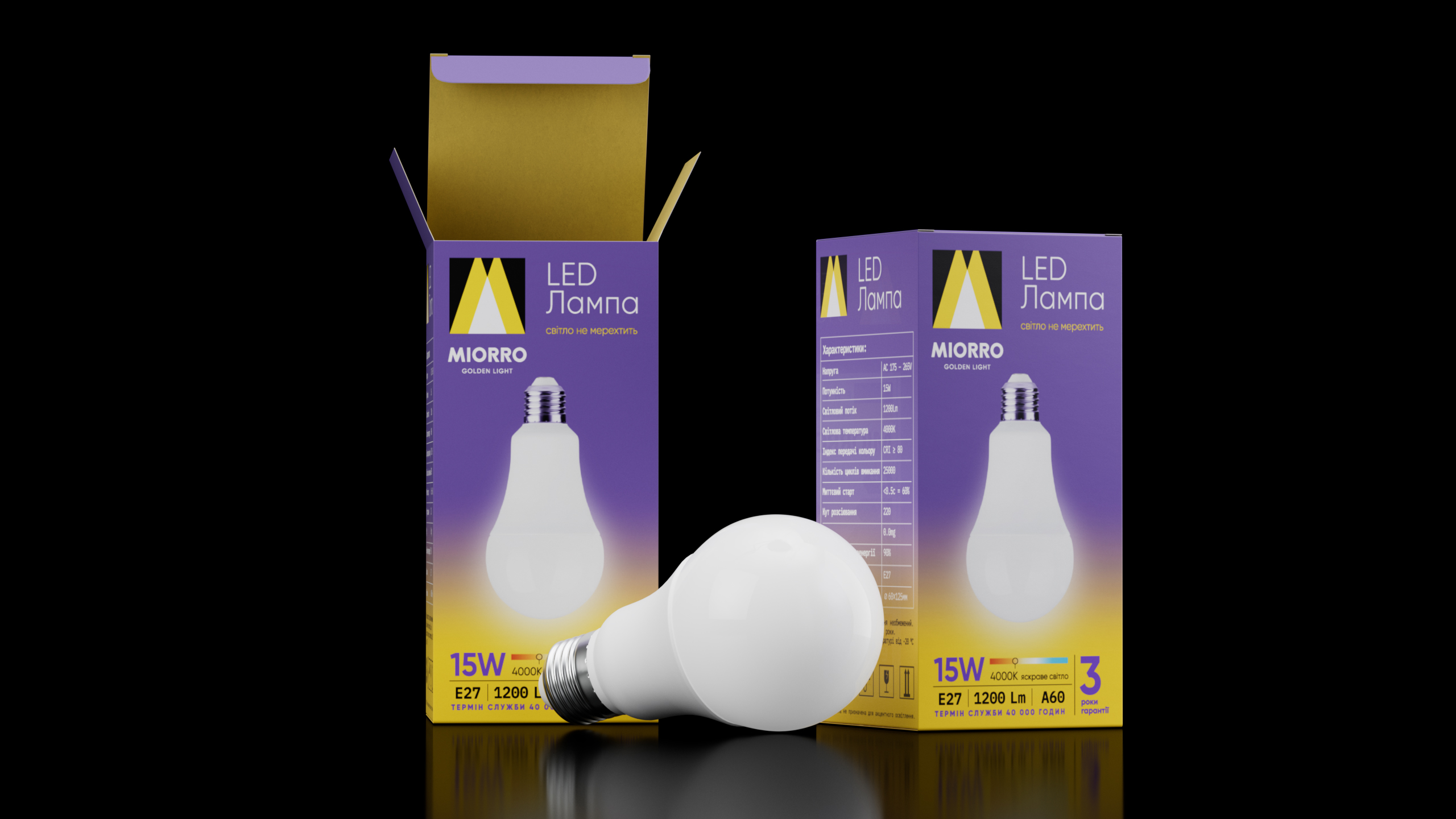
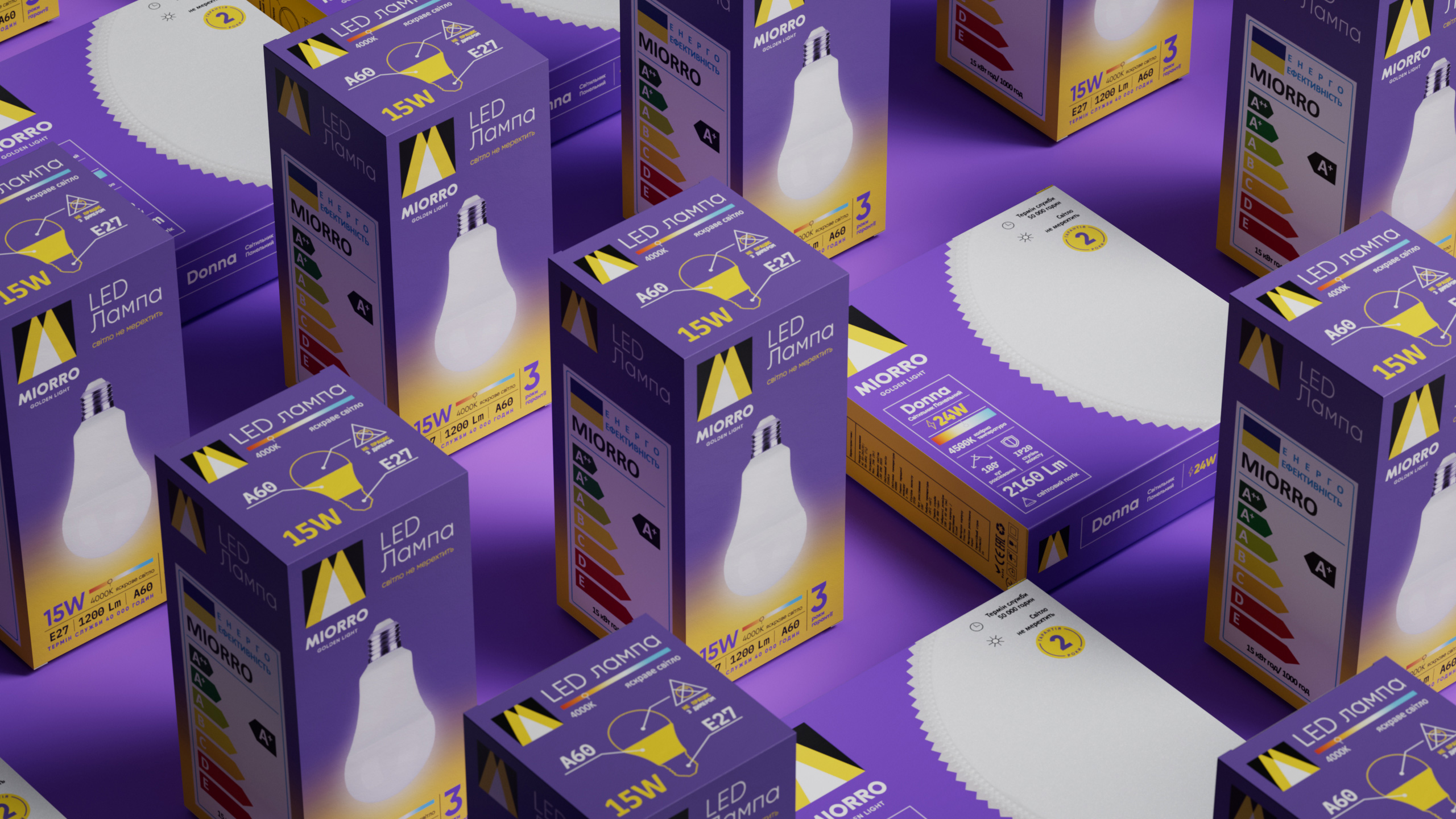
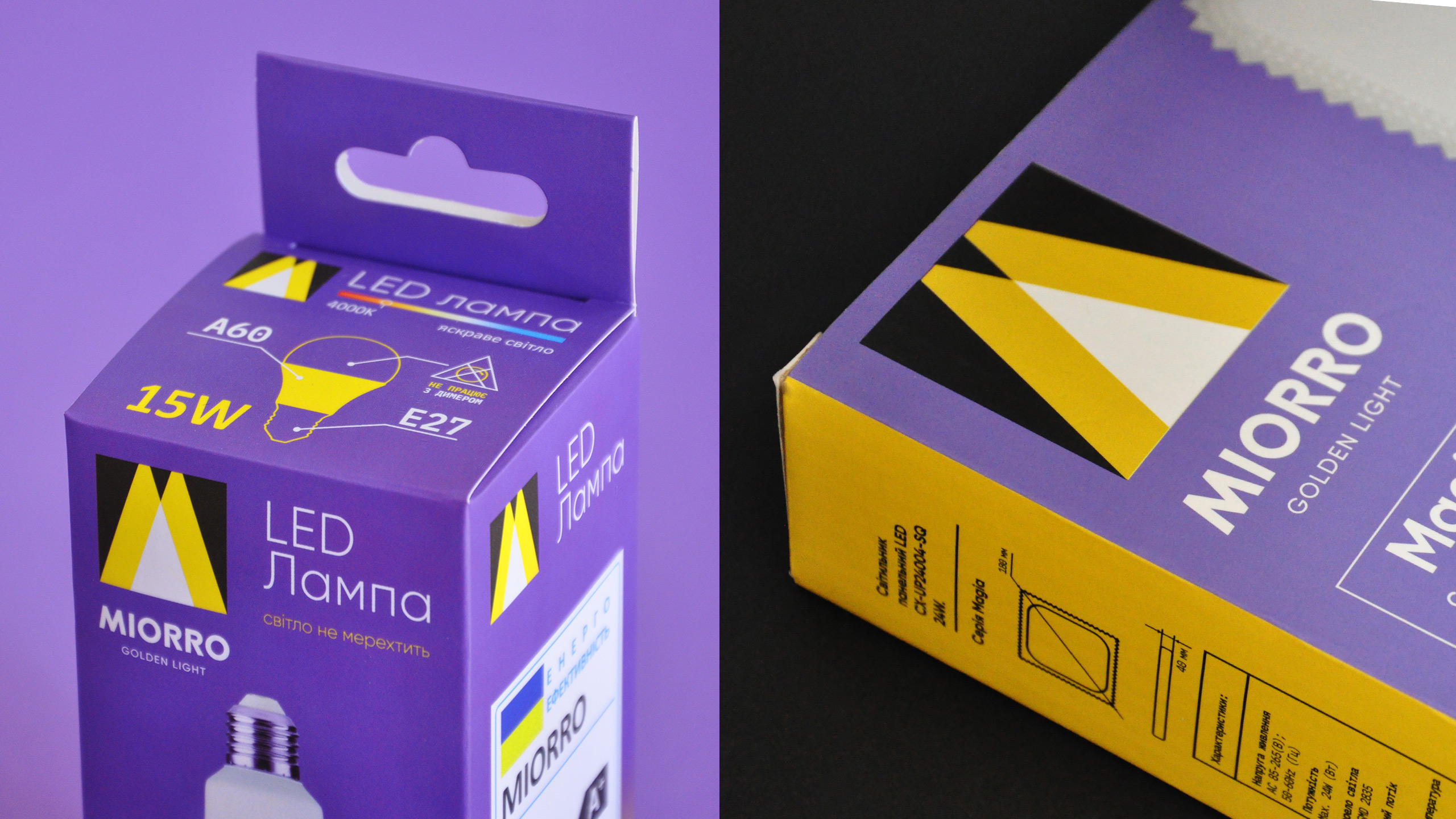
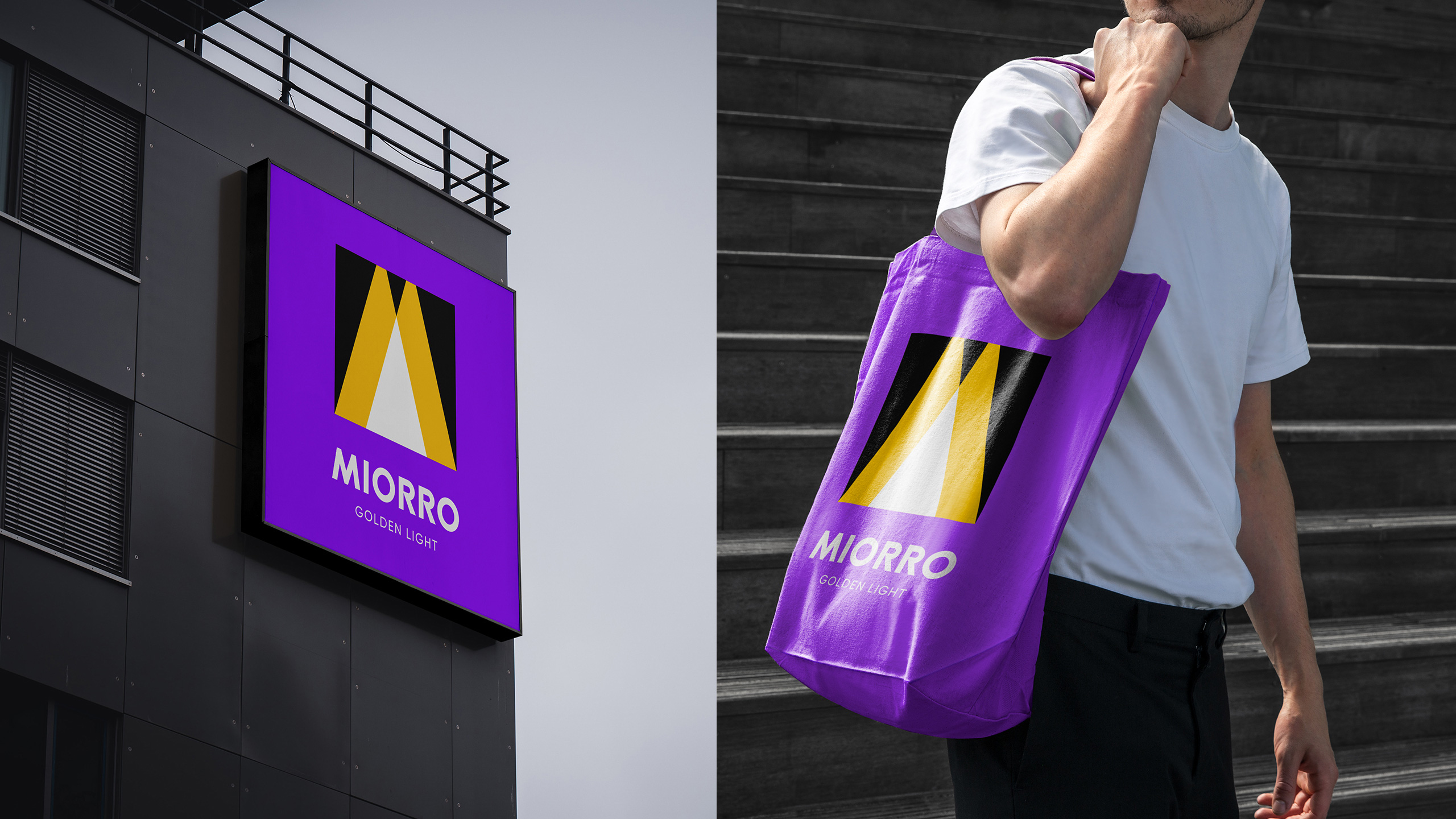
On the bright side we built the strength of the Miorro logo and style, which uses the laconic letter “m” as a design monogram and the effect of light rays that break up the darkness. We diluted the classic black, yellow and white colours that are typical for the lighting market in general with a unique branded purple background. It seemed to add extra light to the brand, making it stand out in the extremely competitive environment. After all, it was a great challenge to attract the attention to the new brand in the context of modern hypermarkets saturated with products.
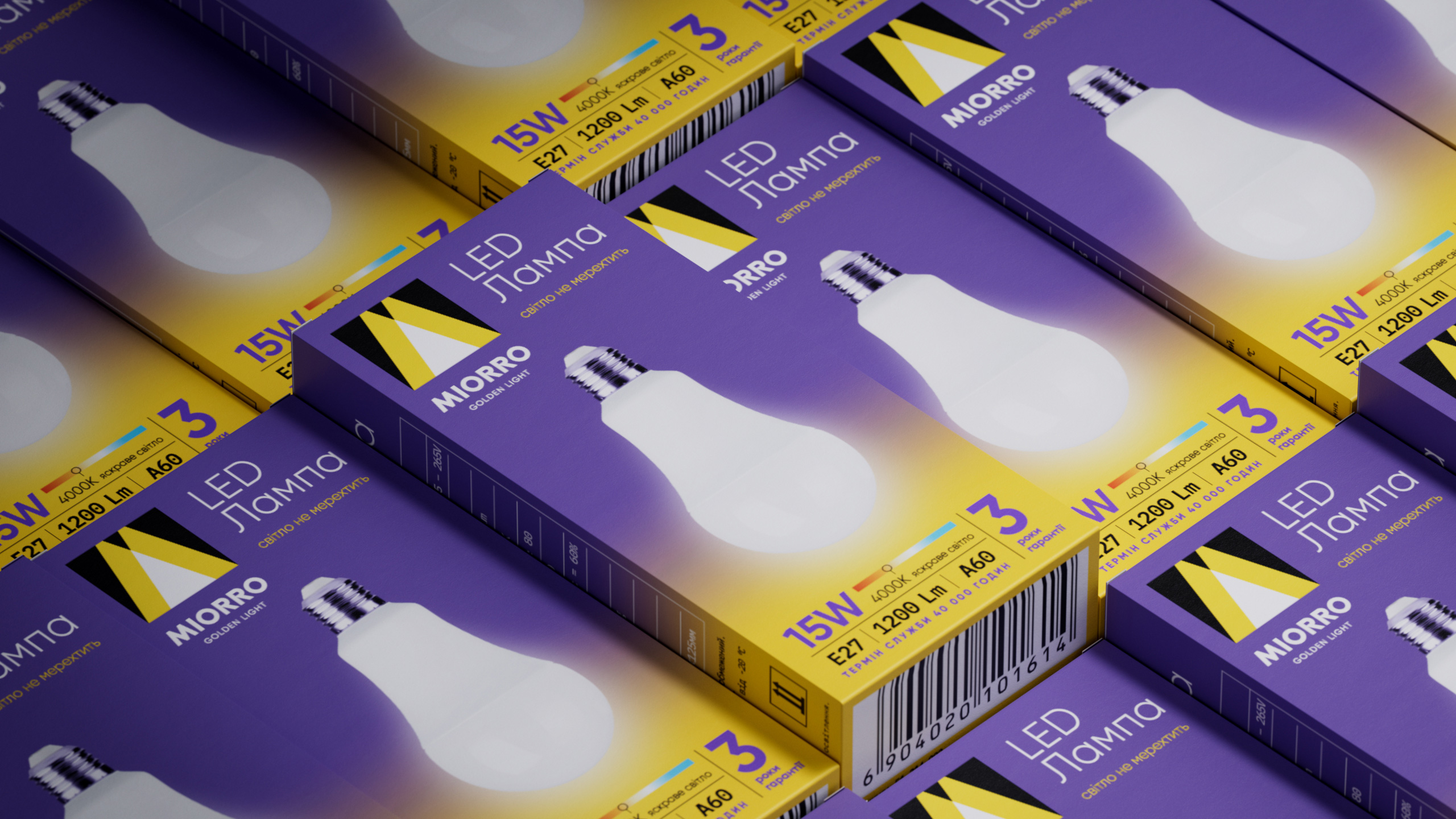
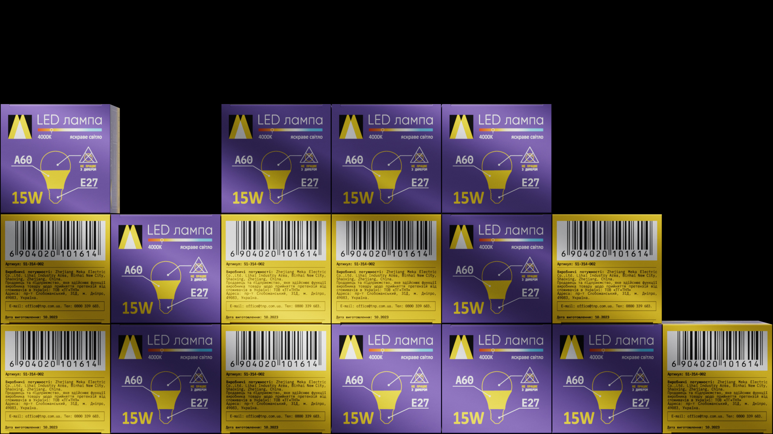
The colour combination of yellow and purple worked amazingly well in the packaging design. It is a more laconic flat solution with a macro photo fragment of the product on large lamps. But on the boxes with light bulbs, according to the client’s vision, we implemented a gradient spread of corporate colors with an imitation of the light effect. In addition, we systematically collected information that, according to the logic of priority, communicates important product features.
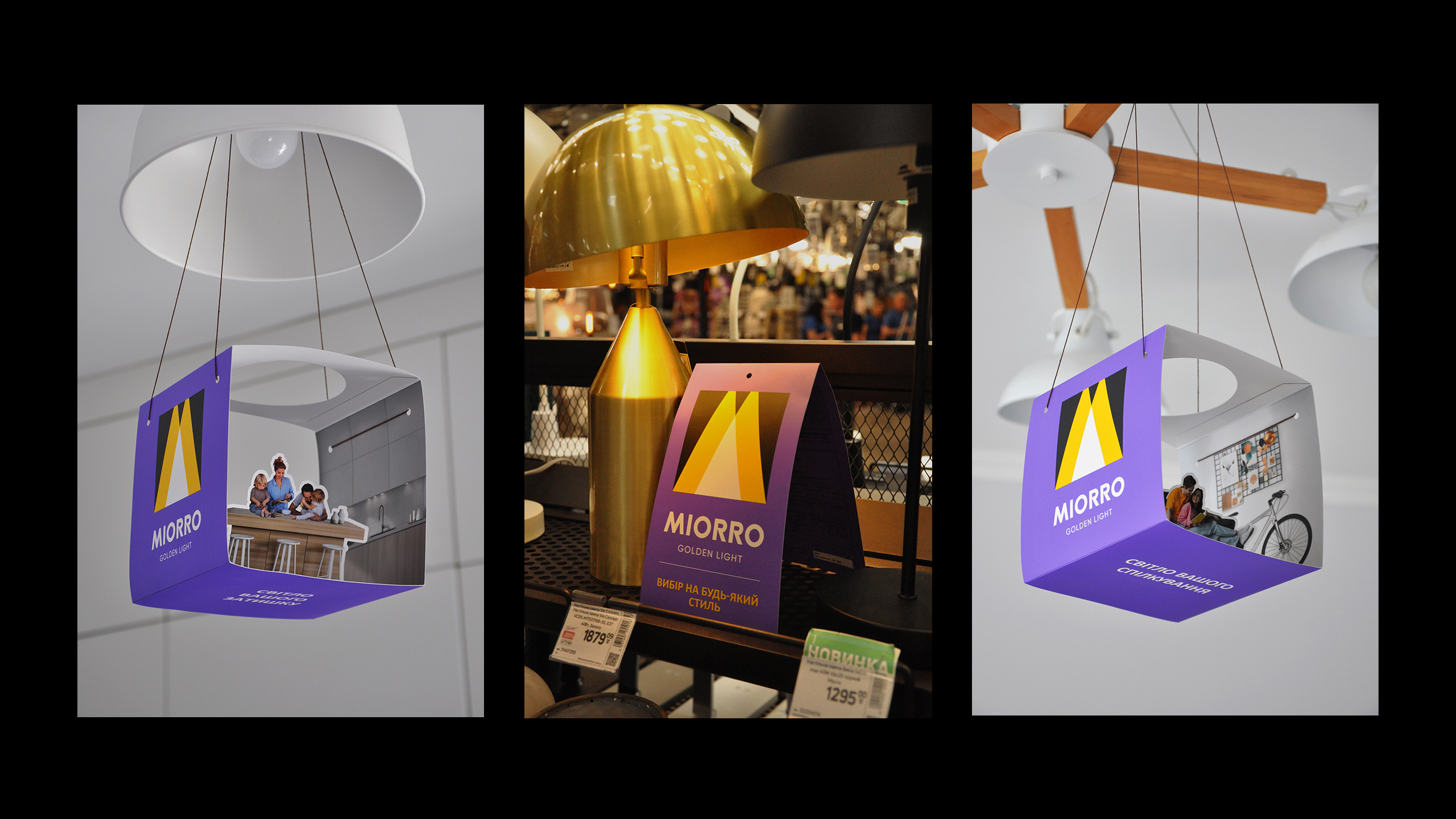
To make bright Miorro even brighter in the world of lights, we developed a system of original POS materials and messages for the project, and exchanged working ideas with the client on how to shine in the most effective way. The highlight of the project was the original design by Nastia Churbanova — a mobile three-dimensional cube with living rooms and different characters, where Miorro lamps at the sales points highlight what is actually more valuable than gold — the light of warm communication and family comfort.
CREDIT
- Agency/Creative: Dozen Agency
- Article Title: Dozen Agency Illuminates the Market with Miorro Lighting Brand
- Organisation/Entity: Agency
- Project Type: Packaging
- Project Status: Published
- Agency/Creative Country: Ukraine
- Agency/Creative City: Kyiv
- Market Region: Europe
- Project Deliverables: Art Direction, Logo Design, Packaging Design
- Format: Wrap
- Industry: Energy
- Keywords: logo, lamp, design, packaging, light
-
Credits:
Art Director: Elena Gavriluk
Art Director: Anastasia Churbanova
Graphic designer: Maria Hlius


