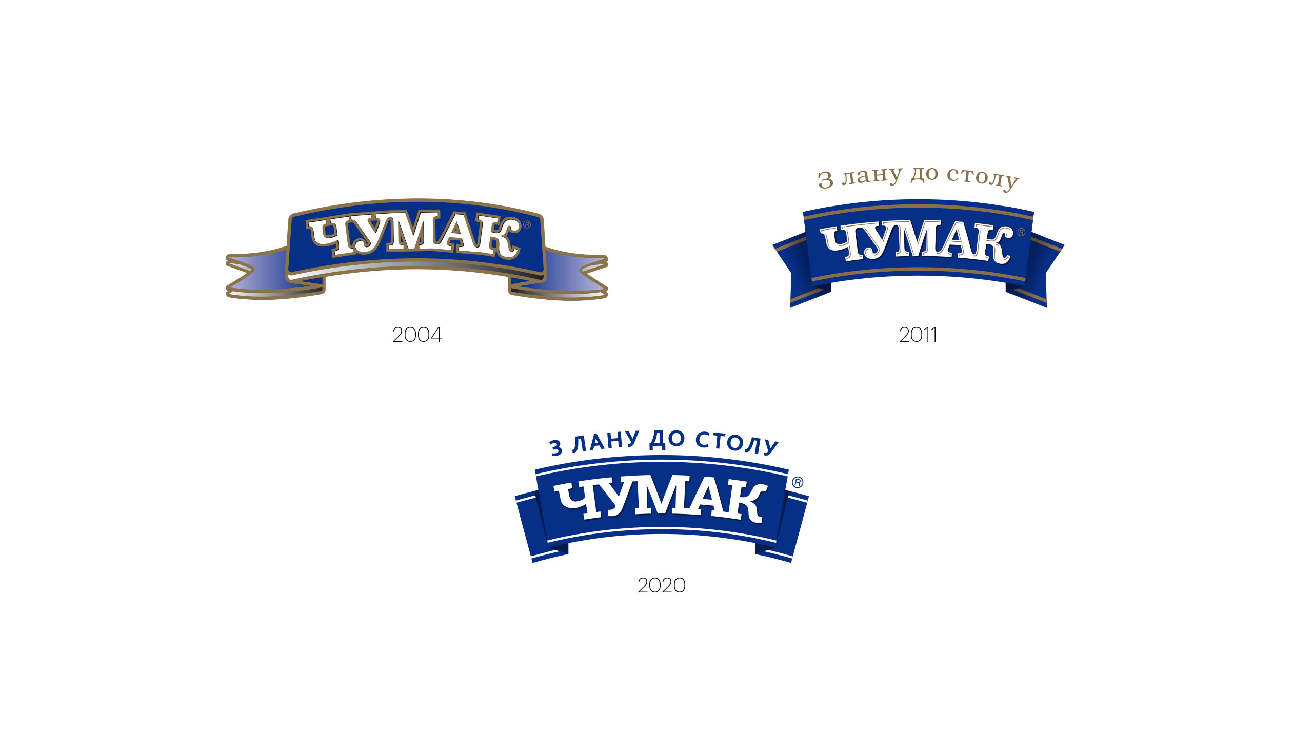
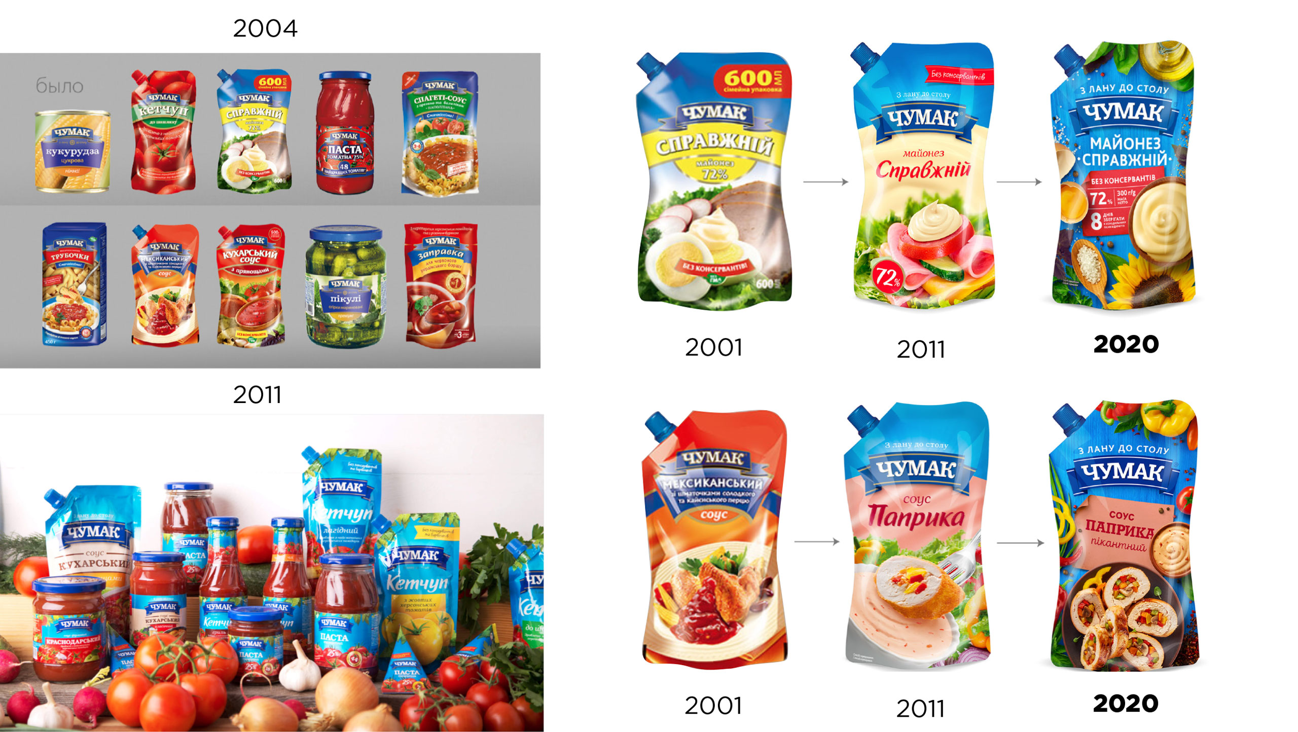
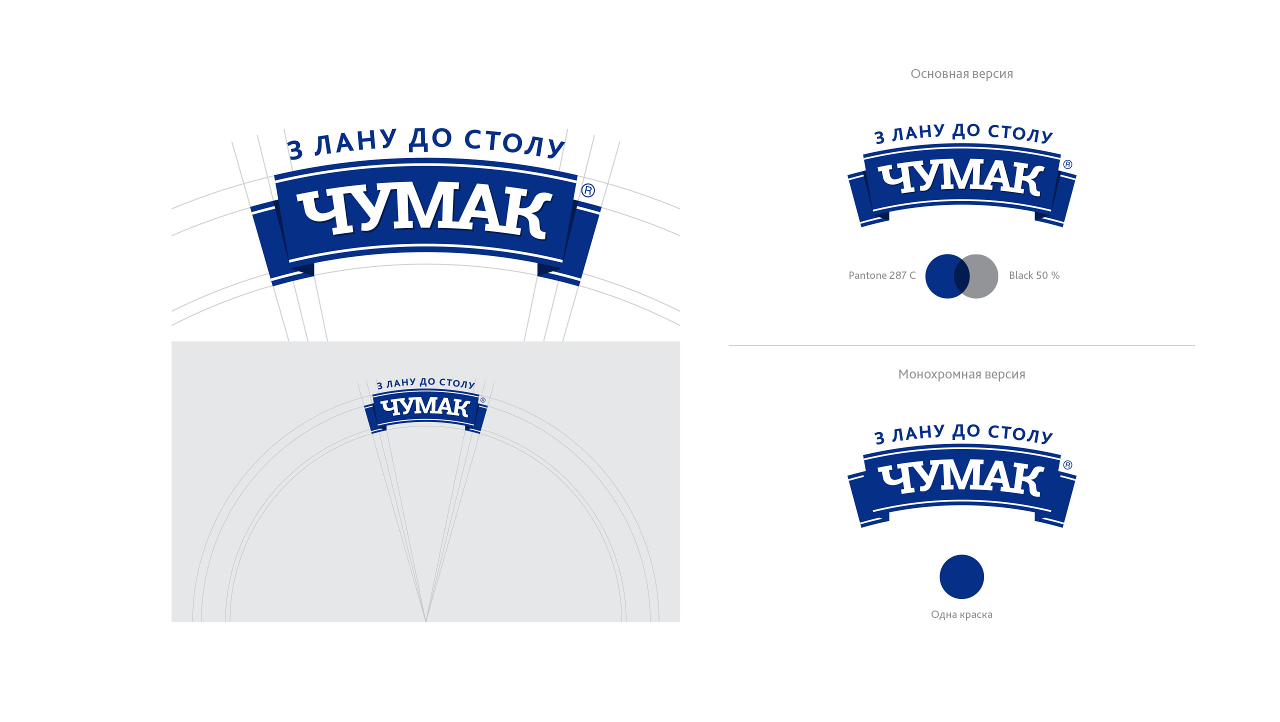
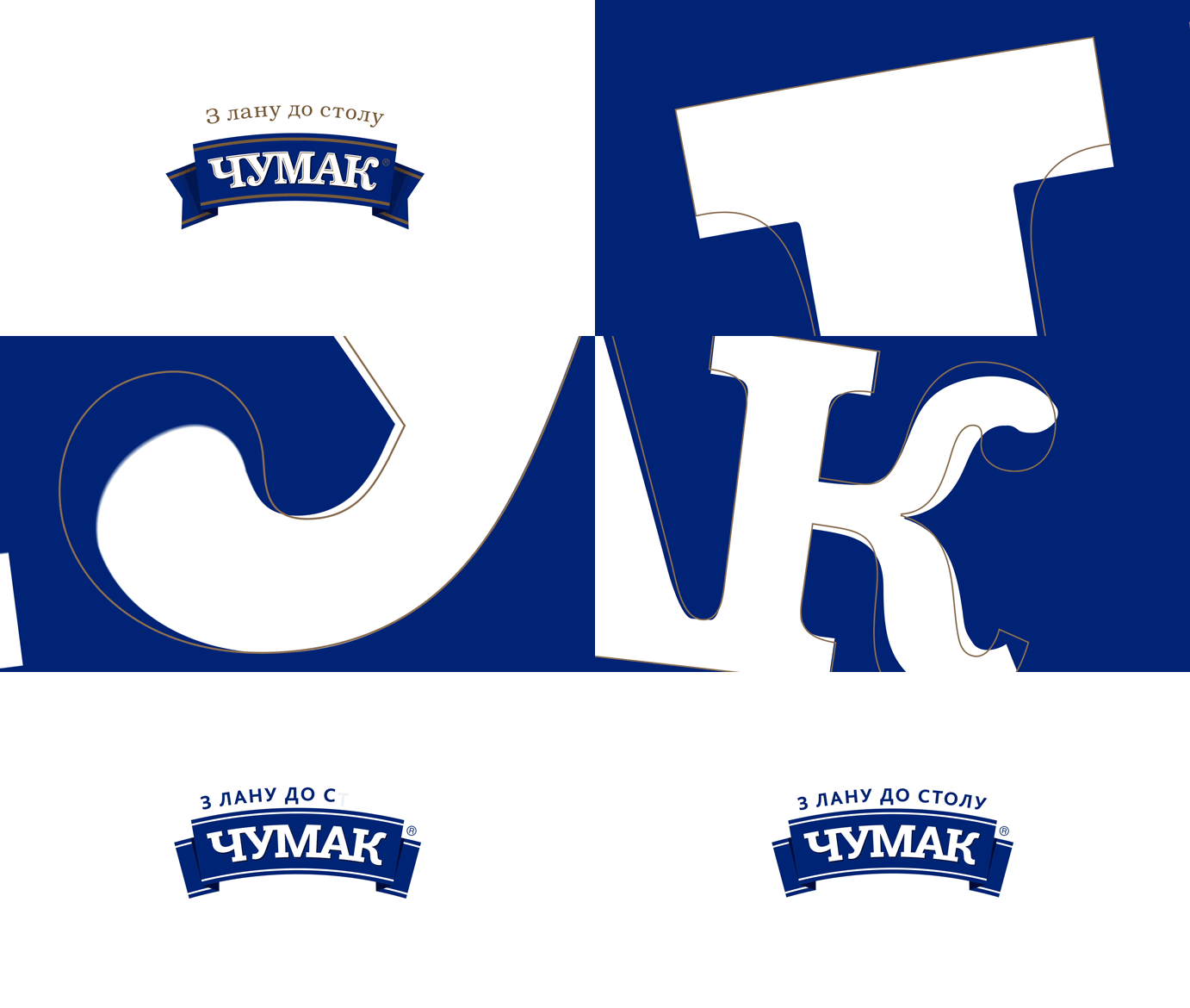
Brand Philosophy: Chumak remains faithful to its long-time value and virtue: ‘From the field to your table’. Like the 2011 re-design, when we committed to continuity to preserve the brand’s DNA, Chumak’s 2020 logo retains that familiarity across the generations of consumers. The latest re-design brings a bunch of contemporary features, such as simplified letter and badge shapes, laconic colours (two instead of three), and improved readability. Chumak now has a refreshed look, bolstered by transparency, openness, and a champion’s ribbon.
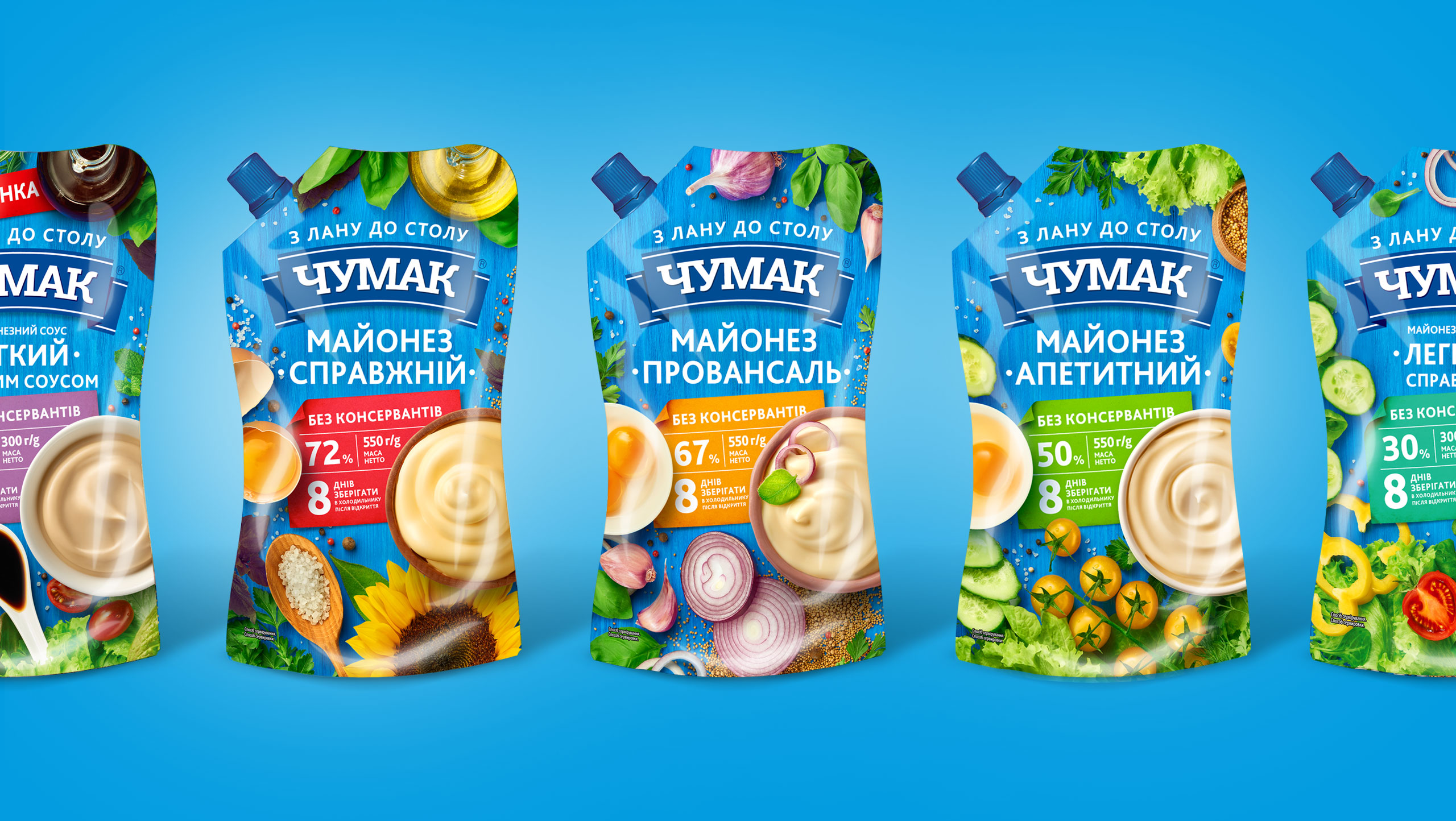
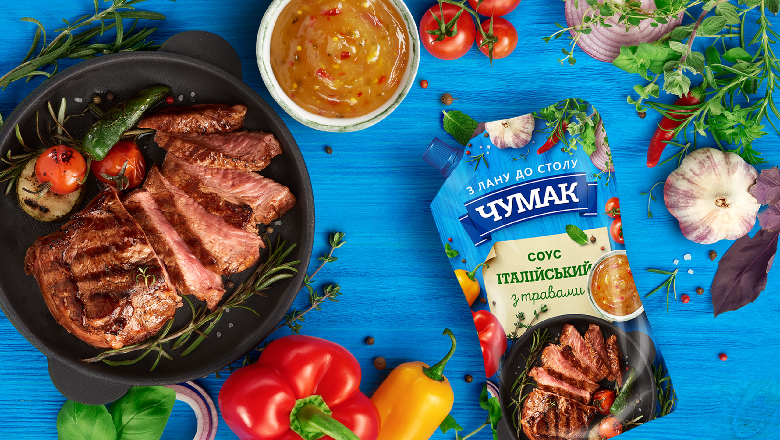
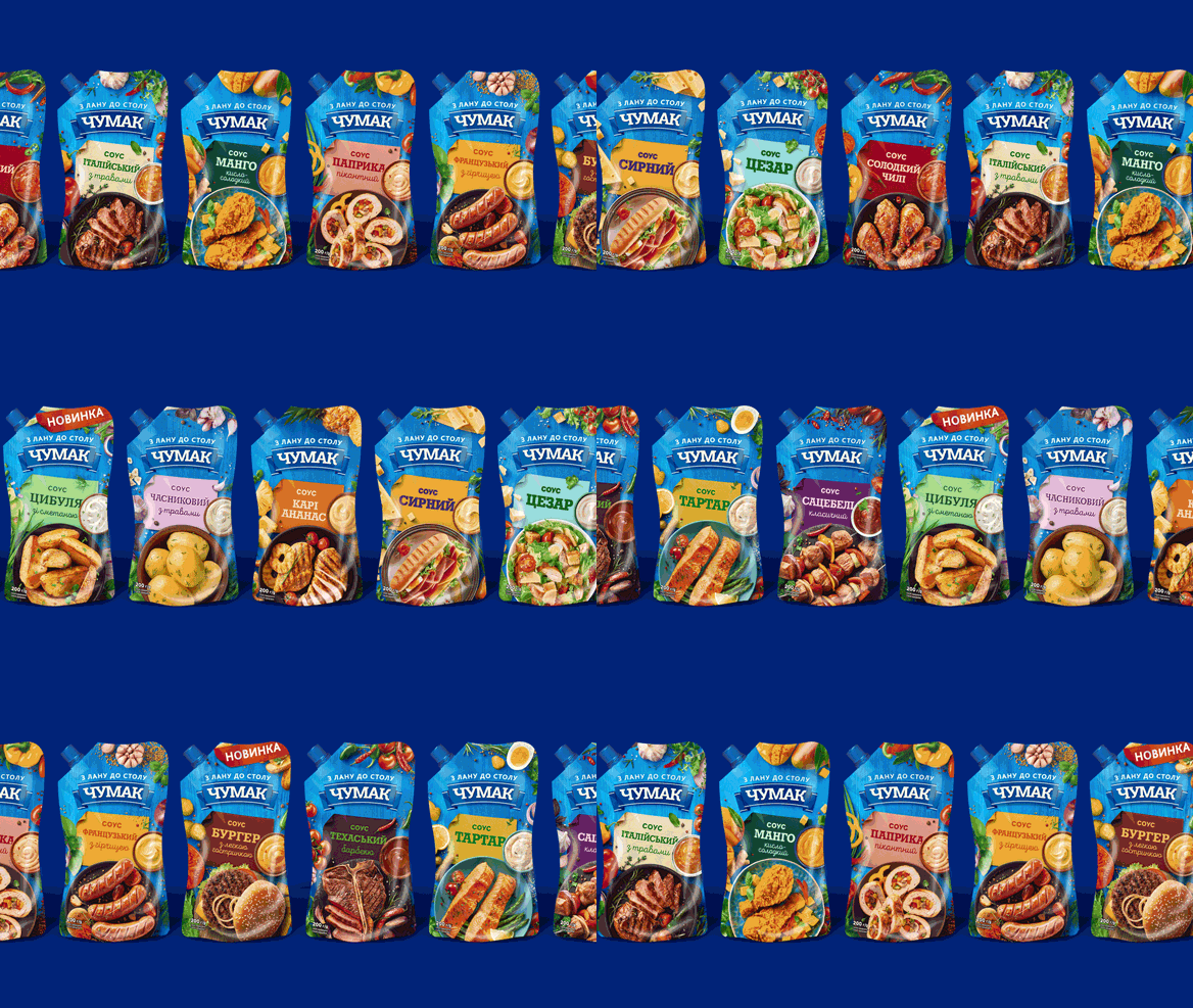
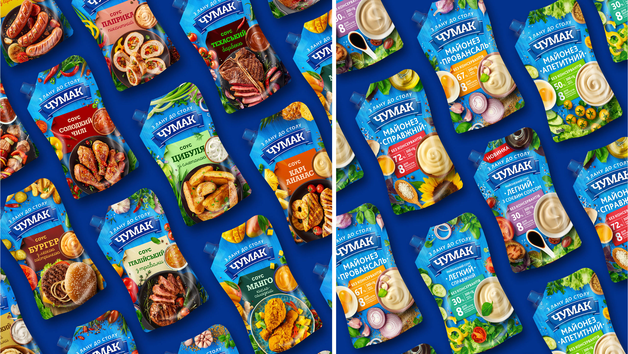
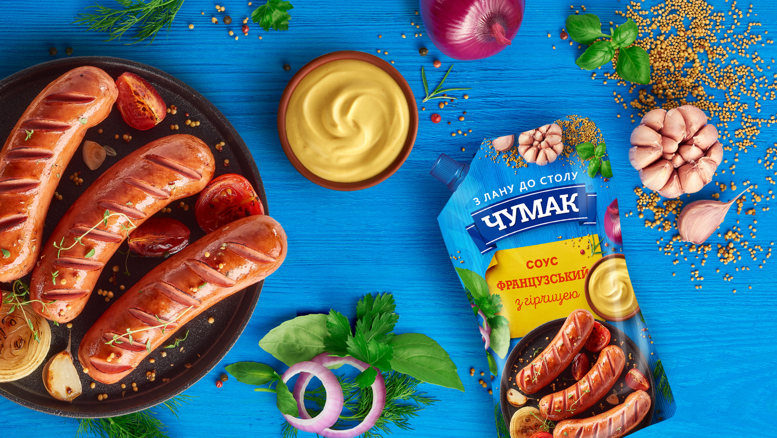
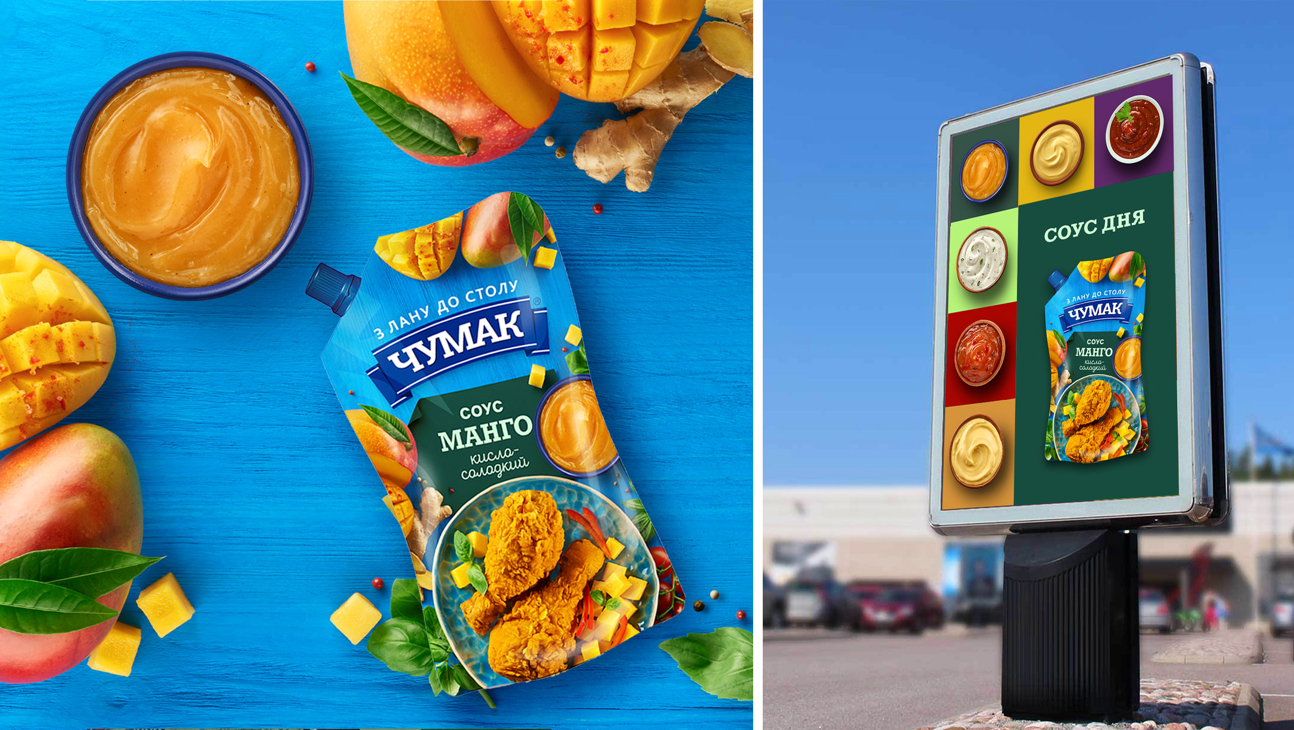
Polychromatic Blue: The brand’s primary colour changed, albeit in a somewhat non-linear manner: its shades were used to distinguish product categories in the portfolio better. So be on the look-out for new packaging: the rollout for the first two categories in Chumak’s portfolio—sauces and mayonnaise—has already begun. The colours of paper name badges that differentiate products within the line remained unchanged as a marker of the previous packaging colour code to make it easier for consumers to find the products they know and love.



CREDIT
- Agency/Creative: Dozen Agency
- Article Title: Dozen Agency Helps the Market Leader Transforms Again
- Organisation/Entity: Agency, Published Commercial Design
- Project Type: Packaging
- Agency/Creative Country: Ukraine
- Market Region: Europe
- Project Deliverables: Brand Architecture, Brand Identity, Brand Strategy, Graphic Design, Packaging Design, Photography, Rebranding, Tone of Voice
- Format: Flow-Pack
- Substrate: Plastic


