


Age From 0 to 10
is just a quantum leap by the standards of human life. It feels like a child has just been born, and then he or she graduates from elementary school and says goodbye to their favorite characters from their first children’s fairy tales. It’s hard to believe, but “Kazkove” also celebrates its 10th anniversary on the market, and “Molokiya” addressed us for a redesign as tender as an evening fairy tale. Our target audience is children from 3 to 7. This is the age of a child for whom their mom buys quality products in the supermarket. Her shopping basket will also contain the well-known “Kazkove”, which will surely be enjoyed by both mother and child.
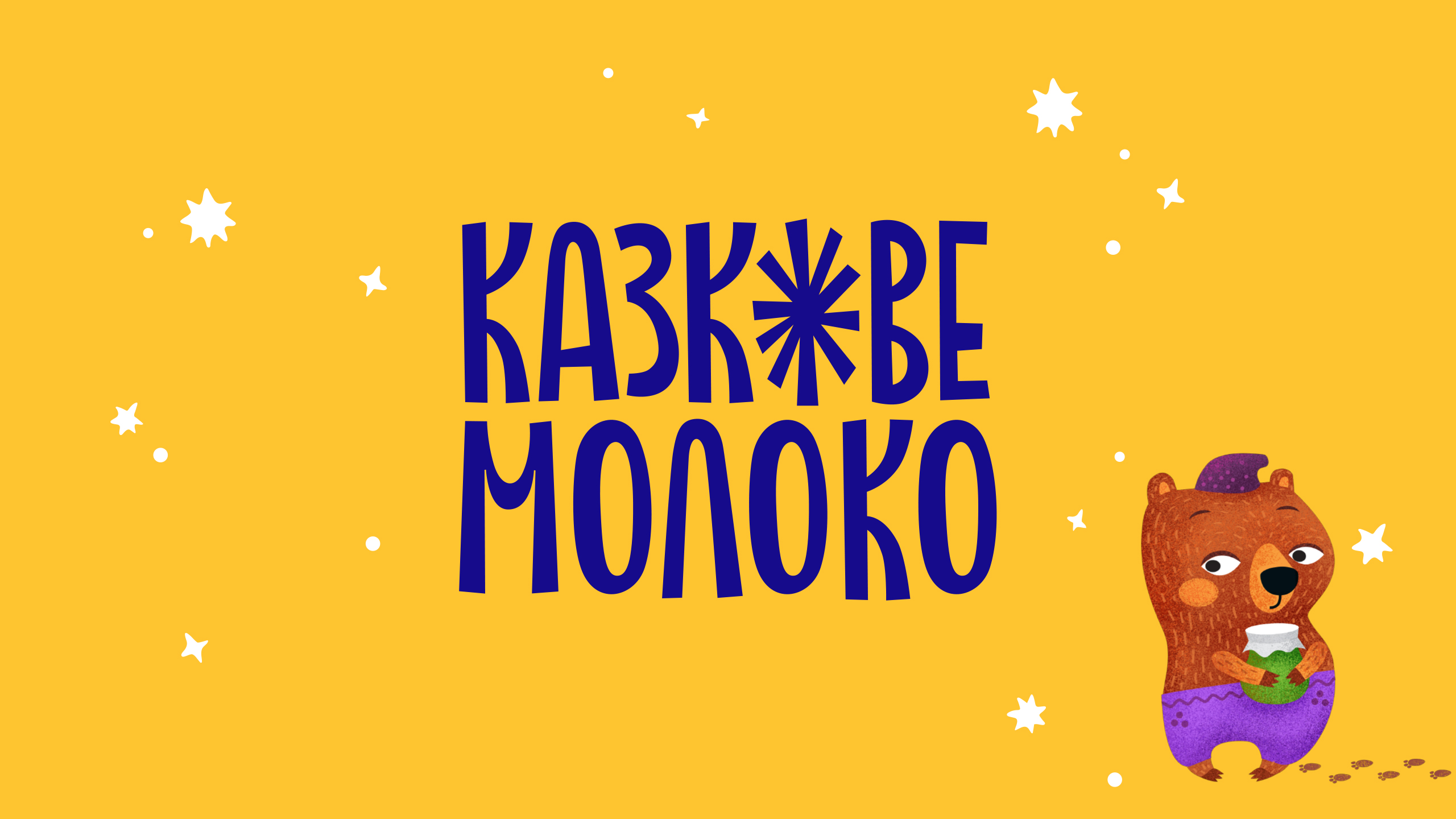
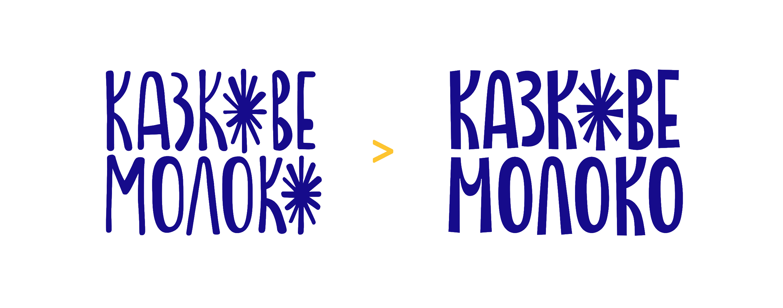
From Good to Better
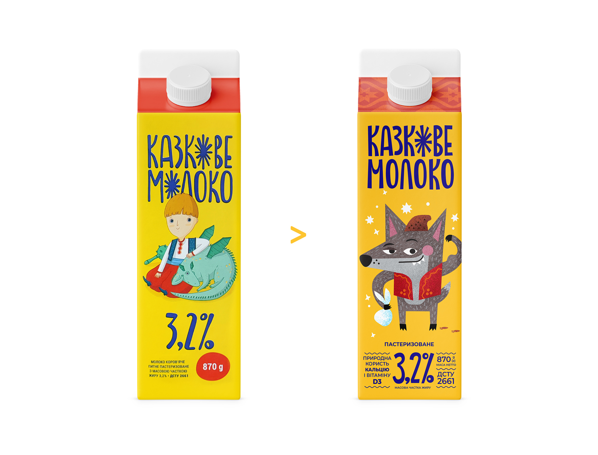
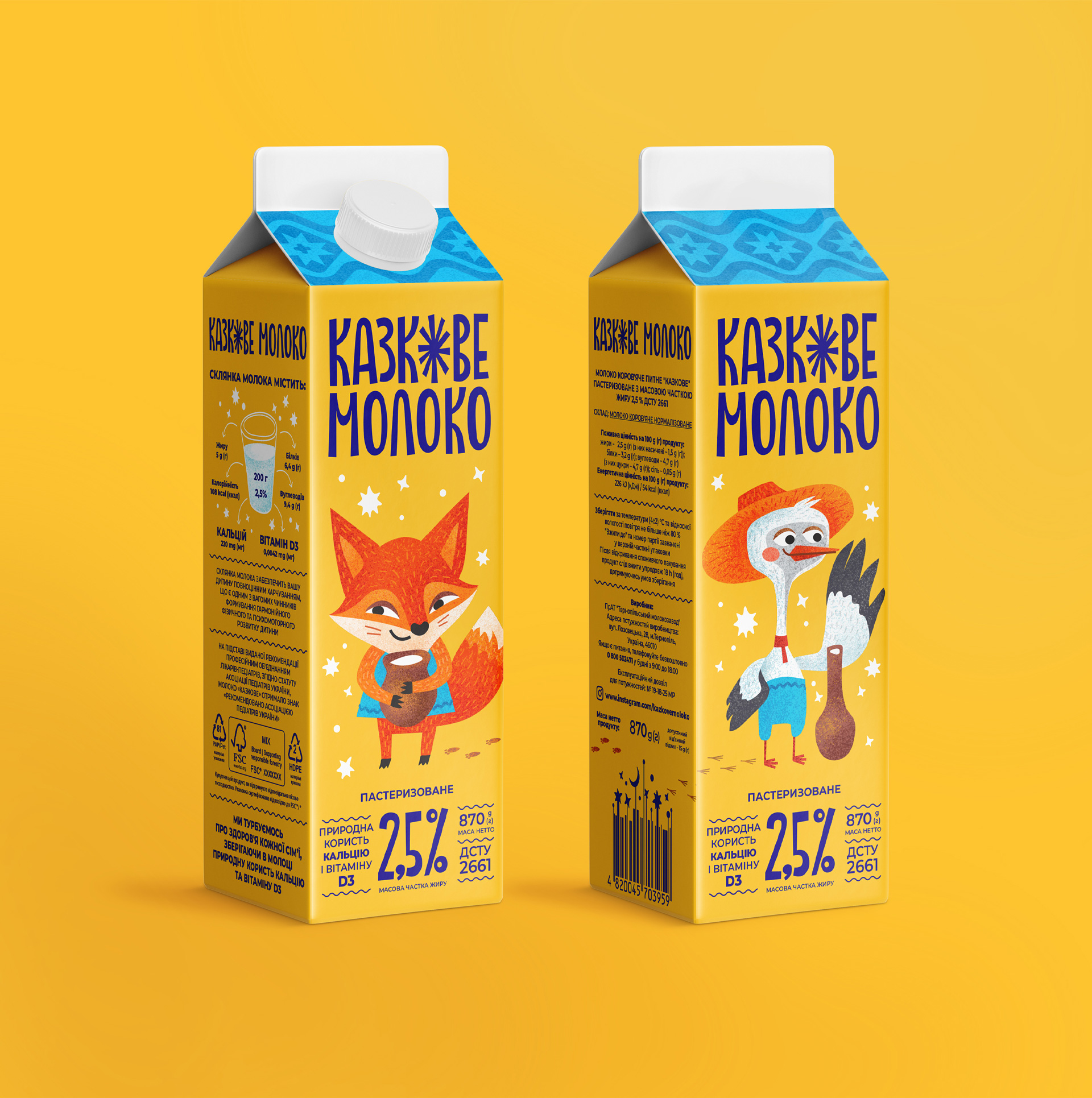
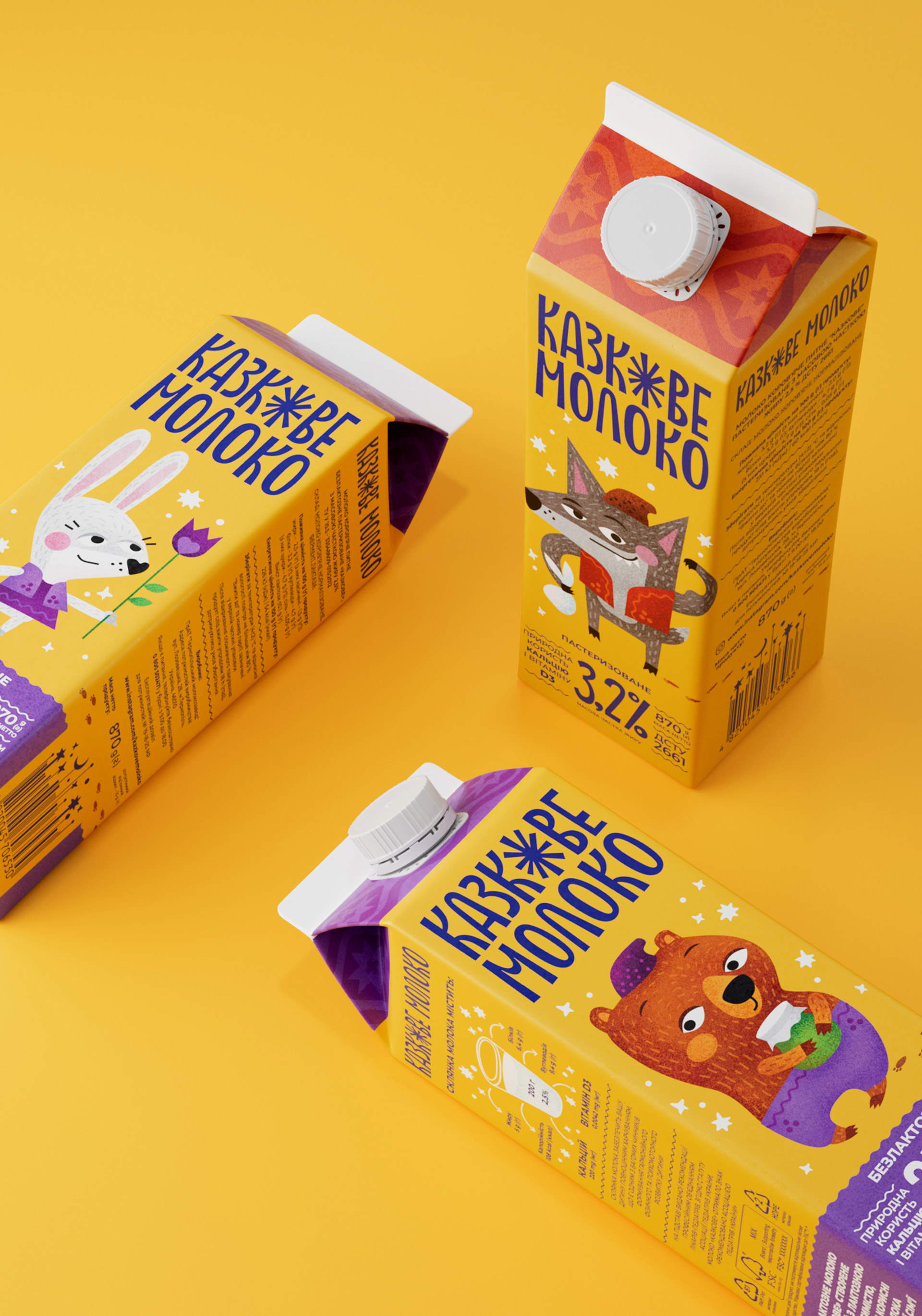
this is how we can characterize the work on the logo we had to create. And what did we do? We built up its milky muscles and left only one graphic trick with the star letter “o” in the stressed vowel. We softened the logo in some places, intensified it in others, and generally kept its childlike, handmade style. In addition, the cheerful sunny and starry yellow was made warmer, deeper, and it turned almost into the color of baked milk. You can’t mistake this milk on the shelf for anything else.
Looking for New Characters
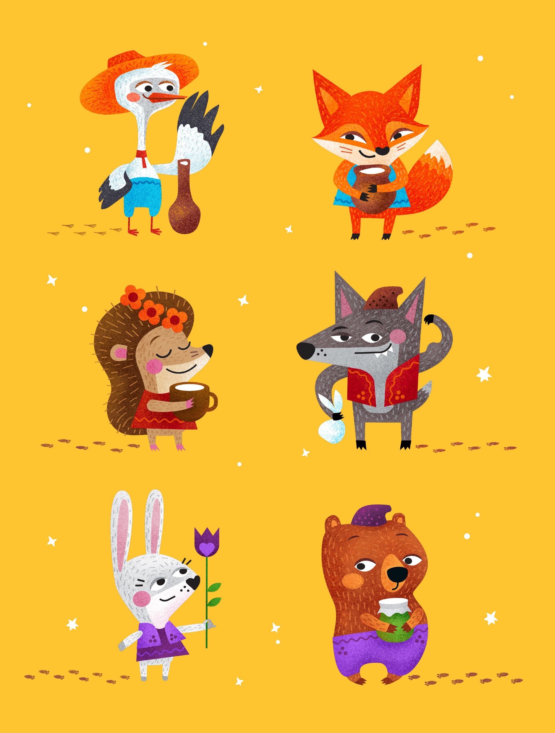
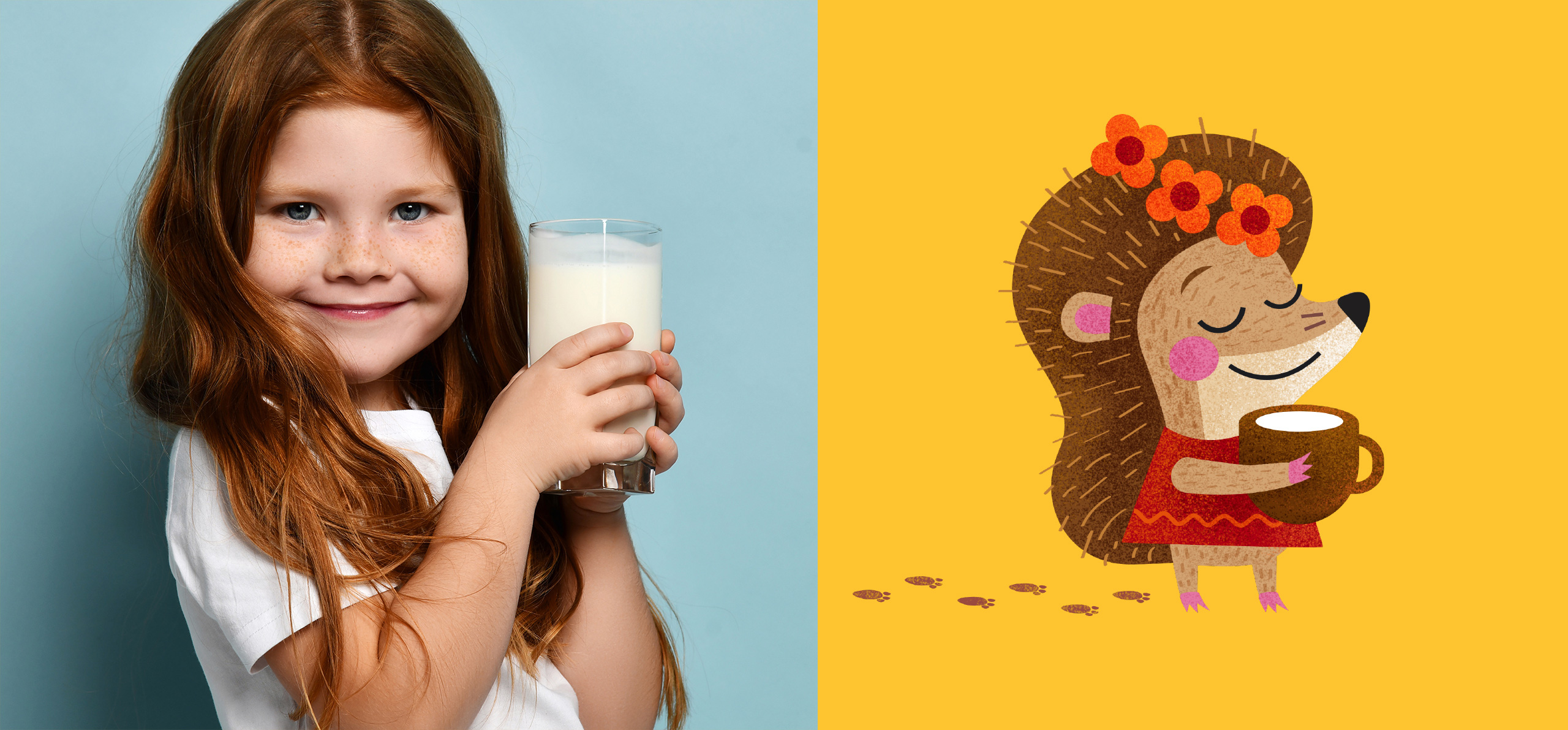
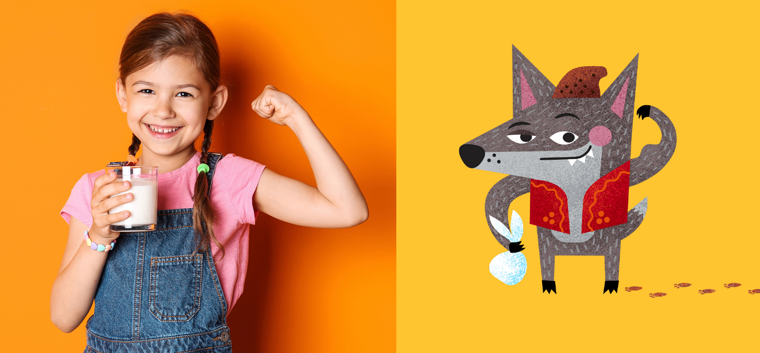
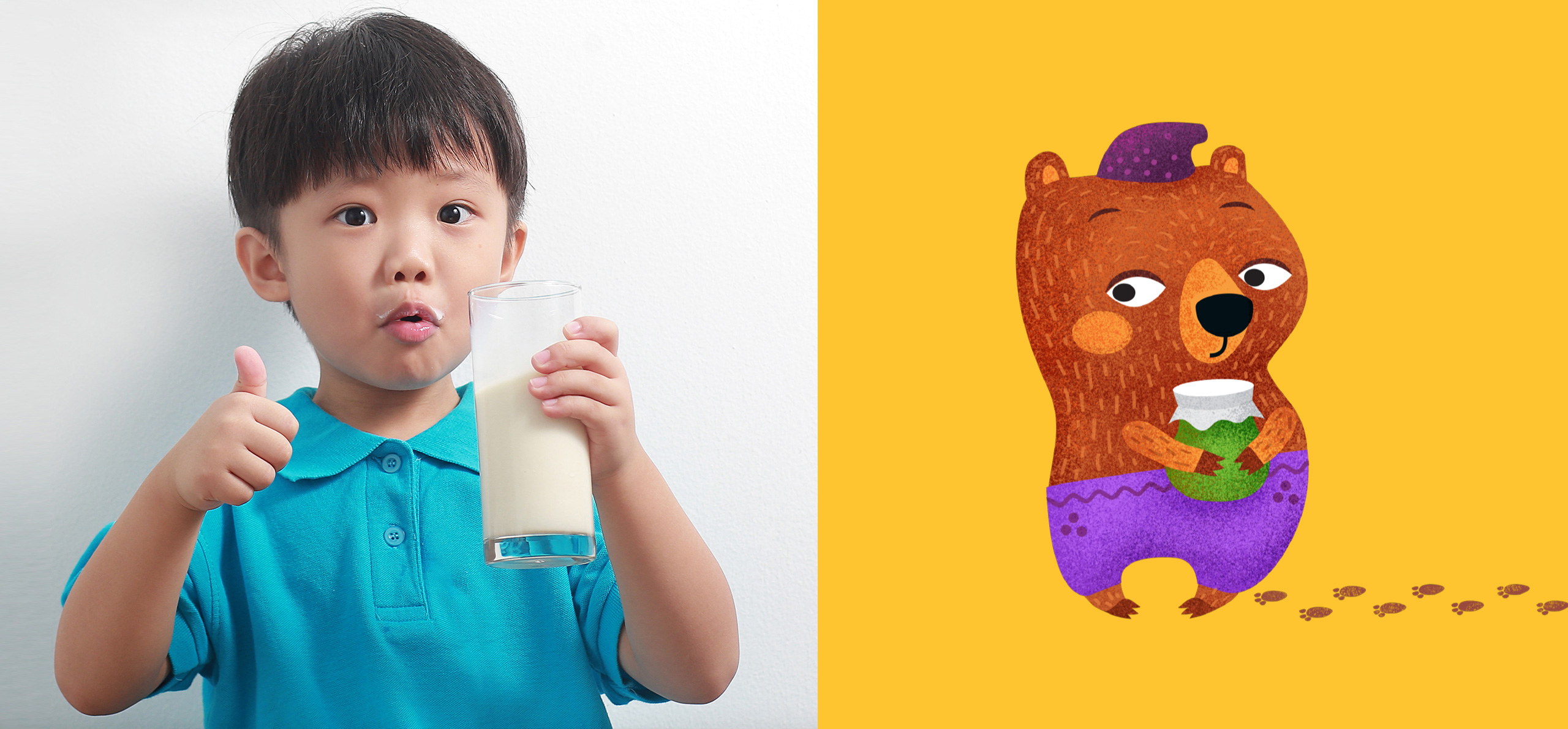
we made several attempts together with the client team. We proposed different ideas, different stories and different styles. Finally, the client refused to use direct quotes and references to concrete stories. So we decided to create a series of characters that would supposedly come to the child, and the child would compare himself or herself to them and fantasize. That’s how our magical team was created by Olena Tverdokhlib on the basis of our favorite animal tales.
Now Every Package
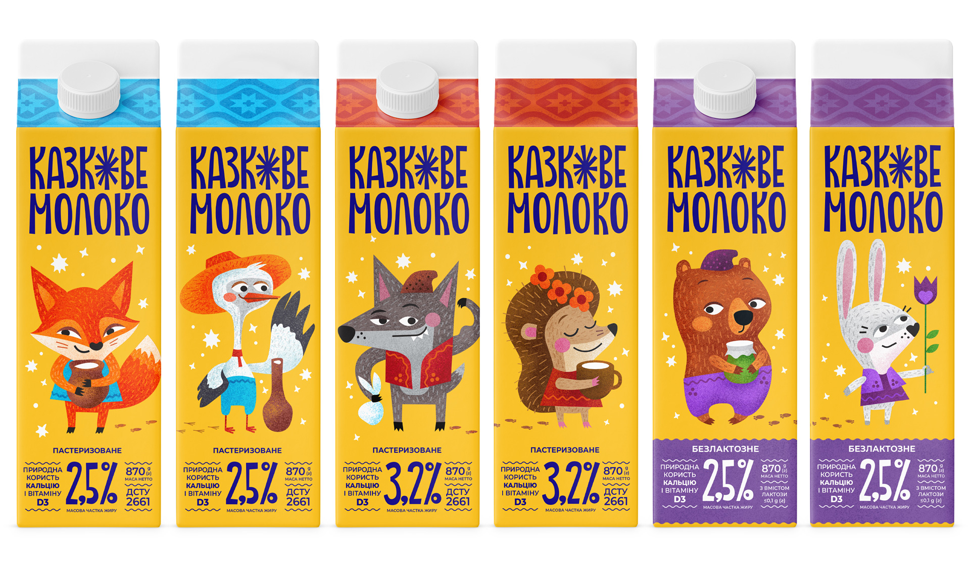
is interesting to spin on the shelf and look at from different angles. After all, no matter how you look at it, two different faces are not just one! Two characters on the package give more space for imagination. You can make up a story about how Wolfie met Hedgehog and she treated him to milk, or how Bunny hurries to congratulate Bear with a flower in early spring, and he has already prepared a pot of honey for her. All of our characters are drawn in a flat illustrative technique in stylized Ukrainian costumes. We also added star and embroidered patterns not only to the clothing elements, but also to the top of the package.
We Also Made It Convenient,
beautifully and clearly visualized the information to distinguish milk by fat content, show its healthy benefits and quality, and emphasize important details. So now you can read, buy, taste and feel free to draw a milk mustache with the redesigned “Kazkove”!
CREDIT
- Agency/Creative: Dozen Agency
- Article Title: Dozen Agency Fresh Redesign for Kazkove Milk Packaging
- Organisation/Entity: Agency
- Project Type: Packaging
- Project Status: Published
- Agency/Creative Country: Ukraine
- Agency/Creative City: Kyiv
- Market Region: Europe
- Project Deliverables: Illustration, Logo Design, Packaging Design
- Format: Tube
- Industry: Food/Beverage
- Keywords: milk, design, packaging, logo, illustration, character, dairy
-
Credits:
Art director, illustrator: Elena Tverdokhlib
Logotype: Roman Melnyk
Technical Design: Maria Hlius


