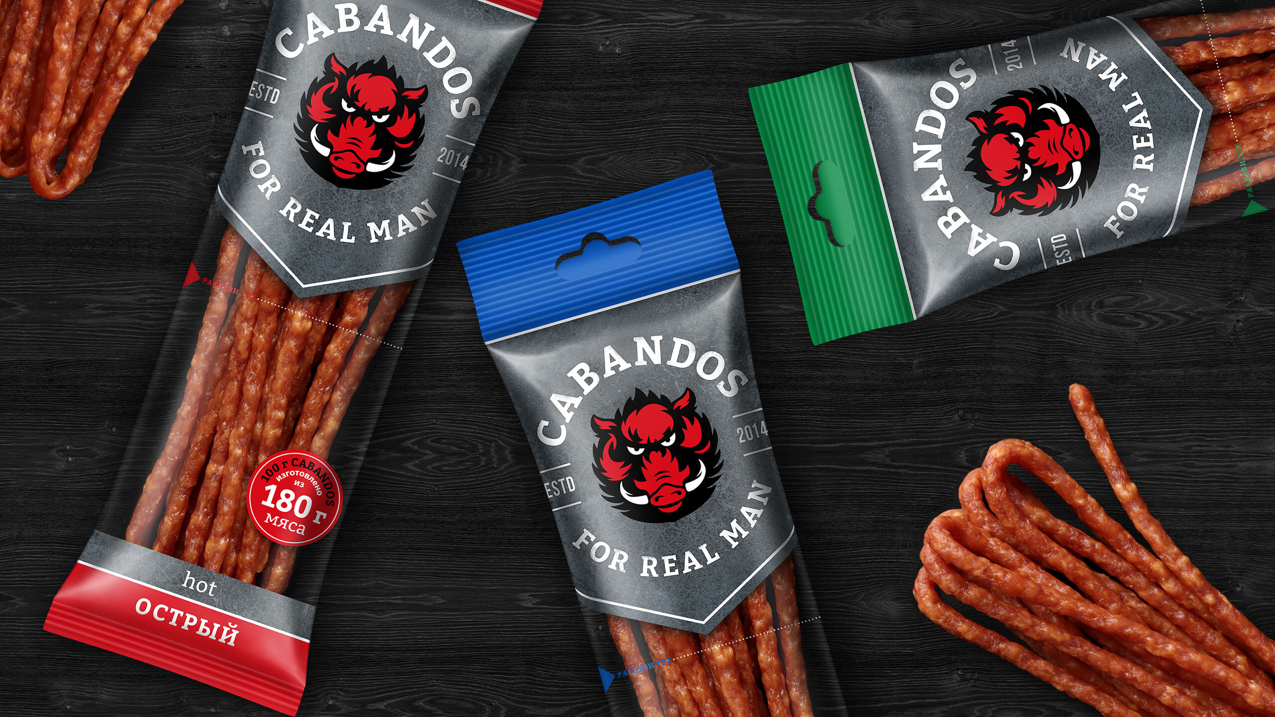
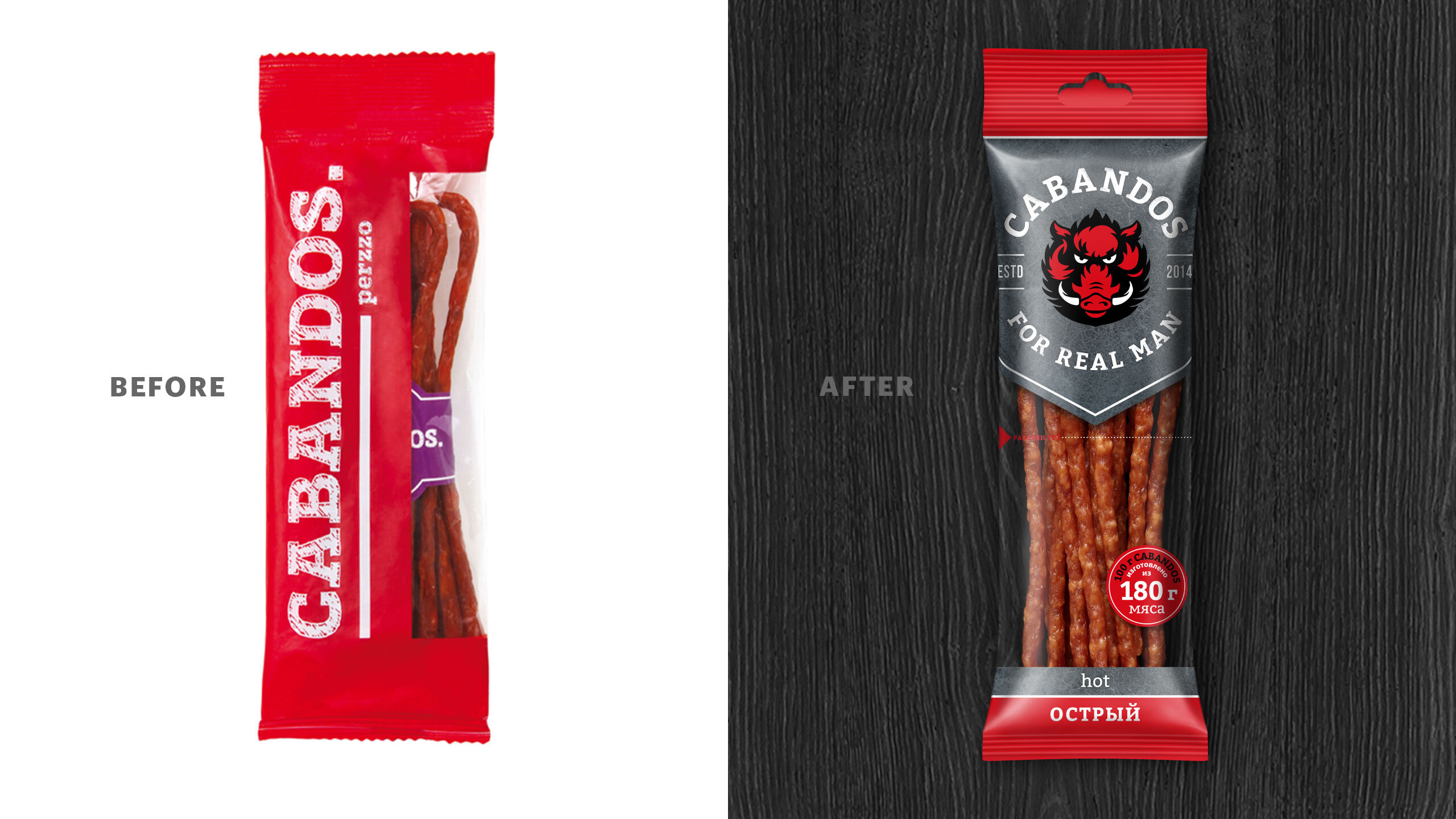
Kabanos from Belarus: With products that have vivid flavours, but not that outstanding of a packaging, they looked for a way to showcase their product on the shelf. This is how Cabandos’ rebranding began.
Meat: It’s the only thing that the manliest of us need when we need to still our hunger ASAP during a football match or a shooter session, when going out of town or spending quality time with friends. So, we have a mouth-watering product, a snappy name, but what brand lacks is some muscle.
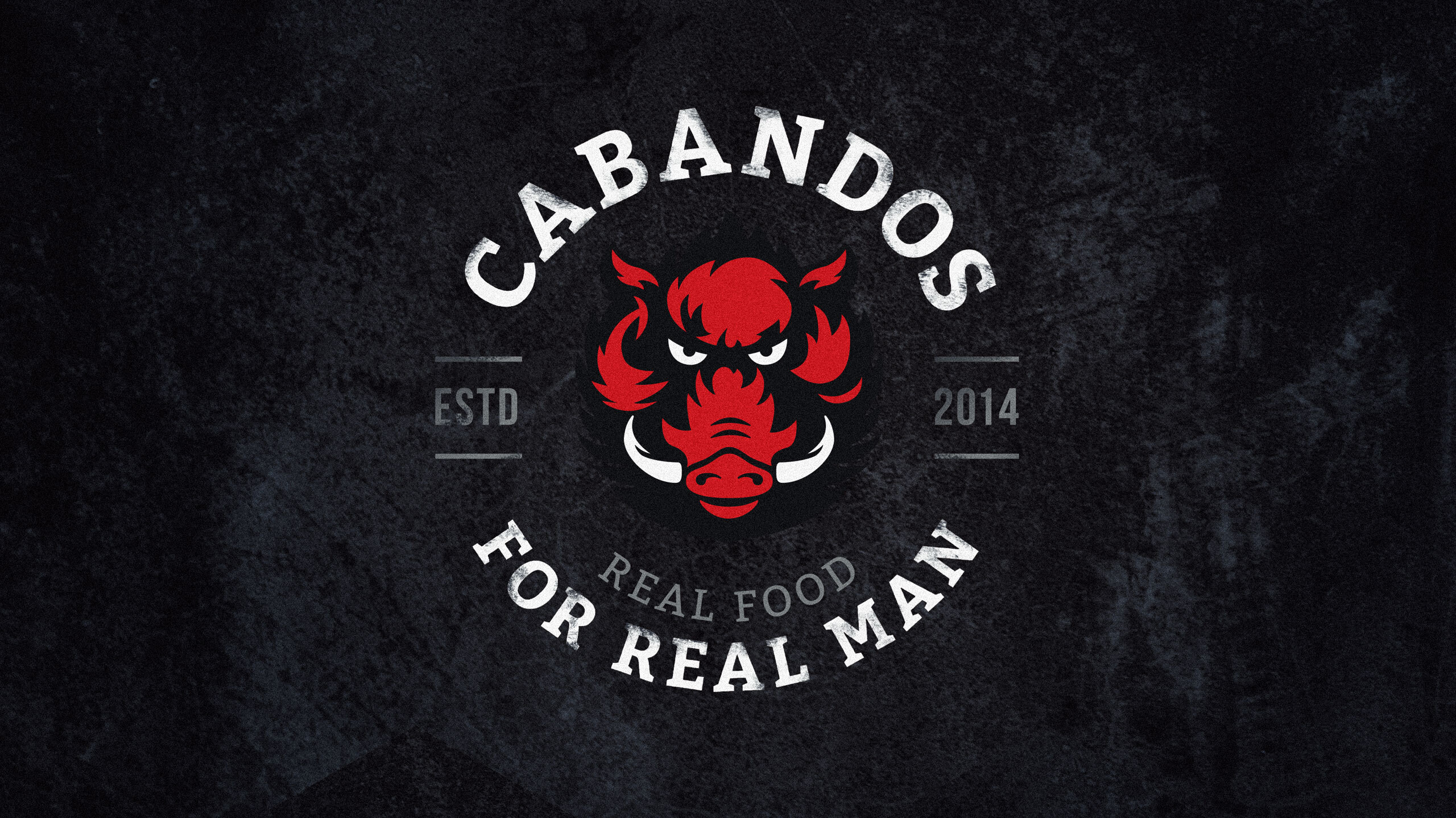
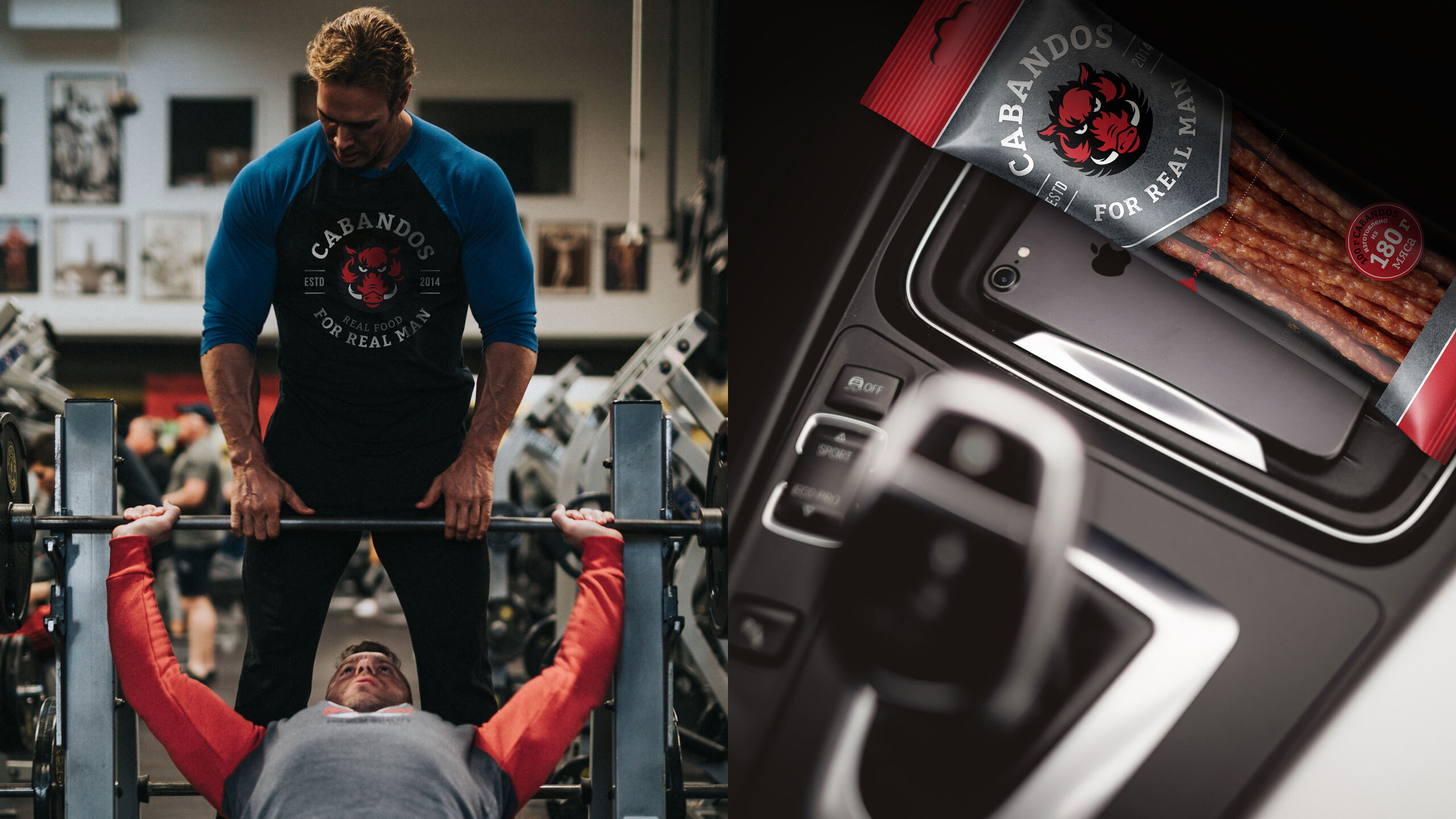
Where Cabandos is, there is a Hog: This is what we understood while holding our survey. Our consumers are not youngsters, but self-reliant experienced men that know what they want: 1) To still their hunger 2) To look manly while doing so. The real thing for real men,” this is how the first-ever manly snacks talk about themselves.
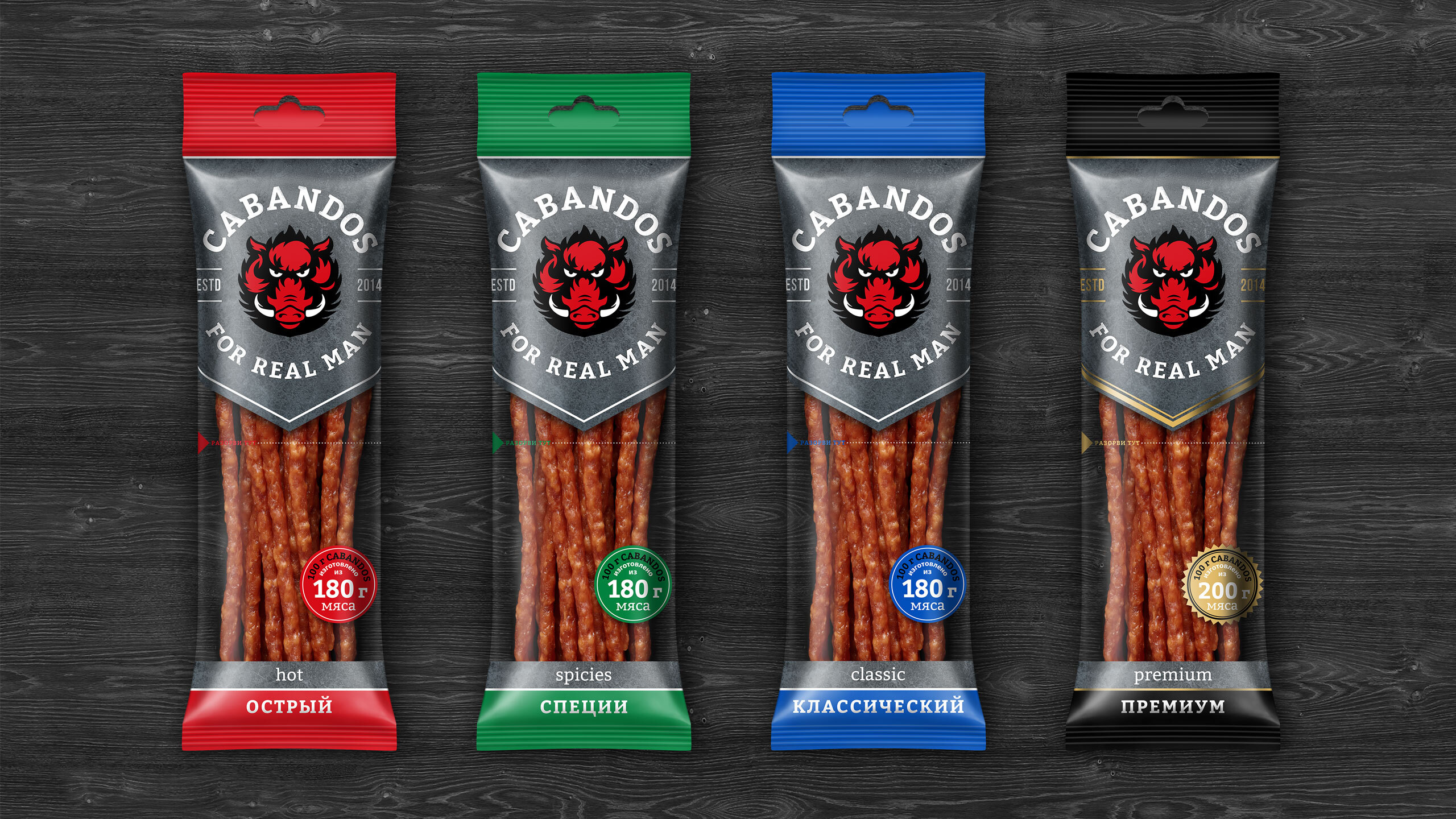
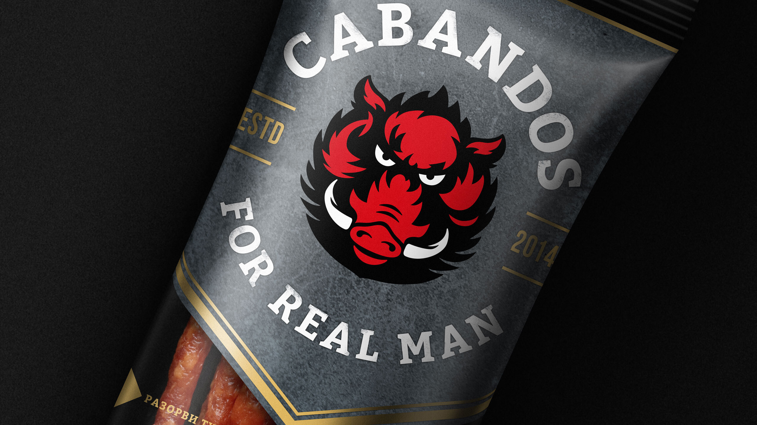
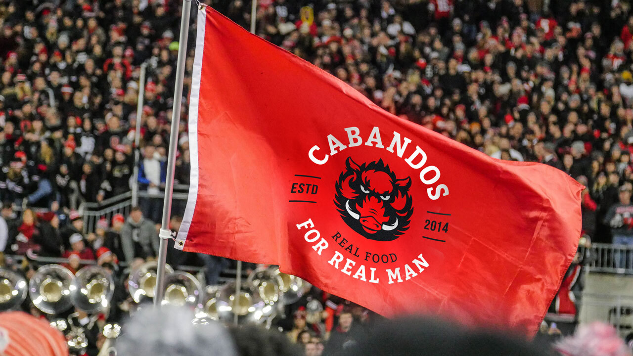
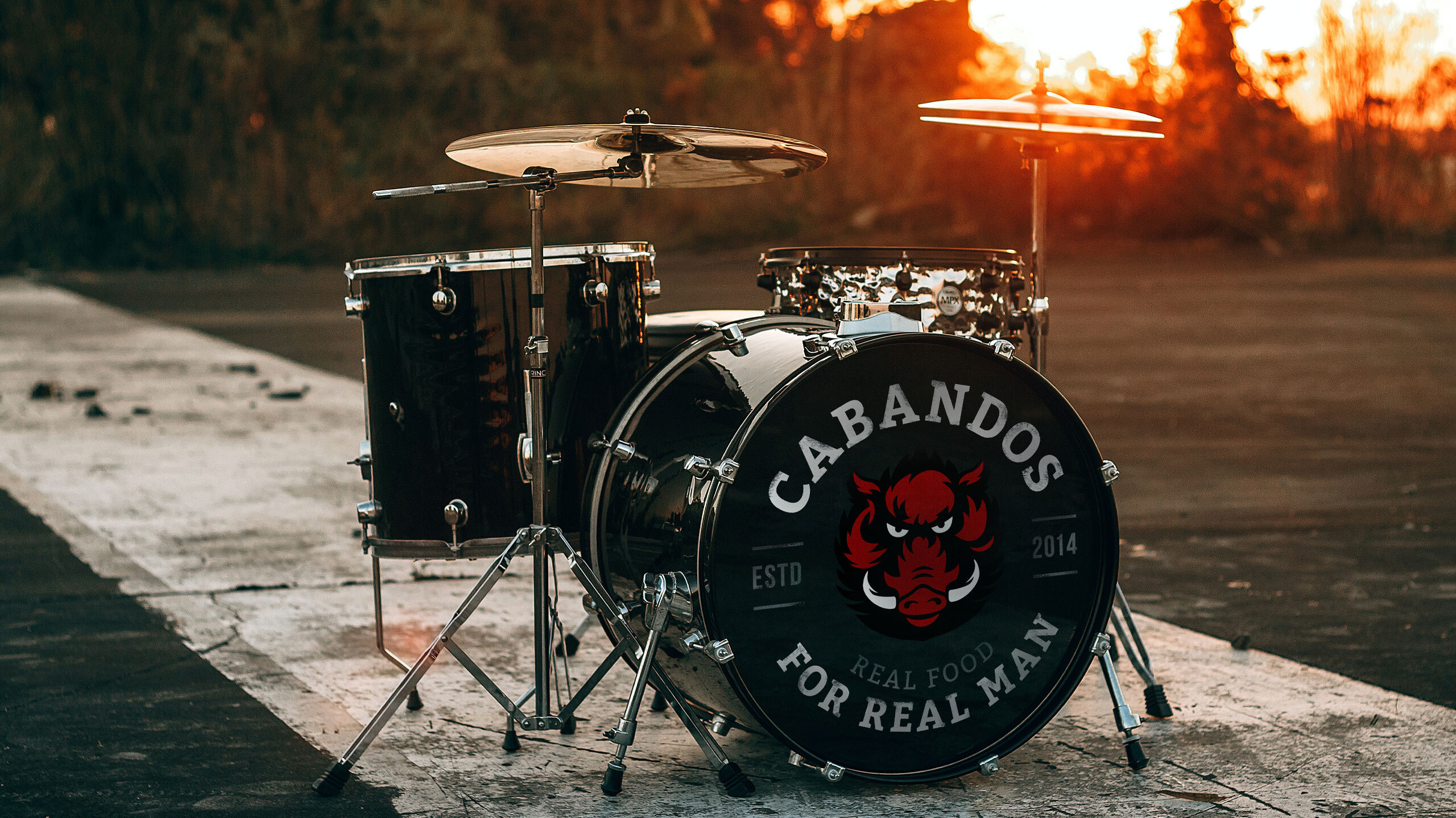
Red Colour: We decided to preserve the original color, especially since it worked well with the new brand mascot. The Hog is symbolic of the trophy of a real man—a breadwinner and achiever. The brand combines its name’s semantics and the image of its mascot. Now, its brave and tough character is noticeable from afar.
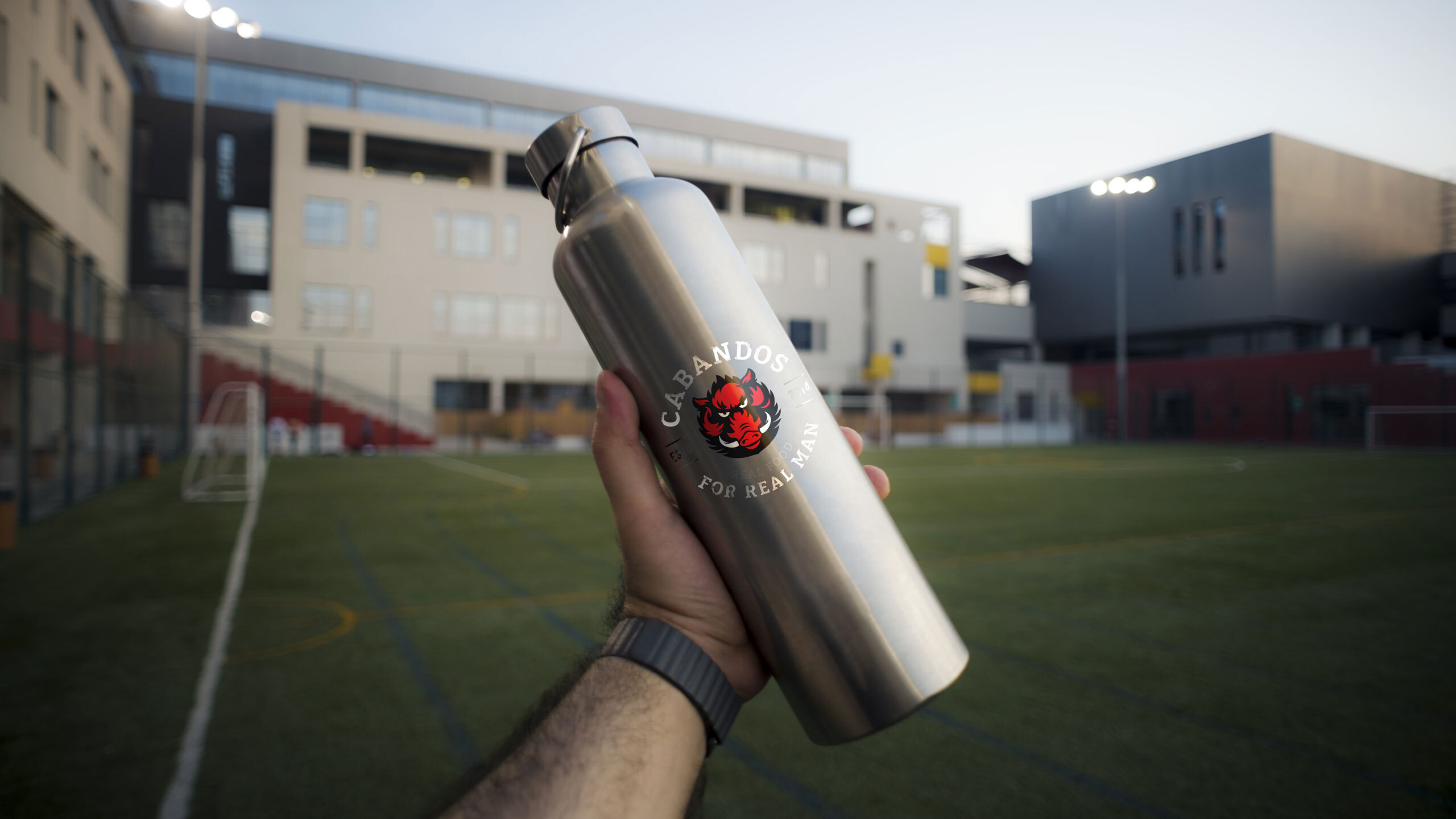
The Cabandos Bunch: Has become a staple for sports events, street-fight venues, music fests, and other “masculine” events. And it’s rather successful at holding its own on the shelf. And we are happy with that. Because sometimes all a brand needs being a bit hog-pushy.
CREDIT
- Agency/Creative: Dozen Agency
- Article Title: Dozen Agency Creates The First Manly Snack Branding for Cabandos
- Organisation/Entity: Agency, Published Commercial Design
- Project Type: Packaging
- Agency/Creative Country: Ukraine
- Market Region: Europe
- Project Deliverables: Brand Architecture, Brand Identity, Brand Redesign, Branding, Graphic Design, Packaging Design, Rebranding, Research, Tone of Voice
- Format: Blister-Pack
- Substrate: Plastic


