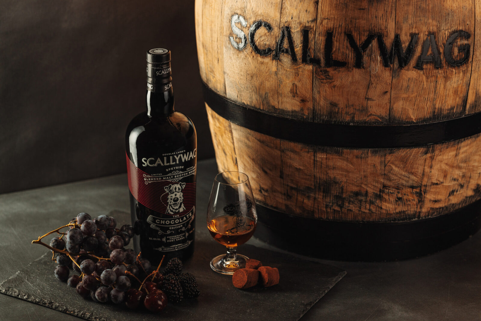
Scallywag Chocolate Edition represents an exquisite blend of Speyside Malt Scotch Whisky matured predominantly in Port Casks. This limited edition release marries the Whisky’s inherent character with the indulgent richness of chocolate, offering a unique sensory experience. The packaging design was crafted to create a luxurious, tactile, and memorable visual identity that reflects the essence of the product, enticing consumers to engage with the brand and the story behind the whisky.
The primary aim of the design was to encapsulate the indulgent experience of unwrapping a luxurious bar of chocolate while staying true to the heritage and character of Scallywag. This approach called for a multi-layered design, incorporating elements that evoke premium quality, Whisky craftsmanship, and a subtle homage to the influence of Port. The packaging had to deliver a tactile and premium unboxing experience, visually connect to Port and chocolate through colour and material choices, and establish a cohesive link to Scallywag’s brand identity.
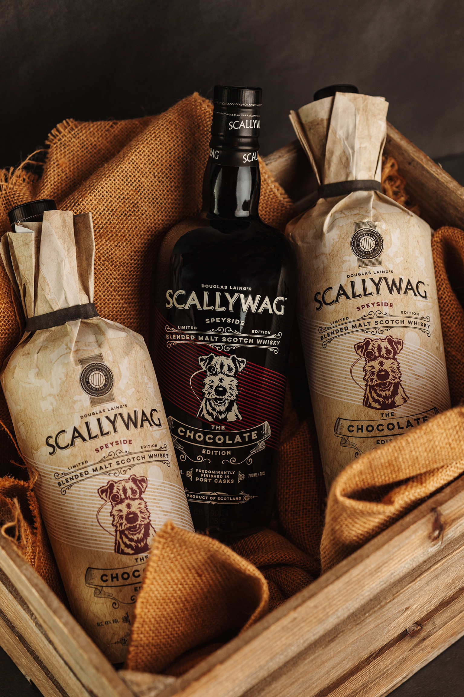
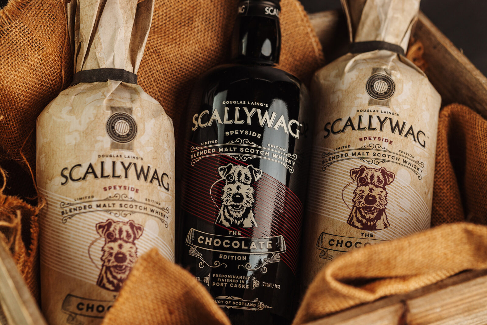
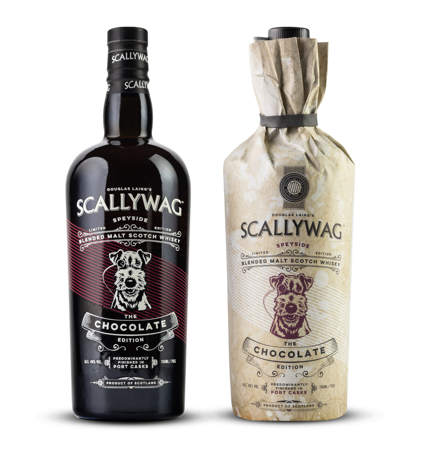
The experience begins with the outer packaging – a paper wrap that immediately evokes the sensation of opening a luxury chocolate bar. This element was not merely functional but an integral part of the storytelling, adorned with subtle yet deliberate nods to Porto, the home of fine Port. A delicately overlaid map serves as the backdrop, connecting the product to its cask heritage and adding depth to the design. The chosen colour palette of black and deep burgundy echoes the rich hues of Port wine, creating a visual parallel to the Whisky’s character. These colours also enhance the luxurious and premium feel of the design. The tactile nature of the paper wrap introduces an immediate sensory connection, setting the stage for the indulgent experience of the Whisky itself.
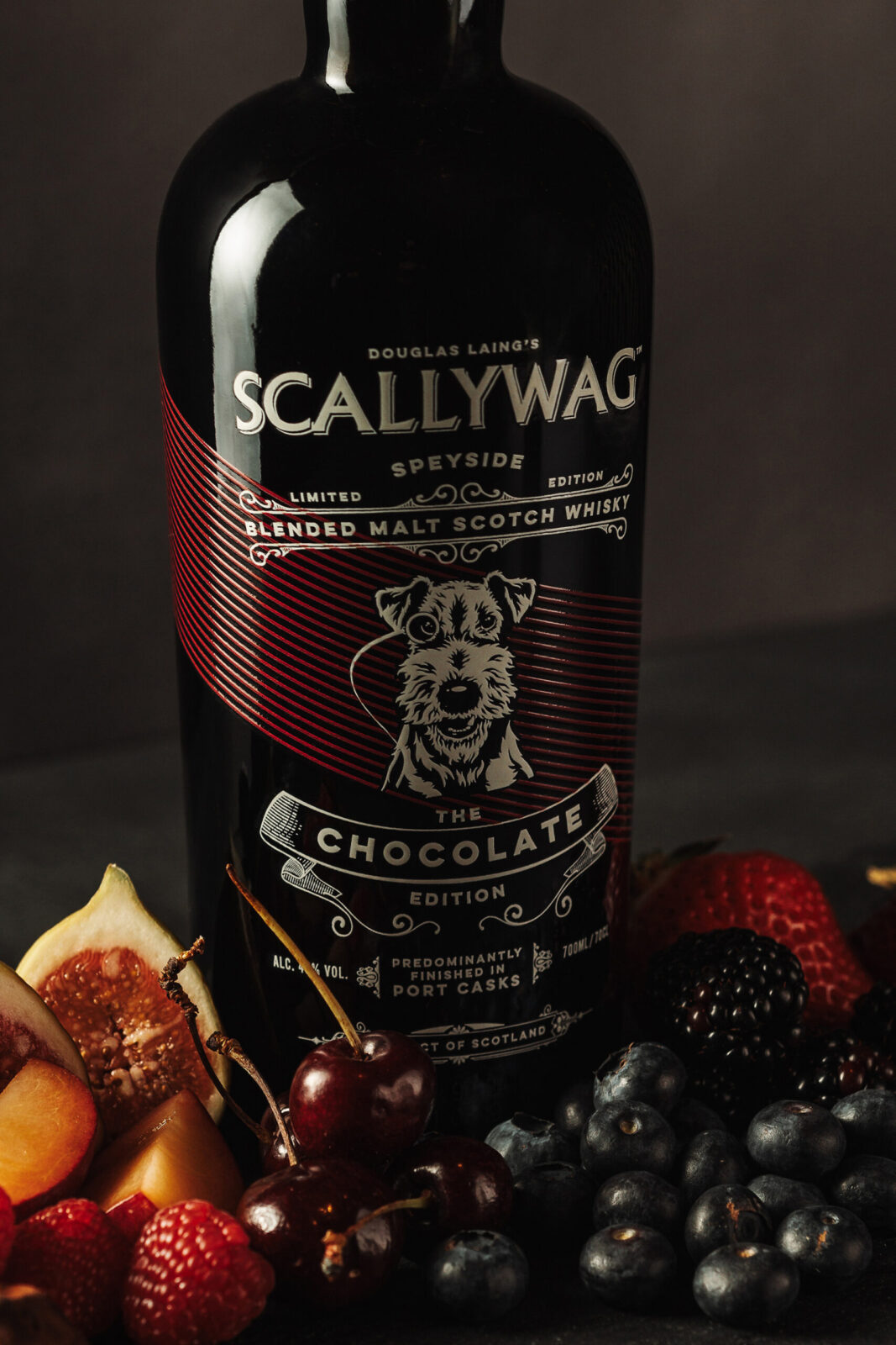
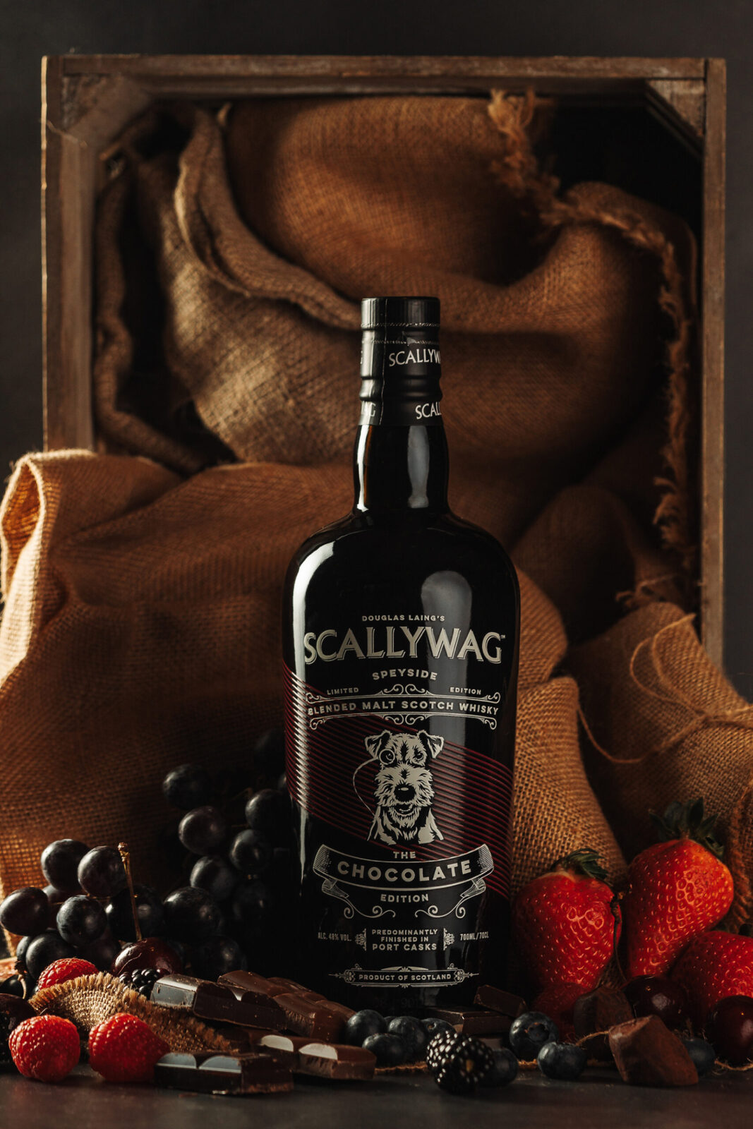
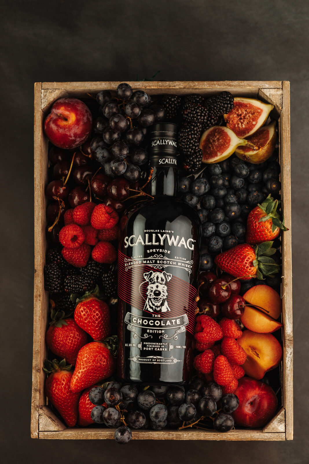
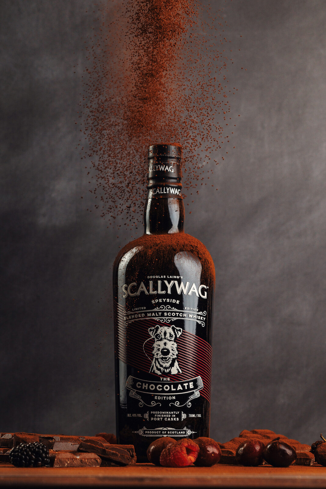
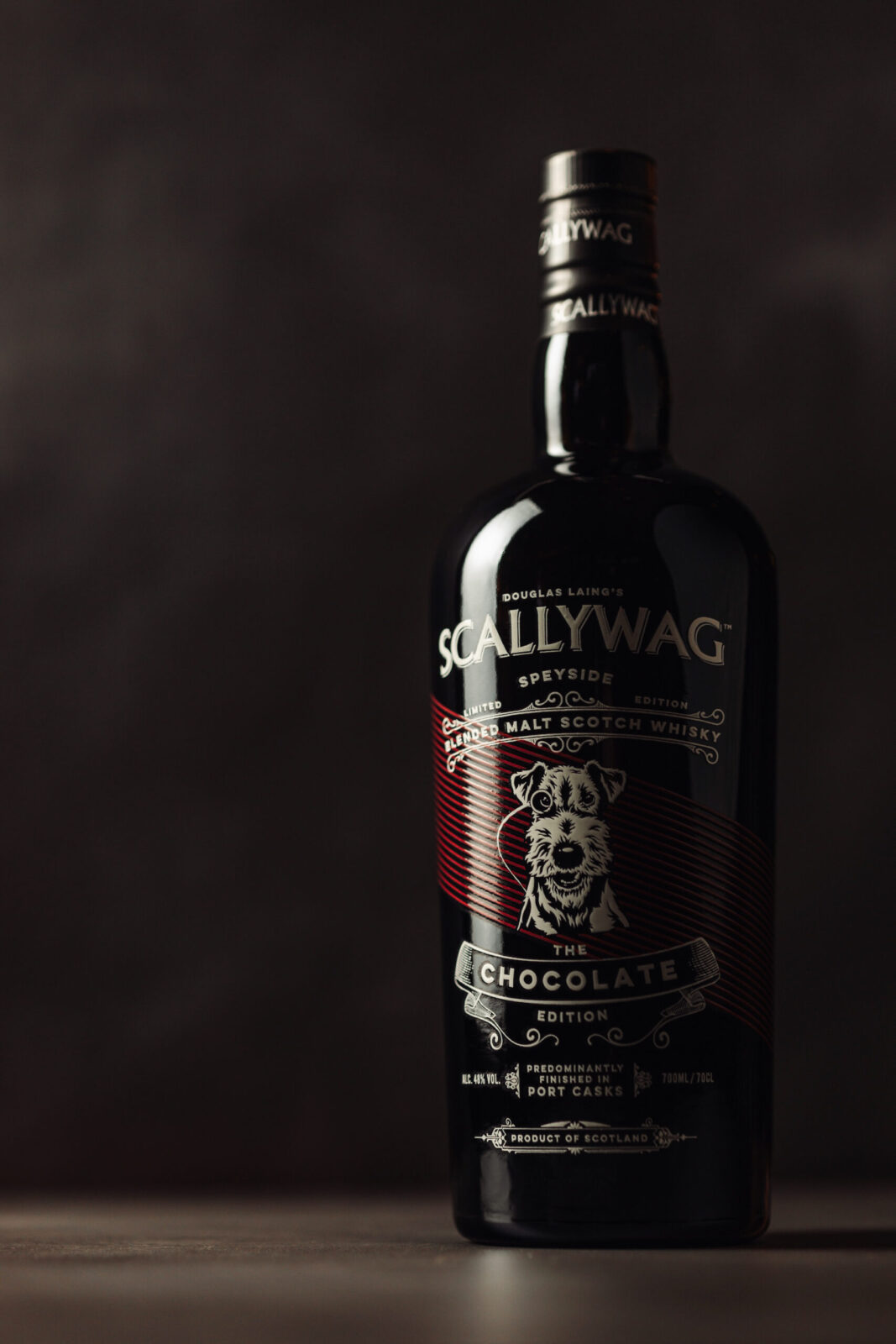
As the paper wrap is removed, it reveals a bold black glass bottle which was a deliberate nod to traditional Port packaging, reinforcing the product’s cask heritage. The screen-printed design features Scallywag’s signature cream tone alongside the burgundy hue, ensuring brand continuity while infusing the design with elegance. The contrast between the black surface and the print elevates the visual impact, creating a striking, modern aesthetic. This layered packaging design not only enhances the premium look and feel of the product, but also the unboxing experience itself.
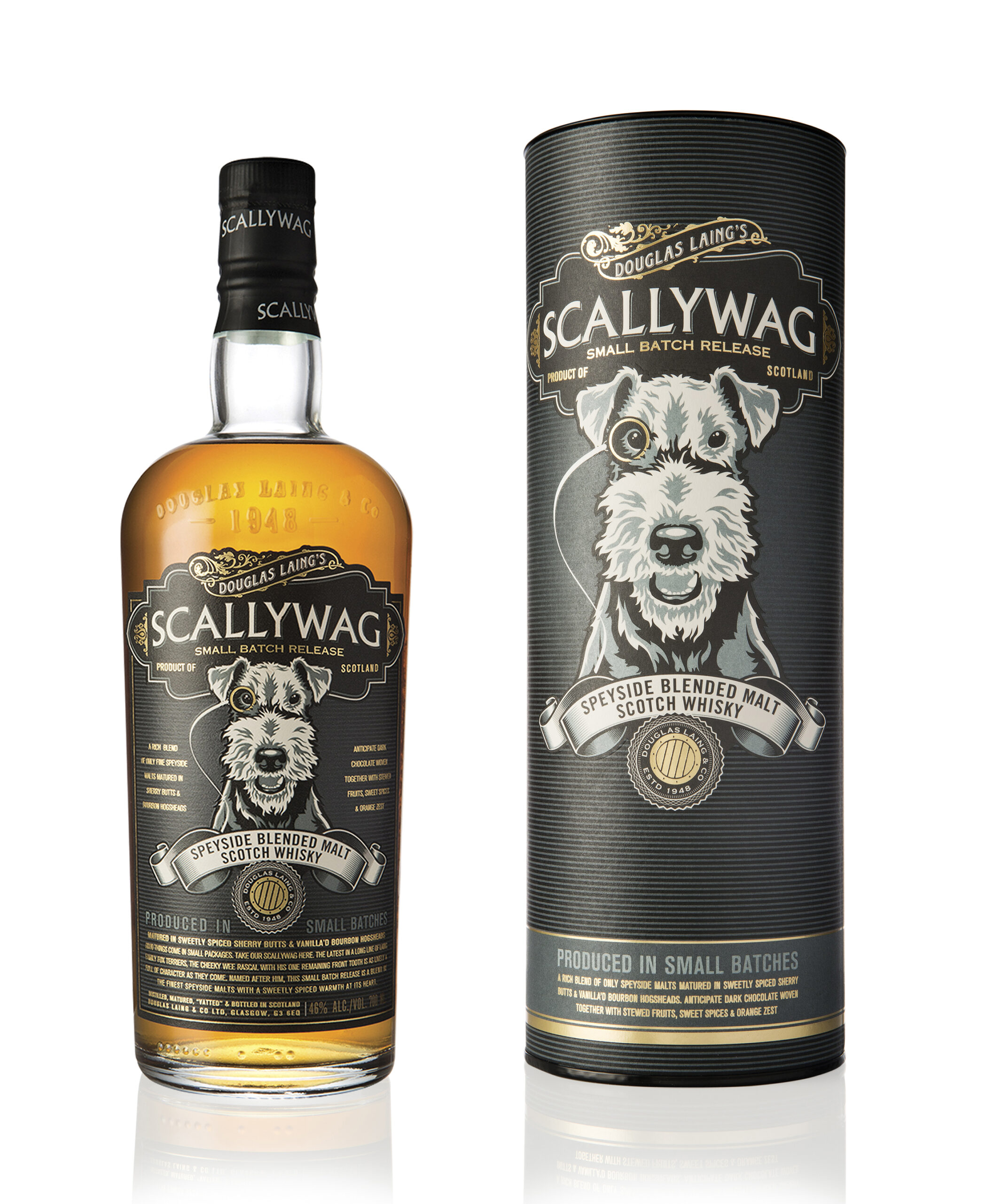
The design incorporates several key elements to achieve its objectives. The tactile paper wrap introduces a hands-on unboxing moment, akin to unwrapping a luxury product, while the map detailing subtly reinforces the connection to Porto and the Port Casks. The interplay of black and burgundy reflects both the Port heritage and the indulgent chocolate theme, visually and emotionally drawing consumers into the Whisky’s story. The black screen-printed bottle reflects traditional Port aesthetics while adding an air of exclusivity, and signature Scallywag elements, including the iconic dog, ensuring this limited edition remains firmly rooted in the brand’s identity. The design also thoughtfully encourages pairing with fine dark chocolate, a detail that ties the concept together and enhances the product’s market positioning.
Scallywag’s Chocolate Edition packaging stands as a testament to the brand’s ability to innovate while staying true to its roots. The final result is an immersive, multi-sensory experience that elevates both the Whisky and its story, ensuring a lasting impression.

CREDIT
- Agency/Creative: Douglas Laing & Co.
- Article Title: Douglas Laing’s Scallywag Chocolate Edition
- Organisation/Entity: In-House
- Project Status: Published
- Agency/Creative Country: United Kingdom
- Agency/Creative City: Glasgow
- Project Deliverables: Packaging Design
- Industry: Food/Beverage
- Keywords: WBDS In-House Design Awards 2024/25 Packaging Design
- Keywords: WBDS In-House Design Awards 2024/25 Packaging Design
-
Credits:
Designer: Claire Coetzee
Scallywag Brand Manager: Scott Morrison
Bottle Screen Print: Image on Glass
Paper wrap: Aro Print
Photographer: Daniel McAvoy


