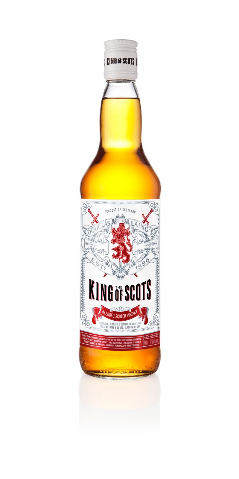
Established in 1948 by Fred Douglas Laing, Douglas Laing & Co. is a third generation family Scotch Whisky business. The first brand in the company’s portfolio was the King of Scots – a Blended Scotch Whisky offering. Purchased post-war, the brand, together with only three casks of Whisky began what would become Douglas Laing & Co. as we know it today. Over the years the Whisky has held high prestige within the company, with only the closest members of the family-owned company knowing the particulars of the King of Scots Blended Scotch Whisky recipe.
As part of Douglas Laing’s 75th Anniversary this year, it was established that this milestone offered an ideal platform to premiumise the King of Scots Blended Scotch brand – the brand that started it all back in 1948.
The brief was to reinvigorate this once core brand via the launch of a high-end, specialist aged limited edition bottling.
Ultimately, the brand marketing team wanted to internally feel pride and passion for this fundamental brand within the portfolio and externally begin the process of repositioning what was once the lead brand for Douglas Laing but has become a second tier offering in recent years.
With such historic importance for the company, a number of old, rare and precious Single Casks were allocated to create this “antique” 50 Year Old Whisky. Thereafter work began on developing the packaging.
Given the increasingly competitive nature of a Whisky retailers shelf, it was recognised the packaging had to reflect the prestigious spirit inside but also have great stand-out / impact.
Specifically, the brief called for a pack design which would:
Convey understated luxury and justify a £650.00 RRP
Showcase the 50 Year Old age statement as prominently as the proud lion rampant emblem
Appeal to the Whisky Enthusiast community who are driven by the spirit quality
Appeal to the high end “lifestyle” consumer who value luxury goods
The resulting packaging has very much responded to the brief and more…
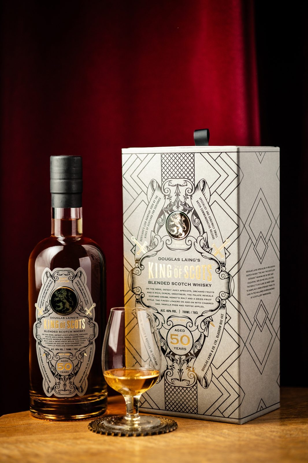
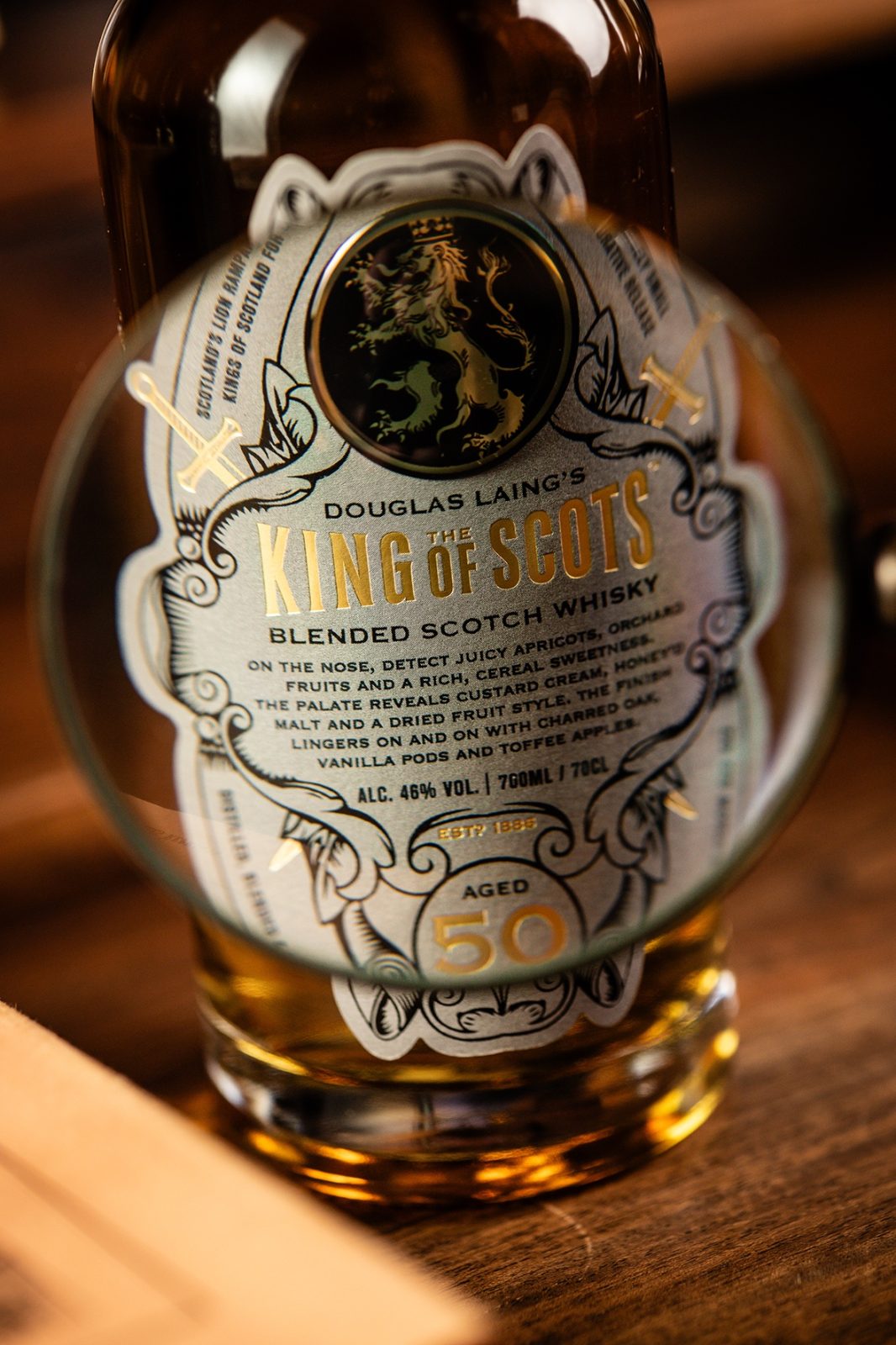
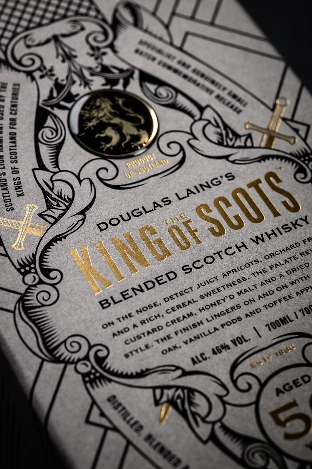
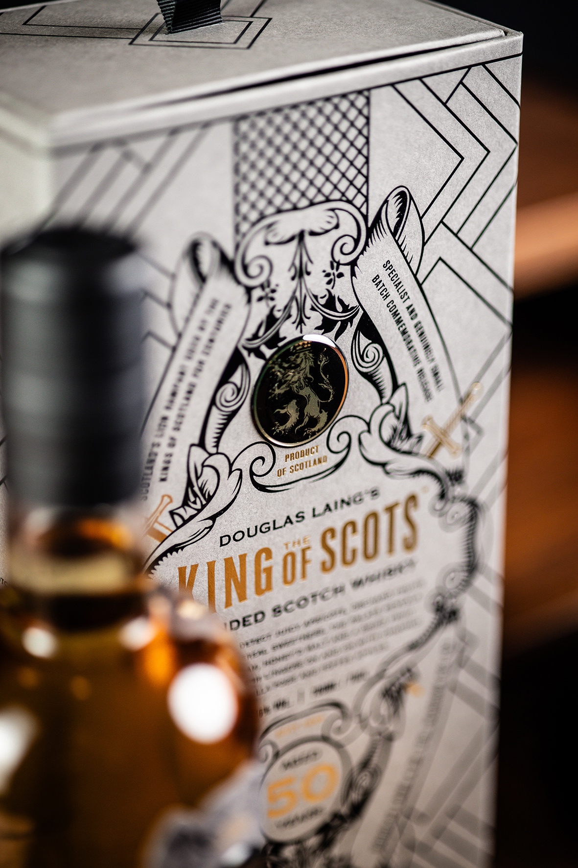
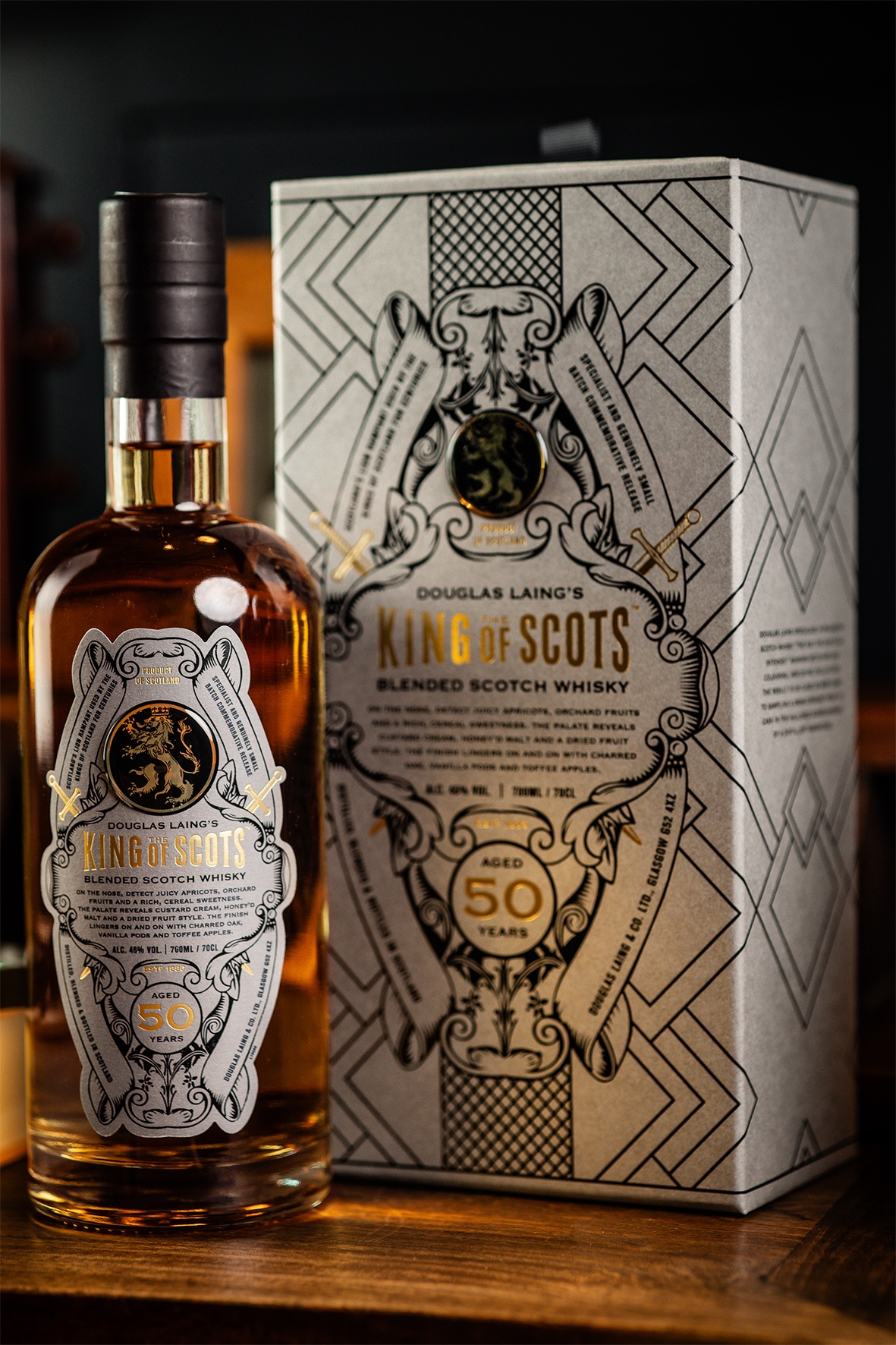
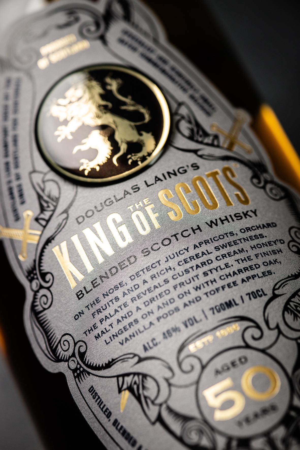
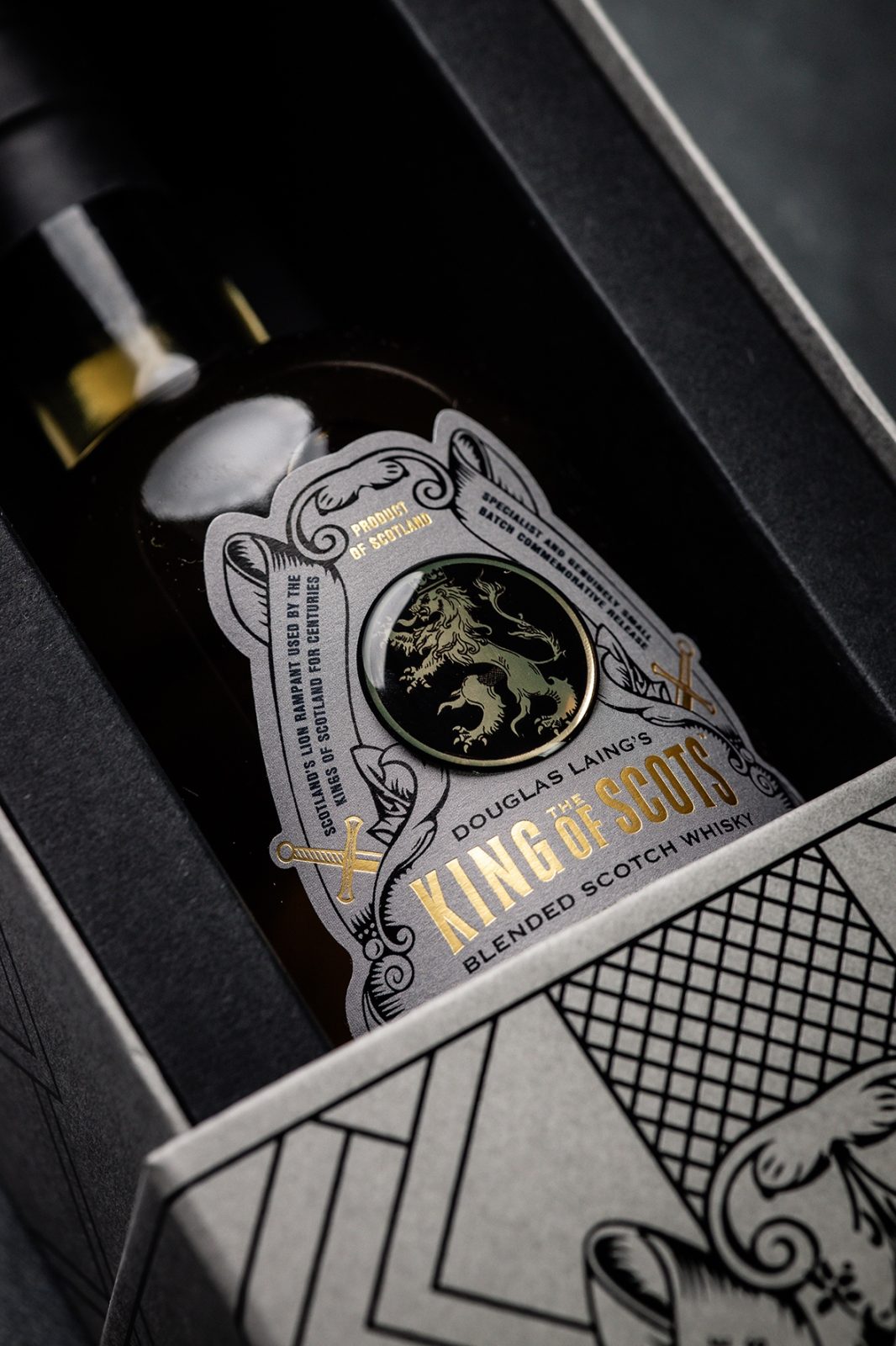
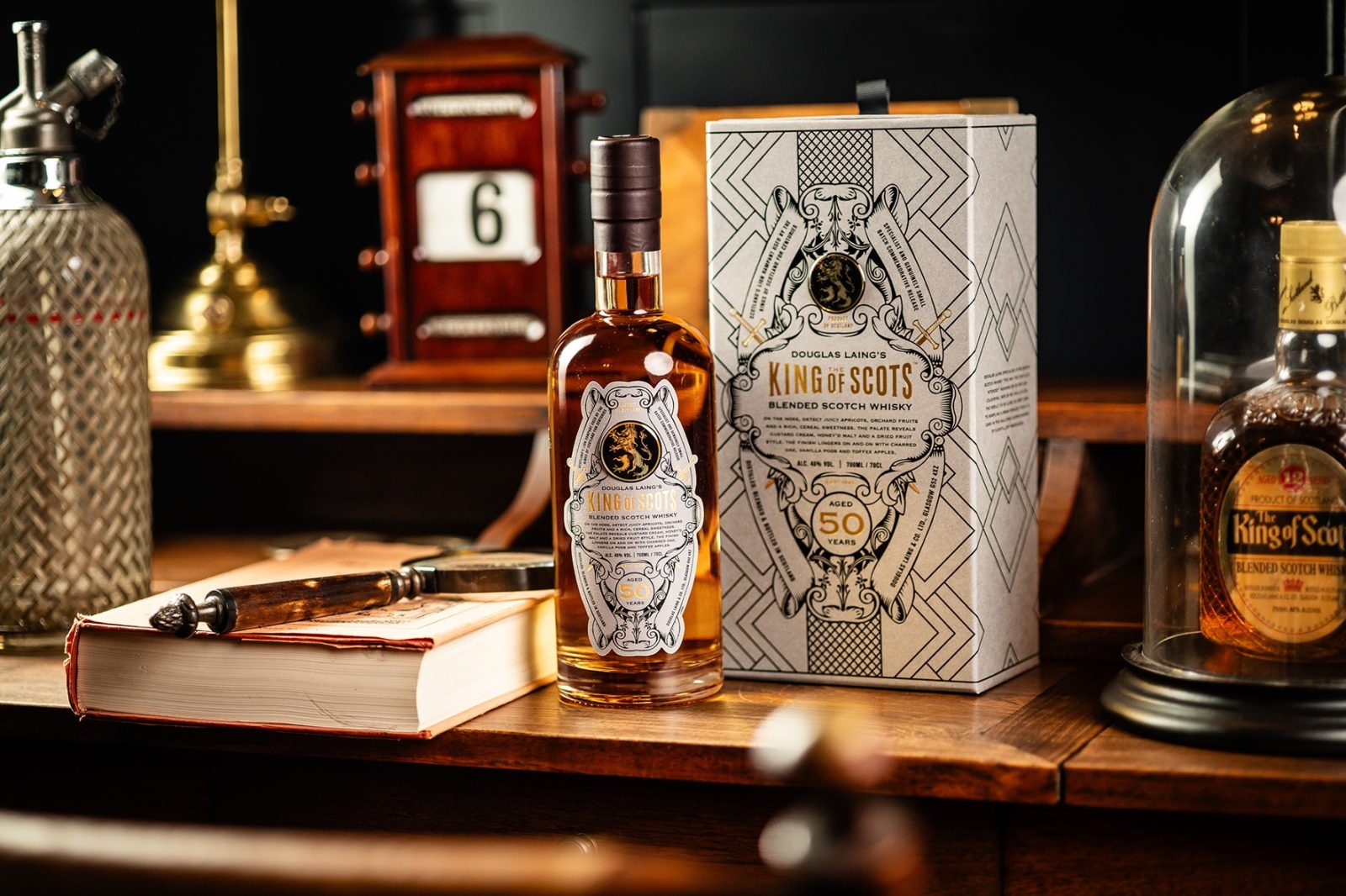
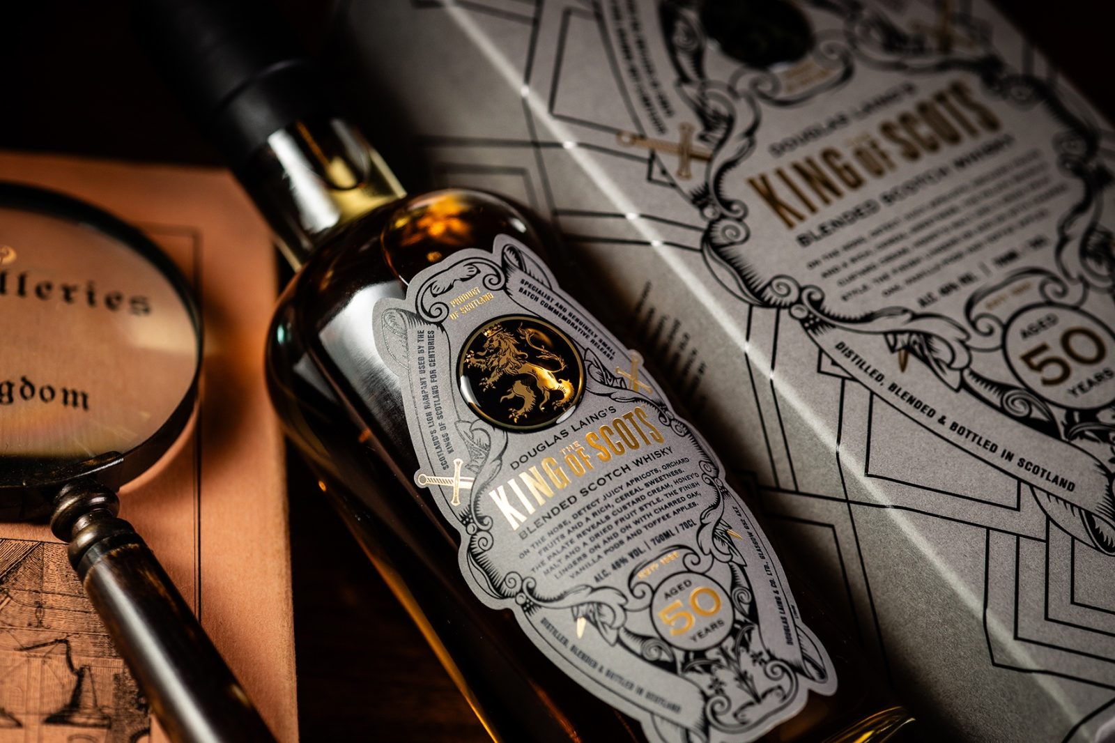
The design’s centrepiece revolves around the intricate emblem from the original King of Scots label, strategically rotated to a vertical position, seamlessly transforming into the defining shape of the bottle label. Within this emblem, the spirit’s details are elegantly encased, complemented by the iconic Lion Rampant, skilfully rendered in gold within a black resin badge.
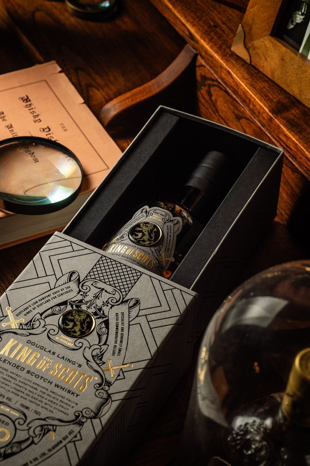
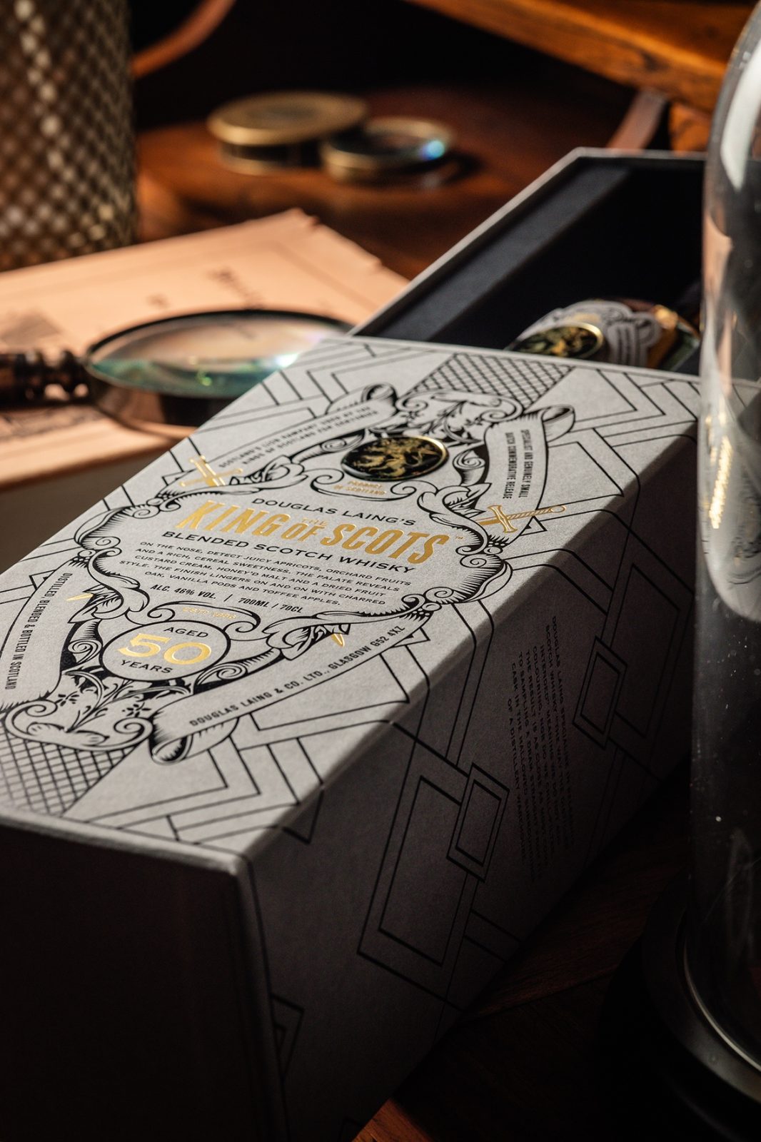
The choice of a soft grey background tone, coupled with the opulence of black and gold foil, creates a sense of sophistication, elevating the pack to a premium aesthetic. The bottle finds its home in a meticulously crafted rigid paper-covered box, adorned with a tasteful black foil pattern that harmonises with the timeless King of Scots emblem. This thoughtful integration of modern elements preserves a historic essence, achieving a design that seamlessly bridges the past and present.
Claire Coetzee, Head of Creative at Douglas Laing, expressed her pride in the final packaging, stating, “We are immensely proud of achieving this packaging goal. Given the significant role this brand plays in Douglas Laing’s rich history, it was crucial to give it the respect it deserves. We believe we have not only met but exceeded this objective, creating something we can genuinely take pride in.”
The response from Douglas Laing’s global distributor partners has been overwhelmingly positive with the stock all allocated or sold-through.
Fred Laing, Chairman, and second generation in the family business notes: “75 years after my father bought King of Scots in 1948, the brand has seen a new lease of life this year. We set out to have this special release 50 Years Old create the ‘halo effect’ for the brand and it has absolutely delivered. The response from consumers and trade partners has been entirely positive. It’s safe to say, the packaging is a reflection of the detail and quality which we have brought to the blend within and both aspects would make our founder very proud.”
CREDIT
- Agency/Creative: Douglas Laing & Co.
- Article Title: Douglas Laing’s King of Scots 50 Years Old Scotch Whisky
- Organisation/Entity: In-House
- Project Type: Packaging
- Project Status: Published
- Agency/Creative Country: United Kingdom
- Agency/Creative City: Glasgow
- Market Region: Global
- Project Deliverables: Packaging Design
- Format: Bottle
- Industry: Food/Beverage
- Keywords: WBDS In-House Design Awards 2023/24
-
Credits:
Head of Creative at Douglas Laing & Co.: Claire Coetzee
Commercial and Marketing Team: Douglas Laing & Co.
Box: Blue Box Design, Maclaren Packaging
Labels: CCL Label
Resin badges: MCC Label
Photographer: Daniel McAvoy


