


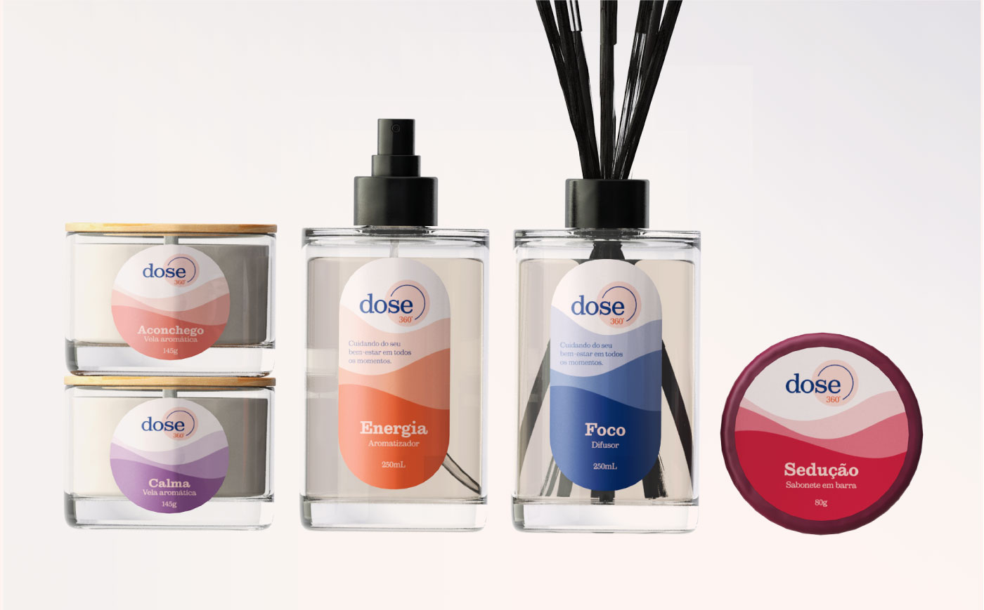
Dose 360º, a brand dedicated to bringing well-being to every moment of your life, embodies a holistic approach to self-care and mindfulness through its meticulously crafted products. At Estúdio 20&2, we took on the challenge of organizing the brand’s concept, developing its visual identity, creating packaging, and designing graphic materials for the lines of handmade products offered by the brand.
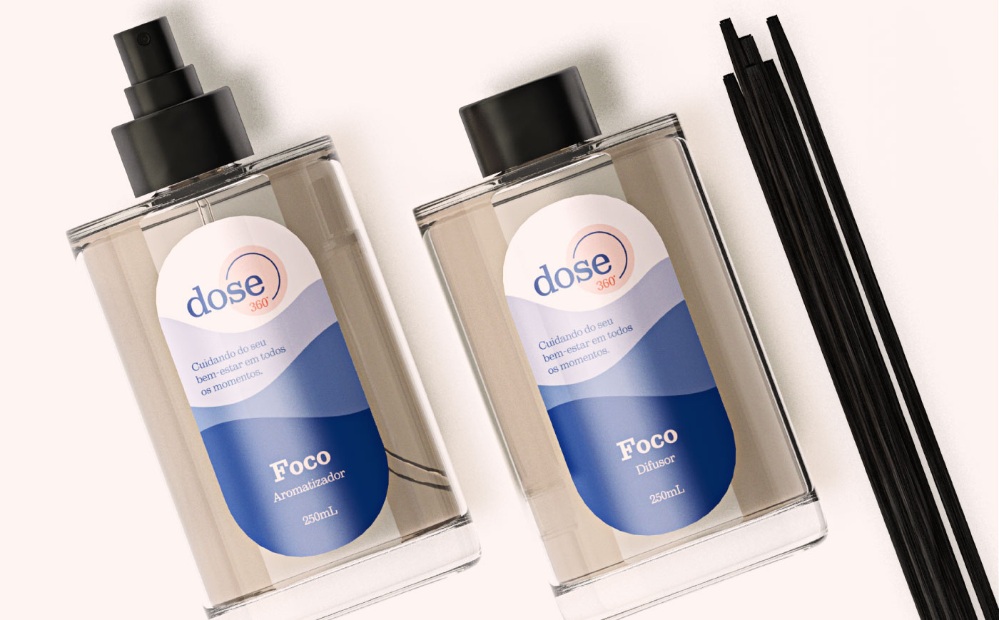
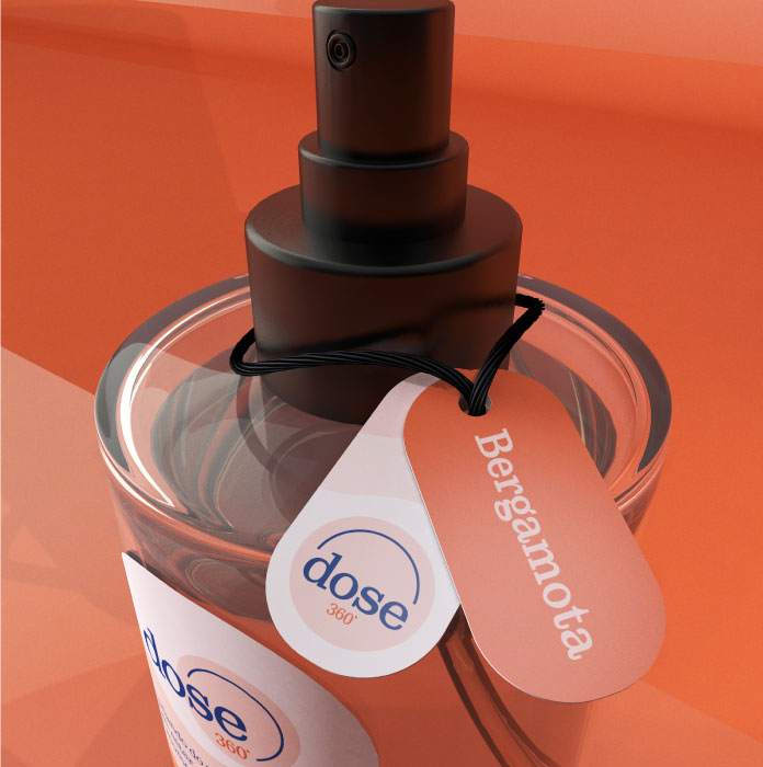
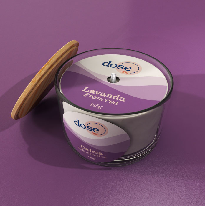
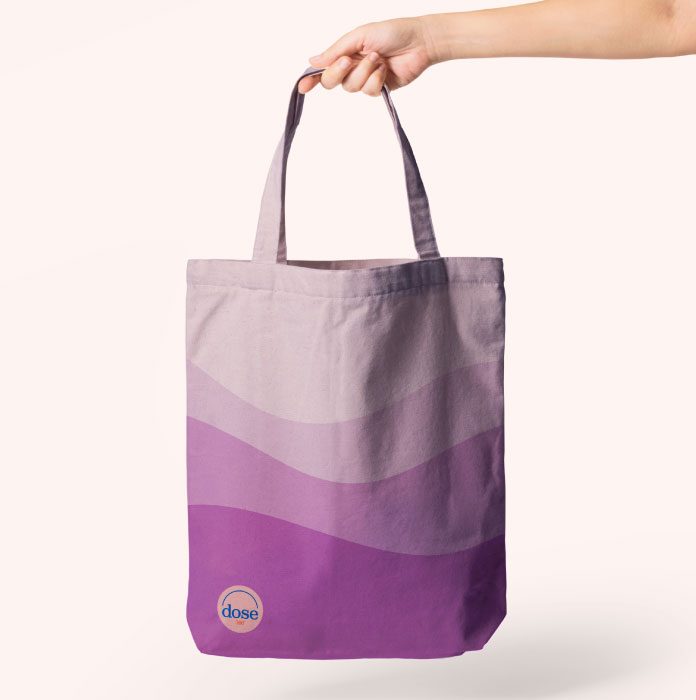
Every aspect of the visual identity was meticulously thought out, from the selection of colors to the layout of the labels. We ensured strong contrast and an intuitive design, making it visually appealing and easy to understand. Our goal was to create a cohesive look that resonates with the philosophy of well-being in every moment of the consumer’s day.
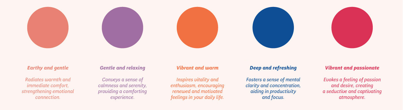
To ensure inclusion and accessibility, we considered every detail in the design of the brand and its packaging. This included the critical aspect of making the products more accessible to people with color blindness. We chose a clean design, highlighting the name of each product line and its color palette. This approach ensures that the most relevant information is easily understandable by all consumers, regardless of their visual abilities.
In our commitment to creating an inclusive design, we worked closely with our client throughout the entire process. We conducted usability tests, gathering feedback from individuals with color blindness. This invaluable input allowed us to adjust the design, ensuring it was both effective and inclusive. Our testing process confirmed that the design elements, from color contrasts to text readability, met the accessibility standards requested by the client.
At Estúdio 20&2, we believe that design should serve everyone. Our work on the Dose 360º brand reflects this belief, as we strive to create products that are not only beautiful but also enhance the user experience for all. Through our essential design process, we have helped Dose 360º deliver on its promise of well-being, ensuring that their products are accessible and enjoyable for a diverse audience.
By emphasizing clarity, simplicity, and accessibility, we have crafted a visual identity that truly represents the values of Dose 360º. Our work ensures that a greater number of customers, regardless of their visual abilities, can appreciate and benefit from the brand’s commitment to quality and well-being.
CREDIT
- Agency/Creative: Estúdio 20&2
- Article Title: Dose 360º Branding and Packaging Design
- Organisation/Entity: Agency
- Project Type: Packaging
- Project Status: Published
- Agency/Creative Country: Brazil
- Agency/Creative City: São Paulo
- Market Region: South America
- Project Deliverables: Brand Creation, Brand Design, Brand Identity, Graphic Design, Packaging Design, Paperwork
- Format: Bottle, Wrap
- Industry: Beauty/Cosmetics
- Keywords: well-being, inclusion, accessibility, handmade products
-
Credits:
Designer: Juliana Alves


