


A supplement identity that bridges the gap between clinical anxiety and performance pressure. DOSAGE utilizes a “dual narrative” packaging system, wrapping the precision of science (The Sage) in the somatic comfort of nature (The Innocent), to empower users rather than prescribe to them.
The Context
The current supplement landscape forces consumers into a polarized choice: the “Clinical Aisle” (sterile, anxiety-inducing, and pharmaceutical) or the “Performance Aisle” (aggressive, loud, and pressure-driven). Both extremes treat the user as a project to be fixed, often selling dependency rather than health.
The Concept: The Goldilocks Zone
DOSAGE was created to occupy the strategic “White Space” between these extremes. The brand identity balances the precision of science with the empathy of nature, positioning itself as a partner in recovery rather than a permanent crutch.
The Strategic Tension (Sage vs. Innocent)
We engineered a deliberate “Product Tension” to build trust:
Verbal Identity (The Sage): The name “DOSAGE” signals clinical precision, measuring the intake to the milligram. It appeals to the intellect, ensuring efficacy.
Visual Identity (The Innocent): The packaging eschews medical tropes for ethereal, elemental textures. It appeals to the somatic senses, promising organic purity.
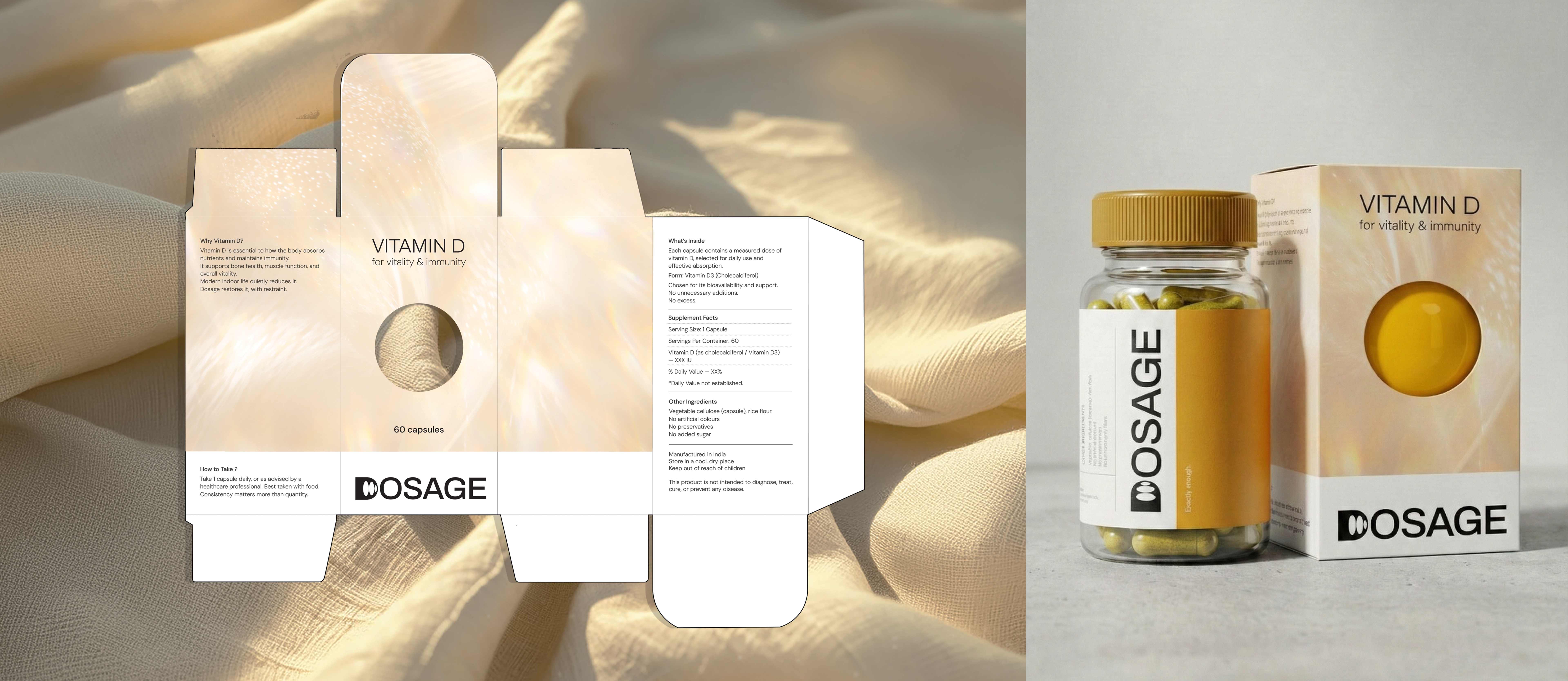
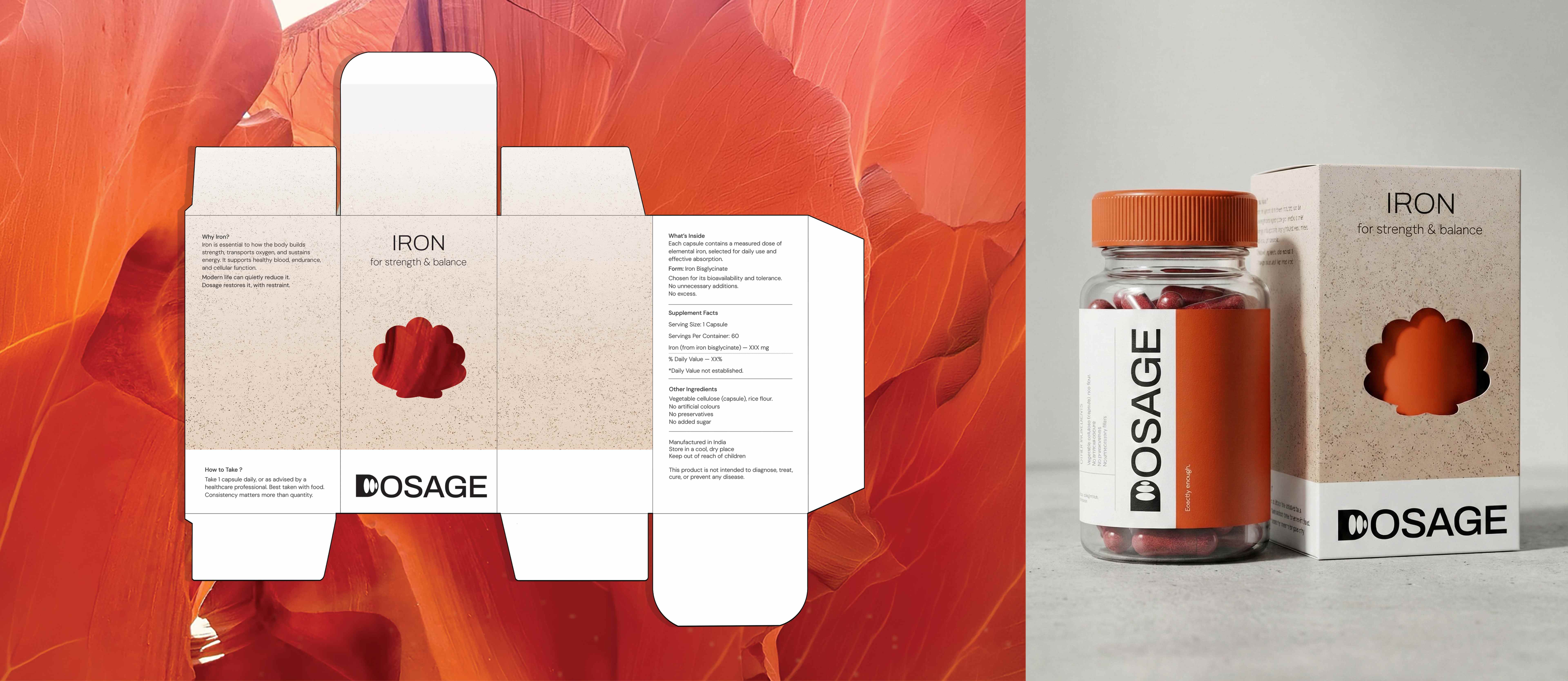
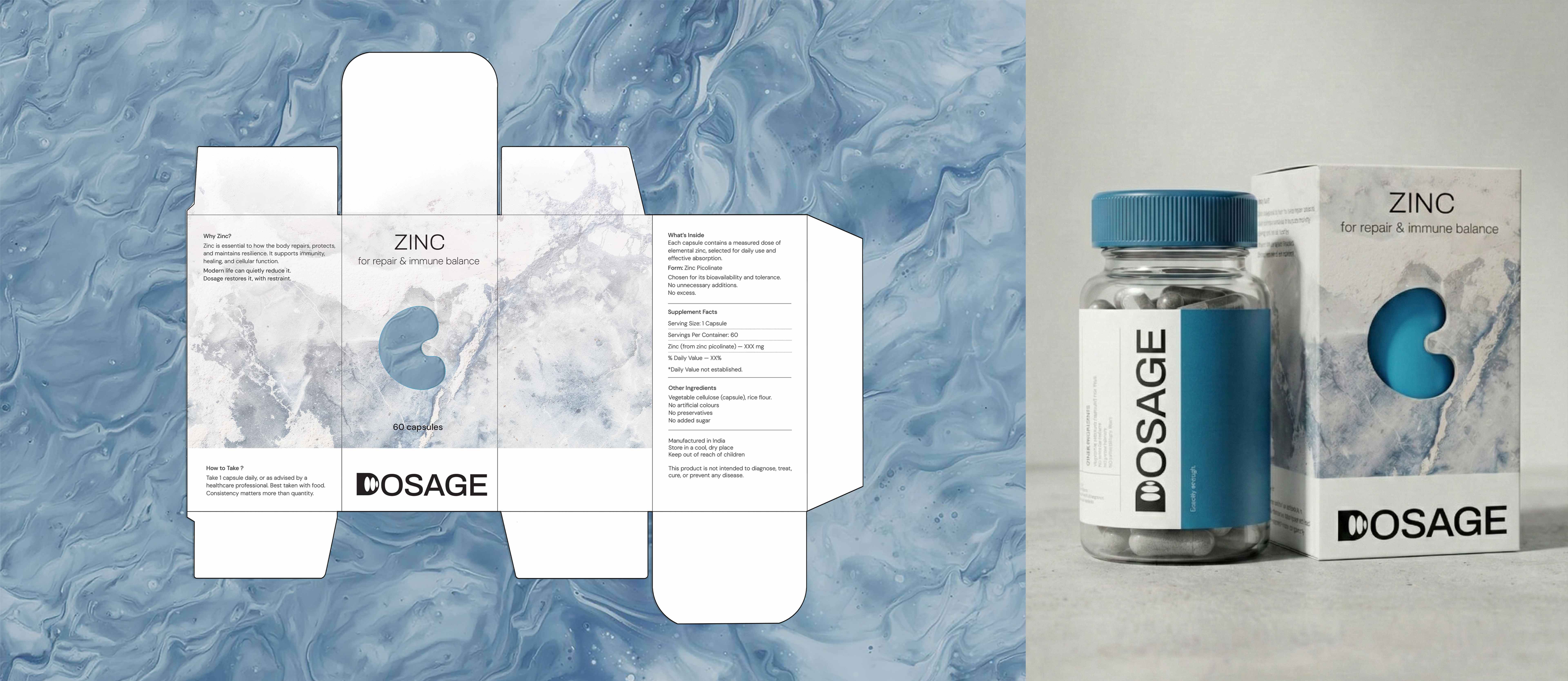
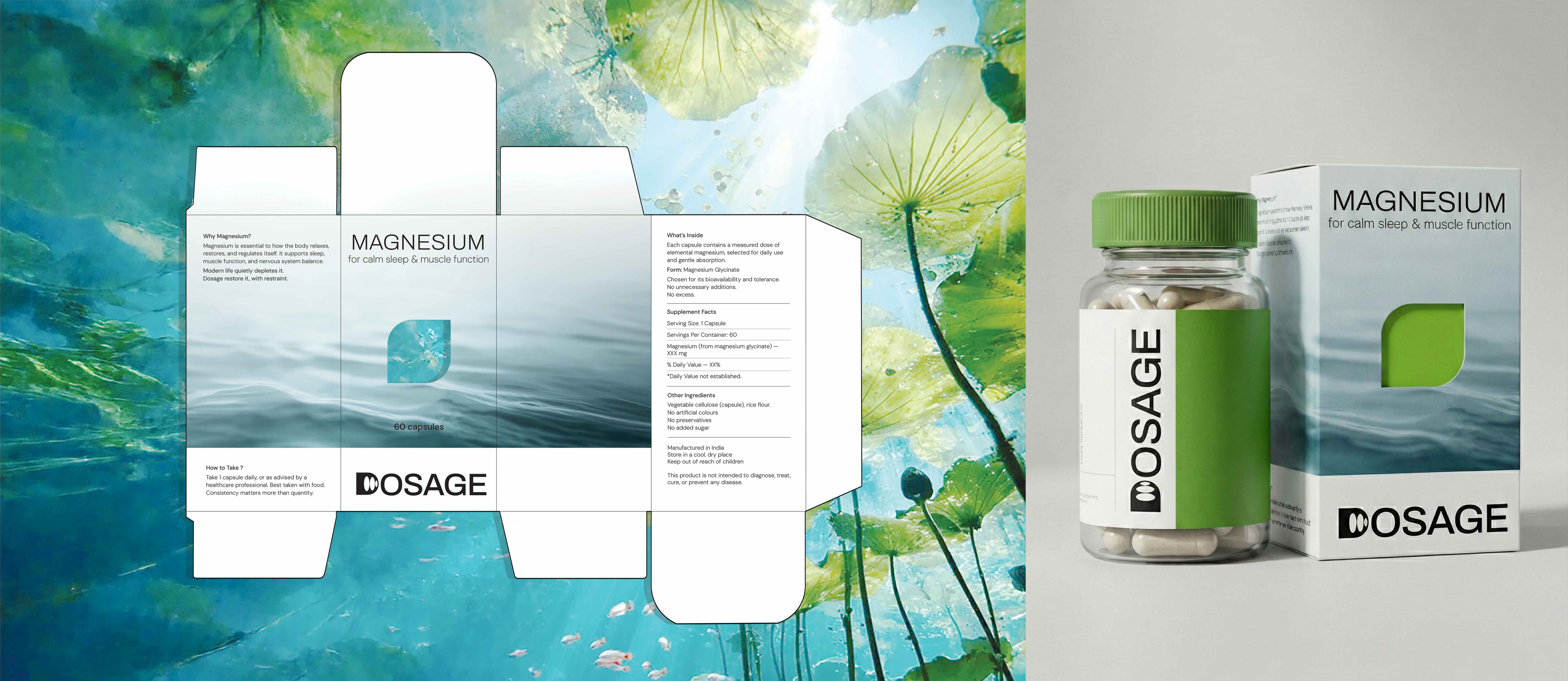
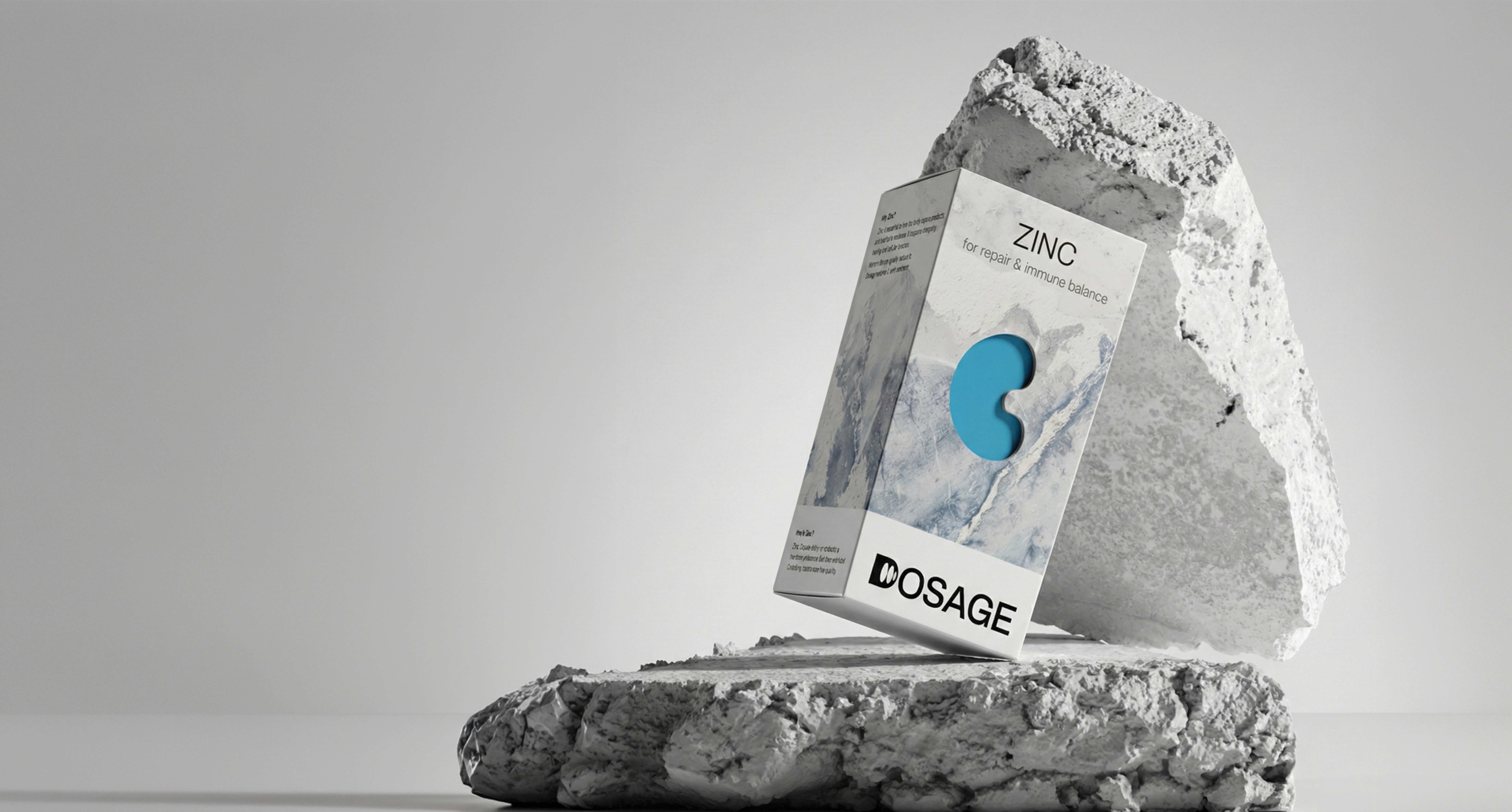
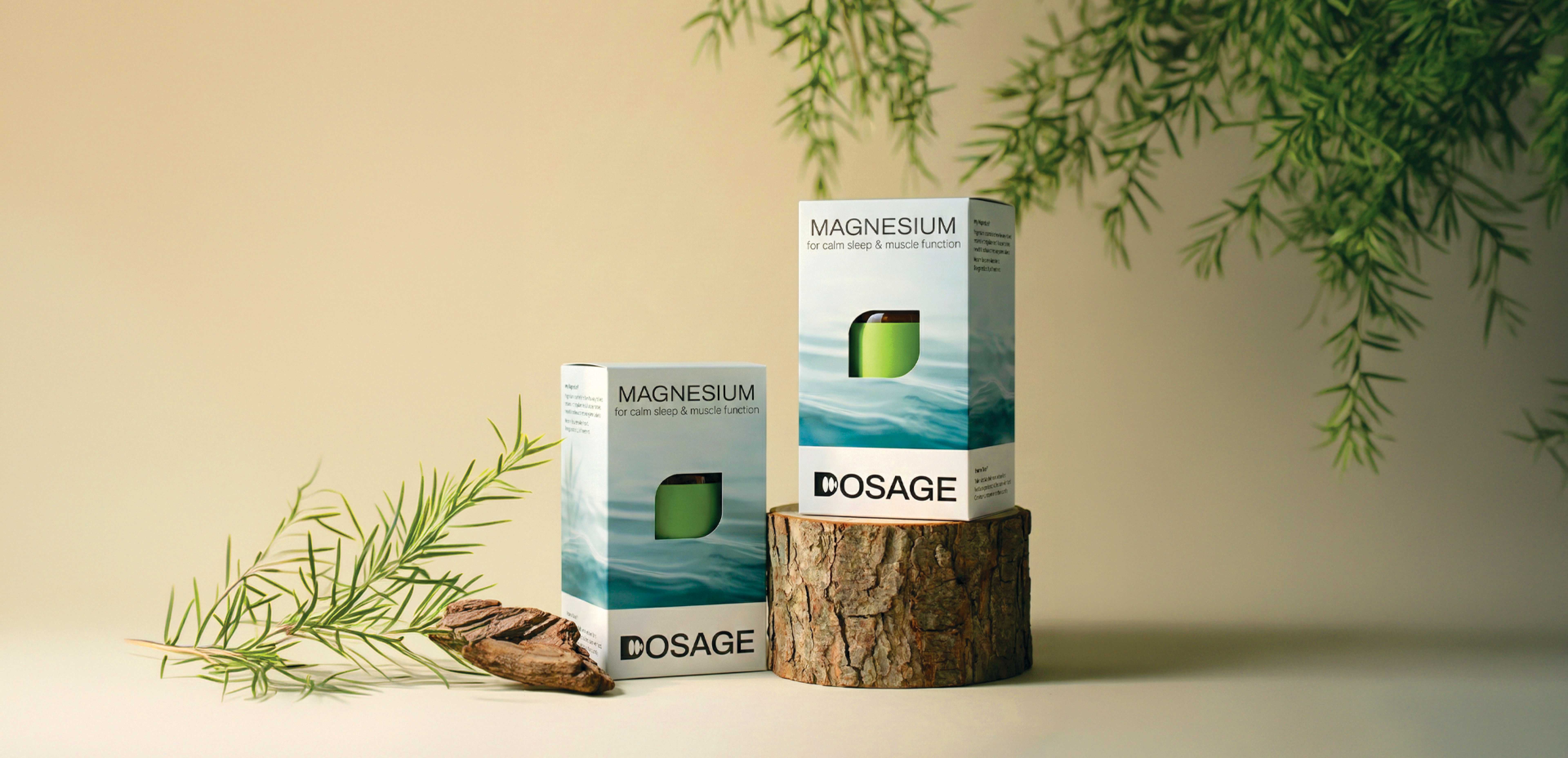
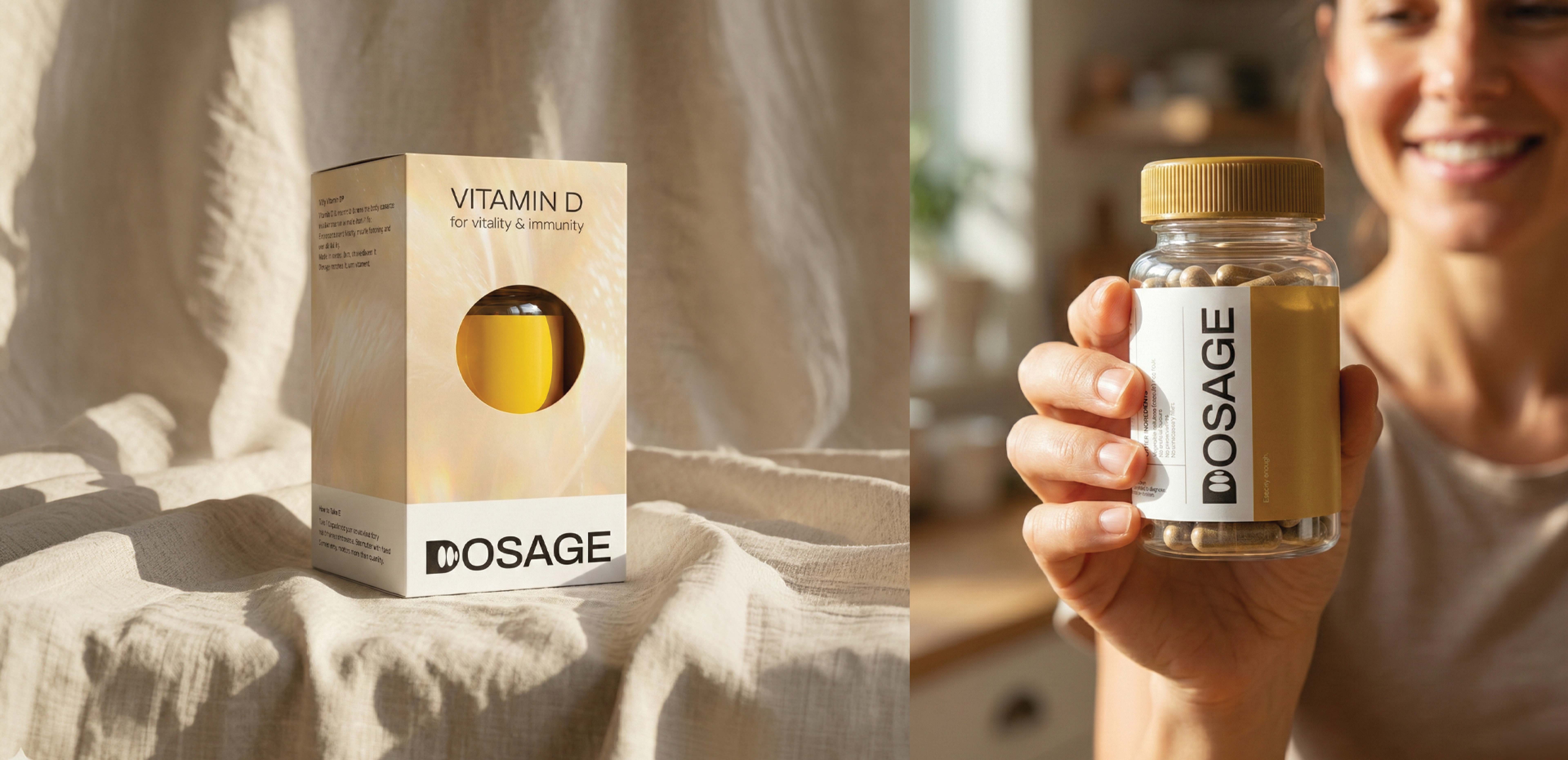
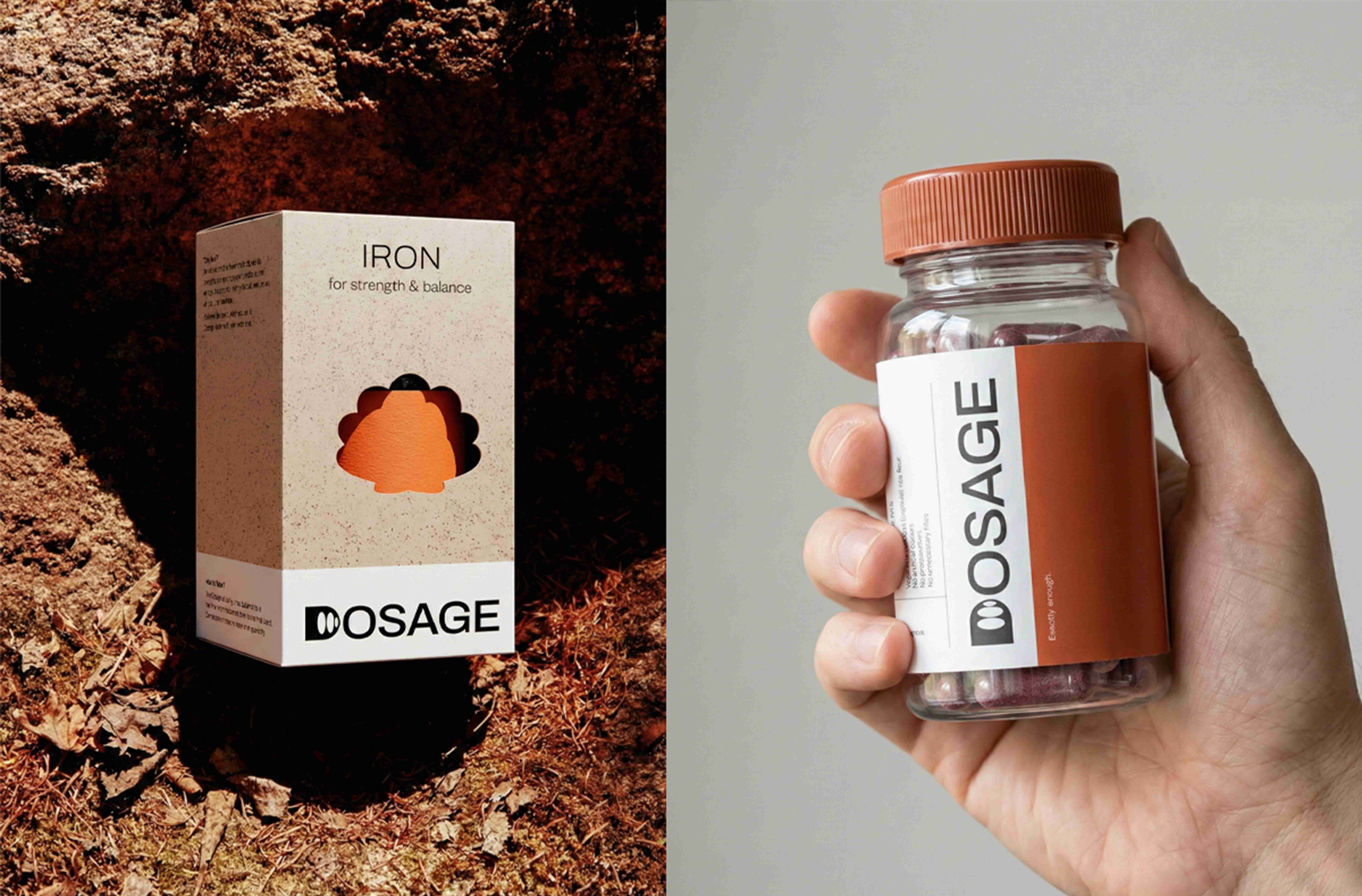
The Packaging System: A Dual Narrative
The unboxing experience is designed to transition the user from “Feeling” to “Function”:
The Exterior (Somatic Layer): The outer boxes feature atmospheric textures (Water, Sunlight, Stone, Ice) that evoke the feeling of the benefit—Calm, Vitality, Strength, Resilience. A central aperture, shaped like the natural source (Leaf, Sun, Shell), grounds the abstract feeling in a tangible origin.
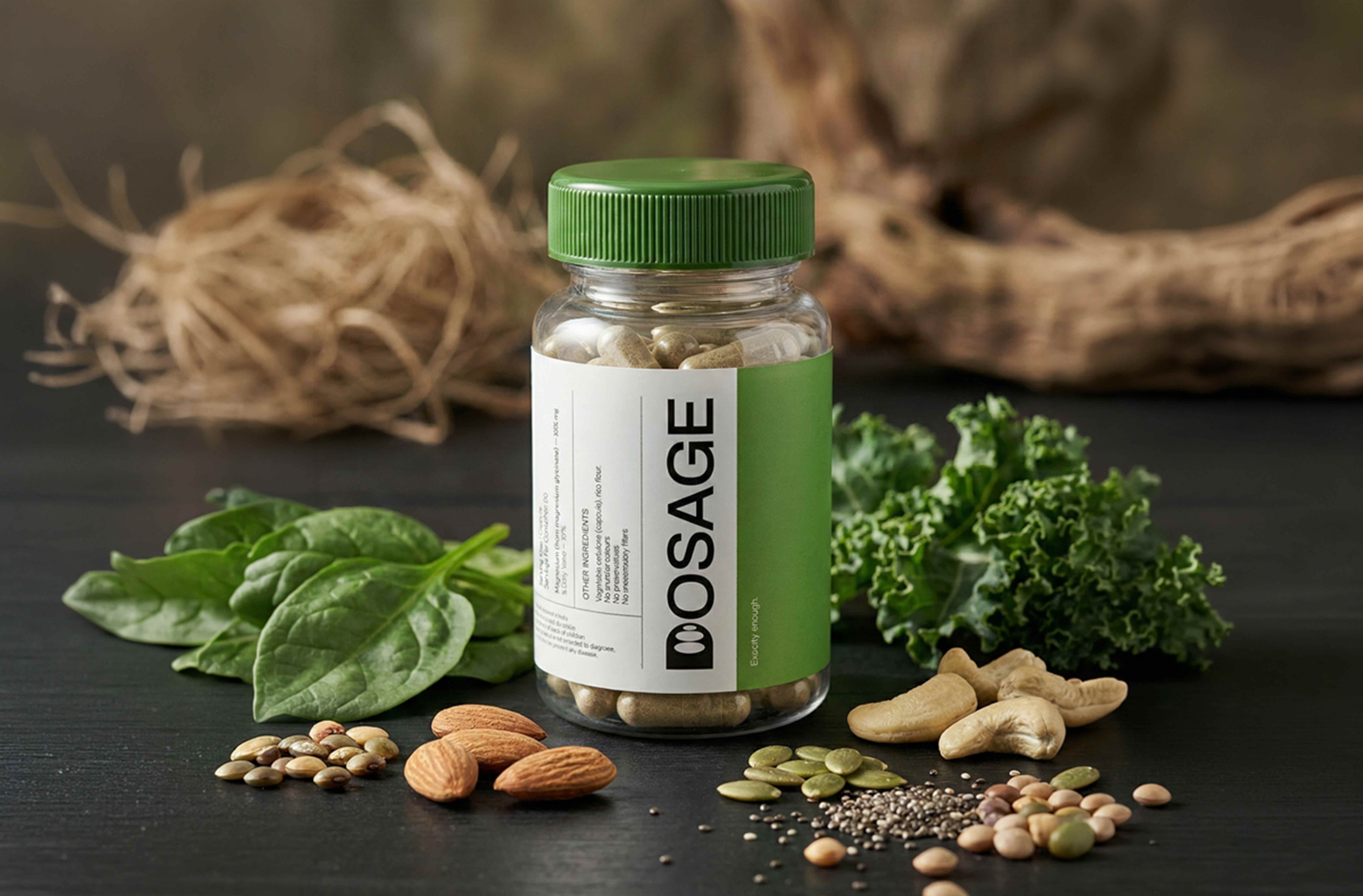
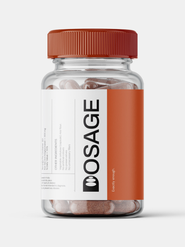
The Interior (Clinical Layer): Inside the emotive box sits a stark, minimal white bottle. This reinforces the brand name, validating the safety and scientific rigor of the product without dominating the user’s environment.
The Logo Philosophy
The “D” icon features a series of concentric circles that recede in size. This is a data visualization of the brand’s core promise: Reducing the Dosage. Unlike competitors who aim for lifetime retention, DOSAGE is designed to restore the body’s natural balance until the supplement is no longer needed.
Result
By harmonizing scientific trust with natural comfort, DOSAGE transforms the daily routine from a medical necessity into a moment of mindful empowerment.
CREDIT
- Agency/Creative: Adarsh S
- Article Title: Dosage: Wellness Designed to Disappear by Adarsh
- Organisation/Entity: Student
- Project Type: Packaging
- Project Status: Published
- Agency/Creative Country: India
- Agency/Creative City: Panaji
- Market Region: Global
- Project Deliverables: Brand Design, Brand Strategy, Label Design, Packaging Design, Packaging Guidelines
- Format: Bottle, Box
- Industry: Health Care
- Keywords: Packaging Design, Brand Strategy, Health & Wellness, Minimalism, Structural Packaging, Visual Identity, Pharma, Packaging system
-
Credits:
Design, Art Direction, Strategy, Visualisation: Adarsh S


