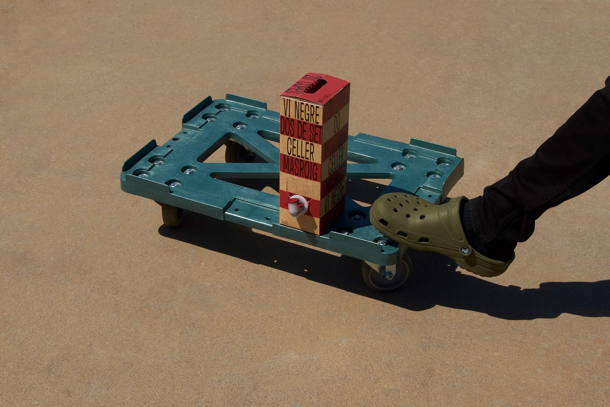
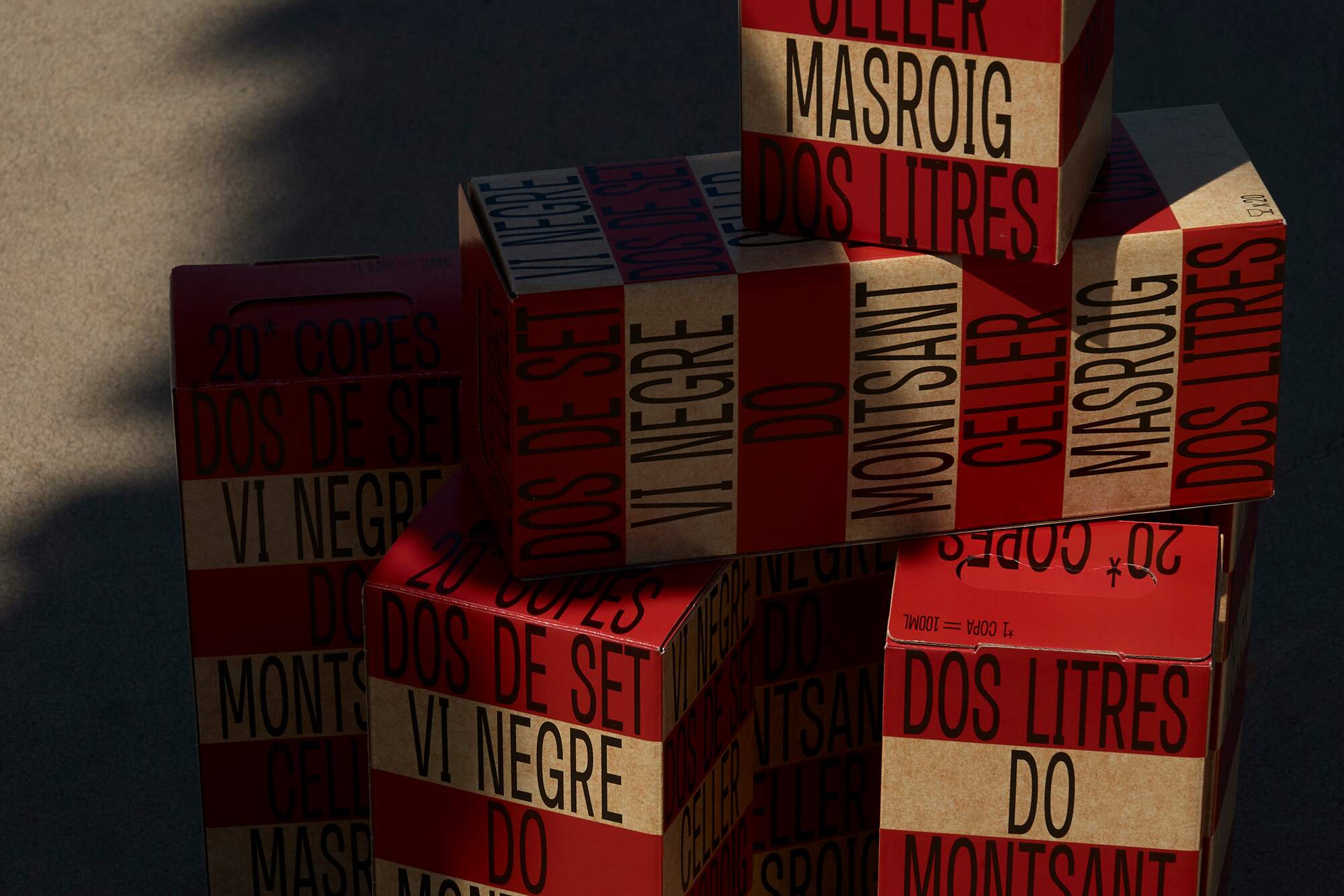
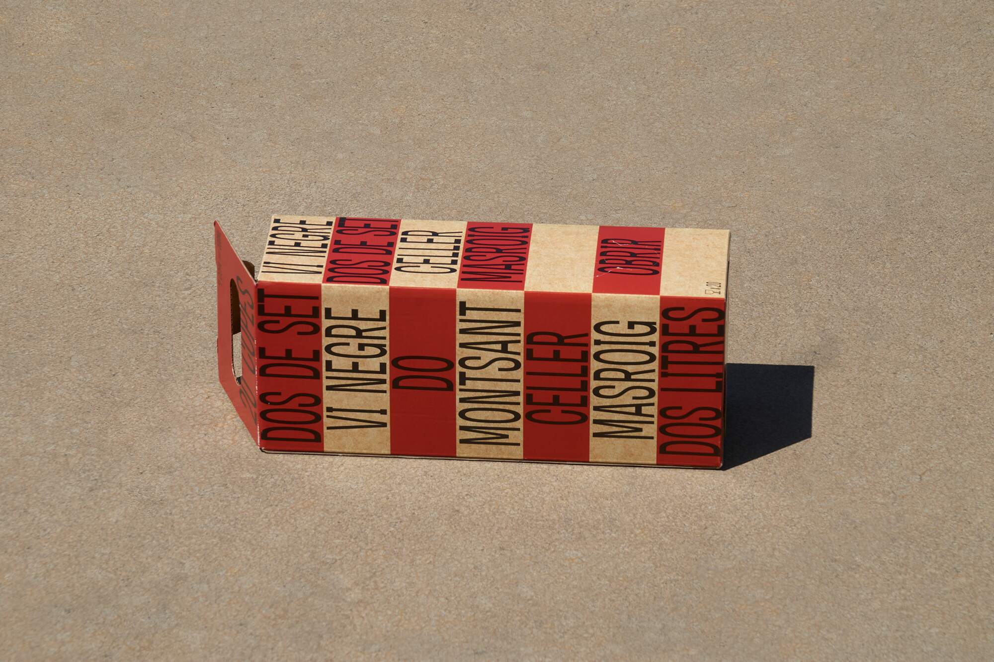
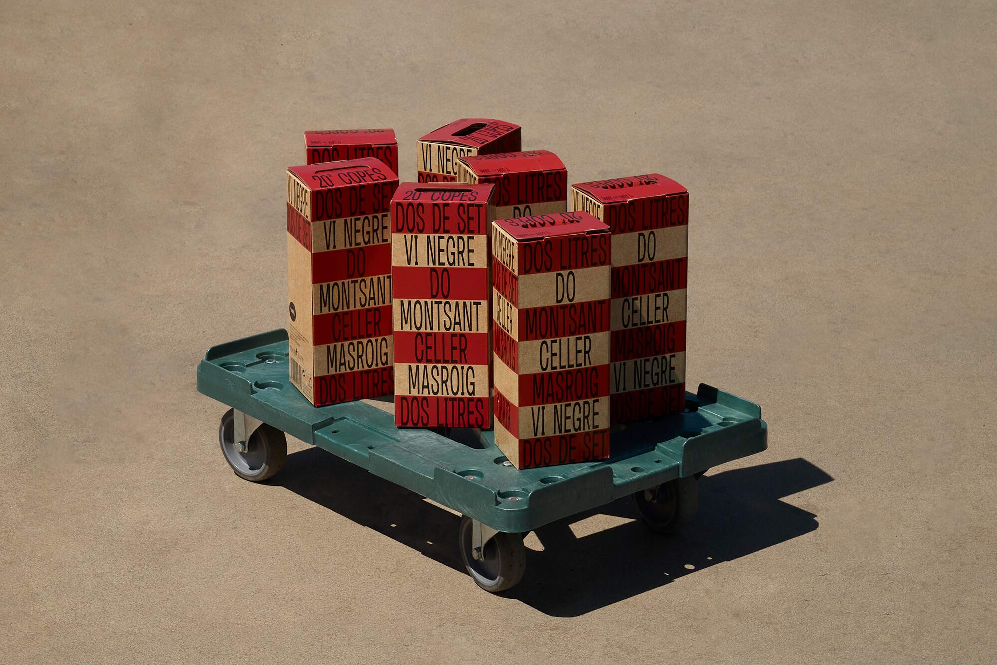
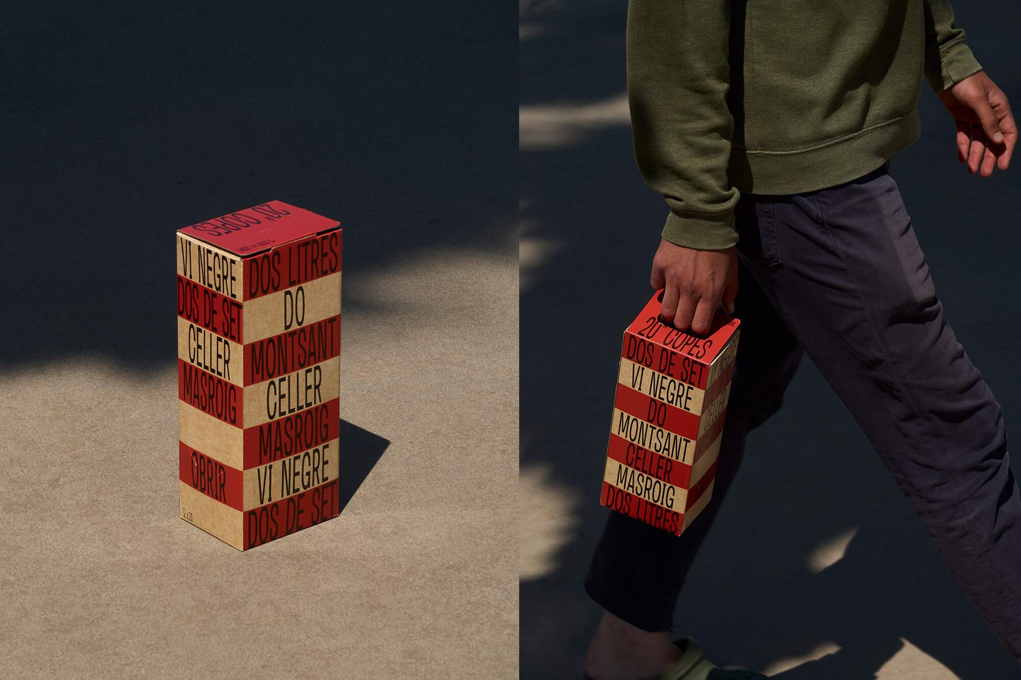
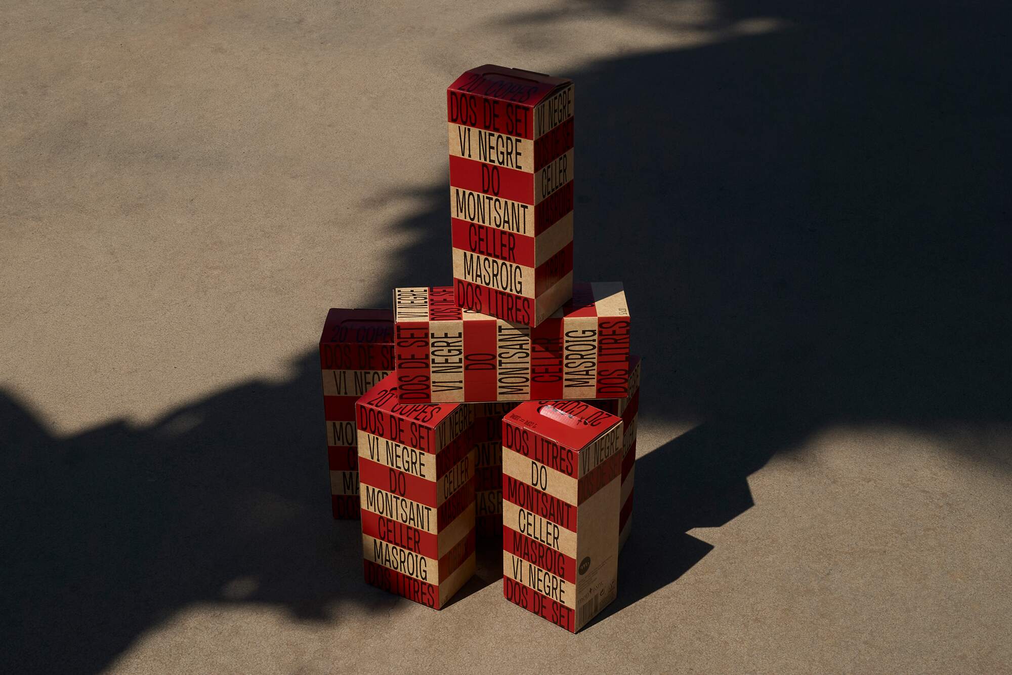
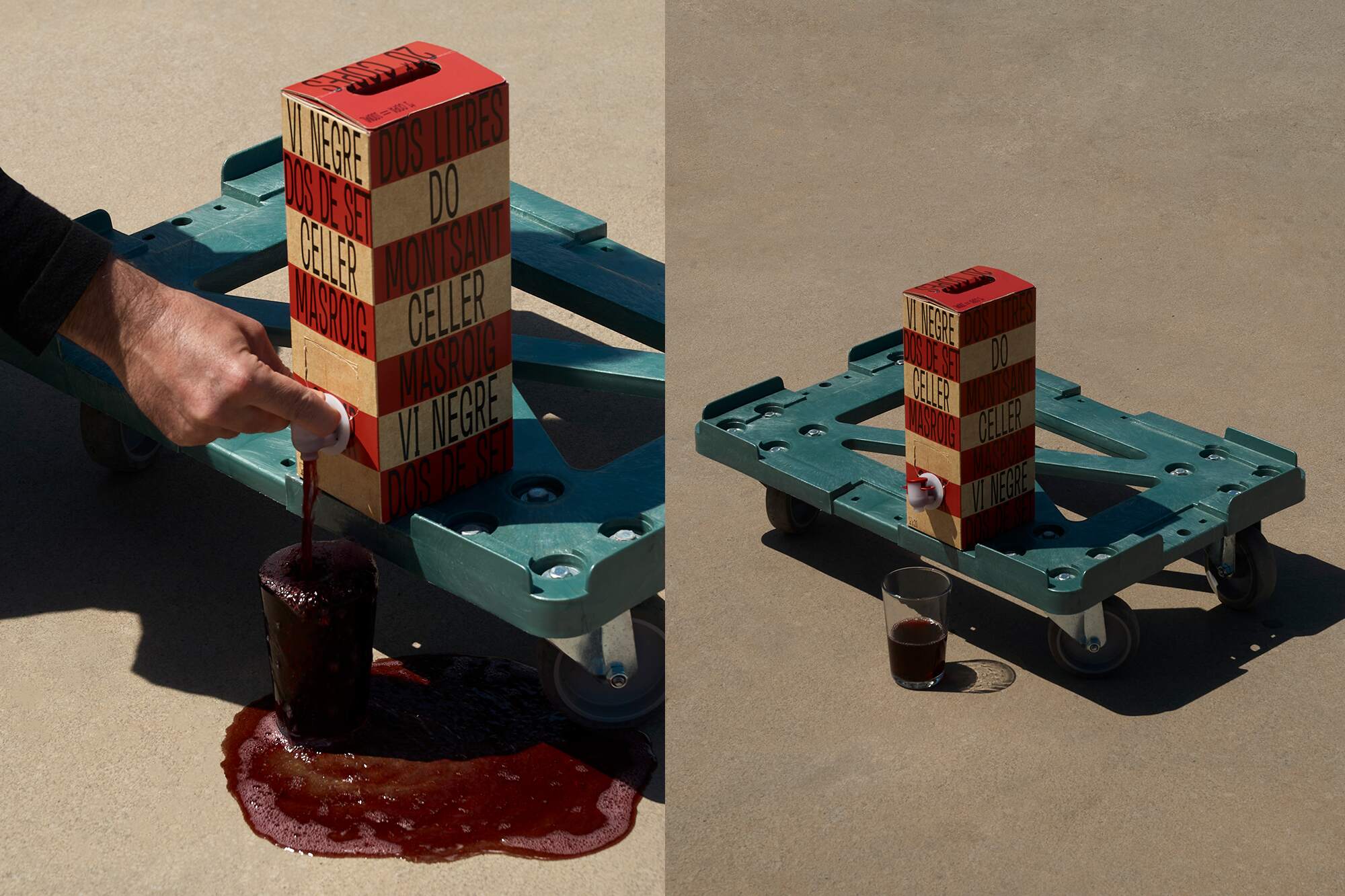
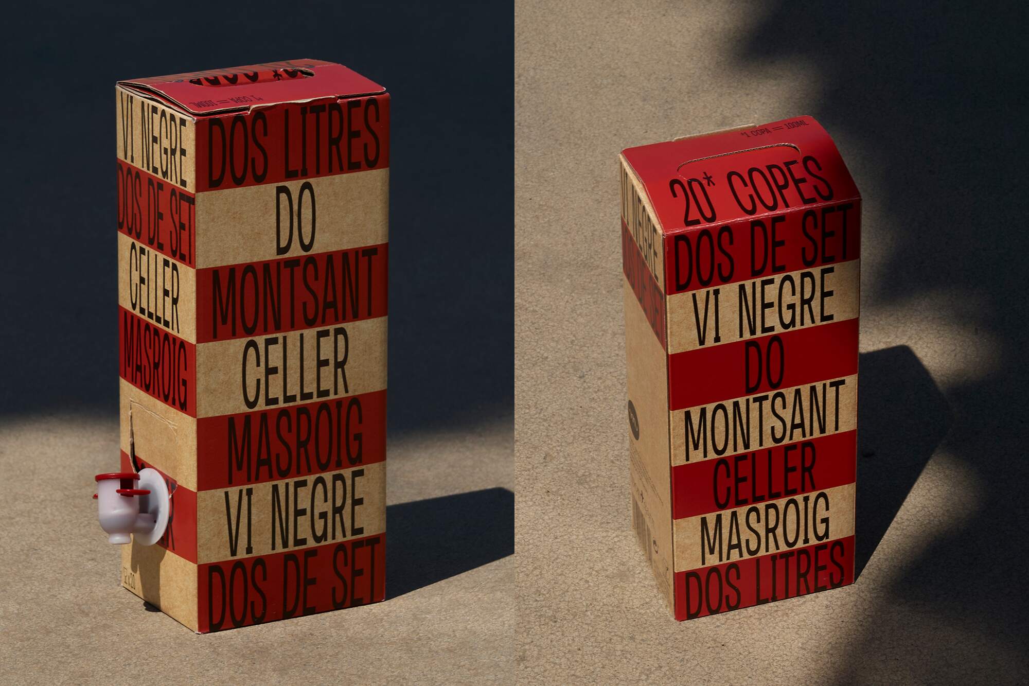
Dos de Set: 2 litres of youthful red wine in a bag, conveniently contained within a box, showcasing a delightful and fruity character that makes it incredibly easy to enjoy.
The box holds two litres of the so-called ” Vi de set” in Catalan (vin de soif), or “thirst-quenching wine”. This term captures the essence of smooth wines that are genuine, delightful, and effortlessly enjoyable.
Dos de Set offers an honest and refined experience for laid-back enjoyment, adding a touch of complexity while maintaining an authentic and delightful character. The name itself, Dos de Set, conveys immediate expression and a warm perception.
The concept is simple yet exudes personality, reflecting the wine it represents – clear, direct, and luminous. The inspiration behind Dos de Set stemmed from a moment at a local celebration in Catalonia, where people come together to build towering human structures called Castells (Castles). Coincidentally, one of these structures shares the same name as the wine, symbolising a triumph over challenges and leading to an extraordinary experience.
Dos de Set’s formula is straightforward, yet it possesses a distinct personality that mirrors the wine’s qualities: clear, direct, and luminous.
Dos de Set embodies simplicity without sacrificing complexity, a perfect harmony that elevates an experience. Its bag-in-box presentation adds convenience, preserving the wine’s delightful character.
In summary, Dos de Set is more than a wine; it’s an embodiment of joy, celebrating the genuine and delightful moments we share.
CREDIT
- Agency/Creative: Atipus
- Article Title: Dos de Set Red Wine Packaging Design
- Organisation/Entity: Agency
- Project Type: Packaging
- Project Status: Published
- Agency/Creative Country: Spain
- Agency/Creative City: Atipus
- Market Region: Europe
- Project Deliverables: Graphic Design, Packaging Design, Product Naming
- Format: Box
- Substrate: Pulp Board
- Industry: Food/Beverage
- Keywords: wine label, wine design, graphic design
-
Credits:
Naming: Atipus and Albert Lopez-Amor


