


What if smiles killed hunger? What if friends, siblings, parents had a flavour? What if hugs had stuffing? What if kisses had a recipe?What if fascinating stories came out of an oven that invoked memories and were always freshly made? In each of our empanadas, there is an unforgettable moment. To eat here or take-out. Don’t cry for me. Argentinian empanadas.
Our client contacted us to develop the branding project for their new Argentinian empanada business, hungry for expansion. As we are good eaters, we loved the proposal. And we got down to work. Or, rather, to working the dough.
As we saw during the market and trend analysis, Argentinian empanadas are consolidating as a new healthy fast food consumption category worldwide. In a market where there are more and more gastronomic chains dedicated to their production, we set out to create a new brand that could potentially be franchised and with international projection.
These were the ingredients we used: 200 grams of inspiration based on Argentine social and cultural icons: Maradona, the Pope, Evita, Cortázar… There are so many! 100 grams of multigenerational collective imaginary. 250 grams of the universal language “Full stomach, contented heart.” Then we sift the ingredients, mix them and pour them into the mould of the strategic positioning on which we built the brand identity: “Argentinian gourmet on the go”. Finally, we baked the dough for a couple of weeks until it was nice and crispy. The result? Don’t Cry For Me: A brand of Argentinian gourmet empanadas with a taste of unforgettable moments.
If after reading the naming you have added (mentally or singing) “Argentinaaaa”, you are part of those generations that have Elaine Paige and, more probably, Madonna, engraved in their retinas and ears, singing that song that became an anthem. In anthem and mantra of a people who carry their joy and affability with them wherever they go. Without tears. Smiling at life. Because Argentines are aware that life is a tango that you have to know how to dance.
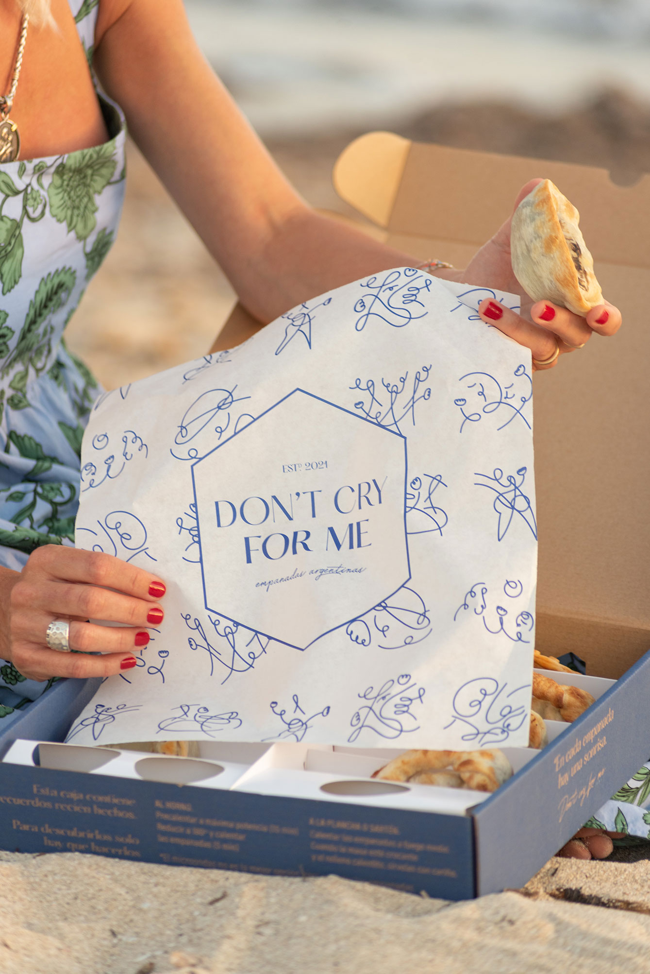
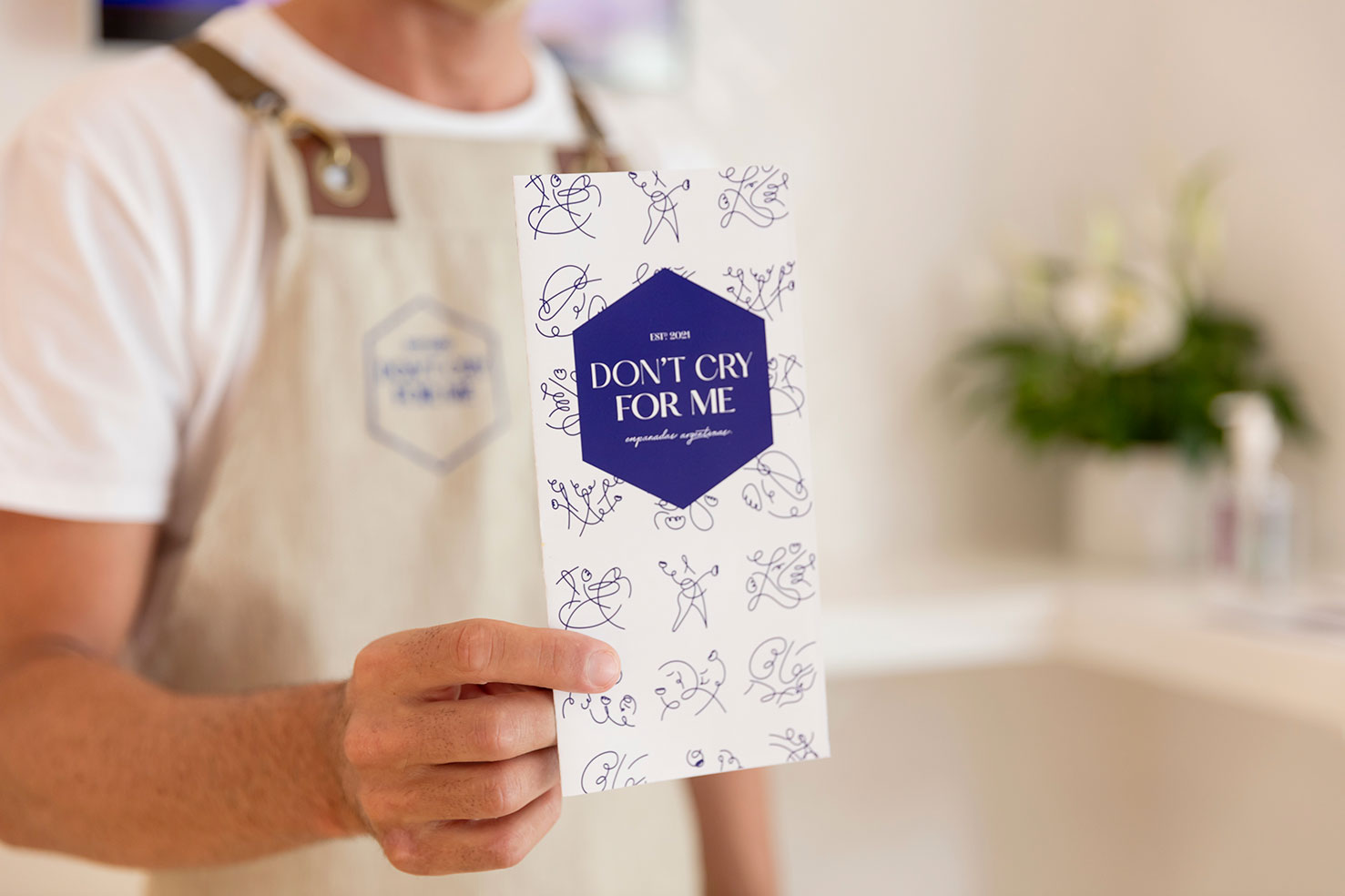
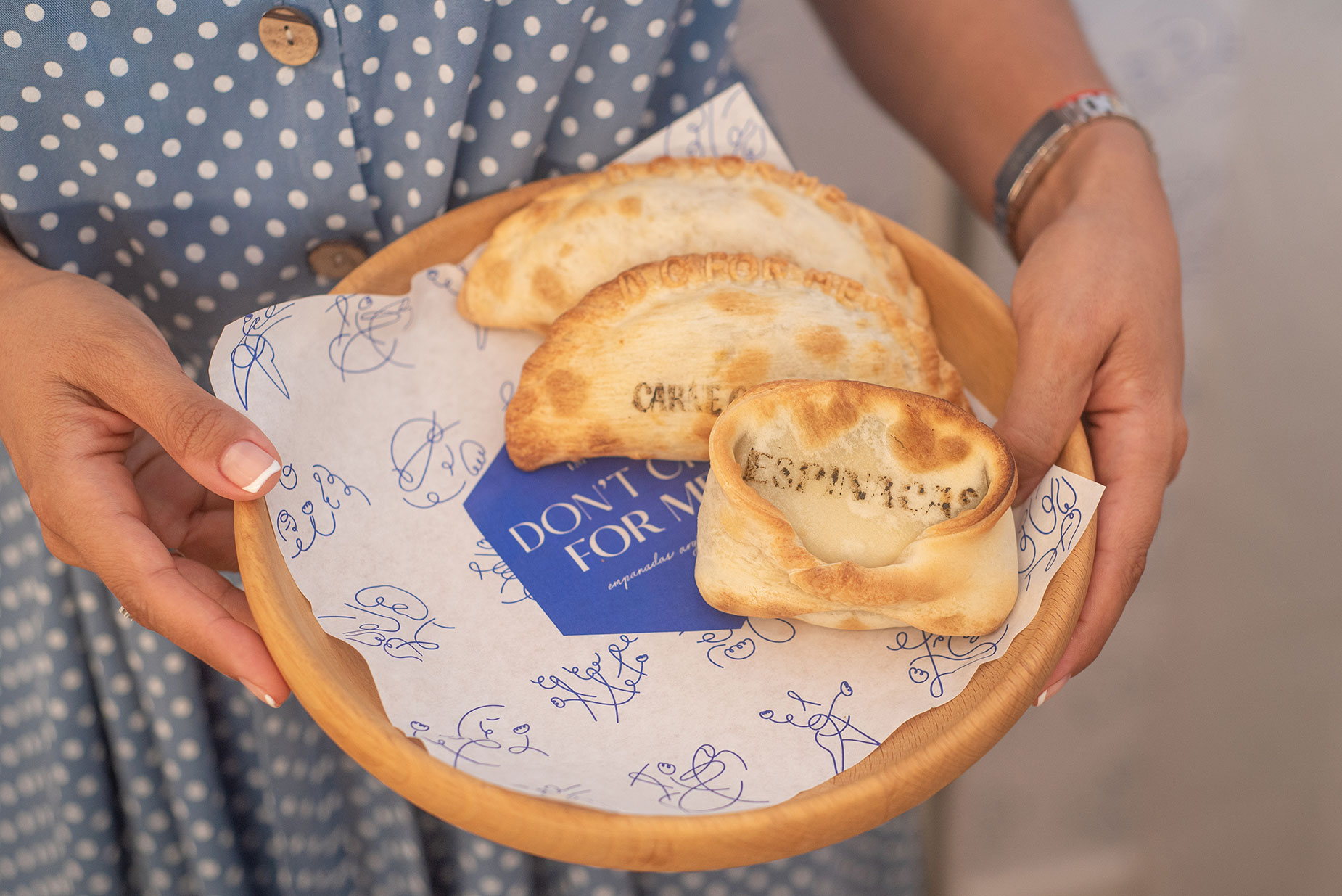
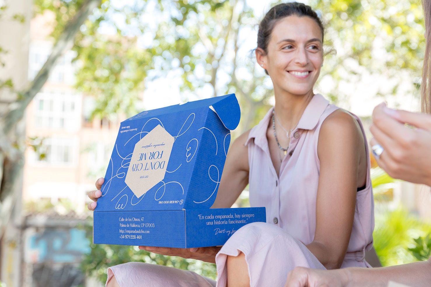
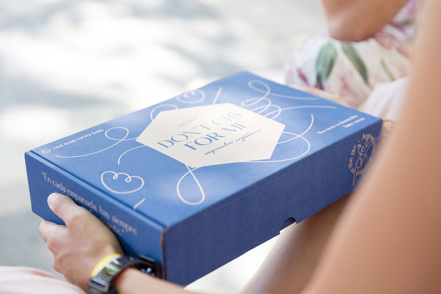
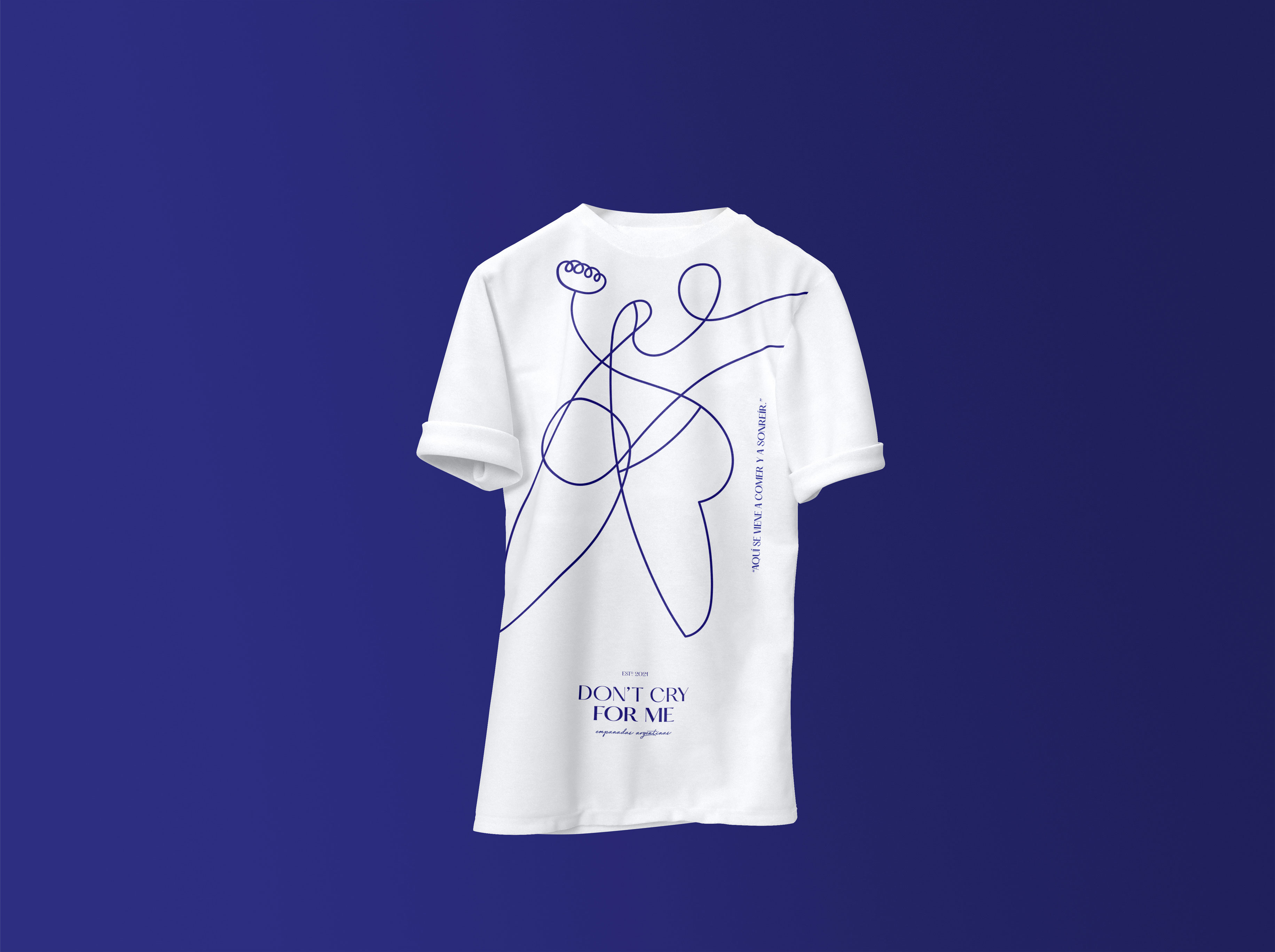
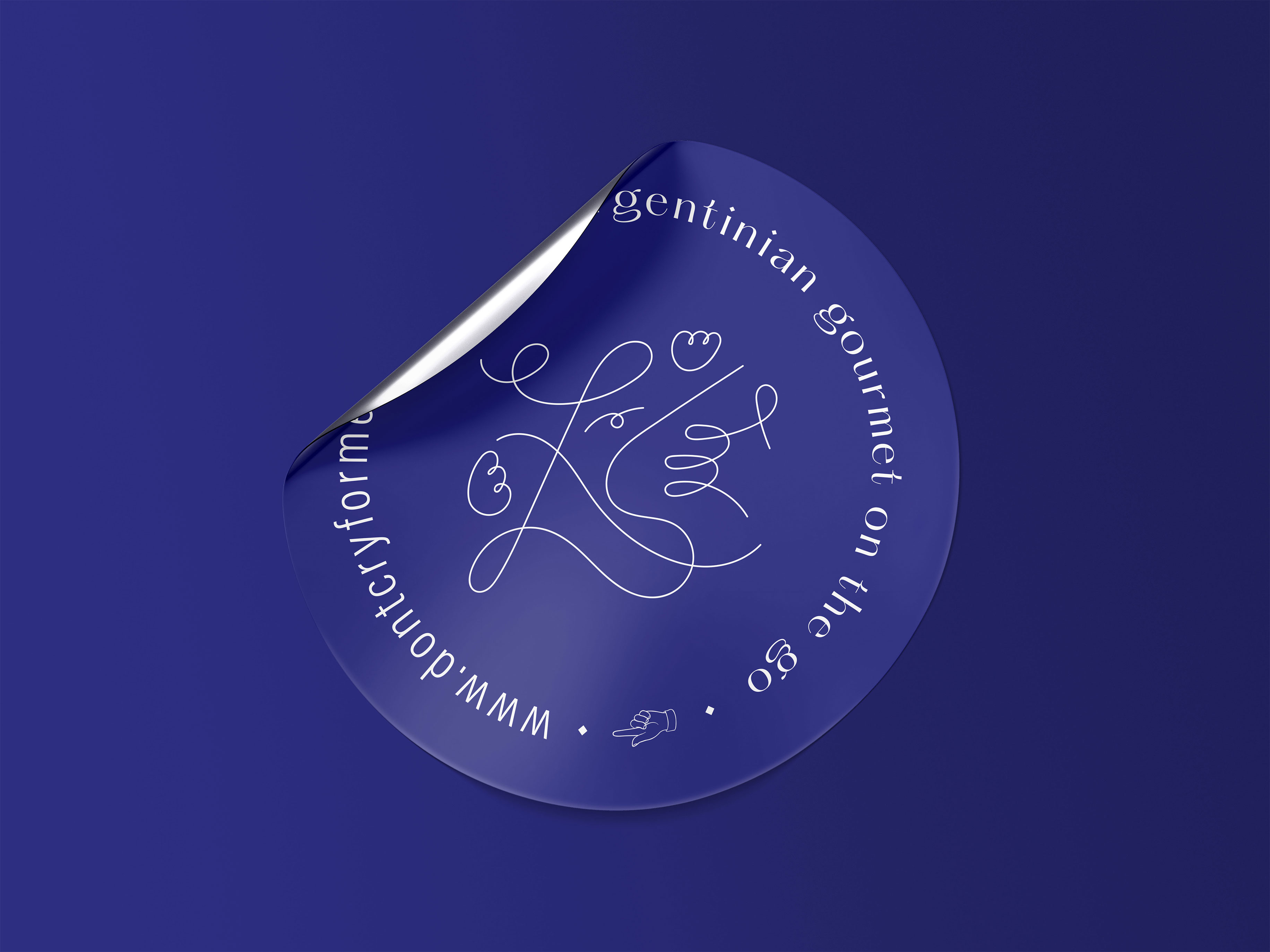
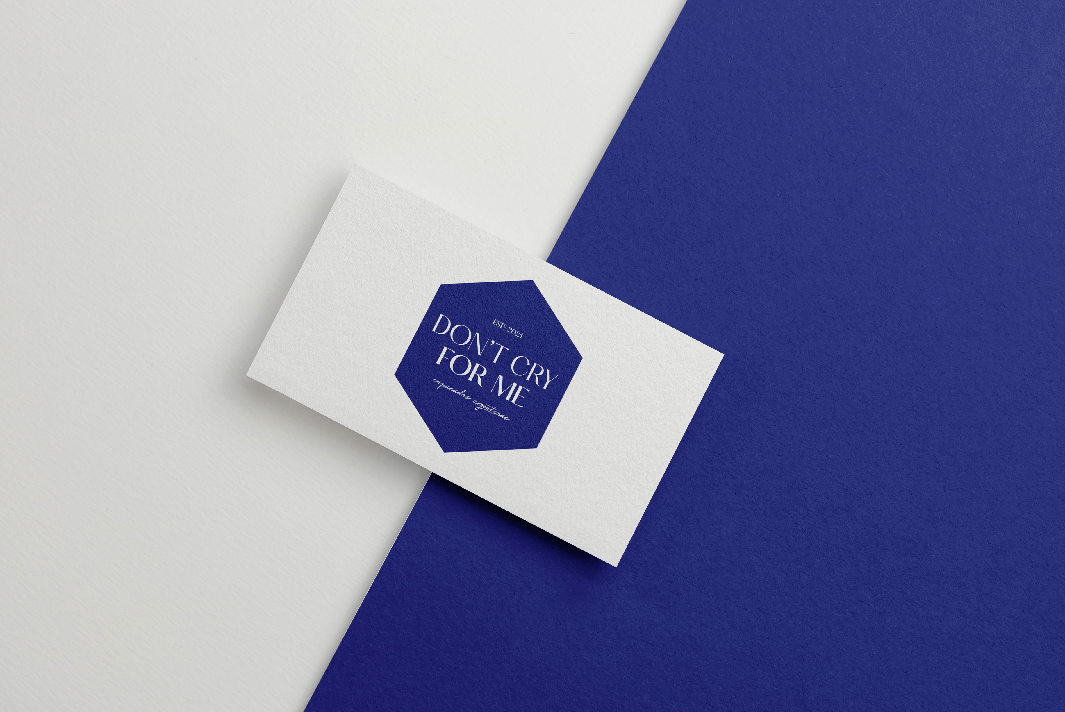
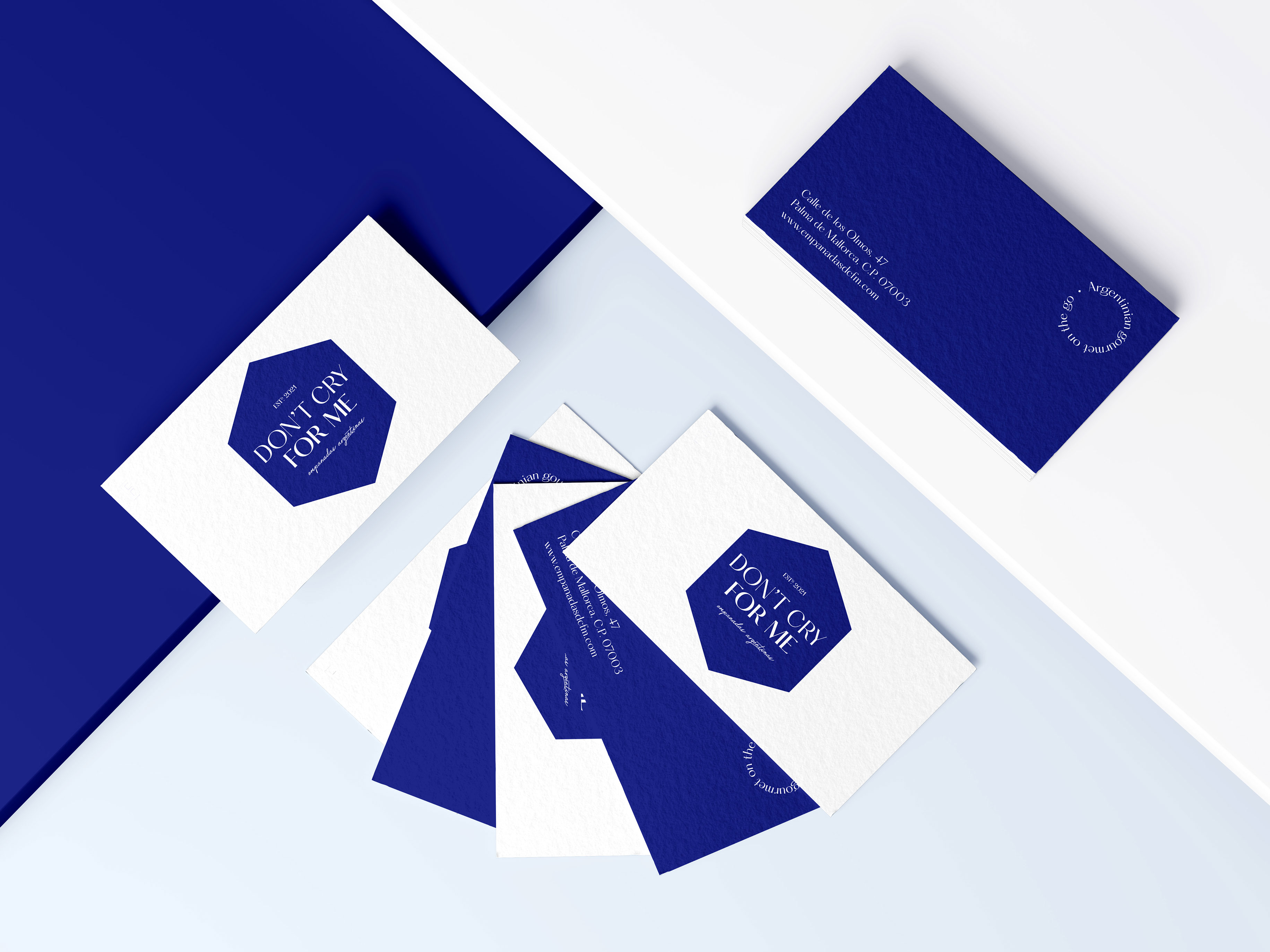
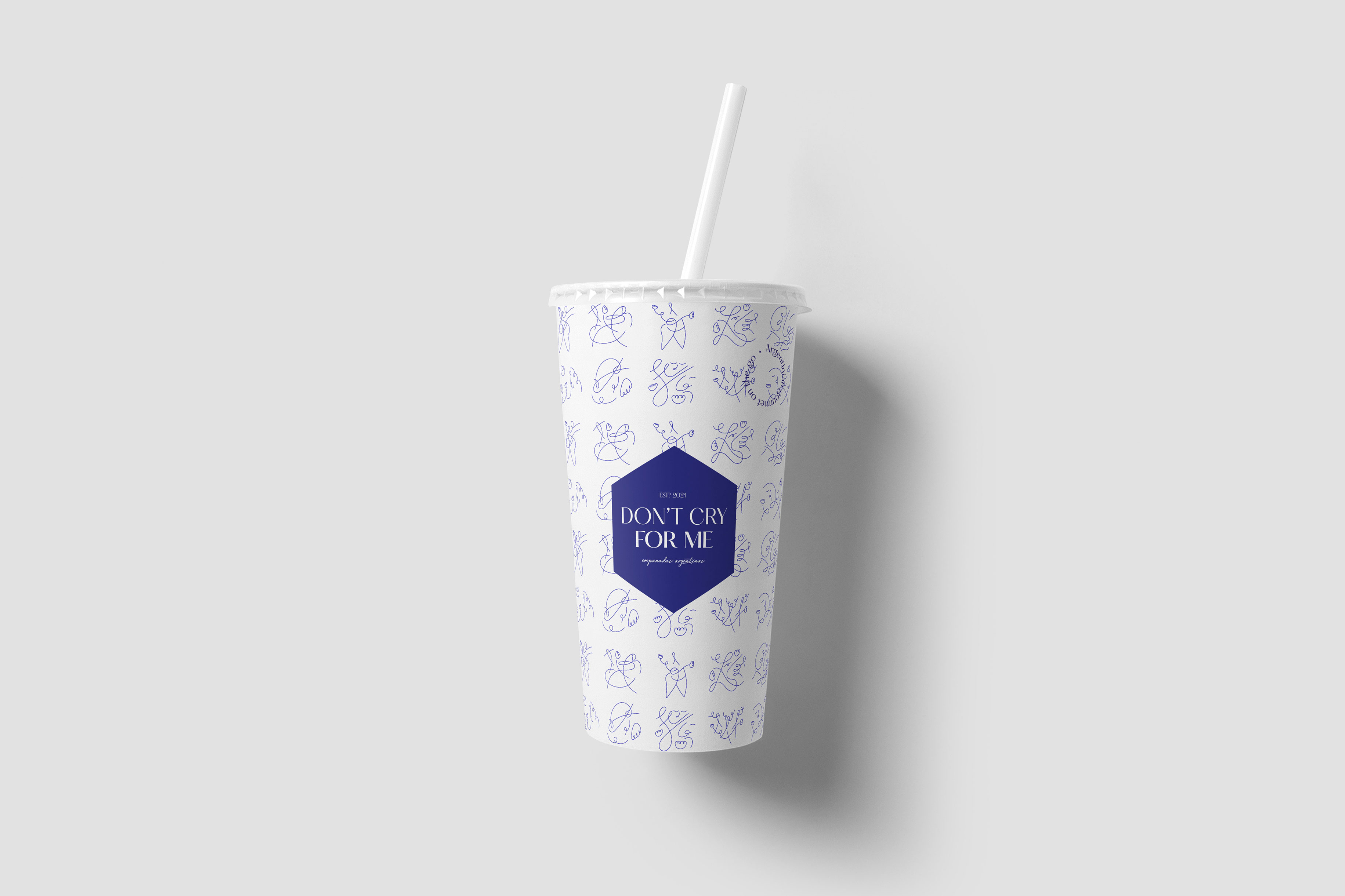
To design the visual identity, we did a typographic composition and illustration work. We created the logo with the Hatton typeface, which is modern and a bit traditional and transmits the lightness, naturalness and joy that we were imagining for the brand. We decided to highlight in bold part of the naming (for me) to emphasize the friendly and warm treatment provided to customers. While for the product description we used a handwritten typeface that enhances the perception of gourmet cuisine. All of this is encased in a hexagon that works as a seal to reinforce the handmade aspect of the products. This figure can be enlarged to adapt to different communication supports, or to incorporate other verbal and graphic resources of the brand, as well as its strategic positioning.
We completed the visual universe with freehand illustrations. To create them we were inspired by tango steps, as their liveliness and dynamism are part of this brand. We also included some curvy figures, which remind us of empanadas. The idea is that these illustrations can be used both in corporate communication supports and at the shop. Finally, we opted for blue to elevate the fast good brand to a more gourmet level.
CREDIT
- Agency/Creative: Wanna
- Article Title: Don’t Cry For Me, Branding for Argentinian Empanadas Designed by Wanna
- Organisation/Entity: Agency
- Project Type: Identity
- Project Status: Published
- Agency/Creative Country: Spain
- Agency/Creative City: Madrid
- Market Region: Europe
- Project Deliverables: Art Direction, Brand Creation, Brand Design, Brand Guidelines, Brand Identity, Brand Naming, Brand Strategy, Brand Tone of Voice, Branding, Copywriting, Creative Direction, Graphic Design, Illustration, Logo Design, Packaging Design, Research, Tone of Voice
- Industry: Food/Beverage
- Keywords: Food, Food design, Packaging, Branding, Fast Good, Gourmet, Naming
-
Credits:
Photography: Nieta Strassberg
Photography: Cristina Ortega


