


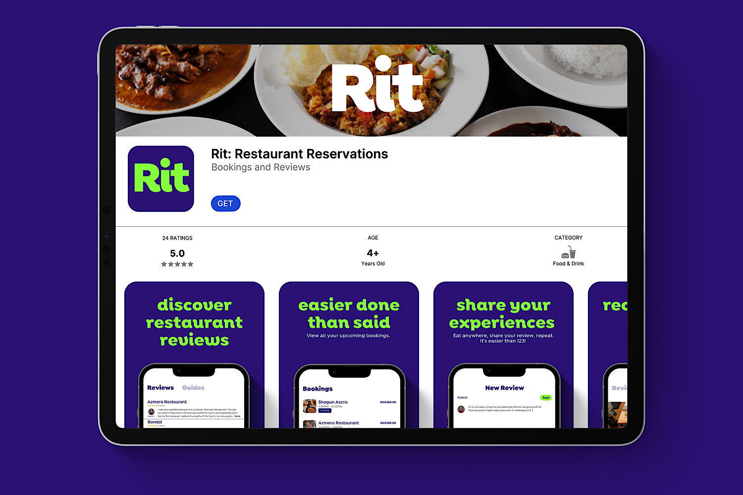
Don’t Be A Stranger was tasked with the exciting opportunity to strategize the creation of a new brand, looking to break ground as Ghana’s first mobile app for restaurant reviews, reservations & curated experiences. For this project, our work ran the gamut from brand naming to visual identity & digital product (UX/UI) design, giving us enough room to explore the studio’s strategic & design potential.
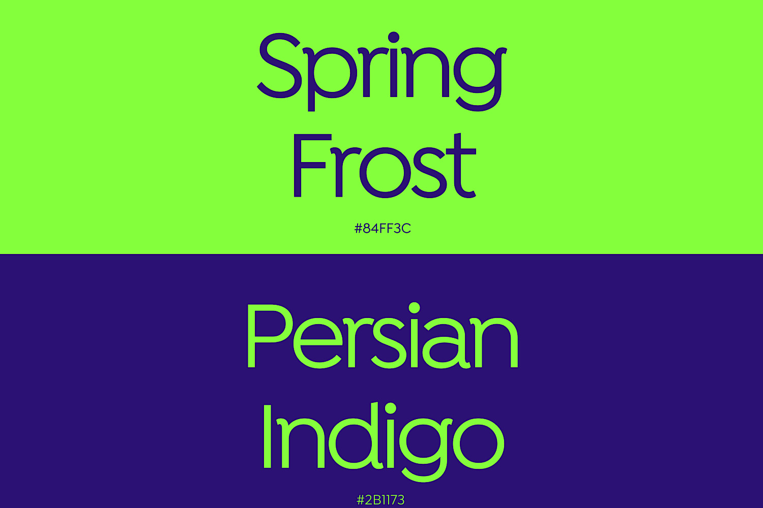
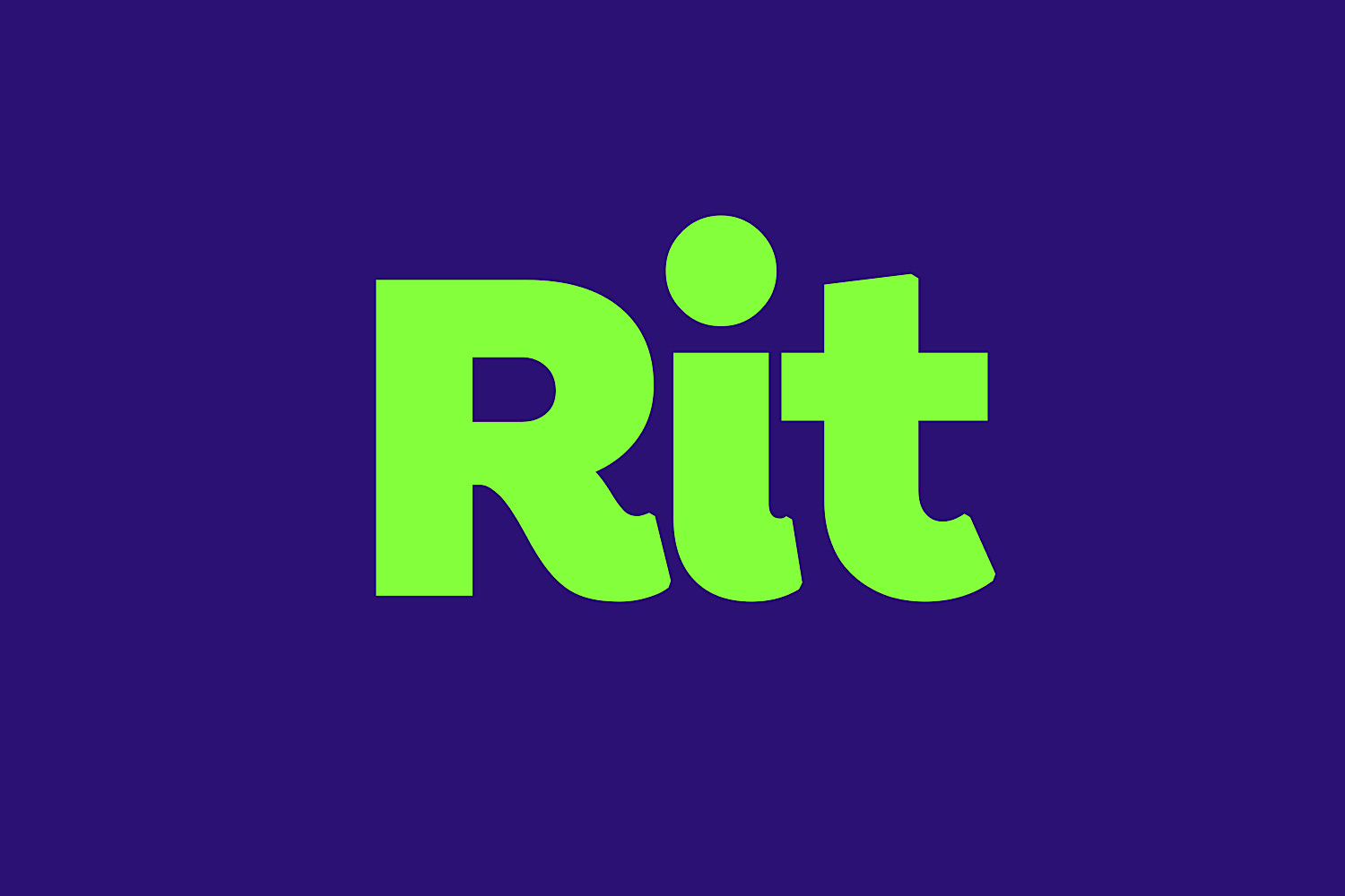
Our approach was simple: Keep. It. Simple. From the brand new brand name, Rit, to the simple two-tone color palette, & most of all the simply constructed logotype, we thoughtfully designed every brand element with simplicity, while giving maximum effect.
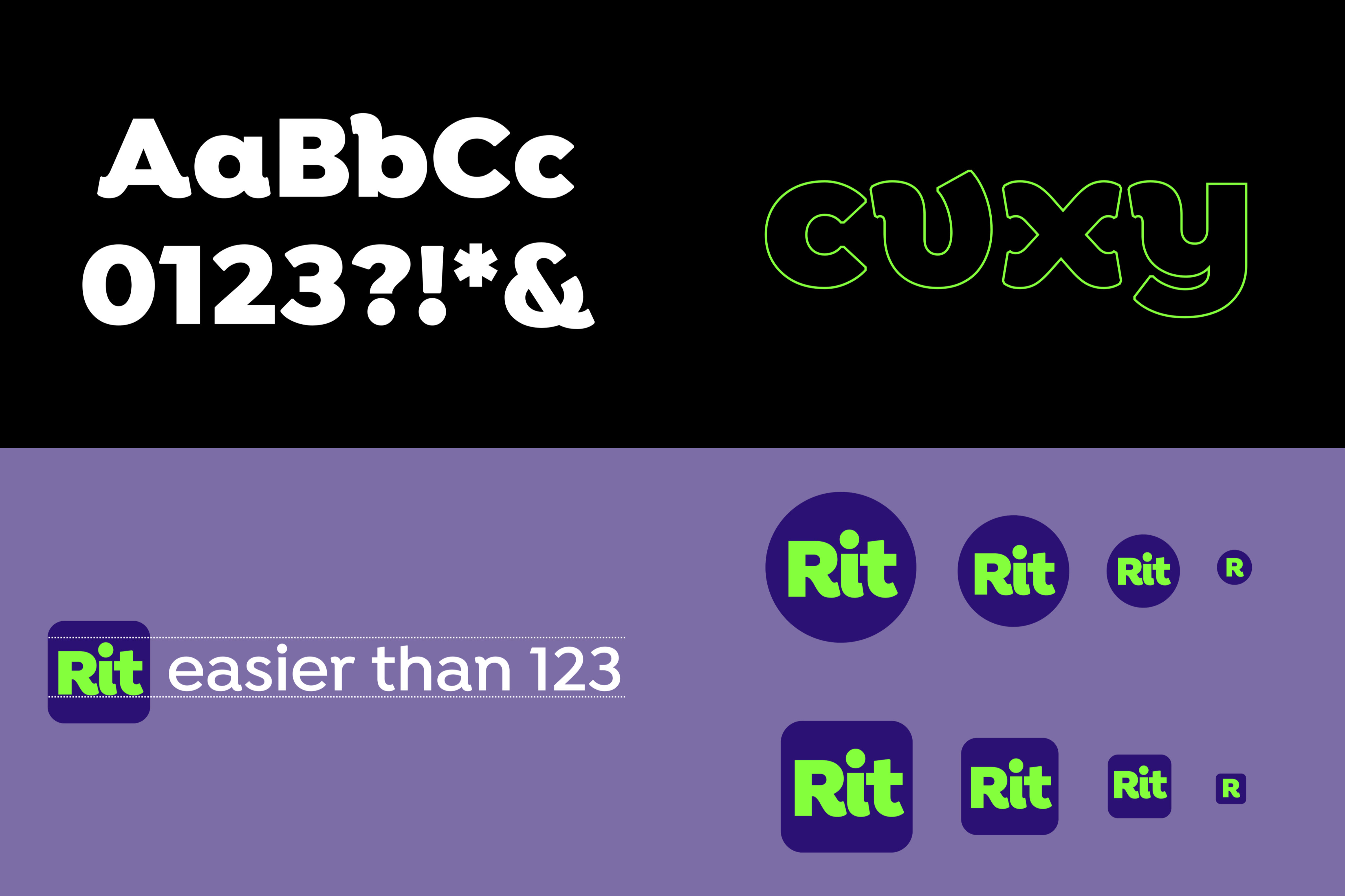
We gave Rit the bespoke treatment with a custom drawn version of the Isidora Alt Black font. In a local Ghanaian context that appreciates ease & accessibility, this font most appropriately visually represents a brand that aims to be relatable & easily understood, with its smooth, inviting curves. It made further sense to use the entire Isidora typeface, along with our redrawn version, as the official type for the Rit brand.
The decision to go with a simple logotype was intentional. With the rise of in-house design teams, we wanted to provide full freedom for the new startup brand’s team to easily recreate the logo, as they grow the brand & bring it to new audiences.
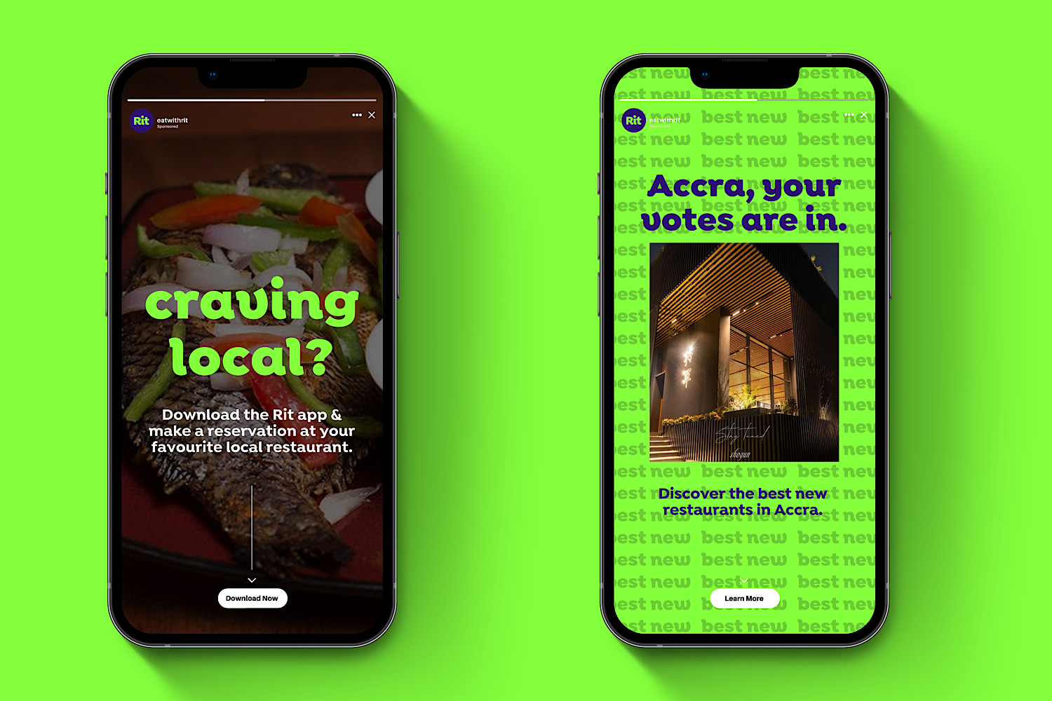
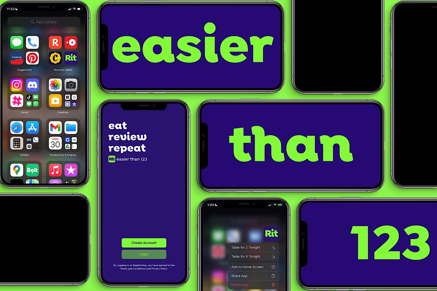
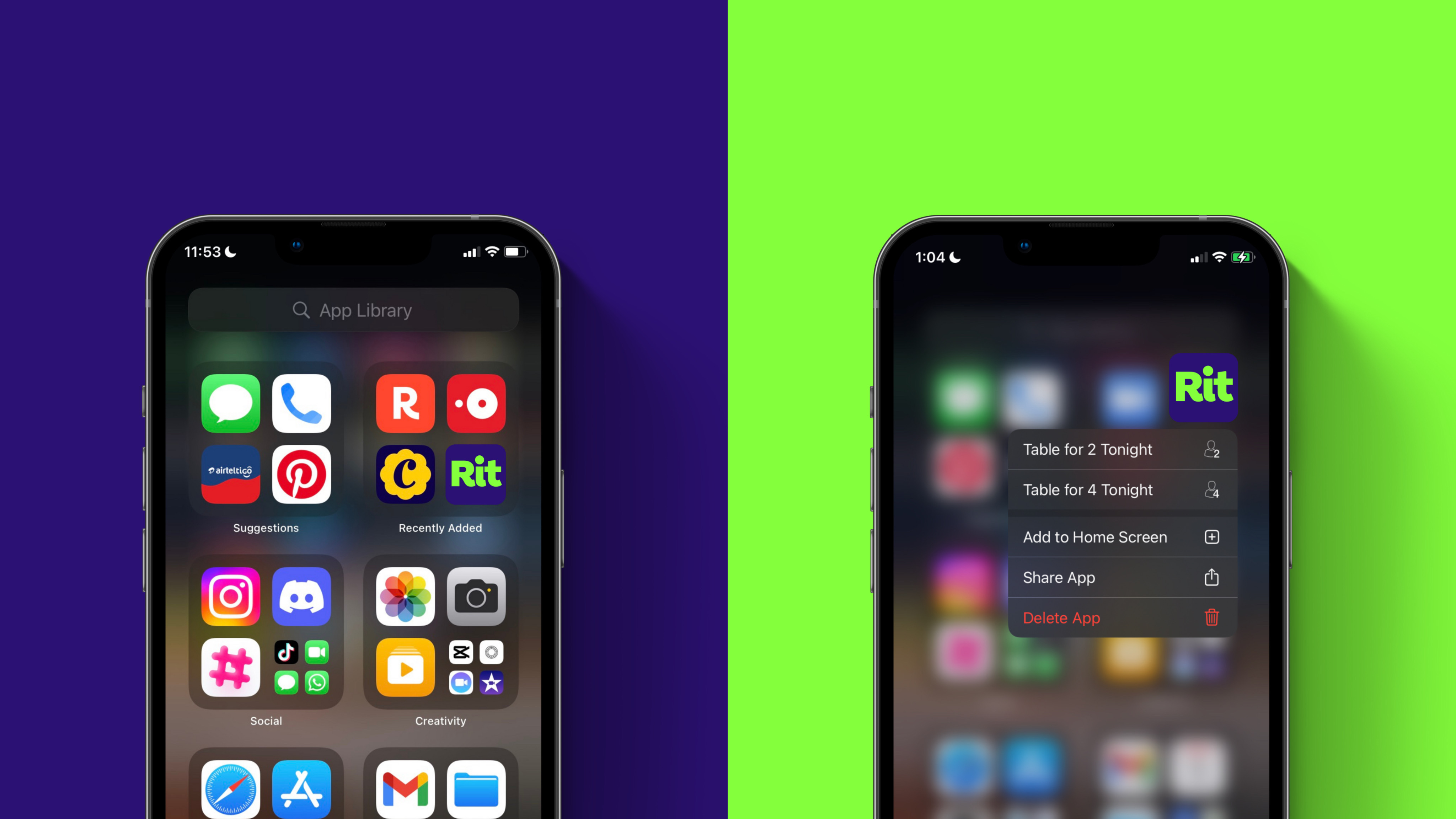
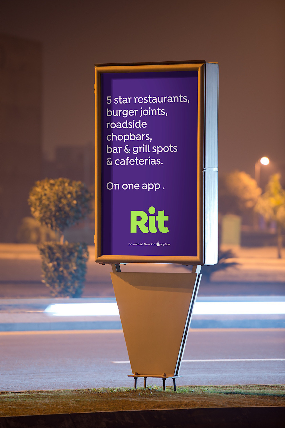
We were mindful of the fact that Rit is a digitally native brand. As such, it needed to have a strong identity offline as much as it has on-screen. This drove the decision to use complimentary colours with strong applications from app icons to print collateral…& even some cool socks!
Throughout the identity, the design elements interact beautifully with each other. The type communicates boldly no matter the weight or the message, & the colours excite & invite users across all platforms.
We also strategized for the strap line “easier than 123”. A new & refreshed take on the familiar saying “as easy as 123”. This lends itself as a platform for the Rit brand to communicate the simplicity & innovation of its offering. Additionally, it strengthens Rit’s core positioning of ease & accessibility.


CREDIT
- Agency/Creative: Don’t Be A Stranger
- Article Title: Don’t Be A Stranger Serves Up Thoughtful Simplicity For Rit’s New Brand Design
- Organisation/Entity: Agency
- Project Type: Identity
- Project Status: Published
- Agency/Creative Country: Ghana
- Agency/Creative City: Tema
- Market Region: Africa
- Project Deliverables: Brand Creation, Brand Design, Brand Identity, Brand Mark, Brand Naming, Brand Strategy, Brand Tone of Voice, Graphic Design, Logo Design, Type Design, Typography
- Industry: Hospitality
- Keywords: Brand Design, Brand Naming, Ghanaian Design, Custom Type, Bespoke Font, Graphic Design, Creative, Strategy
-
Credits:
Design Director: Jean Quarcoopome
Typographer: Jean Quarcoopome
Art Director: Jean Quarcoopome
Writer/Strategist: Jean Quarcoopome


