


Dong A Thanh Hoa is one of the most storied football clubs of Thanh Hoa province-Vietnam, embodying the proud Lam Sơn spirit and the pride of its people. However, the previous brand identity no longer reflected the stature, ambition, and modern language the club needed to step into a new era. The challenge was how to reposition the brand-honoring its heritage while asserting a bold identity capable of connecting with younger generations of fans and the international football community.
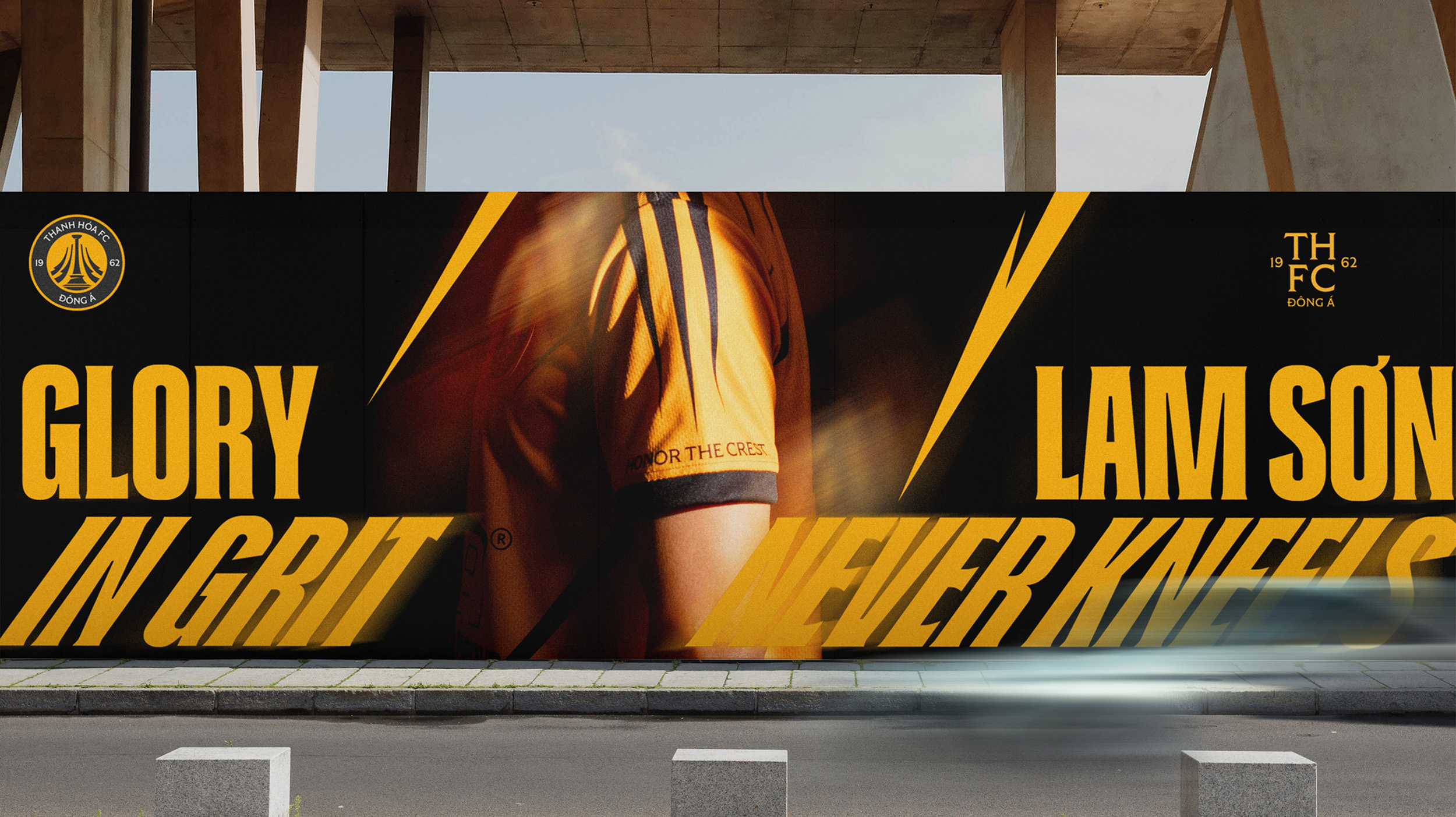
The rebranding journey began with redefining the club’s core essence: inheriting the Lam Son spirit, celebrating the legacy of Thanh Hoa, and embracing a global design language. From this vision, the message “Glory in Grit – Lam Sơn Never Kneels” emerged as the soul of the entire project, affirming that pride and indomitable will are the greatest glories of Dong A Thanh Hoa.
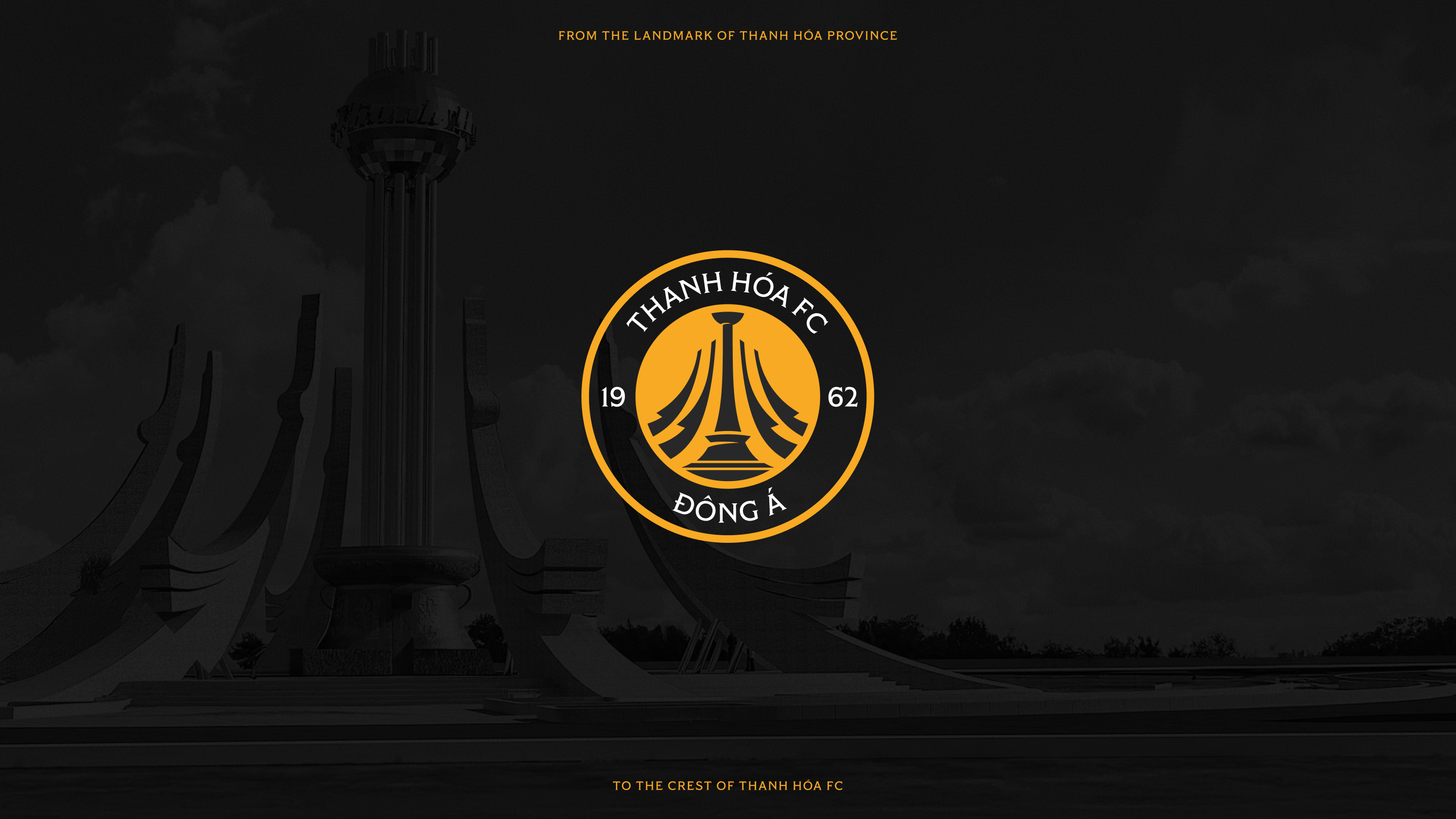
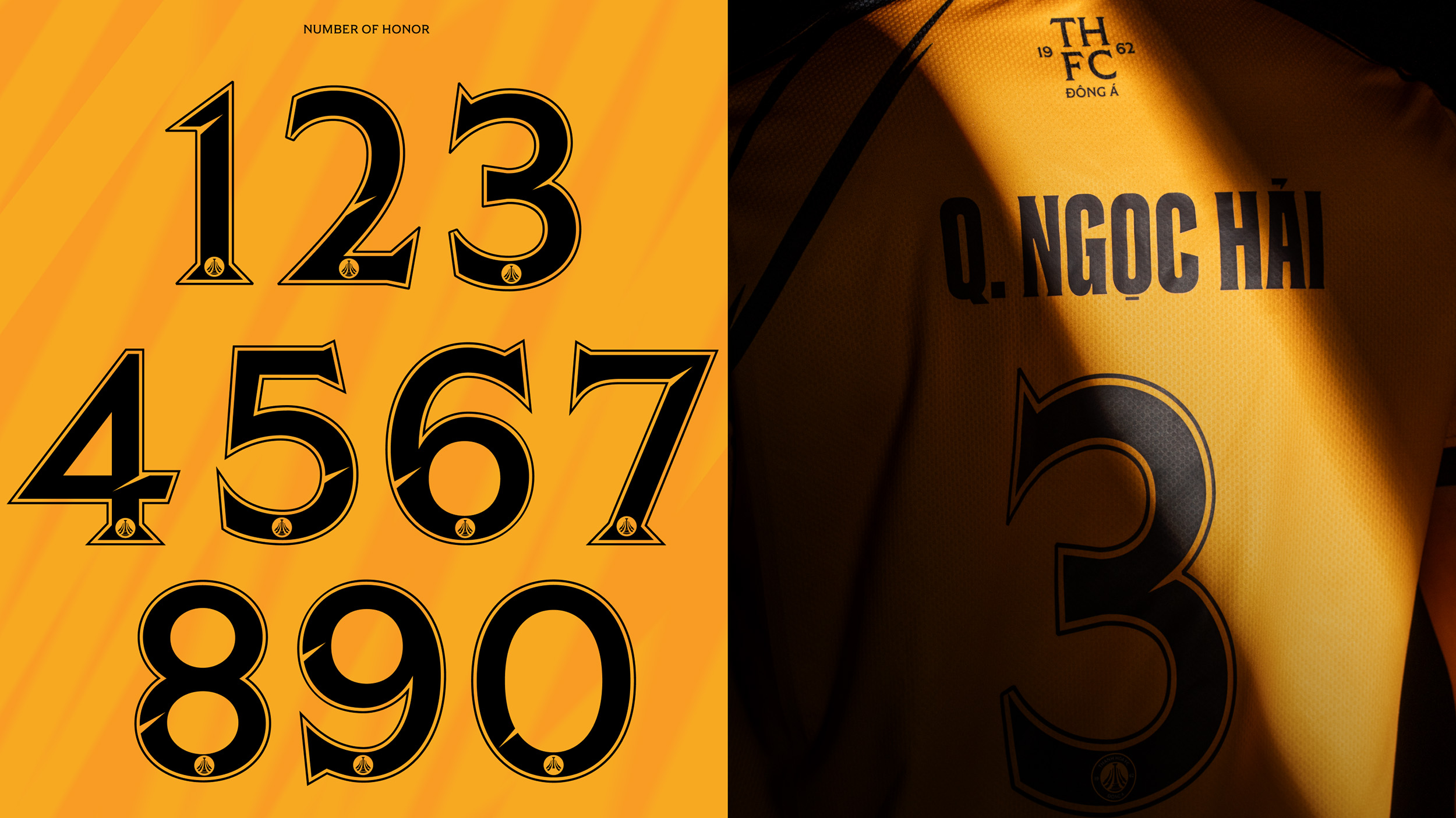
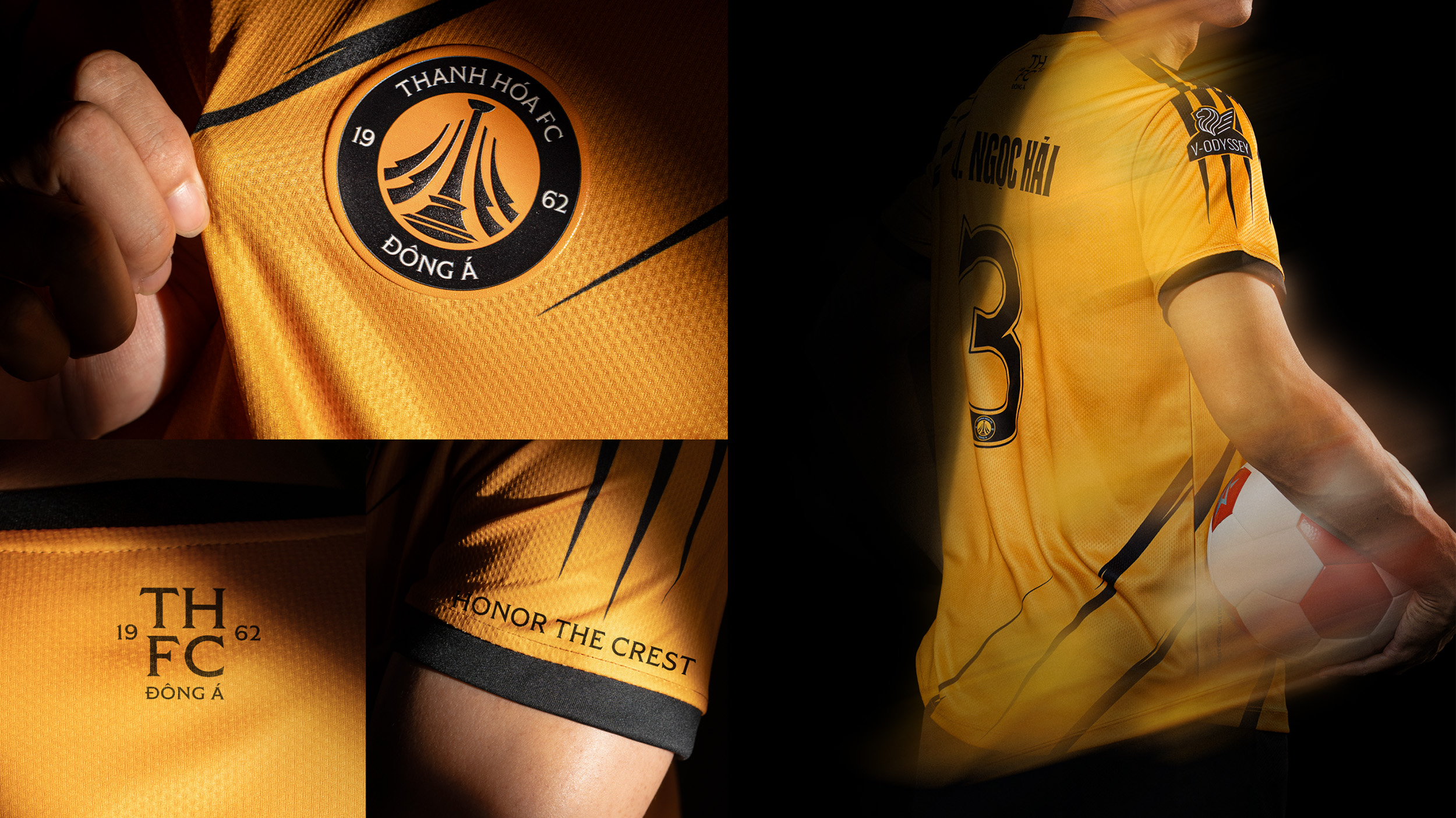
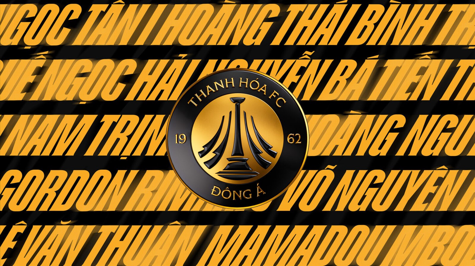
The new logo was crafted as a symbol of rebirth. Inspired by the iconic Hoang Hac roundabout landmark of Thanh Hoa province, it evolved into the image of cranes soaring skyward, representing aspiration, resilience, and unyielding pride. Complementing the emblem, the monogram combines the initials THFC with the founding year 1962, delivering a minimal yet sophisticated international touch.
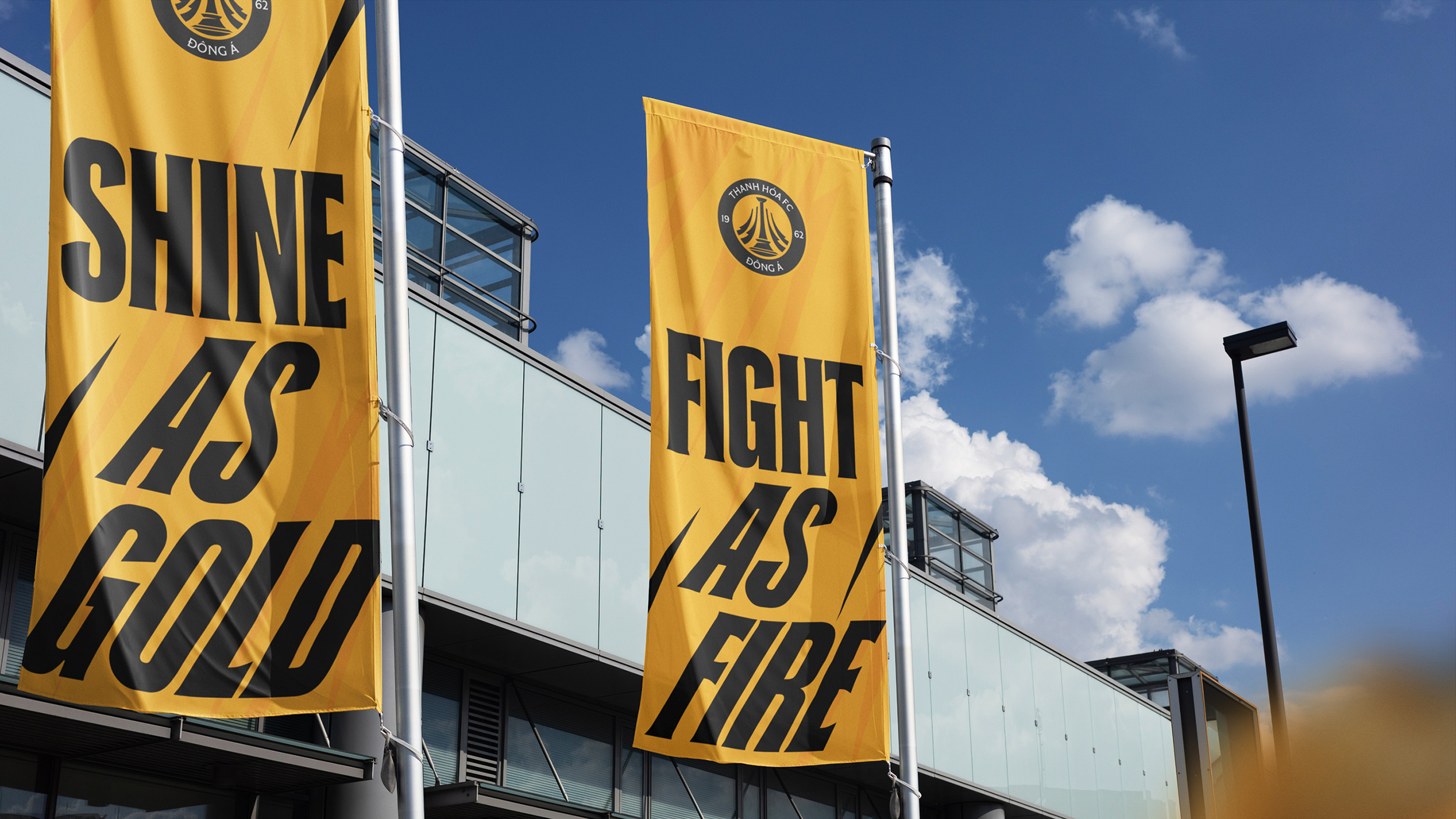
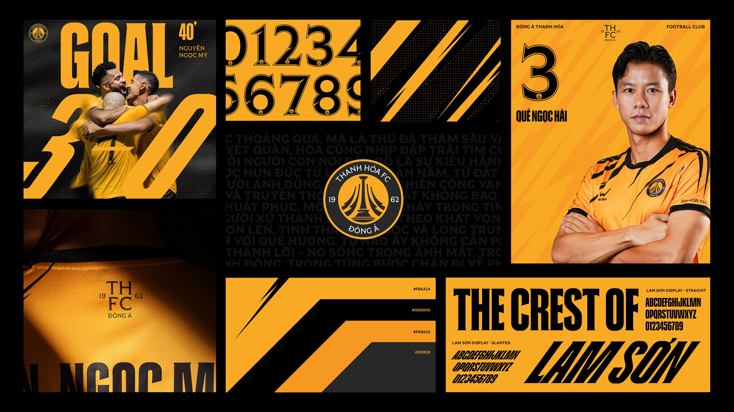
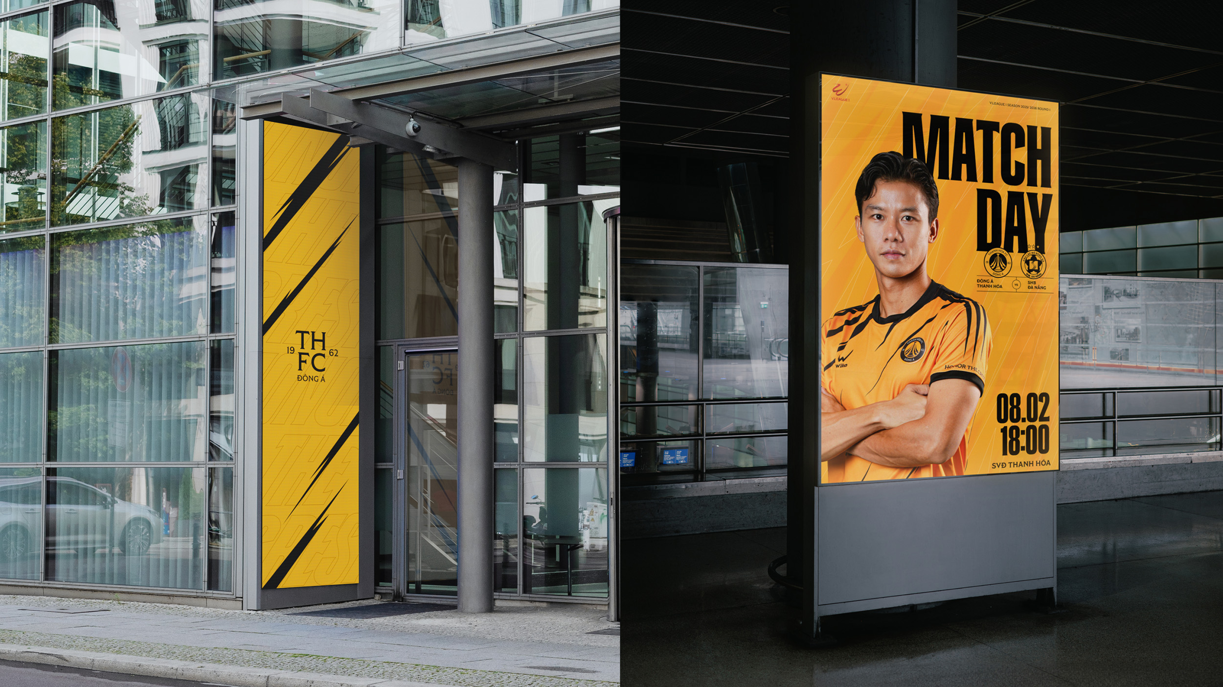
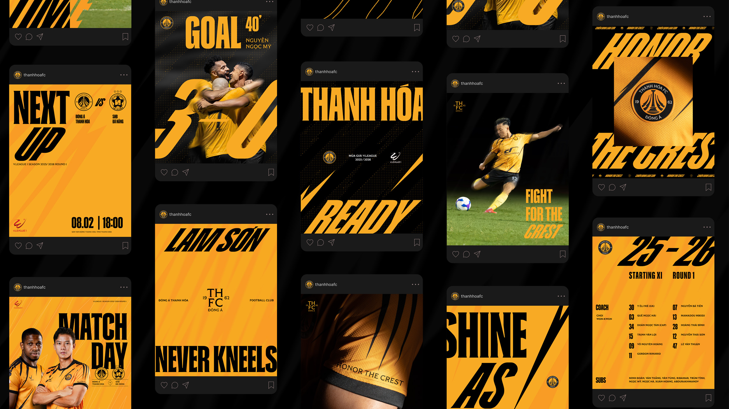
The color system was also redefined. “Flame Yellow” is more than just a hue-it is the flag, the jersey, and the pride that players and supporters wear on their shoulders. When paired with black and gray, the palette embodies boldness and modernity, evoking the language of global sports while staying true to the identity of Xứ Thanh.
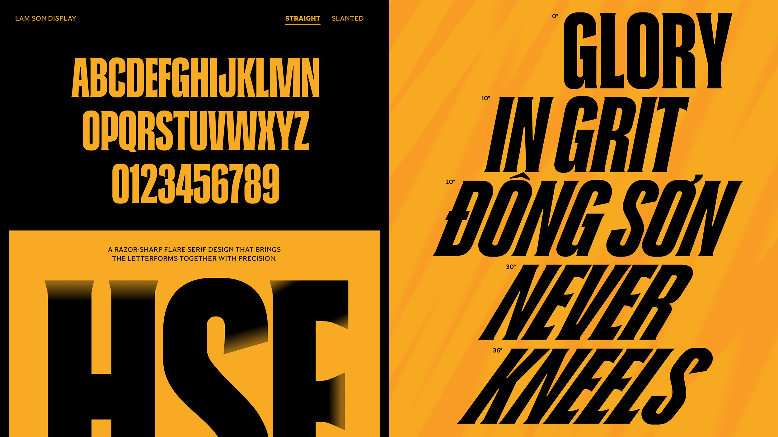
A highlight of the rebrand is the introduction of a custom typeface, the Lam Sơn Typeface. More than a visual tool, it is a statement of strength and pride. With two variations – straight and slanted – the typeface carries bold strokes inspired by the spirit of unyielding warriors, ensuring consistency and distinction across all communication. Alongside, graphic motifs employ sharp cuts derived from the Lam Sơn spear, building a visual system that radiates combativeness and determination.
Rebranding Impact:
The new identity was quickly recognized by the national sports press as a pioneering model. Football fans in general, and Dong A Thanh Hoa supporters in particular, warmly embraced the new identity with high levels of engagement across social media. Through this transformation, the club has successfully asserted itself as bold, proud, and modern, while fostering an indomitable fighting spirit that both players and fans can rally behind with pride.
CREDIT
- Agency/Creative: Line Collective
- Article Title: Dong A Thanh Hoa FC Rebranding by Line Collective
- Organisation/Entity: Agency
- Project Type: Identity
- Project Status: Published
- Agency/Creative Country: Vietnam
- Agency/Creative City: Ho Chi Minh City
- Market Region: Asia
- Project Deliverables: Brand Creation, Brand Identity, Identity System, Logo Design, Type Design, Typography
- Industry: Entertainment
- Keywords: Sport, Football Club, Sport Branding, Football Branding
-
Credits:
Creative Director: Benny Ho
Creative Director: Mark Do
Creative Team: Trg H Thien
Creative Team: Si Tran
Motion Team: Phong Luong
Motion Team: Sang Trinh
Motion Team: Mai Chi Hien
Motion Team: Khang Nguyen
Type Designer: Dinh Duc Hai


