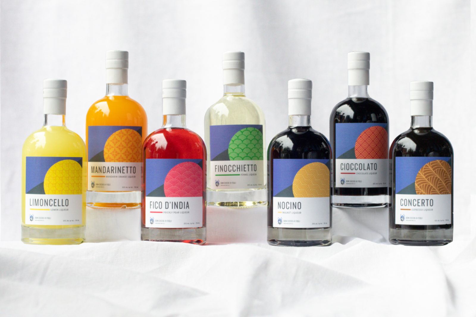
Don Ciccio & Figli are generational crafters of a range of Italian herbal liqueurs, from the bitter to the sweet. Based in Washington DC, the distillery recreates family recipes dating back to 1883. Most brands in this category, like Campari, tell a story of recipes being passed down from one generation to the next. However, unlike the competition, Don Ciccio & Figli’s story is one of revival. Traditional family recipes are being revived 3 generations later from the Amalfi Coast now in the USA. Reborn, never reinvented is the tagline that encapsulates the brand, so when we were tasked with updating their range of cordials, we needed to ensure that we honored the brand’s heritage, but modernized it. The cordial range is one of the first ranges that was launched in the USA and includes Don Ciccio & Figli’s first US crafted liqueur, Limoncello, the flagship spirit. The pressure was on to ensure that the new packaging was as beloved as the liqueur inside.
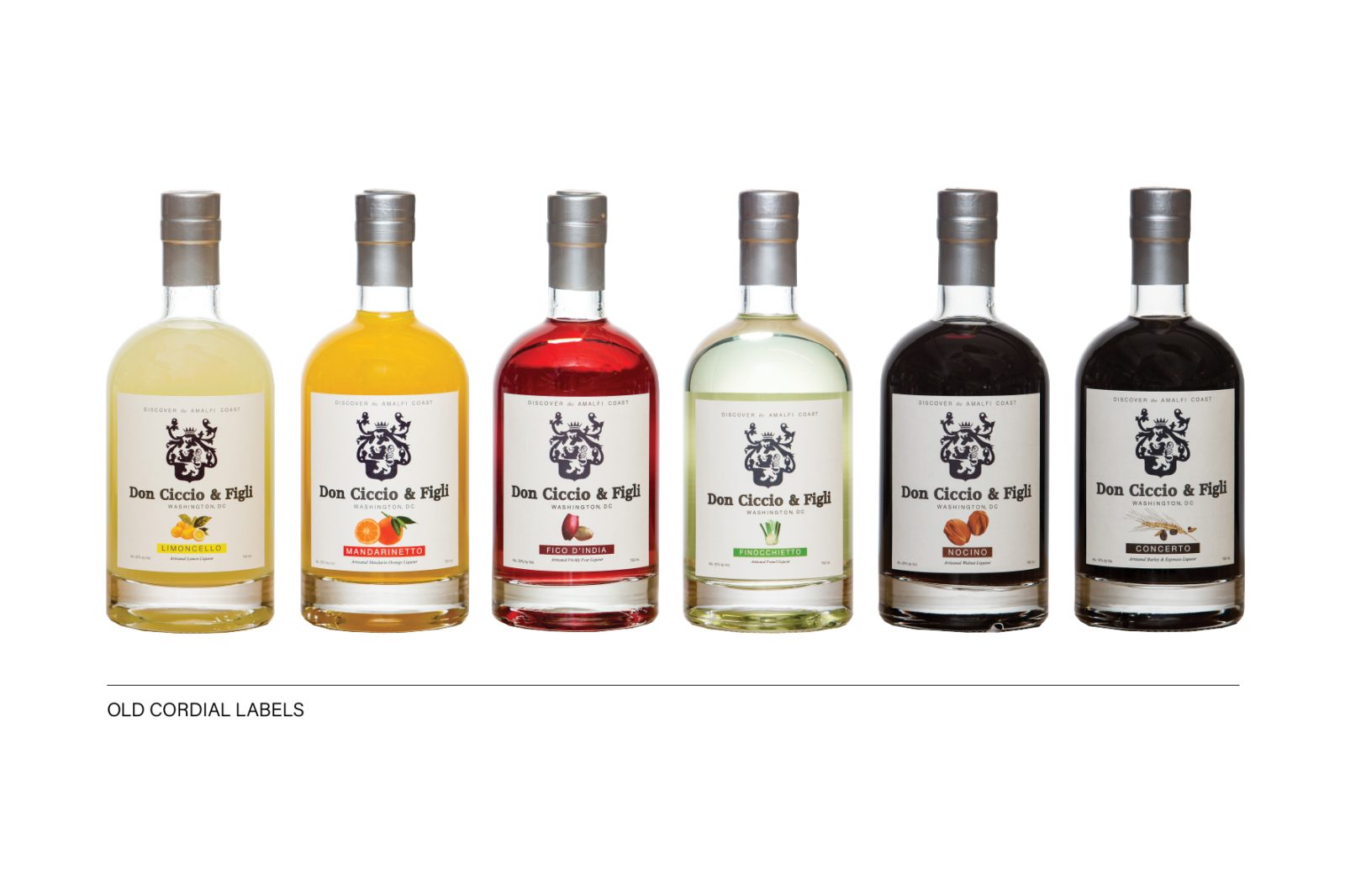
Cordials, which are mostly used in cocktails, are not a very well known category of liqueurs in the USA, outside of Limoncello and the more familiar coffee liqueur. The previous packaging used literal images of the core ingredients to create familiarity for drinkers. While this worked as an initial strategy, the packaging felt tired, too straightforward and less premium than the brand offering. In a range that is extremely flavor forward, we had the hard task of stepping away from literal ingredient display to something more abstract, but ensuring that the flavor profile remained clear and distinct.
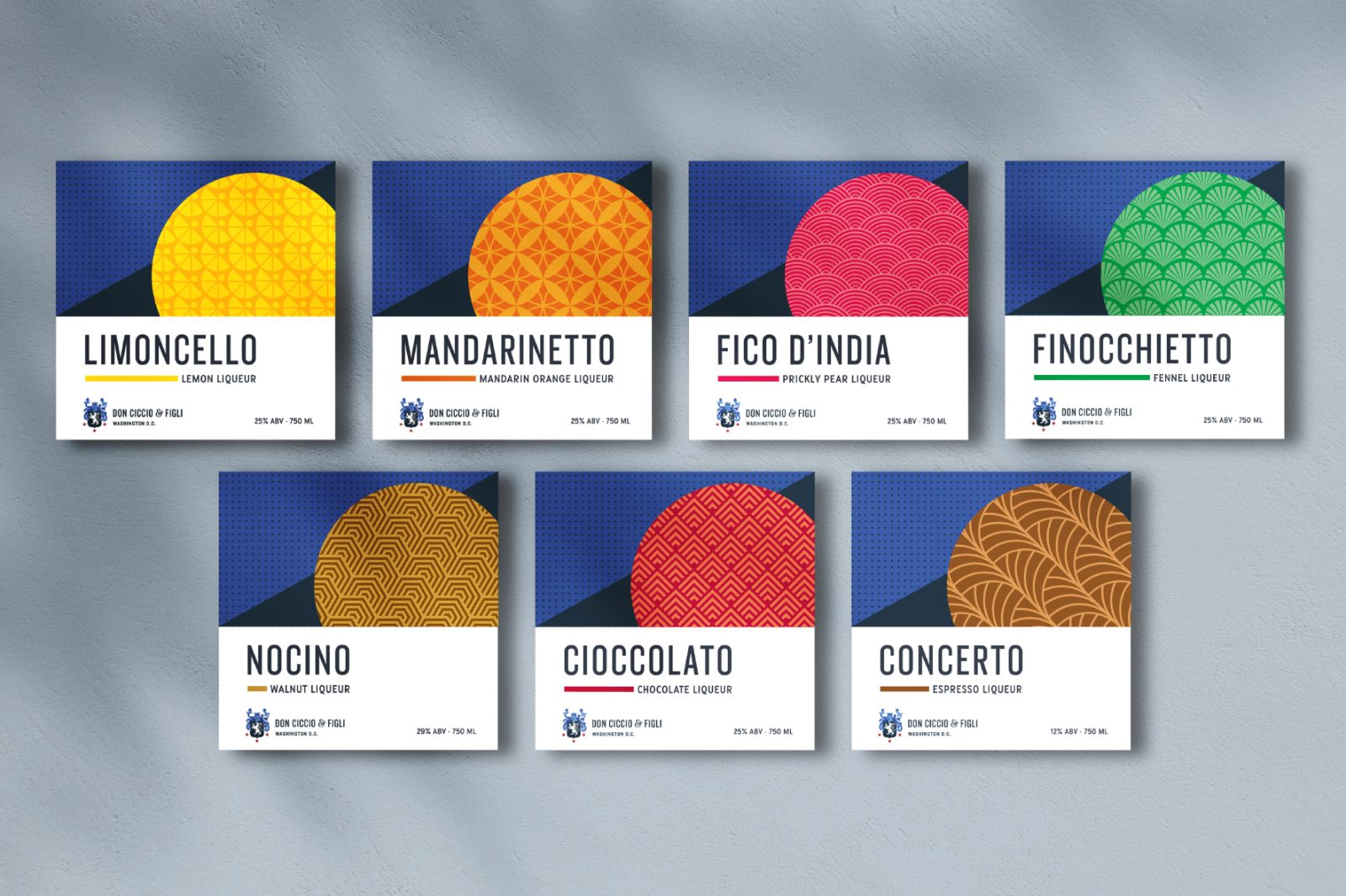
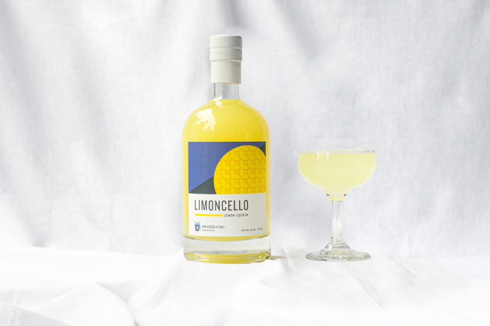
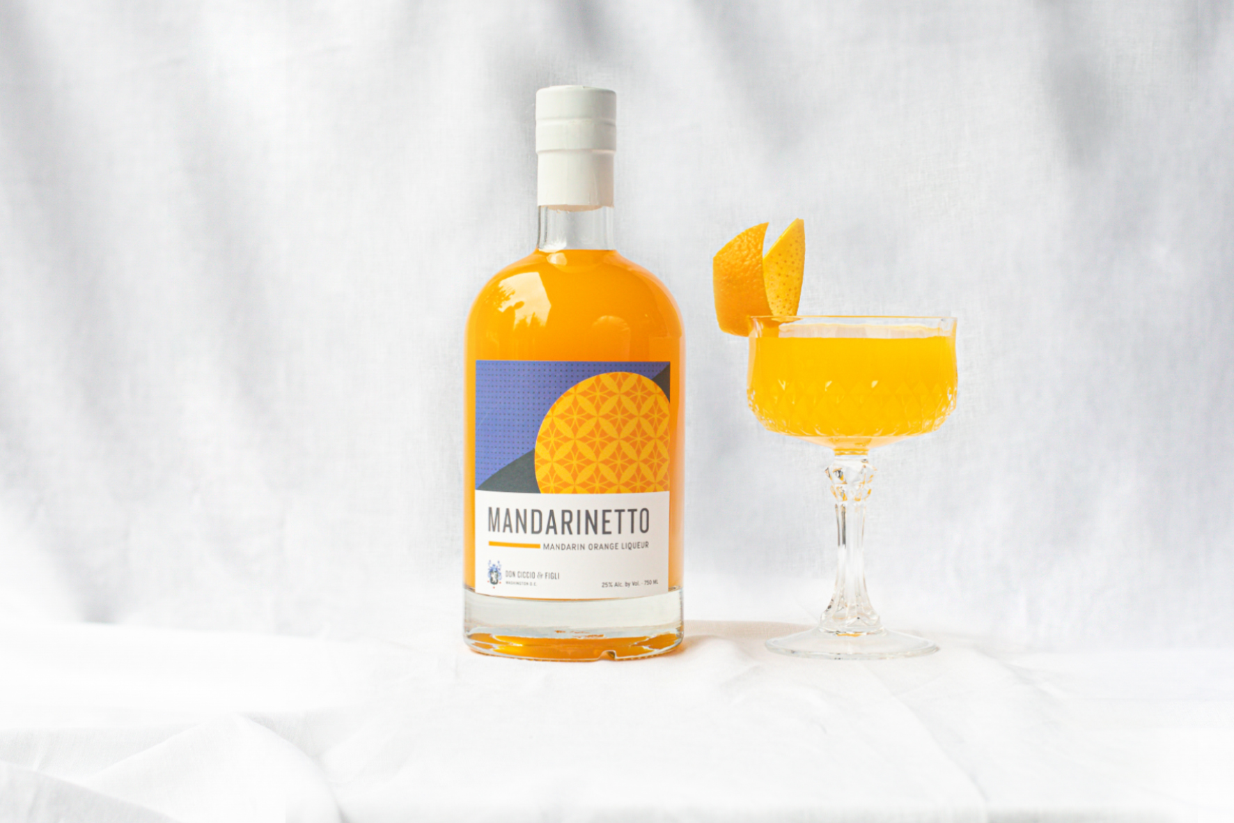
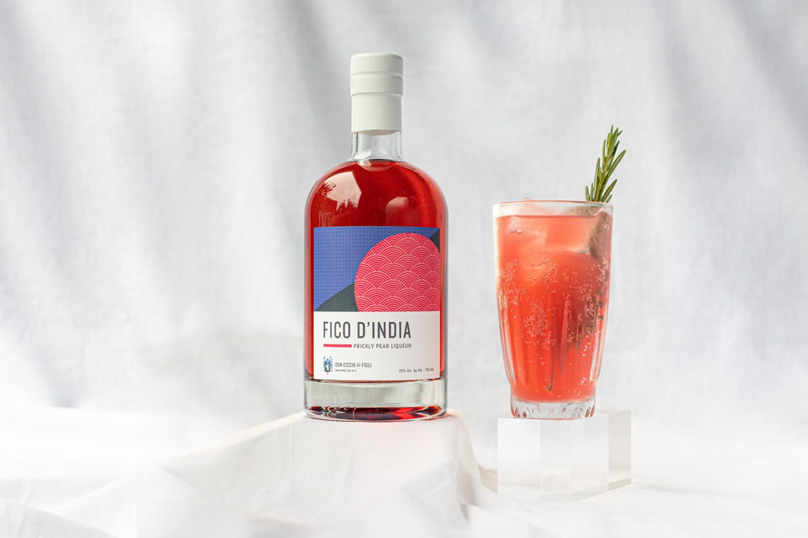
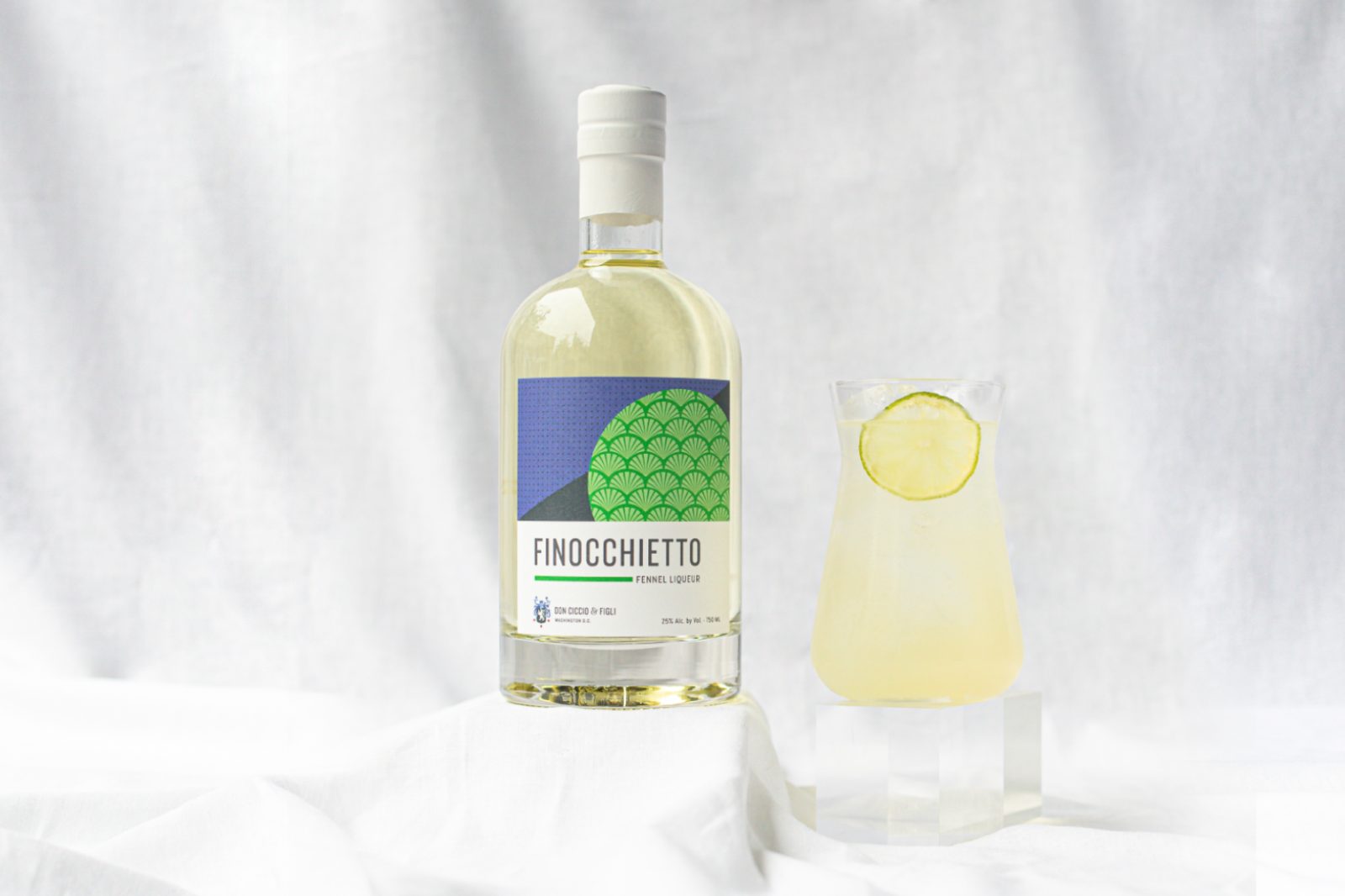
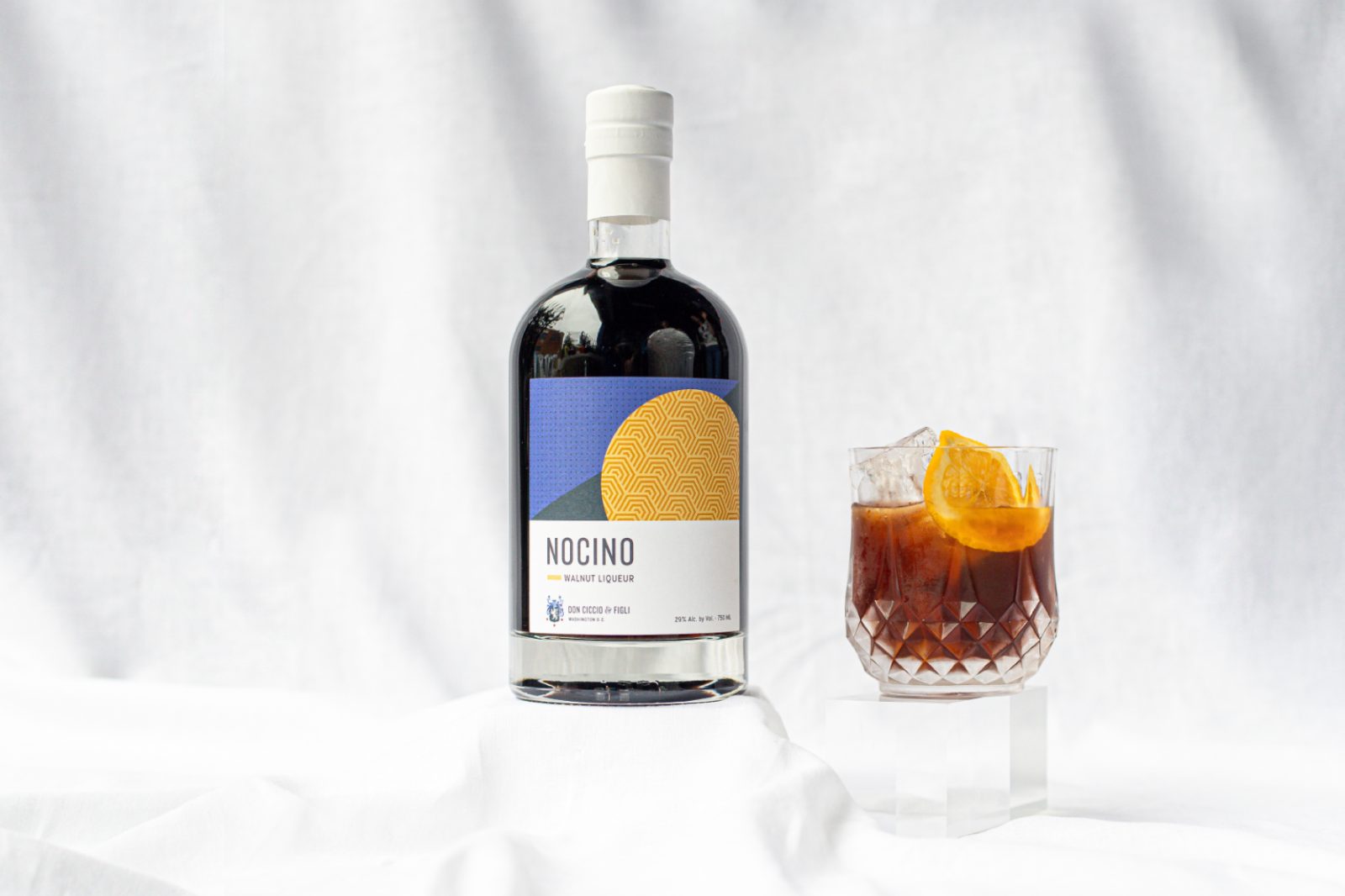
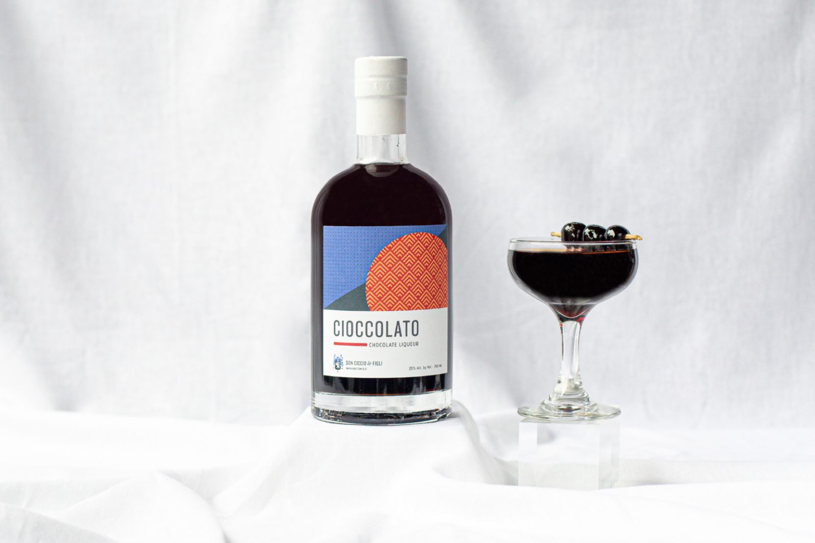
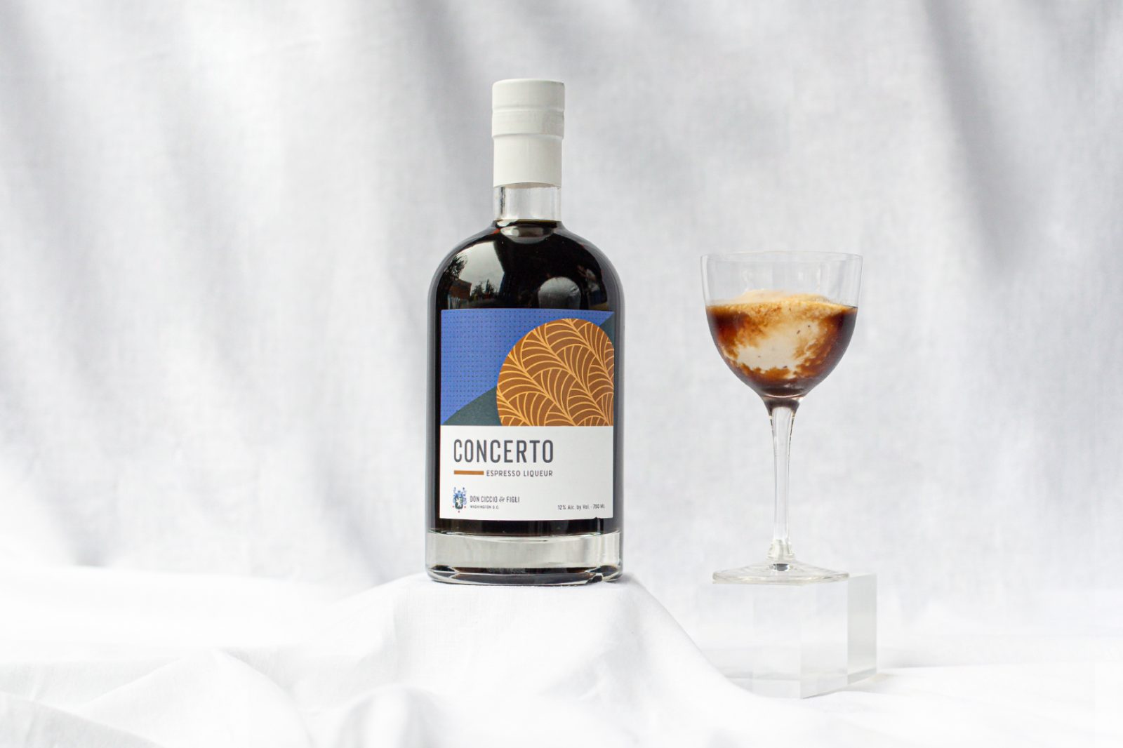
As a solution we used the application of color and illustration to signal flavor, but also to create consistency in the range. In addition, we made the English translation of the flavor profile more prominent, which was less visible on the previous packaging. The core brand identity takes influence from Italian art deco, inspired by its Amalfi Coast heritage, so we pulled that design style through into the pattern illustration. It was important for the range to live on its own, but also complement the other liqueur ranges that are part of the Don Ciccio & Figli brand stable. Budget did not allow for new glass bottles, so to lighten the look of the heavier set bell-shaped bottles, the original silver capsule (neck closure) was replaced with white, making the bottles feel less traditional and heavy. This small touch allowed us to use the existing bottles, but inexpensively made the line feel more modern.
The previous packaging had no explanation on what to expect from the flavors nor how to use the liqueur and how to pronounce the Italian names. To provide more guidance to the drinker, we included phonetic pronunciations, explained the flavor profile and provided a suggestion for cocktail use.
The range was pre-launched online as well as at Don Ciccio & Figli’s distillery in Washington D.C. and received a highly positive reaction from current fans. The new packaging has since been rolled out through distribution to all other local markets and includes a new flavor, Cioccolato or chocolate liqueur, which was not part of the original range.
CREDIT
- Agency/Creative: Betsy Martin , Georgia Bagherpour
- Article Title: Don Ciccio & Figli Cordials Packaging Redesign
- Organisation/Entity: Creative
- Project Type: Packaging
- Project Status: Published
- Agency/Creative Country: United States of America
- Market Region: Washington D.C.
- Industry: Food/Beverage
- Keywords: WBDS Creative Design Awards 2022/23


