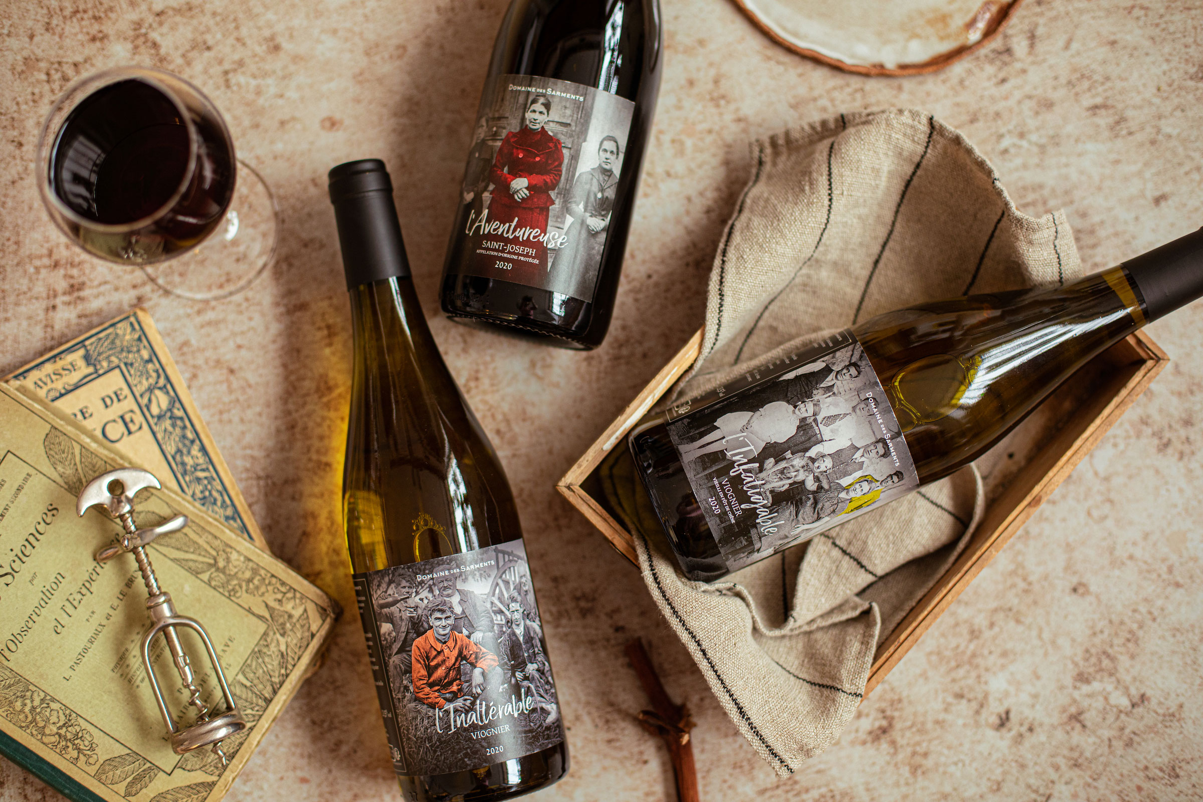
The Domaine des Sarments is the story of a return to basics and the rebirth of a family of winegrowers, through an identity that breaks the codes of French wines.
Background:
In 2002, François Lambert took over the family farm to brew beer and 10 years later he finally realized his dream: to create his own wine (the farm only supplied the cooperative cellars).
Logotype:
The Domaine des Sarments logo contrasts with the traditional codes of French wines. Here, there is no engraving of a luxurious château in the heart of a field of vines, but a more modern and elegant treatment. We are in a niche production and which is aimed at a local clientele who are lovers of new wines.
Packaging concept :
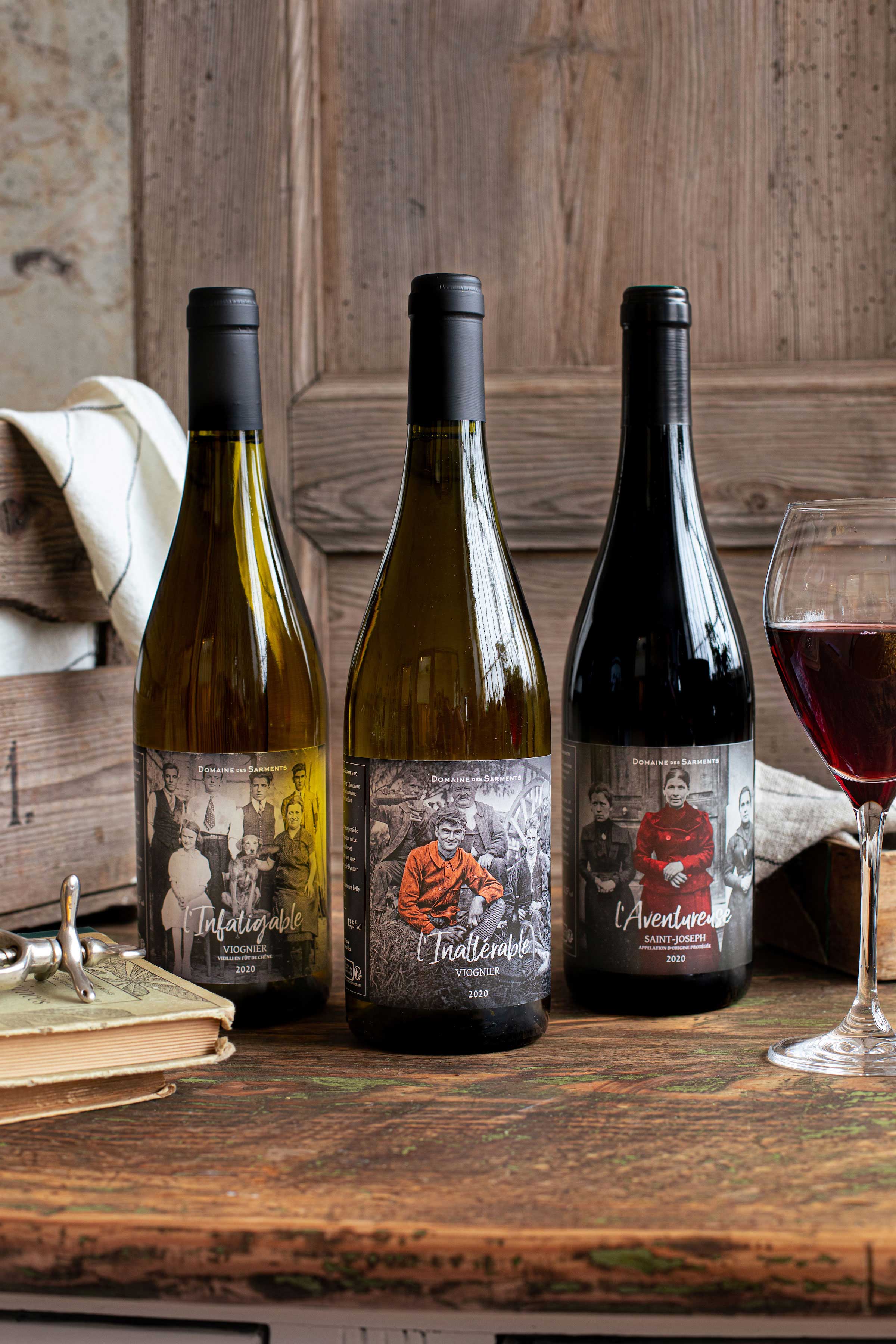
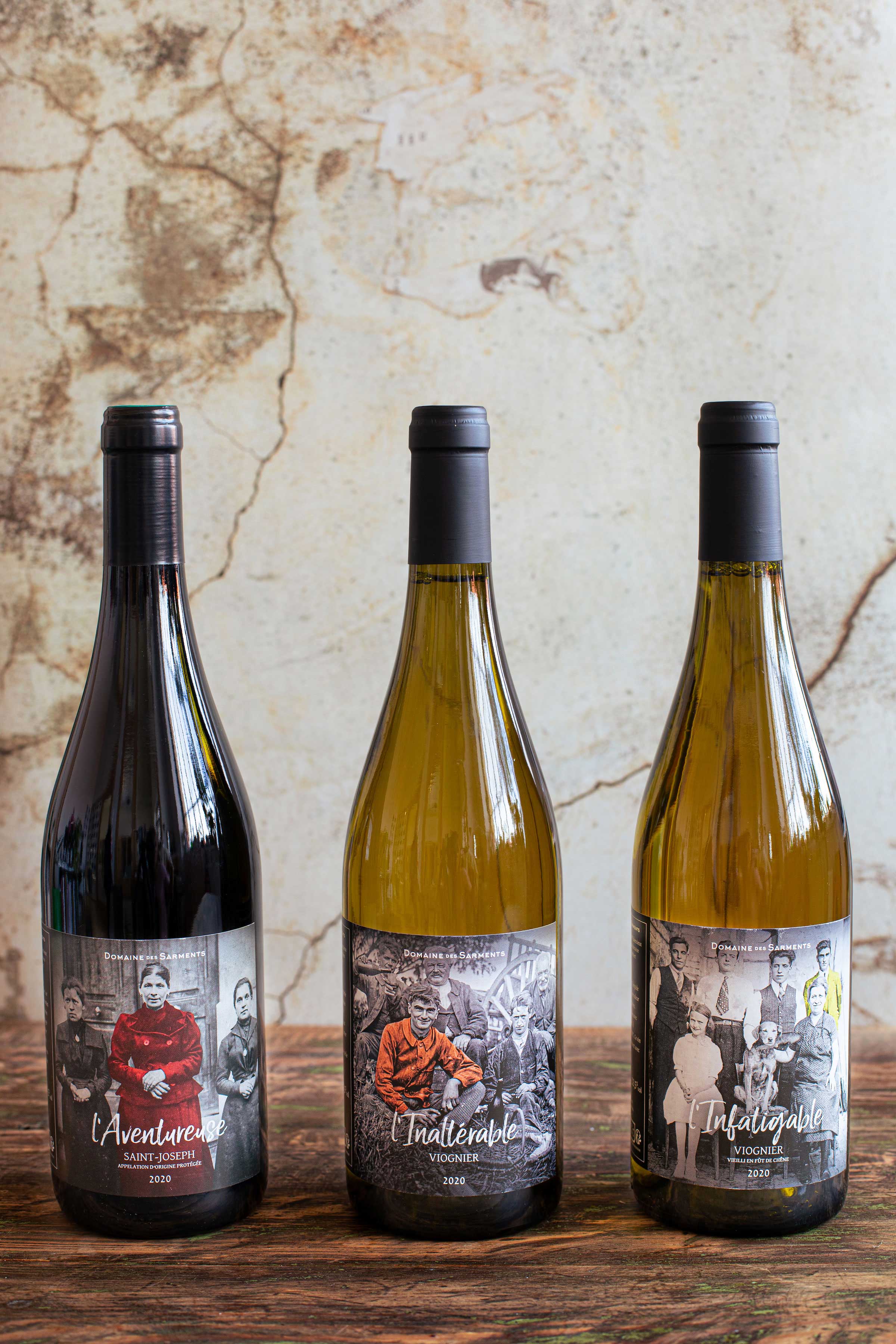
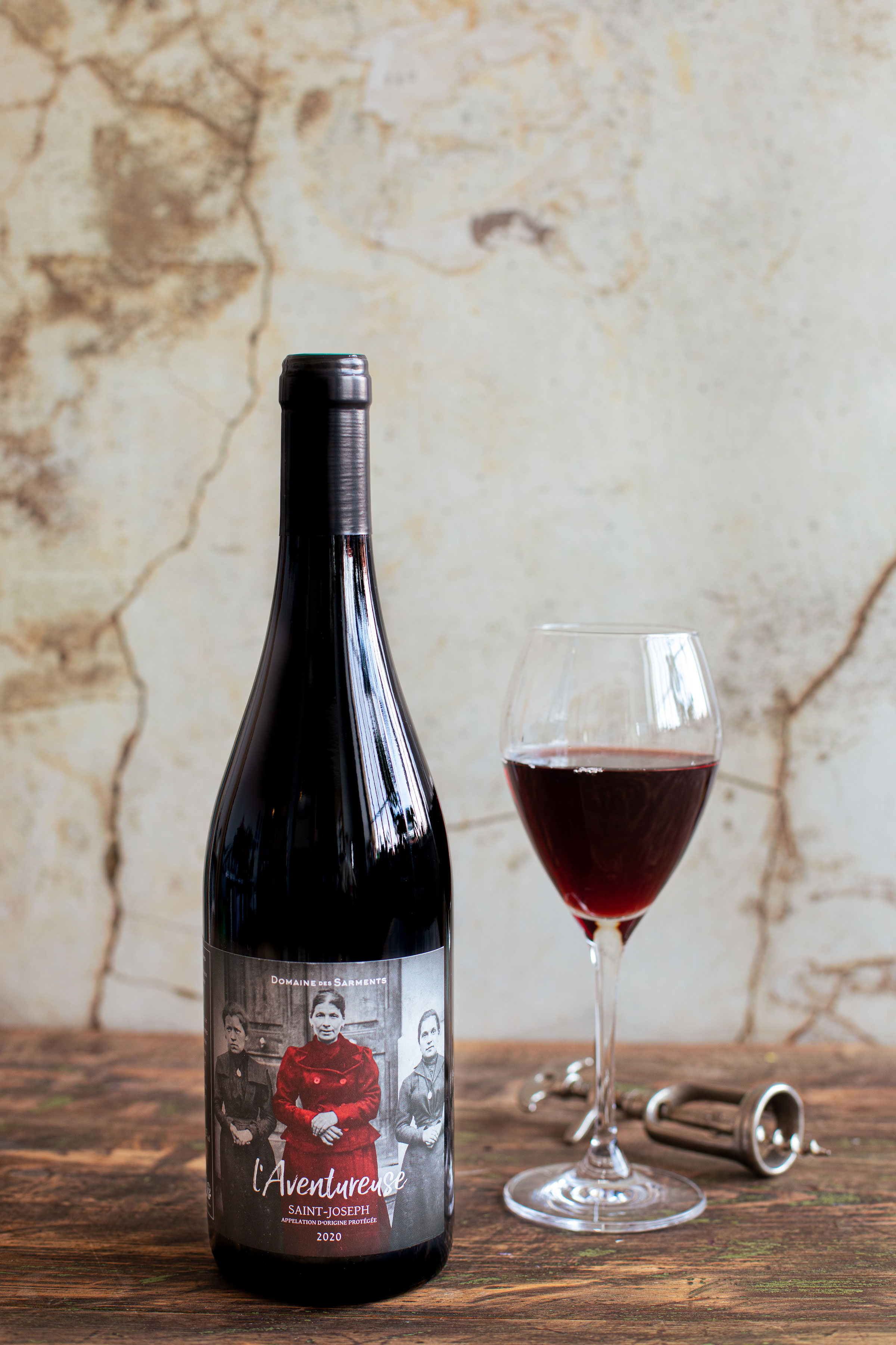
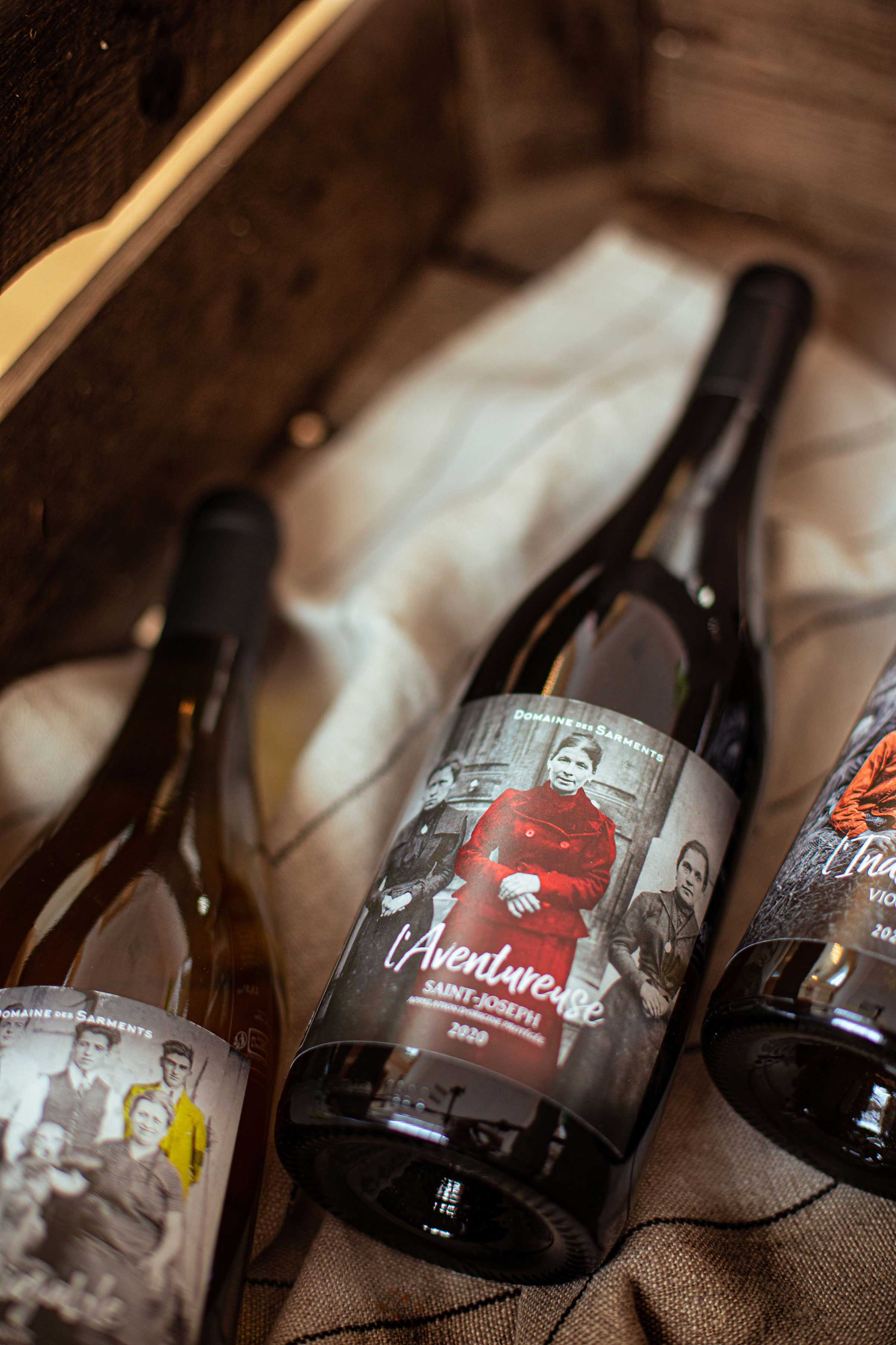
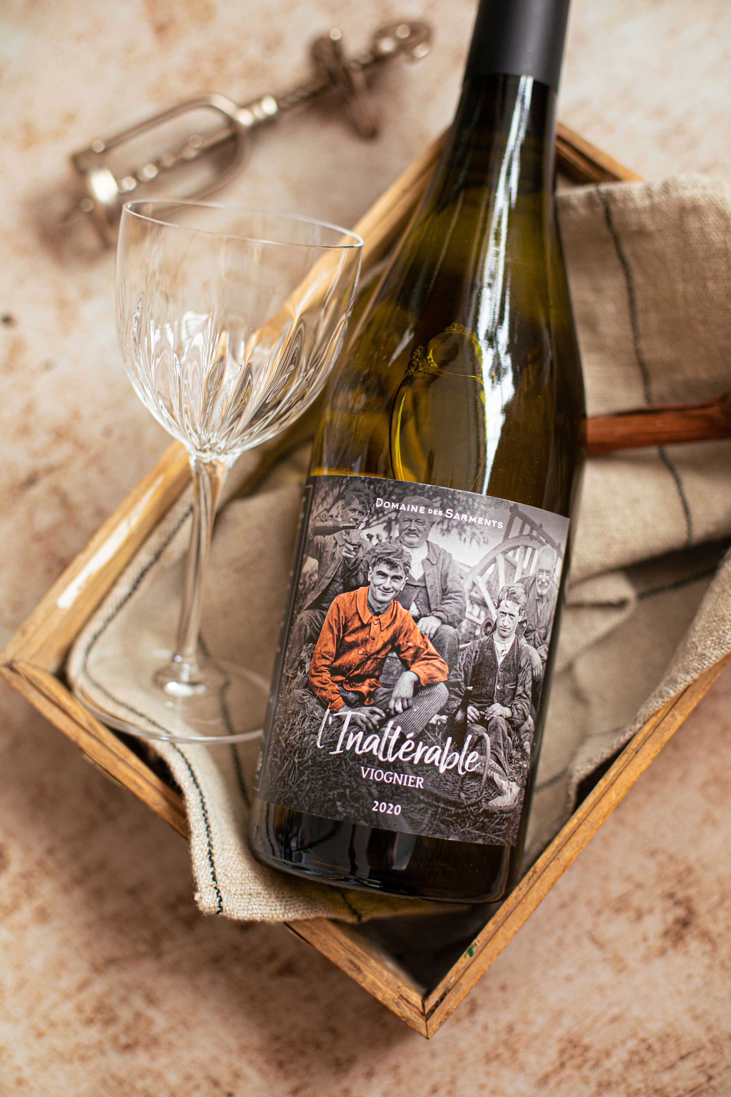
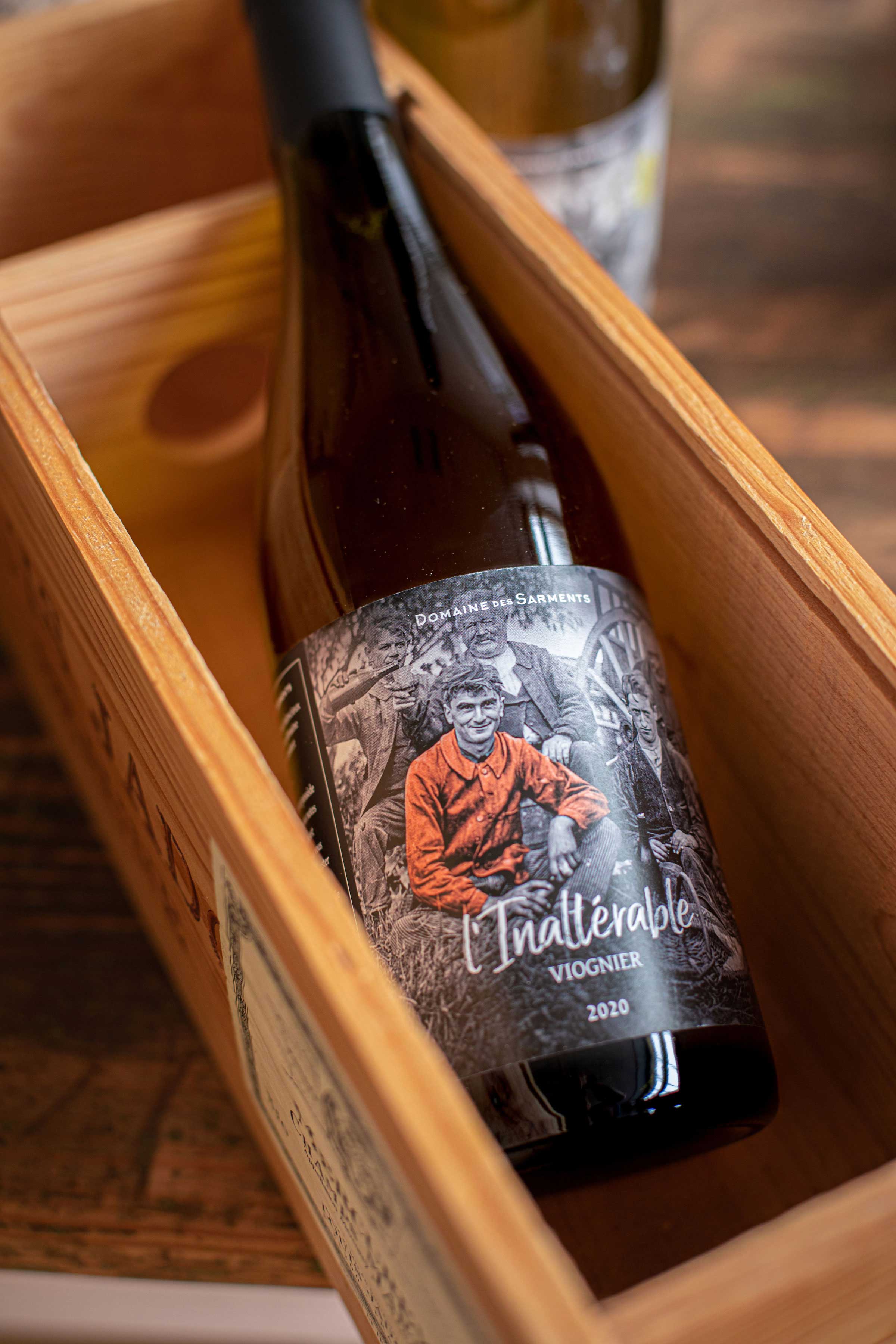
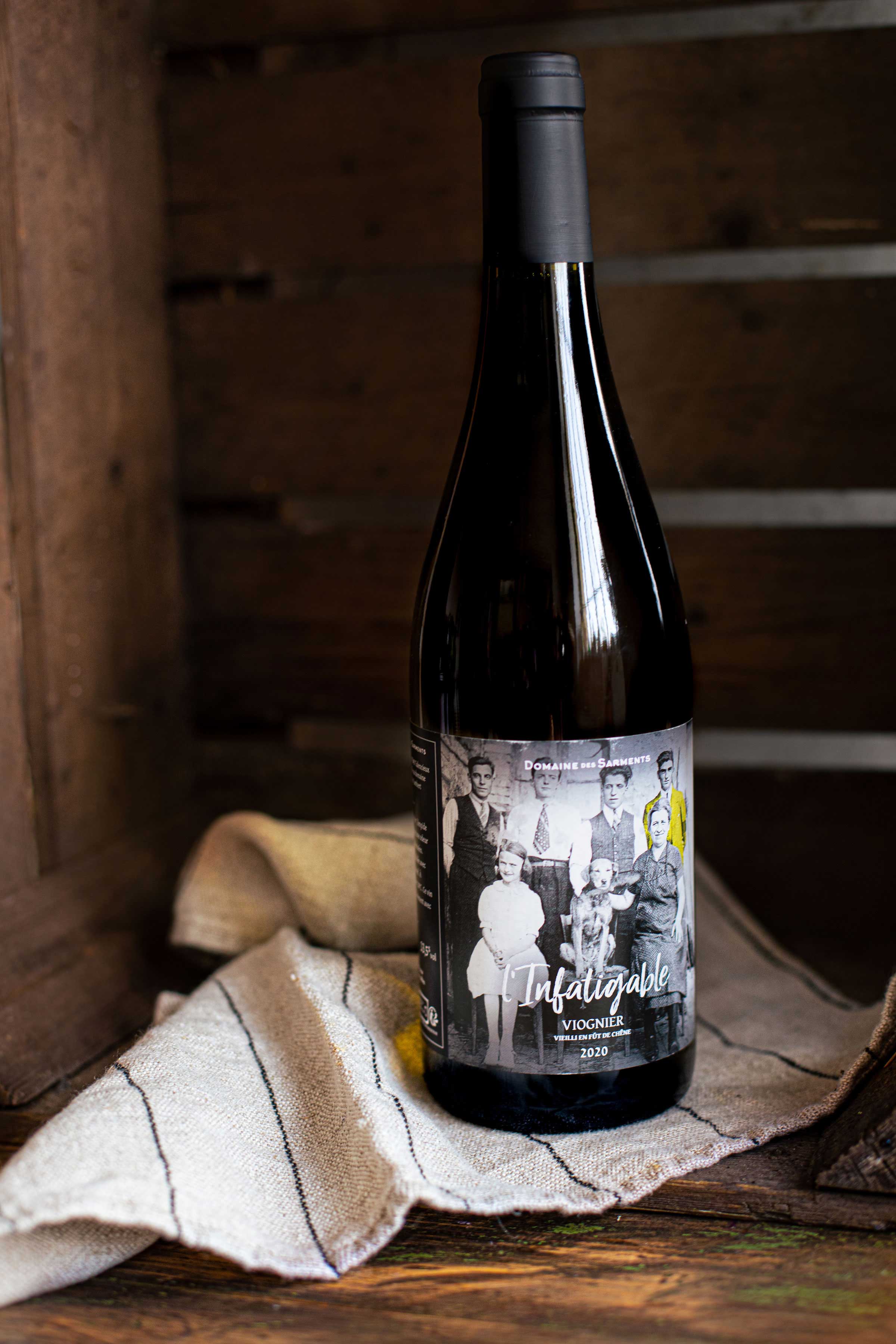
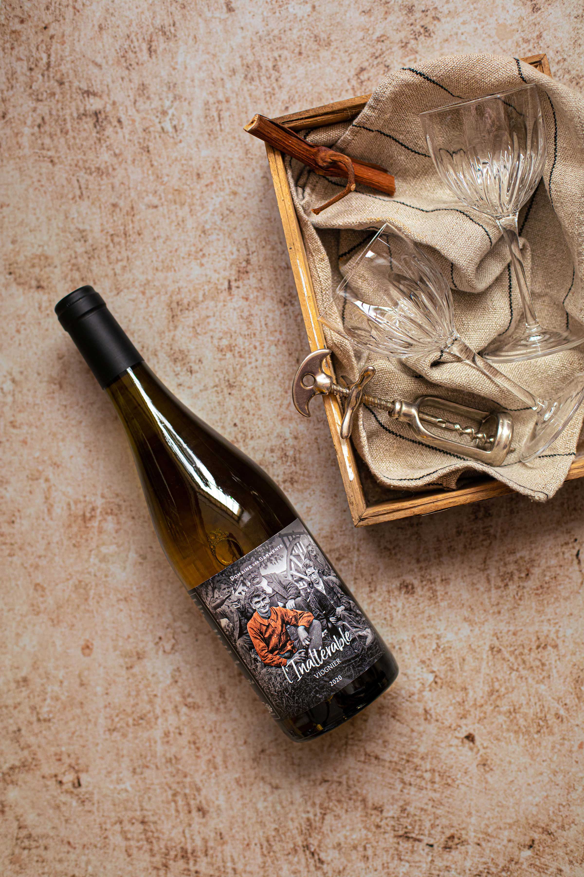
I created the visual identity of the estate and the wines that express a family, epicurean and earthly positioning. The labels pay homage to the Lamberts through emblematic figures of the family. The first three wines (two Viogniers and a Saint-Joseph) tell of the tenacity of a son, the freedom of a great-grandmother and the stubbornness of a father.
Typography:
If the typographic character of the logo shows a certain sobriety, the titles of the labels are more expressive. The Lucky Fellas font brings conviviality to wines. The personality traits inscribed on the bottles are like signatures that we proudly display. The gentium Basic contrasts with the more traditional elegance of its letters.
The labels:
Each label displays an authentic family photo of the customers (François Lambert’s mother is passionate about genealogy). An adjective representing the character trait of the family “troublemaker” gives the name of each wine, while the handwritten typographic character underlines the visual like a signature.
The Domaine des Sarments produces AOP Saint-Joseph’s red and I.G.P. Viognier for the white. Each distinctive character is highlighted by a color. It is an element that guides the eye, but also a graphic element that revisits the archives of a family photo album in a contemporary form.
CREDIT
- Agency/Creative: Cabaroc
- Article Title: Domaine Des Sarments Wine Branding
- Organisation/Entity: Freelance
- Project Type: Packaging
- Project Status: Published
- Agency/Creative Country: France
- Agency/Creative City: Saint-Etienne
- Market Region: Europe
- Project Deliverables: 2D Design, Packaging Design
- Format: Bottle
- Substrate: Glass Bottle
- Industry: Food/Beverage
- Keywords: branding identity, packaging design, wine design
-
Credits:
Branding & art direction: Jean-Philippe Cabaroc


